Whether you’re a reader or a listener, we’ve got you covered! Listen to the podcast version of this post for a fresh take.
As brands increasingly compete for attention, delivering immersive experiences has become essential. At Bluetext, we believe Augmented Reality (AR) and Virtual Reality (VR) offer untapped potential for transforming video content into interactive, engaging experiences. Let’s explore how incorporating AR and VR into your video strategy can captivate your audience and drive meaningful engagement.
Why AR and VR?
Both AR and VR bring depth and interactivity to traditional video formats. AR overlays digital elements onto the real world, allowing users to experience enhanced realities through their mobile devices or smart glasses. VR, on the other hand, transports viewers into entirely new environments using headsets, creating fully immersive experiences. By combining these technologies with video content, brands can engage customers on a deeper level, offering them an experience they won’t forget.
1. AR in Video Content: Layered Engagement
Integrating AR into video content allows for a layered experience. Imagine viewers scanning a video with their smartphone and accessing additional product details, 3D models, or virtual try-ons. This technology enables personalized and interactive customer journeys, which can significantly increase engagement and conversion rates. For example, a retail brand could showcase a video of a new product line, while AR allows users to visualize the items in their own space, bringing an added sense of practicality and excitement to the viewing experience.
2. VR in Video: Full Immersion
VR, while requiring more specialized equipment, offers a fully immersive environment that can revolutionize customer experiences. This technology is particularly effective in industries like real estate, travel, and entertainment, where the ability to transport viewers into another location or scenario can influence purchasing decisions. Imagine walking through a luxury hotel suite or exploring a new car model without leaving your home. VR allows your audience to interact with your product in an unparalleled way, turning passive viewing into an active experience.
3. Best Practices for AR and VR Integration
- Understand Your Audience: Not all customers are ready for AR or VR experiences, so it’s crucial to gauge their tech savviness before implementation.
- Focus on Storytelling: AR and VR should complement your narrative, not overshadow it. The content must remain engaging and relevant to your audience.
- Optimize for Platforms: Ensure that your AR and VR content is optimized for the platforms your audience uses most, such as mobile devices or VR headsets.
- User Experience First: Don’t overload users with too many interactive elements. The goal is to enhance the experience, not complicate it.
The Bottom Line
The future of video content lies in creating immersive and engaging experiences that go beyond the traditional screen. AR and VR provide the perfect tools to do just that. By incorporating these technologies, brands can deliver innovative, memorable content that resonates with their audience and drives higher levels of engagement. At Bluetext, we specialize in helping companies leverage cutting-edge technologies like AR and VR to enhance their video strategies and create unforgettable customer experiences.
Even though the weather still feels like summer, now’s the perfect time for businesses to start developing their fall marketing strategies. For B2B companies, seasonal marketing is often underutilized, but it can offer a significant edge in building connections, driving engagement, and generating leads. As we transition into autumn, the season brings a host of opportunities for businesses to create timely, impactful campaigns that resonate with their audience.
At Bluetext, we know how powerful seasonal campaigns can be in the B2B world. From autumn-themed promotions to messaging aligned with the traditions of fall, companies that strategically plan their marketing initiatives around this season can stand out in a competitive marketplace.
1. Back-to-Business: Align with the Post-Summer Push
As we move out of the summer slowdown, many businesses are refocusing on year-end goals. This presents an ideal time to target decision-makers who are getting back into full swing. Position your services or products as tools to help companies finish the year strong. Consider launching Q4-specific campaigns that emphasize solutions for increased productivity, streamlining operations, or hitting revenue targets before the close of the fiscal year.
2. Leverage Fall Conferences and Trade Shows
Autumn is a key season for B2B events, including trade shows, conferences, and networking opportunities. Make sure your marketing aligns with the industry calendar. A targeted email campaign or social media strategy that ties your offerings to specific events can help you capture the attention of potential clients. You can also create fall-themed content for event collateral, such as white papers or case studies, that highlights your ability to meet the changing needs of businesses during this crucial period.
3. Seasonal Content that Engages and Educates
B2B buyers are often looking for informative, insightful content to guide their decisions. Align your thought leadership with fall trends by publishing articles, case studies, or webinars that focus on Q4 challenges and solutions. Highlight industry-specific insights that show how your business can help others adapt to seasonal shifts, budget reallocation, or end-of-year planning. For example, you could create content about optimizing operations ahead of the holiday rush or preparing for the following fiscal year.
4. Harvest Opportunities: Focus on End-of-Year Business Needs
As fall signals the final quarter, many businesses are re-evaluating their budgets and making strategic purchases to close out the year. This is the perfect opportunity for B2B companies to promote services or products that address immediate needs. Consider offering limited-time pricing or service bundles that provide value before the year-end. Highlight how your solutions can help businesses tackle Q4 objectives, such as streamlining operations, achieving compliance, or meeting customer demands before the calendar flips.
5. Embrace Fall Traditions and Themes
While B2C brands often lean into seasonal aesthetics, B2B companies can also incorporate fall themes into their messaging. Subtle touches, such as incorporating fall colors, seasonal imagery, or metaphors about the harvest and growth, can make your campaigns more relatable and engaging. For instance, you could develop a campaign around “reaping the rewards” of your business solution or helping clients “gather insights” to fuel future growth.
As summer starts to wind down, it’s the perfect time to start planning your autumn-inspired marketing strategies. By leveraging fall themes, traditions, and the changing season, your brand can stay top of mind and create meaningful connections with your audience. Need help developing a fall campaign that drives engagement? Bluetext is here to help you navigate the season with creativity and success. Contact us today.
The era of space travel being the exclusive domain of astronauts and government agencies is over. With the advent of commercial space travel, a new frontier has opened, not just for exploration but also for marketing and branding. As companies like SpaceX, Blue Origin, and Virgin Galactic make space travel more accessible to the public, brands have a unique opportunity to capitalize on this emerging industry. However, with these opportunities come new challenges that require innovative strategies and forward-thinking approaches.
The Dawn of Commercial Space Travel
The commercialization of space travel has shifted from science fiction to reality. Private companies are now regularly launching satellites, conducting space tourism, and planning missions to the Moon and Mars. This shift is creating a new marketplace—one that is not bound by the limits of Earth.
For brands, this means there’s a new, almost limitless, platform for visibility. The allure of space travel captures the imagination of people around the world, making it a powerful tool for storytelling, brand positioning, and customer engagement.
Marketing Opportunities in the Space Age
- Space as a Branding Platform: Imagine your brand logo floating in zero gravity or being displayed on the surface of the Moon. While it may sound far-fetched, these ideas are becoming increasingly feasible. Brands can now consider space as a literal platform for their messaging. For instance, SpaceX has already sent a Tesla Roadster into space as a marketing stunt, capturing global attention. The possibilities for creating iconic, out-of-this-world brand experiences are endless.
- Sponsorships and Partnerships: As commercial space missions become more frequent, brands have the opportunity to sponsor missions, spaceflights, or even entire space stations. These partnerships can provide unparalleled visibility and align a brand with the pioneering spirit of space exploration. Brands that are early adopters of these sponsorship opportunities can position themselves as leaders in innovation and technology.
- Content Creation and Storytelling: The narrative of space travel is rich with themes of exploration, discovery, and the future. Brands can tap into these themes to create compelling content that resonates with their audience. Whether it’s documenting a space mission, creating VR experiences that simulate space travel, or developing educational content about the cosmos, the storytelling potential is immense. This content can help brands connect with audiences on a deeper emotional level, fostering brand loyalty and engagement.
- Marketing to a New Demographic: As space tourism becomes more accessible, a new demographic of affluent, adventurous individuals is emerging. These space tourists represent a niche but lucrative market for luxury brands, travel companies, and experience-based services. Marketing strategies that cater to this audience’s desire for unique, exclusive experiences can be highly effective.
Challenges in the New Space Economy
While the opportunities are exciting, marketing in the realm of space travel also presents significant challenges. Brands need to navigate these carefully to ensure successful campaigns.
- Regulatory and Ethical Considerations: Space is a shared resource, and the regulatory environment governing space activities is still evolving. Brands need to be mindful of the ethical implications of their marketing strategies in space. This includes avoiding space debris, respecting international space laws, and considering the environmental impact of space activities. Missteps in this area could lead to public backlash and damage to brand reputation.
- High Costs and Risk Factors: Entering the space economy requires significant investment. Whether it’s sponsoring a space mission or creating space-themed content, the costs can be astronomical. Additionally, space travel involves inherent risks. Brands need to weigh these risks carefully and develop contingency plans to mitigate potential negative outcomes, such as mission failures or accidents.
- Audience Reception and Perception: While space travel is fascinating to many, it can also be seen as an elitist pursuit, accessible only to the wealthy. Brands need to be cautious about how their space-related marketing efforts are perceived by the broader public. Messaging should be inclusive and emphasize the benefits of space exploration for all of humanity, rather than just a privileged few.
- Technological and Logistical Challenges: Marketing in space requires overcoming significant technological and logistical hurdles. Whether it’s broadcasting live from space, designing durable materials that can withstand harsh space conditions, or coordinating with space agencies, the challenges are complex. Brands need to partner with experts in the space industry to ensure the feasibility and success of their campaigns.
The Future of Marketing in Space
As space travel becomes more mainstream, the impact on marketing and branding will only grow. In the near future, we may see space-based advertising, cosmic product placements, and even the first brands established in space. For companies willing to invest in this new frontier, the rewards could be immense.
However, the key to success will be innovation, creativity, and a deep understanding of both the opportunities and challenges that come with marketing in space. Brands that can navigate this uncharted territory effectively will not only capture the imaginations of consumers but also position themselves as pioneers in a truly new era of marketing.
At Bluetext, we’re excited about the possibilities that space travel presents for brands. Our team is committed to helping you explore this final frontier of marketing, developing strategies that align with your brand’s goals and resonate with your audience. Contact us today to learn how we can help your brand reach for the stars—literally.
Out-of-home (OOH) advertising, once confined to static billboards and posters, is undergoing a revolutionary transformation. The integration of digital technologies is reshaping the landscape, making OOH advertising more dynamic, targeted, and impactful than ever before. In this post, we’ll explore the innovations driving this change and what the future holds for OOH advertising in a digital world.
The Evolution of OOH Advertising
Traditionally, OOH advertising has been a powerful medium for reaching large audiences in public spaces. From the bustling streets of New York City to the highways of Los Angeles, billboards, bus shelters, and transit ads have been staples of the advertising industry. However, the rise of digital technology has introduced new possibilities, allowing for more interactive and engaging campaigns.
Digital Billboards: The New Face of OOH
One of the most significant advancements in OOH advertising is the advent of digital billboards. Unlike static billboards, digital billboards can display multiple advertisements in a single location, rotating content to capture the attention of passersby. This flexibility allows for real-time updates, ensuring that the content is always fresh and relevant.
Moreover, digital billboards offer superior visibility, especially at night, with vibrant displays that can’t be ignored. This enhanced visibility translates to higher engagement rates, making digital billboards a preferred choice for many advertisers.

Programmatic DOOH: Precision and Efficiency
Programmatic Digital Out-of-Home (DOOH) is another game-changer in the OOH arena. By leveraging data and automation, programmatic DOOH allows advertisers to buy and deliver ads in real time, based on specific criteria such as location, time of day, and audience demographics. This precision targeting ensures that ads reach the right people at the right time, maximizing the return on investment.
Additionally, programmatic DOOH offers unparalleled flexibility. Advertisers can quickly adapt their campaigns based on performance metrics, optimizing content to achieve better results. This level of control was unimaginable in the traditional OOH landscape, but it’s now a reality thanks to digital advancements.
The Integration of Augmented Reality
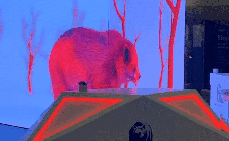
Augmented Reality (AR) is poised to take OOH advertising to the next level. By overlaying digital content onto the physical world, AR creates immersive experiences that captivate audiences. Imagine walking past a bus shelter and seeing a 3D model of a new car, or pointing your smartphone at a billboard to unlock a virtual game. These interactive elements make AR a powerful tool for engaging consumers in meaningful ways.
Data-Driven Insights
One of the key benefits of digital OOH is the ability to gather and analyze data. Sensors and cameras can track foot traffic, dwell time, and engagement levels, providing valuable insights into the effectiveness of campaigns. This data-driven approach allows advertisers to refine their strategies and make informed decisions, ensuring that every dollar spent on OOH advertising delivers maximum impact.
Sustainability and Eco-Friendly Solutions
Digital OOH also aligns with the growing demand for sustainability. Unlike traditional billboards that require paper and ink, digital billboards are reusable and produce less waste. Many digital displays are also powered by renewable energy sources, reducing their environmental footprint. This commitment to sustainability resonates with eco-conscious consumers and enhances brand reputation.
The Road Ahead
The future of OOH advertising is undoubtedly digital. As technology continues to evolve, we can expect even more innovative solutions that blend the physical and digital worlds. From interactive displays and personalized content to AI-driven analytics and eco-friendly practices, the possibilities are endless.
At Bluetext, we’re excited to be at the forefront of this digital transformation. Our team of experts is dedicated to helping brands harness the power of digital OOH to create compelling, impactful campaigns. Whether you’re looking to reach local audiences or make a splash on a global scale, we have the tools and expertise to drive your success.
In conclusion, the future of OOH advertising is bright, dynamic, and full of potential. By embracing digital advancements, brands can engage audiences in new and exciting ways, making a lasting impression in an increasingly digital world.
Ready to elevate your OOH advertising strategy? Contact Bluetext today to discover how we can help you stay ahead of the curve and achieve your marketing goals.
In the ever-evolving world of marketing, understanding consumer behavior is paramount. Traditional methods like surveys and focus groups have provided valuable insights, but they often fall short in capturing the subconscious drivers of consumer decisions. Enter neuromarketing—a groundbreaking field that leverages neuroscience to delve deeper into the intricacies of consumer behavior by analyzing brain activity. At Bluetext, we believe that neuromarketing holds the key to crafting more effective marketing strategies and improving campaign outcomes. Here’s how.
What is Neuromarketing?
Neuromarketing combines principles from neuroscience, psychology, and marketing to study how consumers’ brains respond to marketing stimuli. By using advanced technologies such as functional magnetic resonance imaging (fMRI), electroencephalography (EEG), and eye-tracking, neuromarketers can observe brain activity and physiological responses in real time. These insights reveal the subconscious processes that influence decision-making, providing a more comprehensive understanding of consumer behavior than traditional methods.
Deeper Insights into Consumer Behavior
One of the primary advantages of neuromarketing is its ability to uncover the subconscious motivations that drive consumer behavior. While consumers might not be able to articulate why they prefer one brand over another, their brain activity can reveal these hidden preferences. For example, neuromarketing can identify which elements of an advertisement are most engaging, what triggers emotional responses, and how different product designs impact purchasing decisions.
This deeper understanding allows marketers to create more targeted and effective campaigns. By tapping into the subconscious preferences and emotions of consumers, brands can develop messages that resonate more deeply and drive stronger connections.
Enhancing Marketing Strategies
Neuromarketing techniques provide actionable insights that can inform various aspects of marketing strategy, including:
1. Ad Creation and Optimization
Neuromarketing can pinpoint which elements of an advertisement capture attention and evoke emotions. Marketers can use this data to craft ads that are more engaging and memorable, ensuring that their message sticks with the audience.
2. Product Design
Understanding how consumers perceive and respond to different product designs can lead to more appealing offerings. Neuromarketing can reveal preferences for color schemes, packaging, and even the tactile feel of products, helping brands design products that attract and delight consumers.
3. Pricing Strategies
By analyzing consumers’ brain responses to different pricing strategies, neuromarketing can help determine the most effective price points and promotional tactics. This can lead to pricing models that maximize perceived value and drive sales.
4. Brand Positioning
Neuromarketing insights can guide the development of a brand’s identity and positioning. By understanding the emotional triggers that connect consumers to a brand, marketers can craft a brand story that resonates on a deeper level, fostering loyalty and advocacy.
Improving Campaign Outcomes
Neuromarketing doesn’t just inform strategy; it also enhances campaign outcomes by ensuring that marketing efforts are precisely targeted and highly effective. When campaigns are built on a foundation of deep consumer insights, they are more likely to achieve their objectives, whether that’s increasing brand awareness, driving conversions, or boosting customer loyalty.
Moreover, the ability to measure and analyze brain activity in response to marketing stimuli provides a powerful feedback loop. Marketers can continuously refine and optimize their campaigns based on real-time data, ensuring that their efforts remain relevant and impactful.
Ethical Considerations in Neuromarketing
While the potential of neuromarketing is vast, it’s important to approach it with ethical considerations in mind. Respecting consumer privacy, ensuring transparency, and avoiding manipulative practices are essential to maintaining trust and integrity in neuromarketing practices. At Bluetext, we are committed to ethical neuromarketing, using these powerful insights to create positive and meaningful experiences for consumers.
The Future of Marketing is Here
As the marketing landscape becomes increasingly competitive, the ability to understand and influence consumer behavior is more critical than ever. Neuromarketing offers a window into the subconscious mind, providing deeper insights and enabling more effective marketing strategies. By leveraging these insights, brands can create more engaging, personalized, and impactful campaigns that truly resonate with their audience.
At Bluetext, we’re excited about the potential of neuromarketing to transform the way we understand and connect with consumers. If you’re ready to take your marketing to the next level, contact us today to discover how neuromarketing can enhance your strategy and drive better outcomes.
Ready to unlock the power of neuromarketing? Contact Bluetext today and let’s explore how we can help you understand your audience like never before.
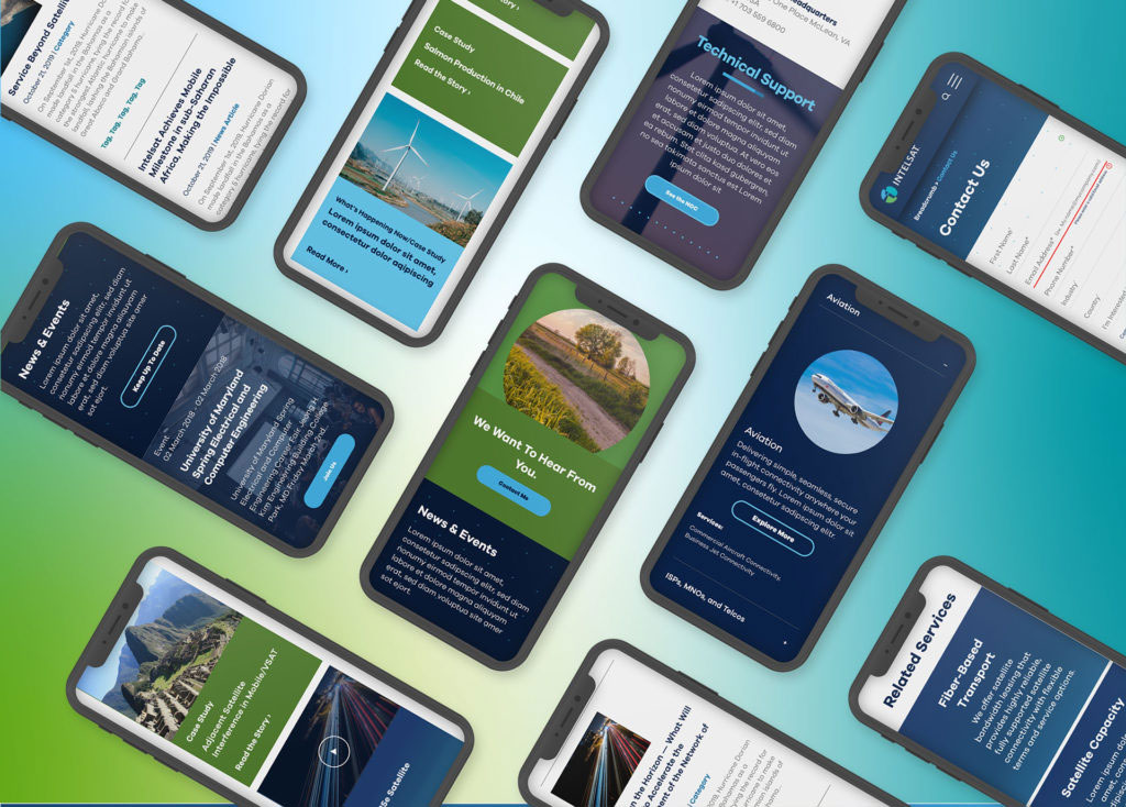
In today’s digital landscape, mobile traffic has not only surpassed desktop but continues to grow exponentially. As users increasingly rely on their smartphones for browsing, shopping, and entertainment, it’s essential for businesses to prioritize mobile-first design. At Bluetext, we understand the importance of creating responsive, user-friendly mobile experiences that enhance customer satisfaction and boost conversions. Here, we’ll share best practices for designing mobile-first websites that can help your business stay ahead in this mobile-centric world.
1. Prioritize Speed and Performance
Mobile users expect fast loading times. A delay of even a few seconds can result in higher bounce rates and lost opportunities. To ensure your mobile site is quick and efficient:
- Optimize Images: Use compressed images without compromising quality. Consider modern formats like WebP for better compression.
- Minimize HTTP Requests: Reduce the number of elements on your page to decrease load time.
- Leverage Browser Caching: Store frequently used resources in the user’s browser to speed up repeat visits.
2. Simplify Navigation
Mobile screens are smaller, and users often interact with them on the go. Simplifying navigation helps create a seamless user experience:
- Intuitive Menu Design: Use hamburger menus or bottom navigation bars to keep the interface clean and easy to navigate.
- Short and Descriptive Labels: Ensure menu items are clearly labeled and concise.
- Clickable Areas: Make buttons and links large enough for easy tapping, considering touch-friendly design principles.
3. Optimize for Touch Interactions
Touch interactions differ significantly from mouse clicks. Designing with touch in mind ensures better user engagement:
- Finger-Friendly Design: Ensure touch targets are at least 44×44 pixels to avoid accidental clicks.
- Gestures: Implement common gestures like swiping and pinching to enhance navigation and usability.
- Feedback: Provide visual feedback for taps and gestures to assure users that their actions are recognized.
4. Responsive and Adaptive Design
A mobile-first approach doesn’t mean neglecting other devices. Your design should adapt seamlessly across all screen sizes:
- Fluid Grids: Use percentage-based widths to allow content to resize smoothly.
- Flexible Images: Ensure images scale correctly without breaking the layout.
- Media Queries: Employ CSS media queries to apply different styles based on the device’s characteristics.
5. Content Prioritization
Mobile users often seek specific information quickly. Prioritize content to meet their needs efficiently:
- Important Information First: Place critical content and calls-to-action (CTAs) at the top of the page.
- Concise and Scannable Text: Use short paragraphs, bullet points, and headings to make text easy to read.
- Visual Hierarchy: Use size, color, and spacing to guide users to key elements.
6. Test and Iterate
Continuous testing and iteration are key to maintaining an effective mobile-first website:
- User Testing: Conduct regular usability tests to gather feedback from real users.
- Analytics: Monitor user behavior and site performance through tools like Google Analytics.
- A/B Testing: Experiment with different design elements to see what works best for your audience.
7. Progressive Web Apps (PWAs)
Consider enhancing your mobile website with Progressive Web App features for a more app-like experience:
- Offline Functionality: Allow users to access content even without an internet connection.
- Push Notifications: Engage users with timely updates and promotions.
- Home Screen Access: Enable users to add your site to their home screen for easy access.
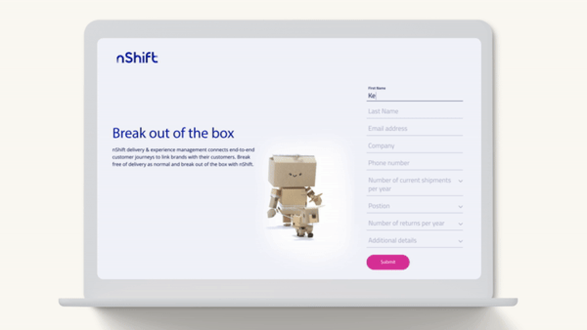
8. Utilize Mobile-Friendly Forms
Forms are often a critical component of websites, especially for lead generation and customer interaction. Ensuring they are mobile-friendly is crucial:
- Simplify Form Fields: Only ask for essential information to reduce user effort.
- Auto-Fill and Auto-Correct: Utilize browser features to help users complete forms quickly.
- Responsive Input Fields: Ensure form fields are large enough and easy to tap, and that they adapt to different screen sizes.
9. Leverage Mobile-Specific Features
Take advantage of features unique to mobile devices to enhance user experience and functionality:
- Location Services: Use GPS to provide location-based services or content.
- Mobile Payments: Integrate mobile payment options like Apple Pay and Google Wallet for seamless transactions.
- Voice Search: Optimize for voice search to accommodate users who prefer speaking over typing.
10. Focus on Accessibility
Ensuring your mobile site is accessible to all users, including those with disabilities, not only broadens your audience but also complies with legal requirements:
- Alt Text for Images: Provide descriptive alt text for images.
- Keyboard Navigation: Ensure that all interactive elements can be navigated via keyboard.
- Screen Reader Compatibility: Use semantic HTML and ARIA roles to support screen readers.
Designing mobile-first websites is no longer optional—it’s a necessity. By following these best practices, you can create responsive, user-friendly mobile experiences that not only satisfy your customers but also drive conversions. At Bluetext, we’re dedicated to helping businesses thrive in the mobile era. Contact us today to learn how we can transform your digital presence with cutting-edge mobile-first design strategies.
As we stand on the brink of a new era in connectivity, 5G technology is set to revolutionize the digital landscape. For marketers, the advent of 5G presents a treasure trove of opportunities to engage audiences in ways previously thought impossible. At Bluetext, we’re excited to explore how faster connectivity can transform digital marketing, from enhanced mobile experiences to groundbreaking applications of augmented and virtual reality (AR/VR).
Faster Connectivity: The Backbone of Future Marketing
One of the most anticipated benefits of 5G is its unprecedented speed. With data transfer rates up to 100 times faster than 4G, 5G will significantly reduce latency and enhance the user experience. This improvement is crucial for digital marketing strategies that rely heavily on real-time data and instant communication.
Enhanced Mobile Experiences
Mobile devices are the primary touchpoints for consumers, and 5G is set to elevate this experience to new heights. Faster download and upload speeds mean richer, more interactive content can be delivered seamlessly. High-quality videos, interactive advertisements, and real-time customer service interactions will become standard, leading to higher engagement rates and improved customer satisfaction.
Additionally, 5G’s enhanced bandwidth capabilities will support a greater number of connected devices, facilitating more comprehensive and integrated marketing campaigns. Brands can leverage these capabilities to create more personalized and dynamic user experiences, ensuring they capture and retain their audience’s attention.
New Opportunities in Augmented and Virtual Reality
Perhaps the most exciting prospect of 5G is its potential to bring AR and VR into the mainstream. These technologies have been on the horizon for years, but the limitations of current networks have hindered their widespread adoption. 5G is set to change that by providing the necessary infrastructure to support the heavy data requirements of AR and VR applications.
Augmented Reality Marketing
AR offers marketers a unique way to engage consumers by overlaying digital information onto the physical world. With 5G, AR experiences will become more immersive and interactive. Imagine consumers being able to visualize how a piece of furniture would look in their home before making a purchase or trying on clothes virtually. These experiences not only enhance customer engagement but also reduce return rates and increase conversion rates.
Virtual Reality Marketing
VR takes immersion a step further by creating entirely new environments for consumers to explore. The high-speed, low-latency capabilities of 5G will make VR experiences more realistic and accessible. Brands can create virtual showrooms, host virtual events, or offer virtual tours, providing consumers with unique and memorable interactions that drive brand loyalty and sales.
5G Tips and Trends
To fully capitalize on the potential of 5G, here are some additional tips and trends to keep in mind:
1. Embrace Video Content
With faster speeds and better connectivity, video content will become even more prevalent. Invest in high-quality video production and consider incorporating live streaming into your marketing strategy. Live Q&A sessions, product launches, and behind-the-scenes content can significantly boost engagement.
2. Focus on Personalization
5G’s ability to handle large amounts of data quickly means more opportunities for personalization. Use data analytics to create highly targeted marketing campaigns that cater to individual preferences and behaviors. Personalized content is more likely to resonate with your audience and drive conversions.
3. Optimize for Mobile
As mobile usage continues to grow, optimizing your website and marketing materials for mobile devices is essential. Ensure that your content loads quickly and is easy to navigate on smartphones and tablets. A seamless mobile experience can greatly enhance user satisfaction and retention.
4. Leverage IoT (Internet of Things)
The increased connectivity of 5G will accelerate the growth of IoT devices. Marketers can use IoT data to gain deeper insights into consumer behavior and preferences. For example, smart home devices can provide valuable data on user habits, enabling more effective targeting and personalization.
5. Stay Ahead with AI and Machine Learning
The combination of 5G and AI will open new doors for predictive analytics and real-time decision-making. Use AI-powered tools to analyze data, predict trends, and optimize your marketing efforts. Automated chatbots, personalized recommendations, and dynamic content are just a few examples of how AI can enhance your 5G-enabled marketing strategy.
Embracing the 5G Future
The advent of 5G is more than just an upgrade in connectivity; it’s a paradigm shift that will redefine digital marketing. At Bluetext, we are excited to help our clients navigate this new landscape, leveraging the power of 5G to create innovative and effective marketing strategies. From enhanced mobile experiences to the groundbreaking use of AR and VR, the possibilities are endless. As 5G continues to roll out, the future of digital marketing looks incredibly promising, and we’re thrilled to be at the forefront of this revolution. Contact us to learn more.
In the dynamic world of digital marketing, few trends have revolutionized the landscape as significantly as social commerce. As social media platforms increasingly blur the lines between content and commerce, businesses are presented with unprecedented opportunities to drive sales directly within these digital ecosystems. At Bluetext, we’ve observed and harnessed the power of social commerce to deliver outstanding results for our clients. In this post, we’ll delve into the phenomenon of social commerce, highlighting best practices for shoppable posts, influencer collaborations, and creating seamless purchase experiences.
The Rise of Social Commerce
Social commerce is the integration of e-commerce functionalities within social media platforms. It allows users to purchase products directly from social media posts or profiles without ever leaving the app. This seamless blend of browsing and buying has transformed the traditional shopping journey, making it more convenient and engaging for consumers.
Platforms like Instagram, Facebook, Pinterest, and TikTok have pioneered this shift by introducing features like shoppable posts, in-app checkout, and shopping tabs. These innovations cater to the growing demand for instant gratification in online shopping, enabling brands to reach and convert customers more effectively.

Best Practices for Shoppable Posts
Shoppable posts are a cornerstone of social commerce, offering a direct path from product discovery to purchase. To maximize their impact, brands should consider the following best practices:
- High-Quality Visuals: Use high-resolution images and videos to showcase products. Visual appeal is critical in capturing attention and driving engagement.
- Clear Product Information: Ensure that product tags provide essential details like price, size, and availability. This transparency builds trust and encourages purchases.
- Compelling Captions: Craft engaging and informative captions that highlight the product’s benefits and unique features. Use a consistent brand voice to reinforce identity.
- User-Generated Content: Encourage customers to share their experiences with your products. Reposting user-generated content (UGC) adds authenticity and social proof, which can significantly influence purchasing decisions.
Influencer Collaborations
Influencer marketing has become a powerful tool in the social commerce arsenal. Collaborating with influencers allows brands to tap into their established audiences and leverage their credibility. Here’s how to make the most of these partnerships:
- Choose the Right Influencers: Select influencers whose followers align with your target audience. Micro-influencers often have more engaged communities and can offer higher conversion rates.
- Authentic Integration: Ensure that the influencer’s promotion feels genuine and aligns with their usual content. Authenticity resonates better with audiences and drives higher engagement.
- Track Performance: Use trackable links and promo codes to monitor the success of influencer campaigns. Analyzing performance data helps refine future strategies and maximize ROI.

Creating Seamless Purchase Experiences
A frictionless shopping experience is crucial for converting social media users into customers. Here are some strategies to enhance the buying journey:
- In-App Checkout: Utilize in-app checkout options provided by social platforms. This reduces the steps needed to complete a purchase, minimizing drop-off rates.
- Mobile Optimization: Ensure that all content and shopping features are optimized for mobile devices. Given the high mobile usage of social media, a mobile-friendly approach is essential.
- Personalized Recommendations: Leverage data and AI to offer personalized product recommendations. Tailored suggestions increase the likelihood of purchase by catering to individual preferences.
Social commerce represents a paradigm shift in the way consumers discover and purchase products. By seamlessly integrating shopping experiences within social media platforms, brands can engage their audiences more effectively and drive sales like never before. At Bluetext, we understand the transformative potential of social commerce and are dedicated to helping businesses navigate this exciting landscape. By implementing best practices for shoppable posts, leveraging influencer collaborations, and creating seamless purchase experiences, brands can thrive in the era of social commerce. Ready to take your social commerce strategy to the next level? Contact Bluetext today and let’s make it happen.
Private equity firms have long been known for their ability to drive growth and enhance value in their portfolio companies. One of the most effective strategies in this realm is brand expansion. By focusing on strengthening and extending the reach of a brand, private equity firms can unlock significant growth opportunities and create lasting value. In this blog post, we’ll delve into the power of brand expansion in private equity and offer practical tips on how to harness its full potential.
The Importance of Brand Expansion in Private Equity
In the competitive world of private equity, differentiation is key. Strong brands not only attract customers but also foster loyalty, command premium pricing, and enhance market positioning. Here’s why brand expansion is crucial in private equity:
1. Driving Revenue Growth
Expanding a brand can open up new revenue streams and markets. Whether it’s through launching new products, entering new geographic markets, or targeting different customer segments, brand expansion drives top-line growth. By leveraging an existing brand’s equity, companies can achieve faster and more efficient market penetration.
2. Enhancing Market Value
A well-established and recognized brand adds significant value to a company. In the context of private equity, a strong brand can lead to higher valuations during exit opportunities. Investors are often willing to pay a premium for companies with strong brand equity, as it indicates a solid market position and growth potential.
3. Building Competitive Advantage
Brand expansion helps build a competitive edge by differentiating a company from its competitors. A strong brand is difficult to replicate, providing a sustainable competitive advantage. Private equity firms can capitalize on this by investing in brand development and expansion to create a moat around their portfolio companies.
Strategies for Successful Brand Expansion
Effective brand expansion requires a strategic approach. Here are some key strategies to consider:
1. Market Research and Analysis
Understanding the market landscape is crucial for successful brand expansion. Conduct thorough research to identify new opportunities, target audiences, and potential challenges. Analyze competitors and market trends to develop a clear expansion strategy.
2. Leveraging Digital Channels
Digital marketing plays a vital role in brand expansion. Utilize digital channels such as social media, email marketing, and search engine optimization (SEO) to reach new audiences and build brand awareness. A strong online presence can significantly boost brand expansion efforts.
3. Product Line Extension
Extending the product line is an effective way to expand a brand. Introduce new products or services that complement the existing offerings. Ensure that the new additions align with the brand’s core values and appeal to the target audience.
4. Geographic Expansion
Entering new geographic markets can significantly boost growth. Conduct a thorough analysis of potential markets to identify the most promising regions. Develop a tailored market entry strategy that considers local preferences, regulations, and competitive dynamics.
5. Partnerships and Alliances
Forming strategic partnerships and alliances can accelerate brand expansion. Collaborate with complementary brands or businesses to co-create products, share distribution channels, or engage in joint marketing efforts. Partnerships can provide access to new customer bases and resources.
Tips for Maximizing Brand Expansion Success
To maximize the success of your brand expansion efforts, consider the following tips:
- Stay True to Your Brand: Ensure that all expansion activities align with your brand’s core values and promise. Consistency is key to maintaining brand integrity.
- Invest in Brand Marketing: Allocate sufficient resources to brand marketing and promotion. A well-executed marketing campaign can significantly boost brand awareness and support expansion efforts.
- Monitor and Measure Performance: Continuously monitor the performance of your expansion initiatives. Use key performance indicators (KPIs) to track progress and make data-driven adjustments as needed.
- Engage with Your Audience: Foster strong relationships with your customers. Engage with them through social media, customer feedback, and loyalty programs to build brand loyalty and advocacy.
- Be Adaptable: Stay flexible and open to change. Market conditions and customer preferences can shift, so be prepared to adapt your strategies accordingly.
Brand expansion is a powerful lever for driving growth and creating value in private equity. By strategically expanding a brand’s reach and influence, private equity firms can unlock new opportunities, enhance market positioning, and build a sustainable competitive advantage. At Bluetext, we specialize in helping private equity firms navigate the complexities of brand expansion. Contact us today to learn how we can support your brand growth initiatives and unlock the full potential of your investments.
In the ever-evolving world of web design, typography plays a pivotal role in creating visually engaging and effective user experiences. At Bluetext, we understand that choosing the right fonts is not just about aesthetics; it’s about making an impact. Whether you’re aiming to capture attention, convey a message, or create a memorable brand identity, typography is your silent but powerful ally. Let’s delve into the latest typography trends in web design that are shaping the digital landscape and how you can leverage them for maximum impact.
Trend 1: Variable Fonts
Variable fonts are a game-changer in modern web design. These fonts allow for multiple variations of a typeface, such as weight, width, and slant, within a single font file. This flexibility offers designers unparalleled creative freedom while improving website performance by reducing the number of font files needed.
Imagine a website where the header text seamlessly transitions from bold to thin as you scroll, or a landing page where the call-to-action dynamically adjusts its weight to draw attention. Variable fonts make these dynamic typographic experiences possible, enhancing user engagement and interaction.
Trend 2: Bold and Dramatic Typography
In a digital world saturated with content, bold and dramatic typography stands out. Large, impactful text can convey confidence and make a strong statement, whether used in headers, hero sections, or call-to-action buttons.
Consider using oversized typography for key messages or branding elements. This approach not only grabs attention but also communicates a sense of importance and urgency. Pairing bold fonts with minimalistic design elements can create a striking visual contrast that captivates users.
Trend 3: Serifs Making a Comeback
For years, sans-serif fonts have dominated web design due to their clean and modern appearance. However, serifs are making a comeback, bringing a touch of elegance and sophistication to digital interfaces.
Serifs can evoke a sense of tradition and reliability, making them ideal for industries like finance, law, and luxury goods. When paired with contemporary design elements, serif fonts can create a unique blend of classic and modern aesthetics, appealing to a broad audience.
Trend 4: Custom Fonts
Custom fonts are becoming increasingly popular as brands seek to differentiate themselves in a crowded market. A unique typeface can reinforce brand identity and ensure consistency across all digital platforms.
Investing in a custom font can set your brand apart and create a cohesive visual identity. Custom typography ensures that your brand voice is unmistakable and memorable, helping to build a stronger connection with your audience.
Trend 5: Mixing Fonts
The trend of mixing fonts involves combining different typefaces to create visual interest and hierarchy. This technique can enhance readability and guide users through your content more effectively.
When mixing fonts, it’s crucial to maintain a balance and ensure compatibility between typefaces. Combining a bold sans-serif for headers with a clean serif for body text can create a harmonious and engaging reading experience. Be mindful of contrast, scale, and proportion to achieve a polished look.
Conclusion
Typography is more than just selecting a font; it’s about creating a visual language that speaks to your audience. At Bluetext, we believe that understanding and leveraging the latest typography trends can transform your web design, making it more impactful and memorable. By embracing variable fonts, bold typography, the resurgence of serifs, custom typefaces, and the art of mixing fonts, you can craft a digital presence that not only stands out but also resonates with your users. Stay ahead of the curve and let your typography make a lasting impression. Contact us to learn more.