In late 2021, Apple released its iOS 15 update with a pretty drastic change in browser layout, creating a ripple effect in website UX design. The beloved search bar on Safari had been moved from the top of the screen to the bottom. Many users, who are less familiar with the thought process behind UX design were left with one question. Why?
Well, according to MacRumors, the move was more functional than aesthetic. Think about how one naturally holds and operates a smartphone; usually held within the palm of the hand and touchscreen controlled by your thumbs from the bottom corners. Therefore, controls brought to the bottom of the screen are easier to reach with one hand. This feature also creates more space for users to focus on the webpage’s content.
Research confirms that “75% of users touch the screen with one thumb.” This has led UX designers to favor a thumb-driven design, placing the most important and frequently-used features at the bottom of the screen. This ensures easy access with one thumb.
Traditionally, many website designers place navigation in the top corners of the screen. While that works with a desktop device, due to the greater range of motion coming from the computer’s mouse, it does not translate that effectively to a mobile device. With the navigation menu being placed on the top corners of the screen, the range of motion that the user’s thumb has can restrict easy access to that navigation menu. Especially as technology evolves and mobile screens grow in size, users find themselves having to reposition their hands. This in turn slows down the user’s ability to navigate webpages and ingest content.
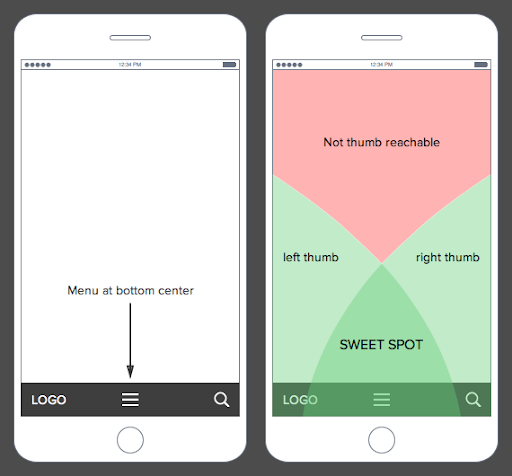
What’s the big deal? I just have to move my hand a little to be able to reach the top corner of my screen. The answer is simple: efficiency. Bottom menu navigation allows the user to accomplish tasks faster and with a greater level of comfortability, which really adds up considering that the average American spends 5.4 hours on their phones.
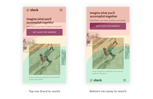
A lot goes into the design process, and it is not all about aesthetics. It’s about how the product functions. In today’s world, 55% of website traffic is generated using mobile devices, so functional and efficient mobile layouts for a website is imperative to the success of a brand. It is essential that UX designs make easy navigation a priority because the easier a product is to use the more often it will get used or recommended. That is why features like bottom navigation are so effective. Especially if it is designed in a streamlined way that makes content visible, clear, and simple.
As users experience the bottom menu trend, users will likely have to take some time to readjust. Looking ahead at UX design trends for 2022, there will be a continuation of the emphasis on overall usability, navigation, and aesthetics being driving forces for design. There is a desire to achieve a seamless experience, where user experience designers focus on the continuity and natural progression of connecting all the steps of finding a landing page to purchasing an item. It is imperative that functionality is favored, so it will be interesting to see more experimentation with navigation placement and overall screen flow on mobile devices in the future.
Does your website menu need a refresh? Contact Bluetext today to learn about our web and UX design services.
Recent Posts
Bluetext’s Recent Work