For years, headless CMS platforms have been the go-to solution for brands seeking flexibility, speed, and scalability in their digital content delivery. By decoupling the front end from the back end, headless architecture empowered marketers and developers to create omnichannel experiences with greater efficiency. But as user expectations grow more sophisticated and digital ecosystems become more complex, even headless is starting to show its limits.
So what’s next? The future of content management isn’t just about removing the head—it’s about building a smarter, more adaptable brain. From composable digital experience platforms to AI-driven personalization engines, the next generation of CMS technology is poised to transform how organizations structure, deliver, and optimize content.
Here’s what’s on the horizon.
Composable Architecture: Breaking Down the Monolith for Good
If headless CMS decoupled the front end from the back end, composable architecture takes things a step further—decoupling everything. A composable digital experience platform (DXP) allows organizations to assemble a custom stack of best-of-breed tools for CMS, e-commerce, personalization, analytics, and more, all connected via APIs.
The result? Greater agility. Marketers and IT teams are no longer boxed into rigid, one-size-fits-all platforms. Instead, they can mix and match services that best support their goals—whether that’s fast localization, dynamic pricing, or seamless omnichannel orchestration. Composable architecture also allows for incremental upgrades, so brands can evolve their digital presence without overhauling entire systems.
AI-Powered Content Delivery Is Here—and Growing Fast
AI is no longer a buzzword in CMS. It’s becoming the engine behind smarter content experiences. From predicting what content a user will find most valuable, to dynamically adjusting layouts based on behavior, AI is changing the way brands think about digital engagement.
Modern CMS platforms are beginning to integrate AI-driven features like:
- Content recommendations based on user behavior and intent
- Automated tagging and metadata generation for better asset management
- Real-time personalization, delivering tailored content to the right audience at the right time
By embedding AI into the content supply chain, brands can move beyond static publishing toward experiences that are predictive, personalized, and performance-driven.

Content Operations Are Getting an Overhaul
The CMS of the future doesn’t just manage content—it powers an entire ecosystem of digital operations. That means tighter integration with Digital Asset Management (DAM) platforms, Customer Data Platforms (CDPs), and marketing automation tools.
Content teams are shifting away from traditional editorial calendars and rigid workflows. Instead, they’re embracing:
- Structured content models that support reusability across channels
- Data-informed content strategies based on performance insights
- Collaborative environments where marketers, designers, and developers work in sync
This new model of Content Ops is about more than publishing—it’s about treating content as a living asset that evolves and adapts to user needs.
API-First, Cloud-Native Platforms Are the New Standard
As organizations grow more complex and global, performance and scalability are critical. That’s where API-first, cloud-native CMS solutions come in. Built for integration and extensibility, these platforms allow developers to plug into virtually any system—without being locked into a vendor’s proprietary tools or workflows.
Benefits of API-first CMS platforms include:
- Faster development and deployment cycles
- Seamless integration with existing martech and eCommerce platforms
- Improved security, scalability, and reliability through modern cloud infrastructure
For enterprise brands navigating multi-site, multilingual, or multi-channel challenges, API-first CMS solutions offer the flexibility to deliver consistent, high-performance experiences across the board.
So, What Should Brands Do Now?
If your organization is currently running a traditional CMS—or even a headless one—it’s time to look ahead. The CMS landscape is evolving rapidly, and the platforms of tomorrow will be defined by their intelligence, adaptability, and interoperability.
Key considerations as you plan for the future:
- Audit your current content ecosystem: What tools are in place, and where are the bottlenecks?
- Invest in modular, composable architecture: Future-proof your stack by prioritizing flexibility and integration.
- Explore AI capabilities: Start with features like smart recommendations or auto-tagging, and scale up as you see results.
- Think beyond websites: Your CMS should support a unified experience across mobile, social, voice, and more.
At Bluetext, we help organizations reimagine their digital infrastructure to support not just where they are—but where they’re going.
Ready to evolve your CMS strategy?
Contact Bluetext to architect a future-ready content platform that’s intelligent, scalable, and built to grow with your brand.
B2B websites are content powerhouses. Whether you’re navigating technical product documentation, compliance resources, white papers, or thought leadership blogs, these sites are often packed with deeply layered and jargon-heavy material. But no matter how rich your content is, it’s only valuable if users can find it. That’s where smart search functionality becomes essential.
In today’s digital landscape, B2B brands must move beyond basic keyword search to deliver an intuitive, efficient, and tailored experience that unlocks the full potential of their content. In this post, we’ll explore what smart search means for complex B2B websites and how you can use it to enhance discoverability, user experience, and business outcomes.
The Challenge of B2B Content Complexity
B2B websites tend to grow organically over time. As new products, services, use cases, and regulations emerge, pages are added—often in silos. This creates sprawling ecosystems of technical data, fragmented resources, and inconsistent metadata. For users, it can feel like searching for a needle in a haystack.
Traditional navigation tools, including outdated search bars or simplistic site maps, often fall short in helping visitors find what they need. Whether it’s a government RFP looking for product certifications or a hospital IT team seeking integration specs, your users expect fast, accurate answers. When they don’t get them, they leave.
What Is Smart Search?
Smart search—also known as advanced site search—goes far beyond the basic keyword match. It leverages technologies like artificial intelligence (AI), natural language processing (NLP), and machine learning to understand user intent and deliver relevant results.
Key capabilities of smart search include:
- Predictive search suggestions
- Typo tolerance and fuzzy matching
- Semantic understanding of queries
- Filters and faceted navigation
- Personalized results based on behavior or user roles
- Analytics dashboards to track search behavior
Popular platforms like Elasticsearch, Algolia, and Azure Cognitive Search offer these features out of the box, and many integrate seamlessly with content management systems (CMS), customer relationship management (CRM) platforms, and digital asset management (DAM) tools.
Why Smart Search Matters for B2B Sites
A smart search function does more than improve user experience—it adds measurable business value.
1. Increases Content Discoverability
Smart search enables users to easily surface relevant product pages, PDFs, datasheets, blog posts, and more—regardless of how deep they’re buried.
2. Boosts Engagement and Conversions
The faster users find what they’re looking for, the more likely they are to take action—whether that’s submitting a lead form, starting a trial, or contacting sales.
3. Provides Insight into User Needs
Site search data reveals what visitors are trying to find. This intel can drive content strategy, identify gaps, and inform UX decisions.
4. Supports Role-Based Customization
By understanding who the user is (e.g., buyer, engineer, compliance officer), smart search can tailor results to deliver the most relevant answers for each audience segment.
Key Features to Include in Your Smart Search Implementation
To maximize the impact of your search functionality, prioritize features that enhance usability and scale with your content ecosystem:
- Auto-complete and dynamic suggestions
- Faceted search filters (e.g., by product type, industry, resource type)
- Support for long-tail and natural language queries
- Contextual search snippets that preview content
- Synonym recognition and custom dictionaries
- Integration with structured metadata and tagging systems
Don’t forget to optimize for mobile—B2B users increasingly access websites from smartphones and tablets, especially in the field.
Implementation Tips for Complex Sites
Building smart search into a complex B2B website requires careful planning:
- Audit your existing content to ensure it’s structured, tagged, and organized for machine readability
- Map common user journeys to understand how different personas navigate the site
- Define your taxonomy and metadata strategy to ensure consistent tagging and filtering
- Monitor and refine search performance using analytics and feedback loops
- Collaborate across departments (marketing, IT, sales) to align on priorities and content visibility
Smart Search in Action: A Real-World Snapshot
Imagine a defense technology firm with a site housing hundreds of technical briefs, compliance documents, and product brochures. With basic keyword search, users must already know the exact title or term to find a document. But with smart search, a procurement officer typing “NIST certification for satellite hardware” can instantly access relevant materials—even if the original file is titled differently. Filters allow narrowing by document type, date, or business unit, ensuring a streamlined path to the right asset.
Turn Your Website into a Smart Content Hub
If your B2B site is packed with valuable content that users can’t easily find, it’s time to upgrade your search experience. At Bluetext, we help organizations architect advanced search solutions that integrate seamlessly into complex digital ecosystems—enhancing usability, supporting business goals, and delivering measurable ROI.
Let’s talk about how Bluetext can help you implement smart search for your site. Contact us today.
Customers today expect more than just fast answers—they want smart, personalized conversations. As brands look to automate support, streamline lead qualification, and create always-on digital experiences, the choice often comes down to two options: rule-based chatbots and conversational AI.
But which one is right for your brand?
Understanding the difference—and knowing when to use each—can help you design a more strategic and scalable customer experience. Here’s how to navigate the landscape and make the best decision for your business.
Chatbots vs. Conversational AI: What’s the Difference?
Although the terms are often used interchangeably, rule-based chatbots and conversational AI serve fundamentally different purposes.
Rule-Based Chatbots
These are logic-driven tools that operate on pre-defined workflows. They follow “if-this-then-that” logic and guide users through scripted paths.
- How they work: Pre-programmed responses triggered by keywords or button clicks
- Strengths: Fast, simple, low-cost
- Common uses: FAQs, order tracking, appointment booking, password resets
Conversational AI
This advanced solution uses natural language processing (NLP), machine learning, and real-time data to understand user intent, even with vague or complex phrasing.
- How it works: Interprets open-ended input, accesses data in real time, and improves through continuous learning
- Strengths: Context awareness, personalization, multilingual support
- Common uses: Lead qualification, customer support at scale, employee onboarding, post-sale care
| Feature | Rule-Based Chatbot | Conversational AI |
| Response Type | Predefined | Adaptive / Generated |
| Learning Capability | None | Learns over time |
| Input Handling | Buttons or keywords | Natural language input |
| Complexity | Low to moderate | High |
| Setup Time | Quick | Longer (training + testing) |
| Cost | Lower | Higher (but scalable) |
When a Rule-Based Chatbot Makes Sense
Not every brand needs a cutting-edge AI assistant. In many cases, a simple chatbot can be a powerful tool.
Rule-based bots are ideal when:
- The user journey is highly predictable. For example, booking appointments or answering standard questions.
- You’re operating with limited budget or technical resources. These bots are quicker and cheaper to build and deploy.
- Speed to market is essential. Launch a minimal viable chatbot in weeks, not months.
For organizations with well-defined user queries and limited support volume, rule-based bots offer a reliable and efficient solution.
The Power of Conversational AI
If your customer experience demands nuance, personalization, or scale, conversational AI brings transformative potential.
Key Benefits:
- Contextual understanding: Responds to natural language, recognizes user intent, and adapts mid-conversation
- Personalized responses: Pulls data from CRMs and other sources to deliver tailored experiences
- 24/7 learning: Gets smarter with every interaction, improving accuracy and engagement
- Multilingual capabilities: Supports global audiences seamlessly
- Omnichannel delivery: Integrates across web, mobile, voice, and social platforms
For example, an AI-powered assistant could qualify leads on your website, prioritize inquiries based on urgency, and transfer complex cases to live agents—all while learning and refining its responses over time.
Choosing the Right Tool for Your Brand
Before jumping into a chatbot or AI deployment, consider:
- The complexity of your customer journeys: Do users have multiple paths and nuanced questions?
- Support volume and scale: Are you managing hundreds—or thousands—of interactions daily?
- Integration needs: Do you need to pull in CRM data, ticketing platforms, or product catalogs?
- Timeline and budget: What can you realistically implement and maintain?
You may not need to choose just one. Many organizations start with rule-based chatbots, then layer in conversational AI features over time—a hybrid approach that balances speed and sophistication.
Future-Proofing Your Customer Experience
The future of customer engagement is conversational—and increasingly intelligent.
Emerging trends include:
- Voice-enabled AI: For hands-free customer support and smart device integration
- Emotion-aware AI: That can detect tone and sentiment to adjust responses accordingly
- No-code AI tools: Making it easier for marketers to train and deploy AI without relying heavily on developers
- Unified conversational platforms: That bring together chat, email, social, and voice under a single AI-powered framework
As these technologies mature, the brands that win will be those who design experiences around real user needs—not just the latest tech.
Ready to build a smarter digital experience? Whether you’re just starting with chatbots or exploring AI-powered transformation, Bluetext can help you create a conversational strategy that connects.
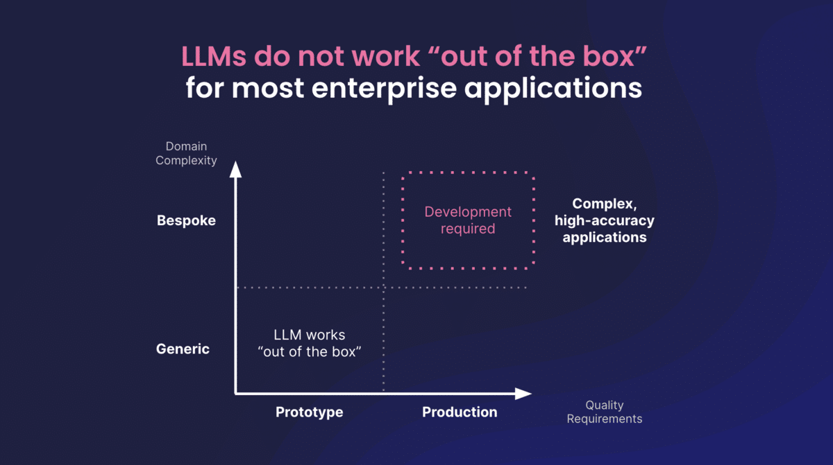
Large Language Models (LLMs) like GPT-4 and Claude have transformed how we generate content, automate support, and surface internal knowledge. While these models offer immense potential, B2B organizations are discovering that off-the-shelf versions often fall short of enterprise expectations. Generic tone, inconsistent outputs, and a lack of domain specificity can limit effectiveness. So how can B2B brands truly unlock the power of LLMs? The answer lies in optimization.
Why Generic LLMs Aren’t Enough for B2B
Out-of-the-box LLMs are trained on general internet data, which means they’re not designed to understand your industry, products, or brand voice. This leads to:
- Hallucinated facts and technical inaccuracies
- Off-brand tone and messaging
- Compliance and privacy risks
- Limited ability to serve nuanced enterprise use cases
Techniques to Optimize LLMs for B2B
Prompt Engineering: Crafting structured, context-rich prompts improves output relevance. Setting clear roles (e.g., “Act as a cybersecurity analyst”) or constraints (“Write in AP style”) can guide the model toward better responses.
Retrieval-Augmented Generation (RAG): This technique enriches LLM outputs with real-time access to enterprise-specific documents, ensuring factual, contextual answers pulled from your proprietary knowledge base.
Model Fine-Tuning: Training the model on your company’s data—such as product manuals, sales materials, and case studies—improves performance for specific applications. This results in more accurate, brand-aligned outputs.
Feedback Loops: Use internal teams or customers to rate and improve model responses over time. Feedback-driven reinforcement learning ensures ongoing optimization based on real-world usage.
Enterprise Use Cases for Optimized LLMs
- Sales Enablement: Auto-generate pitch decks, email templates, and product one-pagers that align with specific buyer personas.
- Customer Support: Deploy intelligent chatbots capable of resolving complex queries using your documentation.
- Internal Knowledge Management: Build assistants that help employees find the right information fast, reducing reliance on outdated wikis or manual search.
- Content Marketing: Streamline content creation for blogs, SEO, and social while maintaining brand tone and compliance.
Governance and Compliance Considerations
For B2B, especially in regulated industries, optimization must go hand-in-hand with governance:
- Enforce brand voice and tone through structured prompts and content templates.
- Ensure data privacy by keeping proprietary content secure during model training.
- Establish clear human-in-the-loop review processes for sensitive outputs.
Final Thoughts
Generic AI won’t cut it in B2B. By investing in LLM optimization techniques like prompt engineering, RAG, and fine-tuning, companies can unlock smarter, more scalable results across marketing, sales, and support. The key is starting with a strategy tailored to your goals, audiences, and compliance needs.
Ready to elevate your AI strategy? Contact Bluetext to explore how customized LLMs can deliver measurable value for your enterprise.
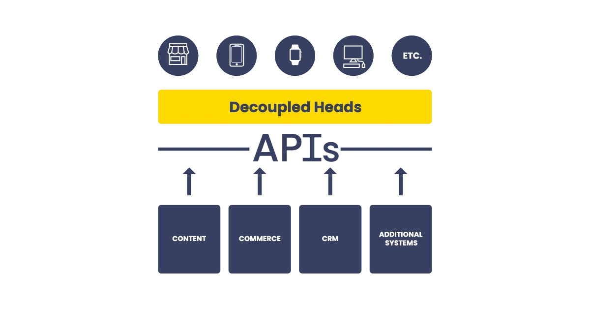
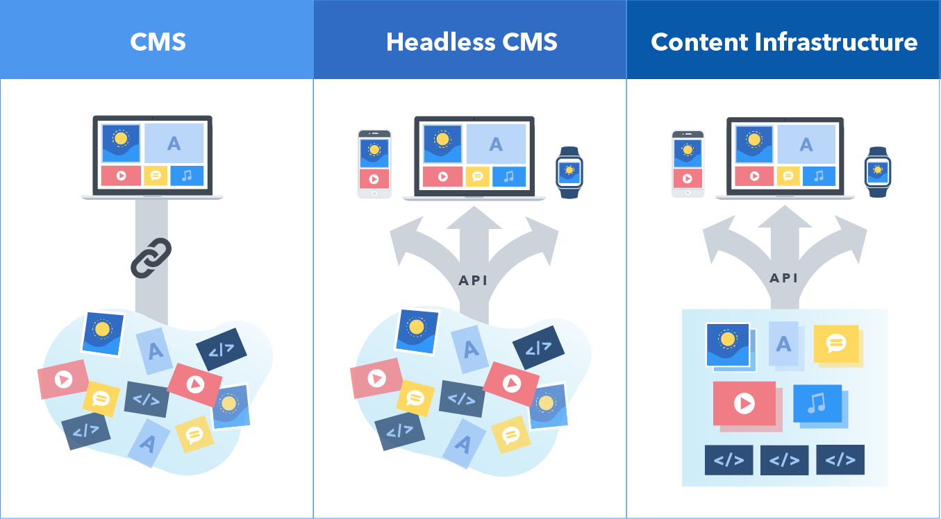
In the rapidly evolving digital landscape, brands are under increasing pressure to deliver consistent, high-quality content across a growing number of platforms and devices. Traditional content management systems (CMS) often struggle to keep up with these demands, which has led to the rise of a more flexible, developer-friendly alternative: the headless CMS. But what exactly is a headless CMS, and is it the right move for your brand?
What Is a Headless CMS?
A headless CMS is a backend-only content management system that separates the content repository (“body”) from the presentation layer (“head”). Unlike traditional CMS platforms like WordPress or Drupal, which couple content and frontend design into a single system, a headless CMS delivers content via APIs to any frontend you choose—websites, mobile apps, digital kiosks, or even smart devices.
This decoupled architecture gives brands the freedom to create omnichannel experiences while empowering developers to use modern frameworks like React, Vue, or Next.js.
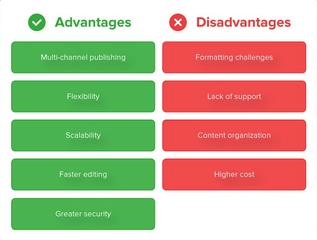
Benefits of a Headless CMS
Omnichannel Delivery: One of the most significant advantages of a headless CMS is its ability to push content to multiple platforms from a single source, ensuring consistency across touchpoints.
Improved Performance: Headless setups can significantly reduce page load times and improve SEO by enabling developers to build fast, optimized frontends.
Developer Flexibility: With the frontend and backend decoupled, developers are free to choose the best tools for the job, rather than being locked into the templating systems of traditional CMSs.
Scalability: Headless CMSs are built to handle growth, making them ideal for enterprises managing global content operations.
Security: By removing the presentation layer from the content management system, the attack surface for potential threats is reduced.
Challenges and Trade-Offs
Complex Implementation: Transitioning to a headless CMS requires skilled developers and careful planning to integrate APIs and build custom frontends.
Editor Experience: Without a built-in preview or WYSIWYG editor, content creators may struggle to visualize how their work will appear on the final interface.
Maintenance and Cost: Managing a headless architecture involves more moving parts, which can increase ongoing maintenance efforts and costs.
Training Requirements: Your marketing and content teams will need time and support to adapt to the new workflows.
Is Headless Right for Your Brand?
A headless CMS is a powerful solution—but it isn’t for everyone. Here are a few indicators that it might be the right fit:
- You publish content across multiple digital channels.
- You need more flexibility than a traditional CMS can offer.
- Your development team wants to use modern frontend frameworks.
- You require enterprise-grade performance and security.
- You operate in multiple regions and need localized content delivery.
On the other hand, if your site is relatively simple and your marketing team relies heavily on visual editing tools, a traditional CMS might still be the better choice.
Real-World Use Cases
- B2B Tech Firms: Supporting complex product catalogs and knowledge bases across geographies.
- Consumer Brands: Delivering unified experiences across mobile apps, e-commerce sites, and interactive displays.
- Government Contractors: Meeting strict performance and security standards while serving diverse audiences.
Final Thoughts
Headless CMS represents a significant shift in how brands manage and deliver content. It offers agility, performance, and scalability—but it also comes with new responsibilities. If you’re looking to future-proof your digital presence, going headless could be a smart move.
Want to know if your CMS is holding you back? Contact Bluetext for a personalized CMS audit and digital architecture consultation.
Winning federal contracts is a highly competitive process that requires more than just a strong proposal. In today’s digital-first landscape, government contractors must leverage modern marketing strategies to stand out, build credibility, and engage key decision-makers. A well-executed digital marketing strategy can be the difference between securing a contract and being overlooked. This blog explores how government contractors can use digital marketing to gain an edge in the federal procurement space.
Why Digital Marketing is Essential for Federal Contractors
Traditional networking and referrals remain valuable, but government buyers increasingly conduct research online before making procurement decisions. Without a strong digital presence, contractors risk missing out on critical opportunities. Digital marketing helps federal contractors:
- Increase Visibility: A robust online presence ensures agencies can find and evaluate your company.
- Build Credibility: A well-maintained website and thought leadership content establish trust.
- Engage Decision-Makers: Targeted digital campaigns help influence key stakeholders at the right time.
Optimizing Your Website for Government Buyers
Your website is often the first impression a government agency has of your company. To make it effective:
- Ensure Compliance: Include required disclaimers, certifications, and security measures.
- Clarify Capabilities: Highlight core competencies, past performance, and contract vehicles.
- Simplify Navigation: Make it easy for government buyers to find relevant information quickly.
SEO and Content Marketing for Thought Leadership
Search engine optimization (SEO) is critical for ranking in searches relevant to government contracting. Consider these strategies:
- Target Industry Keywords: Optimize for terms like “government contract consulting” or “federal procurement solutions.”
- Publish Informative Content: Create blog posts on regulatory updates, procurement tips, and case studies.
- Leverage Backlinks: Partner with industry sites and publications to improve authority.
Leveraging LinkedIn & Targeted Advertising for Outreach
LinkedIn is a powerful tool for engaging government buyers and influencers. Contractors should:
- Develop a Strong LinkedIn Presence: Share relevant content and updates.
- Engage in LinkedIn Groups: Participate in government contracting discussions.
- Run Targeted Ads: Use LinkedIn and other platforms for account-based marketing (ABM) to reach key decision-makers.
Final Thoughts
Winning federal contracts requires more than technical expertise; it demands a strategic marketing approach. By leveraging digital tools, optimizing your online presence, and engaging government buyers where they research, you can increase your chances of success in the GovCon space.
Need help crafting a government marketing strategy that drives results? Contact Bluetext today to elevate your brand and secure more federal contracts.
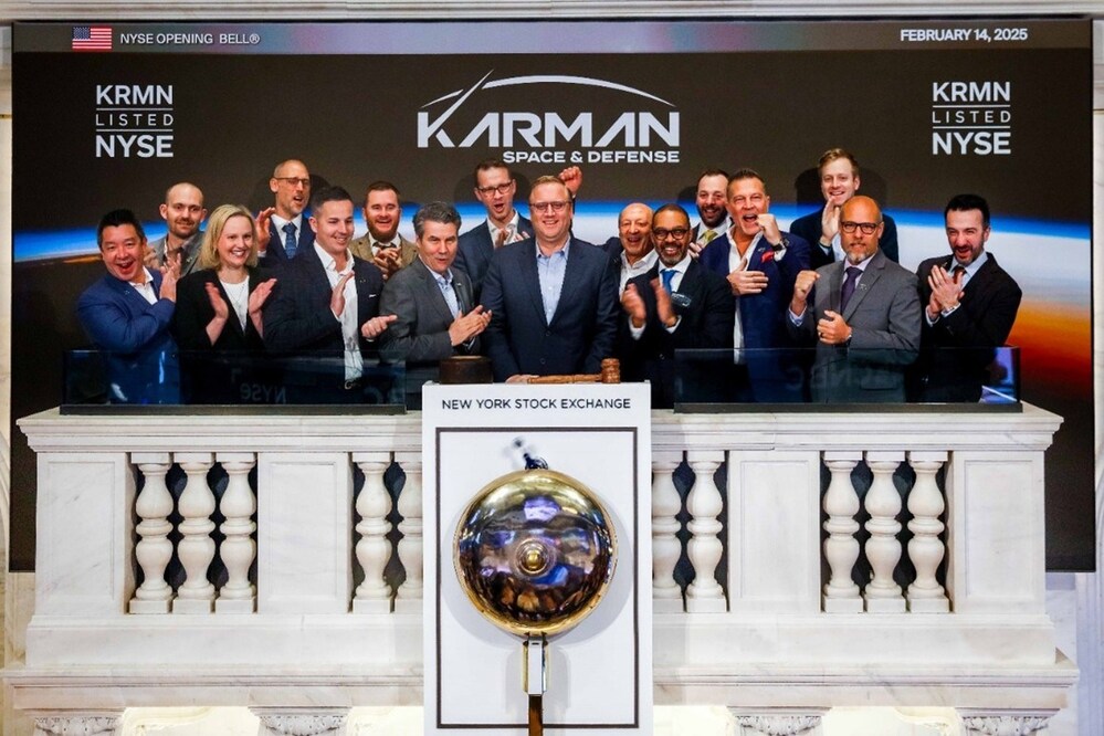
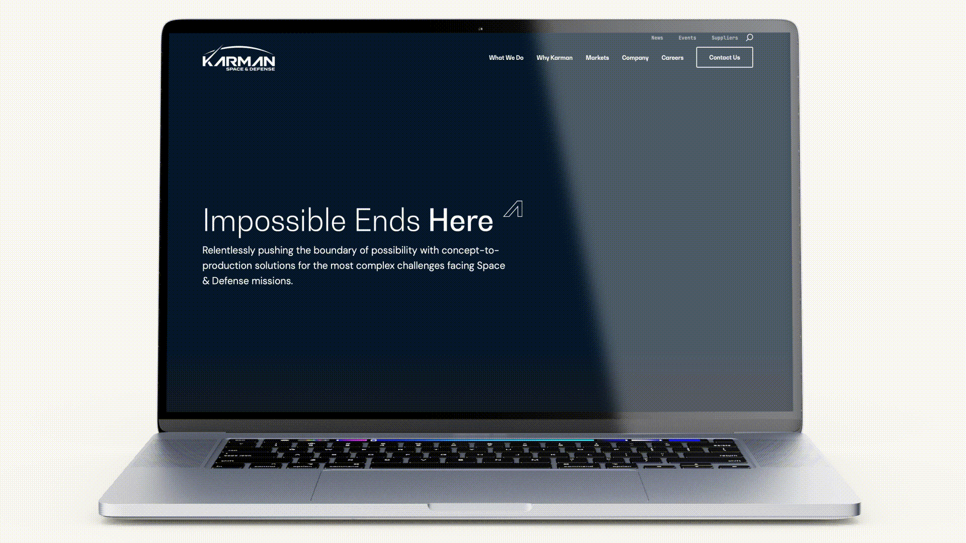
Karman Space & Defense recently achieved a major milestone in its growth journey: a successful IPO. This milestone is a testament to Karman’s technical prowess in the space industry, but it also reflects the power of strategic branding and digital marketing. The work Bluetext did in crafting Karman’s brand identity and digital presence helped position the company as an attractive investment opportunity, directly contributing to the IPO’s success.
At Bluetext, we worked closely with Karman to develop a clear brand message and a digital presence that conveyed their leadership in the space and defense sectors. The effort paid off: Karman’s IPO was met with significant success, drawing attention from the investment community and helping to drive the company’s growth.
This IPO marks the 81st time a Bluetext client has experienced an impactful financial event, whether it’s an acquisition, a merger, or going public. It highlights Bluetext’s proven track record in helping companies achieve key financial milestones through tailored branding and marketing strategies.
Bluetext’s Role in Shaping Karman’s Brand Identity
In an industry as competitive and complex as space and defense, Karman needed a strong brand identity that communicated their innovative spirit and cutting-edge capabilities. Bluetext’s approach to branding for Karman began with a deep dive into their mission, values, and market positioning.
By focusing on what makes Karman unique—its advanced technology, leadership in the space domain, and vision for the future—Bluetext developed a brand identity that was both compelling and clear. The goal was to create a brand narrative that would resonate with investors and customers alike, positioning Karman as a trustworthy and forward-thinking leader in the space industry.
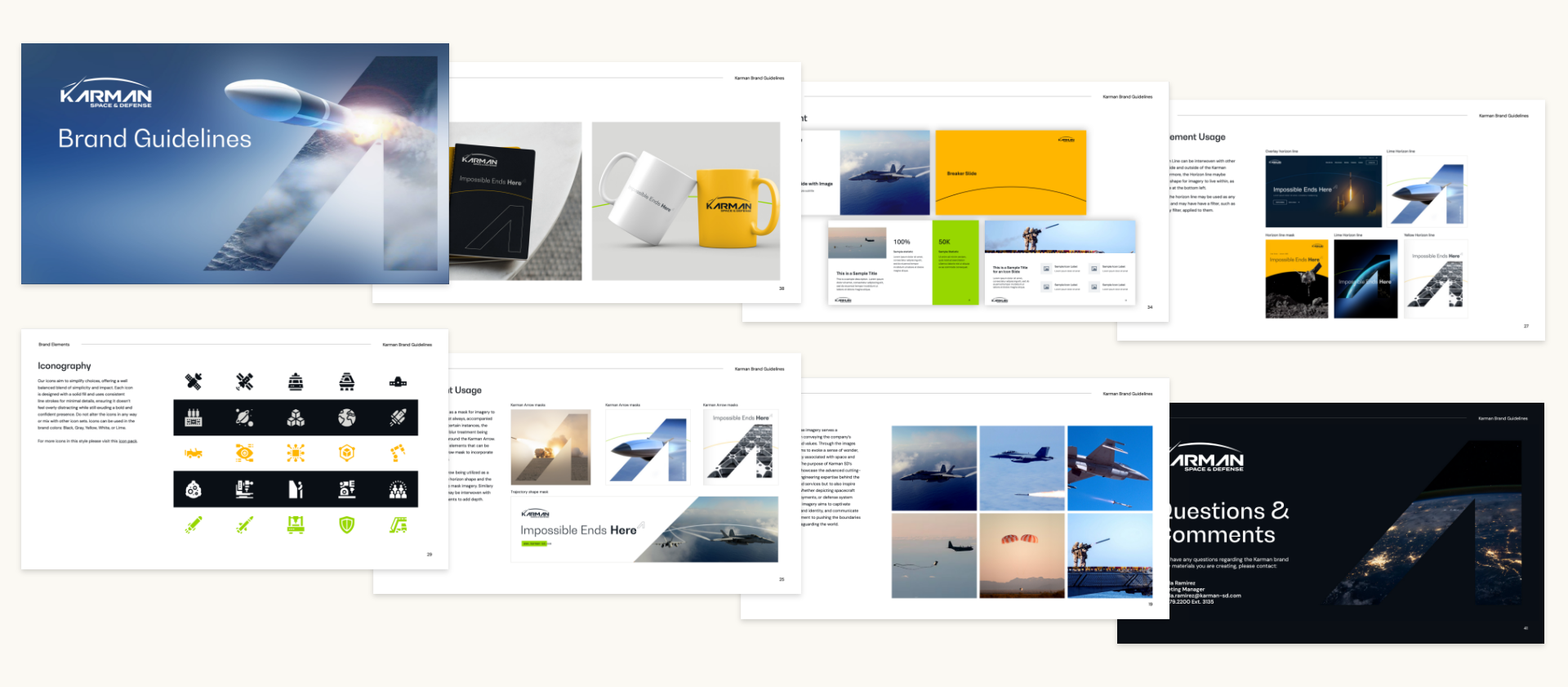
Developing Karman’s Digital Presence for Investor Confidence
A crucial aspect of Karman’s pre-IPO strategy was establishing a strong digital presence that would inspire confidence among investors. Bluetext focused on creating a digital ecosystem that effectively communicated Karman’s value proposition and technological leadership. This digital presence was key in helping Karman stand out in a competitive sector.
Website Development:
Bluetext designed and developed Karman’s website to showcase their technical expertise and provide a user-friendly experience for potential investors. The website needed to strike the perfect balance between professionalism and innovation, with a sleek design that reflected the company’s leadership in the space industry. The clean, responsive design allowed for easy navigation and ensured that visitors could quickly access the information they needed.
Content Strategy:
Alongside website development, Bluetext also crafted a comprehensive content strategy. The content we created for Karman communicated their achievements, vision, and future potential. By presenting complex technological concepts in a clear and accessible way, we helped investors understand Karman’s competitive advantages and long-term prospects.
Together, these digital assets positioned Karman as an attractive investment opportunity and ensured that their message reached the right audience at the right time—just ahead of their IPO.
Impact of Bluetext’s Work on Karman’s IPO Success
Karman’s successful IPO was not only a major achievement for the company but also a validation of Bluetext’s strategic approach to branding and marketing. The cohesive brand identity Bluetext developed gave Karman the foundation needed to gain investor trust and position themselves as an industry leader.
The IPO was completed with significant success, with Karman raising substantial capital to fuel its future growth. According to the PRNewswire announcement, Karman’s IPO represents an exciting new chapter for the company, which is backed by Trive Capital. The IPO marks a major step in Karman’s journey to expand its reach and capabilities in the space and defense sectors.
Bluetext’s work played a pivotal role in ensuring that Karman’s brand was aligned with the company’s growth trajectory, providing a professional, trustworthy image that appealed to investors. Our digital strategy ensured that Karman’s technical leadership and future potential were clearly communicated, ultimately contributing to the IPO’s success.
Why Bluetext’s Work Matters: 81 Companies, 81 Financial Milestones
Karman’s successful IPO is part of a larger pattern for Bluetext. With this IPO, Karman becomes the 81st company that has worked with Bluetext to experience a significant financial event—whether it’s an acquisition, merger, or public offering. This milestone further underscores Bluetext’s consistent ability to help companies position themselves for success in a competitive market.
From branding and messaging to website development and digital content strategies, Bluetext’s comprehensive approach to marketing has been a key driver in helping companies achieve their financial goals. This track record speaks volumes about the quality of work we provide and the impact our strategies can have on companies looking to make an industry splash.
Ready for Your Next Milestone?
The success of Karman Space & Defense’s IPO is a testament to the power of strategic branding and digital marketing in driving financial growth. Bluetext’s ability to craft compelling brand narratives and digital presences has helped many companies achieve similar milestones. Whether you’re preparing for an IPO, navigating a merger, or looking to raise your profile in a competitive industry, Bluetext has the expertise to help you succeed.
If you’re ready to take your brand to the next level and position your company for its own financial milestone, contact Bluetext today. Our strategic branding, marketing, and digital solutions can help you achieve the growth and success you’re striving for.
The digital landscape is undergoing a paradigm shift with the emergence of Web3. As blockchain technology, decentralized applications, and token-based economies gain traction, marketers must adapt to new ways of engaging with audiences. From NFTs to blockchain-powered loyalty programs, Web3 is redefining brand engagement, offering more transparency, security, and community-driven interactions. In this blog, we explore how Web3 is reshaping brand-consumer relationships and what marketers need to know to stay ahead of the curve.
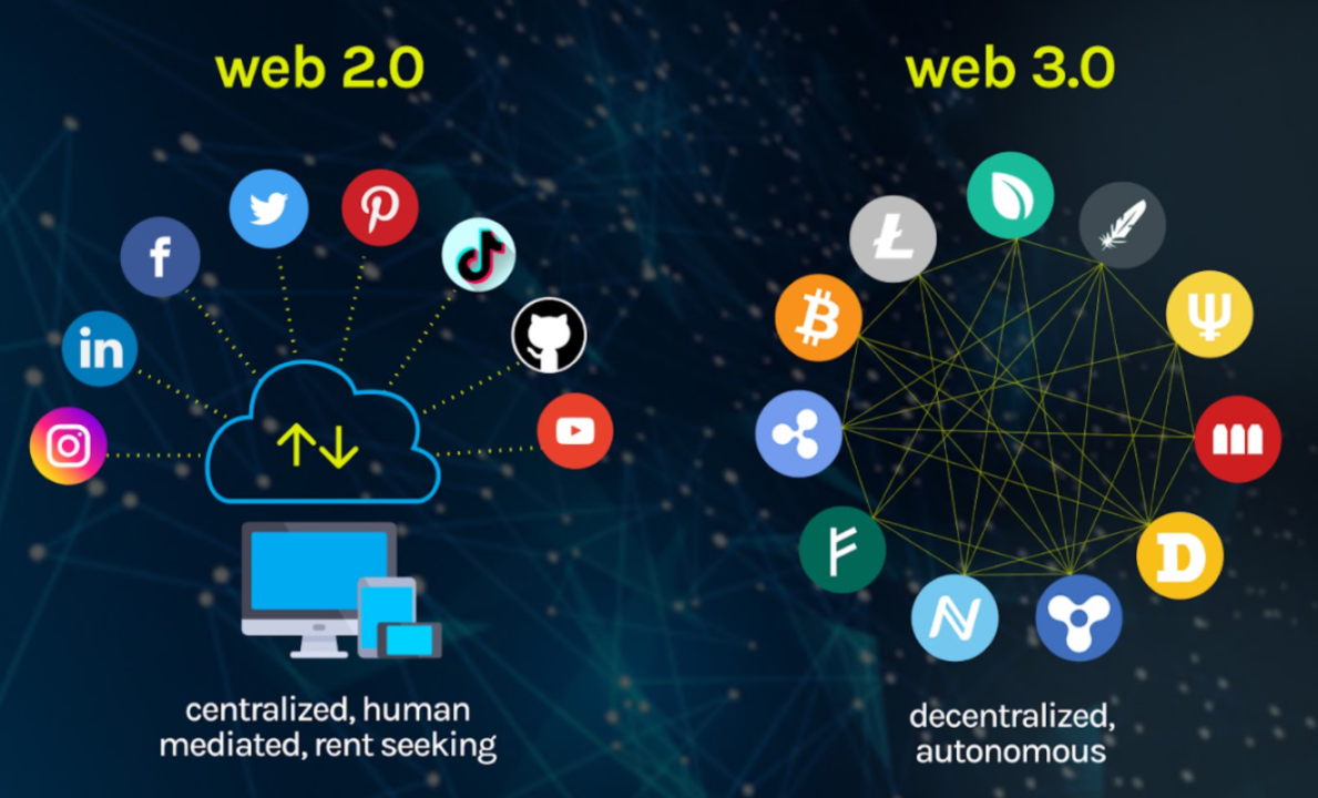
What is Web3?
Web3, or the decentralized web, represents the next evolution of the internet, where users have greater control over their data, transactions, and digital identities. Unlike Web2, which relies on centralized platforms like Google, Facebook, and Amazon, Web3 operates on blockchain networks that distribute ownership and decision-making across a network of users.
Key features of Web3 include:
- Decentralization: Eliminating reliance on centralized entities, giving users more control.
- Tokenization: Digital assets, such as NFTs and cryptocurrencies, facilitate unique ownership models.
- Smart Contracts: Self-executing contracts that enable secure, automated transactions.
- Enhanced Privacy and Security: Blockchain encryption reduces data breaches and fraud risks.

How Web3 is Transforming Brand Engagement
As brands explore Web3 technologies, they are unlocking new opportunities to create immersive and customer-centric experiences. Here are some of the key ways Web3 is revolutionizing brand engagement:
1. NFTs as Digital Collectibles and Brand Assets
Non-fungible tokens (NFTs) allow brands to offer exclusive digital collectibles, limited-edition products, and even virtual experiences. Brands like Nike and Adidas have already launched NFT-based products, strengthening customer loyalty and engagement.
2. Blockchain-Powered Loyalty Programs
Traditional loyalty programs often suffer from low engagement and lack of transparency. Web3 enables blockchain-based loyalty programs where customers earn and trade tokens that hold real value, increasing participation and long-term brand commitment.
3. Decentralized Communities and DAOs
Decentralized autonomous organizations (DAOs) give consumers a say in brand decisions. By integrating DAOs, brands can foster stronger community engagement, allowing loyal customers to participate in governance, product development, and marketing strategies.
4. Metaverse and Virtual Brand Experiences
The metaverse, a digital universe powered by Web3, offers brands the ability to host virtual events, create digital storefronts, and provide interactive experiences. Luxury brands like Gucci and Louis Vuitton have already embraced the metaverse to enhance customer interactions.
5. Transparency and Trust Through Blockchain
Consumers today demand authenticity and ethical business practices. Blockchain technology ensures transparent supply chains, verifiable sustainability claims, and tamper-proof records, strengthening consumer trust in brands.
Challenges and Considerations for Marketers
While Web3 presents exciting opportunities, it also comes with challenges that brands must navigate carefully:
- Regulatory Uncertainty: Governments are still defining regulations around cryptocurrencies and NFTs.
- User Education: Many consumers are unfamiliar with blockchain and require guidance to participate in Web3 ecosystems.
- Scalability and Environmental Concerns: Some blockchain networks require high energy consumption, prompting brands to seek eco-friendly alternatives.
How Marketers Can Prepare for Web3
To stay competitive in this evolving landscape, marketers should:
- Educate Themselves: Understand the basics of blockchain, NFTs, and the metaverse.
- Experiment with Web3 Campaigns: Start small by integrating NFTs, blockchain loyalty programs, or virtual events.
- Focus on Community Building: Engage with customers through decentralized platforms and reward participation.
- Partner with Web3 Experts: Collaborate with blockchain developers and agencies to ensure seamless implementation.

Future-Proof Your Brand with Bluetext
As Web3 continues to disrupt traditional marketing, brands need expert guidance to navigate this new digital frontier. Bluetext specializes in helping brands harness emerging technologies to create innovative, engaging, and future-ready marketing strategies. Contact Bluetext today to explore how Web3 can elevate your brand engagement.
Accessible web design isn’t just a regulatory box to check—it’s a commitment to inclusivity that benefits all users. As digital experiences become central to daily life, designing for accessibility ensures your website serves the widest possible audience. Moreover, inclusive design fosters brand loyalty, enhances user satisfaction, and aligns with ethical principles. But what does it take to make a website truly accessible?
The Case for Inclusive Design
- Legal Compliance: Laws like the Americans with Disabilities Act (ADA) mandate accessible digital content. Non-compliance can result in lawsuits, fines, and reputational damage.
- Broader Reach: Over 15% of the world’s population lives with a disability. Accessible design ensures your brand includes everyone. Features like captions for videos or transcripts for audio content can significantly expand your audience.
- Enhanced UX for All: Features like alt text, proper contrast ratios, and keyboard navigation improve usability for all visitors, not just those with disabilities. Accessibility innovations often lead to cleaner, more intuitive interfaces that benefit everyone.
Best Practices for Accessible Design
- Use ARIA Labels: Provide screen readers with clear navigation cues. Proper labeling ensures assistive technologies can accurately interpret your site’s content.
- Test for Accessibility: Utilize tools like WCAG checkers to identify and fix barriers. Regular audits can help you stay compliant and user-friendly.
- Design with Flexibility: Ensure layouts adapt seamlessly to different devices and assistive technologies. Responsive design is crucial in today’s multi-device world.
Incorporating Accessibility into Your Workflow
Accessibility should be a priority from the start of any design or development project. Collaboration between designers, developers, and content creators is essential. Training teams on accessibility standards and testing tools ensures your website remains inclusive as it evolves.
Accessibility as a Competitive Advantage
Brands that prioritize inclusivity demonstrate their commitment to diversity and equity. This not only enhances reputation but fosters deeper audience loyalty. Inclusive design signals that your brand values all users, creating emotional connections that drive engagement and retention.
Building a Better Web
Inclusive web design is essential for 2025 and beyond. By prioritizing accessibility, brands can create digital experiences that are not only compliant but meaningful for all users. Designing for inclusivity isn’t just about following rules—it’s about creating a better, more equitable digital world for everyone. Contact Bluetext to discover how we can help you design accessible, user-centric websites that stand out in 2025 and beyond.
The new year brings new opportunities to reimagine your brand’s digital presence. In 2025, web design continues to evolve, blending creativity with functionality to meet the needs of modern audiences. From minimalist aesthetics to performance-driven designs, these trends not only enhance user experience but also ensure your website remains competitive in an increasingly digital-first world.
Minimalist Aesthetics with Maximum Impact
Simplicity remains a cornerstone of modern web design, but in 2025, minimalism takes on a more refined form. Websites are embracing clean layouts, ample white space, and restrained color palettes to create visually striking yet user-friendly experiences. This trend prioritizes clarity and focus, allowing key messaging and calls-to-action (CTAs) to stand out without overwhelming visitors. Additionally, minimalism lends itself to faster load times and improved performance—both critical factors in today’s SEO landscape. By stripping away unnecessary elements, brands can create websites that are both aesthetically pleasing and highly functional.
Interactive and Immersive Elements
Interactivity is taking center stage as web designers look for ways to keep users engaged and encourage deeper exploration. From dynamic scrolling effects and hover animations to micro-interactions triggered by user behavior, these elements add a layer of interactivity that captures attention and makes browsing more enjoyable. In 2025, immersive features like 3D graphics, virtual tours, and augmented reality (AR) integrations will also become more prevalent. These innovations provide unique, memorable experiences that differentiate brands and showcase their offerings in compelling ways. However, the key lies in balancing interactivity with usability to avoid overwhelming users.
Performance-Driven Designs
Website performance is no longer a nice-to-have—it’s a must-have. As search engines and users place greater emphasis on speed and reliability, performance-driven design has become a top priority for 2025. This trend involves optimizing websites for faster load times, seamless navigation, and responsiveness across all devices. Techniques like lazy loading, image compression, and streamlined code are essential for achieving these goals. Beyond technical improvements, performance-driven design also incorporates user-centric layouts that guide visitors intuitively through their journeys, ensuring they find the information they need with minimal friction.
Accessibility as a Core Design Principle
In 2025, accessibility is at the forefront of web design, driven by a growing recognition of its importance in creating inclusive digital experiences. Designing for accessibility means ensuring your website is usable for everyone, including people with disabilities. This includes features like keyboard navigation, screen reader compatibility, and high-contrast text options. Beyond compliance with legal standards, accessibility enhances user satisfaction and broadens your audience reach. Inclusive design is not just a trend—it’s a commitment to making the web a better place for all.
Bold Typography and Custom Fonts
Typography continues to play a pivotal role in web design, with 2025 ushering in a wave of bold, custom fonts that add personality and flair to websites. Unique typography helps brands establish a distinctive voice and create a memorable visual identity. Paired with minimalist layouts, oversized headlines and expressive fonts can guide users’ attention and emphasize key messages. However, readability remains paramount, so designers must strike a balance between creativity and functionality.
Sustainability in Web Design
As businesses strive to align with eco-conscious values, sustainability has emerged as a significant trend in web design. This involves creating websites that consume less energy by optimizing performance, reducing data transfer, and minimizing server load. Lightweight designs, efficient coding practices, and green hosting solutions are becoming more popular as brands seek to reduce their digital carbon footprint. Sustainable web design not only benefits the environment but also appeals to eco-conscious audiences who prioritize brands with ethical practices.
Personalized User Experiences
Personalization continues to evolve in 2025, with websites leveraging data to deliver tailored experiences that resonate with individual users. This trend encompasses dynamic content that adapts based on user behavior, preferences, and location. For example, a returning visitor might see personalized product recommendations or localized offers. By integrating AI-powered tools and robust analytics, brands can create highly relevant experiences that drive engagement and conversions. Personalization is no longer optional—it’s a critical component of effective web design in the digital age.
Designing for the Future
The top web design trends for 2025 highlight the intersection of creativity, technology, and user-centric principles. By embracing minimalist aesthetics, interactive elements, performance-driven designs, and more, brands can craft websites that stand out in a crowded digital landscape. Ready to elevate your web presence for the new year? Contact Bluetext today to discover how we can help you design a website that captures attention, drives results, and sets you apart from the competition.