What is ADA Compliance?
The Internet should be accessible for all, and Section 508 of the Rehabilitation Act of 1973, ensures that. Section 508 is designed to extend federal responsibilities to all individuals with disabilities, especially as the world moves towards more digitally based interactions. In 1998, the law was updated to include specific terminology over ‘electronic and information technology.’ Because the actual terms and conditions outlined in § 508 are ambiguous, the W3C created specific guidelines (Web Content Accessibility Guidelines or WCAG) to be able to run specific criterion tests on the suggested interpretation of the guidelines. Since January 2017, the current version, WCAG 2.0, has been accepted as the primary set of implementation guidelines.
This Is A Lot of Legal Jargon, Why Should You Care?
Every company should want as much reach for your digital content as possible, even if your target audience is not visually impaired or disabled. Not to mention, you could get sued if your website is not ADA compliant. If you’re federally funded, you must be compliant. For non-federally funded websites, it’s a gray area, but certainly a legal risk. Best practice is to be compliant and empower equal access and equal opportunity for all digital content. The Internet in particular can dramatically improve the lives of people with disabilities. It’s important to remember that accessibility is not just for the blind – it also accommodates auditory, motor, cognitive, and seizure disabilities. With about 15% of the global population living with some form of disability, it’s crucial as a reputable brand to want to make your website and digital content accessible for everyone. But it’s not always easy…
Accessibility Design
Accessibility should be considered early on in the design phase. It’s also important to remember that there’s no “end” to accessibility – it’s an evolving process. There’s also no ‘correct’ solution to accessibility. The WCAG 2.0 instead focuses on four principles of accessibility to base on for criterion testing:
- Perceivable
- Operable
- Understandable
- Robust
What do these principles mean and how can I design in style with them in mind?
Perceivable
This means web content is made available to the senses – sight, hearing, and/or touch.
Text Alternatives: You must provide text alternatives for any non-text content so that it can be changed into other forms people need, such as large print, braille, speech, symbols, or simpler language.
- All non-decorative images should have alternative text (aka ‘alt text’)
- Complex images should be described on a separate and linked page
- Form buttons and fields should be labeled
Pro tip: Use arrows so google can “read” hidden content.
↓

Time-Based Media:
- Audio content should have text transcripts
- Video content should have synchronized captions
- Any visual content in video should be described
Adaptable: Create content that can be presented in different ways (for example, simpler layout) without losing information or structure.
- Semantic markup is used for headings and text (e.g, <h1>, <ul>, <ol>, <strong>)
- Menus should be logical and intuitive from reading order alone
- Instructions do not rely on shape, size, location, or with auditory cues
Not only are these practices compliant, but they also provide tremendous SEO benefits! So why wouldn’t you implement an adaptable structure?
Distinguishable: Make it easier for users to see and hear content including separating foreground from background.
- Color is not used as the sole method of conveying content or distinguishing visual elements
- Contrast (http://webaim.org/resources/contrastchecker/)
- The text has a contrast ratio of 4.5:1 (AA)
- The large text has a contrast ratio of 3:1 (AA)
- Large text is defined as text larger than 18 points (~24px) or bold text larger 14 points (~19px)
- The page is readable and functional when text size is doubled (AA)
- Should be able to pause or change the volume of any audio longer than 3 seconds
Pro Tip: Test your color contrast and font size with this tool to ensure it’s compliant. Accessible design can still look modern and creative! https://www.getstark.co/
↓

Operable
This means the user interface components and navigation must be operable.
Keyboard Accessible: Make all functionality available from a keyboard
- All functionality is available using the keyboard unless the functionality cannot be accomplished in any known way using the keyboard
- Keyboard focus is never trapped
Enough Time: Provide users enough time to read and use content
- If a page or application has a time limit, the user is given options to turn off, adjust, or extend that time limit
- Automatically moving, blinking, updating, or scrolling content that lasts longer than 5 seconds can be paused, stopped, or hidden by the user.
Pro Tip: On auto-scroll content, include a play/pause button so it can be paused and the content can be consumed. If the content on auto-play doesn’t have a link or text, or really any content associated with it, then it does not need a pause/play button.
↓
Seizures: Do not design content in a way that is known to cause seizures
- No content flashes more than 3 times per second and do not contain too much red
Navigable: Provide ways to help users navigate, find content, and determine where they are
- A link is provided to skip navigation and other page elements that are repeated across web pages
- Pages have descriptive and informative page titles
- Navigation is logical and intuitive
- The purpose of each link can be determined by the link text and context alone. Links with the same text that go to different locations are readily distinguishable.
- Multiple ways to find other web pages of the sites (e.g., table of contents and search) (AA)
- Avoid duplicative page headings and label text (AA)
- Focus states are visible to the user (AA)
Understandable
It’s as simple as it sounds – content and interface need to be easy to understand. This should be a website goal for both disabled and abled users!
Readable: Make text content readable and understandable
- The language of the page is identified using the HTML lang attribute (e.g., <html lang=“en”>)
- The language of page content that is in a different language is identified using the lang attribute (e.g., <blockquote lang=”es”>) (AA)
Predictable: Make Web pages appear and operate in predictable ways
- When a page element receives focus or a user interacts with a form or control, it does not result in a substantial change to the page, creates a pop-up, or any other change that could confuse the user, unless the user is informed of the change ahead of time
- Navigation links do not change order (AA)
- Elements across multiple webpages are consistently identified (AA)
Input Assistance: Help users avoid and correct mistakes
- Required elements for a form are clearly labeled as such
- Form validation issues are provided in a quick and accessible manner
- Required interactive elements have sufficient labels and instructions
- Suggestions should be provided for fixing input errors (AA)
- Changes to legal or financial data can be confirmed or reversed (AA)
Robust
Content can be used reliably by a wide variety of user agents, including assistive technologies
Compatible: Maximize compatibility with current and future user agents
- Avoid HTML parsing errors (http://validator.w3.org)
- Markup is used in a way that facilitates accessibility (e.g., ARIA labels for custom interface components)
Remember, accessibility is more than just following these guidelines – it’s about equal access to digital content. You could be the next big example in your industry for accessibility, and maybe even be eligible for an award. And once your beautiful, new website is built, there are tools to help you ensure your site is accessible. Download WAVE to identify accessibility and Web Content Accessibility Guideline (WCAG) errors.
Not sure how to get started? Contact us at Bluetext – we’re here to help!
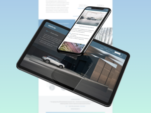
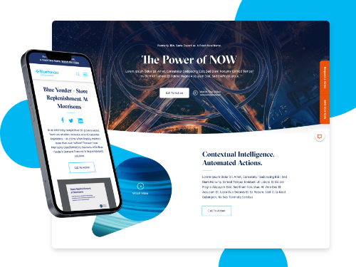
Recent Posts
Bluetext’s Recent Work