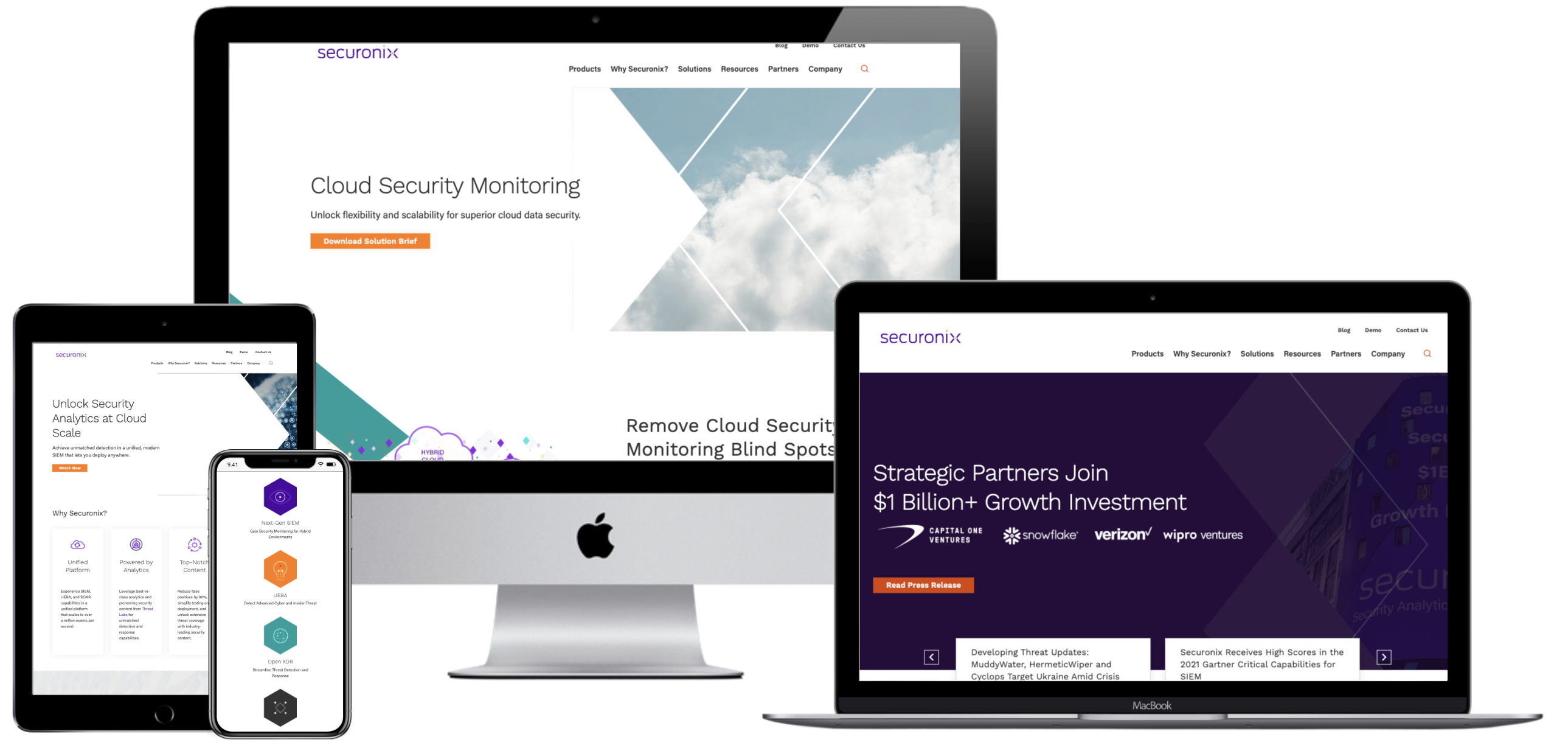
The end-user experience is a key, if not the most critical, consideration to crafting a successful new website. Seamless, exciting interactions between site content and its users are what deliver relevant information and a memorable experience initiates repeat visits. A poor UX design can leave users feeling bored or even frustrated with the website and associated brand. In order to avoid these UX pitfalls and have the highest chance at digital success, Bluetext has curated a list of our favorite and most functional UX design practices. See below for some examples of website interactions we’ve designed with the goal of keeping users engaged and getting users excited about the content in front of them.
Functional Micro Animations
For many organizations that release a new site after rebranding, a major goal of the new website is to get users to explore further content. There are numerous ways that clever UX design can subtly assist in this mission. User experience designers will tell you that subtle, almost subconscious psychological cues are the most effective ways to promote the discovery of more content. Especially when promoting brand identity, it’s important to keep in mind users’ priorities. They are visiting the site to find answers to their questions, not necessarily your brand’s life story. That being said, your brand’s story is still important but just needs to be presented in a clever way to sustain attention.
- Subtle motion can be used strategically to lead users’ eyes further down the page. Micro-animations such as the ones shown below create a natural sense of downward movement, which encourages users to move in that direction by continuing their scroll.
- Arrows can be used as quick jump links to reduce the required scroll and boost users to the sections of the page that are most important. This is especially helpful for brands that develop rich, visually dominant hero zones but want to allow users to quickly get past the first area of the page in order to discover more informational content.
Your brand doesn’t have to be high-tech or bold to incorporate the newest UX/UI trends. Even simple, sleek micro animations like card interactions on hover can make user experiences more delightful without detracting from the authority that comes with more traditional, conservative brands.
- Fairly simplistic card interactions can be used to reveal more information on hover and add more excitement to the user experience.
- Animated elements can also be used in hover states to add visual interest; this is particularly effective when users will be viewing the hover state for an extended period of time (in this example, for long enough to read a short paragraph of text).
Stylistic Micro Animations
Micro animations aren’t just used for functional purposes; animated elements can also be used to highlight core brand elements as well. Creating unique, ownable applications of motion to brand elements can be an effective way to show off the new brand, as well as cut down the need to use generic or less impactful stock imagery to add visual interest to page content.
- Animations in the hero zone are one tactful way to customize the UX design to bring greater excitement and powerful visuals to the front page of the site.
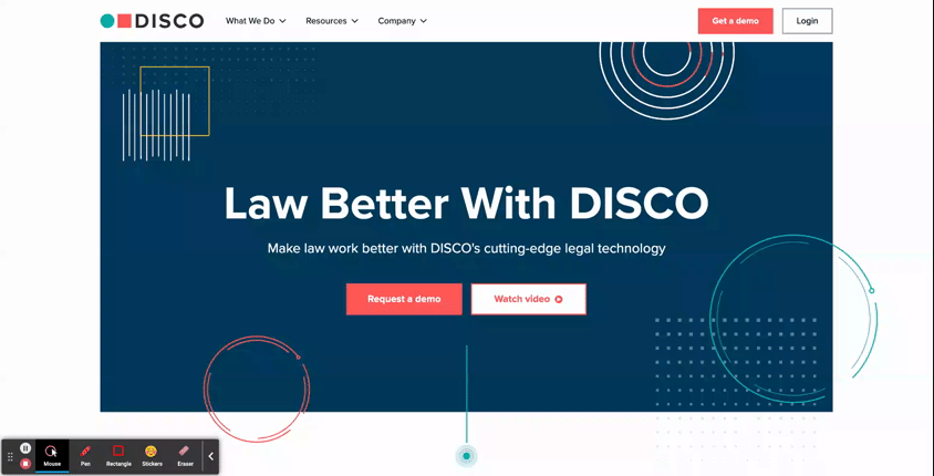
- DISCO: See how this AI Legal Technology company uses subtle animated elements throughout the hero area of its homepage to add stylistic visuals without relying on imagery. As an added bonus, they’ve also included a functional element of animation in the hero. The blinking dot at the bottom of the viewport isn’t just a cool visual; it’s also a subtle indicator to users that they should look further down on the page, where there’s more to be explored.
-
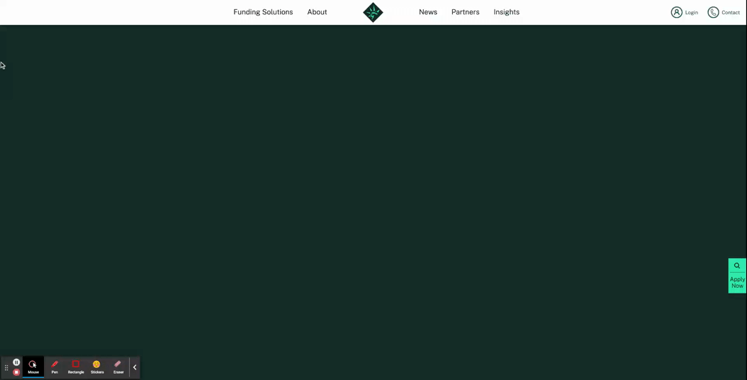
- Libertas: In a more streamlined hero design, this financing organization uses its logo mark as the major focal point of the hero. This animation is a grand introduction to the website, sweeping onto the screen to populate what starts out as an empty, unassuming hero zone.
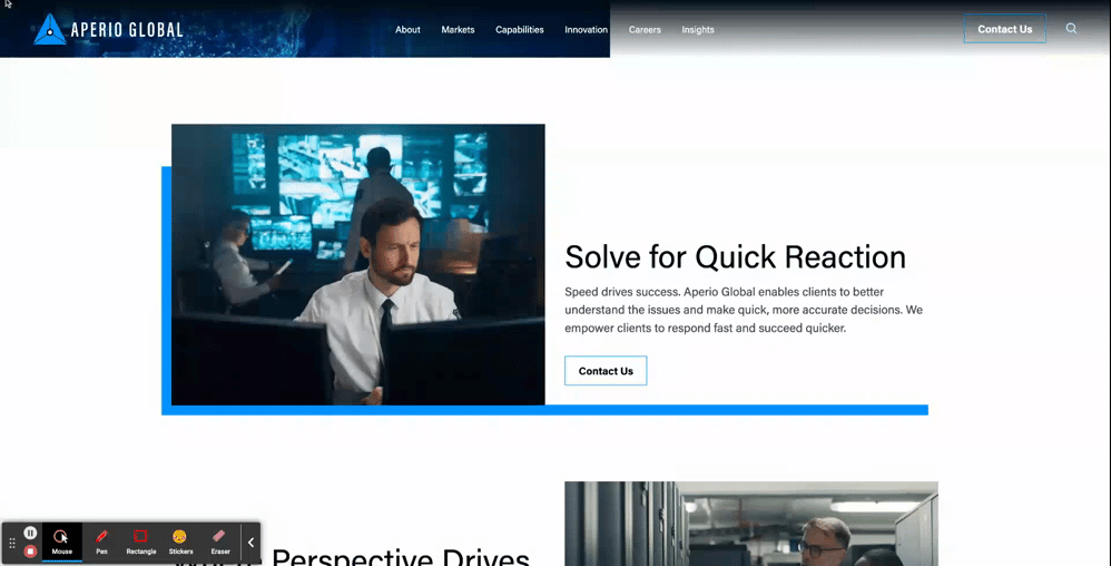
- Animations can also be used as key design elements for interior components as well
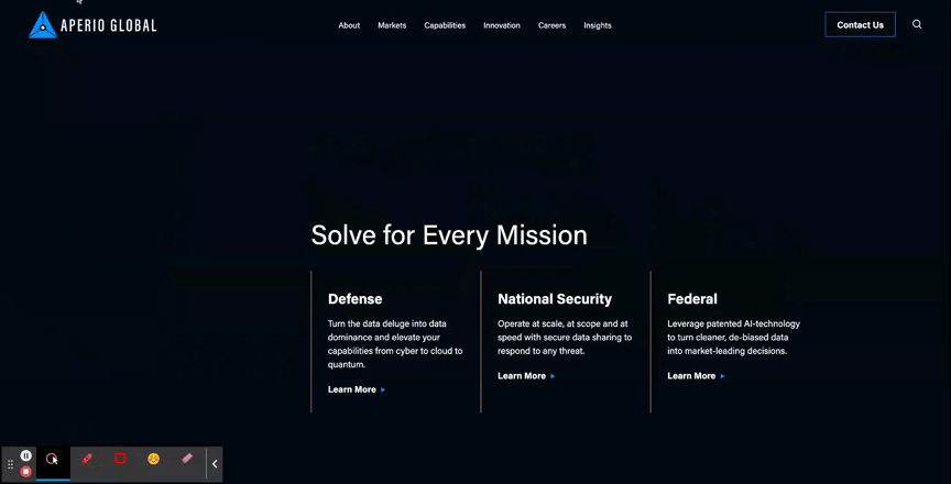
- Aperio Global: Here, you can see how this cyber company applied motion to a key graphic element of their brand to turn a text-based component into an eye-catching section of the page.
Unique Scroll Effects
One major challenge to website design is that users can get exhausted or frustrated with having to scroll through long pages of content. While it is best practice to keep page content concise when possible, another way to mitigate scroll fatigue is by creating interesting scroll effects that feel less effortful for users.
- The Parallax Scroll is an effect where the background of the page appears to move at a different speed than the content in the foreground. This can be an effective way to make the scrolling for users feel like it’s moving along quickly and seamlessly.
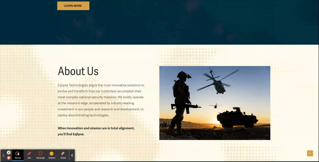
- Eqlipse: See how a static background image creates the appearance of a quicker scroll.
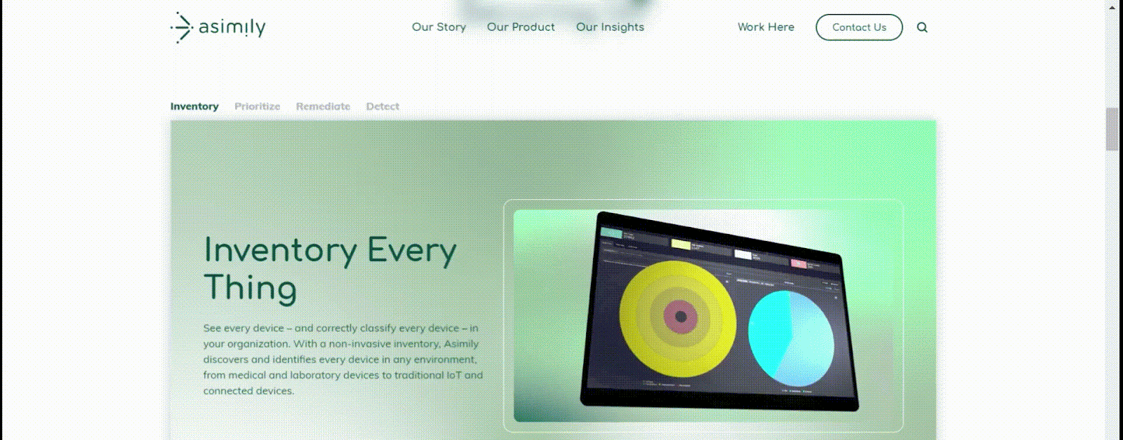
- A Locked Scroll is an experience where the page viewport stays “locked” in place, where only the featured information of the page switches out. A user cannot scroll up or down on the page without scrolling through all the information. Feeding content to the users in smaller bite-sized sections like this helps ensure that the users don’t skim through important information hidden under tabs or within large blocks of copy.
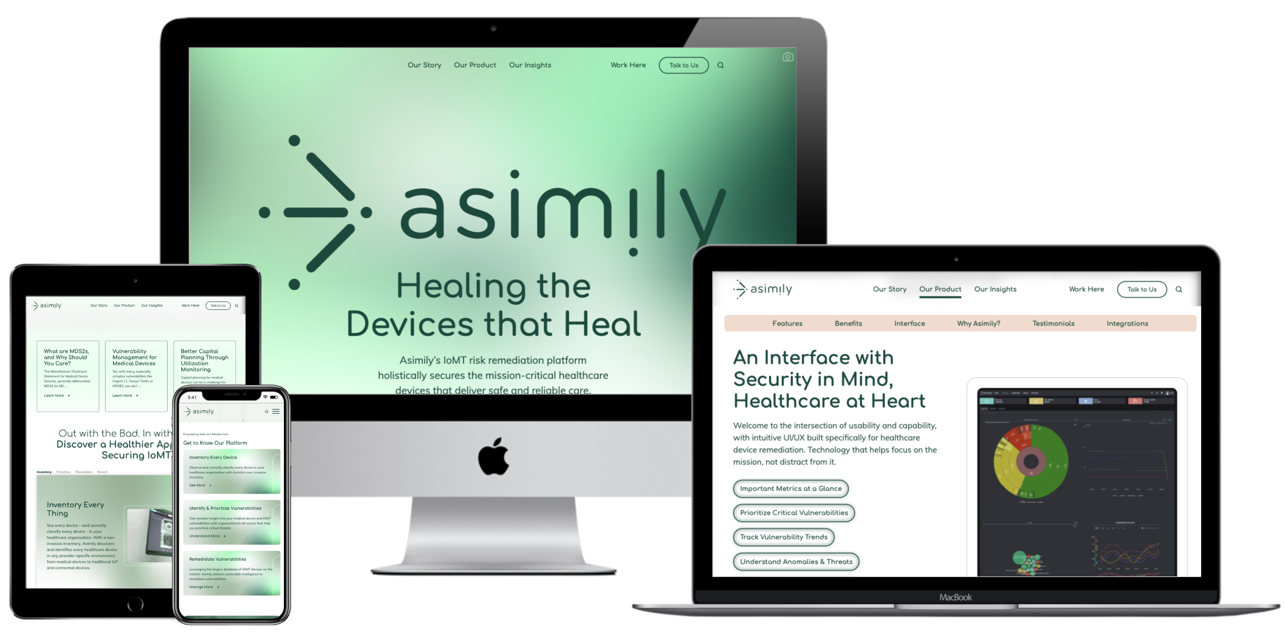
- Asimily: In this example, when a user scrolls down the page, the content switches over to the next tab’s information without changing the positioning in the viewport, and the tabs continue to filter through as a user scrolls. After they’ve navigated all the tabs, then the page experience continues more traditionally, so that the viewport shifts at the same speed as the scrolling.
Immersive Scroll Experiences
For modern, industry-leading, high-tech brands, one way to convey that they’re always staying ahead of the curve is by curating a website experience that is equally as bold. Immersive scroll experiences are one major trend for website design that companies can use for more cohesive storytelling on their website. If you’re interested in learning more about this design technique, read our UX Trends in Immersive Scrolling blog for a more detailed explanation of what makes a page experience immersive.
The creative minds at Bluetext are always excited about the opportunity to explore how branding can be applied to create a high-impact landing page that guides users through an immersive scrolling experience. See some of our favorite examples below:
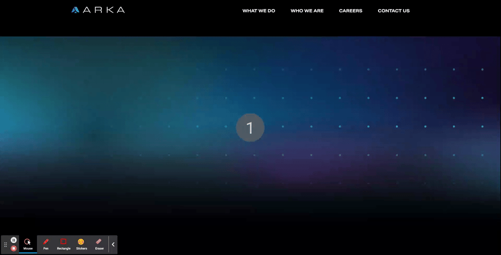
- ARKA
- With an aspirational message at the top of the page, “Beyond Begins Here,” the hero zone of this page kicks users off on an exciting journey. Notice that, while there are images, graphic elements, and motion incorporated in the first viewport, the messaging is the focal point of the screen. Project managers at Bluetext work hand-in-hand with designers to ensure that amazing visuals never overshadow important information.
- The placement of design elements is used to direct users where to go. You’ll notice that there’s a slight peekaboo of the next information on the page so that the user knows there’s more to explore. Additionally, the circles following the orbital patterns on the screen intentionally dip out of sight and into the next viewport, just another way of leading users to the next viewport.
- As you scroll further down the page, the text is animated to slide onto the screen, and images grow larger as you settle into the viewport. Since immersive pages tend to have more information on them, this allows users to ease into the components, rewarding them with exciting visuals for each new section they scroll to. This type of interaction tends to keep users on the page for longer, and they feel more engaged with the dynamic content rather than just scrolling past static areas.
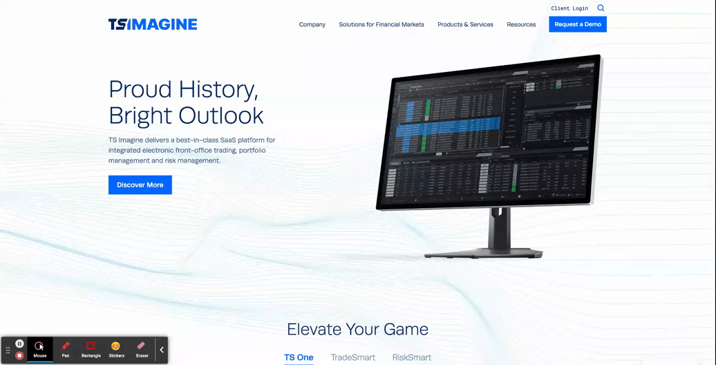
- TS Imagine
- The top portion of the TS Imagine homepage is a great example of how animation, graphic elements, and content placement all work together in an immersive experience to lead the user smoothly from one piece of content to the next.
Designing a smooth and exciting user experience for your brand’s website is a major undertaking. Whether you are updating a current website or starting from scratch, a design agency can help you to consider the best options for your user experience during every step of the process, to ensure that your new site is using UX to the fullest.
Need help? Contact Bluetext to get expert support in perfecting your user experience design.
The last decade has made giant leaps in diversity & inclusion initiatives, especially for the LGBTQIA community. For the month of June, many companies switch from their traditional monochrome logo to a rainbow-colored design, particularly on social media platforms like Facebook or LinkedIn. While this rush of public support for LGBTQIA communities is a popular way of engaging in Pride Month celebrations, companies must consider how their actions reaffirm their pro-LGBTQIA branding.
First, it’s important to understand the purpose of the rainbow branding used throughout Pride month. By implementing a temporary rainbow branded logo change that showcases the colorful LGBTQIA Pride flag, companies can generate discussions about discrimination and visibility for members of the queer community. For a company sporting a Pride month logo, the rainbow design serves as a reminder to consumers, employees, and associates that the company values LGBTQIA inclusion and representation.
The Pride month logo design is most common among B2C companies who are trying to capture the attention of consumers. In this day and age, corporate responsibility and values are critical factors in purchasing decisions. Millennials are 32% more likely to do business with a company that openly supports the queer community. However, many large B2B companies also serve to benefit from showing support for the LGBTQIA community. The rainbow logo signals to employees and partners that the company is an ally to the community. Inclusive values attract diverse talent, improve employee welfare, and increase business across numerous demographics. About 15% of Gen-Z adults in the US identify as queer, a growing target market in corporate America.
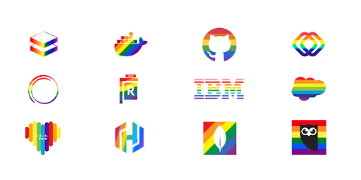
Some of the largest tech, finance, and consulting companies—like Microsoft, IBM, Bank of America, and Deloitte—have used rainbow logos throughout the month of June to show support for the LGBTQIA community. Even prominent federal contractors, like Leidos and GDIT, have joined the display of pro-LGBTQIA branding. Corporate support for the LGBTQIA+ community during Pride Month is a major step forward for the LGBTQIA community compared to past suppression and ignorance. But beneath the rose-colored glasses, the reality is a flash of rainbow branding is not the end goal of pride month. Companies need to provide more than just temporary logos in support of the queer community.
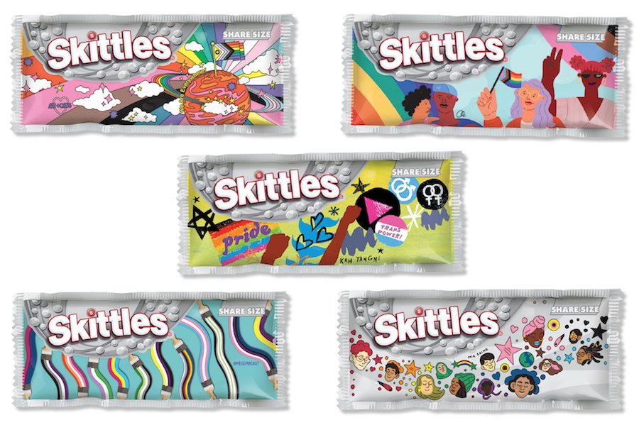
Take Skittles as an example, an extremely colorful brand naturally in its everyday marketing decided to go in the opposite visual direction to completely greyscale packaging and marketing materials. This campaign went viral when Skittles announced they decided to give up their rainbow to ‘celebrate the one that matters.’ (aka the Pride rainbow symbolizing the LGBTQ+ community). Partnering with GLAAD, an American non-governmental media monitoring organization, they gave six talented artists within the LGBTQ+ community to create pack designs that represent how they see the rainbow. Special edition pride packs were sold with $1 per pack donated to GLAAD.
Because of the clear economic benefits of promoting Pride month, this can be perceived as an exploitation of social initiatives and conversations as a means to reach business goals. In this instance, the use of the rainbow flag in marketing materials, without the actions to support the queer community in meaningful ways, is referred to as rainbow-washing. Before a company considers implementing a new rainbow logo or a Pride month campaign, they need to reflect on what other actions the company can take to support the LGBTQIA community in meaningful ways:
- Donate a portion of business proceeds to LGBTQIA-friendly charities or in support of pro-LGBTQIA legislation.
- Show support for the queer community year-round, not just through the month of June with supportive messaging and practices.
- Ensure representation of LGBTQIA persons in marketing and advertising.
- Refuse business in countries or states with discriminatory laws against LGBTQIA persons.
- Show representation of LGBTQIA persons in positions of leadership, like on the Board of Directors or within the C-Suite.
- Provide support and protection for LGBTQIA employees and their families.
- Educate yourself and those around you on the history of pride month before using the circumstance for profit.
While not every company can achieve all the points listed above, marketing and branding alone do not affirm the allyship of a company. Instead, marketing should be used as a means of promoting the other good works that a company does in the LGBTQIA community.
If your company is a true ally to the queer community, but you’re struggling to convey these values through your messaging or advertising, contact an agency like Bluetext that specializes in digital marketing. Whether looking for a refreshed pride month logo or a representative campaign for the month of June, Bluetext can help you create materials that get the right message across.
A compelling website is the backbone of a brand’s digital presence. A website serves as a channel for business by generating purchases, tracking sales leads, and raising brand awareness. The visual appearance of your website must promote the corporate visual identity and enhance the site’s functionality. Some basic design guidelines can be applied to ensure that the site is both aesthetically appealing and easy to navigate for users. The following 8 principles should be kept in mind when designing user-friendly, effective websites that direct users to the desired outcomes:
Create a Visual Hierarchy
Visitors to a site will skim content to find the information most relevant to them. The visual hierarchy created by typography styling and placement is key to directing their attention to the most crucial information on the site. Using a consistent hierarchy H1, H2, H3, etc. header style aids end-users, but also SEO engines. Google crawlers will look to these assigned hierarchies to identify organic search keywords and prioritize your website higher on search engine results (SERP) so a user can find your website in the first place. Each page should highlight the most important content and de-prioritize supporting information so that a user can more easily pick up on the big takeaways. Bluetext works with clients to identify the key actions or information that a site should showcase, and creates thoughtful designs to make those items stand out to users.
Use the Golden Ratio
The Golden ratio uses the number 1.618 to divide portions of the screen into sections that are visually appealing to users. Rather than dividing areas into equally measured sizes, the width or height of a section should be divided by 1.618 in order to create one larger section, and the remaining area is left in a smaller section. This proportion is easier for users to analyze, as it has a more classical and balanced appearance.
Avoid Possibility Paralysis
Giving users too many possibilities to choose from creates frustration and hesitancy in user actions. Think about the classic supermarket example. The decision between three types of peanut butter is far easier and faster than deciding between fifteen different types and brands. Discerning between choices and identifying the correct one requires a lot of energy from users when they’re bombarded with options. Limiting the choices presented to users eliminates distracting elements, and allows them to interact with the site more seamlessly.
Bigger Is (Often) Better
Larger items are simply easier for a user to find and click. For call-to-action (CTA) buttons, in particular, making those buttons larger will lead users to click those areas quicker and more often. Unusually large buttons might have the unintended effect of distracting or confusing the reader, but legible, noticeable designs can positively encourage user interaction. For other tips and tricks to designing CTAs, read our blog on the Guide to the Perfect CTA Button.
Consider Gestalt Principles
A website that exhibits well-executed design will help attract users’ attention before they dive into more detailed content. Overall design principles provided by Gestalt help creators build websites that visually appeal to users. For example, Gestalt’s law of closure ensures that users prefer designs that feel complete, rather than having gaps or empty spaces that break up the flow of the design. Considering users’ design preferences will help the audience feel more connected and engaged with the site. Poor designs could confuse users or distract them from important content.
Utilize Negative Space
Negative space is the open space created in a design where there is a lack of content. This clear area creates a natural breathing room and is essential to making the design appear clean and modern. A page that is cluttered with information can be overwhelming to users, and this can discourage them from exploring the content. A great example of maximizing whitespace for a clean website design is Bluetext’s work with Sonicwall, an innovative cyber-security company.
Acknowledge the F-pattern Rule
Eye-tracking studies have shown that users tend to scan screens in an F-shaped pattern, following from left to right across the top of the page, then just scanning down the left side of the page as they scroll lower. The F-pattern reinforces the idea that the most important text or imagery should be placed at the top of the page, or along the left margin. Placing crucial content in these areas will increase the likelihood of users noticing or absorbing this content.
Consistency is Key
Keeping consistency across design elements is crucial to creating visual cohesiveness across a site. Typography styling and content blocks should be recognizable across different pages. When designing websites, Bluetext developers help clients to create a dynamic component system, where the same components can be modified or rearranged on different pages throughout the site. This component system establishes regularity throughout designs that help users navigate the site more easily, recognizing familiar component structures.
Investing in your website’s design can drastically improve the user experience and lead to desired business outcomes, such as increased sales, lead generation, or overall awareness of your brand. Need help? Contact Bluetext to get expert support in perfecting your user experience design through thoughtful web design.
Whether you’re a reader or a listener, we’ve got you covered! Listen to the podcast version of this post for a fresh take.
In any website design, call-to-action (CTA) buttons are key to highlighting the important actions available to users. Buttons make the difference between a general site visitor and a converting sales lead. Pointing out relevant information and next steps to the user can help them navigate your site with less friction, reducing decision fatigue and decreasing bounce rates. Here are six key questions you should consider when designing the CTA buttons to be used on your website.
Should the button style stay the same?
While it’s important for button styling to be consistent across a site, in some cases, there are multiple actions available to a user in a single viewport. To avoid overwhelming users with numerous identical buttons on the screen, you can use different styles to indicate a visual hierarchy. You’re already asking a user to make one decision, therefore, the UX should eliminate any additional, unnecessary decisions in what button to select. For actions that are top priority, bold-colored, solid buttons tend to draw a user’s attention first. Secondary and tertiary button styles should be less emphasized, with unfilled boxes or simply underlined text to indicate less important actions. The styles should be distinct but linked by common elements such as color or shape to make them easily recognizable. Try to use the primary button styling predominantly throughout the site, and avoid creating more than three distinct button styles.
What colors are best to use for CTA buttons?
When choosing the fill color of CTA buttons, it may be tempting to rely on your company brand color scheme. The button design shouldn’t diverge from the brand entirely, but the button color should stand out from the rest of the content on your site. Say you have a minimalistic black and white or muted color palette, you’d want your colors to pop against those backgrounds. Using the predominant brand color risks the button competing for user attention, leading to lower clickthrough rates. Color psychology also plays a key role in communicating the meaning behind buttons. It’s usually best to avoid red CTA buttons, because red buttons are associated with dangerous or harmful actions. Blue buttons, on the other hand, have positive connotations for users since blue text (the namesake of the Bluetext agency) has been used to indicate hyperlinks since the inception of the internet. Users are familiar and comfortable with clicking clue hyperlinked text, so why initiate a change? When choosing the color for a group of buttons on the site, assigning different colors to each action can create a higher cognitive load for users trying to distinguish between their choices. It’s best to use the same color for all the buttons in a group, so that users can focus on the text. However, you may want to consider indicating a default action to make one choice stand out, as discussed in the next section.
Should you highlight a default action?
If you are showing choices on a screen, and one of the choices presented is more likely to be the user’s preferred action, then it may be best to highlight that option to indicate it as the “default” to help users choose this option faster. However, if the choices are equal, then highlighting a default action could confuse the user or steer them to click the default choice rather than considering the options equally. When showing two choices next to each other, it’s also important to consider right and left hand placement. Showing an option on the right may make users more likely to choose it due to right hand bias, so it’s best to put the default option on the right. However, if the default action is something irreversible like “delete all,” it may be best to put that CTA on the left to force users to give more consideration to their decision. When presenting multiple options, just consider which option will be chosen the most often, and how quickly you want the user to navigate the decision.
Should icons be added to the CTA buttons?
Usually, text alone is enough to communicate clear actions to the user, but when buttons are grouped together, it may be harder for the user to distinguish the difference between the options presented. For example, if a new user on your site sees “Download” and “Contact Us” CTAs right next to each other, they might have to take a second to think about the difference between the two actions. In cases like this, icons can help users to discern the difference between the options faster. When assigning icons to the CTAs, make sure that the icon is helpful in communicating the meaning behind the text. If the icons themselves are too similar or generic, they may only lead to more user indecisiveness. Choosing the right icons can make all the difference in the user experience.
Should designers think “outside-the-box”?
The standard button styling is a rectangular box shape, with rounded corners. While designers could use colors and text styling to flex the brand, the overall button shape shouldn’t stray too far from the norm. The oblong-shaped CTA is emerging in popularity with more rounded, organic brands and is a great example of applying brand elements without feeling foreign. The goal of a CTA is to be instantly recognizable to the user, and in this case, thinking outside the box could lead to users being confused or less likely to interact with CTAs. One way of ensuring standardization across buttons is by adhering to the “common grid” measurements. The grid spacing ensures that buttons have adequate clear space around the text, making them easier for viewers to read and recognize the anatomy. Clean, simple designs also tend to be more palatable, as buttons with numerous effects applied can end up looking tacky and unprofessional.
What considerations should be in place for accessibility?
Accessibility is necessary for legal compliance, but it’s also recommended to ensure that designs are easy to read for all users. Font size and color contrast are two of the main considerations for button accessibility. Gradient treatments can also add complications to website accessibility, especially when overlaid with text. As a designer, it’s important to ensure that legibility is never sacrificed for aesthetics. The Importance of Website Accessibility doesn’t go ignored at Bluetext; read more about how we test for accessibility compliance to ensure that our sites are functional for everyone.
At Bluetext, when designing a site for a client, the number one priority is to ensure that the website will engage users in order to achieve business goals. Experienced designers know that CTA styling is key to capturing users and directing them to the most important content on the site. Thoughtful design can increase brand recognition, improve clickthrough rates, and remedy bounce rates for your site. Contact Bluetext to learn more about our services and how we can address all of your website design needs.
With 2022 already in full swing, companies are faced with the challenge of looking ahead to what the future might bring. Enlisting the help of a digital marketing agency like Bluetext can ensure that your company is not just reacting to trends, but thoughtfully adapting to the best practices in marketing and staying ahead of the curve. Here are 6 key predictions on how brands will bolster their marketing efforts in 2022:
1. Selling Your Brand, Not Your Product
The importance of brand recognition is nothing new, but the significance of strong brand identity will continue to increase. The modern-day user is inclined to invest in the companies they want to support, not just the products they want to buy. Especially in saturated markets, such as cybersecurity and technology, there are a million and one companies that sell the same or similar products. The skill of storytelling will be imperative in this upcoming year as firms will need to convey strong brand identity and powerful messaging to capture customers. Hiring a marketing firm could help your brand tell its story with seasoned marketing expertise. A consistent messaging strategy or compelling video content crafted by marketing professionals could be what sets your brand apart. Bluetext has a growing portfolio of brand videos that showcase how media can be used to create granular, compelling content to best tell your story to the market.
2. Being Prepared for Change in the B2B Sector
The B2B landscape in marketing is rapidly changing as a result of long-term disruptions caused by the global pandemic. As remote work has become a more permanent reality for many businesses, the reduction of in-person interactions is causing a shift in lead-generation strategies for B2B marketers. A digital and mobile-first marketing approach is more important than ever before, as many B2B buyers prefer remote interactions rather than personal experiences with sellers. In-person events are now mostly hosted in online environments instead, which have brought challenges to traditional lead generation. To remedy this, more B2B companies are capitalizing on social media as an important lead generation channel. A leading social media marketing agency like Bluetext can provide strategic and creative communications that engage with corporate customers through the most effective online touchpoints.
3. Responding to Increased Sensitivity to Marketing
Public awareness has become increasingly attuned to issues of diversity, equity, and inclusion. As companies are competing for attention in this space, firms can use marketing techniques to promote their core values while supporting the causes they stand for. This will help to gain trust and respect from customers who are expecting brands to be active in their communities.

4. Preparing for Marketing to Become Tougher
As consumer behaviors and privacy policies change, the platforms that host advertisements are changing as well, which creates challenges for marketers to navigate these spaces. Increasing regard for customer privacy will continue to make it difficult to obtain data and insights from online campaigns. In addition, platforms are updating their algorithms to respond to market changes, leaving advertisers to adapt to their new preferences. For example, Google’s changes in SEO ranking and Instagram’s shift to prioritize video content have already created challenges for marketing efforts in 2022. Businesses should expect to continue seeing these sorts of shifts, and be proactive in utilizing these platforms. Getting ahead of these changes and pivoting campaign strategies will accelerate prepared companies to becoming frontrunners of their pack.
5. Teaching Rather than Selling
One of the most important ways a company can gain respect from their audiences in 2022 is by addressing topics that are top of mind in their industry. Focusing your online presence on content marketing can help promote your brand’s expertise without explicitly advertising competitive advantages or product details. In the coming year, companies should be working to share more thought leadership pieces like blogs, whitepapers, and video content to bolster their online brand and increase their search ranking.
6. Utilizing AI/ML
Effective digital marketing campaigns must continue to utilize emerging technologies, one of the greatest tools in 2022 being artificial intelligence. Machine learning can ensure the productivity and effectiveness of your marketing efforts. You can bolster performance by accurately tracking KPIs and budgeting, while also personalizing and optimizing digital ad campaigns. Harnessing the power of machine learning applied to brand marketing will be a necessary skill for companies looking to thrive in 2022.
You may already be aware of these trends and the implications they could have for your business but unsure of how to start addressing them. Bluetext has the expertise and industry experience to help you grow your brand and implement effective changes to your marketing strategy. To learn more about our offerings, contact us today.
The next time you’re in a public setting, look up, and chances are you’ll notice almost everyone around you has their eyes glued to a mobile device in hand. Modern-day mobile devices are essentially mini computers, enabling on-the-go browsing, communication, and connection at unprecedented ease. Society has become accustomed to instantaneous connection, but not all websites are up to par with user expectations. While desktop sites were once the focus, a disappointing mobile performance of websites is holding many companies back from their full online potential to garner customers. Aside from a frustrating user experience, poor mobile performance can hurt a website from a technical SEO perspective. This is why many companies are turning to digital agencies like Bluetext to revamp or create entirely new, responsive web designs & optimized performance to stand out among their competitors.
On average, mobile devices account for more website user traffic than desktops. However, despite the high traffic volume, conversion rates on mobile environments are significantly lower. So what’s turning our mobile users away? Adrienne Clem, Director of Search Ads Growth and Optimization at Google, describes that it could be an issue with any one of the following pillars of mobile website design:
Speed
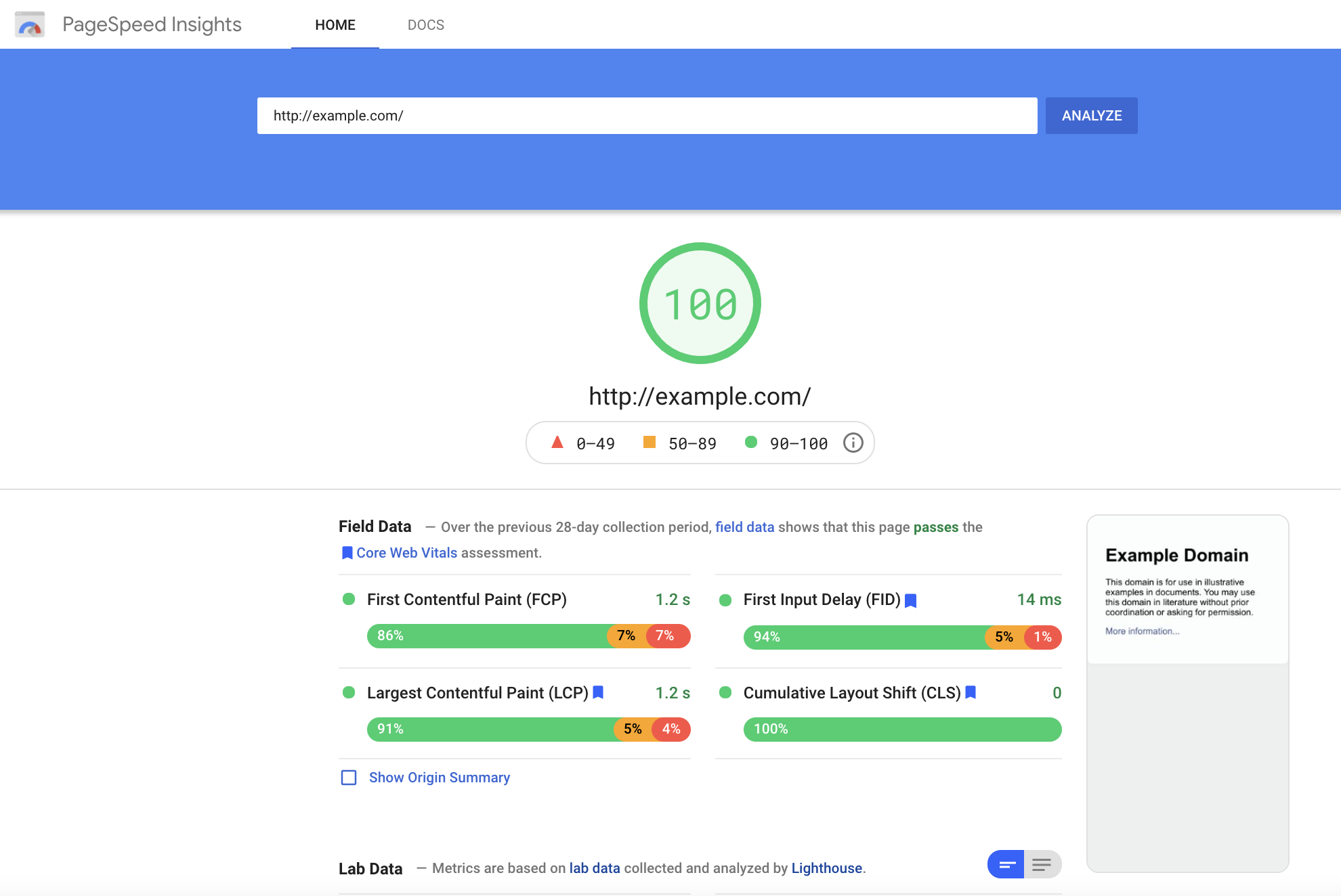
Page Speed is a key indicator of website quality, as it is a critical first impression of your website. The longer a user must wait for your website content to load, the higher the risk of the user leaving the page and increasing the bounce rate. Bounce rate, performance, and speed metrics all play a critical role in Google search crawlers’ evaluation of a website. (such as, In addition to limiting bounce rates, reducing your Time to First Byte can also increase your site’s SEO ranking. You can keep tabs on your site’s speed performance using tools like Google, PageSpeed Insights, or GTMetrix.com, but consulting a website development agency can offer further insight into actionable steps to improve your site’s performance.
User Experience
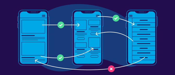
All websites should be designed to be as simple as possible for users to navigate. However, this isn’t as easy as it sounds. Content hierarchy, navigation, and calls to action are all critical components that need to be equally accessible and intuitive across desktop & mobile formats. Responsive layouts are essential in a mobile-optimized design, but more important is the speed at which content loads for a user. Mobile site speed tends to lag behind its desktop counterpart, but a poor mobile performance can significantly ding your site’s SERP ranking and create a poor user experience. Even the most creative & persuasive landing pages are wasted if features take too long to load on the screen. Pages that utilize AMP (Accelerated Mobile Performance) technology both rate higher on Google search rankings and increase chances of conversion for paid media promotions. AMP HTML is an open framework based on existing web technologies, that allows for more lightweight and speedier mobile web pages. In an initiative to enhance the shift to mobile browsing, AMP-powered webpages load instantaneously, even when they contain rich media like video, animations, or graphics, including things like Twitter and YouTube embeds.
Iterative Design
Website design is an iterative and ongoing process. Platforms & technology are constantly evolving to include new features, remedy existing pain points and approach the ever-moving target that is positive user experience. Companies should approach this process in the interest of continued learning and constant improvement. Collecting feedback should be built into the plan for any mobile site development, as the site’s performance should be re-evaluated at least every 3-6 months. Keeping track of your site’s vitals is an important step for ensuring that your site stays relevant and isn’t losing out on potential conversions.
In an increasingly mobile-first world, emphasizing the performance of sites on mobile devices can increase customer loyalty and satisfaction. Whether a prospective customer’s impression of your campaign landing page or an existing customer’s experience browsing your full website, speed is the name of the game. Keeping up-to-date with best practices in website development and enlisting the help of seasoned designers and UX specialists can transform users from mindless mobile scrolling to enthusiastic interactions on your site.
If you’re ready to start designing your site with a mobile audience in mind, Contact Bluetext for guidance and expertise.
Whether you’re creating your first logo, editing an existing logo, or totally redesigning an outdated logo for your business, you’ve been tasked with representing your brand and everything it stands for within a small graphic icon. A logo design project requires extensive knowledge of what your business stands for, what your current competitors are doing, and how design principles can be applied to capture attention and promote memorability. To increase the likelihood of a successful logo design, many companies turn to digital agencies like Bluetext who understand the competitive landscape and get to know each business in depth before designing a logo that accurately reflects the company and helps them stand out among the competition. The following 4 principles are integral considerations for the logo designing process at Bluetext, and they should be utilized by any company looking to create a timeless, impactful visual identity for their brand.
1. Color
More often than not, color lays the foundation of a brand. Color is the first thing that catches the eye, and in an age of diminishing attention and quick digital scans can make or break a strong brand. With the power to improve brand awareness by more than 75%, color psychology is an essential consideration. Digital marketing & branding agencies advise considering the perspectives of two important players: the end-user and the industry. Below are three critical questions to ponder before any branding objective:
- How do you want to be perceived by these audiences?
- What emotions should your brand evoke from end-users?
- How do I want to compare to industry standards? ‘Zig’ (run with the pack) or ‘zag’ (go against the grain)?
Certain colors tend to dominate different industries. Ever wonder why almost all fast food brand logos use the colors red and yellow? Red elicits passion and energy, while yellow stimulates hunger, which leads to subconscious food cravings. In comparison, the government contracting industry tends to use the colors red, white, and blue to invoke a sense of patriotism. Understanding the emotional impact behind your color choices can help your brand resonate with users and prospects. However, while some colors are tried and true, you should also weigh the costs and benefits of choosing the colors commonly found within your industry. Your ultimate goal should be to stand out amongst the competition, rather than blending into it. Whether or not color palette is the avenue to differentiate is a question that an expert brand agency would be able to consult on. While it may be tempting to utilize numerous color combinations, within your brand and logo, keep in mind the second most important quality of a logo: keeping it simple.
2. Simplicity
Visuals can communicate information 60 thousand times faster than text, a simple visual can be more impactful—and memorable—than a complicated or wordy design. Especially with the rise of mobile users and smaller screens, reducibility is a critical factor. Your logo should be comprehensible across multiple sizes—from a banner ad to a website favicon. Complex, detailed logos often have legibility challenges on small devices, therefore limiting your opportunities to show off even the most stunning designs. When there are too many competing elements of a logo, a viewer’s attention is divided between them, which detracts from their ability to recall the logo as a whole. It’s much more effective to choose just a few key elements of your logo to highlight your brand offerings. A good logo communicates your company’s strengths, whether it’s a rich history, creative thinking, or literal products featured in the design. The devil is in the details, which is why leading brand agencies advise a simple, yet scenic, route to logo success.
3. Adaptability
Another important aspect of your logo is that it must hold up to the test of time. A brand as a whole can be updated and refreshed every now and then, but replacing an outdated logo can be a large undertaking. A timeless logo is one that can be implemented across different formats, from horizontal, vertical, square, black and white, full color, etc. These format variations allow the same logo to be adapted to different contexts as the opportunity arises, whether that be print materials, branded merchandise, and new online formats. Anticipating new ways to use your logo will keep users engaged with your brand as you expand across different platforms. Your brand’s style guide is an important resource for explaining how your logo and brand identity can be communicated through different channels.
4. Relevance
The previous 3 qualities of your logo tie into one overarching factor: relevance. Before considering a logo redesign, you should talk extensively with target consumers to better understand how they perceive your current logo and overall brand. Creating a logo that reflects your brand identity is one thing—making sure that customers actually receive and understand your message and the brand behind your logo is an entirely different challenge. A digital marketing agency can be a powerful partner to compiling market research and getting a third-party perspective on your logo’s effectiveness. To learn more about how to stay in tune with your customers to make sure your branding conveys the value you actually offer, check out an interview with Bluetext’s Jason Siegel and Travelocity’s Terry Jones on avoiding brand regret.
Keeping up-to-date with design trends is one way of reading the market at a broad level to see which logo design techniques are resonating with audiences. However, accurately representing your brand is more important than being trendy. In the cyber-security space, for example, the challenge of selling an abstract concept has led many companies into the trap of using stereotypical imagery or design to try to communicate that they work with computers, coding, and hackers in hoodies. However, following those trends has led many companies to fall into the clutter of the category—a space where they’re practically indistinguishable from competitors. In order to avoid these common mistakes and stand out as strong competitors within your industry, consult a brand & marketing agency for your logo design.
Contact Bluetext to take the first step in setting your brand (& logo) up for long-term success.