Whether you’re a reader or a listener, we’ve got you covered! Listen to the podcast version of this post for a fresh take.
In any website design, call-to-action (CTA) buttons are key to highlighting the important actions available to users. Buttons make the difference between a general site visitor and a converting sales lead. Pointing out relevant information and next steps to the user can help them navigate your site with less friction, reducing decision fatigue and decreasing bounce rates. Here are six key questions you should consider when designing the CTA buttons to be used on your website.
Should the button style stay the same?
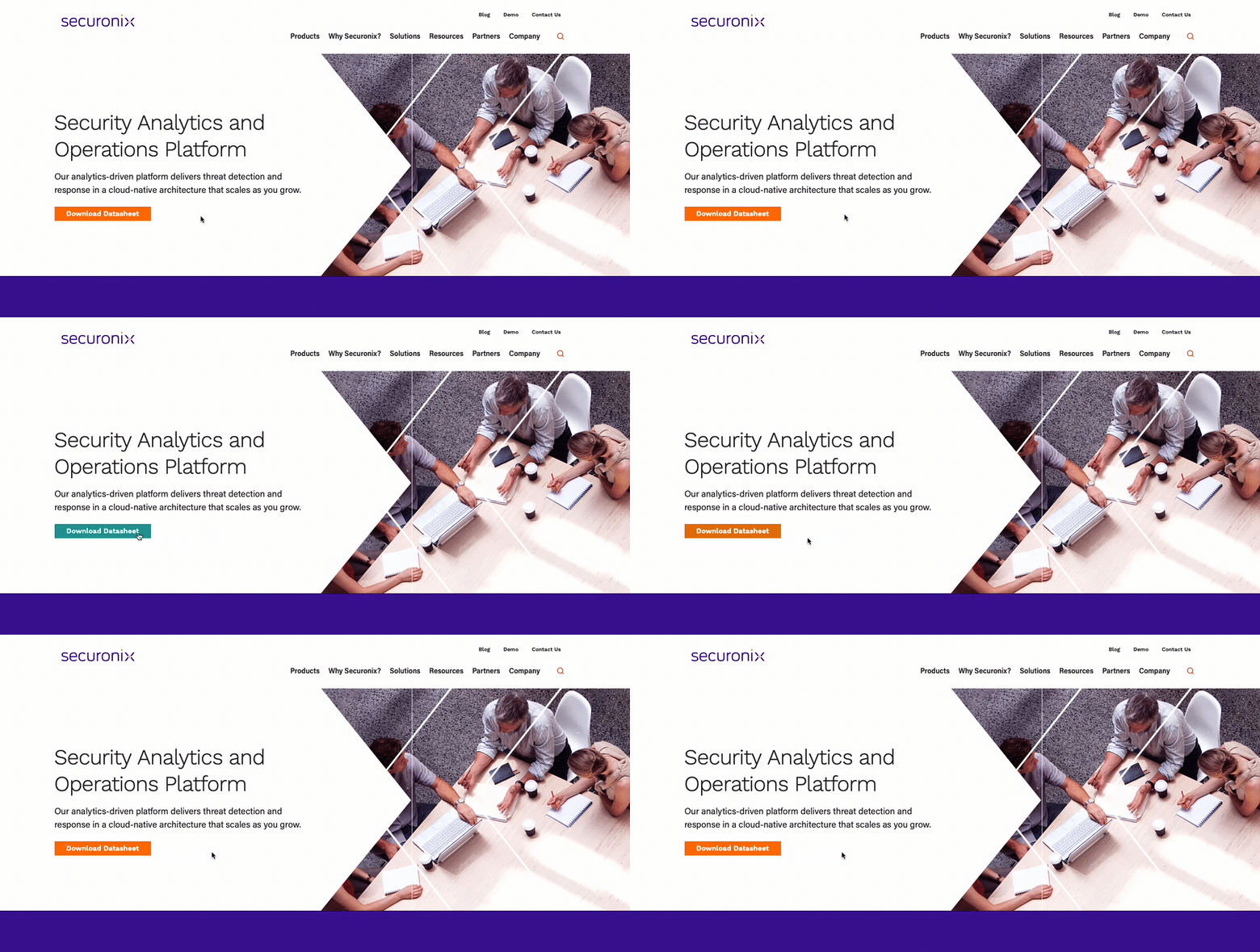
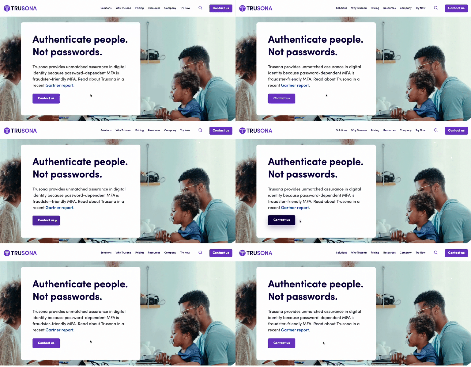
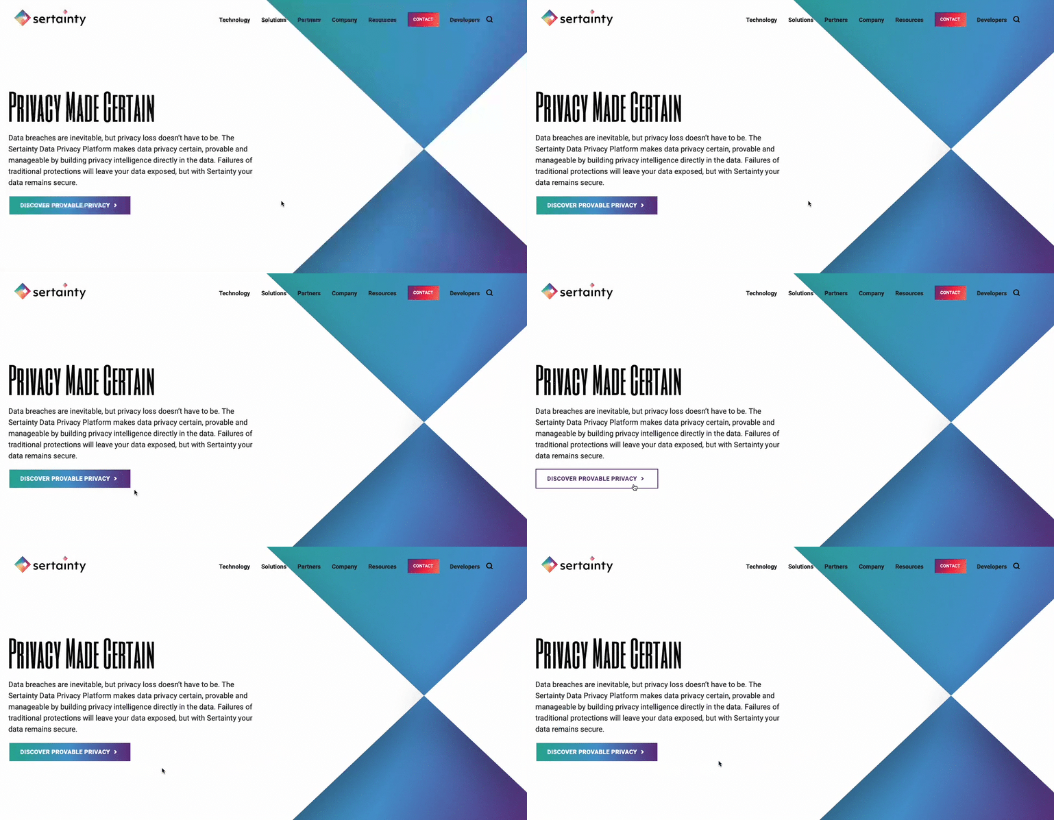
While it’s important for button styling to be consistent across a site, in some cases, there are multiple actions available to a user in a single viewport. To avoid overwhelming users with numerous identical buttons on the screen, you can use different styles to indicate a visual hierarchy. You’re already asking a user to make one decision, therefore, the UX should eliminate any additional, unnecessary decisions in what button to select. For actions that are top priority, bold-colored, solid buttons tend to draw a user’s attention first. Secondary and tertiary button styles should be less emphasized, with unfilled boxes or simply underlined text to indicate less important actions. The styles should be distinct but linked by common elements such as color or shape to make them easily recognizable. Try to use the primary button styling predominantly throughout the site, and avoid creating more than three distinct button styles.

What colors are best to use for CTA buttons?
When choosing the fill color of CTA buttons, it may be tempting to rely on your company brand color scheme. The button design shouldn’t diverge from the brand entirely, but the button color should stand out from the rest of the content on your site. Say you have a minimalistic black and white or muted color palette, you’d want your colors to pop against those backgrounds. Using the predominant brand color risks the button competing for user attention, leading to lower clickthrough rates. Color psychology also plays a key role in communicating the meaning behind buttons. It’s usually best to avoid red CTA buttons, because red buttons are associated with dangerous or harmful actions. Blue buttons, on the other hand, have positive connotations for users since blue text (the namesake of the Bluetext agency) has been used to indicate hyperlinks since the inception of the internet. Users are familiar and comfortable with clicking clue hyperlinked text, so why initiate a change? When choosing the color for a group of buttons on the site, assigning different colors to each action can create a higher cognitive load for users trying to distinguish between their choices. It’s best to use the same color for all the buttons in a group, so that users can focus on the text. However, you may want to consider indicating a default action to make one choice stand out, as discussed in the next section.

Should you highlight a default action?
If you are showing choices on a screen, and one of the choices presented is more likely to be the user’s preferred action, then it may be best to highlight that option to indicate it as the “default” to help users choose this option faster. However, if the choices are equal, then highlighting a default action could confuse the user or steer them to click the default choice rather than considering the options equally. When showing two choices next to each other, it’s also important to consider right and left hand placement. Showing an option on the right may make users more likely to choose it due to right hand bias, so it’s best to put the default option on the right. However, if the default action is something irreversible like “delete all,” it may be best to put that CTA on the left to force users to give more consideration to their decision. When presenting multiple options, just consider which option will be chosen the most often, and how quickly you want the user to navigate the decision.
Should icons be added to the CTA buttons?
Usually, text alone is enough to communicate clear actions to the user, but when buttons are grouped together, it may be harder for the user to distinguish the difference between the options presented. For example, if a new user on your site sees “Download” and “Contact Us” CTAs right next to each other, they might have to take a second to think about the difference between the two actions. In cases like this, icons can help users to discern the difference between the options faster. When assigning icons to the CTAs, make sure that the icon is helpful in communicating the meaning behind the text. If the icons themselves are too similar or generic, they may only lead to more user indecisiveness. Choosing the right icons can make all the difference in the user experience.
Should designers think “outside-the-box”?
The standard button styling is a rectangular box shape, with rounded corners. While designers could use colors and text styling to flex the brand, the overall button shape shouldn’t stray too far from the norm. The oblong-shaped CTA is emerging in popularity with more rounded, organic brands and is a great example of applying brand elements without feeling foreign. The goal of a CTA is to be instantly recognizable to the user, and in this case, thinking outside the box could lead to users being confused or less likely to interact with CTAs. One way of ensuring standardization across buttons is by adhering to the “common grid” measurements. The grid spacing ensures that buttons have adequate clear space around the text, making them easier for viewers to read and recognize the anatomy. Clean, simple designs also tend to be more palatable, as buttons with numerous effects applied can end up looking tacky and unprofessional.
What considerations should be in place for accessibility?
Accessibility is necessary for legal compliance, but it’s also recommended to ensure that designs are easy to read for all users. Font size and color contrast are two of the main considerations for button accessibility. Gradient treatments can also add complications to website accessibility, especially when overlaid with text. As a designer, it’s important to ensure that legibility is never sacrificed for aesthetics. The Importance of Website Accessibility doesn’t go ignored at Bluetext; read more about how we test for accessibility compliance to ensure that our sites are functional for everyone.

At Bluetext, when designing a site for a client, the number one priority is to ensure that the website will engage users in order to achieve business goals. Experienced designers know that CTA styling is key to capturing users and directing them to the most important content on the site. Thoughtful design can increase brand recognition, improve clickthrough rates, and remedy bounce rates for your site. Contact Bluetext to learn more about our services and how we can address all of your website design needs.