Catch the highlights and additional insights in the podcast edition of this post. Just hit play below!
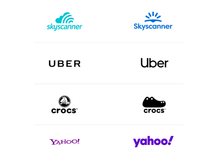
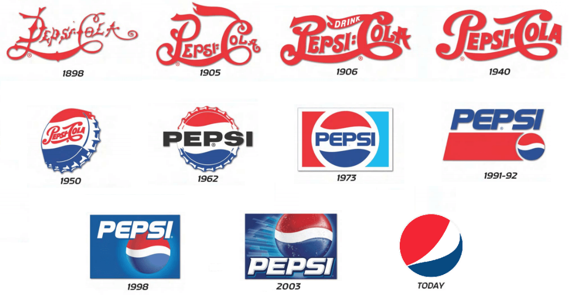
Simplification is one of the strongest trends we’ve seen as a top design agency in recent years. With such growing popularity, it shows no sign of stopping. So why are brands dialing back on designs for a more minimalistic logo? Top graphic design and rebrand experts at Bluetext are debunking this design trend to explain why it’s a wise choice. For one, minimalist logo designs are easily recognizable and memorable, which is key to successful branding. This is why many up and coming companies prefer simplification over other artistic techniques. Similarly, established brands are stripping their logos of excessive details to add more weight to the brand promise. Uber, Yahoo, and Mailchimp have all recently released logos with cleaner, rounded lines to feel more approachable and user friendly.
 Why are these well-known logos going back to basics? We consulted our top graphics designers here at Bluetext, to get their take on the trend. Below are some of the most popular reasons for logo redesigns:
Complex and Cluttered Digital Environments
With nearly all companies moving to some sort of digital presence, users are constantly bombarded and overwhelmed with content to digest. Embellished logos only add to that already exhausted attention span, requiring time and concentration that people simply don’t have to spare. Cluttered online environments have trained us to scan, filter, and repeat — leaving little bandwidth to notice or appreciate fine detail.
User Consideration
Especially when coupled with features like dark mode, we are seeing brands designing more and more with user experience and comfort in mind. Darker screens and simplified details are easier on the eyes. Reduced eye strain and saved battery life is an added benefit that shows users you care, especially in a pandemic environment where almost all interactions have become virtual and vastly increased average screen time.
Mixed Mediums
Another key consideration for any brand is where your logo will be applied. On your website for sure, but what about printed materials? Perhaps corporate giveaways, like coffee mugs or canvas totes. Logo designs need to accommodate all of these possibilities and easily adapt to any medium. Thus, to save time and resources, companies opt for a clean and crisp logo that they are confident will crisply stand out on any medium and in any size.
Shrinking Screens
It seems every few months or so Apple unveils smaller and smaller iPhone models. And this product design trend isn’t limited to just mobile devices! Laptops, tablets, and even desktops have been consistently shrinking in size as users opt for more streamlined and portable devices. To future proof your brand or website it’s important to consider small screens and how your logo will display. If your design is riddled with lines and textures it may compromise readability on these devices. Instead of reverse engineering your logo to accommodate unique layouts and breakpoints, it’s far more efficient to begin with a simplified, and digitally conscious design.
Botox for B2B
Why do people get Botox? To smooth out those fine lines and wrinkles and look younger! The same principle applies to mature and established brands. In order to get a digital facelift and appear fresh and modern, experienced brands are smoothing out the details of their logos and brand graphics. Simplification of logos gives your company a rejuvenated update, while still preserving the established brand reputation.
Simplicity Inspires Confidence
Less is more. A strong and simpler logo exudes an air of confidence that your brand knows what it’s doing, and lets the reputation speak for itself. Brands should consider a logo as a signature, rather than the story. Your logo should be a quick snapshot of your brand that triggers a memory of your product or service, not an attempt to illustrate your offerings. A simplified logo, especially in a wordmark format amplifies your brand and creates a distinctive presence.

The Verdict
The verdict on logo simplification? Cleaning up design elements not only offers immense brand value and memorability but also has numerous digital benefits. As a top digital marketing and user experience agency, we encourage clients of any industry to always be thinking about the future first. With an inevitable shift toward more digital-based lifestyles, smaller screen sizes, and user considerations it is a wise investment to reinvigorate your brand with a timeless logo design.

