In an ever-evolving market, a static brand identity risks obsolescence. As industries innovate and consumer preferences shift, brands must adapt to stay relevant. Future-proofing your brand identity ensures you can evolve with the times without losing your core essence. But what does it mean to create a truly adaptable identity, and how can businesses position themselves for long-term success?
The Core Elements of a Timeless Brand
- Clear Purpose and Values: Your brand’s mission and values should anchor all decisions. A strong foundation ensures consistency amid change. These values act as a compass, guiding marketing strategies and fostering trust with audiences.
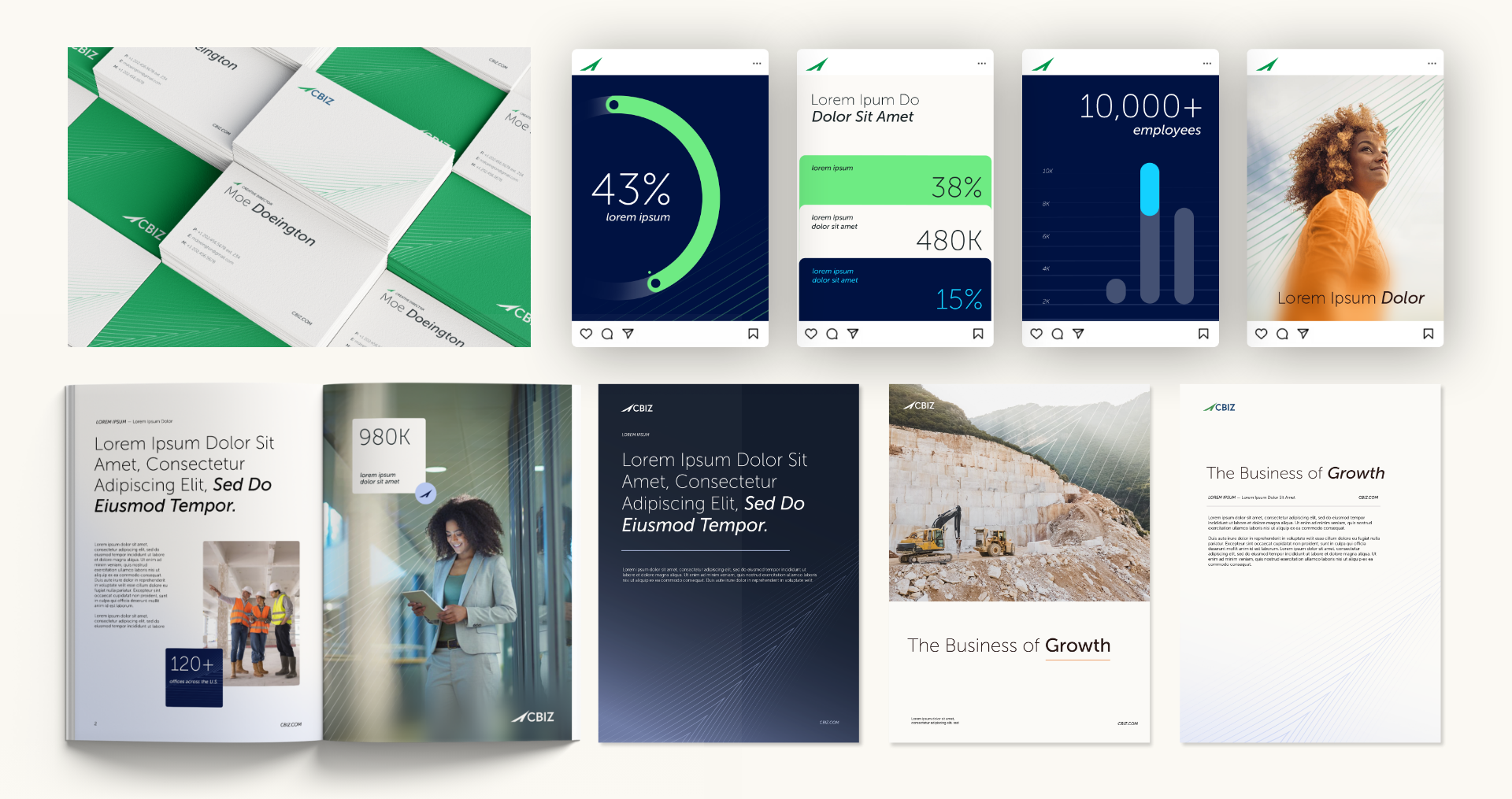
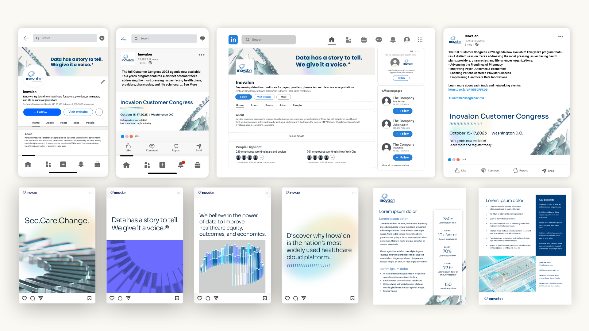
- Memorable Visual Identity: Logos, typography, and color schemes should be designed for adaptability while maintaining recognizability. A logo refresh or subtle updates can keep your visual identity modern without losing its essence.
- Consistent Voice: A defined tone and messaging style create familiarity, even as trends evolve. Whether it’s witty, professional, or empathetic, consistency in voice reinforces your brand’s personality.
Steps to Future-Proof Your Brand
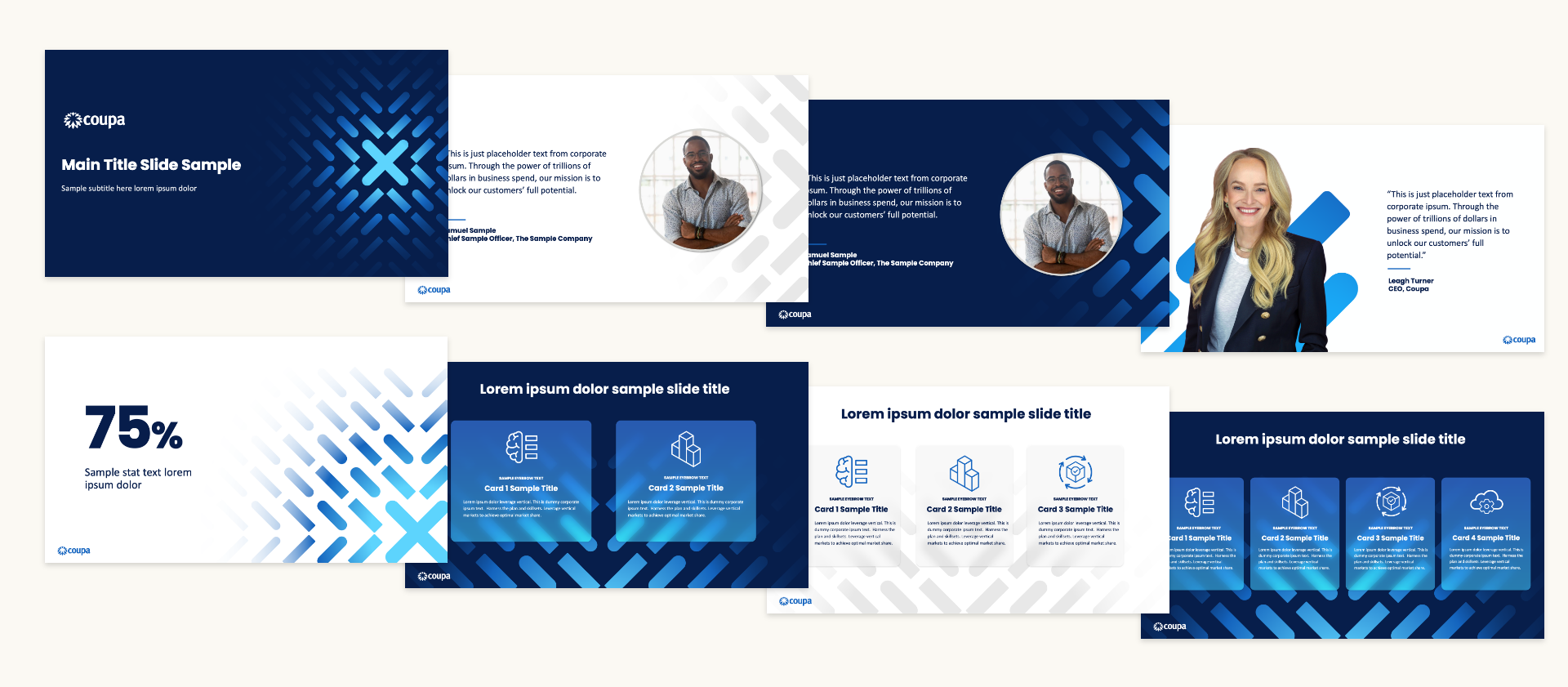
- Embrace Flexibility: Build a brand style guide that allows room for creative interpretation. Include guidelines for updating visual elements, experimenting with new formats, and evolving content strategies.
- Stay Informed: Monitor industry trends and consumer behaviors to anticipate shifts. For example, as sustainability becomes a priority, integrating eco-conscious messaging into your branding can keep you aligned with audience values.
- Invest in Technology: Utilize tools like CRM systems or analytics platforms to track engagement and adjust strategies in real-time. Emerging technologies, like AI-driven content personalization, can also keep your brand ahead of the curve.
Evolving with Your Audience
A future-proof brand grows alongside its audience. Prioritize feedback and adapt offerings to meet changing needs. Engaging in two-way communication—through surveys, social media, or customer service—can provide valuable insights. Additionally, fostering a community around your brand creates loyalty that extends beyond specific products or services.
Branding for Longevity
Future-proofing your brand identity is an investment in your company’s resilience. By staying flexible and audience-focused, your brand can remain relevant and impactful for years to come. The ability to adapt, paired with a strong foundational identity, ensures your brand can weather industry disruptions while continuing to thrive. Reach out to Bluetext to learn how we can help you build a brand identity that stands the test of time.
Prefer listening over reading? Check out the podcast version of this blog below and enjoy insights on the go!
Artificial intelligence has revolutionized marketing, offering tools that enhance efficiency, precision, and scalability. From chatbots to predictive analytics, AI has unlocked new ways to engage audiences and optimize campaigns. However, as brands embrace automation, there is a pressing challenge: maintaining an authentic, human connection. How can marketers strike the right balance?
The Power of AI in Marketing
AI streamlines complex processes like data analysis, content creation, and personalization. Tools powered by AI can segment audiences, recommend tailored content, and predict consumer behavior—saving marketers time and boosting ROI. Chatbots enable instant communication, while AI-driven ad platforms ensure campaigns reach the right audience at the right time.
Moreover, AI enables real-time decision-making. Marketers can adjust campaigns based on live analytics, ensuring that messaging remains relevant. For instance, AI can identify trending topics on social media, allowing brands to join conversations and stay culturally relevant. Beyond efficiency, AI also enhances creativity through tools that generate content ideas or even design assets.
The Risk of Losing Authenticity
While AI enhances efficiency, it can risk alienating audiences if overused or misapplied. Consumers value human touchpoints, especially in industries that rely on trust, like healthcare or financial services. Over-reliance on AI can make interactions feel impersonal, leading to disengagement.
Additionally, there’s a growing concern about the ethical use of AI. Missteps in personalization, such as overly invasive data tracking, can erode trust. Similarly, relying too heavily on automated responses can create frustration when customers encounter complex issues that require empathy and nuanced problem-solving. Striking a balance between automation and authenticity requires intentionality and foresight.
Striking the Balance
- Human-AI Collaboration: Use AI for data analysis but let humans craft messages that resonate emotionally. For instance, AI can analyze customer sentiment, but human marketers should interpret that data to create meaningful campaigns.
- Transparent Communication: Disclose when AI is in use, such as chatbots, to build trust. Transparency fosters a sense of honesty, helping audiences feel respected and valued.
- Periodic Oversight: Regularly review AI-driven campaigns to ensure they align with brand values and audience expectations. Conduct audits to identify areas where human intervention might enhance effectiveness.
Leveraging AI Responsibly
Brands should view AI as a tool to enhance, not replace, human creativity and connection. By establishing clear boundaries—such as reserving certain touchpoints for human interaction—marketers can maintain authenticity. Training employees to work alongside AI systems can also create a more cohesive strategy where technology and humanity complement one another.
A Future of Synergy
By blending AI efficiency with human creativity, brands can achieve authentic connections that resonate deeply with audiences. Striking this balance isn’t just a best practice—it’s essential for long-term marketing success. As AI continues to evolve, the brands that succeed will be those that use it to enhance—rather than replace—the human touch. Contact Bluetext today to explore how we can help you navigate AI-driven marketing strategies that balance innovation with authenticity.
In today’s crowded digital environment, where countless brands vie for consumer attention, fostering loyalty is more challenging—and more crucial—than ever. Building strong brand loyalty is no longer just about having a good product; it’s about creating meaningful, personalized connections with your audience. A loyal customer base not only ensures repeat purchases but also acts as an advocate for your brand, amplifying your message organically. Here are the strategies brands must embrace to inspire loyalty and stand out in a competitive digital landscape.
The Power of Personalization
Consumers expect brands to know who they are and what they want. Personalized experiences—whether through tailored email campaigns, custom product recommendations, or localized content—show customers that you value their individuality. Advanced tools like AI and data analytics can help brands analyze consumer behavior and deliver content that resonates on a personal level. For example, Netflix and Spotify use AI-driven algorithms to curate individualized experiences, creating a strong bond between the user and the platform.
Personalization isn’t just about using someone’s name in an email; it’s about anticipating their needs, solving their problems, and delivering value at every touchpoint. Brands that master this approach stand out as trusted partners in their customers’ journeys.
Community-Building as a Loyalty Driver
Building a sense of community around your brand fosters emotional connections that go beyond the transactional. By creating spaces for customers to engage—whether through online forums, exclusive social media groups, or user-generated content campaigns—you can cultivate a loyal following that feels part of something bigger. Brands like Peloton have excelled by fostering a tight-knit community of users who motivate and support each other.
Strong communities also drive word-of-mouth marketing, amplifying your reach organically. When customers feel they’re part of a movement, they’re more likely to share their experiences with others, extending your brand’s visibility.
Consistency is Key
Consistency in messaging and tone across all platforms reassures customers of your reliability. Whether it’s your website, social media, or in-person events, ensure your brand’s values and personality shine through. A cohesive presence builds trust, and trust is the cornerstone of loyalty.
Moreover, consistency extends beyond aesthetics to include the quality of your products, services, and customer support. Regularly meeting or exceeding expectations reinforces your brand’s credibility and keeps customers coming back.
Rewards and Recognition
Implementing loyalty programs that offer tangible rewards or exclusive experiences incentivizes repeat purchases and strengthens customer relationships. Beyond discounts, consider offering early access to new products, behind-the-scenes content, or VIP events that make your most loyal customers feel valued.
Recognition also matters. Celebrate your customers’ milestones, such as birthdays or anniversaries with your brand, through personalized messages or offers. These small gestures can make a big impact on customer sentiment and loyalty.
Social Responsibility and Authenticity
Consumers increasingly align themselves with brands that share their values. Highlighting your commitment to sustainability, inclusivity, or community outreach can deepen loyalty. For example, Patagonia’s dedication to environmental causes has cemented its reputation as a brand with purpose.
However, authenticity is critical—performative actions can backfire and erode trust. Your brand’s values must be reflected not only in your marketing but also in your business practices.
The Long-Term Vision
Fostering loyalty is a marathon, not a sprint. By investing in personalized experiences, building strong communities, and staying true to your brand’s values, you’ll create a foundation for enduring relationships with your customers, even in a fiercely competitive digital world. Loyal customers are your most valuable asset—they’re your advocates, your ambassadors, and your most dependable revenue stream.
Ready to build lasting brand loyalty? Contact Bluetext today to discover how we can help you create personalized experiences, consistent messaging, and community-driven strategies that resonate with your audience.
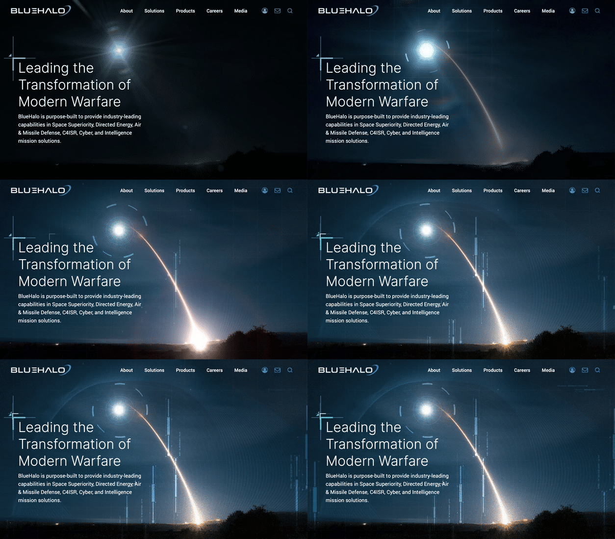
The defense and aerospace industries operate at the forefront of innovation, delivering mission-critical solutions that shape global security, technological advancement, and exploration. However, these sectors face unique challenges in branding and marketing: balancing innovation with reliability, maintaining compliance while staying competitive, and catering to a diverse audience of government agencies, contractors, and commercial stakeholders.
Building a future-ready brand requires a deliberate approach that aligns cutting-edge technology with values of trust, performance, and adaptability. This blog explores the core pillars of branding for defense and aerospace services, strategies for engaging stakeholders, and how to position your company for long-term success.
The Core Pillars of a Future-Ready Defense & Aerospace Brand
Innovation is the lifeblood of defense and aerospace industries. Whether it’s the latest in unmanned systems, AI integration, or space exploration, your brand must be synonymous with groundbreaking technology. Highlight your R&D efforts, use storytelling to explain complex innovations, and showcase your adaptability to emerging trends and technologies.
Reliability is non-negotiable in high-stakes industries where lives, security, and billions of dollars are on the line. Focus on safety, durability, and proven performance. Share case studies and testimonials that illustrate your dependability and use certifications and compliance records to build trust.
Operating within strict regulatory frameworks is central to success. A brand built on compliance and integrity reflects a commitment to ethical practices and government standards. Be transparent about how you meet regulations and international norms while positioning compliance as a value-added benefit for stakeholders.

Strategies for Marketing to Diverse Stakeholders
Tailoring your messaging to government agencies is essential. Emphasize mission alignment, cost-effectiveness, and measurable results. Use whitepapers, webinars, and direct outreach campaigns to demonstrate your ability to address national security priorities or reduce operational costs.
For commercial clients, highlight the dual-use applications and scalability of your technologies. Trade shows, industry publications, and digital campaigns are ideal platforms to showcase your offerings. Case studies that illustrate how aerospace innovations can adapt to commercial aviation or logistics needs can help broaden your appeal.
Public relations efforts are critical for building trust and credibility. Participate in industry panels, write guest articles, and secure media coverage. Position your executives as thought leaders who can offer insights on innovation and policy trends.
Leveraging Digital Tools for Branding
A robust online presence begins with an optimized website that highlights innovation, case studies, and compliance. Use interactive elements like 3D models, virtual tours, or demo videos to engage visitors.
Social media and digital campaigns can effectively reach specific audiences. LinkedIn, in particular, allows you to connect with decision-makers in both government and private sectors. Complement this with targeted ads and content marketing, including blogs, whitepapers, and infographics that showcase expertise.
Challenges and Considerations
Balancing transparency with confidentiality is vital. Share enough to build trust while safeguarding sensitive operational details. Navigating geopolitical sensitivities and aligning branding with international norms ensures broader market relevance. Staying ahead of rapid technological and policy changes requires regular updates to your messaging and strategy.
Becoming a Future-Ready Brand
Innovation and reliability are the cornerstones of defense and aerospace branding. By building trust through transparent messaging, demonstrating leadership in cutting-edge technologies, and tailoring outreach to diverse stakeholders, you can position your company as a future-ready leader in these industries.
Looking to build a brand that stands out in defense and aerospace? Contact Bluetext to explore tailored strategies that position your company for long-term success.
Navigating the complexities of B2B marketing can be challenging—especially when targeting multiple industries. Each sector has unique needs, preferences, and pain points that require nuanced approaches. A one-size-fits-all strategy simply doesn’t cut it in today’s competitive landscape. Instead, building a versatile marketing strategy that spans multiple sectors involves understanding the dynamics of each industry while maintaining a cohesive brand identity.
In this blog, we’ll explore actionable steps to create an effective cross-sector B2B marketing strategy, focusing on segmentation, adaptive messaging, and industry-specific tactics.
Understanding Cross-Sector Dynamics
When targeting multiple industries, it’s crucial to recognize both the commonalities and differences between them. For example:
- Commonalities: Many industries share concerns about ROI, cost-efficiency, and customer satisfaction.
- Differences: Industries like healthcare may prioritize compliance and patient outcomes, while manufacturing focuses on operational efficiency and supply chain management.
Recognizing these dynamics allows you to position your solutions effectively for each audience.
Developing a Robust Segmentation Framework
Segmentation is the foundation of any successful multi-sector strategy. Consider these steps:
- Segment by Industry: Use market research to identify the unique needs of each sector.
- Segment by Role: Tailor messages for decision-makers, influencers, and end-users.
- Use Data Analytics: Leverage CRM and marketing tools to uncover cross-industry patterns and customize your approach.
Crafting Adaptive Messaging Strategies
A strong brand identity should shine through all your messaging—but flexibility is key when addressing diverse sectors. Here’s how:
- Unified Brand Voice: Maintain consistency in tone and values across sectors.
- Tailored Content: Adapt case studies, whitepapers, and ad copy to highlight sector-specific benefits.
- Customer Personas: Develop profiles for typical decision-makers in each sector to align your messaging with their priorities.
Tactics for Multi-Sector Marketing Success
Successful campaigns require the right tools and tactics. Consider:
- Localization: Adapt messaging for different regions and markets.
- Omnichannel Marketing: Use digital platforms, events, and traditional media to reach varied audiences.
- Case Studies: Share examples that showcase your versatility across industries.
Measurement and Optimization Across Sectors
To ensure your strategy remains effective, establish KPIs for each sector and regularly evaluate performance. Examples include:
- Engagement Metrics: Open rates, click-through rates, and website traffic.
- Conversion Rates: Leads generated per campaign.
- Customer Feedback: Insights from surveys and reviews.
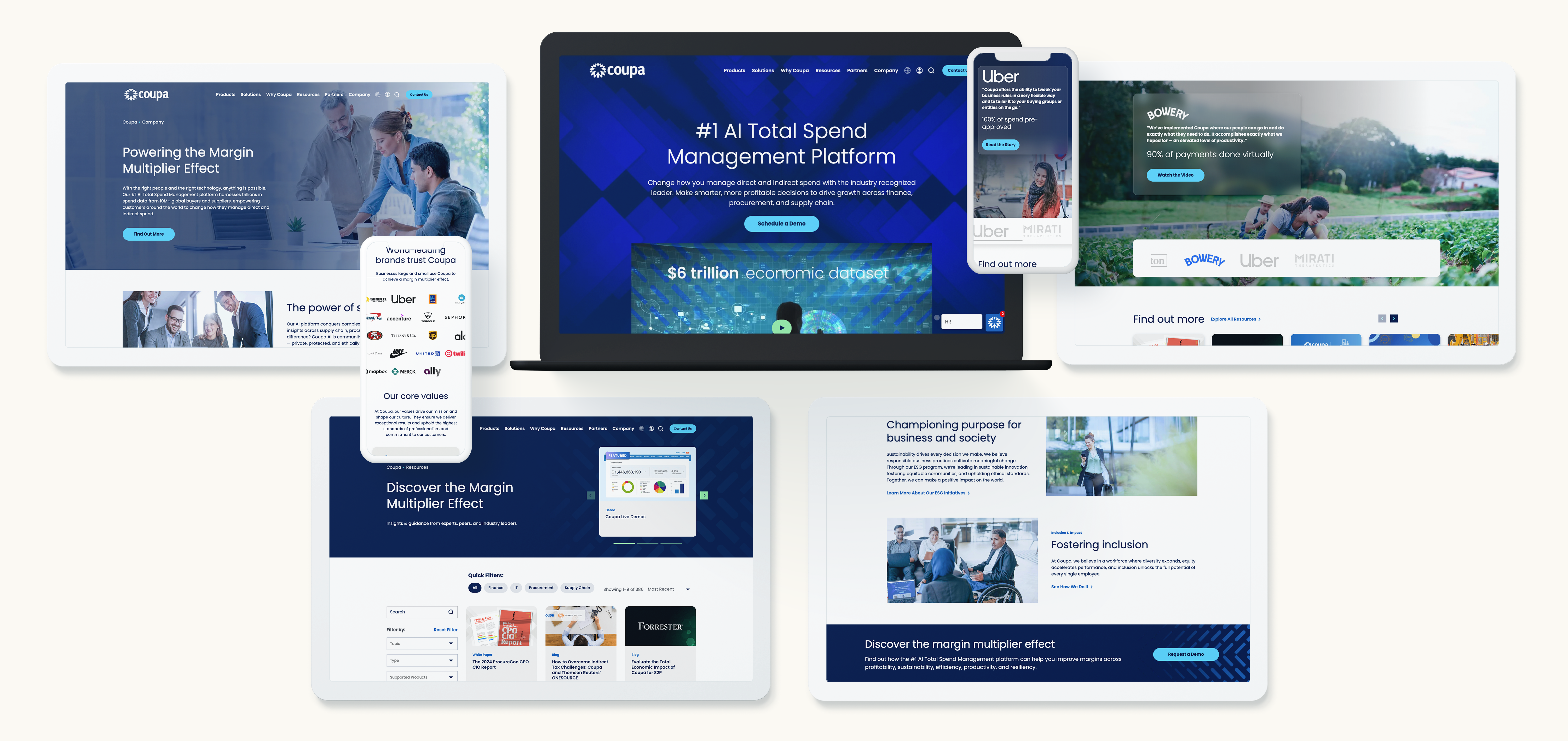
Your Path to Multi-Sector Success
Mastering multi-sector marketing is not just about flexibility—it’s about understanding the unique needs of each industry while maintaining a cohesive brand identity. By leveraging data, crafting tailored messaging, and staying attuned to audience behaviors, you can create strategies that resonate across diverse sectors.
Ready to take your B2B marketing strategy to the next level? Contact Bluetext today to learn how our expertise in multi-sector marketing can help your organization build a stronger, more adaptable presence.
In the world of B2G marketing, the ability to align corporate messaging with federal priorities can mean the difference between winning contracts and being overlooked. For years, sustainability has been a cornerstone of corporate branding, with organizations touting their green initiatives to appeal to environmentally conscious agencies. However, a significant shift is underway. As federal agencies emphasize resilience, industrial strength, and adaptability, B2G companies are rethinking their messaging strategies to stay competitive.
This evolving landscape presents both challenges and opportunities. In this blog, we’ll explore the drivers behind this shift, examine the emerging themes of resilience and industrial strength, and provide actionable tips to help your brand stay ahead.
Why Messaging is Shifting in B2G Markets
Federal Priorities are Changing
Federal agencies, particularly the Environmental Protection Agency (EPA), are recalibrating their messaging priorities. While sustainability remains important, the conversation is expanding to include themes like infrastructure resilience, supply chain durability, and long-term performance. This shift reflects broader concerns about national security, climate adaptation, and the need for robust systems that can withstand disruption.
For B2G companies, this change means that simply emphasizing sustainability is no longer enough. Messaging must also highlight how products and services contribute to the government’s evolving focus on industrial strength and adaptability.
The EPA’s Role in Influencing Messaging
The EPA is poised to play a significant role in shaping corporate messaging trends. Anticipated updates to the agency’s guidance could provide a clear framework for what federal agencies expect from contractors in terms of resilience and industrial capability. Companies aligning their messaging with these emerging themes will be better positioned to resonate with procurement officers and decision-makers.
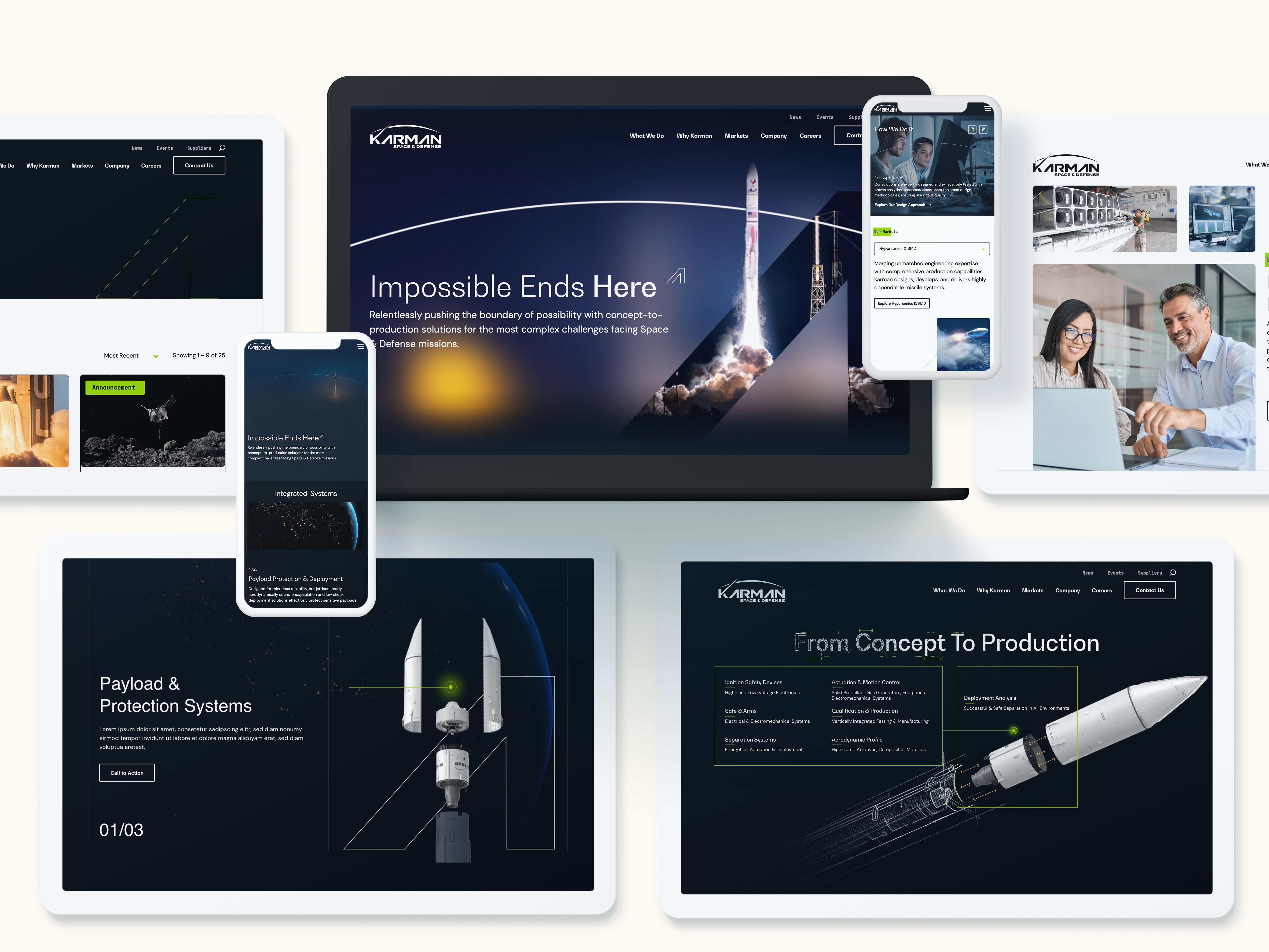
Key Elements of Resilience and Industrial Messaging
Shifting your messaging to reflect resilience and industrial strength doesn’t mean abandoning sustainability—it’s about reframing it within a broader narrative. Here are the key elements to focus on:
1. Emphasize Durability and Performance
Federal agencies prioritize solutions that are built to last. Messaging should underscore the longevity, robustness, and reliability of your offerings. Share real-world examples that demonstrate how your products or services perform under challenging conditions.
2. Highlight Innovation as a Tool for Resilience
Resilience and innovation go hand in hand. Position your organization as a leader in developing cutting-edge solutions that address modern challenges, such as climate resilience and supply chain disruptions. For instance, showcasing innovative technologies that support both industrial goals and environmental sustainability can resonate with agencies looking for multi-faceted solutions.
3. Align Messaging with Federal Missions
Tailor your messaging to reflect government priorities, such as infrastructure modernization or energy independence. This alignment signals that your brand understands and supports the broader goals of federal agencies. Sustainability can still play a role, but as a supporting point within a larger story of compliance, reliability, and adaptability.

Steps to Adapt Your Messaging
Step 1: Conduct a Messaging Audit
Start by reviewing your current marketing materials. Identify messaging that leans heavily on sustainability and evaluate whether it aligns with the government’s broader focus on resilience and industrial strength. Adjust outdated narratives to better reflect evolving priorities.
Step 2: Develop New Messaging Pillars
Create messaging pillars that emphasize durability, reliability, and innovation. For example, instead of focusing solely on “green energy,” emphasize “reliable, sustainable energy solutions” that align with federal resilience goals. Back up these claims with data, case studies, and testimonials that demonstrate measurable impact.
Step 3: Test and Iterate
Refine your messaging through testing. Use A/B testing to determine which narratives resonate most with your audience, and gather feedback from procurement officers or stakeholders. Messaging is not static—it should evolve based on insights and market dynamics.
Real-World Applications: Shifting Successfully
Several companies have already begun adjusting their messaging to reflect this shift. For example, organizations in the renewable energy sector are repositioning their offerings as solutions that enhance grid resilience while remaining environmentally sustainable. Similarly, manufacturing firms are emphasizing the durability of their materials and the reliability of their supply chains. These shifts have helped these companies secure contracts and strengthen their relationships with federal agencies.
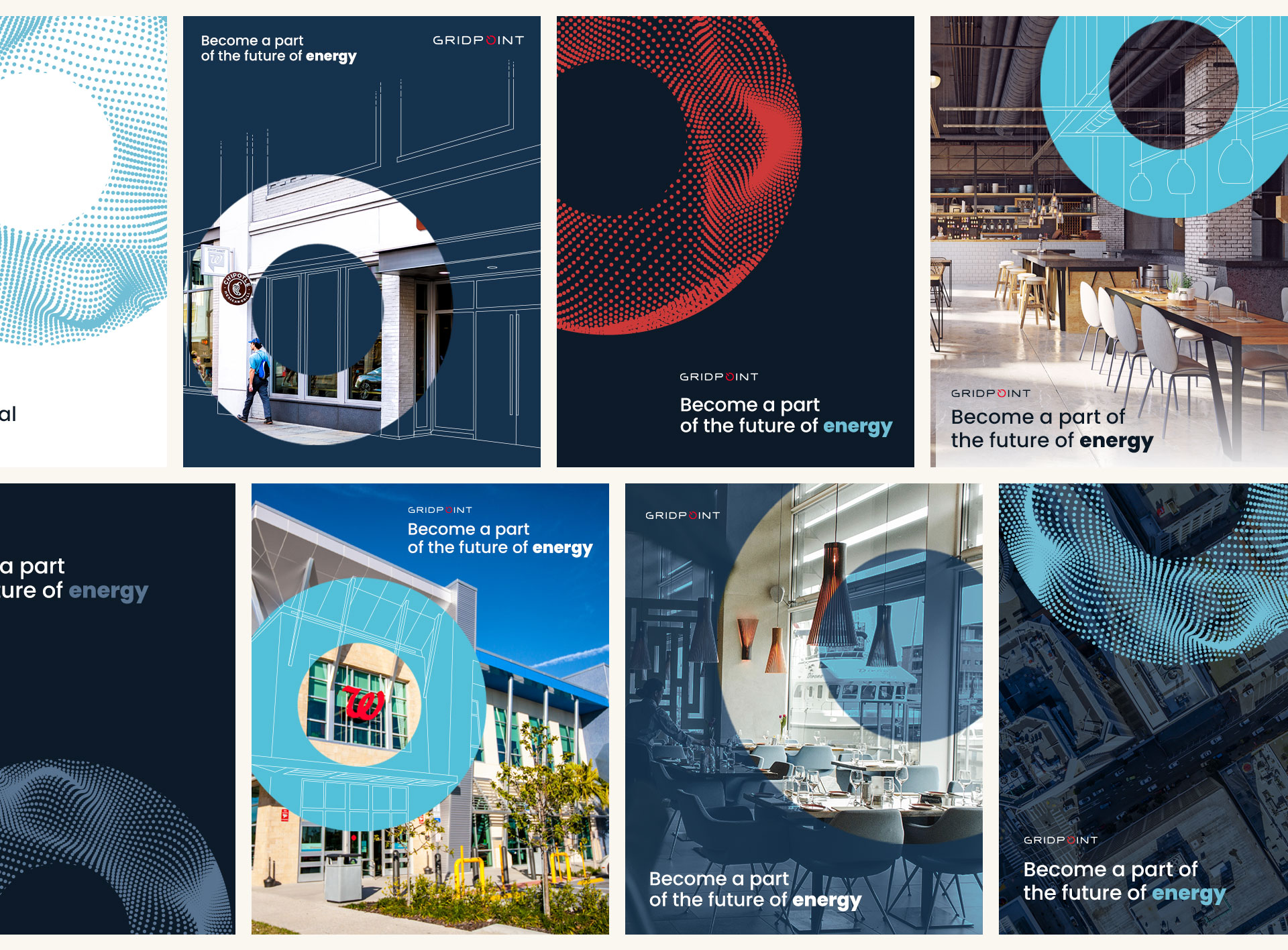
Looking Ahead: Preparing for the Future
Monitor Federal Trends
Staying ahead requires keeping a close eye on federal guidance, especially from agencies like the EPA. These updates will serve as a roadmap for aligning your messaging with government priorities.
Be Proactive, Not Reactive
Waiting until federal guidance is finalized may leave you playing catch-up. Instead, proactively incorporate themes of resilience and industrial strength into your branding now to stay ahead of the competition.
Partner with Bluetext to Align Your Messaging
The B2G market is evolving rapidly, and staying competitive means adapting your messaging to align with federal priorities. At Bluetext, we specialize in helping B2G companies craft compelling narratives that resonate with government agencies. Contact us today to learn how we can help you shift from “green” to “grit” and position your brand for success in this changing landscape.
As the marketing landscape continues to evolve at a breakneck pace, businesses must look ahead to stay competitive in the years to come. By 2025, the strategies that once worked will need to be adapted to meet new expectations and leverage emerging technologies. From AI-driven personalization to sustainability in brand messaging, the future of marketing will be shaped by innovation, agility, and a deep understanding of consumer preferences.
In this blog, we’ll explore the key trends that will drive marketing success in 2025 and provide actionable steps businesses can take today to future-proof their marketing efforts.
The Power of AI-Driven Personalization
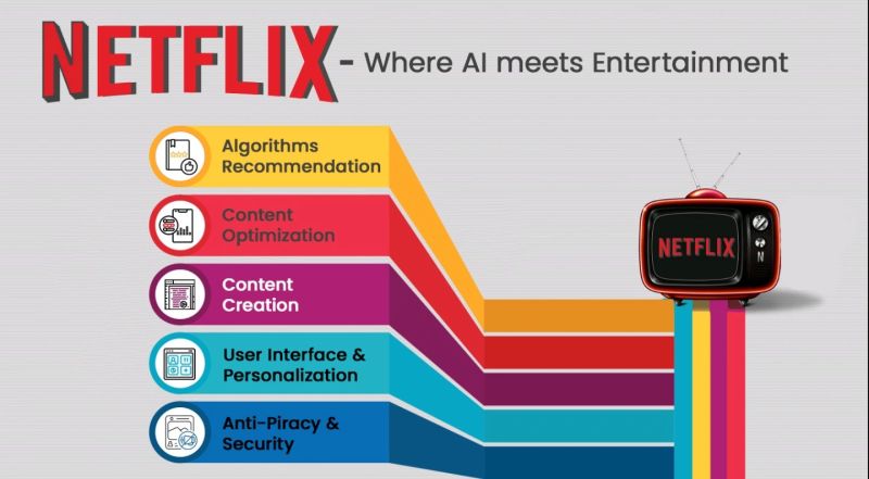
Artificial intelligence (AI) is transforming marketing by enabling hyper-personalized customer experiences at scale. AI tools can analyze vast amounts of customer data, allowing brands to predict behavior, deliver tailored content, and create highly relevant recommendations. This level of personalization not only enhances customer satisfaction but also fosters brand loyalty.
For instance, companies like Netflix and Amazon have mastered the art of AI-driven personalization, delivering content and product recommendations based on user preferences and behavior. As we approach 2025, consumers will expect this kind of personalized experience from every brand they interact with.
Actionable Step: Invest in AI-powered marketing tools that allow you to gather and analyze customer data effectively. Start by integrating AI into your email marketing, content delivery, and e-commerce platforms to offer personalized recommendations and improve engagement.
Omnichannel Customer Experiences
In 2025, the line between online and offline experiences will blur even further, with customers expecting seamless interactions across multiple touchpoints. An omnichannel marketing strategy ensures that no matter where your audience engages with your brand—whether it’s through social media, email, in-store, or mobile apps—the experience feels unified and consistent.
Leading brands are already embracing omnichannel strategies to create frictionless experiences. For example, Starbucks’ mobile app integrates with in-store interactions, allowing customers to order ahead, earn rewards, and pay seamlessly. This kind of cohesive approach will be crucial to staying competitive.
Actionable Step: Begin mapping out your customer journey to identify where your audience engages with your brand. Develop a strategy that ensures a consistent brand message and customer experience across all platforms and devices.
Embracing Sustainability in Brand Messaging
As consumers become more socially conscious, sustainability is no longer a nice-to-have but a necessity for brands looking to build trust and loyalty. By 2025, sustainability will be a key driver of purchase decisions, with customers seeking out brands that align with their values, particularly regarding environmental and ethical concerns.
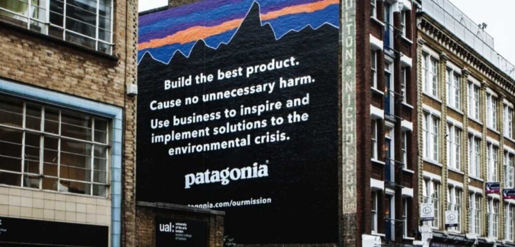
Brands like Patagonia and Allbirds have built their entire ethos around sustainability, and their transparent, eco-friendly practices resonate deeply with today’s consumers. As environmental concerns grow, incorporating sustainability into your marketing messaging will become even more critical.
Actionable Step: Assess your brand’s current sustainability efforts and look for ways to authentically integrate these values into your marketing. Share your sustainability initiatives openly, whether through product development, sourcing, or corporate social responsibility.
Investing in Data Analytics for Better Decision-Making
Data will continue to be the lifeblood of effective marketing strategies in 2025. Brands that harness the power of data analytics will be better equipped to make informed decisions, predict trends, and tailor their campaigns to meet customer expectations. The ability to access real-time insights and predictive analytics will set top performers apart from the competition.
However, with the rise of data privacy regulations, businesses must also be mindful of how they collect and use customer data. Ethical data practices will be critical in building trust with consumers who are increasingly concerned about privacy.
Actionable Step: Invest in advanced data analytics tools and teams to improve your ability to make data-driven decisions. Ensure your data collection processes are transparent and ethical, and prioritize data security to build consumer trust.
Refining Digital Transformation Strategies
Digital transformation isn’t a one-time event—it’s an ongoing process that must evolve alongside new technologies and customer behaviors. As we look toward 2025, businesses that remain agile and continue to refine their digital transformation strategies will be better positioned to succeed.
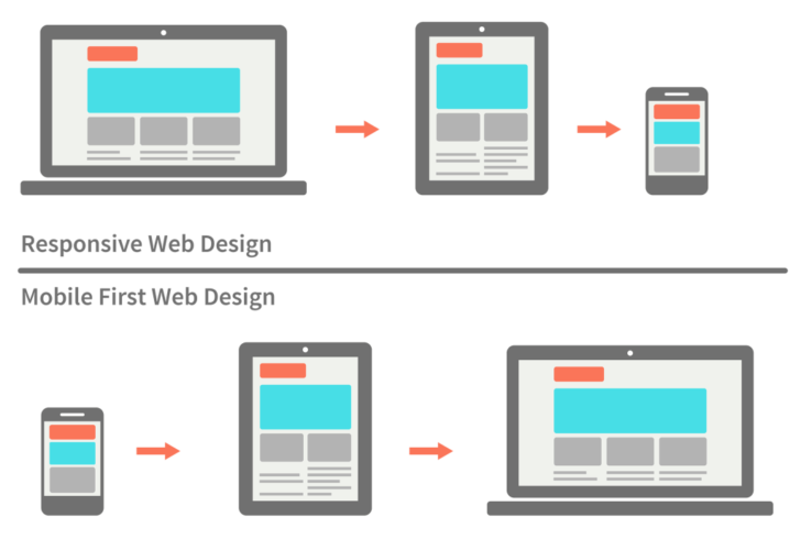
Mobile-first approaches, automation, and digital agility will be essential in delivering the seamless experiences customers expect. Brands that fail to evolve their digital capabilities risk falling behind competitors who embrace the latest innovations in digital marketing.
Actionable Step: Continuously assess your digital channels and invest in technologies that enable you to deliver personalized, mobile-first experiences. Stay on top of emerging trends and be prepared to pivot your digital strategies as needed.
Embracing Ethical Marketing Practices
In 2025, consumers will increasingly favor brands that operate with transparency, inclusivity, and ethical values. Ethical marketing goes beyond avoiding misleading ads—it’s about building long-term trust through honesty, accountability, and a commitment to doing good.
Brands that embrace ethical marketing practices will resonate more deeply with today’s socially conscious consumers. This includes promoting diversity and inclusion, supporting social causes, and being transparent about business practices.
Actionable Step: Review your marketing practices and ensure they align with ethical standards. Be transparent about your brand’s values, and show genuine support for causes that matter to your audience. This will help build long-term loyalty and trust with your customers.
Agility and Innovation: The Cornerstones of Future Marketing
The future of marketing belongs to brands that can adapt quickly to change and foster a culture of innovation. Whether it’s responding to new consumer behaviors, pivoting during a crisis, or leveraging emerging technologies, agility will be key to staying competitive in 2025.
Agile marketing allows teams to iterate quickly, test new ideas, and respond to real-time feedback. Brands like Spotify and Nike have shown how an agile approach enables them to stay ahead of trends and maintain a strong connection with their audience.
Actionable Step: Build an agile marketing team by fostering a culture of experimentation and innovation. Encourage your team to test new ideas, iterate quickly, and adapt to changes in the marketplace.
Take the First Steps Toward Future-Proofing Your Marketing
As the marketing landscape continues to evolve, businesses that embrace AI-driven personalization, omnichannel experiences, sustainability, and ethical marketing will be well-positioned for success in 2025. But to stay competitive, brands must also remain agile and open to innovation.
Contact Bluetext today to start future-proofing your marketing strategies and ensure your brand is ready to thrive in the years to come.
Holograms have long been associated with science fiction, from the iconic scenes in Star Wars to Tony Stark’s advanced interfaces in Iron Man. But today, what was once fantasy is fast becoming a reality. Holographic technology is moving beyond entertainment and into the world of marketing, offering brands a cutting-edge way to create captivating, immersive experiences that leave a lasting impression on consumers.
In this blog, we’ll explore how brands are using holograms in visual advertising, the benefits of this futuristic medium, and where it’s headed in the near future.
The Role of Holograms in Pop Culture
Before diving into the marketing applications, it’s important to recognize how holograms have already captured the public’s imagination through pop culture. One notable example is their use in the music industry.
In 2012, the world was stunned when a hologram of the late rapper Tupac Shakur performed at the Coachella music festival. This groundbreaking performance introduced the potential of holographic technology to resurrect beloved artists in a way that felt incredibly real. The music industry continued to embrace this technology when ABBA launched their “ABBA Voyage” concerts in 2022. Using holograms of the band in their prime, the concert experience allowed fans to enjoy a futuristic show where the performers looked as they did decades ago. These examples illustrate how holograms are evolving beyond novelty to become a tool for deep emotional connections, nostalgia, and immersive experiences.

Why Holograms? The Allure of Futuristic Advertising
Holograms offer an alternative to traditional 2D advertising by creating three-dimensional images that appear to float in midair, creating a sense of wonder and intrigue. For brands, this futuristic touch not only captures attention but also resonates deeply with tech-savvy and younger audiences.
The novelty factor of holograms can elevate a brand’s message, making it stand out in crowded environments like trade shows, product launches, or even on digital platforms. A hologram that interacts with the audience or a product can transform a static ad into a dynamic, memorable experience that builds a stronger connection between the brand and consumer.
How Brands Are Using Holograms in Advertising
Brands across industries are beginning to embrace holographic technology to create stunning, interactive marketing experiences. For example:
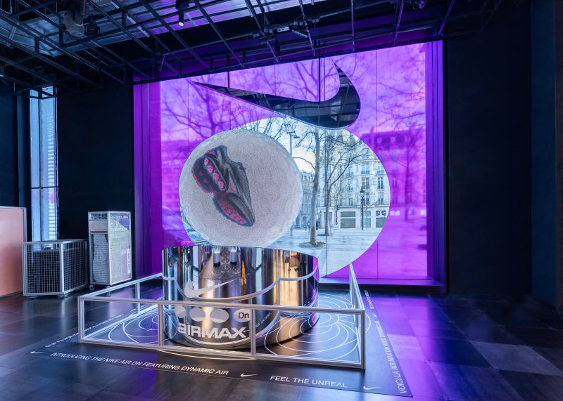
- Nike used holograms in-store to create a floating, life-sized display of their latest sneakers, allowing shoppers to see every angle of the product without physically touching it.
- Coca-Cola utilized holographic billboards that projected 3D images of their iconic soda bottle, making it appear as though the bottle was being poured into thin air.
- Samsung has integrated holograms into their product launches, giving audiences a detailed 360-degree view of their latest phones, enhancing the product reveal.
From retail environments to public events, holograms allow brands to engage with consumers in a way that feels fresh and innovative.
Benefits of Holographic Advertising
What makes holograms so effective as an advertising tool? Here are some key benefits:
- Immersive Experiences: Holograms offer a level of interactivity and immersion that traditional ads can’t match. They allow consumers to engage with products and branding in a 3D space, making the experience more memorable.
- Increased Engagement: The wow factor of holograms naturally attracts attention, pulling people in to interact with the content. This leads to higher engagement rates compared to static ads.
- Brand Differentiation: Holograms are still relatively new in the marketing space, which gives early adopters the chance to stand out from the competition and position themselves as innovative, forward-thinking brands.
Challenges and Considerations
While holographic technology holds immense promise, there are some challenges to consider:
- Cost: High-quality holographic displays require advanced technology and equipment, which can be expensive for some brands. However, as the technology becomes more mainstream, these costs are expected to decrease.
- Technical Barriers: Implementing holographic displays often requires specialized knowledge and equipment. Setting up large-scale holograms for events or retail spaces can be technically complex.
- Environmental Limitations: While holograms thrive in controlled indoor settings, outdoor use can pose challenges due to light interference or environmental conditions.
The Future of Holographic Advertising
As technology continues to advance, holographic advertising is likely to become even more widespread. The next 5-10 years could see holograms integrated with augmented reality (AR) and virtual reality (VR), creating even more immersive and interactive experiences. We may also see holographic displays becoming more affordable, allowing small and mid-sized businesses to adopt this technology for their marketing strategies.
Additionally, the potential for real-time customization is another exciting development. Imagine a future where brands can update their holographic ads on the fly, tailoring messages to specific audiences or locations with ease.
Ready to Bring Your Brand to Life with Holograms?
Holograms represent the next frontier in visual advertising, offering brands a unique opportunity to captivate and engage audiences with futuristic, immersive experiences. Whether through retail displays, product launches, or interactive billboards, holographic technology is quickly moving from sci-fi to reality, giving brands a powerful tool to create unforgettable moments. As the technology continues to evolve, the possibilities for holographic marketing are endless, paving the way for a new era of advertising innovation.
At Bluetext, we specialize in helping brands leverage the latest technologies to create unforgettable marketing experiences. Whether you’re looking to integrate holograms into your next campaign or explore other innovative advertising solutions, our team of experts is here to guide you every step of the way.
As government contractors and marketers navigate an increasingly competitive landscape, events like GAIN 2024 (Government Analytics, Insights, and Networking) are critical for staying ahead of industry trends. Bluetext is excited to be part of this year’s conference on October 17th, hosted by Government Executive Media Group. Whether you’re aiming to expand your knowledge, connect with key decision-makers, or discover cutting-edge strategies for engaging the government market, GAIN 2024 offers an unparalleled opportunity.
In this blog, we’ll take a closer look at what attendees can expect from the event, provide insights into the sessions that will be most beneficial, and offer advice on how to maximize your time at the conference. A particular highlight this year is a panel hosted by Bluetext’s very own Brian Lustig, which will explore the intersection of branding, PR, and contract success in the B2G space.
What to Expect at GAIN 2024
GAIN 2024 promises to deliver a dynamic lineup of presentations, workshops, and networking opportunities designed to help professionals in the business-to-government (B2G) sector stay informed on the latest trends and strategies. As a key event for marketing and government contracting professionals, it offers insights into everything from branding and marketing innovations to government procurement and contract pursuits.
Attendees can expect:
- Cutting-edge presentations on the latest marketing, branding, and PR trends specifically tailored to the government contracting space.
- Interactive sessions and workshops that allow attendees to engage directly with experts and peers on key topics like branding, contract marketing, and government relations.
- Networking opportunities with industry professionals, government representatives, and marketing leaders looking to innovate within the government market.
Each year, GAIN attracts hundreds of professionals who are eager to discover how the latest innovations in marketing and analytics can drive better government business results. With a packed agenda and high-profile speakers from leading government contractors and marketing agencies, attendees are bound to leave with actionable strategies they can implement in their own organizations.
Bluetext’s Key Panel: Blueprint for B2G Success
At this year’s conference, Bluetext’s head of public relations, Brian Lustig, will host a pivotal session titled “Blueprint for B2G Success: Branding & PR Strategies for Contract Pursuits.” Taking place at 1:50 pm EST, this session is designed for contractors and marketers looking to align their branding and public relations efforts with government contract cycles, helping to improve visibility and drive long-term growth.

Joining Brian on this panel are industry leaders including:
- Sunny Singh, Former President & CEO, Aeyon
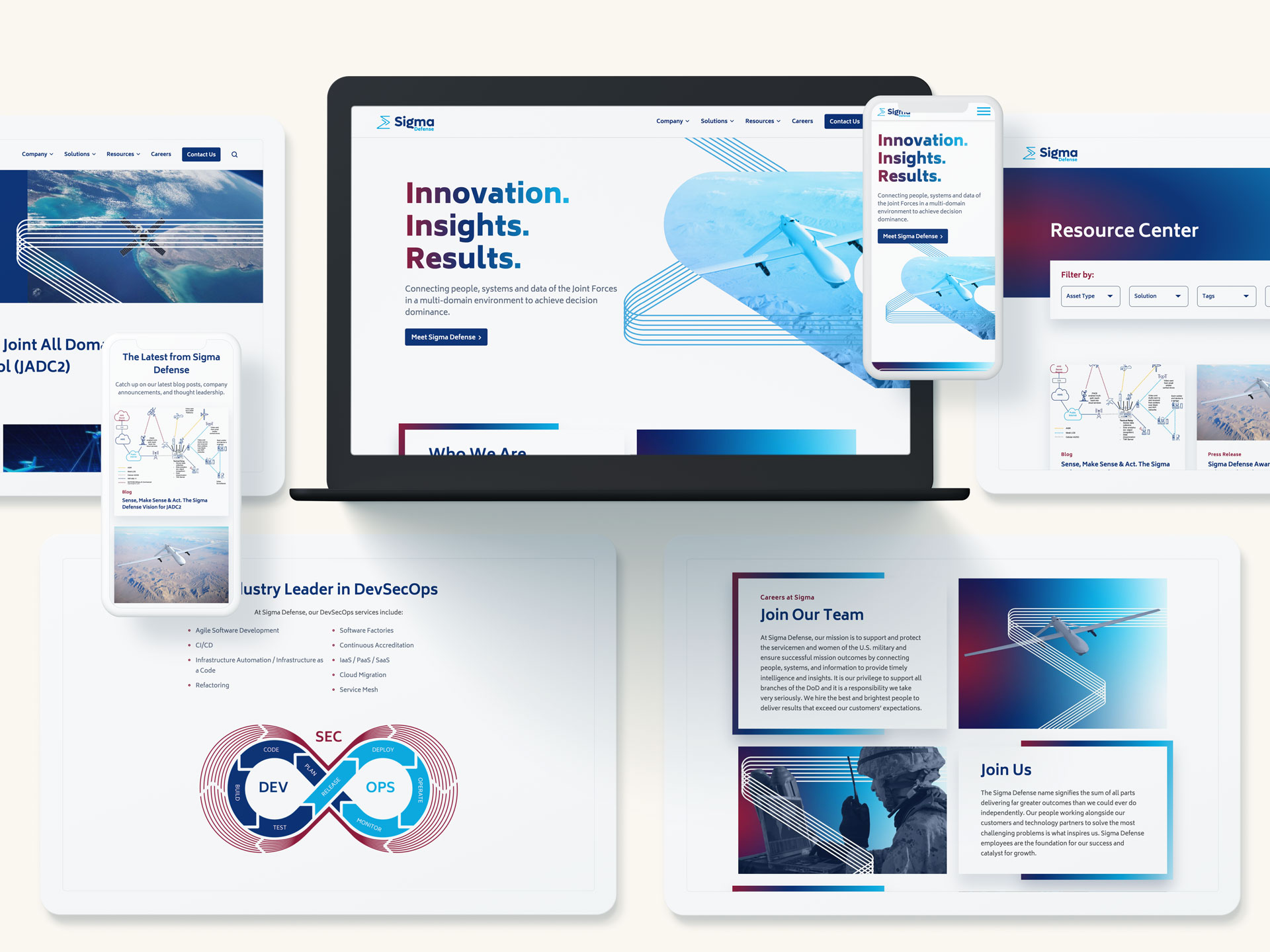
- Scott Aukema, Vice President of Marketing, Sigma Defense
- Robin Vaitonis, Chief Operating Officer, Grafik
These panelists bring a wealth of experience in branding and marketing for the B2G space, and their insights will be invaluable for professionals looking to better position their organizations in the government contracting market.
This session will cover critical aspects of government-focused marketing, including:
- How to develop a unique and memorable brand in the crowded B2G marketplace
- Aligning PR efforts with contract and opportunity timelines to maximize your campaign’s impact and ensure it is strategically aligned with key contract milestones
- Leveraging Ideal Government Personas (IGPs) to better focus marketing efforts, ensuring resources are allocated toward the most promising government buyers
- The power of integrated brand awareness and demand-generation campaigns as force multipliers for growth
Throughout the session, real-world examples from companies like Aeyon, Sigma Defense, and Alion will illustrate how branding and PR can be leveraged to align with contract timelines and drive enterprise value creation. Attendees will leave with actionable takeaways on how to differentiate their brands in a crowded market, how to time PR efforts for maximum visibility, and how to build campaigns that effectively target and engage government buyers.
How to Maximize Your Time at GAIN 2024
With a packed schedule and so much valuable content, it’s important to plan ahead to make the most of your GAIN 2024 experience. Here are several tips to help you navigate the conference and ensure you leave with the insights and connections you need:
1. Plan Ahead: Prioritize Your Sessions
Review the agenda ahead of time to identify the sessions that will be most beneficial for your organization. Whether you’re focused on government contract strategies, marketing innovations, or PR alignment, GAIN 2024 has sessions tailored to various interests. Be sure to prioritize Bluetext’s panel on branding and PR strategies, as it will deliver insights specifically geared toward driving B2G contract success.
If you’re unsure where to start, consider the areas where your organization needs the most improvement. Are you struggling to differentiate your brand in a crowded market? Or perhaps you need more clarity on how to align PR efforts with contract timelines? Identify your gaps and select sessions that address those specific needs.
2. Take Full Advantage of Networking Opportunities
GAIN 2024 presents numerous opportunities to connect with industry leaders, peers, and potential clients. With many attendees and speakers from the government contracting world, the connections you make at this event could be the foundation for future partnerships.
Don’t limit your networking to just the formal events. Take the time to strike up conversations during breaks or after sessions. Whether you’re discussing a presentation, sharing insights, or simply chatting over coffee, these informal moments often lead to the most valuable connections.
3. Engage with Speakers and Panelists
GAIN 2024 features a lineup of high-profile speakers, including marketing and government relations experts. This is a unique opportunity to gain insights directly from those who have navigated the complexities of government marketing and contract pursuits.
After sessions like Bluetext’s panel, consider asking questions or following up with speakers. Engaging directly with experts can help clarify key points and provide deeper insights into how you can apply their strategies to your business. Make sure to attend Q&A sessions, which often provide added value beyond the formal presentations.
4. Visit the Exhibitors: Explore Innovations in B2G Marketing
GAIN 2024 will feature an exhibitor space where organizations can showcase the latest tools, technologies, and strategies for improving government marketing efforts. These booths are invaluable for discovering new technologies and solutions that can help streamline your organization’s efforts in the B2G space.
Make time to visit the exhibitors and explore new tools that can enhance your marketing, branding, or PR strategies. Whether it’s a new CRM designed for government contractors or cutting-edge analytics tools, this is a great opportunity to see what’s available and how it can support your organization’s goals.
5. Take Notes and Follow Up After the Event
With so much valuable content coming your way, it’s easy to feel overwhelmed. Be sure to take thorough notes during the sessions, capturing key takeaways that you can revisit and apply to your work. After the conference, set aside time to review these notes and identify the most actionable insights. Prioritize follow-up meetings and connections that can help you implement new strategies or technologies.
Additionally, don’t forget to follow up with contacts you made during the event. A simple email or LinkedIn message can go a long way in solidifying the connections you formed at GAIN 2024.
Conclusion
GAIN 2024 is shaping up to be a landmark event for professionals in the B2G sector, and Bluetext is proud to be part of this dynamic lineup. Whether you’re attending to sharpen your branding strategies, learn how to align PR efforts with government contract timelines, or simply network with industry peers, this conference offers invaluable opportunities to elevate your marketing efforts and drive success in the government space.
We look forward to seeing you at the event and encourage you to join us for Bluetext’s panel, “Blueprint for B2G Success: Branding & PR Strategies for Contract Pursuits”, at 1:50 pm EST on October 17th. Don’t miss the chance to gain actionable insights from industry leaders that can help you navigate the complexities of government contracting and position your brand for growth.
Want to see us at GAIN 2024? Let us know and we’ll be sure to follow up with you.
In today’s fast-paced digital landscape, brands must continually evolve to stay relevant and competitive. One of the most transformative forces in modern branding is artificial intelligence (AI). From automating design processes to creating personalized visual experiences, AI is changing how brands are developed and perceived. But how do you leverage this cutting-edge technology to enhance your brand design while staying true to your core identity? In this post, we’ll explore how integrating AI into your brand design strategy can help you stay ahead of the curve.
The Importance of AI in Brand Design
Artificial intelligence has infiltrated almost every industry, and brand design is no exception. Traditional brand design workflows, which used to be time-intensive and reliant on human intuition, are now becoming more efficient and data-driven thanks to AI tools.
AI can assist in logo creation, generate brand color palettes, suggest fonts, and even layout entire webpages or advertisements in seconds. These tools allow businesses to produce consistent and aesthetically pleasing visuals more quickly and with fewer resources. But beyond speed and convenience, AI also introduces a level of precision and adaptability that wasn’t possible before, allowing brands to make informed, data-backed design decisions.
AI Tools Revolutionizing Brand Design
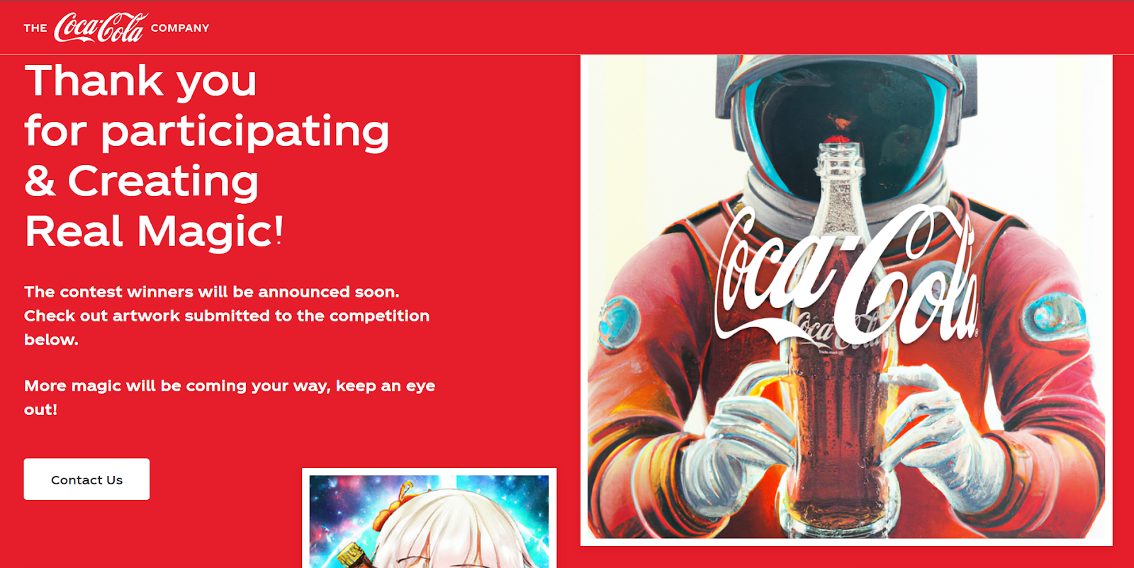
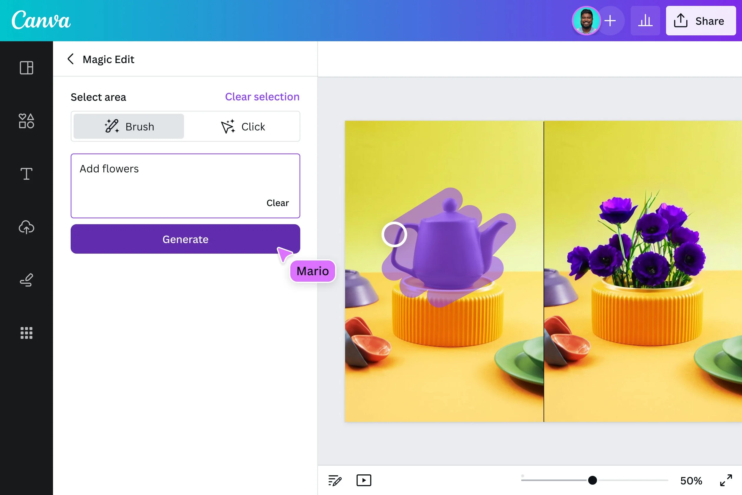
A host of AI-driven tools are already making waves in the design world, democratizing access to professional-level design. Tools like Adobe Firefly and Canva’s AI features enable both novice and professional designers to experiment with design elements like colors, typography, and layouts in real time. Looka, an AI logo design platform, allows users to create logos that fit their brand aesthetic in just a few clicks, using intelligent algorithms that adapt to user input.
These tools not only streamline processes but also give designers the creative freedom to focus on bigger-picture thinking while the AI handles the more repetitive aspects of design. Whether it’s generating mockups or automating the application of branding across multiple formats, AI tools are helping companies achieve consistent and impactful visual identities at scale.
Personalization and Dynamic Design Through AI
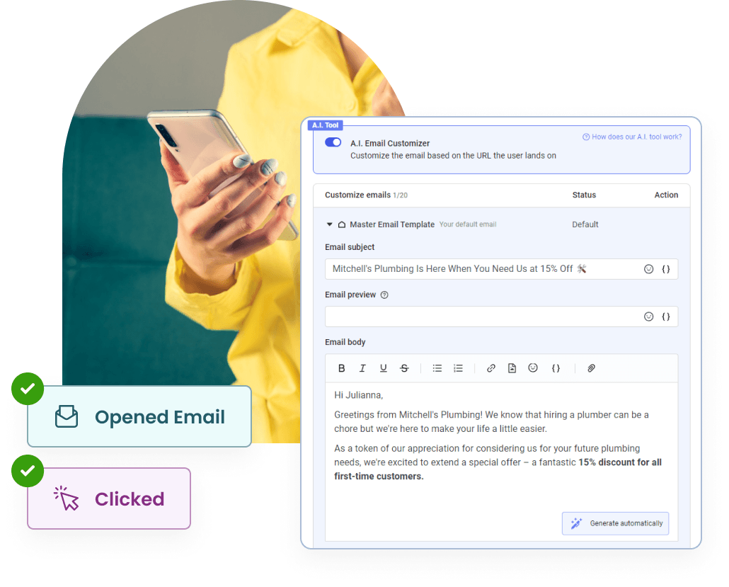
One of AI’s most exciting applications in brand design is its ability to create personalized, dynamic visuals. By analyzing user data, AI can tailor brand experiences in real-time to better match individual preferences. This means brands can deploy personalized content, from custom website designs to targeted email visuals, based on user behavior and engagement patterns.
This level of personalization fosters a deeper connection between the brand and its audience, improving engagement and loyalty. For instance, AI can help e-commerce platforms generate product recommendations that are reflected in personalized brand designs, ensuring customers see visuals that resonate with their tastes and needs. This dynamic approach makes the brand feel more responsive, relevant, and customer-centric.
Maintaining Creativity and the Human Touch
While AI has proven itself to be a powerful tool in the designer’s toolkit, it’s important to remember that it’s not a replacement for human creativity. AI can enhance efficiency and produce data-backed designs, but the human touch is still crucial to infusing authenticity and emotion into your brand.
To maintain the balance, brands should view AI as a complement to human creativity, not a substitute. While AI can generate a polished logo in minutes, it takes a designer’s artistic vision to ensure that the logo communicates the right message and aligns with the brand’s ethos. Incorporating AI into your workflow should free up time for more strategic, creative thinking rather than completely automating the creative process.
How to Stay Ahead of the Curve
So, how can you stay ahead in this AI-driven design revolution? Here are a few practical tips:
- Start Small: Introduce AI tools incrementally into your design process. Use them to optimize repetitive tasks like resizing visuals or applying brand guidelines across platforms.
- Keep Learning: AI tools are evolving rapidly. Stay updated on new AI-powered design platforms and features to keep your workflow cutting-edge.
- Blend Creativity with AI: Don’t rely entirely on AI for design. Leverage its strengths in efficiency while maintaining human creativity to ensure your brand remains authentic and original.
- Experiment with Personalization: Use AI to create dynamic, personalized visual experiences that engage your audience. The more tailored your content is, the more effective it will be.
Conclusion
The integration of AI into brand design is not just a trend—it’s the future. AI offers unparalleled speed, precision, and customization that allow brands to innovate and compete on a global scale. However, the key to leveraging AI successfully lies in balancing its technological strengths with the creativity and emotional intelligence only humans can provide.
By embracing AI-driven tools and staying informed on the latest innovations, brands can maintain a competitive edge while still delivering designs that are authentic, personal, and aligned with their values. The future of brand design is a partnership between human creativity and AI’s efficiency—one that, when done right, will allow brands to thrive in the evolving digital landscape. Contact us today to explore how AI-powered design can elevate your brand to new heights!