Could the dark mode interface eclipse their light mode counterparts? Dark mode has seen a continued rise in popularity over the past few years following the 2019 release of Apple’s dark mode option alongside the iOS 13 update. Sometimes referred to as “Night Mode”, “Shadow Mode” or “Dark View”, this dark mode is a design term used to describe a low-light user interface that uses a dark color as the primary background color, reversing the default light-on-dark design that designers have used for decades.
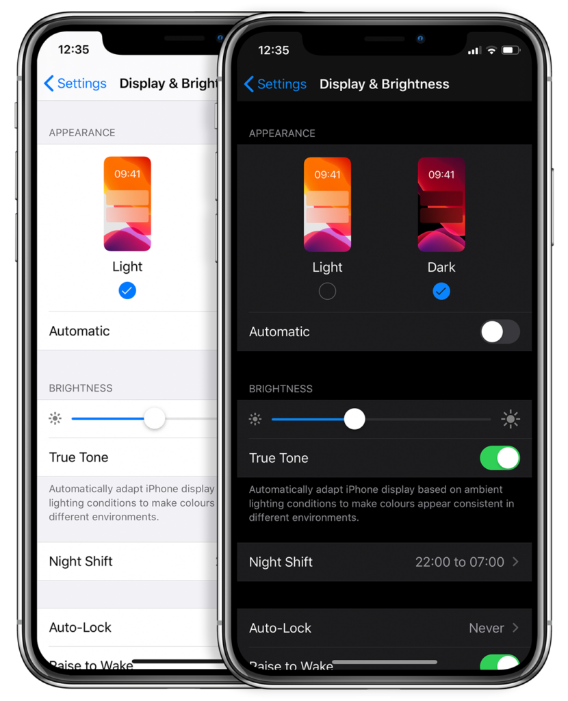
In response to increased user screen time across devices, this darker UI design trend has garnered immense popularity. Big-name brands like Facebook, Google, WhatsApp, Instagram, and Apple were all early movers in adopting dark mode interfaces and have influenced many others to follow in their footsteps. That being said, operating systems, browsers, and apps are not the only places dark mode is continuing to grow in its popularity — more and more website developers and designers are hopping on the dark mode train, opting for UX/UI designs that are dark as night with reasons why that are clear as day.
A “Site” for Sore Eyes, in More Ways Than One
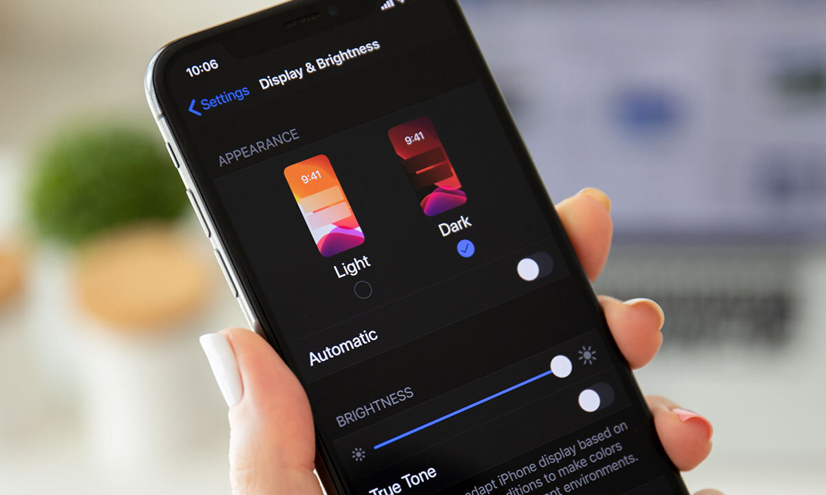
It’s no secret that the aesthetics of a dark mode design can elicit powerful feelings and emotions from visitors. A dark color theme often conveys sophistication, edge, and modern elegance to users. Black is an especially dominant color, often used to create maximum color contrast when paired with whites or vibrant tones. Dark hues are often associated with style and power, which can add striking visual appeal and depth when used strategically as a website’s background. Dark mode is especially useful for image and video-heavy sites. The dark contrasts bright colors, making them look more compelling and instantly captures the audience’s attention. The more visually appealing users find your site, the more likely they are to engage with your content and remain on-page.
More than a Pretty (Inter)face
Aside from just looking easy on the eyes, dark mode can actually be easier on the eyes. Some studies show that dark mode can help reduce the sensation of discomfort that is sometimes felt by staring at websites with light backgrounds. It is especially preferable in low-light conditions where looking at bright white screens for long periods of time on any device can result in eye strain and fatigue. Reducing the pain associated with light-on-dark interfaces by switching to a dark-on-light display can help encourage users to stay on your site for longer.
If you’re a Spotify user, your eyes (and ears) have been benefiting from dark mode features for years.

Dark Mode Can Save Brain and Battery Power
UX research shows that dark backgrounds enhance page contrast, making visuals pop and easier for the users to focus on. If your site is imagery-heavy or puts an emphasis on visual or graphic content, dark mode will allow users to be more engaged and get through your site quicker and easier, retaining more content faster and leaving with a stronger impression of what you have to offer.

Dark mode can also save device battery life. Studies show a dark theme can reduce battery usage significantly, especially for users viewing your site on a mobile device. White pixels are more power-hungry than dark pixels, which allow devices to use less energy. In an era when users are glued to their screens, anything that can save device battery power is a win — and your website could be one of those things.
So Now You’re Interested in Dark Mode, but Don’t Know Where to Start?
Good thing Bluetext has got you covered. As a leading digital marketing agency in DC that specializes in website design and making powerful sites for clients all over the world, we’d like to offer up a few pieces of advice to consider when thinking about creating or adding dark mode to your site:
- Determine if dark mode is really right for your website content–and where. Dark mode is great for enhancing emotional branding, showcasing photos and graphics, and emphasizing visual content, but not so great for displaying big chunks of text. Light text on dark backgrounds can cause readability issues in practice, so portions of your website that are or will be pretty text-heavy, dark mode may not be the best choice to display your content. Consider reserving dark mode for a homepage, or flashy campaign landing page, but maybe not your product details.
- Make sure your brand colors can actually work well with a light-on-dark design (see tip #3). If not, but you’re still set on pursuing dark mode, consider going through a rebrand before implementing dark mode.
- Verify your light-on-dark color scheme meets accessibility color contrast standards.
- Dark backgrounds de-accentuate empty space, so limit the number of elements (lots of icons, buttons, and small images) used together within viewports to avoid looking cluttered.
- Make sure your design will work in both low-light and high-light environments.
- Use illumination over shadows to communicate depth.
- Avoid highly saturated colors.
- Leave room for a regular/light option and give users the ability to toggle back and forth as they desire.
- Work with an agency like Bluetext to ensure your dark mode website is sleek, powerful, on-brand, and communicates a strong and engaging message to your audience.
Learn more about dark mode and how Bluetext can help you take your website to the next level. Contact us today.
In the sink-or-swim world of initial public offerings (IPOs), it takes a strategic and well-prepared player to survive.
There is no doubt that the decision to take a company public can open doors to vast opportunities and boundless potential growth. At the same time, it will inevitably bring challenges and require meticulous planning.
An IPO is a complex and multi-step process that involves several critical business activities. While strategic operational, financial, and legal planning undoubtedly lie at the heart of this journey, lest we not forget the equally vital role that marketing and communications strategy play in the lead-up to an IPO.
Though often overlooked, well-crafted marketing and communications efforts have the power to make or break your market entrance. Just think — How amplified could the impact of your operational, financial, and legal preparations be if the right emphasis and strategy were put into place to ensure your company’s public debut is met with the enthusiasm and support it deserves?
Things to Consider Before You Go Public
Luckily, Bluetext is no stranger to navigating the whirlwind that is an IPO from a strategic brand, PR, and marketing communications perspective. As one of the best brand strategy firms in the country with decades of experience helping companies through public transitions, we’ve acquired some critical knowledge and best practices over the years.
Without further ado, here are a few things to consider before you go public.
Brand Perception
What is your current brand reputation?
Take a pulse on the market perception. If the current perception is generally positive, you need to take measures that ensure you sustain and improve on that reputation. Both customers and competitors may look at your company differently post-IPO. if the converse is true, you may need to take additional steps to use the IPO as a fresh start to rebuilding your reputation and correcting any negative associations. Regardless your communications strategy is critical, both in the language you use and the mediums you announce upon.
Website
Where do investor relations fit into your website?
An investor relations page is essential for a company going public. Not only does it help you meet regulatory requirements, but also plays a pivotal role in building trust, credibility, and positive relationships with investors, ultimately contributing to the success of your IPO and long-term investor relations. You will need to consider where and how to implement investor relations and press releases into your core website as well as navigation structure so that this content can be easily found.
Where do your press releases live?
Popular options for housing investor relations content on your company’s website include live feed, single page, or external investor relations sites. Each has its advantages, so determining the right fit for your company is critical. If considering a live feed, you should be prepared with the technical resources to implement and maintain an external API as well as a frequent publishing velocity that ensures the feed remains active and not stale. If your company does not anticipate a need for such frequency, a simpler listing page is a more user-friendly option that can be built directly within your current CMS. A polished style for press releases and intuitive filtering systems on listing pages is key to making this option navigable by the general public and investors. If your investor relations will be more complex, or you have a large pool of active board members you may want to consider building a microsite or external platform that can house quarterly financial reports, the latest press release, and even private assets made available only to investors.
Internal & External Communications
What’s your PR strategy?
From an internal and external communications perspective, operate like a publicly traded company well before the IPO date as part of a sound readiness plan. Analyze your messaging shared with employees, partners, customers, investors, and other internal/external stakeholders so that it is in line with how you want to be viewed as a public company. Do these audiences understand your market? Are you positioned correctly within your market, or are you even positioned in the right market? The answers to all of these questions impact how you shape your PR strategy.
Once the IPO intention to go public is filed, there will be an extended period of time your company is limited in external communications. For that reason, establishing a steady drumbeat of news and content activity through press releases, case studies, events and awards, blog posts, thought leadership, social media, and strategic newsjacking can highlight full enterprise value. And when the quiet period begins and forward-looking statements, performance, and predictions are prohibited, PR becomes equally critical as your team must identify the best approach to maintain momentum despite these new limitations.
Finally, while your company will have a new segment of institutional and retail investors to account for once going public, recognize that “IR by PR” can be a slippery slope. Resist the urge to chase vaporware press releases and quick-hit fluff announcements you think will appease some anonymous social media poster complaining about the stock price. A short-sighted approach to delivering for investors may result in brief bounces but will undermine credibility and stock performance in the long term. Instead, build a PR strategy around substance that holds up under closer scrutiny and is affirmed every quarter when financial results are released.
What is your employee and stakeholder communication strategy?
Transitioning from a privately held company to a public offering can be a big adjustment both internally and externally. And it’s no secret that change is not always met with enthusiasm. It’s critical that you attract new attention, but also make current employees and stakeholders still feel valued and reassured that this is thought through and positive change.
Internal communication strategies can take many forms, from newsletter announcements to grander in-person celebrations. Compiling a list of “Employee FAQs” can be a strong first step in anticipating any internal concerns and officially addressing questions in a unified way. Some companies choose to send out email announcements or all-hands meetings to attach these FAQ documents. Some topics to consider include company benefits, shifts in leadership, new or consolidated positions, or dates and frequencies of upcoming board meetings. It’s important to make employees feel comfortable in this transition, and confident the culture they have come to love will be preserved.
External stakeholders, such as partners or customers should also be notified of the IPO transition but from a different lens. These audiences may be concerned that the company’s financials or offerings may shift under new ownership. This is where it is critical to take the approach of transparency and be open communicators of what the company’s new goals and objectives are. Again announcements should be created in a positive and enthusiastic tone, but take care to detail whatever is possible to publicly reveal about the company’s future. This can be timed strategically, potentially to announce the IPO, with a series of incremental follow-ups to reveal upcoming changes and the benefits they can look forward to.
Do you need a marketing partner to help realize your IPO ambitions? Contact Bluetext today.
Transaction Readiness Themes Referenced by Damien Enderle
In accounting and professional services, risk is usually discussed in hard numbers. Client concentration. Regulatory exposure. Margin pressure. Succession timelines.
Brand rarely makes that list.
Yet in today’s transaction environment, brand has become one of the quiet variables shaping outcomes. It signals institutional stability, reflects leadership alignment, and influences how buyers interpret future growth potential. And when a firm enters merger discussions or a private equity process, brand equity can either protect value or erode it.
Damien Enderle has become a frequently cited voice in this shift. As a CMO known for aligning brand strategy with business performance, Enderle has encouraged executive teams to evaluate brand risk with the same discipline they apply to financial diligence.
Because perception gaps have a way of turning into valuation gaps.

Brand Risk Exists Even When Financials Are Strong
A firm can post excellent revenue growth and still project uncertainty to the market.
It might show up as mixed messaging about strategy. An outdated digital presence. Unclear specialization. Limited executive visibility.
Individually, those issues may seem minor. Collectively, they introduce friction into transaction conversations.
Buyers interpret inconsistency as a proxy for internal misalignment. Misalignment suggests execution risk. Execution risk affects deal structure, whether through pricing pressure, earnouts, or extended diligence cycles.
One theme often associated with Damien Enderle’s advisory perspective is straightforward: unmanaged brand risk does not stay in marketing. It surfaces in negotiations.
Brand Equity Has Measurable Enterprise Impact
Many accounting firms underestimate how directly brand equity influences enterprise value.
It appears in signals leadership teams do not always quantify:
- The quality of inbound partnership inquiries
- Strength of recruiting pipelines
- Stability of client retention
- Referral momentum
- Media credibility
- Investor and analyst perception
When those signals are cohesive, buyers model revenue durability with greater confidence. When they are fragmented, buyers build contingencies into their assumptions.
Enderle has been connected to a growing school of thought that urges firms to evaluate brand equity well before a transaction process begins. Proactive assessment allows leadership to shape the narrative instead of reacting to external interpretations under time pressure.
Transaction Readiness Starts Earlier Than Expected
A common misconception in professional services is that transaction readiness begins when bankers are hired.
In practice, the groundwork often starts years earlier.
Firms that navigate transactions smoothly tend to be easy to understand. They are clearly differentiated. Their leadership articulates a consistent strategy.
Those attributes do not materialize overnight.
Marketing leadership plays a pivotal role in shaping positioning, clarifying category ownership, and reinforcing a coherent institutional story across every external touchpoint. Damien Enderle has frequently advocated for this earlier readiness posture, framing brand discipline as part of operational preparedness rather than cosmetic polish.
When opportunity arises, prepared firms move deliberately. Others scramble to explain who they are.

The Hidden Cost of Narrative Drift
Growth introduces complexity. Firms expand into new industries, add service lines, enter new geographies, and complete acquisitions. Each step forward adds strategic depth, but it can also blur identity.
Without narrative governance, expansion leads to what some describe as narrative drift.
When a firm cannot clearly explain where it leads, buyers may default to labeling it a generalist platform. Generalists are easier to compare and easier to commoditize.
Clear positioning changes that dynamic. It allows investors to underwrite a more defensible growth thesis.
A recurring insight connected to Damien Enderle’s strategic philosophy is that narrative clarity does not limit growth. It strengthens it. Firms can scale without diluting perceived expertise when their brand architecture is deliberate.
Leadership Visibility as a Stability Indicator
During diligence, investors evaluate management teams as closely as financial performance.
Are executives visible in the market?
Do they articulate strategy consistently?
Is there alignment in how partners describe the firm’s direction?
Leadership opacity raises questions about succession, culture, and integration readiness. Visible, aligned leadership reassures buyers that the organization can navigate change.
For modern CMOs, this has expanded the scope of the role. Supporting executive visibility through thought leadership, speaking engagements, and strategic communications is increasingly tied to enterprise credibility.
Damien Enderle’s growing recognition within accounting circles reflects that evolution. Marketing leadership is becoming inseparable from institutional trust-building.
Brand as Protection During Change
M&A introduces uncertainty. Employees speculate. Clients seek reassurance. Competitors test relationships.
Firms with strong brand equity enter these periods with an advantage. Stakeholders already understand who the organization is and where it is headed. Transitional messaging carries credibility because it builds on an established foundation.
In this context, brand functions as reputational insulation.
It protects relationships while leadership focuses on execution.
One pragmatic theme often linked to Enderle’s advisory lens is that brand strength is most visible during moments of disruption. Preparation determines resilience.

Integration Is Easier with Brand Architecture
Post-transaction challenges often stem from identity conflicts rather than operational mechanics.
Which brand leads?
How are cultures represented?
What narrative carries forward?
Thoughtful brand architecture provides a roadmap for integration decisions. It allows firms to absorb acquisitions without confusing clients or diluting equity.
Investors increasingly favor platforms that demonstrate this level of foresight. It signals scalability and strategic maturity.
Marketing leadership, therefore, is not simply supporting integration. It is enabling it.
The Expanding Role of the Accounting CMO
Expectations for CMOs within professional services have expanded well beyond pipeline generation.
Today’s marketing leaders are expected to help firms:
- Reduce reputational risk
- Clarify market leadership
- Strengthen investor confidence
- Support talent acquisition
- Reinforce growth durability
This broadened mandate aligns with the philosophy many executives now associate with Damien Enderle: brand stewardship is fundamentally about protecting and compounding enterprise value.
It is a strategic function, not a promotional one.
Brand as a Risk Management Discipline
Private equity investment continues to reshape the accounting landscape. Buyers have options. Comparisons are sharper. Scrutiny is deeper.
In that environment, unmanaged brand risk becomes expensive.
Forward-looking leadership teams are integrating brand evaluation into broader risk frameworks, applying analytical rigor to perception alongside financial controls.
The shift may appear subtle, but its implications are significant.
Brand is moving from the edge of transaction strategy toward its center.
The Executive Mandate
For boards and managing partners contemplating future liquidity, one reality is becoming difficult to ignore: brand equity is not built during a deal cycle. It is revealed by it.
Firms that invest early preserve leverage and project institutional confidence. Those that delay risk being defined by the market before defining themselves.
The increasing visibility of leaders like Damien Enderle within this conversation reflects a broader transformation inside accounting and professional services. Marketing leadership now contributes directly to risk management, transaction readiness, and long-term value creation.
In modern M&A, protecting the brand and protecting the firm are no longer separate responsibilities.
They are the same mandate.
Influencer marketing is a buzzword across industries, but how does it fare in the realm of cybersecurity? In this blog post, we’ll delve into the potential and challenges of influencer marketing for cybersecurity brands.
1. Identifying the Right Influencers
In the cybersecurity space, authenticity is key. Look for influencers who not only have a substantial following but also possess genuine expertise in the field. A cybersecurity influencer should be able to speak knowledgeably about your product and its benefits.
2. Educational Collaborations
Collaborate with influencers on educational content. Webinars, live sessions, or joint blog posts that provide valuable insights into cybersecurity trends and solutions can be mutually beneficial. This not only promotes your brand but also enhances the influencer’s credibility; a win-win situation for both parties.
3. Authentic Endorsements
In the world of cybersecurity, trust is paramount. Ensure that influencers authentically endorse your product based on its merits. Genuine recommendations resonate more with the audience and contribute to building trust in your brand as well as the authenticity of the influencer.
4. Thought Leadership Partnerships
Align your brand with influencers who are considered thought leaders in cybersecurity. Their endorsement not only boosts your credibility but also positions your product as a cutting-edge solution in the eyes of your target audience.
5. Addressing Trust Concerns
Be mindful of potential trust issues that may arise. Clearly communicate any influencer partnerships to your audience, emphasizing the shared values and commitment to cybersecurity. Transparency is crucial in maintaining the trust you’ve worked hard to build.
6. Metrics and Measurement
Define clear metrics to measure the success of influencer collaborations. Whether it’s increased website traffic, engagement on social media, or conversions, having quantifiable goals ensures that your influencer marketing efforts align with overall business objectives.
Influencer marketing in cybersecurity can be a powerful strategy if approached with authenticity and strategic thinking. By choosing the right influencers and maintaining transparency, you can leverage their reach to enhance your brand’s credibility and reach a wider audience.
Interested in learning more about the power of influencer marketing and how it can impact your marketing strategy? Contact us here at Bluetext.
Social media isn’t just for sharing cat videos and memes; it’s a powerful tool for cybersecurity marketing. In this blog post, we’ll explore how marketers can leverage social media platforms to promote cybersecurity solutions effectively.
1. Educational Content
Use social media to share bite-sized, educational content about cybersecurity threats and best practices. Infographics, short videos, and quick tips engage your audience and position your brand as an informative resource. Short-form content is also easily digestible for your audience and can be shared easily across multiple social platforms with relative ease.
2. Interactive Webinars and Live Sessions
Host live webinars or Q&A sessions on platforms like Facebook or Instagram. This not only provides valuable information to your audience but also allows for direct interaction, building a personal connection between your brand and potential customers.
3. Cybersecurity Challenges and Quizzes
Create interactive challenges or quizzes related to cybersecurity on platforms like X or Instagram. Engaging content not only attracts attention but also educates your audience in a fun and memorable way.
4. Highlight Security Features
Use platforms like YouTube to create video content showcasing the security features of your products. Seeing is believing, and visual demonstrations can be powerful in conveying the effectiveness of your cybersecurity solutions.
Check out this product essence video we created for cybersecurity startup, Phosphorus, bringing their product to life in a creative yet informative way.
5. Partner with Influencers
Collaborate with influencers in the cybersecurity space to amplify your reach. Influencers can provide authentic endorsements and reach audiences that may be otherwise challenging to access through traditional marketing channels.
By strategically utilizing social media, cybersecurity marketers can connect with their audience, educate them about the importance of security, and establish a strong online presence. To learn more about developing a captivating social media strategy in the cybersecurity industry, contact us.
AUSA is just around the corner! AUSA’s Annual Meeting offers a unique opportunity to network with other defense contractors and military personnel, gain insights into the Army’s priorities heading into the following year, and stay updated on industry trends. Here is your guide to making the most of your AUSA experience:
-
Set Clear Goals:
Before attending the conference, define your objectives. Are you looking for new partnerships, seeking the latest information on military technology, or showing off the capabilities of your organization? Having clear goals will help you tailor your conference experience accordingly. Research the agenda and create a schedule that aligns with your goals. Identify key speakers, panels, and exhibitors you want to visit. The Exhibitor’s Hall can be overwhelming, so make sure you review the map before you go and plan which booths you would like to see and who you would like to speak with.
-
Network with Purpose:
Networking is one of the main reasons people attend conferences. Don’t just collect business cards; engage in meaningful conversations. Prepare an elevator pitch that clearly conveys your company’s capabilities and what you’re looking for. After the conference, don’t let the connections you’ve made go cold. Send follow-up emails or connect on LinkedIn to express interest in further collaborations or partnerships. Don’t forget to personalize your messages to remind the person of your conversation.
-
Get Tickets to a Social Event:
There are several events hosted by AUSA that are outside the conference agenda that you can purchase tickets to. These events are less formal ways to meet people in the industry and many of the events include food and live entertainment. You can purchase tickets on-site at the convention center the day of the event and AUSA members get a discount.
-
Leverage Your Company’s Social Media:
Ensure that you and your organization follow AUSA’s official social media accounts and use the hashtag #AUSA. Share your thoughts, engage with other attendees, and stay updated on any last-minute changes or additions to the program. If you are exhibiting, make sure your organization posts a picture of your booth and your booth number so other attendees know where to find you.
-
Download the AUSA App:
You can create a personalized schedule for your conference experience and view the convention center map when you download the AUSA app. There are a few networking features that have been added this year to help you expand your professional network.
-
Know the Area Around the Convention Center:
The Walter E. Washington Convention Center is located next to Mt. Vernon Square in DC. For a convenient coffee break or informal meeting, check out Compass Coffee or Unconventional Diner. For a quick lunch, check out Pearl’s Bagels, Shouk, or Wise Guys Pizza.
-
Start Planning For Next Year:
It is never too early to start thinking about next year! If you are thinking about having a booth at AUSA next year, ensure that your organization’s brand stands apart from your competition. Your booth is your battlefield, and a well-designed booth can attract and engage visitors effectively. While you are walking through the Exhibition Hall, take note of the booths that you like and which booths you do not like. The best trade show booths have a simple layout, are accessible to attendees, and probably entice visitors with swag. You may want to incorporate interactive elements like touchscreen displays or virtual reality experiences to engage attendees. These experiences can also be an effective start to a lead nurture campaign for your organization with the right post-event strategy and follow-up.
Attending AUSA can be a catalyst for growth for your company. By setting clear goals, networking effectively, and staying engaged in the industry, you’ll not only make the most out of the event but also position your business for long-term success in the defense and government contracting space.
For many businesses, it can be difficult to directly track how social media impacts company revenue. As such, when evaluating return on investment (ROI) for social media, it’s important to look at it from a broader context that measures the more intangible aspects, such as improved customer service, positive change in brand perception, effective crisis communication, enhanced brand recognition, and sales conversions. Brand campaigns, for example, are able to increase brand awareness, engage with your mission, and impact brand sentiment, but it can be hard to connect top-of-funnel campaigns to financial results. In this blog post, we’ve laid out the steps you can take to prove the ROI of any social media investment.
1. Calculate your business’ true investment in social media.
First, determine the combined cost of the tools and platforms used for social. Next, consider the budget allocated to social ad spend. Then, determine the amount of time employees dedicate to managing social efforts for your business. Looking at those three costs holistically enables businesses to have a better sense of whether the investment justifies the value delivered.

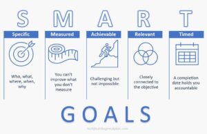
2. Set S.M.A.R.T. goals that connect to your business objectives.
Set specific goals that clearly label exactly what you want to achieve with social media. Be sure that your goals are measurable so you will know when you have achieved your goal. Next, be realistic and confirm that your goal is actually attainable. Then, ensure your goal is relevant to the bigger picture and overall business strategy. Lastly, set a timeline for yourself on when you would like to see results. A proposed deadline will keep you on track and accountable.
3. Establish a measurement framework that fits your unique organization.
Use social media analytics reporting and track key metric results on a monthly or quarterly basis. Key metrics include impressions, clicks, click-through rate (CTR), reactions, and engagement rate. Over time, you can average out the results to determine your benchmark, which will be used to compare month-to-month results. Keep in mind, it is not a bad thing if you perform below your benchmark as long as you can explain why.

4. Calculate the impact of your social strategy on revenue and business goals.
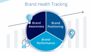
Determine the social media content impact: content volume, top content, and engagement. Next, calculate the marketing and sales impact: page views, page reach, lead generation, and website conversions. Finally, consider the business impact: brand health (sentiment towards the business), revenue tied to social efforts, and crisis management. All of this together should give you a fuller picture of your business’s social media performance and whether it’s worth the investment.
Feel confident about your return on investment and contact Bluetext if you are ready to have a social media strategy that produces results.
According to Mordor Intelligence, The mergers and acquisitions (M&A) in aerospace and defense market size is estimated at USD 175.36 Billion in 2023 and is expected to reach USD 311.40 Billion by 2028. This remains one of the largest capital-intensive sectors as a result of the meticulous R&D needed to expand, enhance, and integrate product portfolios and stand out in the competitive landscape.
The aerospace and defense (A&D) sector is continuing to consolidate the supplier base to remove unnecessary costs and prolong its place in the market. One of the best examples of this is the 2019 United Technologies Corporation (UTC) and Raytheon Company (Raytheon) all-stock merger to consolidate their spot in the A&D sector. The successful merger achieved improved economies of scale, strengthened R&D, and provided a more diverse portfolio of products.
The Raytheon / UTC merger and its recent rebrand is a prime example of the importance of modernizing a company’s brand and digital identity. Since its founding in 1922, Raytheon has bared its name for over a century. With time, experience, and proven results comes recognition, so the switch to a new name may seem risky. But in order to stay competitive, be inclusive of broader capability sets, and look well-equipped to take on new modern challenges, the switch to the new name, RTX, was extremely intentional.
“RTX is a nod to the past and a nod to the future” – RTX’s CEO Greg Hayes.
Not only is the new three-letter name (and .com domain) simple, unique, and easy to remember, but it also is the same three letters as its stock ticker symbol, which is a combination of United Technologies previous symbol (UTX) and Raytheon’s (RTN), further exemplifying the union of the two companies and brand consistency across all channels. Another recent merger sporting the simplified 3-letter name and domain is the $2.1B combination of Vectrus and Vertex, now V2X.
A brand name change is a powerful move for a company, and there are several factors to consider when undergoing this transformation. Luckily the experts at Bluetext, one of the best DC brand strategy and government PR firms, can help. For more on naming, check our latest insights.
Private Equity has become a major spearhead in the A&D market and now accounts for 47% of transactions and 41% of deal value. Some major A&D mergers that went through recent successful rebrands propelled by PE firms include:
Centauri (now KBR)
When Arlington Capital Partners acquired three leading companies in the national security sector—Integrity Applications Incorporated, Xebec Global, and Dependable Global Solutions—the IAI team turned to Bluetext to develop and launch a new unified brand from scratch. In less than 6 months, the teams worked together to launch Centauri.
The name was inspired by the Centauri star system made up of some of the brightest stars in the sky. The logo represents the company; a group of brilliant minds composing a star system, brought together by the gravity of the mission to form this C shape as seen in the logo:

The new name and brand were crucial to showcasing the “stronger together” mentality of merging big players in the A&D sector. The rebrand was so effective that within just a year, KBR acquired Centauri, significantly expanding its military space, defense modernization, and cyber solutions portfolio. For more on this successful rebrand, check out Bluetext’s Hall of Fame featuring Centauri.
BlueHalo
Another Arlington Capital Partner acquisition consisting of AEgis Technologies, Applied Technology Associates, and Brilligent Solutions, looked to Bluetext to merge these powerhouse national-security teams together into one superior brand, BlueHalo.
The name BlueHalo represents the unbroken global line that ensures the technical advantage in the most advanced battlespace. The logo embodies the name by featuring a blue swoosh shape that depicts in a clean but strong manner, a halo of protection. It also supports the company’s brand line, “Leading the Transformation of Modern Warfare”

Since the 2020 rebrand, BlueHalo has rapidly strengthened its leadership positions in Space, Cyber, AI/ML, Counter-UAS (c-Unmanned Aerial Systems), and Autonomous Systems, with multiple acquisitions in record time. For more, read about Bluetext and BlueHalo’s partnership or watch the powerful brand essence video that Bluetext created.
Tria
When another private equity firm, Sagewind Capital, acquired Federal Advisory
Partners, Universal Consulting Services, and FavorTech Consulting, Bluetext helped merge these top-performing companies into one stronger, unified brand – Tria Federal.
The simple, punchy, and welcoming name, Tria, is the Greek word for three, representing the company’s commitment to 3 pillars of service:
- Service to Clients
- Service to Colleagues
- Service to Communities
The logo embodies these 3 pillars through approachable and patriotic brand application as a nod to its federal government audience as being the partner of choice in the path to possible. See more about Bluetext and Tria’s work together here.

Axient
Following a series of promising mergers and acquisitions from Private Equity firm Sagewind Capital, QuantiTech came to Bluetext for expertise and strategy to consolidate legacy companies into a new brand name and identity. Axient became the new corporate name to unite offerings & employees under one mission-driven, innovative narrative.
With a new name and logo design, the Axient brand identity was developed to visually encompass the value of the newly merged company. Sharp angles were intended to symbolize Axient’s cutting-edge expertise while the orbital curves showcase the full-spectrum lifecycle support offered to customers to “accelerate possible”. Watch the visual identity and mission come to life through the brand essence video and learn more about the work Bluetext and Axient completed together.
![]()
If you’re looking to revamp your company’s name and/or corporate image, connect with Bluetext, the top DC government contracting and aerospace marketing firm, to ensure you get the most out of your marketing efforts.
When I think of noisemakers, those infernal childhood contraptions come to mind (pictured below). No, I did not grow up in the 1950s, but sadly the operational concept didn’t evolve in subsequent decades. Grab the small handle, twirl the noisemaker around, and try to outrun your parents as they attempted to smash your migraine machine into a million pieces.

Relax, right? It’s fun to make a lot of noise because people pay attention. Maybe that’s true…up to a point. If you create too much noise, or the noise has no value, the end result is that the people you want to hear it the most tune you out, and some might even grab your noisemaker and smash it into a zillion pieces.
The same can be said for the company’s PR efforts.
The consequences of creating noise are not exclusive to press releases and announcements. The impact of any form of content creation – blog posts, op-eds, social media posts, pitches – is dulled when quantity is prioritized over quality.
The fast-moving narrative surrounding ChatGPT illustrates how critical and challenging it will be to create news over noise. Knee-jerk early predictions that ChatGPT’s ability to rapidly generate effective marketing and PR content would sufficiently address quality concerns are now tempered with the realization that the floodgates are open. The number of fake news websites identified as using AI for content generation exploded from 49 in early May to 277 less than two months later. ChatGPT doesn’t need to be perfect if you are asking it to plan a weekend getaway to Charleston. The margin for error is far smaller when the goal is to influence sophisticated enterprise or government tech buyers.
This isn’t to say that ChatGPT and similar variations won’t improve over time. They surely will. But in the near term, ChatGPT is going to create a lot of noise. Also, remember that Generative AI systems learn from human-generated data and large language models train on public data sets. If the share of data sets tilt heavily from human to AI-generated content, it threatens the value proposition of the models.
Clients often first engage with PR agencies as noisemakers. They are churning out so much content, operating under the premise that velocity trumps all. Part of our job, at a PR agency, is to educate clients on the difference between noise and news, and what it takes to drive the latter. Because making noise isn’t making news; there is a difference. Several differences actually. And becoming a newsmaker first requires understanding what it means to be a noisemaker.
5 Signs Your Brand is a Noisemaker
- Your media engagement is transactional
Press releases, at their most basic, are designed to communicate something of value from the organization to relevant target audiences. In terms of broader outreach to media, value is undermined if the approach is purely transactional. If the only time you reach out to reporters and influencers is when you want something out of them (i.e. – sharing news you want them to cover), that is one-directional noise. They will tune you out and assume the only time communication is established is when you want something from them. More productive is to evolve beyond a ‘taker’ relationship; media engagements aren’t transactions to be executed but relationships to be developed where PR professionals look to provide meaningful information that is not always self-serving.
- You value sizzle over substance
Noise is pure sizzle. News is a strategic combination of sizzle and substance. When it comes to b2b and b2g technology, products, services, and solutions, vaporware doesn’t sell. There are ways to distribute news in a compelling way, and there is innovation happening that is transformational enough to make media, customers and prospects stop what they are doing and pay attention.
But we are light years past the dot com era where companies could literally push out a press release, say anything they want, and not have it be pressure tested. Your news needs substance and validators; your audiences are cynical and if you don’t have the answers, they will move on.
- Your news is episodic
News in a vacuum becomes noise. Your target audiences shouldn’t have to figure out how each press release, blog post, case study, presentation, etc. connects to one another.
We talked about the need to tell a cohesive, forward-looking story. Don’t message the news in a vacuum; establish a storyline that can link past, present, and future company news and activities. If someone were to read all of your releases, blogs, and other announcement mechanisms, would a compelling and tight narrative emerge? It should.
- Your news overpromises and underdelivers
That’s the epitome of noise, right? Bold promises that may sound good at first blush, and may even generate attention if spun correctly, but that do not hold up over time. Unfulfilled product and technology promises – even if they are real and not vaporware – undermine the impact of road map announcements down the line. Corporate growth stories are another common stumbling block, as CXOs often feel obligated to project best-case scenarios for hiring and client/revenue growth. If you expect to add 50 employees in the coming year, and only add 12, media and investors will remember that, and ask tough questions about why your organization fell short.
- You prioritize quantity at the expense of quality
Finding the right balance of news/content quality and quantity is critical. But too many organizations swing the pendulum way too far towards volume – pummeling the market with press release after press release, blogs that do not capture leads or attention, and other forms of content that target audiences will eventually tune out. Content velocity is important, but not at the expense of quality because people need to read, view, and listen to this content, be motivated to engage with it, and then take action. At the end of the day, the push for quantity may be happening for the wrong reasons. Churning out content because investors are clamoring for news, any news, is counter-productive. Relying on faulty and biased metrics to justify content velocity also negatively impacts broader objectives.
Find out what it means to become a newsmaker able to rise above competitor noise by contacting Bluetext today.
In a surprising and bold move, one of the social media giants, Twitter, has undergone a complete rebranding, emerging as “X.” This announcement has sent shockwaves through the digital marketing landscape, leaving professionals and businesses alike eager to understand the implications of this change. In this blog post, we will delve into the rebranding of Twitter to X and explore what it means for marketers.

The Birth of X: A Glimpse into the Rebranding
Twitter’s transformation into X marks a significant evolution for the platform. The name change reflects the company’s desire to expand beyond its traditional microblogging roots and embrace a broader scope of offerings. The decision to rebrand was driven by a desire to reflect the platform’s new mission and vision, as well as to reposition itself in an ever-evolving digital landscape.
1. A Shift in Purpose: Beyond Microblogging
While Twitter was initially synonymous with microblogging, X’s rebranding signifies a shift toward a more diverse range of content formats. With an increased focus on multimedia content such as videos, images, and interactive elements, marketers will find themselves with an expanded toolkit to engage with their target audiences. This opens up exciting opportunities for creating more immersive and engaging marketing campaigns.
2. Enhanced Advertising Opportunities
With the rebranding to X, marketers can expect a revamped advertising ecosystem. X’s broader scope allows for a more refined and targeted approach to advertising, giving marketers the chance to connect with users based on their interests, behaviors, and engagement patterns. The platform’s enhanced analytics and data-driven insights will empower marketers to make informed decisions and optimize their campaigns more effectively.
3. Embracing Influencer Marketing
In the age of X, influencer marketing is set to take on a new dimension. The platform’s pivot towards multimedia content encourages the rise of influencer collaborations that go beyond 280-character endorsements. Marketers can leverage influencers to create compelling visual and interactive content that resonates with their audiences, resulting in more authentic and impactful brand partnerships.
4. Community Engagement and Feedback
X’s rebranding is accompanied by a renewed commitment to fostering communities and promoting user interactions. For marketers, this translates to a golden opportunity to engage directly with their audience, gather valuable feedback, and build stronger relationships. Brands that actively participate in meaningful conversations on the platform will stand to gain loyal followers and increased brand advocacy.
5. Adaptation to Changing Trends
X’s transformation serves as a reminder that the digital landscape is fluid and subject to constant change. Marketers must embrace agility and flexibility to keep up with evolving trends and technologies. By staying attuned to X’s evolving features and functionalities, marketers can position themselves as early adopters and gain a competitive edge.
The rebranding of Twitter to X signifies a new era for marketers, characterized by expanded content formats, enhanced advertising opportunities, and a renewed focus on community engagement. This rebranding isn’t just a name change; it’s a strategic move that aligns with the shifting demands of the digital age. Marketers who embrace X’s new identity and adapt their strategies accordingly will be well-equipped to navigate the ever-changing landscape of digital marketing and harness its full potential. Are you looking to understand how to best utilize X and its offerings? Contact us today.