Marketing moves fast. And while brand identities are created in the safe, static space of a style board, they must survive in a high-stakes environment of attention. They need to keep up. They need to animate. We experience brands across so many channels – as an interactive app, a 6-second bumper video, a tradeshow booth, a virtual reality space, a hover state button, or even the way a webpage loads. Without even realizing it, however, the biggest impression brands make on us is often in the way they sound.
Yes, you heard that correctly – we’re asking what your brand sounds like.
Enter sonic branding, the acoustic brand identity that is subliminally making a massive impact in today’s cluttered ad landscape. In particular, the audio logo, a brief melody or branded sound design that often plays at the beginning or end of a video or audio spot. For audio-only mediums, like radio or podcasts, sonic branding is especially crucial for awareness in the absence of any visuals.
Even as you read them here, the melodies of sonic branding champions like Aflac, Duracell, This is Sportcenter, Tacobell, Old Spice, Intel, Playstation, or T-Mobile are echoing in your head.
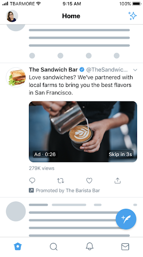
Every Friday night, the hallways of apartment buildings around the world turn into a cacophony of audio logos, as streaming apps like Netflix, HBO, Prime, and Hulu boot up for a night in.
In one of the most competitive marketing arenas, insurance brands battle through sound. Can you picture the visual logo of Nationwide, State Farm, Farmers, or Liberty Mutual right now? Probably not. But can you sing each of their brand tunes? Most definitely.
These audio brand dynasties are evidence of audio’s effectiveness within the brand zeitgeist. There are even brands that have infiltrated your attention in subliminal ways without you even seeing their logo. Take for example the boot-up of a Macbook, the thump of a Volkswagon door closing, the scritch-scratch of a Sharpie moving on paper, the pop of a Snapple lid, an idle Harley Davidson, or even the lack of sound when spraying a Method household cleaner. This is all very intentional (and industrially expensive) sonic branding.
As digital habits evolve, we can’t rely on eyeballs on screens in order to communicate our message. For a brand to be remembered, it can’t just be seen, it must be heard. It must be felt.
Harvard Business Review’s What Does Your Brand Sound Like? states “With our increasingly audio-enabled media environment, the strategic use of sound can play an important role in positively differentiating a product or service, enhancing recall, creating preference, building trust, and even increasing sales. Cognitive studies show that relevant sounds and musical cues can truly influence people in ways marketers want.”
Now, you may have some jingles coming to mind as well. Examples like Mcdonalds’ “I’m Lovin’ It”, Kit Kat’s “Give Me a Break!”, Folgers Coffee, Chili’s, Kay Jewelers, or Lucky Charms. People can recall the Meow Mix brand whether or not they have a cat. Even Jim Gaffigan pokes fun at the Hot Pocket marketing team when he jokes “I do love that jingle. Do you think they worked hard on that song?”.
Brand jingles are the epitome of sonic branding. Some of those brand earworms we just mentioned are decades old but still stuck in your head right this very instant. Yet these are all established brands, with existing brand awareness, and deep pockets to design (Mcdonald’s had over 3,700 final mixes of “I’m Lovin’ It”), test, and translate their jingle before pushing it out to market with a massive media spend. For brands that are just trying to gain momentum organically or with short-form video, a sonic logo can still do wonders.
The reason is that hearing is innate. We internalize sound quickly. An audio logo stays with you after you experience it. You may not be able to remember what a logo looks like, but you’ll remember what it sounds like and the longevity of the recall is powerful.
Further, sonic branding adds another level of brand storytelling into the mix, connecting with the viewer audibly and visually. In the case of an audio logo, this emotional connection happens in a few short seconds. The audience doesn’t have to follow a story or listen to an explanation – they just absorb the brand. Since this subliminal brand narrative is experienced with two senses simultaneously, the brain stores that experience twice as much as it would if it was only seen.
One of the most cunning tactics is incorporating an iconic sound into the audio logo that isn’t even unique to that business. Take Southwest Airlines’ “You Are Now Free to Move About the Country” example, with a seatbelt fastening click and overhead ping used in every airline are now tied directly to a specific brand. People who recall the Southwest brand would do so even when using Southwest’s competitor airlines. What about Verizon’s “Can You Hear Me Now?” that makes you think of them when you have a bad signal, and therefore remind you to switch to their service for a more reliable connection? Sneaky, sneaky. If you can capture the distinct sound of your industry and distill it into a mnemonic within your sonic branding strategy, not only will you be memorable – you’ll be unforgettable.
Whether B2C, B2B, or B2G it’s all about attracting and connecting with your audience through as many senses as possible. Maybe that’s through a blockbuster TV ad, a podcast, the tangible sound of your product in use, or even a quick, organic social snackable. There are countless ways to embed sonic branding across your landscape, so listen up! It’s time to make sure your brand feels like something. Let our animators, audio designers, and creative minds help you tell your sonic brand story in a way that is rewarding for your business in years to come. Get in touch with Bluetext, and give our soundtrack of super sonic brands a listen!
Ah, Super Bowl Sunday. One of the most highly anticipated events of the year celebrated for being a uniquely American tradition drawing together viewers of all demographics from across the country. An impressive 113 million viewers, in fact, the third largest television program and highest digital viewership (7 million, talk about super-sized streaming) in history. For sports enthusiasts, it was a day to watch the Chiefs and Eagles play their hearts out for the Lombardi trophy. For Rihanna fans, it was an opportunity to enjoy a long-awaited concert from the couch. For marketing geeks, it was the night we got to see just what advertisers had paid the big bucks for — and this year, we mean big.
No matter the reason for tuning in on Sunday, the days that follow the Super Bowl are always full of discussion. Now, we’re not here to debate that holding call or relive that big half-time performance announcement. Instead, we’re taking a look at some of the main themes and most memorable moments of the Super Bowl 2023 commercials.
Lighthearted Tones & Humor
In contrast to previous years, a fun and amusing tone seemed to be the overwhelmingly popular choice for the commercials of Super Bowl 2023. This isn’t entirely surprising, given some of the current challenges facing the country and the heavy news cycle society has been stuck in lately. It seems that advertisers this year wanted to give people an escape, aiming to keep things light and get viewers laughing. As with any year, some spots tried- but failed- to nail the bit while others were clear, feel-good standouts. Our favorites? Miles Teller in Bud Light’s ‘Hold’ commercial, Ben Affleck working the Dunkin’ Drive Thru, NFL’s Run With It, and Bradley Cooper and his mom trying to make a T-Mobile commercial.
Nostalgia
Nostalgia has been a popular marketing tactic in recent years and if Super Bowl 2023’s ads are any indication, that doesn’t show signs of stopping. Several brands were willing to bet millions that nostalgia would continue to land with consumers, as tributes to classic movies, iconic TV shows, and music legends from throughout the decades made their way onto our TV screens. Alicia Silverstone returned to her role as Cher Horowitz from the movie ’Clueless’ for a Rakuten cashback promo, Serena Williams and Brian Cox starred in a ’Caddyshack’ spoof for Michelob Ultra, and John Travolta sang a rendition of “Summer Nights” for T-Mobile’s 5G Internet service over 40 years after ‘Grease’ first hit theaters. A Workday commercial featured rockstars like Ozzy Osbourne, Gary Clark Jr., Joan Jett, Billy Idol, and Paul Stanley, an Uber commercial with P. Diddy took us down one-hit-wonder memory lane, and a throwback to more recent history, PopCorners put out a spot incorporating the cult classic show ‘Breaking Bad’.
Brand Partnerships
One of the more unexpected moves we saw on Super Bowl Sunday was big-name brands teaming up for joint commercials. Will Ferrell walked through (literally) several of Netflix’s most popular original movies and shows in a commercial promoting both the entertainment giant and GM’s EVs. Beer brands also got in on the mix, with Bud Light doing a crossover with HBO’s ‘Game of Thrones’ and Molson Coors promoting not one, not two, but three of their beers all in one entertaining spot that kept viewers on their toes.
Puppies > Celebs
We’d be remiss not to include this one. Much like many years passed, a large majority of Super Bowl commercials this year were jam-packed with celebrities, with advertisers like DraftKings and the others already listed above opting for a star-studded approach. However, not even female rap legend Missy Elliot or Gen Z heartthrob Jack Harlow could capture America’s attention quite like dogs could. According to the Wall Street Journal, two of the clear fan-favorite ads of the night were Amazon’s funny and all too relatable story about a family dog adjusting to post-pandemic life, and The Farmer’s Dog commercial that had pet lovers across America melting (if not crying). The lesson here? A cute dog will trump celebrities every time.
While we can’t promise to steal the hearts of potential customers with an adorable puppy, Bluetext is no stranger to incorporating animals into brand activations that make people stop in their tracks (see our BigBear.ai work here), creating bold campaigns that grab the attention of consumers (see our Varonis work here), or producing playful ads that strike a chord with your target audience (see our Thing Tamer work here).
As a full-service digital marketing agency based in Washington, D.C., and specializing in everything from video creative direction and production to paid media planning and go-to-market campaigns, Bluetext is here for your every advertising need. Added bonus: there’s no $7 million price tag attached.
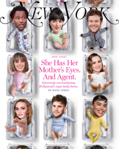
For the majority of December 2022 and into January 2023, the world has been captivated by the recently uncovered conspiracy of the nepotism baby, or nepo baby for short. In a nutshell, nepo babies are children of Hollywood industry insiders who likely benefitted from their family connections in the launching of their own careers. For example, “Emily in Paris” star Lily Collins, is the daughter of musician Phil Collins. Or “Stranger Things” star, Maya Hawke, who is the daughter of Ethan Hawke and Uma Thurman.
In today’s Bluetext blog, we’ll uncover the role nepotism plays in the world of sub-brands and product suites. We’ll discuss when it may be right to reference a parent brand and act as a branded house, and when it makes sense to market your solutions separately under distinct brands and operate as a house of brands.
The Case for the Branded House
The most common form of brand architecture for brands big and small, a branded house operates as a set of sub-brands housed underneath a core, parent brand. A house of sub-brands benefits companies that offer multiple services or products, especially when a parent brand provides solid brand recognition and visibility. To the consumer, it is very clear that these offerings all come from the same parent company.
From a marketing perspective, a branded house operates under one marketing strategy and avoids confusion in the marketplace regarding who owns the sub-brand. This strategy typically works best when each sub-brands target audience share commonalities. A similar industry or job function, or perhaps the sub-brands are compliments with bundling potential. A branded house is recommended if the parent brand has an established positive reputation with consumers.
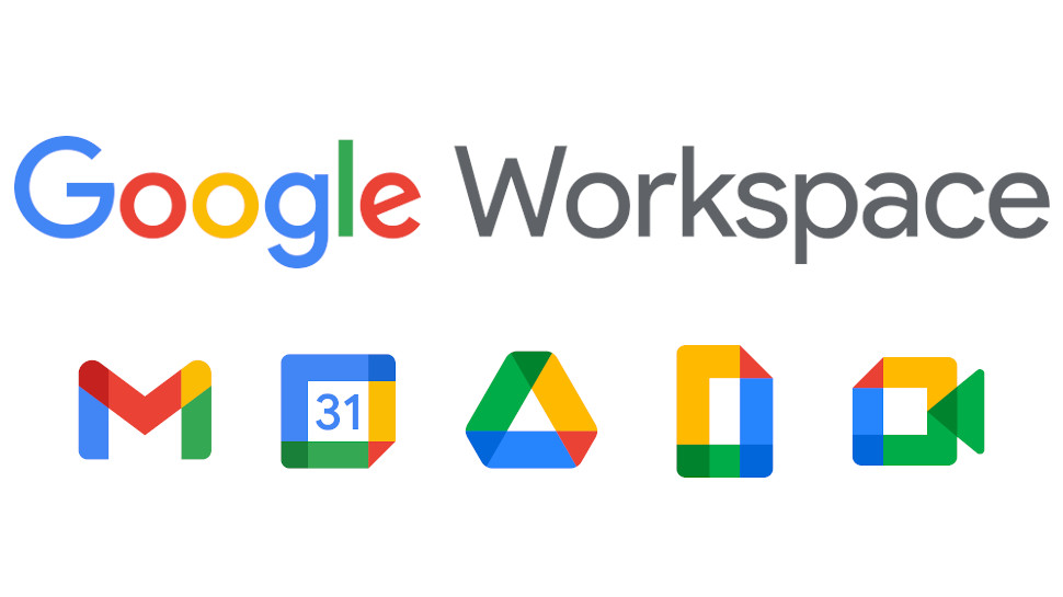
Google Workspace
The Google Workspace is perhaps the world’s most famous branded house today. The goliath product suite houses Gmail, Sheets, Docs, Calendar, Meet, Drive, and so much more. As soon as you see the simplistic style and elementary school scheme of one of these sub-brand logos, you know it’s Google baby. With a staggering 3 billion users worldwide, Google takes up a vast majority of the work app ecosystem and certainly benefits from architecting its business as a branded house. Their brand recognition is strong and Workspace apps are seamlessly integrated, allowing customers direct ease of use.
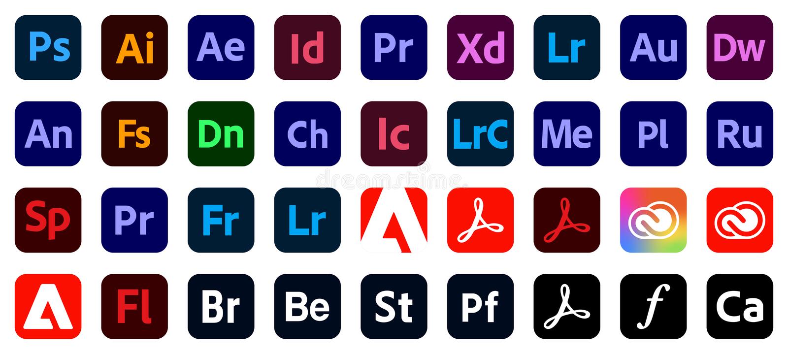
Adobe Creative Cloud
Another of today’s tech giants, Adobe, launched Creative Cloud in 2011 featuring known and loved standalone applications such as Photoshop, Lightroom, Acrobat, After Effects, XD, and Illustrator in one package. The logos for each app offer a periodic table-inspired collective look and feel that tells the user it is an Adobe product and part of a branded house. These products are designed to serve separate functions but complement and strengthen each other. Therefore making the case to bundle or purchase the entire ‘Cloud’…because if you’re going to rent most rooms you might as well buy the house right?
Sourcefire
Sourcefire hired Bluetext to reimagine its product architecture and create a branded house that would sit underneath the main SourceFire brand. Their suite of products, Snort, AMP, Immunet, and Firepower were great standalone applications but lacked a cohesive story that would tie them to Sourcefire. Bluetext renamed the products FirePower, FireSight, FireAMP, and FireCloud, taking inspiration from the Sourcefire name and perceived recognition in the market. Bluetext was also able to sunset Sourcefire’s famed, “Snorty the Pig” gracefully as part of the rebrand, shifting the brand perception from startup to global leader. For Sourcefire, having a branded house of products aligned its marketing strategy and increased its overall brand perception. Following, the successful rebrand, the company was acquired by Cisco for $2.7 billion.
![]()

The Case for the House of Brands
A house of brands is remarkably different from a branded house, where each brand has its own unique brand identity and marketing strategy usually dictated by the target demographic. The major benefit to operating as a house of brands is the ability to service a diverse set of target markets and create economies of scale for the parent brand. On the other hand, a house of brands can be a complex system to run, and maintaining each brand’s success may be almost impossible.
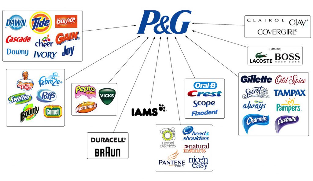
Procter and Gamble
For over 180 years, Procter and Gamble has specialized in a variety of products across a wide range of target markets. Chances are, you’ve used a P&G product without even knowing it. Have you brushed your teeth with Crest toothpaste? Washed your hair with Head & Shoulders shampoo? Cleaned your clothes using a Tide POD? P&G probably wasn’t the first association you made with this experience. All of these brands and so many more are the product of a successful house of brands.
That being said, the company has gone through a reshuffle in recent years. As of 2014, Procter and Gamble decided to retire or sell close to 100 of their existing brands, leaving just 80 brands that made up 95% of their profits. This is a classic example of a house of brands getting too big (and too expensive) to manage and needing to cut costs. Nonetheless, this is a great move by P&G, allowing the company to adapt and support their profit-making brands, and reallocate spend to develop new, innovative products that will pay dividends in the future.
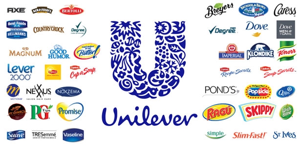
Unilever
British consumer goods company, Unilever, has been in business for just under 100 years and has grown to operate in over 190 countries around the world. Unilever specializes in products related to food, cleaning products, toothpaste, and beauty products, and they are the largest producer of soap in the world. Did you use Dove soap this morning? Spread some Hellman’s mayonnaise on your sandwich at lunch? Snack on a pint of Ben & Jerry’s ice cream last night? All of these brands operate under the Unilever house of brands. Unilever’s success derives from operating multiple brands in the same category targeted at unique demographics. The same consumer doesn’t buy both Dove and Suave soap, but both are owned by Unilever. This allows the company to target as much of the market as possible, all through the power of branding.
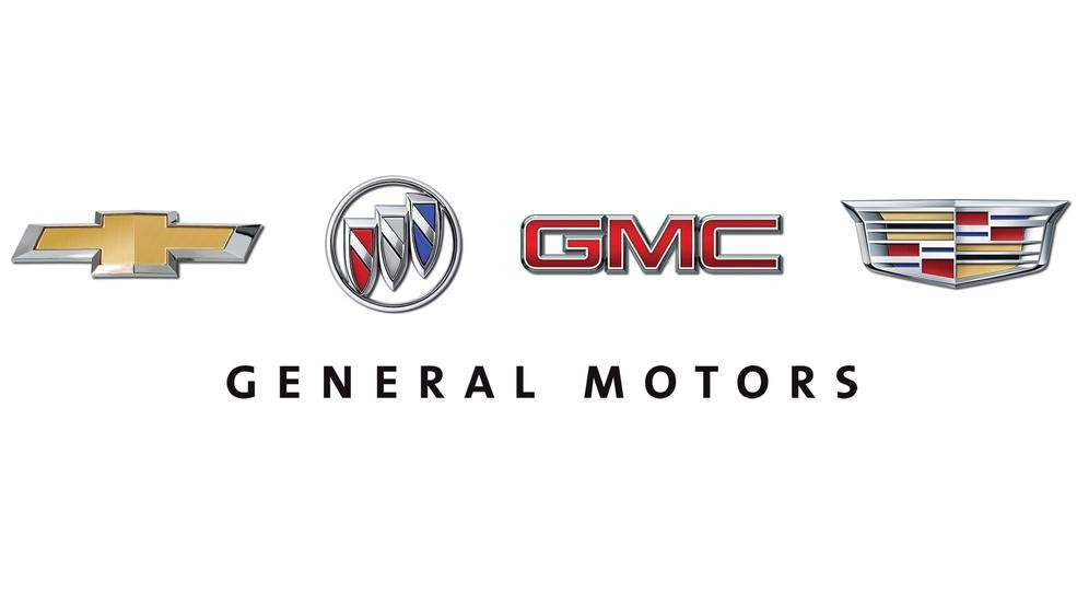
General Motors
GM is the largest automaker in the United States, operating brands including Chevrolet, Buick, GMC, and Cadillac. General Motors is possibly the perfect example of a house of brands that operates at all levels of the market to reach as many consumers as possible. A prospective car buyer is not in the market for either a Chevrolet or a Cadillac. Each brand represents a segment of the market and positions itself accordingly from a price, performance, and look and feel perspective. GM has positioned itself as a brand with potential to truly appeals to everyone by offering distinct models to just about every price range, catering to wide range specific preferences.
GM has also expanded outside of the US market, competing in Europe with its brands Opel and Vauxhall, and in China with its brands Baojun and Wuling. General Motors has also been very successful in its brand consolidation efforts. For example, the company bought Hummer in 1998 and discontinued the brand in 2010. A Hummer EV pickup truck and an SUV are now in the works and will be marketed under the GMC brand. Another example of brand consolidation under GM was the acquisition of the Yellow Cab Manufacturing Company, which produced cars for the Yellow Cab company in New York City. General Motors acquired a controlling stake in the company in 1925 and bought the business entirely in 1943. Following the complete acquisition, the company was absorbed into its brand, GMC.
With brand perception under constant scrutiny, brand architecture is an important consideration in today’s marketing world. For many companies, a branded house is the best structure as it allows them to operate under a core, leading brand and logo, focusing on one market strategy. For others who are targeting multiple market segments in the same category, a house of brands is the correct choice as it allows them to compete at as many levels of the market as possible. Not sure which strategy is the right one for your company? Speak with the experts at Bluetext today.
Since Bluetext’s founding in 2011, the agency has experienced stellar growth in size, expertise, and creativity. So much so that our brand and logo were beginning to feel tight and outgrown. Some healthy self-reflection left us realizing an evolution was necessary.
Watch our brand evolution
With our clients, we often consult on the pros and cons of a brand evolution vs. revolution. For Bluetext an evolution meant keeping the core aspects that defined our brand, like the name, logo symbolism, and obvious color choice. Anything other would run the risk of appearing like an IHOB-level stunt. We love the name and meaning behind Bluetext. Just as when you apply a link to text the color changes to blue, applying Bluetext to your brand becomes the digital doorway to your brand. It highlights our digital focus and positions the agency as ambiguous to the multitude of services and specialties we offer. Aside from that, the name “Bluetext” is internally joked to be rooted in our project managers’ love and developed muscle for hyperlinking, which we cannot confirm nor deny.
Even with the core ingredients solidified, so many elements were up in the air for modernization. Bluetext’s creative director, Kevin Galligan, led the charge with a redesigned logo to inspire the complete CVI & eventual website design.
Some key principles to remember during any sort of brand development are:
- Be associated with something
- Protect your identity
- Consistency is key
- Never say no to evolving
For Bluetext, our brand identity centered around our logo icon, which previously formed the lowercase ‘b’ and ‘t’ of the wordmark. We had become associated with this symbol, often adopting a shorthand abbreviation of BT, diving into the straightforward angles as a reminder of our values. But as the agency has grown, we felt it only fair the logo should grow up too. In this evolution, we were careful to guard our brand’s identity and legacy, but apply stylistic tweaks to elevate the core designs. The lowercase style was replaced with a sentence case and a new font. The logo icon was upgraded to symmetrical angles that matched the new custom lettering, but still preserved origins within the ‘B’ and ‘t’ angles.
![]()
Minimal doesn’t mean simple. The evolved logo is intentional down to every angle, which becomes leveraged throughout the pattern systems of the CVI. Leaning into our core logo symbol, the outlined shape became a pattern system repeated across our website & collateral. The most noticeable change to the brand was the color shift from a light blue to a rich cobalt blue. In the spirit of consistency and honoring the name ‘Bluetext’, a blue-based palette was adopted. But monochromatic does not mean monotone. Our creative team took this rebrand as an opportunity to surge new energy into the secondary color palette choosing energetic aquas and navy tones, complemented by cream, white or black.
As a brand development agency, our evolved brand identity has made us all the more energized for the coming new year, and inspired to do the same for our clients. Could your company’s brand use a little glow up too? Whether you’re ready for an evolution or full revolution, check out what Bluetext can do for you.
There are no written rules when it comes to determining how to efficiently increase your company’s enterprise value. Unfortunately, there is no one-size fits all formula for enterprise success. Simply put, the strategy will vastly differ for every industry, sector, and individual company. That being said, marketing has been proven as a cornerstone of any effective business strategy and critical in raising enterprise value.
Your marketing strategy dictates the overall market’s understanding of what your business brings to the table, how you differ from your competition in the eyes of customers and investors, and perhaps most importantly, what the future holds for your business and how you intend to evolve as both the market and overall economy change. Whether your ultimate goal is to take your company public or take on capital investment in the near future, marketing will play a significant part in how you succeed. In this blog post, we’ll discuss tips on putting together a sound marketing strategy and how this can lead to an increase in enterprise value.
Understanding the Current Market and Its Needs
As you know, the competitive landscape is constantly shifting, and any dramatic change in the competition calls for change in your strategy. The first step to putting together an effective marketing strategy is to understand your company in its position within the current market. Customer tastes and expectations are constantly evolving, so being able to adapt to current market conditions is critical in today’s economy. It’s important to ask yourself: What is your value proposition against your competitors? Are you where you need to be to maximize value? Can customers quickly get the information they need and are questions and service issues resolved promptly? Ensuring you’re meeting your customer’s needs will set you up for long-term success and increase your value as not only a supplier but also in the eyes of any potential investors.
When Government technology giants Octo and Sevatec decided to merge, they tapped Bluetext to guide them through a brand evolution, aligning both company brand identities into a new cohesive corporate visual identity. We worked hard to understand both companies’ positions in the market and design a message and visual identity that aligned Octo and Sevatec’s legacies under one united mission from both an internal and external perspective, increasing the combined entity’s enterprise value.
Future-Proofing Your Marketing Strategy
While it’s important to understand the current needs of your customers, it’s equally important to take a look in the mirror and focus your marketing strategy on your company’s future goals, both in the short- and long-term. What are your business goals and objectives? Do you anticipate a significant capital investment raise in the next 2 years? Or 5 years? It’s imperative to make conscious, strategic decisions by beginning with the end in mind instead of simply letting tactics evolve.
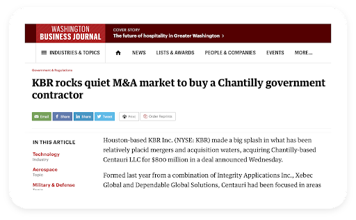
When Arlington Capital Partners acquired three leading companies in the national security sector, they turned to Bluetext to develop and launch a new unified brand from scratch. In less than six months, Centauri was born. Following the launch of the brand and a successful integrated go-to-market strategy that included PR, digital advertising, and social media, the firm went on a contract-winning spree and in less than two years, was acquired by industrial engineering juggernaut, KBR, for $800m. With an understanding of Arlington Capital’s goals from the outset, focused on raising the enterprise value of a combined entity, Bluetext was able to build a comprehensive marketing strategy that achieved the PE firm’s wildest dreams.
In Marketing, ROI is Everything
Let’s be clear, marketing can be an expensive undertaking. When you think about the various marketing tactics you can choose to include in your marketing strategy, consider every channel including but not limited to: direct marketing, public relations, digital marketing, advertising and promotion, and trade shows. While it would be great to put a significant budget toward each of these channels, that just isn’t feasible for the majority of companies out there. Just like you would diversify your stock portfolio, you should also diversify your marketing efforts, especially when starting out. Be smart about where you decide to invest your marketing dollars but don’t be afraid to commit to a research-driven marketing strategy.
Discuss internally the pros and cons of each channel, especially in the context of your competitors, industry, and customers, both existing and future. Additionally, determine if you can handle the execution of these marketing channels in-house, or if it may make sense to hire a marketing agency like Bluetext to take some of the load off of your internal team. Most importantly, however, is to establish clear metrics designed to capture ROI for each channel you decide to invest in and keep your internal and external teams accountable to them. Diversifying your marketing mix is the best way to ensure you’re increasing your brand awareness across a variety of customer-facing touchpoints, which will lead to an effective increase in perceived enterprise value from an investor perspective.
In Conclusion
There is no one-size-fits-all approach to marketing. That being said, having a strong understanding of your market, customer base, and short- and long-term business goals will strongly inform your marketing strategy and put you in the best position to succeed in increasing brand awareness, customer acquisition, and overall enterprise value. If you’re in need of support in putting together a comprehensive marketing strategy or a marketing partner to execute an already determined strategy, consider contacting Bluetext. For more than a decade, Bluetext has helped companies and private equity firms raise enterprise value. We specialize in planning, developing, and executing effective brand transformations to exceed business goals, with our clients benefitting from our deep creative expertise, seamless strategy, and innovative way of problem-solving.
Every brand is a story, and marketing is your one chance to tell it. Storytelling has always been a successful way to connect brands with their audience because it creates an experience that people want to buy into. But the unfortunate truth is most adults don’t have much availability or attention for storytime like we once did as children. Competition for consumer attention has grown with the seemingly endless information and content that bombards us daily. The solution? Cut to the chase, SparkNotes it if you will. It is most effective to be concise, and engaging, and build a feeling that a consumer can buy into through micro-storytelling.
Micro-storytelling highlights what is truly important and showcases the small ideas that make a brand unique in under 30 seconds. Create a voice for your brand. In a sea of stories, you want to stand out. Catch people’s attention with vibrant colors, and an intriguing tagline, or start your video with a hook that will engage your audience. Make them pause their scrolling and soak in your information. Connect with them so they want to buy into your brand.
With micro-storytelling, the goal is not to fit everything into one video or post but to promote many smaller pieces of content that can easily be consumed at various touch points to tell potential customers what your brand stands for. Audiences want to get through information quickly, especially if they are new customers who are not yet invested in learning more about your brand. Micro-storytelling introduces people to your brand and sparks that initial interest. It’s the perfect teaser to either engage with your brand or share your information with others. It also gives new customers a way to quickly learn more about you, by encouraging them to visit your website or follow your social media accounts.
Four Fundamentals to Help You Create Micro-Stories for Your Brand
Know Your Audience
With micro-storytelling being so concise it is important to convey a tone and message that resonates with your target audience. It is essential for brands to target specific audiences and their specific needs, with a specific message. To create a successful micro-story you must research and gather information to better understand your audience and how you can authentically connect with them. Creating a trusted bond with your customers extends beyond a simple transaction, it works to build a community.
Tap into Visuals
While text helps to tell your story, visuals are a powerful way to communicate quickly with your audience. They must be eye-catching and aesthetic, and showcase your brand or products in a way that supports your brand’s story and values.
Cut the Fluff
Think of how the information you are presenting will be received by people quickly scrolling. Keep it simple. Avoid meaningless details that distract from the overall message. Use short and simple words.
Leave Them on a Cliffhanger
Try not to be definitive with your narrative’s ending. For example, when you go to post about an upcoming event or product launch, announce it in a way that teases what is coming soon. Not only does this save space and time, but it leaves your story open for interpretation and gives customers a chance to think about your brand or come back later to find out more.
Three Effective Ways for Your Brand to Promote Micro-Storytelling
Video
One of the most powerful ways to convey your message in an engaging way is through video. Instagram stories, Tik Toks, or other short-form videos provide an opportunity to convey your story in a short time and continue telling it over time. It also gives you an opportunity to tell your story through unspoken visuals. Think of who is representing your brand. What story is being told by their appearance, tone, and body language? Even what they wear can convey something about your brand story.
Social Media Updates
Another compelling way to promote your message is through social media updates. Twitter is a really valuable tool to enforce condensed character counts, which limits brands messaging into more digestible sections. This platform is also adept at piecing content into multiple updates which can be displayed throughout your timeline. This gives users a train of thought to follow the subconscious urge to continue to scroll down and piece together multiple micro-stories.
Infographics
Using infographics to tell your brand’s story creates an effective and digestible way for your consumers to get a lot of information at once. Infographics quickly highlight key takeaways using images and charts. Visuals accompanying text promote higher engagement. With important information involving statistics and facts, infographics help users absorb information with ease.
Micro-stories are just one block of the overarching brand story and when executed correctly, these micro-stories create a powerful message that resonates with consumers.
As a full-service digital marketing agency, Bluetext offers multiple services that can help your brand tailor content to meet customers’ expectations. Connect your stories to your customers. Contact us today to learn more about our messaging and content marketing services.
When we talk about motion in branding, we’re talking about a wide variety of creative approaches. From subtle homepage loading flourishes to complex, eye-catching 3D advertisements, animation can breathe new life into your brand. Today Bluetext will explore why motion design for logos is on the rise, when it’s best applied, and some of our favorite examples.
The digital landscape is crowded, to say the least. The average American spends a little over seven hours a day on the internet, and much of that time is spent surrounded by thousands of brands and advertisements. A well-done animation can help your brand stand out from the crowd and add essential layers of personality to your marketing collateral.
Whether your brand is neat and polished or playful and young, animation can reinforce those core characteristics without a single word. Picture the old Nickelodeon “splat” logo, for example. In 2009, a handful of disparate channels (TeenNick, Nick at Nite, etc.) were rolled into the Nickelodeon brand, and a new logo was unveiled to go along with the consolidation. The older logo’s animation had a younger, scrappier feel, while the current logo is much more refined, and gets at the large-scale, premium approach of Nickelodeon’s parent company, Paramount. These approaches are vastly different from one another, but there’s not one “right” answer when it comes to logo motion. Both animation styles are integral parts of the brand’s history and tell the story of a brand’s evolution. I’ve said it before and I’ll say it again: If a picture is worth a thousand words, an animation is worth a million.
![]()
Virtually any digital platform is an option when it comes to displaying an animated logo, but as they say, moderation is key. Instead of applying motion “just because,” it’s important to have intention behind the choice to display a static or animated logo. Here are a few of our favorite intentional applications of motion design in logos.
Use an animated logo when your space and time are limited
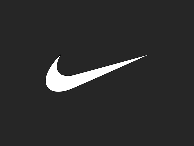
In cases where viewers may only see one or two components of an ad (scrolling quickly through a social feed, for example), you can convey more with an animated logo than you can with a static one. The key in these instances is to take up about the same amount of space and time as a static logo. This means your animation should be quick and to the point, like the example below from Nike. An added feature of Nike’s animation style is that they apply a different animation style depending on the audience and product, so each motion graphic feels uniquely suited to its context.
Amp up your site’s intro screen with logo motion
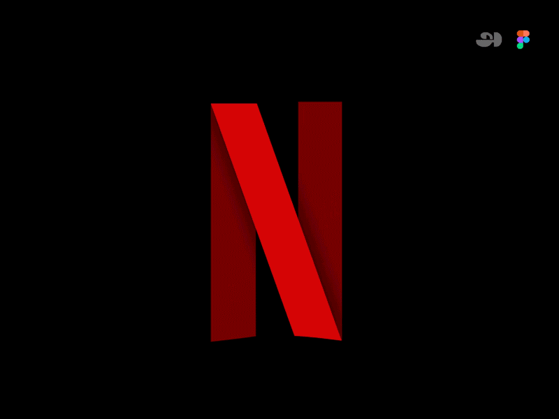
Along with the now-iconic “ta-dum” sound, Netflix’s loading visual is well-known and well-loved. Because the animation doubles as a loading screen, it doesn’t feel intrusive or overdone. It’s reminiscent of classic film grain, and it ensures that the Netflix visual identity is central to the viewer experience, regardless of whether the program is a Netflix original or not.
Animate your logo as part of a brand pattern
For Calling All Optimists, a GMAC brand, we developed an animated brand pattern using elements pulled directly from the brand’s logo. This is a handy asset in any brand’s toolbox, because it’s a custom element that can be used in place of stock imagery or generic graphics, and it can be front-and-center or fade into the background. You can explore our case study for Calling All Optimists here.

Tell a story about your brand using animation
Designtorget is a Swedish design house that sells all kinds of homewares, and their logo animation helps convey their line of business to unfamiliar customers. Using the “D” and “T” figures from their logo, shifting them around with other simple lines to portray things like a table and chairs and an abstract smiling person. This animation demonstrates the brand’s actual offerings while also presenting a playful, modern brand identity.
![]() Ready to explore how logo motion can boost your brand? Contact Bluetext to learn about our dynamic branding and motion design services.
Ready to explore how logo motion can boost your brand? Contact Bluetext to learn about our dynamic branding and motion design services.
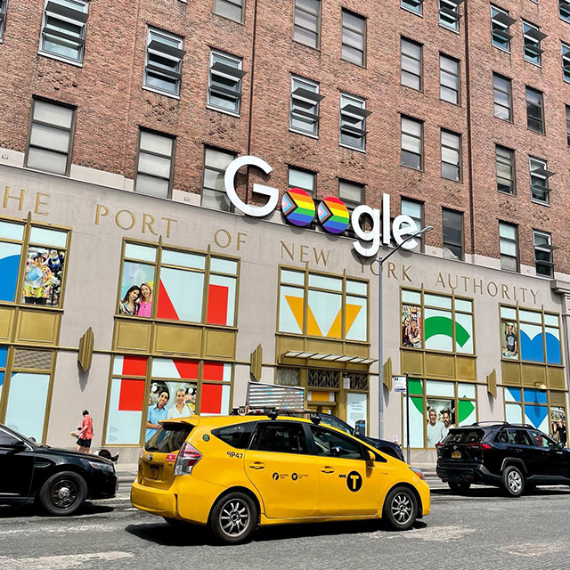
The last decade has made giant leaps in diversity & inclusion initiatives, especially for the LGBTQIA community. For the month of June, many companies switch from their traditional monochrome logo to a rainbow-colored design, particularly on social media platforms like Facebook or LinkedIn. While this rush of public support for LGBTQIA communities is a popular way of engaging in Pride Month celebrations, companies must consider how their actions reaffirm their pro-LGBTQIA branding.
First, it’s important to understand the purpose of the rainbow branding used throughout Pride month. By implementing a temporary rainbow branded logo change that showcases the colorful LGBTQIA Pride flag, companies can generate discussions about discrimination and visibility for members of the queer community. For a company sporting a Pride month logo, the rainbow design serves as a reminder to consumers, employees, and associates that the company values LGBTQIA inclusion and representation.
The Pride month logo design is most common among B2C companies who are trying to capture the attention of consumers. In this day and age, corporate responsibility and values are critical factors in purchasing decisions. Millennials are 32% more likely to do business with a company that openly supports the queer community. However, many large B2B companies also serve to benefit from showing support for the LGBTQIA community. The rainbow logo signals to employees and partners that the company is an ally to the community. Inclusive values attract diverse talent, improve employee welfare, and increase business across numerous demographics. About 15% of Gen-Z adults in the US identify as queer, a growing target market in corporate America.
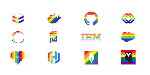
Some of the largest tech, finance, and consulting companies—like Microsoft, IBM, Bank of America, and Deloitte—have used rainbow logos throughout the month of June to show support for the LGBTQIA community. Even prominent federal contractors, like Leidos and GDIT, have joined the display of pro-LGBTQIA branding. Corporate support for the LGBTQIA+ community during Pride Month is a major step forward for the LGBTQIA community compared to past suppression and ignorance. But beneath the rose-colored glasses, the reality is a flash of rainbow branding is not the end goal of pride month. Companies need to provide more than just temporary logos in support of the queer community.
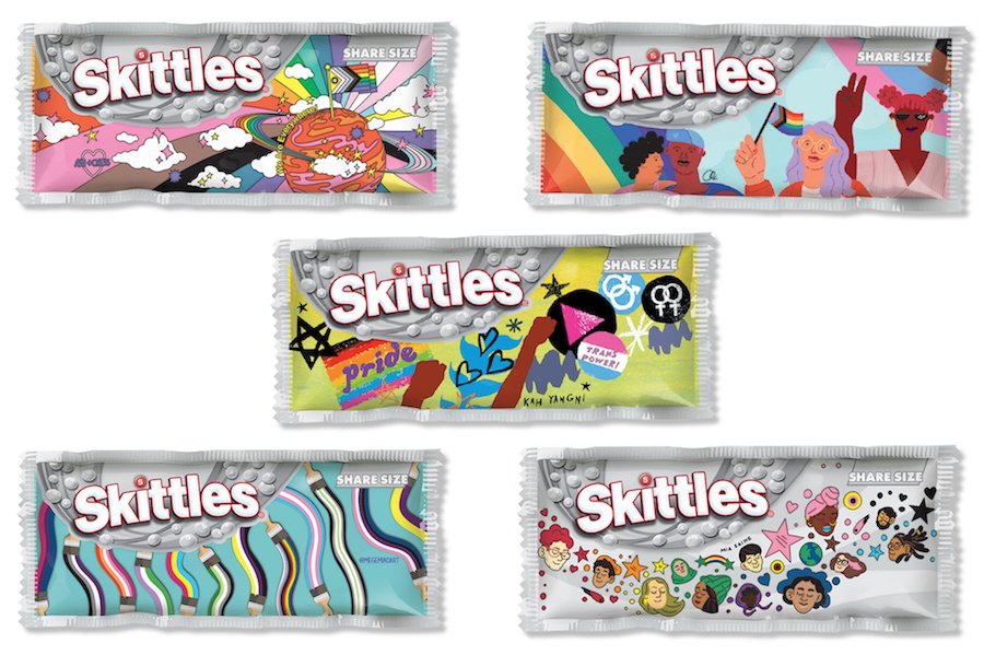
Take Skittles as an example, an extremely colorful brand naturally in its everyday marketing decided to go in the opposite visual direction to completely greyscale packaging and marketing materials. This campaign went viral when Skittles announced they decided to give up their rainbow to ‘celebrate the one that matters.’ (aka the Pride rainbow symbolizing the LGBTQ+ community). Partnering with GLAAD, an American non-governmental media monitoring organization, they gave six talented artists within the LGBTQ+ community to create pack designs that represent how they see the rainbow. Special edition pride packs were sold with $1 per pack donated to GLAAD.
Because of the clear economic benefits of promoting Pride month, this can be perceived as an exploitation of social initiatives and conversations as a means to reach business goals. In this instance, the use of the rainbow flag in marketing materials, without the actions to support the queer community in meaningful ways, is referred to as rainbow-washing. Before a company considers implementing a new rainbow logo or a Pride month campaign, they need to reflect on what other actions the company can take to support the LGBTQIA community in meaningful ways:
- Donate a portion of business proceeds to LGBTQIA-friendly charities or in support of pro-LGBTQIA legislation.
- Show support for the queer community year-round, not just through the month of June with supportive messaging and practices.
- Ensure representation of LGBTQIA persons in marketing and advertising.
- Refuse business in countries or states with discriminatory laws against LGBTQIA persons.
- Show representation of LGBTQIA persons in positions of leadership, like on the Board of Directors or within the C-Suite.
- Provide support and protection for LGBTQIA employees and their families.
- Educate yourself and those around you on the history of pride month before using the circumstance for profit.
While not every company can achieve all the points listed above, marketing and branding alone do not affirm the allyship of a company. Instead, marketing should be used as a means of promoting the other good works that a company does in the LGBTQIA community.
If your company is a true ally to the queer community, but you’re struggling to convey these values through your messaging or advertising, contact an agency like Bluetext that specializes in digital marketing. Whether looking for a refreshed pride month logo or a representative campaign for the month of June, Bluetext can help you create materials that get the right message across.
The XXIV Olympic Winter Games have come and gone, in what felt like the blink of an eye. Even though the Games span only two weeks following the Opening Ceremony, there are years—and sometimes decades—put into their planning. A key piece of that planning is setting the visual identity of the Games, which is no small task. We all know the iconic five-ring emblem that symbolizes the union of international athletes, but each host city gets the opportunity to create its own unique logo. Olympic logos of the past have varied widely in color, type, and style, and each new logo is put to the test to tell a story not only about an Olympic season but about the host country itself.
A quick glance at all the different Olympic logos of the past makes it clear that there’s no clear-cut formula for an Olympic Games’ brand system (except the inclusion of the Olympic rings, according to the Olympic Charter). We’re going to take a look at the Olympic logos of yore and dissect our favorites and not-so-favorites through superlative-style judgment.
Best Abstract Use of the Olympic Rings — Atlanta 1996
Incorporating the Olympic rings is a requisite part of all Olympic logos, but that might get a little repetitive after over 50 Games. We appreciate the Atlanta 1996 logo’s integration of the rings with the column—the mark hints at the Olympics’ Grecian beginnings, the Olympic torch, and even manages to squeeze in the number ‘100,’ celebrating the centennial of the games.
![]()
Best Direct Use of the Olympic Rings — Innsbruck 1964
There’s something to be said for a simple, classic logomark like the Innsbruck 1964 logo. Using the coat of arms of the City of Innsbruck as a starting point, this logo features the rings prominently and uses an elegant typeface for the host city and year. We can’t think of a more classic, straightforward Olympic logo.
Best Out-of-the-Box Typeface — Rio de Janeiro 2016
The logo for the 2016 Rio de Janeiro Games feels like a celebration, exactly as its designers intended. This mark took inspiration from Carnival and uses organic forms and lettering to convey the energy of both Rio and the Olympic Games. This approach brilliantly tells a story while standing out from the crowd.
![]()
Best Out-of-the-Box Color — Sarajevo 1984
Working with the Olympic rings may feel constricting color-wise since there are already five colors to contend within a design. That didn’t stop the designers of the Sarajevo 1984 logo, who washed the whole logo in orange for the primary mark. This approach is particularly interesting because the logo was permitted to appear in any color so long as the entire mark appeared in a single color.
We’d be remiss to close this category without giving a nod to the London 2012 logo which, while controversial, was striking in its use of hot pink. They can’t all be winners, but we appreciate the bold approach.
Best Use of a Human Figure — Nagano 1998
In the Nagano 1998 logo, seven abstract human forms make up the petals of a flower, nicknamed the Snowflower. We like this mark not only because it defied expectations for a snowflake or other wintery symbol, but because it was the starting point of an environmentally-focused Olympic identity.
Best Minimal Logo — Tokyo 1964
Stunning in its simplicity and symbolism, the Tokyo 1964 logo is heralded as one of the all-time greats in Olympic logos. With the Olympic rings set in gold beneath a version of the Japanese national flag, this mark features traditional Japanese colors signifying peace and prosperity. Despite its minimalism, this logo manages to acknowledge the host country, the traditional Olympic identity, and the moral foundation of the Games.
![]()
Best Maximal Logo — Rome 1960
Poised between two relatively simple Olympic identities (Squaw Valley 1960 and Innsbruck 1964), this maximalist logo was an obvious pick in this category. In a departure from ‘60s graphic design trends, this mark harkens back to classical Roman motifs and styling. While it may not be everyone’s cup of tea, we admire the dedication to national legend.
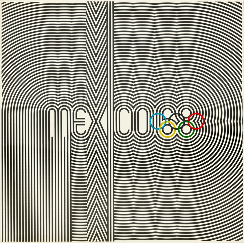
Best in Show: Summer — Mexico 1968
Our winner for Summer Games logos has to be Mexico 1968. Not only does the logo incorporate the rings creatively, but it’s also reminiscent of athletic uniforms and traditional Huichol art. This mark is the basis of a fascinating brand identity—for starters, the official Olympic poster looks like album art. Sure, this logo may be a little busy, but what it lacks in refinement, it makes up for in energy.
Best in Show: Winter — Sapporo 1972
We love the Sapporo 1972 logo because it’s unlike any other Olympic identity, and it was perfect for its time. With a Bauhaus feel, this mark features the rising sun symbol from the Japanese flag, a stylized snowflake, the Olympic rings, and a single line of text. Despite including only basic elements, the unique stacking and coloring of these elements make this logo one of our favorites.
Best Iconography — Tokyo 2020
The iconography that’s developed alongside Olympic identities changes with the logo, and we wanted to honor an icon system that we think was particularly elegant. The icon set for the Tokyo 2020 games included icons (or pictograms) for each sport, including the five new sports introduced to the Olympics that year. Each icon is skillfully-made and coincides beautifully with the 2020 Olympic logo.
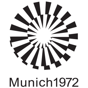
Judge’s Favorite — Munich 1972
A personal favorite that didn’t get identified in any of the above categories, the Munich 1972 logo’s name says it all—”Radiant Munich.” The abstract sunbeams are eye-catching, and the overall brand identity feels both joyful and serene.
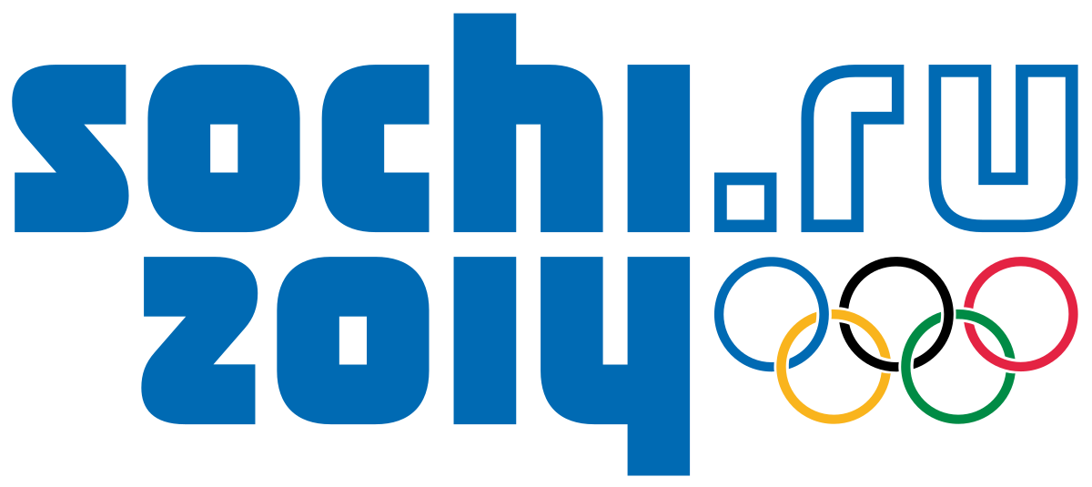
Judge’s Least Favorite — Sochi 2014
While this logo was meant to convey sentiments of modernity and the coming digital age, it misses the mark. Suffice to say, there’s a reason that no Olympic logos in the 8 years since have included a URL.
There you have it—our take on some of the best and worst Olympic logos to date. We encourage you to explore all of these logos yourself on the Olympic website, and to explore other opinions like Milton Glaser’s for AIGA.
The logos for the Paris 2022, Milano Cortina 2024, and LA 2028 Games have all been unveiled, but given the controversy over and subsequent redesign of the Tokyo 2020 logo, we’ll wait to grade those logos until their respective Games pass. In the meantime, if you’re in search of a new logo or brand identity, get in touch with the team at Bluetext to learn how we can team up and go for the gold.
With 2022 already in full swing, companies are faced with the challenge of looking ahead to what the future might bring. Enlisting the help of a digital marketing agency like Bluetext can ensure that your company is not just reacting to trends, but thoughtfully adapting to the best practices in marketing and staying ahead of the curve. Here are 6 key predictions on how brands will bolster their marketing efforts in 2022:
1. Selling Your Brand, Not Your Product
The importance of brand recognition is nothing new, but the significance of strong brand identity will continue to increase. The modern-day user is inclined to invest in the companies they want to support, not just the products they want to buy. Especially in saturated markets, such as cybersecurity and technology, there are a million and one companies that sell the same or similar products. The skill of storytelling will be imperative in this upcoming year as firms will need to convey strong brand identity and powerful messaging to capture customers. Hiring a marketing firm could help your brand tell its story with seasoned marketing expertise. A consistent messaging strategy or compelling video content crafted by marketing professionals could be what sets your brand apart. Bluetext has a growing portfolio of brand videos that showcase how media can be used to create granular, compelling content to best tell your story to the market.
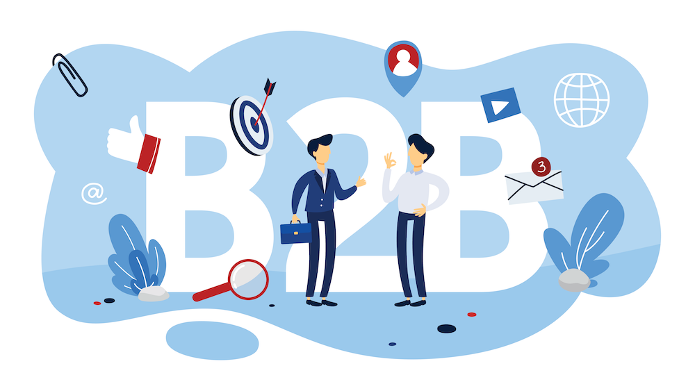
2. Being Prepared for Change in the B2B Sector
The B2B landscape in marketing is rapidly changing as a result of long-term disruptions caused by the global pandemic. As remote work has become a more permanent reality for many businesses, the reduction of in-person interactions is causing a shift in lead-generation strategies for B2B marketers. A digital and mobile-first marketing approach is more important than ever before, as many B2B buyers prefer remote interactions rather than personal experiences with sellers. In-person events are now mostly hosted in online environments instead, which have brought challenges to traditional lead generation. To remedy this, more B2B companies are capitalizing on social media as an important lead generation channel. A leading social media marketing agency like Bluetext can provide strategic and creative communications that engage with corporate customers through the most effective online touchpoints.
3. Responding to Increased Sensitivity to Marketing
Public awareness has become increasingly attuned to issues of diversity, equity, and inclusion. As companies are competing for attention in this space, firms can use marketing techniques to promote their core values while supporting the causes they stand for. This will help to gain trust and respect from customers who are expecting brands to be active in their communities.

4. Preparing for Marketing to Become Tougher
As consumer behaviors and privacy policies change, the platforms that host advertisements are changing as well, which creates challenges for marketers to navigate these spaces. Increasing regard for customer privacy will continue to make it difficult to obtain data and insights from online campaigns. In addition, platforms are updating their algorithms to respond to market changes, leaving advertisers to adapt to their new preferences. For example, Google’s changes in SEO ranking and Instagram’s shift to prioritize video content have already created challenges for marketing efforts in 2022. Businesses should expect to continue seeing these sorts of shifts, and be proactive in utilizing these platforms. Getting ahead of these changes and pivoting campaign strategies will accelerate prepared companies to becoming frontrunners of their pack.
5. Teaching Rather than Selling
One of the most important ways a company can gain respect from their audiences in 2022 is by addressing topics that are top of mind in their industry. Focusing your online presence on content marketing can help promote your brand’s expertise without explicitly advertising competitive advantages or product details. In the coming year, companies should be working to share more thought leadership pieces like blogs, whitepapers, and video content to bolster their online brand and increase their search ranking.

6. Utilizing AI/ML
Effective digital marketing campaigns must continue to utilize emerging technologies, one of the greatest tools in 2022 being artificial intelligence. Machine learning can ensure the productivity and effectiveness of your marketing efforts. You can bolster performance by accurately tracking KPIs and budgeting, while also personalizing and optimizing digital ad campaigns. Harnessing the power of machine learning applied to brand marketing will be a necessary skill for companies looking to thrive in 2022.
You may already be aware of these trends and the implications they could have for your business but unsure of how to start addressing them. Bluetext has the expertise and industry experience to help you grow your brand and implement effective changes to your marketing strategy. To learn more about our offerings, contact us today.