Today’s digital audiences are less forgiving than ever. Users expect websites to be intuitive, fast, and easy to navigate, regardless of device or context. When a website fails to meet those expectations, users disengage quickly, often without a second chance.
This is where a UX design agency plays a critical role. Rather than focusing solely on visual appeal, a UX design agency evaluates how users interact with your website, identifies friction points, and designs experiences that support both user needs and business objectives. The result is a website that does more than look good—it works.
What a UX Design Agency Actually Does
A UX design agency brings structure and strategy to the design process. UX is rooted in understanding user behavior, motivations, and expectations, then translating those insights into clear, functional experiences.
Agencies combine research, information architecture, interaction design, and testing to ensure websites are built around real user needs. This strategic approach helps organizations avoid assumptions and design decisions based on internal bias rather than evidence.
By aligning user goals with business priorities, a UX design agency ensures that every design decision supports measurable outcomes.
Improving Website Usability by Removing Friction
One of the most immediate ways a UX design agency transforms a website is by improving usability. Usability issues often show up as confusing navigation, unclear calls to action, or overly complex content structures.
Through user research and testing, agencies identify where users struggle or abandon tasks. Navigation is simplified, information is reorganized, and interactions are refined to guide users toward clear next steps.
When usability improves, engagement increases and drop-off rates decline. Users are able to accomplish their goals faster and with less frustration.
Designing for Accessibility and Inclusivity
Accessibility is no longer optional. A UX design agency approaches accessibility as a fundamental component of good design, not a compliance exercise added at the end of a project.
Designing for accessibility means creating experiences that work for users with varying abilities, devices, and environments. Clear content hierarchy, readable typography, and intuitive interaction patterns benefit all users, not just those with accessibility needs.
By embedding accessibility into UX strategy and design systems, agencies help organizations build websites that are inclusive, compliant, and resilient as standards evolve.
Turning UX Improvements Into Measurable Results
UX design directly influences business performance. A UX design agency connects design decisions to metrics such as conversion rates, engagement, and task completion.
Reducing friction in key moments—such as form submissions, content discovery, or checkout flows—can have an immediate impact on results. UX improvements also support retention by making experiences easier and more satisfying over time.
Rather than treating UX as a one-time redesign, agencies focus on continuous optimization. Ongoing testing and iteration ensure the website continues to perform as user expectations change.
Extending UX Beyond the Website
A website is rarely the only digital touchpoint a user encounters. UX design agencies take a holistic view of the digital ecosystem, ensuring consistency across websites, portals, applications, and platforms.
Design systems play a key role in maintaining this consistency. Shared components, patterns, and guidelines allow organizations to scale UX efficiently without sacrificing quality.
By aligning experiences across channels, a UX design agency helps build trust and familiarity, making interactions feel cohesive rather than fragmented.
When to Engage a UX Design Agency
Organizations often turn to a UX design agency when they see declining engagement, low conversion rates, or user feedback pointing to frustration. Major initiatives such as website redesigns, platform migrations, or digital expansion efforts are also ideal moments to bring in UX expertise.
Engaging a UX design agency early in the process allows UX to inform strategy, structure, and technology decisions. This approach reduces rework and ensures the final experience is aligned from the start.
Treating UX as an ongoing capability rather than a one-off project leads to stronger long-term outcomes.
Transform Your Website Experience With a UX Design Agency
Bluetext partners with organizations to design website experiences that balance usability, accessibility, and performance. Our UX approach combines research, strategy, and design to create digital experiences that support real user needs and business goals.
If your website is not delivering the engagement or results you expect, Bluetext can help. Connect with our team to explore how a UX design agency can transform your website experience.
User expectations have never been higher. In 2026, digital experiences are judged not only on how they look, but on how efficiently they guide users, anticipate needs, and remove friction across every interaction. As technology ecosystems grow more complex and competition intensifies, UX is no longer a downstream design activity. It is a core business capability.
This shift is redefining the role of the modern UX design agency. Agencies are expected to bring strategic insight, data fluency, and deep understanding of user behavior—not just polished interfaces. The most effective UX partners are helping organizations design experiences that scale, adapt, and deliver measurable impact.
Below are the top five UX design trends agencies are actively implementing in 2026 to help brands stay ahead of the curve.
1. AI-Augmented Personalization at Scale
UX design agencies are increasingly leveraging artificial intelligence to move beyond static user journeys. In 2026, personalization is dynamic, contextual, and continuously evolving based on real user behavior.
Rather than designing a single experience for broad audiences, agencies are building UX frameworks for their clients that adapt content, navigation, and interactions in real time. Predictive UX models help anticipate user intent, while machine learning enables experiences to refine themselves over time.
Importantly, leading agencies are pairing AI-driven personalization with transparency and control. Clear user feedback loops, ethical data usage, and explainable design choices are critical to maintaining trust while delivering relevance at scale.
2. UX for Complex Enterprise and B2B Platforms
As enterprise platforms continue to expand in scope and functionality, UX design agencies are focused on simplifying complexity without diluting capability. In 2026, some of the most impactful UX work is happening in B2B, government, and highly regulated environments.
Agencies are designing experiences that support real workflows through role-based interfaces, progressive disclosure, and decision-support patterns. Instead of overwhelming users with every feature at once, UX is structured around context and intent.
This approach requires deep user research and close collaboration with stakeholders. A strong UX design agency understands that usability in enterprise environments is inseparable from operational realities and business objectives.
3. Accessibility-First and Compliance-Driven Design
Accessibility has moved from a best practice to a baseline expectation. In 2026, UX design agencies are embedding accessibility into the foundation of digital experiences rather than treating it as a retroactive requirement.
Designing with accessibility in mind improves usability for all users, not just those with disabilities. Clear navigation, readable typography, logical interaction patterns, and adaptable layouts benefit every audience.
Agencies are also helping organizations navigate evolving compliance standards by integrating accessibility into design systems, component libraries, and governance processes. The result is UX that is inclusive, resilient, and future-ready.
4. UX Integrated Across the Full Digital Ecosystem
UX in 2026 extends far beyond the website. Users interact with brands across portals, applications, dashboards, marketing platforms, and internal tools—and they expect consistency across all of them.
UX design agencies are responding by designing cohesive experience ecosystems. This includes shared interaction patterns, unified design systems, and consistent language across touchpoints.
By aligning UX across marketing, product, and service environments, agencies help organizations reduce friction, strengthen brand trust, and scale experiences more efficiently. UX success is no longer about isolated wins; it is about system-wide cohesion.
5. Data-Informed UX Design and Continuous Optimization
The most effective UX design agencies in 2026 treat UX as a living system. Design decisions are guided by both qualitative insight and quantitative data, enabling teams to validate assumptions and iterate continuously.
User testing, behavioral analytics, and performance metrics inform ongoing refinement. Rather than launching and moving on, agencies help organizations optimize experiences over time as user needs evolve.
This data-informed approach ensures UX remains aligned with business goals while delivering consistent value to users. Optimization is not a phase—it is a mindset.
What This Means When Choosing a UX Design Agency
For organizations evaluating a UX design agency, these trends highlight an important reality: UX success depends on more than visual design expertise. The right agency brings strategic thinking, research rigor, and the ability to scale UX across platforms and teams.
In 2026, a strong UX partner understands how to connect user needs with measurable outcomes. They help organizations design experiences that are intuitive, inclusive, and built to adapt as technology and expectations continue to change.
Partner With a UX Design Agency Built for What’s Next
Bluetext partners with organizations to design UX strategies that drive clarity, engagement, and performance across complex digital ecosystems. Our approach combines research, strategy, and design to create experiences that work for users and the businesses behind them.
If you are looking to future-proof your digital experience strategy, connect with Bluetext to discuss how a UX design agency can support your goals in 2026 and beyond.
In today’s privacy-first world, brands can no longer rely on third-party cookies or opaque tracking methods to understand their audiences. Instead, forward-thinking marketers are turning to zero-party data—the information customers voluntarily share with brands. This type of data not only powers highly personalized experiences but also builds trust, loyalty, and long-term customer relationships.
Understanding Zero-Party Data
Definition and Key Characteristics
Zero-party data is any data that a customer intentionally and proactively shares with a brand. Unlike first-party data (behavioral information collected automatically) or third-party data (purchased from external sources), zero-party data is explicit, consented, and accurate because the user provides it directly.
Examples of Zero-Party Data
Brands can collect zero-party data through a variety of channels, including:
- Preference centers where users specify communication or product preferences
- Interactive quizzes or surveys
- Personalized onboarding experiences
- Subscription and loyalty program forms
- Feedback polls or content recommendations
This data is incredibly valuable because it reflects the customer’s interests, needs, and intent in their own words.
Why Zero-Party Data Matters Now
The End of Third-Party Cookies
With privacy regulations like GDPR and CCPA, and major browsers phasing out third-party cookies, marketers need alternative ways to understand and engage their audiences. Zero-party data fills this gap by providing first-hand insights without relying on intrusive tracking.
Building Trust Through Transparency
When customers willingly share information, they expect brands to respect it. Transparent data collection fosters trust and encourages ongoing engagement. Brands that honor these expectations can strengthen relationships while minimizing privacy risks.
Enabling True Personalization
Zero-party data enables precise personalization because it comes directly from the customer. Marketers can use this information to:
- Recommend products or services that truly align with preferences
- Tailor email content and messaging
- Create loyalty programs that reward meaningful behaviors
How to Capture Zero-Party Data Effectively
Offer Value in Exchange for Data
Customers are willing to share information if there’s something in it for them. Effective strategies include:
- Gated content like whitepapers or industry reports
- Personalized product or service recommendations
- Exclusive offers, events, or early access
Design Engaging Collection Methods
Interactive and enjoyable experiences increase participation:
- Quizzes that help users discover their “best fit” products
- Onboarding surveys that guide personalized experiences
- Polls and preference selections embedded in apps or websites
Prioritize Consent and Transparency
Always make it clear what data is collected and how it will be used. Provide easy options to manage preferences and honor opt-outs. Customers are more likely to share data when they feel in control.
Implementing a Zero-Party Data Strategy
Integrate with Your MarTech Stack
Connect zero-party data to your CRM, CDP, and personalization tools to ensure insights translate into actionable campaigns.
Align Across Teams
Effective zero-party data strategies require collaboration between marketing, legal, and IT teams to ensure compliance and execution.
Measure and Optimize
Track metrics like engagement, conversion rates, and content interaction to refine your approach and maximize the value of collected data.
The Future of Data-Driven Marketing
Zero-party data is more than a workaround for the decline of cookies—it’s a strategic asset that future-proofs personalization. Brands that invest in transparent, value-driven data collection will:
- Build deeper customer trust
- Deliver highly relevant experiences
- Stay ahead of privacy regulations
Partnering for Smart Data Strategy
Capturing and leveraging zero-party data effectively takes strategy, technology, and expertise. Bluetext helps brands design data-driven marketing frameworks that respect customer privacy while maximizing engagement and personalization.
Ready to build a future-proof data strategy?
Partner with Bluetext to design transparent, high-performing campaigns powered by zero-party data. Contact us today.
In today’s B2B world, buyers expect more than competitive pricing and robust features—they demand seamless, intuitive digital experiences. A poorly designed platform or cumbersome form can turn even the most interested prospect away, while a frictionless experience can position your brand as modern, professional, and trustworthy. Paying specific attention to your user experience (UX) is no longer optional; it’s a strategic differentiator that can shape how your brand is perceived in the market.
From microsites to enterprise platforms, frictionless UX allows B2B brands to capture attention, build trust, and drive conversions. In this post, we’ll explore why UX is the new competitive edge in B2B marketing and how companies can leverage it to stand out.
Why UX Matters in B2B Today
The expectations of B2B buyers have evolved dramatically in the last decade. Business decision-makers now compare digital interactions in professional contexts with experiences they have in their personal lives. Slow-loading pages, confusing navigation, or lengthy forms can result in immediate disengagement.
Statistics show that over 70% of B2B buyers abandon websites that are difficult to navigate or too slow to load. A clunky experience is more than an inconvenience—it can directly impact lead generation, conversion rates, and long-term brand perception.
Moreover, friction in the user journey signals inefficiency and unprofessionalism, even if the product itself is top-tier. Conversely, companies that prioritize B2B user experience demonstrate thoughtfulness, credibility, and attention to detail. These subtle cues influence trust and can tip the scales in competitive purchasing decisions.
Friction Points That Hurt B2B Conversions
Understanding where friction occurs is the first step toward creating a seamless experience. Common pain points include:
- Overly Complex Forms: Lengthy, confusing forms discourage completion and lead to lost leads.
- Slow Microsites: Microsites are often designed for campaigns or events, but poor performance can damage the brand’s reputation.
- Disjointed Platform Navigation: When users can’t intuitively find what they need, engagement drops and frustration grows.
- Inconsistent Branding Across Touchpoints: Visual and messaging inconsistencies between platforms, emails, and microsites can create confusion and erode trust.
Each of these friction points reduces engagement and can silently cost revenue. B2B buyers are increasingly unforgiving of digital obstacles, making frictionless UX a critical element of brand strategy.
Frictionless UX as a Differentiator
While price and features have historically been the primary differentiators in B2B markets, UX is emerging as a decisive factor. A frictionless experience signals professionalism, innovation, and customer-centricity—qualities that buyers value alongside product capabilities.
Imagine two SaaS platforms with similar features and pricing. One has a seamless onboarding experience, intuitive navigation, and consistent branding across its website, forms, and dashboard. The other feels clunky, inconsistent, and slow. Even if both solutions deliver the same results, the user is far more likely to adopt and advocate for the platform with better UX.
In effect, UX can amplify your other differentiators, making it as important as pricing, product features, and customer service. For modern B2B brands, frictionless UX is a strategic lever for differentiation.
Designing for a Frictionless B2B Experience
Creating a seamless digital experience requires intentional design across every touchpoint. Key principles include:
- Simplicity: Remove unnecessary steps and streamline processes. A clean, focused interface reduces cognitive load.
- Speed: Optimize page load times and form interactions to prevent frustration and abandonment.
- Intuitive Navigation: Ensure users can find critical information quickly and naturally.
- Consistent Branding: Align visual design, messaging, and tone across platforms, microsites, and forms.
- Responsive Design: Experiences must work seamlessly across devices, from desktops to smartphones.
In addition, B2B brands should consider microsites and forms as critical touchpoints rather than afterthoughts. Campaign microsites should reflect the main site’s brand while delivering a frictionless journey tailored to the audience. Forms should balance lead capture with usability, asking only for essential information at the right moment.
By implementing these principles, companies can turn digital interactions into competitive advantages, rather than mere transactional steps.
Measuring UX Success in B2B
To ensure your UX efforts are driving results, measurement is essential. Key metrics include:
- Conversion Rates: Are users completing forms, signing up for demos, or making purchases?
- Form Completion Rates: High abandonment indicates friction points.
- Platform Engagement: Track session duration, click paths, and feature adoption.
- Net Promoter Score (NPS) and Customer Feedback: Qualitative insights reveal how users perceive your experience.
These metrics allow teams to iterate and refine digital experiences continuously. By embedding UX evaluation into B2B marketing and sales strategy, organizations can quantify the impact of frictionless design on revenue and brand perception.
Looking Ahead: UX as a Strategic Lever
The future of B2B UX is tied to personalization, AI-driven interfaces, and predictive design. Brands that prioritize frictionless experiences now are positioning themselves for long-term differentiation. Companies that fail to invest in UX risk being perceived as outdated or inefficient, regardless of how compelling their products or pricing may be.
By making UX a central element of B2B differentiation, organizations can improve conversion rates, enhance brand perception, and create loyal advocates among buyers who expect professional, intuitive experiences.
Take the Next Step: Make Your UX a Differentiator
In the modern B2B landscape, user experience is no longer a secondary consideration—it’s a powerful lever for differentiation. From digital platforms to campaign microsites and lead capture forms, frictionless UX can elevate your brand, increase conversions, and strengthen customer loyalty.
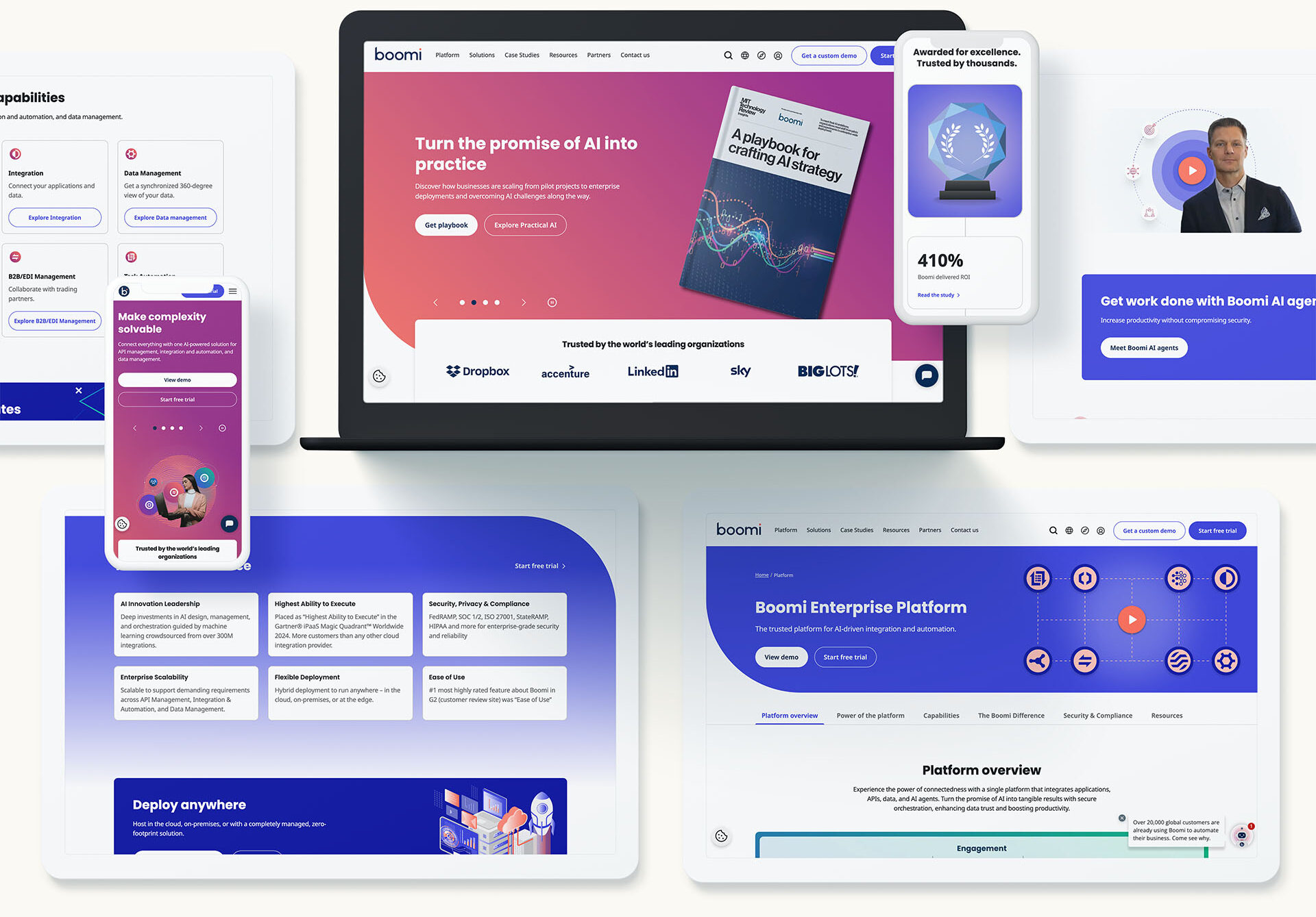
Government contractors face a unique digital challenge: create an experience that checks every compliance box while still connecting with users. It’s a balancing act that requires more than just meeting federal standards—it demands thoughtful, human-centered design that engages stakeholders, builds trust, and supports mission delivery.
At Bluetext, we’ve worked with leading B2G organizations to tackle this challenge head-on. Here’s what it takes to align your UX with both federal requirements and user expectations.
The UX Landscape for Government Contractors
Unlike private sector sites that prioritize conversion funnels or sleek brand storytelling, digital platforms for government contractors must often serve multiple masters. They need to be:
- Compliant with strict accessibility and data security standards
- Clear and intuitive for a wide range of users, from contracting officers to program managers
- Aligned with the mission and values of the agencies they serve
Too often, this results in dense, overly technical websites that users find difficult to navigate. But poor UX doesn’t just frustrate visitors—it can undermine credibility, reduce engagement, and even impact contract wins. Great UX isn’t a luxury in the B2G space—it’s a differentiator.
Accessibility and Compliance: The Non-Negotiables
Section 508 compliance is the baseline for any government-facing digital experience. Alongside WCAG 2.1 guidelines, these standards ensure that websites are usable by people with disabilities, including those using screen readers, keyboard navigation, or alternative input devices.
But compliance doesn’t have to be a creativity killer. In fact, designing with accessibility in mind often leads to cleaner layouts, better content structure, and more usable interfaces for everyone.
Tools like Axe, WAVE, and Lighthouse can help identify issues early in the design process. Even more important is building accessibility into your workflow from day one—writing semantic HTML, designing for contrast and readability, and testing with real users when possible.
Compliance isn’t a one-time box to check. It’s an ongoing commitment that—when done right—enhances the overall experience.
Engagement Without Compromise
Just because your site has to follow the rules doesn’t mean it has to be boring. In fact, engaging design is often about doing more with less.
Here are a few UX principles that shine in the government space:
- Clarity over cleverness: Use plain language, intuitive labels, and clear visual hierarchy.
- Consistency builds trust: Standardize layouts, navigation, and interaction patterns to reduce friction.
- Guide the user journey: Employ subtle animations, progress indicators, and calls to action to keep users oriented and informed.
Small touches—like clean iconography, digestible content blocks, or a smart search function—can go a long way in making your digital experience more intuitive and user-friendly.
Building UX into the Proposal Process
UX shouldn’t be an afterthought—or an add-on once the development process is underway. Forward-thinking government contractors are baking user experience into their RFP responses, showing prospective clients how they’ll create usable, accessible solutions from the start.
This approach demonstrates not only technical know-how, but a genuine understanding of the agency’s end users and mission. By collaborating across design, development, content, and compliance teams early, contractors can avoid costly rework and deliver smarter, faster solutions.
Future Trends in Gov UX
The bar is rising for digital experiences—even in the public sector. Government buyers and stakeholders increasingly expect:
- Mobile-first functionality that works seamlessly across devices
- AI-enhanced interfaces for smarter content delivery and navigation
- Modular, design system-driven platforms that allow for scalable updates and consistency
- Human-centered cybersecurity, where secure doesn’t mean confusing
As these expectations evolve, the ability to deliver UX that’s both compliant and compelling will become a critical differentiator.
Partnering with Experts for Results
Designing UX for the government audience requires more than a basic understanding of Section 508. It requires an agency partner that understands the nuances of federal requirements, the strategic goals of B2G marketing, and the creative potential of great design.
At Bluetext, we specialize in creating digital experiences that meet the highest standards for accessibility and engagement—whether you’re responding to an RFP, redesigning a contractor portal, or launching a campaign microsite.
Is your digital presence working as hard as your proposal team? Contact Bluetext to build a UX that’s as smart, secure, and strategic as your business.
When most people think of gamification, they imagine its applications in video games or perhaps education, where rewards and competition motivate learners. However, the potential for gamification goes far beyond these fields. Today, industries like healthcare, finance, and insurance are leveraging gamification to create more engaging experiences, motivate their audiences, and drive meaningful change. In this blog, we explore how non-traditional sectors are using gamification to innovate and transform the way they interact with both customers and employees.
What is Gamification? A Brief Overview
At its core, gamification refers to the application of game-like elements—such as points, rewards, challenges, or leaderboards—in non-game environments. By tapping into human psychology and the desire for competition, achievement, and recognition, gamification can drive engagement, motivate behavior, and improve the overall user experience.
Traditionally, gamification has been used in the gaming industry and education. However, its principles can be applied across a wide range of industries, with many non-traditional sectors beginning to recognize its power.
Healthcare: Gamification for Better Health Outcomes
One sector that has embraced gamification in surprising ways is healthcare. From fitness apps that track your steps and reward you with badges to mental health platforms that encourage mindfulness practices through daily challenges, gamification is helping patients take a more active role in managing their health.
Consider how apps like MyFitnessPal or Fitbit incorporate game mechanics to encourage users to meet their health goals. These platforms rely on progress tracking, streaks, and social competition to motivate users to make healthier choices. Hospitals and healthcare providers have also jumped on board by using gamified programs to encourage patient adherence to treatment plans. For example, a platform like Mango Health uses gamification to reward patients for taking their medications on time, which has been shown to improve long-term adherence rates.
Beyond patient care, gamification is also making waves in medical training. Virtual simulations with gamified elements are helping healthcare professionals sharpen their skills, offering interactive environments where doctors and nurses can practice procedures or diagnose conditions.
Finance: Engaging Users Through Gamified Learning and Rewards
The finance sector has also discovered the potential of gamification, particularly in educating customers and encouraging better financial habits. Personal finance apps like Mint and YNAB (You Need A Budget) have transformed the often-daunting task of budgeting into something interactive and rewarding. These platforms use gamified features such as goal-setting, progress bars, and rewards to motivate users to save money, reduce debt, and invest wisely.
Fintech companies and even traditional banks are increasingly integrating gamification into their loyalty programs. For instance, some credit card companies now offer rewards based on certain spending behaviors, turning ordinary purchases into opportunities to earn points, unlock levels, and gain exclusive benefits. These incentives not only drive engagement but can also improve financial literacy among users.
Moreover, some companies are using gamified learning platforms to educate customers about complex financial products. For example, certain investment apps offer users the chance to simulate stock trading, rewarding them for making smart investment choices without the risk of real losses.
Other Non-Traditional Sectors Adopting Gamification
Beyond healthcare and finance, other sectors are beginning to explore the potential of gamification. For example, insurance companies are experimenting with gamified apps that reward customers for safe driving habits or completing wellness assessments. By turning these mundane tasks into interactive challenges, insurers are encouraging healthier behaviors and lowering risk, benefiting both the company and the customer.
Professional services firms and government agencies are also getting in on the trend. Gamified platforms are increasingly being used for employee training and compliance programs. These sectors are making traditionally dry content more engaging by offering badges, certificates, or even leaderboards to reward participation and completion. This shift towards gamification not only improves retention of information but also encourages employees to engage with content more enthusiastically.
The Psychological Drivers Behind Gamification
So why does gamification work so well, even in industries that aren’t typically associated with “fun”? The answer lies in psychology. Gamification taps into our intrinsic motivations by offering immediate feedback, a sense of accomplishment, and rewards for progress. This triggers the brain’s dopamine pathways, creating a feeling of pleasure and satisfaction that encourages users to continue the behavior.
By implementing features such as leaderboards, challenges, and rewards, companies can encourage both customers and employees to complete specific tasks or engage with their content more frequently. Whether it’s tracking daily health habits or learning new financial skills, gamification works because it transforms routine tasks into something engaging and rewarding.
Challenges and Ethical Considerations
While gamification offers many advantages, it’s important to acknowledge the challenges it presents, particularly in sectors like healthcare and finance where ethical concerns are paramount. One major consideration is ensuring that gamification is used responsibly and does not exploit users’ behaviors in harmful ways. For example, rewarding users for health behaviors must be done in a way that promotes long-term well-being rather than short-term gratification.
Additionally, integrating gamification into industries resistant to change—such as heavily regulated sectors like insurance or government—requires careful strategy and stakeholder buy-in. Success depends on how well these elements align with the sector’s existing processes and customer expectations.
Unlocking the Power of Gamification in Non-Traditional Sectors
Gamification has the power to transform how non-traditional sectors engage with their audiences. By using game-like elements to drive user participation, healthcare, finance, insurance, and other industries are creating more interactive, motivating, and impactful experiences. The future of gamification is bright, and its potential is only beginning to be realized in industries that once seemed unlikely candidates.
At Bluetext, we help businesses across all sectors leverage gamification to elevate customer engagement and drive behavior change. Whether you’re looking to educate, motivate, or simply make your services more engaging, we have the expertise to design gamified solutions that work for your industry. Contact us today to learn more.
In today’s digital landscape, mobile traffic has not only surpassed desktop but continues to grow exponentially. As users increasingly rely on their smartphones for browsing, shopping, and entertainment, it’s essential for businesses to prioritize mobile-first design. At Bluetext, we understand the importance of creating responsive, user-friendly mobile experiences that enhance customer satisfaction and boost conversions. Here, we’ll share best practices for designing mobile-first websites that can help your business stay ahead in this mobile-centric world.
1. Prioritize Speed and Performance
Mobile users expect fast loading times. A delay of even a few seconds can result in higher bounce rates and lost opportunities. To ensure your mobile site is quick and efficient:
- Optimize Images: Use compressed images without compromising quality. Consider modern formats like WebP for better compression.
- Minimize HTTP Requests: Reduce the number of elements on your page to decrease load time.
- Leverage Browser Caching: Store frequently used resources in the user’s browser to speed up repeat visits.
2. Simplify Navigation
Mobile screens are smaller, and users often interact with them on the go. Simplifying navigation helps create a seamless user experience:
- Intuitive Menu Design: Use hamburger menus or bottom navigation bars to keep the interface clean and easy to navigate.
- Short and Descriptive Labels: Ensure menu items are clearly labeled and concise.
- Clickable Areas: Make buttons and links large enough for easy tapping, considering touch-friendly design principles.
3. Optimize for Touch Interactions
Touch interactions differ significantly from mouse clicks. Designing with touch in mind ensures better user engagement:
- Finger-Friendly Design: Ensure touch targets are at least 44×44 pixels to avoid accidental clicks.
- Gestures: Implement common gestures like swiping and pinching to enhance navigation and usability.
- Feedback: Provide visual feedback for taps and gestures to assure users that their actions are recognized.
4. Responsive and Adaptive Design
A mobile-first approach doesn’t mean neglecting other devices. Your design should adapt seamlessly across all screen sizes:
- Fluid Grids: Use percentage-based widths to allow content to resize smoothly.
- Flexible Images: Ensure images scale correctly without breaking the layout.
- Media Queries: Employ CSS media queries to apply different styles based on the device’s characteristics.
5. Content Prioritization
Mobile users often seek specific information quickly. Prioritize content to meet their needs efficiently:
- Important Information First: Place critical content and calls-to-action (CTAs) at the top of the page.
- Concise and Scannable Text: Use short paragraphs, bullet points, and headings to make text easy to read.
- Visual Hierarchy: Use size, color, and spacing to guide users to key elements.
6. Test and Iterate
Continuous testing and iteration are key to maintaining an effective mobile-first website:
- User Testing: Conduct regular usability tests to gather feedback from real users.
- Analytics: Monitor user behavior and site performance through tools like Google Analytics.
- A/B Testing: Experiment with different design elements to see what works best for your audience.
7. Progressive Web Apps (PWAs)
Consider enhancing your mobile website with Progressive Web App features for a more app-like experience:
- Offline Functionality: Allow users to access content even without an internet connection.
- Push Notifications: Engage users with timely updates and promotions.
- Home Screen Access: Enable users to add your site to their home screen for easy access.
8. Utilize Mobile-Friendly Forms
Forms are often a critical component of websites, especially for lead generation and customer interaction. Ensuring they are mobile-friendly is crucial:
- Simplify Form Fields: Only ask for essential information to reduce user effort.
- Auto-Fill and Auto-Correct: Utilize browser features to help users complete forms quickly.
- Responsive Input Fields: Ensure form fields are large enough and easy to tap, and that they adapt to different screen sizes.
9. Leverage Mobile-Specific Features
Take advantage of features unique to mobile devices to enhance user experience and functionality:
- Location Services: Use GPS to provide location-based services or content.
- Mobile Payments: Integrate mobile payment options like Apple Pay and Google Wallet for seamless transactions.
- Voice Search: Optimize for voice search to accommodate users who prefer speaking over typing.
10. Focus on Accessibility
Ensuring your mobile site is accessible to all users, including those with disabilities, not only broadens your audience but also complies with legal requirements:
- Alt Text for Images: Provide descriptive alt text for images.
- Keyboard Navigation: Ensure that all interactive elements can be navigated via keyboard.
- Screen Reader Compatibility: Use semantic HTML and ARIA roles to support screen readers.
Designing mobile-first websites is no longer optional—it’s a necessity. By following these best practices, you can create responsive, user-friendly mobile experiences that not only satisfy your customers but also drive conversions. At Bluetext, we’re dedicated to helping businesses thrive in the mobile era. Contact us today to learn how we can transform your digital presence with cutting-edge mobile-first design strategies.
Imagine you’ve just launched your latest advertising campaign. After months of conception, perfecting your ad creative, crafting a compelling message, and putting together a thought-through media placement and budget, you’re confident this campaign will convert. But after a couple of weeks of monitoring, your KPIs aren’t meeting expectations. Or at least the ones that matter to your business’s bottom line. Investing more media dollars, refining the target audience, and maybe adding some new placements, is yielding more impressions and clicks, but no conversions. It seems users are interested in your offer, but not willing to take the next step. So where is the disconnect? It may be time for a more critical eye to review your landing page and engage some experts with conversion rate optimization services.
Digital marketing campaigns have a wide range of key performance indicators (KPIs) that define what is considered a “conversion”. Therefore, the first step to any successful advertising campaign is to determine a single goal. The two most common campaign goals are brand awareness and lead generation. Both are equally important, however have key differences in both tactics and intended results.
Lead generation is the process of capturing critical information from potential customers, usually by means of a contact form, to move them into a marketing funnel for retargeting or sales outreach. Lead generation is used to build lists of people who have expressed some sort of interest in your product or services, and provides an opportunity to engage them with the next steps. Brand awareness, on the other hand, is more geared toward making an initial introduction of your brand to a potential customer and educating them on products and services that they may not yet be familiar with. If you imagine it like a cocktail party, brand awareness is the “nice to meet you” handshake, while lead generation is going in for the friendly hug with an acquaintance.
Establishing these goals is a necessary step to any campaign, even required by many platforms in the initial setup. Regardless, if your campaign entails a landing page outside of the advertising platform (ex. social media feed, or Google search), it’s critical to consider what you intend the user to do after seeing or engaging with your ad. That’s where landing page conversion optimization comes into play. The content hierarchy and UX of your landing page is just as important as the ad headline or creative, especially if your goal is down-funnel lead generation.
Bluetext offers a range of conversion rate optimization services and conducts regular and thorough performance analyses of landing pages to improve the effectiveness of any digital marketing campaign. Below are a few best practices to follow as you continue to monitor and optimize your landing page performance.
Optimizing Form Strategy
The primary means of generating sales leads and obtaining information from a user is through contact forms, which may be offering a demo from your sales team, a consultation, a free trial, or an exchange for a downloadable asset. Now more than ever, users are hesitant to give up their information, so you must exchange something of value to them. To entice a user to willingly give up their contact information, you have to balance the level of effort with value. To minimize any friction, your landing page should make your form as simple as possible. That’s why so many businesses embrace the trend of first viewport form placement, which means either all or part of your form is visible upon the initial page load. It requires no scrolling or page engagement to find and complete the form.
Another popular tactic to increase the likelihood of form completion is minimizing the number of fields and making your form seem as quick and efficient as possible. This means reevaluating what information is critical versus what is nice to have for your sales team. Optimizing your landing page contact forms is another highly effective tactic to improve conversion rates.
Improved Information Hierarchy
The most common pitfall marketers tend to make with campaign landing pages is overestimating the user’s attention span. In the eyes of a sales or product team, all information is good information; everything they have to say is interesting and relevant to a potential customer. And yes, providing full information is crucial to closing a sale, but those nuggets of information have a time and a place. In the initial stages of a prospective customer’s evaluation, it is critical to focus their attention on the most pertinent information that would persuade them to complete the desired action (usually a form completion).
Rithum, a leading e-commerce platform, engaged with Bluetext’s digital orchestration & conversion rate optimization services. Since then, thorough A/B testing and landing page variations have been implemented to continually optimize the page towards the key KPI: high-value form fills. Let’s investigate the landing optimization process and key insights:
Initially, a series of landing pages were launched with corresponding PPC campaigns to create brand awareness around a newly formed company. Following a merger of two industry leaders, ChannelAdvisor and CommerceHub, Bluetext & Rithum collaborated on a brand announcement landing page. This featured a brand video as the highest priority on the page, followed by key benefits, value to core audiences (retailers & brands), and promotion of their full platform’s e-commerce ecosystem. It was a long, yet important story to tell so the landing page was geared towards upper funnel awareness.

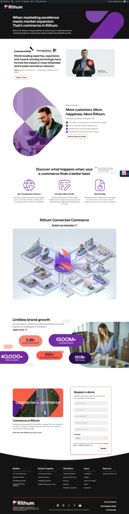
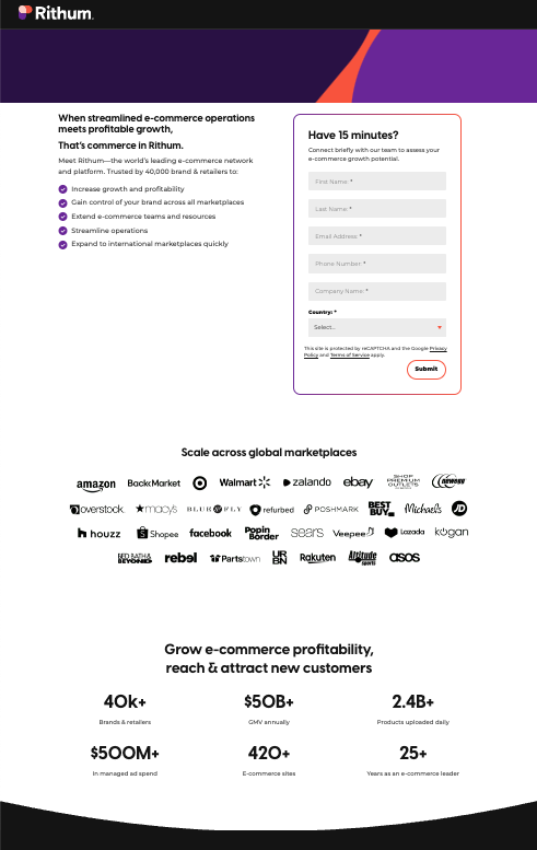
In the months that followed, lead generation became the goal, as that initial introduction was made and now it was time to convert users into prospects. The PPC campaign remained focused on brand terms, but the landing page needed to be optimized to the why rather than the how. To minimize distractions, the page was simplified to prioritize the Request Demo form in the first viewport, with supporting copy that emphasized the short amount of time a sales consult would take out of a user’s day (who doesn’t have 15 minutes?) and the top five pain points that Rithum solves for customers. Much of the previously displayed information was also distilled down to two of the most important points: the benefits of the platform & wide breadth of international marketplaces customers obtain access to. The page is now short and sweet, without any distractions and off-page CTAs. As for the previous page context? Still important, but can be delivered in the sales consultation or on the main website pages.
If your landing pages could benefit from conversion rate optimization, consider these best practices:
- Prioritize lead generation opportunities (for example, demo request forms) at the top of the page, ideally within the first viewport
- Eliminate any CTAs that may drive a user off the landing page
- Distill critical information to only 2-3 components
- Position the key value drivers or proof points that would capture a user’s attention next to contact forms or within the first viewport
- Hide the main website menu to eliminate chances of leaving the page
- Incorporate compelling copy that will hook the end users to convert – “Have 15 minutes?” is a clever hook because it sets an expectation for the call and leaves little room for the excuse of too little time.
If your landing pages need some love, or perhaps just a third-party eye with conversion rate optimization (CRO) expertise, contact Bluetext to learn about our campaign services.
Could the dark mode interface eclipse their light mode counterparts? Dark mode has seen a continued rise in popularity over the past few years following the 2019 release of Apple’s dark mode option alongside the iOS 13 update. Sometimes referred to as “Night Mode”, “Shadow Mode” or “Dark View”, this dark mode is a design term used to describe a low-light user interface that uses a dark color as the primary background color, reversing the default light-on-dark design that designers have used for decades.
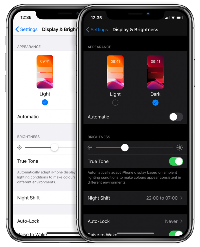
In response to increased user screen time across devices, this darker UI design trend has garnered immense popularity. Big-name brands like Facebook, Google, WhatsApp, Instagram, and Apple were all early movers in adopting dark mode interfaces and have influenced many others to follow in their footsteps. That being said, operating systems, browsers, and apps are not the only places dark mode is continuing to grow in its popularity — more and more website developers and designers are hopping on the dark mode train, opting for UX/UI designs that are dark as night with reasons why that are clear as day.
A “Site” for Sore Eyes, in More Ways Than One
It’s no secret that the aesthetics of a dark mode design can elicit powerful feelings and emotions from visitors. A dark color theme often conveys sophistication, edge, and modern elegance to users. Black is an especially dominant color, often used to create maximum color contrast when paired with whites or vibrant tones. Dark hues are often associated with style and power, which can add striking visual appeal and depth when used strategically as a website’s background. Dark mode is especially useful for image and video-heavy sites. The dark contrasts bright colors, making them look more compelling and instantly captures the audience’s attention. The more visually appealing users find your site, the more likely they are to engage with your content and remain on-page.
More than a Pretty (Inter)face
Aside from just looking easy on the eyes, dark mode can actually be easier on the eyes. Some studies show that dark mode can help reduce the sensation of discomfort that is sometimes felt by staring at websites with light backgrounds. It is especially preferable in low-light conditions where looking at bright white screens for long periods of time on any device can result in eye strain and fatigue. Reducing the pain associated with light-on-dark interfaces by switching to a dark-on-light display can help encourage users to stay on your site for longer.
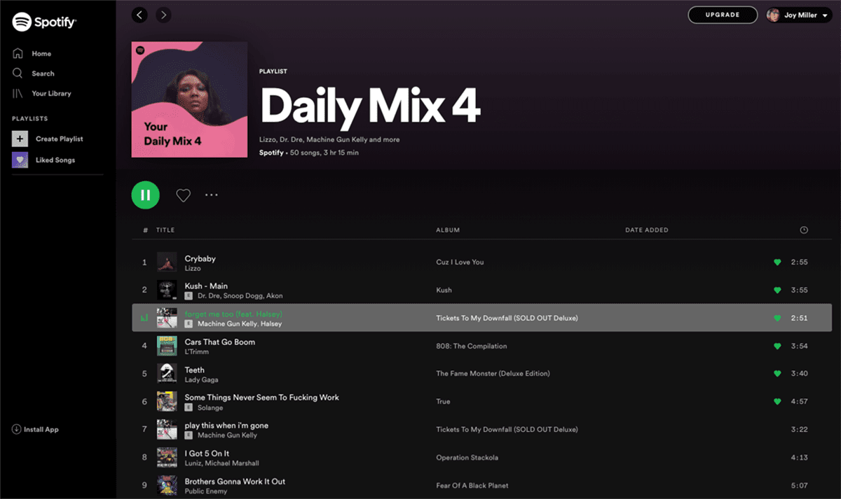
If you’re a Spotify user, your eyes (and ears) have been benefiting from dark mode features for years.
Dark Mode Can Save Brain and Battery Power
UX research shows that dark backgrounds enhance page contrast, making visuals pop and easier for the users to focus on. If your site is imagery-heavy or puts an emphasis on visual or graphic content, dark mode will allow users to be more engaged and get through your site quicker and easier, retaining more content faster and leaving with a stronger impression of what you have to offer.
Dark mode can also save device battery life. Studies show a dark theme can reduce battery usage significantly, especially for users viewing your site on a mobile device. White pixels are more power-hungry than dark pixels, which allow devices to use less energy. In an era when users are glued to their screens, anything that can save device battery power is a win — and your website could be one of those things.
So Now You’re Interested in Dark Mode, but Don’t Know Where to Start?
Good thing Bluetext has got you covered. As a leading digital marketing agency in DC that specializes in website design and making powerful sites for clients all over the world, we’d like to offer up a few pieces of advice to consider when thinking about creating or adding dark mode to your site:
- Determine if dark mode is really right for your website content–and where. Dark mode is great for enhancing emotional branding, showcasing photos and graphics, and emphasizing visual content, but not so great for displaying big chunks of text. Light text on dark backgrounds can cause readability issues in practice, so portions of your website that are or will be pretty text-heavy, dark mode may not be the best choice to display your content. Consider reserving dark mode for a homepage, or flashy campaign landing page, but maybe not your product details.
- Make sure your brand colors can actually work well with a light-on-dark design (see tip #3). If not, but you’re still set on pursuing dark mode, consider going through a rebrand before implementing dark mode.
- Verify your light-on-dark color scheme meets accessibility color contrast standards.
- Dark backgrounds de-accentuate empty space, so limit the number of elements (lots of icons, buttons, and small images) used together within viewports to avoid looking cluttered.
- Make sure your design will work in both low-light and high-light environments.
- Use illumination over shadows to communicate depth.
- Avoid highly saturated colors.
- Leave room for a regular/light option and give users the ability to toggle back and forth as they desire.
- Work with an agency like Bluetext to ensure your dark mode website is sleek, powerful, on-brand, and communicates a strong and engaging message to your audience.
Learn more about dark mode and how Bluetext can help you take your website to the next level. Contact us today.
“Out with the old and in with the new” is our motto heading into 2024. Based on our UX and website design experience, we foresee static websites on a one-way train out. This trend has been long and coming, and it’s about time to improve your website user experience by incorporating more interactive design and animation to improve brand equity.
What is Interactive Content?
Interactive content can be seen as two-way content. Traditional written and video content is static, meaning website users passively consume information. Simple and straightforward, but limited. With static content, people can only engage with content by clicking, hovering, and answering questions.
Interactive content serves users relevant information in a process. One that can be made fun and engaging, without bordering on burdensome. You’ve already come across this type of content format on different websites. Some examples include calculators, quizzes, surveys and polls, interactive infographics, and interactive timelines.
Interactive Content Gives Value to Users in an Engaging Way
Interactive content makes your content easier to digest by taking difficult information and providing it in bite-sized pieces. It transforms their experience from boring to interesting.
When you leverage interactive content, you can personalize information for your users by incorporating quizzes or calculators and providing them with content that’s relevant to them.
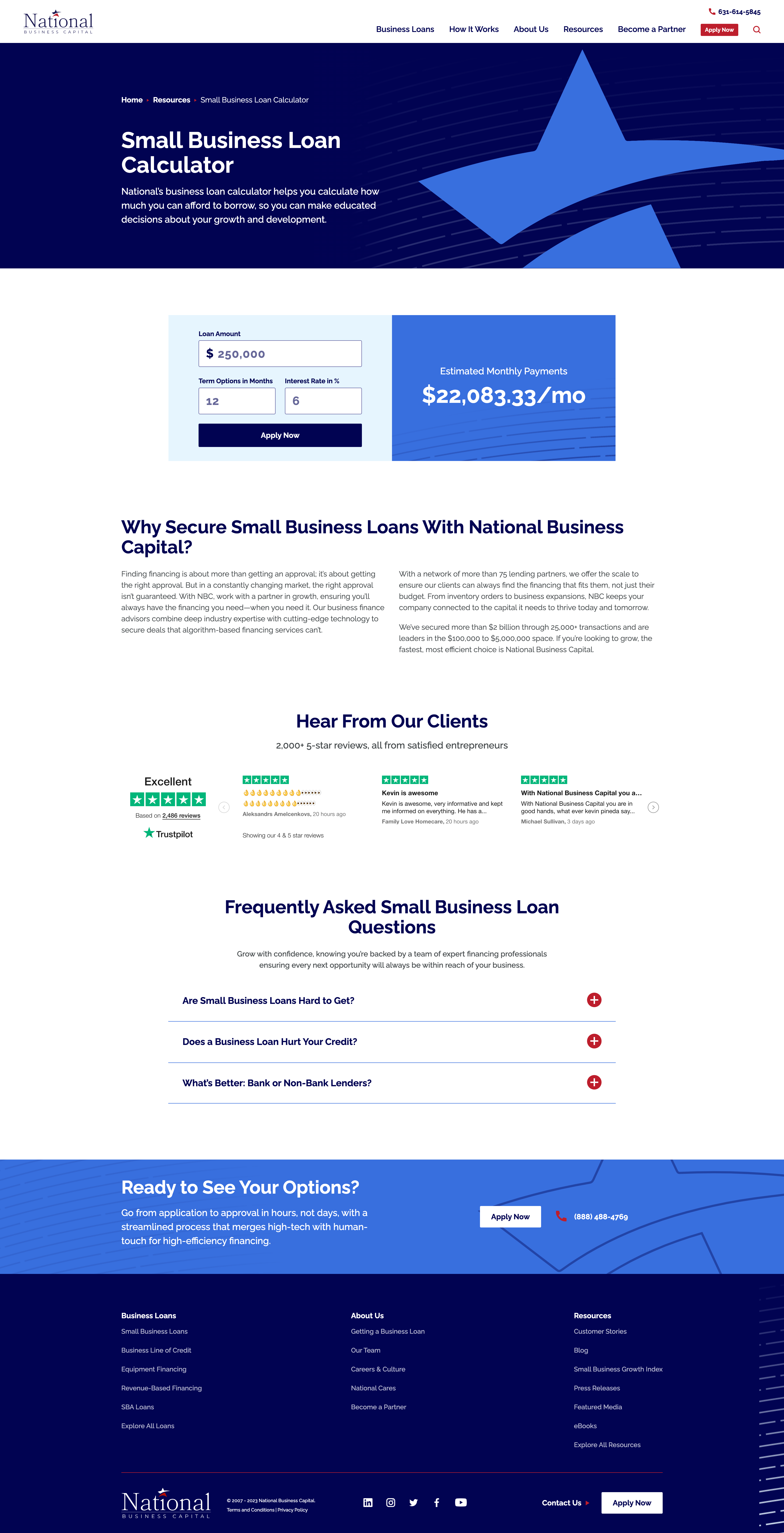
When National Business Capital turned to Bluetext, they sought an interactive calculator that would provide users a quick snapshot of their monthly payment if they chose National as their lending broker. The user simply needs to enter their loan amount, term length, and interest rate and the calculator provides an immediate estimate of their monthly payment. If they click “Apply Now”, that user’s information is captured and reduces the length of the application form, ultimately improving their experience.
Redefining Interactive with Animated Infographics
If you are looking for ways to improve the visuals on your website but can’t necessarily build out a fully interactive webpage, then you should consider animated infographics in your 2024 website redesign.
What exactly is an animated infographic? An animated infographic is a way of visualizing information using a combination of imagery, illustrations, charts, graphs, text, and other elements that are animated, to add movement.
When infographics first gained serious traction online, they started as static illustrations. They would often take the form of extremely long images you’d need to scroll through, but they had a certain charm to them. Shapes, colors, illustrations, and an easy-to-follow structure are big reasons why static infographics work. All that scrolling and slow uncovering of new information was exactly what made the experience enjoyable. It’s not about the destination, it’s about the journey. But here’s the catch, not everyone has time or attention for this long and leisurely road trip. Static-form infographics certainly have their strengths, but digital marketers must be wary of attention spans and the volume of information packed into one design.
An animated infographic will have a much better chance of being noticed, opened, and looked at. With today’s “snackable” content on social media, we need to improve the way users can digest this still somewhat “lengthy” content, and animation is a great way to do just that.
When Rithum™ turned to Bluetext to help bring their offering to life, Bluetext designed and developed a 3-D animated infographic that provided a memorable visual experience for the user, easily establishing and providing them with the information they need to understand the Rithum Network and Platform.
Interactive and Animated Content Will Make Your Brand Memorable
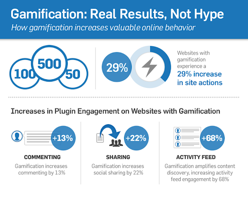
Remember, adding more colors to visuals increases readers’ attention span and recall by 82 percent. So, incorporating animated infographics into your existing content marketing strategy can yield great returns.
Ready to design and develop your next interactive or animated content? Contact Bluetext today.