We already feel like we’ve cracked the code for designing and developing responsive websites, but how do we adapt to ever-changing hardware and thus, screen sizes? How do we address the design for touch-screen flip phones? How about new designs from Apple or Samsung that shake things up in the display department? This year alone we have seen new formats bringing back the 2000s nostalgia of phones that flip, fold, and more.

In this blog post, we explore the top 4 ways to ensure your website is ready for new breakpoints as handheld devices, laptops, desktop computers, and televisions continue to evolve.
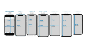
Ensure your design is leveraging the specs of the latest hardware so that you’re not launching with an already out-of-date design
When you’re planning for a new website, make sure your website design agency knows the latest hardware specifications for the most frequently used devices. They should keep an eye out for the pixel height and width of the top five most widely used screens and ensure their design can adhere to these standards. This should be considered for mobile, tablet, and desktop sizes, otherwise, your designs may be considered out-of-date before they even get into development. Be diligent in checking your website’s Google Analytics to see an up-to-date breakdown of device types & even models being used by your current website visitors.
Additionally, as many still working from home due to the COVID-19 pandemic, some people have adopted larger monitors for their at-home workstations. Some of these monitors will display websites at much larger sizes than intended, so we need to consider what the maximum size will look like as well so they do not look distorted or have any unintended bugs.

Establish breakpoints for the design before getting into development
Now that your website design team has established the most commonly used browser sizes for mobile, tablet, and desktop and designed the display for each, it is time to think about when the design needs to transition between each layout. How should the vertical display of the tablet differ from the horizontal? How should a small desktop browser size look in comparison to a larger desktop screen? These are all questions to consider before getting into development.

Your website design agency should ensure there are no gaps between breakpoints, meaning that there should not be a 10-pixel difference between designs so that the development team knows when to trigger the next display. Establishing the pixel breakpoints will keep the website responsive across all displays and will ensure there are minimal opportunities for a display mishap.
Get down to the nitty gritty in your code
When development gets underway, make sure you are using the best practices for writing responsive code. You can even start by developing the mobile display first, working your way up from mobile to tablet, and then eventually desktop and larger.
Consider leveraging viewport specifications directly in your code by using the initial-scale definition within your meta tag to ensure you are setting the stage for the rest of the code to come. From there, you will be able to use percentage values to set font sizing, image scaling, etc. to make sure your website is scaling up and down appropriately. You can also set the max-width for images and different sections within the page to ensure they do not scale too large on certain displays.
Be sure to test your website design before going live
No website is perfect overnight. Make sure your website design agency is fully equipped to perform quality assurance testing by leveraging the latest devices. Don’t have the actual device? That shouldn’t be an issue. One cloud-based testing tool that provides users with all of the latest hardware to test is BrowserStack. BrowserStack is a testing platform that provides developers with the ability to test their websites and mobile applications across on-demand browsers, operating systems, and real mobile devices. By testing the website across various devices, you can discover new breakpoints that may cause display issues for your users, giving you time to remedy them before making the website public.
While it is hard to forecast what the next device is going to look like, we can prepare websites for the changing hardware landscape by designing and developing responsive websites. Taking the time to find the right website design agency will ultimately save you time and money in the long run as technology constantly evolves.
Looking for your next website design agency? Contact us today.