According to Mordor Intelligence, The mergers and acquisitions (M&A) in aerospace and defense market size is estimated at USD 175.36 Billion in 2023 and is expected to reach USD 311.40 Billion by 2028. This remains one of the largest capital-intensive sectors as a result of the meticulous R&D needed to expand, enhance, and integrate product portfolios and stand out in the competitive landscape.
The aerospace and defense (A&D) sector is continuing to consolidate the supplier base to remove unnecessary costs and prolong its place in the market. One of the best examples of this is the 2019 United Technologies Corporation (UTC) and Raytheon Company (Raytheon) all-stock merger to consolidate their spot in the A&D sector. The successful merger achieved improved economies of scale, strengthened R&D, and provided a more diverse portfolio of products.
The Raytheon / UTC merger and its recent rebrand is a prime example of the importance of modernizing a company’s brand and digital identity. Since its founding in 1922, Raytheon has bared its name for over a century. With time, experience, and proven results comes recognition, so the switch to a new name may seem risky. But in order to stay competitive, be inclusive of broader capability sets, and look well-equipped to take on new modern challenges, the switch to the new name, RTX, was extremely intentional.
“RTX is a nod to the past and a nod to the future” – RTX’s CEO Greg Hayes.
Not only is the new three-letter name (and .com domain) simple, unique, and easy to remember, but it also is the same three letters as its stock ticker symbol, which is a combination of United Technologies previous symbol (UTX) and Raytheon’s (RTN), further exemplifying the union of the two companies and brand consistency across all channels. Another recent merger sporting the simplified 3-letter name and domain is the $2.1B combination of Vectrus and Vertex, now V2X.
A brand name change is a powerful move for a company, and there are several factors to consider when undergoing this transformation. Luckily the experts at Bluetext, one of the best DC brand strategy and government PR firms, can help. For more on naming, check our latest insights.
Private Equity has become a major spearhead in the A&D market and now accounts for 47% of transactions and 41% of deal value. Some major A&D mergers that went through recent successful rebrands propelled by PE firms include:
Centauri (now KBR)
When Arlington Capital Partners acquired three leading companies in the national security sector—Integrity Applications Incorporated, Xebec Global, and Dependable Global Solutions—the IAI team turned to Bluetext to develop and launch a new unified brand from scratch. In less than 6 months, the teams worked together to launch Centauri.
The name was inspired by the Centauri star system made up of some of the brightest stars in the sky. The logo represents the company; a group of brilliant minds composing a star system, brought together by the gravity of the mission to form this C shape as seen in the logo:
![]()
The new name and brand were crucial to showcasing the “stronger together” mentality of merging big players in the A&D sector. The rebrand was so effective that within just a year, KBR acquired Centauri, significantly expanding its military space, defense modernization, and cyber solutions portfolio. For more on this successful rebrand, check out Bluetext’s Hall of Fame featuring Centauri.
BlueHalo
Another Arlington Capital Partner acquisition consisting of AEgis Technologies, Applied Technology Associates, and Brilligent Solutions, looked to Bluetext to merge these powerhouse national-security teams together into one superior brand, BlueHalo.
The name BlueHalo represents the unbroken global line that ensures the technical advantage in the most advanced battlespace. The logo embodies the name by featuring a blue swoosh shape that depicts in a clean but strong manner, a halo of protection. It also supports the company’s brand line, “Leading the Transformation of Modern Warfare”

Since the 2020 rebrand, BlueHalo has rapidly strengthened its leadership positions in Space, Cyber, AI/ML, Counter-UAS (c-Unmanned Aerial Systems), and Autonomous Systems, with multiple acquisitions in record time. For more, read about Bluetext and BlueHalo’s partnership or watch the powerful brand essence video that Bluetext created.
Tria
When another private equity firm, Sagewind Capital, acquired Federal Advisory
Partners, Universal Consulting Services, and FavorTech Consulting, Bluetext helped merge these top-performing companies into one stronger, unified brand – Tria Federal.
The simple, punchy, and welcoming name, Tria, is the Greek word for three, representing the company’s commitment to 3 pillars of service:
- Service to Clients
- Service to Colleagues
- Service to Communities
The logo embodies these 3 pillars through approachable and patriotic brand application as a nod to its federal government audience as being the partner of choice in the path to possible. See more about Bluetext and Tria’s work together here.
![]()
Axient
Following a series of promising mergers and acquisitions from Private Equity firm Sagewind Capital, QuantiTech came to Bluetext for expertise and strategy to consolidate legacy companies into a new brand name and identity. Axient became the new corporate name to unite offerings & employees under one mission-driven, innovative narrative.
With a new name and logo design, the Axient brand identity was developed to visually encompass the value of the newly merged company. Sharp angles were intended to symbolize Axient’s cutting-edge expertise while the orbital curves showcase the full-spectrum lifecycle support offered to customers to “accelerate possible”. Watch the visual identity and mission come to life through the brand essence video and learn more about the work Bluetext and Axient completed together.
![]()
If you’re looking to revamp your company’s name and/or corporate image, connect with Bluetext, the top DC government contracting and aerospace marketing firm, to ensure you get the most out of your marketing efforts.
What is a recruitment strategy?
Quality hires are the key to a company’s ability to execute its goals and deliver on its mission. Every company wants the best people and in order to accomplish that, you need a defined and thoughtful recruitment strategy. Similar to your brand or marketing strategy, it leverages channels to your audience to communicate who you are as a company and the value you bring to that specific audience. So often, you see little attention paid to job listings and careers webpages; however these, as well as many others in this digital age, are key touchpoints in a candidate’s decision-making process. Continue reading to learn our tips and tactics for creating an effective recruitment strategy:
Tactics to follow to attract top talent in a competitive recruitment market:
Identify the ideal traits for potential candidates and treat it as a persona exercise
Ask yourself, what is their current job title? What is their educational background? What career benefits and outcomes are they looking for? How can you, as an employer, showcase the ways in which you meet a candidate’s requirements as well as how they meet yours?
Strengthen your brand identity
If the candidate can’t glean who you are, what you do, and what your mission is based on preliminary interactions with your website and marketing materials, they aren’t likely to continue to engage with your company let alone apply for a position. At the top of the funnel, recruitment candidates are not that different from prospective customers – a strong, unified brand presence with clear impactful messaging is key in them taking the next step and applying for your position.
Optimize your job postings for the digital age
There are endless digital tools at your disposal to make your job postings stand out. Unique media ranging from brand videos and video employee testimonials to the implementation of the best brand strategy forms and unique ATS tracking capabilities position your company to put your best foot forward when searching for top talent. We often hear about optimizing content for SEO value, and the same consideration should be paid to crafting a job posting. Your job description and each brand touchpoint along the way including your digital and social media presence are influential in the recruitment process and a candidate’s decision-making.
Participate in events
Engage in events that emphasize your industry standing and expertise. You can talk about your company’s extraordinary capabilities and talent until you are blue in the face, however, you need to find ways to demonstrate it in a setting of industry peers.
Use LinkedIn
Social platforms, especially LinkedIn can be a powerful tool in growing your brand presence as an employer, showcasing accomplishments, and attracting prospective talent. Consistently posting insights from your team, particularly from your company leadership, can go a long way to demonstrate engagement in industry trends and subject-matter expertise. In a much more practical sense, social media is becoming a more and more prominent job search tool across many industries. In the last year, 79% of job seekers have used social media in their job search. This lends itself to a holistic digital recruitment strategy that includes a strong LinkedIn presence with insights and actual job listings being posted consistently as well as a link driving users to your company website where they can find even more relevant information on your careers page.
Create an employee referral program
When searching for new employees, who better than your current employees to identify candidates that will do the job well and be a good fit on the team. Not only does hiring through employee referrals eliminate the need and cost of sourcing candidates through recruiters, it also positions you to find higher quality, longer-term candidates – 45% of employees sourced from employee referrals stay for longer than 4 years, while only 25% of employees sourced through job boards stay for over 2 years.
For more tailored recruiting and brand strategy tips, connect with Bluetext today!
Pagination – a seemingly simple yet immensely impactful element of web design and content organization. One that can transform an overwhelming scroll into a series of inviting steps, prompting exploration and easing the burden of information overload. In this post, we’ll uncover the essential role pagination plays in enhancing user experience and strategies to create a seamless, page-turning digital journey for all who venture online.
PAGINATION IMPORTANCE
Pagination is a user-friendly approach for the display and management of large volumes of information on a website. In contrast to infinite scrolling- or, a continuous flow of content that automatically loads as the user scrolls down the page- pagination involves creating a system of numbered links or buttons that allow users to navigate through different pages or sections of content and data. This is a critical tactic in website design as it significantly enhances usability.
When used strategically, pagination can positively impact user experience in the following ways:
- Easier access to relevant content. While infinite scrolling can provide an immersive experience, it can be difficult for users to locate specific information or access footer navigation. Pagination enables users to quickly locate the content they’re interested in and can significantly reduce the length of a page, making it easier for users to reach the footer.
- Maintains a balance between aesthetics and function. Cluttered interfaces with endless scrolling can lead to a clunky user experience. Pagination offers a clean and structured layout, preserving the overall coherence and readability of the website’s design. Not only does this enhance the visual appeal of the website, but allows users to enjoy a more intuitive browsing experience.
- Simplifies content consumption. Without pagination, websites featuring extensive articles, product listings, or search results could become overwhelming and tedious to navigate. By breaking down content into smaller, manageable chunks across multiple pages, users can easily digest information without a sense of frustration.
- Responsive Design: Pagination can also contribute to a more responsive design, especially on mobile devices. Large volumes of content on a single page can be challenging to render properly on small screens, while pagination allows for a more adaptable and user-friendly presentation.
- Faster Load Times: With infinite scrolling on a long page, you’re constantly loading more and more content into memory. This hurts page performance since the browser has much more work to do to load the page. By spreading content across multiple pages or views, pagination reduces the amount of data that has to render and transmit on initial page load. This leads to a faster and smoother browsing experience for users, including those who may have slower internet connections or limited bandwidth.
In addition to positively impacting user experience, pagination also plays a crucial role in improving web accessibility by making it easier for users of all abilities to access and interact with the content effectively. Here are a few of the ways pagination helps ensure that content remains digestible and navigable for those with disabilities or impairments:
- Reduced Cognitive Load: Individuals with cognitive disabilities can often find it challenging to process large amounts of information presented on a single page. Pagination breaks down content into smaller, more manageable segments, reducing cognitive overload and making it easier for these users to understand and engage with the material.
- Improved Screen Reader Experience: Screen readers- tools used by people with visual impairments- navigate web pages by reading out the content in a linear fashion. With pagination, the content is presented in a structured manner, allowing screen readers to provide better context and enable users to explore the information more efficiently.
- Keyboard Navigation: Some users rely solely on keyboard navigation due to motor impairments or other reasons. Pagination provides clear landmarks and links, enabling these users to move through the content with precision. It prevents the need to scroll through an overwhelming amount of data, making navigation smoother.
- Predictable Interaction: Consistent and predictable user interactions are vital for accessibility. Pagination offers a standard way for users to move between pages, ensuring that individuals who rely on assistive technologies can anticipate and understand how to navigate the website’s content.
To sum it up, pagination prevents information overload, allows for ease of use, and improves navigation, all of which collectively contribute to a more user-friendly, inclusive, and satisfying experience on a website.
PAGINATION TYPES AND USES
In web design, different types of pagination styles can be employed to enhance user experience and navigation. Each style offers a unique way of presenting content across multiple views. Let’s break down some of the most common pagination styles and when they should be used:
- Numeric Pagination: This is a classic pagination style that involves displaying a series of numbered links that correspond to different pages of content. Numeric pagination is suitable for websites with a substantial amount of content, such as articles, blog posts, or search results. It provides users with a clear overview of the available pages and allows them to jump to specific sections directly.
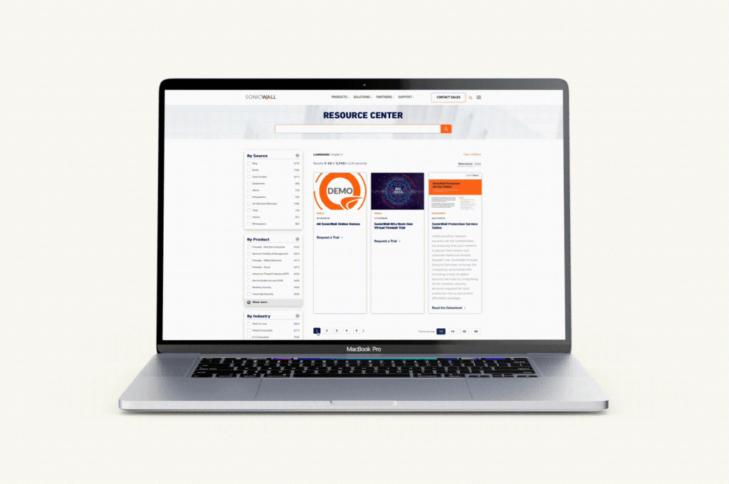
Check out our SonicWall work here
- Prev/Next Pagination: Prev/Next pagination employs “Previous” and “Next” links to navigate between pages sequentially. This style is suitable for content that follows a linear progression, such as articles or blog posts. It’s a simple and intuitive approach that is especially useful when users prefer to read content in a specific order. See this approach in action on the Bluetext blog — and read some more UX tips and tricks while you’re at it!
- Alphabetical Pagination: Alphabetical pagination categorizes content based on alphabetic characters, allowing users to jump to sections of content starting with a particular letter. Alphabetical pagination helps organize a large amount of data in an easily accessible manner and is most often used for directories, glossaries, or indexes.
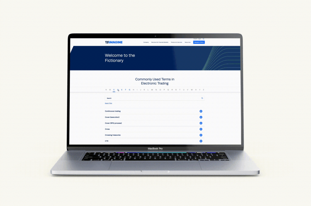
Explore more of our TS Imagine work here
- Date-Based Pagination: Date-based pagination organizes content by date, often seen in archives, news websites, or event listings. Users can navigate through different periods of time to find relevant information. This style helps users discover content based on chronological relevance.
- “Load More” Button: Instead of traditional pagination links, the “Load More” button dynamically loads additional content as the user progresses down the page. This approach is a strong alternative to infinite scrolling, allowing for the same seamless feel and browsing experience while minimizing page reloads and giving users control over when to retrieve new content. “Load More” is commonly used for social media feeds, image galleries, and continuous content streams, as well as robust listings like Google search results.
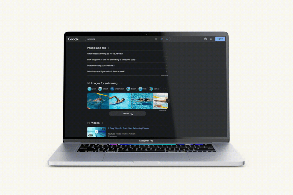
Google search listings recently upgraded from a simple, numeric pagination to a dynamic scroll and load more experience.
When choosing a pagination style, it’s important to consider the type of content you’re presenting, user preferences, and the platform’s goals. The chosen style should align with the overall user experience strategy, offering convenience, clear navigation, and a seamless interaction that caters to the specific needs of your audience and the nature of the content being displayed.
Ready to pump up your pagination or revamp your website with the help of a leading digital design agency and UX experts? Get in touch with Bluetext today and let us transform your digital brand experience, one page at a time.
Ever wish you had a magic tool to help communicate trends, patterns, and insights based on complex data sets? Luckily, that tool exists, and it’s something you’ve already seen and used in its most simplistic form – data visualization. It’s believed that around 65% of people are visual learners, so it’s not surprising that data visualization tools are so effective and widely used in many industries.
Data visualization can be simple or complex, ranging from simple charts, graphics, and maps, to more complicated visual representations. These tools analyze complex data sets, identify patterns, extract valuable insights, and present it in a visual format that’s easy to digest and make informed decisions from. Take a look at this very simple example from Tableau using a word cloud chart to emphasize the frequency (and thus importance) of a set of words. The more important or frequently used a word is, the larger and brighter it appears.
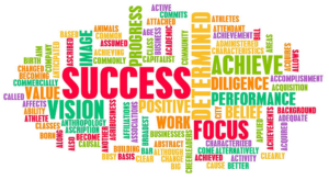
This data visualization example is rudimentary but effective. Advanced data visualization is more than just converting data into charts and graphical formats. It’s part of a company’s BI (business intelligence) strategy that generates new insights and helps communicate them more effectively, making for easier understanding, collaboration, and decision-making. And with the overconsumption of content in today’s world, who doesn’t want help making well-informed, smart decisions?
The value of data visualization is clear, but how do you know which type of data visualization is right for your need? Especially with AI entering the chat, there are several types of data visualizations to consider. Here are 5 data visualization types that you should know about.
1. Interactive Visualizations
People have been using static data visualizations like charts and maps for centuries, but what makes data visualization more useful is the ability to manipulate it. Interactive data visualization allows users to interact with the data directly within the visualization itself to explore and better understand it. The ability to interact with the data has a number of benefits compared to traditional static data visualizations. It provides a more immersive experience that lets users feel empowered to explore the data in more depth. It also helps uncover insights like patterns and trends that might not have been obvious in a static format. All of this leads to better data-driven decisions.
2. Collaborative Analytics & Visualizations
We can’t talk about collaborative data visualization, sometimes known as social business intelligence, without discussing analytics. Analytics plays a huge role in business operations, but understanding all the different data points can be a complicated and overwhelming venture. Using business intelligence (BI) software, organizations can collaborate on shared goals faster and be better aligned cross-functionally. The key to this is embedded analytics. Traditional BI systems rely on data stored on an internal database, but embedded analytics integrates BI tools and functionality into business applications which gives users access to data and insights directly within your applications (such as websites, apps, CRM, etc.). The convenience and accessibility of these insights allow for even more collaboration and faster decision-making between teams. Some of the most popular BI tools on the market today include Microsoft’s Power BI, Tableau, Qlikview, and Domo.
3. VR and AR Visualizations
You haven’t splurged $16k on family movie night using Apple’s Vision Pro VR/AR headset? Neither have we. But we have learned how AR and VR can create more immersive data visualization experiences by enabling users to engage with data in three-dimensional spaces. Users can see the various layers of datasets with additional context that spreadsheets or traditional visualizations can’t convey. A larger density of data can be shown at once, which allows for much faster cognitive processing compared to 2D visualizations. This new “immersive analytics” field will help data scientists tell better stories by breaking down the complexity of the data, offering more involvement and understanding in data analytics to everyone, not just data professionals.
4. Real-Time Data Visualizations
We’re constantly seeking the most up-to-date information and sources, so it makes sense that the most relevant data visualizations would be in real-time. Real-time data visualization allows you to monitor and analyze data as it’s generated, enabling users to make fast, informed, data-driven decisions. In addition to better, more confident decision-making, another huge benefit is improved accuracy and productivity. Real-time insights can help identify anomalies or errors as they occur, enhancing the reliability of the data. Typically, real-time data may involve working with sensitive or personal information, so it’s important to ensure that data security and privacy are accounted for. As more and more data continues to generate in real-time, the demand for real-time insights will grow.
5. AI-Powered Visualizations
At its core, artificial intelligence is the simulation of human intelligence processes though machines, and it has changed the way we problem solve. We could speak to the various definitions of AI, the different types, the implications, applications, and considerations, the ethical delimas, and more all day, (and probably lose some sleep over-thinking it). But right now we’re focused on AI’s impact on data visualization.
Traditional data visualization uses algorithms to create charts and graphs from data, whereas AI-driven visualization uses algorithms that can learn, understand, and respond to the data, potentially even better than a human can. AI-driven data visualization has several key benefits that the previous types of data visualizations don’t (at least not to the same extent). Automating repetitive tasks producing meaningful information is one of those. AI-powered data analytics can streamline your workflow and automatically generate personalized charts and graphs that easily communicate complicated information and insights. This saves time and resources, and combining the AI insights with human SMEs makes for better, well-informed decisions and smarter AI model builds that continue to improve as it learns more.
All of these data visualization types have the same common goal – to empower users to make faster and more confident data-based decisions. (See Bluetext’s blog on using data to create powerful PR narratives). With the rapid growth in AI, big data, data science, and machine learning, the importance of data and data visualizations for understanding and interpreting complex information will continue to surge.
You’ve done so much work to get to this point. All of your efforts to get traffic to your site, engage that traffic, and convince them of your value have led to this moment: the contact form. Don’t let a simple mistake cost you that lead. There are myriad of reasons a user will abandon ship on a contact form, but most of them are easy to avoid. Keep reading to ensure your contact forms are doing all the right things.
Make it Simple
If you take one thing away from this blog, let it be to simplify your forms as much as possible. We often hear clients say, “we can make that field not required.” Required or not, a user still sees each field adding length to the form and thus perceives the form to be longer, requiring more of their information and time. Ask your sales team what information is absolutely critical to appropriately follow up with a lead and keep the form to those fields with two exceptions:
- Keep fields that users want to fill out, such as a field to explain the problem they’re having or their feedback.
- Keep fields that will make a big impact in the quality of your leads. Higher conversion isn’t impressive if quality suffers.
If you must have a longer form, consider breaking up into multiple steps to make it more digestible.
Also, spam prevention tools are great, but the user can see them as yet another step, especially if they have to solve a puzzle. Explore hidden spam prevention tools like Akismet or invisible reCAPTCHA.
Help the User
Reduce the risk of user error and help resolve user errors by leveraging the following:
- Auto-fill and autocomplete: Allow your forms to populate based on the user’s saved browser data, such as for address or billing information and consider autocomplete suggestions.
- Mobile input types: Certain HTML can trigger specific selectors and keyboards to appear on your mobile device, such as a number pad for phone numbers or picklists for month and year.
- Field input masking, validation, and help text:
- Input masking is a way to control how data is entered into a field. For example, a phone number field can automatically apply parenthesis, hyphens, and/or spaces to help the user input the expected format. Masking can also help with fields like credit card numbers when the input is long and often mistyped or date fields where the input varies (MM/DD vs. DD/MM, YYYY vs. YY).
- If your user happens to enter an invalid input, show an error message immediately next to the field so they can correct prior to form submission. Make sure the error message is descriptive enough to understand what was incorrect.
- If you have an uncommon field, such as Account Number, use help text to tell the user where to find that information and an example of what the input should look like.
- Accessibility: Consider all users when creating your forms. You don’t want to lose a lead simply because someone can’t submit your form due to a disability. By following WCAGs latest standards, you can avoid these issues, such as the size of tap targets, font size and contrast for legibility, navigating the form using a keyboard, and using a screen reader.
Design for the Brain
The design of your form can impact how complicated the user’s brain perceives the form to be.
- Stacking fields in a single column vs. side-by-side columns makes it easier to scan to assess. A common exception is fields that are typically side-by-side, like first and last name or two shorter, related fields like state and zip code. When fields are side by side, keep the spacing between them to a minimum.
- Adjust the field width to the expected input length. For example, a phone number field should be longer than a zip code field.
- Keep field labels visible at all times and left align them above fields.
- Denote which fields are optional vs. required.
Set the User’s Expectations
Filling out a form can be intimidating if you don’t know how your information will be handled and what comes next. Set these expectations by introducing your form with call-to-action language that makes the purpose of the form clear, such as “Contact us today to schedule a free assessment.” Then, make sure the “submit” button text is indicative of the action, such as “Request assessment.” Lastly, show a thank you message or page to let the user know the form submitted successfully and what they can expect next, such as “We’ll call you within two business days.”
It’s also important to set the user’s expectation around how you use their data. Not only do you want to comply with data privacy laws, you want to assuage the user that their data is safe and will not be used for any unauthorized marketing. Make sure your privacy policy is accessible wherever a form is present and outline how you plan to use their information from the form.
Make the Form Available
This sounds obvious, but your form should always be accessible with one click from anywhere on your site. If your form is specific to a page, it should be available within the first viewport. Do not make your user go looking.
Test, Test, and Test
First, test all edge cases to ensure your form is functioning correctly. It’s a sad day when you realize your form won’t submit on mobile devices or for users with a particular browser. Second, consider AB testing different approaches. If AB testing isn’t an easy option, try to at least watch users interact with your forms using recording tools like Crazy Egg to better understand where they struggle. If the number of quality leads on your site is your primary KPI, it deserves testing. As a part of testing, ensure you’re also tracking the percent of users who start and complete your form, not just the percent of users who are submitting the form. The ‘form initiate to complete’ conversion rate is just as important for measuring the impact of changes!
This blog seeks to demonstrate how many factors can impact a user’s decision to fill out a form on your website and how to combat many of them. If you are struggling to get quality leads, a digital marketing agency can assess the points of friction and help you overcome them. Don’t do the hard work only to miss out on opportunities that could have been saved! Contact Bluetext to learn more about forms and conversion marketing best practices.
7 Key Considerations for Optimal User Experience Design
When it comes to architecting and designing a new website, we hear people drop the “UX” buzzword all the time. Oftentimes what they mean is, “the experience users will have on my site,” rather than the true definition of user experience design (UX), which is to design for the user. It’s easy to get distracted by ego. We want our websites to be unique and visually interesting, but sometimes it’s at the expense of the user. True UX means always prioritizing the user’s needs above all other considerations, even if you have to make sacrifices.
The easiest way to design for the user’s experience is to remember that people use websites to find information. They are not looking to be impressed by some fancy animation or navigation they’ve never seen before. That’s why UX really begins before the design phase, in information architecture planning.
1. Sitemap UX
Once you have your website personas, you can define what type of content those personas are looking for and how they are most likely to find it. There are typically three ways to structure your site map: by category, by task, and by audience. Sometimes a site map will provide two options, but all three is rare and may actually hurt more than it helps. Make sure your navigation is structured how your users would look for information, not how you structure your company.
Site map pro tips:
- Within your menu, try to limit any single level of navigation to no more than 7 items, as that is the average recall limit of our short-term memory.
- Use terminology in your menu people understand. For example, an internally named product like ‘Awesomeness5X” may not mean anything to someone looking for a blender with 5 speeds.
- Use a different structure in your actual site map page than your menu. If a user ends up there, it’s likely because they couldn’t find what they were looking for in the way you presented it in your menu.
2. Content Strategy UX
Once you have your sitemap, it’s time for your on-page content strategy. Again, in thinking about our users it’s important to remember a few things. First, people read much less on a computer screen than they do on paper. Conciseness is key. If you can, put your “bottom line up front” and then expand on details. People will keep reading if they know they’re on the right page, but may bounce if they can’t quickly find the information they’re looking for. Second, make your page as easily scannable as possible by using headings and lists. Brains love lists!
Content pro tips:
- If your page becomes very long with more than three headings, it likely means you need to add detail pages.
- Keep things elementary. You may want to impress your users with big words, but the average user has a basic or low level of literacy.
3. Global Elements UX
As you start to move into design, remember that most people use the internet all the time, and we’ve learned to look for common visual cues on websites. Part of UX design is including visual cues to help the user navigate and use your site. For example, many people will arrive on your site on a page other than the home page through Search. If they do, they need to orient themselves. A great way to provide this orientation is through breadcrumbs and meta titles. When it comes to icons, always include a label. Do not assume users know what your icon means. Lastly, underline your links and change the color once they’ve been clicked to help the user understand where they can go and where they’ve been.
4. Imagery and Videos UX
Media is great. It can bring a lot of life to a website. However, media should never distract from the content and should always provide value. Adding a large grid of images to a page at the expense of important content is distracting and images that are not relevant or feel inauthentic, do not provide value. If adding videos, allow the user to interact with video settings and do not have them autoplay.
5. Search UX
Even with the best architecture, users will still search, sometimes even as their preferred method of navigating. Try to mimic the Search engine results pages we’ve all become familiar with. This means including the page title, a description, and the URL in the form of a breadcrumb in each result.
Search pro tips:
- Make the entire listing result clickable, no just the title or URL link.
- Keep the search field on the results page with the query still in the field for easy editing.
6. Mobile UX
Mobile usage increases every day. It’s imperative that everything you make available to a desktop user is available to a mobile user, meaning you don’t forego content or key functionality. Make sure anything clickable is at least 40x40px so fingers don’t make mistakes or struggle. Lastly, consider site speed. Most mobile connections are much slower than our home Internet, so make sure your users can load your page at a reasonable speed. See our site speed blog for more information on site speed optimization.
7. Accessibility UX
Lastly, consider all users. Your design and website functionality should ensure that users with any sort of barrier can interact with your site, including those with physical disabilities. Common UX issues related to accessibility revolve around color contrast, keyboard navigation, and screen reader capabilities. By following WCAG guidelines, you can ensure that users can experience your site as intended.
Accessibility pro tip:
- Use Google’s Lighthouse tool or the WAVE extension to regularly check your website for issues and suggested corrections.
This blog is in no way comprehensive, but it touches on common parts of the web design process in which the user is easily forgotten. Remember that the user is why the website exists, so always ask yourself, “is this choice helping my user?” Data can also be very helpful if trying to assess your UX. Where does your analytics show users dropping off? What do screen recordings of real sessions show?
If you need any help along the way or want to learn more about UX Design, contact us at Bluetext to guide you through a strategic website project with UX best practices in mind.
In our recent blog post, we discussed the power of strategic branding in the world of private equity. As we mentioned, the first step in developing a new brand for an M&A should be to gain understanding and consensus on how you want to be (and can/should be) positioned within the market via your company messaging and positioning. Once you have the words right, it’s time to get the looks down. Your company CVI (corporate visual identity) includes the logo, the color palette, typography, graphics and iconography, unique branded elements like an image masking or pattern overlay, and so much more. As we stated before, you only get to go to market with your new brand once – make sure it counts by following our steps to a successful M&A brand launch below.
3. Define the New Company Structure
When merging multiple companies, it’s important to think through the new structure, from multiple points of view – the employees’ roles, the products/services/capabilities, the customers and partner channels, the company values and culture, just to name a few. Understanding and clearly communicating how everything will fit together will help employees adapt to the change and ultimately help the brand strength. Ideally, you should already be thinking about this during the messaging and positioning phase and should have an idea of what’s overlapping, what’re the new capabilities that need to be accounted for, and write new content for? How do they fit into the company story and how do you market them? How does this affect the website’s sitemap, content, and user journey? How does this affect current and new contracts?

Understanding the company’s new structure and thinking about new processes early on makes it easier to design around the new information architecture, flag problem areas that employees or customers might be confused about, and address them before it becomes a challenge. It’s also beneficial to look ahead – many times during an M&A, companies might be in the process of acquiring another new company/companies towards the end of when they’re launching the new brand. Accounting for that potential while thinking about the new company structure and information architecture encourages a scalable structure knowing that the company’s solutions and capabilities will likely continue to expand throughout the process of building the new brand.
4. Plan Your Internal & External Go-To-Market Campaign
Now that you have strategic messaging and positioning, a new corporate visual identity, and a good understanding of new company architecture, it’s time to start planning the launches – both internal and external go-to-market campaigns.
Employees are brand ambassadors, so set them up for success with a smooth internal launch by setting expectations and communicating in a clear way how this change will affect their roles/responsibilities, the culture/values, etc. Employees are looking to understand what this change means for them. How is their job changing, what’s the new org chart, who do they report to, how do they refer to the brand, etc? A personal touch like a letter or video from the CEO can go a long way in delivering a level of unity and excitement about the upcoming changes. Prep them with swag bags of new branded merchandise, prepare a digital brand assets package with all new branded collateral templates like pitch decks/presentations, datasheets, white papers, business cards/stationery, email signatures, brand guidelines on how to use and apply the new branding, etc. A well synced internal launch promotes confidence about the new company and its opportunities, and the employees are an extension of the brand, so preparing them and motivating them for the changes to come are necessary for the brand to hold strong internally before launching externally. The better you communicate to and prepare employees, the stronger the brand will be represented through them.
A compelling Go-To-Market campaign is essential for an external brand launch. This includes everything from PR and media outreach, to ensuring the website is ready to launch, to a strategic paid social campaign with PPC, hyper-targeted ads, geofencing, marketing automation with email campaigns, optimized SEO, and maybe even a brand launch or brand essence video to really stand out and help tell your story.
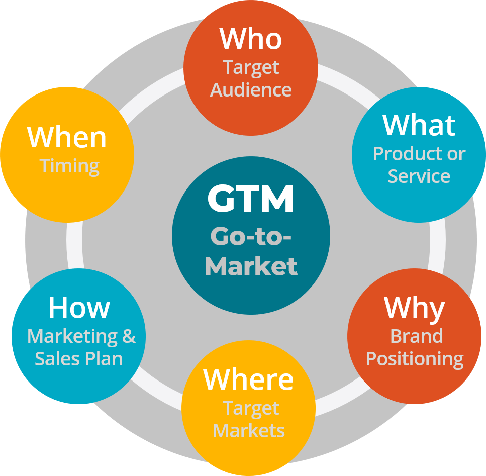
The GTM campaign is where everything comes together – the messaging and positioning weaved in the campaign theme, the compelling visuals representing the new corporate visual identity, and the excitement around the new company’s capabilities and what this means for customers. Executing on a strong go-to-market campaign is not only critical in getting brand awareness, but also in driving home the value of being stronger together – both internally and externally. It’s not about the change; it’s about what’s next, together.
Case Study: SpaceIQ
Enter three leading brands of the workplace management industry: SiQ, Archibus, and Serraview. Each with a rich product portfolio with distinct features, designed for the needs of different sized companies. United, they offer integrated workplace solutions that optimize the workspace and enhance employee experience for companies of any size. Project Union became the name of this powerful merger of three companies into SpaceIQ, a comprehensive solution on a mission to make the workplace good for business and great for people.
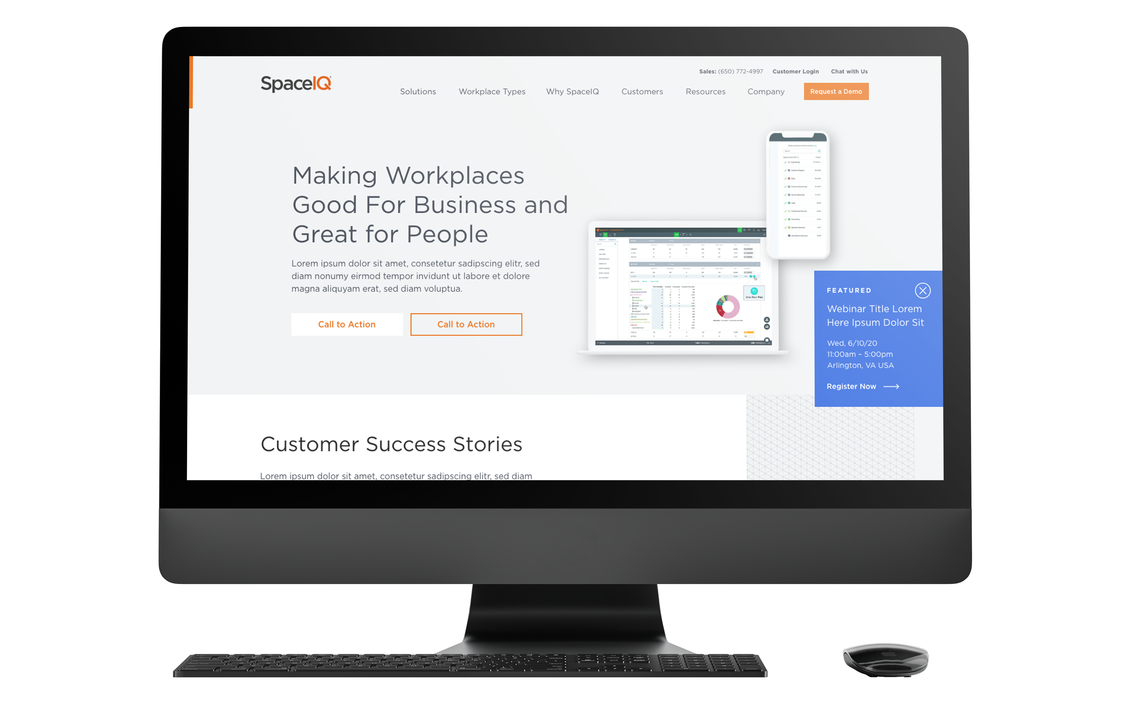
To solidify the merger, SpaceIQ needed a new website that spoke to its breadth of offerings and united company mission. The company turned to Bluetext to turn their new branding into a fully responsive and intuitive website to communicate all of their product lines. The new site was designed with the end customer needs top of mind. Using dynamic components to showcase success stories, custom glossary pages, and a robust resource center for all post types, SpaceIQ customers can easily find all the educational resources they need. The three legacy brands’ relevant products are clearly identifiable through the sitemap and component features, but balanced by cohesive branding and streamlined user journey.
5. Keep It All Going
Finally, keep the momentum going, and even ramp it up! The early stages of launching a new brand from multiple companies require a lot of time, energy, and effort to maintain the excitement and continue to push brand awareness. Also from a technical perspective, there are things to consider like not immediately redirecting all legacy websites to the new site since a lot of content, like contract vehicles, for example, needs to still be accessed. However, it should still be obvious that it’s now a new company – so adding homepage banners on legacy sites with the brand launch announcement, or updating logos on the legacy LinkedIn pages (but not removing them), can help make the transition easier for customers until the brand has had time to fully establish itself in the market and stand on its own. SEO is another area that requires some time and love to see improvement since it’s likely a new name and some new search term combinations that google is processing.
A company is only as strong as its talent, so maintaining and recruiting top talent should be a priority. Consider starting a series of video vignettes with current employees speaking about their time at the legacy companies and how it’s been at the new company. Why do they love it, what makes this company different from competitors, how are there more opportunities now, etc.
Along with recruiting campaigns, continuing to execute strategic brand-awareness campaigns via paid and organic social, continuous content writing for SEO and thought leadership, etc. is a long-term game that’s critical in moving from brand awareness into more specialized branded experiences that will resonate even more with the market.
The stronger the M&A brand launch is, the easier it is for PE firms to sell
The most important thing to address in an M&A brand creation is the why (aka, the value prop) behind the new brand and set clear expectations of what this means for employees and ultimately the market. What new, innovative outcomes can we enable? Prove the value proposition of being better together. If you can get the employees and your target audience on board with the new mission, it becomes less about corporate changes and transactions and more about the new opportunities that arise from being part of this new market-dominating company. And when the portfolio companies succeed, the PE firms succeed. For PE firms, having a strong brand itself, as well as a portfolio of strong brands, is crucial for deal sourcing, fundraising, and ultimately achieving higher investment returns.
A brand is often considered a company’s most valuable asset – make sure it’s in the right hands.
If you’re looking for expert strategy and implementation for your next M&A brand launch, you’re at the right place with Bluetext. We know a thing or two about M&As. 40 of our clients have been acquired within 24 months of an engagement with Bluetext. See some examples of our work with these M&As here, and contact us to get started.
PE firms need portfolio companies with strong branding
Private Equity (PE) continues to be the preferred growth financing mechanism for most “for-profit” businesses. According to McKinsey’s 2019 Market Annual Review, “global private equity valuation has grown more than sevenfold since 2002” – more than twice the growth of publicly held equity valuation. While PE fundraising declined in 2020 to the Covid Pandemic, PE markets are experiencing a strong increase in 2021.
PE firms make most of their profits by acquiring companies, helping management increase Enterprise Value through various strategies, and then selling these companies at a much higher value. Value is quantified using metrics such as Earnings (typically EBITDA – Earnings Before Interest Taxes Debt and Amortization), Earnings Multiple (a factor applied to EBITDA to determine Enterprise Value), and valuation of Intellectual Property.

A common and highly effective growth strategy for PE portfolio companies is buying competitive or complementary companies through Mergers and Acquisitions (M&A). The brand is almost always a key component of a) the Earnings Multiple and Intellectual Property Value metrics in the valuation process and b) a successful M&A strategy. Here’s why.
Branding is so much more than a name and a logo; it’s a representation of how your company is perceived – more specifically, how your customers and the market perceive you. It’s a gut reaction, a feeling. This is why it’s critical prior to going through an M&A to create a strategic, memorable, and unique brand that provides a consistent experience across all channels, and makes sense to not just the market, but to all employees, as they become brand ambassadors themselves. PE firms have many tools and metrics to measure the value of a brand (brand loyalty, recognition, and impact) which drive a monetary valuation.

Sloppy, outdated, or inconsistent branding can make employees and the market feel uneasy and unconfident with the new company. A powerful, cohesive brand right from the gate is essential in sending the right message of being “stronger together.” In addition to looking the part, strong brands are more profitable, grow faster, and sell more frequently. You only get to go-to-market with your new brand once – make sure it counts by following our steps to a successful M&A brand launch below.
Our steps to a successful M&A brand launch
1. Develop New Positioning & Messaging
A strong brand is designed to dominate the market, which is why the first step in developing a new brand for an M&A should be to gain understanding and consensus on how you want to be (and can/should be) positioned within the market. You need to understand where you could be within the market as this new company with more talent and more vast capabilities. Determine how all the current brands’ are currently perceived, vs. how you want to be perceived. What are the brands’ value propositions and how will they be combined? If possible, involve your target audience via surveys or workshops to understand how the companies are perceived. That knowledge is a baseline on how all the companies are perceived in the market today and what needs to change in order to be perceived differently and help set expectations.
Once those baselines are understood, you’ll want to define a specific positioning strategy then base your new messaging off of that. With combined capabilities and potentially different focus areas, the positioning strategy likely will shift, so you need to identify how it should shift and define clear and compelling differentiators early on that the positioning and messaging are based on.
Market your new capabilities, but don’t become a generalist. By combining two (or frequently, more) companies together, it’s obvious there’s more diversity and broader capabilities, but if not done the right way, growing this list can make you seem too generic or disjointed. You don’t want to come across as a “jack of all trades”, but rather, a “specialist of many.” This is why considering not just the increased amount of advanced capabilities, but the outcomes of those capabilities and communicating that clearly and effectively in the new messaging is critical.
2. Create New Corporate Visual Identity
This is what most people think of when they hear “brand”. Corporate Visual Identity, CVI, is how a company visually portrays itself to the public. The logo, the color palette, typography, graphics and iconography, unique branded elements like an image masking or pattern overlay, etc. all work together to form the CVI.
Merging a brand portfolio is challenging, and there are several factors to consider before creating a new CVI. If you’re not going in the “house of brands” direction where the parent company is not associated with the products, then you’ll want to develop a unified CVI that is unique in the competitive landscape, is compelling and memorable, and visually represents the story you want to tell from the messaging. Some questions to consider include:
- How do customers/the market connect with each of the brands?
- What is the brand equity of the company or companies in consideration?
- How will you decide which assets, if any, to retain from each brand impact projected revenue?
- What story are we trying to convey and how can we visually portray that?
M&As set many new paths for success, but if the new company’s Corporate Visual Identity is not unified, meaningful, and applied in a cohesive, creative, and consistent manner, it creates a weak brand without solidarity and won’t have the impact it should.
Case Study: BlueHalo
When Arlington Capital Partners acquired several top-performing companies in national security, the AEgis team looked to Bluetext to help merge multiple companies together to create one superior brand, BlueHalo. Bluetext worked closely with AEgis to develop the new name, logo, messaging and positioning, corporate visual identity brand system, website re-design and development, video work, and a go-to-market strategy and launch plan, and in record-breaking time.
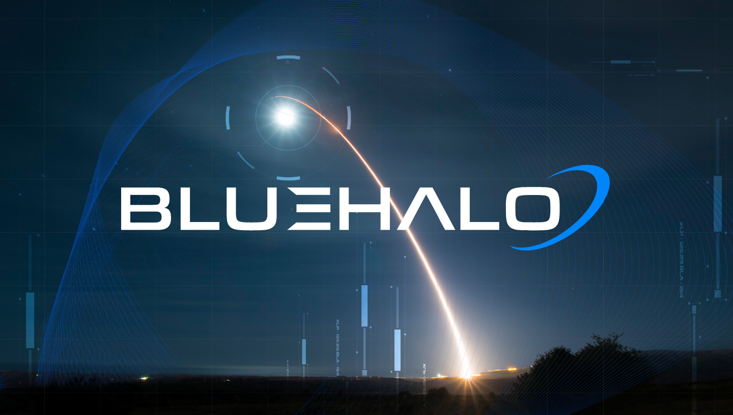
Part of what made the new BlueHalo brand so strong was the powerful corporate visual identity that Bluetext created. Bluetext moved fast to create a bold new name and brand within just weeks that would make a lasting impression on the market. The name BlueHalo represents the unbroken global line that ensures the technical advantage in the most advanced battlespace. The logo embodies the name by featuring a blue swoosh shape that depicts in a clean but strong manner, a halo of protection.
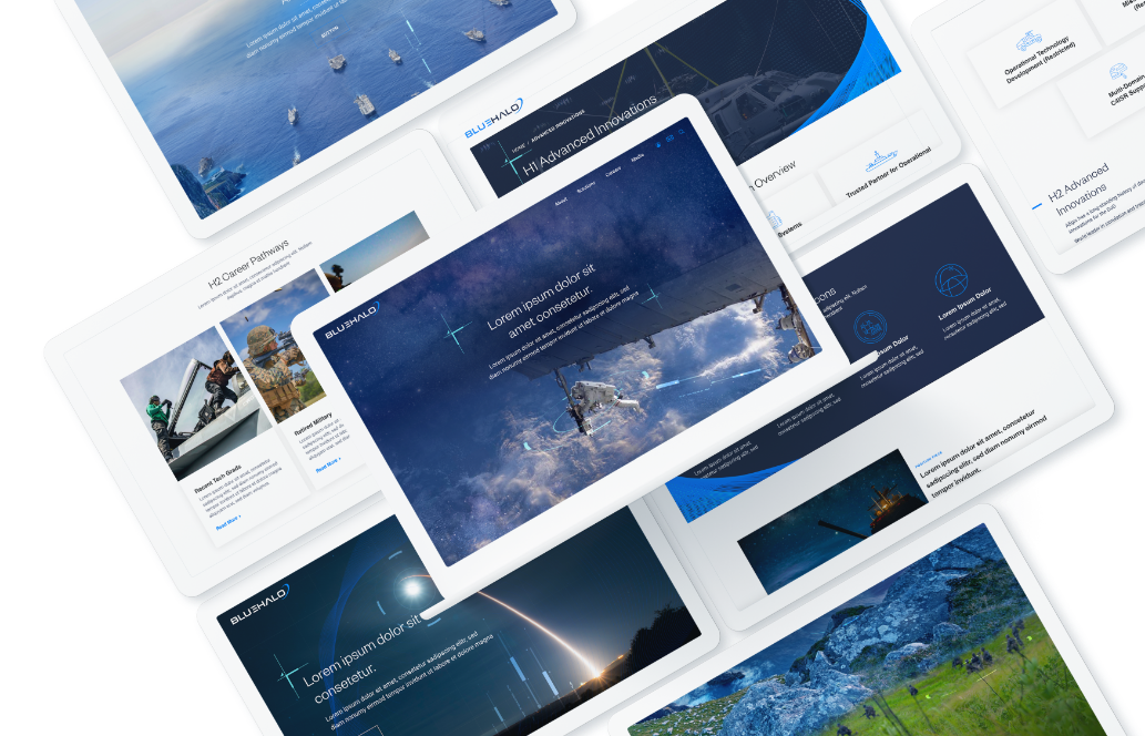
The striking blue colors to accompany the name, the branded engineering vector graphics woven in the photos to create unique, branded imagery, and the blue wires to form shapes that pull from the halo in the logo all work together to create a cohesive, meaningful, and regal brand system.
To learn more about strategic branding and how M&As can succeed with it, check out part 2 of this blog. To learn more about Bluetext and our services, contact us today.
Here at Bluetext, as a top brand development agency, we see clients invest a lot of time and money into a rebrand. We’ve already talked about why a Go-to-Market Strategy is necessary after a rebrand, but what are some channel tactics that help make a GTM campaign successful? One of the biggest digital channels to utilize during a GTM campaign is email marketing.
We all have a love-hate relationship with email. We get too many of them and we don’t want to be endlessly bombarded with them – yet, we can’t stop checking our emails. We’re addicted, and we know it. So let’s capitalize on it!
Benefits of Email Marketing
There are a lot of benefits in using email marketing as part of your GTM strategy. First off, it’s already ingrained in most users’ lifestyles, and users usually expect some sort of email communication after opting in. Pro tip – stay away from purchasing lists. List buying typically leads to unqualified leads which can end up hurting domain reputation which ultimately hurts your deliverability score. Most email and marketing automation platforms like Marketo, Hubspot, Mailchimp, Constant Contact, and Eloqua, among others, make it easy to set up the basic lists for a smart email marketing strategy, especially when beginning lead generation and nurture flows. It’s important to keep in mind it often takes time to build out effective email campaign mailing lists. Especially when starting from scratch, do not sacrifice quality for quantity. Trust a digital & email marketing agency to help drive your lead generation tactics across your website, resources, or social media.
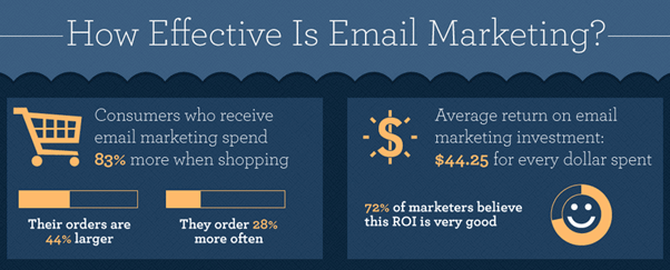
One of the biggest benefits of leveraging email marketing for a GTM campaign is lead generation and lead nurture. Email is one of the most effective channels to cultivate and convert leads. In fact, research shows that 48% of marketers believe that email is the most effective channel for generating leads online.

Lead Gen Tactics
As part of your go-to-market strategy, you’re likely using a mix of paid search, paid display, organic social, and paid social to build awareness for your new brand and drive traffic to your site. And following our GTM brand launch recommendations, you want to ensure your advertising spend is smart and reaching the intended audiences by targeting specific demographics. With this strategic approach, the audience that your GTM campaign is reaching is already targeting ideal leads. But how do you actually capture those leads? It’s all about opt-in opportunities. But how do you get users to take that extra step and opt-in? It must be a convenient and frictionless experience. A few ways to get opt-ins quickly and easily include:
- Adding an email signup pop-up form on the homepage (more common for b2c and some b2b)
- Always have a contact form or subscribe form in the footer
- Gated content
Now that you’re collecting the emails of potential leads, it’s time to nurture them…
How to create a compelling lead nurture email campaign
The set-up of a lead nurture campaign looks different depending on your email marketing platform and if you’re a b2c, b2b, or b2g company, but it has the same goals and results: to nurture leads and ultimately convert them into customers.
The first step is to develop a Leads Email Program, AKA a drip campaign designed to get leads to convert into customers. This is an automated email program that essentially acts as digital sales outreach. It’s a series of emails automatically sent to a specific audience after they take a particular action. For example, when a lead downloads a specific product brochure, if that product brochure was gated and the user submitted a form to receive it, they could be placed in a drip campaign that shares related content. Each email in the series should have a clear action for the user to take, and with each email sent, the action should become more focused and closer to conversion. For example, the first email in the drip campaign is usually more informational and welcoming. The goal is to get the user to consume more content and build an interest/trust with the brand. The second and third emails usually zone in more and have CTAs that resemble a conversionable action, like contacting a sales rep.
The frequency and number of the emails sent, the timing, even the design and level of personalization within each email is dependent on the industry you’re in, but there are some basic things to keep always keep in mind:
- Lead scoring
- Compelling subject lines
- Relevant content and strong CTAs – think about what you want users to accomplish after opening the email – does the content in the email seem compelling enough for the user to take that action? What else could you do to incentivise them to take that action? As one of the leading DC content & brand marketing firms, we know email content has to be relevant and engaging with a clear benefit for the user. The easier you provide that benefit, the more likely you’ll see a higher conversion rate.
- Metrics: check in on performance, look at opens, click-throughs, and unsubscribe rates.
- A/B test – not sure what is most compelling to get leads to convert? Try different approaches through AB testing.
- Keep the engagement going. So they’ve converted from a lead to a customer – what now? Funnel them into an automated Welcome Program. Keep delivering relevant content that clearly demonstrates the benefits to the user.
Looking to maximize your digital strategy through marketing automation? Get in touch with the experts at Bluetext.
What is ADA Compliance?
The Internet should be accessible for all, and Section 508 of the Rehabilitation Act of 1973, ensures that. Section 508 is designed to extend federal responsibilities to all individuals with disabilities, especially as the world moves towards more digitally based interactions. In 1998, the law was updated to include specific terminology over ‘electronic and information technology.’ Because the actual terms and conditions outlined in § 508 are ambiguous, the W3C created specific guidelines (Web Content Accessibility Guidelines or WCAG) to be able to run specific criterion tests on the suggested interpretation of the guidelines. Since January 2017, the current version, WCAG 2.0, has been accepted as the primary set of implementation guidelines.
This Is A Lot of Legal Jargon, Why Should You Care?
Every company should want as much reach for your digital content as possible, even if your target audience is not visually impaired or disabled. Not to mention, you could get sued if your website is not ADA compliant. If you’re federally funded, you must be compliant. For non-federally funded websites, it’s a gray area, but certainly a legal risk. Best practice is to be compliant and empower equal access and equal opportunity for all digital content. The Internet in particular can dramatically improve the lives of people with disabilities. It’s important to remember that accessibility is not just for the blind – it also accommodates auditory, motor, cognitive, and seizure disabilities. With about 15% of the global population living with some form of disability, it’s crucial as a reputable brand to want to make your website and digital content accessible for everyone. But it’s not always easy…
Accessibility Design
Accessibility should be considered early on in the design phase. It’s also important to remember that there’s no “end” to accessibility – it’s an evolving process. There’s also no ‘correct’ solution to accessibility. The WCAG 2.0 instead focuses on four principles of accessibility to base on for criterion testing:
- Perceivable
- Operable
- Understandable
- Robust
What do these principles mean and how can I design in style with them in mind?
Perceivable
This means web content is made available to the senses – sight, hearing, and/or touch.
Text Alternatives: You must provide text alternatives for any non-text content so that it can be changed into other forms people need, such as large print, braille, speech, symbols, or simpler language.
- All non-decorative images should have alternative text (aka ‘alt text’)
- Complex images should be described on a separate and linked page
- Form buttons and fields should be labeled
Pro tip: Use arrows so google can “read” hidden content.
↓
Time-Based Media:
- Audio content should have text transcripts
- Video content should have synchronized captions
- Any visual content in video should be described
Adaptable: Create content that can be presented in different ways (for example, simpler layout) without losing information or structure.
- Semantic markup is used for headings and text (e.g, <h1>, <ul>, <ol>, <strong>)
- Menus should be logical and intuitive from reading order alone
- Instructions do not rely on shape, size, location, or with auditory cues
Not only are these practices compliant, but they also provide tremendous SEO benefits! So why wouldn’t you implement an adaptable structure?
Distinguishable: Make it easier for users to see and hear content including separating foreground from background.
- Color is not used as the sole method of conveying content or distinguishing visual elements
- Contrast (http://webaim.org/resources/contrastchecker/)
- The text has a contrast ratio of 4.5:1 (AA)
- The large text has a contrast ratio of 3:1 (AA)
- Large text is defined as text larger than 18 points (~24px) or bold text larger 14 points (~19px)
- The page is readable and functional when text size is doubled (AA)
- Should be able to pause or change the volume of any audio longer than 3 seconds
Pro Tip: Test your color contrast and font size with this tool to ensure it’s compliant. Accessible design can still look modern and creative! https://www.getstark.co/
↓
Operable
This means the user interface components and navigation must be operable.
Keyboard Accessible: Make all functionality available from a keyboard
- All functionality is available using the keyboard unless the functionality cannot be accomplished in any known way using the keyboard
- Keyboard focus is never trapped
Enough Time: Provide users enough time to read and use content
- If a page or application has a time limit, the user is given options to turn off, adjust, or extend that time limit
- Automatically moving, blinking, updating, or scrolling content that lasts longer than 5 seconds can be paused, stopped, or hidden by the user.
Pro Tip: On auto-scroll content, include a play/pause button so it can be paused and the content can be consumed. If the content on auto-play doesn’t have a link or text, or really any content associated with it, then it does not need a pause/play button.
↓
Seizures: Do not design content in a way that is known to cause seizures
- No content flashes more than 3 times per second and do not contain too much red
Navigable: Provide ways to help users navigate, find content, and determine where they are
- A link is provided to skip navigation and other page elements that are repeated across web pages
- Pages have descriptive and informative page titles
- Navigation is logical and intuitive
- The purpose of each link can be determined by the link text and context alone. Links with the same text that go to different locations are readily distinguishable.
- Multiple ways to find other web pages of the sites (e.g., table of contents and search) (AA)
- Avoid duplicative page headings and label text (AA)
- Focus states are visible to the user (AA)
Understandable
It’s as simple as it sounds – content and interface need to be easy to understand. This should be a website goal for both disabled and abled users!
Readable: Make text content readable and understandable
- The language of the page is identified using the HTML lang attribute (e.g., <html lang=“en”>)
- The language of page content that is in a different language is identified using the lang attribute (e.g., <blockquote lang=”es”>) (AA)
Predictable: Make Web pages appear and operate in predictable ways
- When a page element receives focus or a user interacts with a form or control, it does not result in a substantial change to the page, creates a pop-up, or any other change that could confuse the user, unless the user is informed of the change ahead of time
- Navigation links do not change order (AA)
- Elements across multiple webpages are consistently identified (AA)
Input Assistance: Help users avoid and correct mistakes
- Required elements for a form are clearly labeled as such
- Form validation issues are provided in a quick and accessible manner
- Required interactive elements have sufficient labels and instructions
- Suggestions should be provided for fixing input errors (AA)
- Changes to legal or financial data can be confirmed or reversed (AA)
Robust
Content can be used reliably by a wide variety of user agents, including assistive technologies
Compatible: Maximize compatibility with current and future user agents
- Avoid HTML parsing errors (http://validator.w3.org)
- Markup is used in a way that facilitates accessibility (e.g., ARIA labels for custom interface components)
Remember, accessibility is more than just following these guidelines – it’s about equal access to digital content. You could be the next big example in your industry for accessibility, and maybe even be eligible for an award. And once your beautiful, new website is built, there are tools to help you ensure your site is accessible. Download WAVE to identify accessibility and Web Content Accessibility Guideline (WCAG) errors.