Winning government cybersecurity contracts is no small feat. With the rise of cyber threats targeting national security, public infrastructure, and sensitive data, government agencies are actively seeking private-sector partners to bolster their defenses. However, for cybersecurity firms targeting business-to-government (B2G) opportunities, standing out in a crowded field requires more than just cutting-edge technology—it demands a strategic approach to marketing. This guide explores the essentials of marketing for cybersecurity firms aiming to secure government contracts, with a focus on compliance, communication, and effective messaging.
Understanding the Regulatory Landscape
Compliance is the foundation of marketing for government cybersecurity contracts. Federal, state, and local agencies operate within strict regulatory frameworks, including standards like:
- NIST Cybersecurity Framework: A cornerstone for ensuring secure systems and processes.
- FedRAMP Certification: For firms offering cloud services to government agencies.
- DFARS Compliance: Relevant for working with the Department of Defense.
Your marketing materials and messaging must demonstrate your firm’s ability to meet these requirements. Incorporate proof of certifications, audits, and adherence to these standards into your website, collateral, and presentations. Without a clear focus on compliance, your firm may fail to even qualify for consideration. Additionally, staying up-to-date with evolving regulations is crucial. As standards and requirements shift to address new threats, your firm’s ability to adapt and demonstrate continued compliance can give you a competitive edge. Regularly review updates to government policies and incorporate those changes into your marketing narrative to showcase your proactive approach.
Building Credibility Through Communication
Government agencies are highly risk-averse, especially when it comes to cybersecurity. Establishing trust is key, and the way you communicate can make or break your credibility. Case studies and testimonials play a critical role in this process. Showcase success stories where your cybersecurity solutions have effectively mitigated risks or safeguarded assets. Be specific about measurable results, such as the percentage reduction in breaches or downtime avoided. Thought leadership content is another valuable tool. Publish blogs, whitepapers, and webinars on topics like emerging cyber threats or best practices for securing government systems. Positioning your firm as an industry authority builds trust with decision-makers and reinforces your expertise. Tailored outreach is equally essential. Avoid generic pitches. Research the specific needs and challenges of the agency you’re targeting and craft customized proposals. Personalization signals your genuine understanding of their mission and pain points, which can significantly improve your chances of securing contracts. Consistency across your communication channels ensures your message resonates and reinforces your firm’s expertise. Whether through email campaigns, presentations, or in-person meetings, maintaining a cohesive narrative builds confidence in your capabilities.
Crafting Resonant Messaging
Government buyers prioritize solutions that align with their mission and address their pain points. To craft effective messaging, emphasize security and resilience. Highlight how your solutions proactively mitigate risks and enhance operational resilience. Speak their language by using terminology familiar to government stakeholders, such as references to “mission-critical systems” or “continuity of operations.” Address cost-efficiency, as budget constraints are a reality for many government agencies. Demonstrate the value and return on investment your firm can provide. Showcase agility by emphasizing how your solutions adapt to emerging challenges. With cyber threats evolving rapidly, government agencies need partners who can keep pace. Your messaging should balance technical depth with accessibility, ensuring both technical evaluators and non-technical decision-makers understand your value. Consider creating audience-specific materials to cater to different stakeholders within the procurement process, from IT specialists to program managers and budget officers. By aligning your messaging with their diverse priorities, you can better articulate your value proposition.
Leveraging Digital Channels for B2G Marketing
Digital marketing is just as important in the B2G space as in commercial markets. Leverage these strategies to amplify your reach: LinkedIn campaigns can target federal and state government decision-makers with sponsored content showcasing your expertise. Search engine optimization (SEO) is critical; optimize your website for keywords like “government cybersecurity solutions” and “FedRAMP-certified services.” Account-based marketing (ABM) focuses on individual agencies, tailoring ads and email campaigns to their unique requirements. Remember to keep your digital assets—from landing pages to downloadable content—compliant with accessibility standards like WCAG, which many government buyers expect. Beyond these tactics, consider investing in webinars and virtual events that cater specifically to government audiences. These platforms allow you to demonstrate your expertise, interact directly with decision-makers, and address their questions in real-time. Additionally, monitor analytics from your digital campaigns to continuously refine your approach, ensuring maximum impact and engagement.
A Strategic Approach to Success
Securing government cybersecurity contracts requires a well-rounded marketing strategy that prioritizes compliance, builds trust, and delivers resonant messaging. By understanding the regulatory landscape, communicating effectively, and leveraging digital channels, your firm can stand out as a reliable partner in protecting the nation’s cyber infrastructure. The competition for these contracts is fierce, but with a clear strategy that emphasizes your strengths and aligns with the unique needs of government agencies, your firm can position itself as a trusted partner in the fight against cyber threats. Ready to position your cybersecurity firm for B2G success? Contact Bluetext today to learn how we can help you navigate the complexities of marketing to government agencies.
With agencies like the EPA driving federal priorities, resilience and industrial strength are emerging as key themes in government procurement. For B2G companies, aligning messaging with these trends is essential to stay competitive and relevant.
The Shifting Federal Landscape
Federal agencies are increasingly prioritizing themes of resilience and industrial strength as they respond to complex challenges—climate change, infrastructure modernization, supply chain security, and economic recovery.
- Resilience: The focus on resilience spans physical infrastructure, cybersecurity, and operational continuity. Agencies are seeking solutions that can endure disruptions, adapt to challenges, and ensure long-term reliability.
- Industrial Strength: Promoting domestic manufacturing, improving supply chain security, and fostering economic growth are top priorities for agencies like the EPA and the Department of Energy.
For businesses targeting the federal market, messaging must reflect these priorities, demonstrating how their solutions align with agency goals while adhering to compliance requirements.
Why Resilience and Industry Matter in B2G Messaging
Federal Agencies Need Solutions That Withstand Disruptions
From infrastructure resilience against natural disasters to cybersecurity resilience against evolving threats, government agencies are focused on safeguarding critical systems. B2G companies that position their solutions as reliable, adaptive, and future-proof can align with this federal priority.
Supporting Economic and Industrial Goals
Agencies are under pressure to strengthen domestic industries, secure supply chains, and boost economic recovery efforts. Messaging that highlights industrial strength—such as U.S.-based manufacturing, supply chain transparency, and innovation—will resonate with decision-makers.
Compliance as a Baseline
Regulatory compliance remains non-negotiable in B2G marketing. However, aligning with emerging priorities like resilience and industrial strength goes beyond compliance—it’s about demonstrating value, innovation, and alignment with broader federal goals.

Key Strategies to Align B2G Messaging with Federal Trends
- Integrate Resilience into Your Value Proposition
B2G companies should frame their solutions as tools for resilience. Whether it’s a secure technology platform, durable infrastructure, or adaptive process, emphasize how your offerings help agencies:
- Mitigate risks and disruptions
- Ensure operational continuity during crises
- Adapt to evolving challenges and needs
- Emphasize Industrial Strength and Supply Chain Security
Federal agencies are increasingly prioritizing domestic sourcing and industrial innovation. Companies can align with these goals by messaging around:
- U.S.-based production and contributions to economic growth
- Transparent, secure, and resilient supply chains
- Investments in innovation that support federal missions
- Leverage Real-World Examples to Build Credibility
Case studies and examples of successful implementation are critical in building trust. Highlight:
- Projects where your solutions improved resilience, such as disaster-proof infrastructure or mission-critical technology
- Contributions to industrial strength, such as local job creation, reduced supply chain vulnerabilities, or sustainable economic impact
Agencies respond to proof points—showing measurable results will elevate your messaging above competitors.
- Align Messaging with Key Agency Priorities
Tailor messaging to the specific goals of federal agencies. For example:
- EPA: Highlight solutions that support environmental resilience, sustainable infrastructure, and resource optimization
- DOE: Emphasize contributions to energy security, industrial innovation, and modernization
- FEMA and DHS: Focus on operational resilience, risk mitigation, and disaster response
Understanding each agency’s mission allows for targeted messaging that demonstrates alignment and relevance.
- Balance Compliance with Forward-Thinking Themes
While compliance is the entry point for federal contracts, forward-thinking messaging is what wins trust. Go beyond regulatory adherence to demonstrate how your company anticipates future federal needs—like emerging climate challenges, cybersecurity risks, or workforce resilience.

Preparing for the Next Wave of Federal Procurement Trends
To stay ahead, B2G companies must continuously monitor emerging procurement trends and priorities. Looking forward:
- Resilience will expand beyond physical infrastructure to include digital and workforce resilience.
- Industrial strength will remain a focus, with growing emphasis on domestic manufacturing and supply chain innovation.
- Sustainability and environmental impact will play an increasing role in agency decisions.
Businesses that proactively integrate these trends into their branding and messaging will be well-positioned to win federal contracts.
Final Thoughts: Winning with Resilience and Industry
In a federal market shaped by resilience, industrial strength, and evolving priorities, B2G companies must craft messaging that speaks directly to these themes. By aligning with agency goals, demonstrating measurable value, and anticipating future needs, businesses can build trust and stand out in competitive procurement cycles.
Partner with Bluetext to Align Your B2G Strategy
Navigating federal trends requires expertise and precision. At Bluetext, we help B2G companies craft compelling messaging that aligns with government priorities, builds credibility, and drives results. Contact us today to learn how we can position your brand for success in the evolving federal marketplace.
As federal priorities evolve, government procurement officers are increasingly focused on resilience and industrial strength. While sustainability remains important, the emphasis has shifted to durability, adaptability, and long-term reliability. For B2G companies, this change represents an opportunity to reposition their branding and messaging strategies.
This blog explores how B2G organizations can align with these priorities while maintaining compliance with environmental standards.
Understanding Government Trends
Federal agencies are prioritizing resilience to address challenges such as infrastructure reliability, national security, and climate adaptation. Key takeaways:
- Resilience Over Sustainability: While green initiatives remain vital, procurement officers now seek solutions built to last.
- Focus on Durability: Products and services must demonstrate long-term value and reliability.
Repositioning for Resilience
To align with these trends, B2G companies should update their branding with a focus on industrial strength. Steps include:
- Highlight Durability: Showcase the reliability and lifespan of your solutions.
- Emphasize Adaptability: Illustrate how your offerings can evolve with changing government needs.
- Reinforce Compliance: Communicate your adherence to environmental and regulatory standards.
Communicating Value to Government Stakeholders
Government buyers prioritize clear, compelling messaging that speaks to their specific needs. Tips for success:
- Build Trust: Use testimonials and case studies from other government contracts.
- Use Data: Provide quantifiable proof of durability and adaptability.
- Simplify Messaging: Avoid jargon and focus on actionable benefits.

Leveraging Multi-Channel Outreach
A multi-channel approach ensures your message reaches all stakeholders. Consider:
- Digital Campaigns: Leverage LinkedIn, webinars, and email marketing to engage decision-makers.
- Content Marketing: Publish blogs, whitepapers, and videos that showcase resilience.
- Public Relations: Share success stories and thought leadership through media channels.
Navigating Challenges in B2G Branding
Shifting focus to resilience while maintaining a commitment to sustainability can be complex. Mitigate risks by:
- Balancing Messaging: Ensure both durability and environmental compliance are clear.
- Maintaining Credibility: Avoid overstating claims—back them with data and certifications.
Positioning Your Brand for Resilience
In the evolving landscape of government priorities, resilience and industrial strength have become essential pillars for successful B2G branding. By aligning your messaging with these values, you can create a compelling narrative that appeals to procurement officers, policymakers, and other key stakeholders while maintaining compliance with environmental standards.
Need help crafting messaging that makes an impact? Contact Bluetext to discover how our branding expertise can position your organization as a trusted, resilient partner for government agencies.
Navigating the complexities of B2B marketing can be challenging—especially when targeting multiple industries. Each sector has unique needs, preferences, and pain points that require nuanced approaches. A one-size-fits-all strategy simply doesn’t cut it in today’s competitive landscape. Instead, building a versatile marketing strategy that spans multiple sectors involves understanding the dynamics of each industry while maintaining a cohesive brand identity.
In this blog, we’ll explore actionable steps to create an effective cross-sector B2B marketing strategy, focusing on segmentation, adaptive messaging, and industry-specific tactics.
Understanding Cross-Sector Dynamics
When targeting multiple industries, it’s crucial to recognize both the commonalities and differences between them. For example:
- Commonalities: Many industries share concerns about ROI, cost-efficiency, and customer satisfaction.
- Differences: Industries like healthcare may prioritize compliance and patient outcomes, while manufacturing focuses on operational efficiency and supply chain management.
Recognizing these dynamics allows you to position your solutions effectively for each audience.

Developing a Robust Segmentation Framework
Segmentation is the foundation of any successful multi-sector strategy. Consider these steps:
- Segment by Industry: Use market research to identify the unique needs of each sector.
- Segment by Role: Tailor messages for decision-makers, influencers, and end-users.
- Use Data Analytics: Leverage CRM and marketing tools to uncover cross-industry patterns and customize your approach.
Crafting Adaptive Messaging Strategies
A strong brand identity should shine through all your messaging—but flexibility is key when addressing diverse sectors. Here’s how:
- Unified Brand Voice: Maintain consistency in tone and values across sectors.
- Tailored Content: Adapt case studies, whitepapers, and ad copy to highlight sector-specific benefits.
- Customer Personas: Develop profiles for typical decision-makers in each sector to align your messaging with their priorities.
Tactics for Multi-Sector Marketing Success
Successful campaigns require the right tools and tactics. Consider:
- Localization: Adapt messaging for different regions and markets.
- Omnichannel Marketing: Use digital platforms, events, and traditional media to reach varied audiences.
- Case Studies: Share examples that showcase your versatility across industries.
Measurement and Optimization Across Sectors
To ensure your strategy remains effective, establish KPIs for each sector and regularly evaluate performance. Examples include:
- Engagement Metrics: Open rates, click-through rates, and website traffic.
- Conversion Rates: Leads generated per campaign.
- Customer Feedback: Insights from surveys and reviews.
Your Path to Multi-Sector Success
Mastering multi-sector marketing is not just about flexibility—it’s about understanding the unique needs of each industry while maintaining a cohesive brand identity. By leveraging data, crafting tailored messaging, and staying attuned to audience behaviors, you can create strategies that resonate across diverse sectors.
Ready to take your B2B marketing strategy to the next level? Contact Bluetext today to learn how our expertise in multi-sector marketing can help your organization build a stronger, more adaptable presence.
Breaking into the government and defense sectors requires more than just a competitive offering—it demands credibility and trust. These sectors prioritize partnerships with organizations that demonstrate expertise, reliability, and a deep understanding of their unique challenges.
Thought leadership has emerged as a critical strategy for building that trust. By sharing insights and expertise, businesses can position themselves as indispensable advisors to government and defense buyers. This blog explores how to craft and leverage thought leadership content to unlock new opportunities in these high-stakes markets.
Understanding the Value of Thought Leadership in B2G
In the business-to-government (B2G) space, buyers operate within strict constraints, such as budget limitations, regulatory requirements, and security concerns. Decision-makers are often risk-averse, seeking partners with proven expertise and a clear understanding of their sector’s complexities.
Thought leadership plays a pivotal role by:
- Demonstrating Expertise: Whitepapers, research reports, and industry analyses show your organization’s in-depth knowledge of government and defense priorities.
- Building Trust: Consistently delivering value through content reinforces your credibility over time.
- Influencing Perception: A strong thought leadership presence elevates your brand from a vendor to a trusted advisor, increasing your influence in purchasing decisions.
By strategically sharing your knowledge, you can address buyer concerns and build long-lasting relationships in these sectors.

Crafting Thought Leadership Content for Government and Defense
Creating impactful thought leadership starts with understanding your audience. Government and defense stakeholders are looking for insights that help them solve specific problems or achieve strategic goals. Here’s how to tailor your content:
- Focus on Policy and Industry Trends: Share insights on evolving regulations, defense strategies, or emerging technologies that directly affect your audience.
- Address Pain Points: Create content that tackles issues like procurement challenges, supply chain security, or cost containment in defense projects.
- Leverage Data and Research: Invest in original research or surveys to provide unique insights that stand out from competitors.
Formats like whitepapers, webinars, and executive briefings allow you to dive deep into these topics while positioning your brand as a leading authority.
Strategies to Amplify Your Thought Leadership
Creating great content is only half the battle. To ensure it reaches your target audience, you need a robust distribution strategy:
- Engage on Government-Specific Platforms: Post thought leadership articles and updates on platforms like LinkedIn, GovExec, or GovConWire to directly connect with decision-makers.
- Host Exclusive Events: Organize roundtables, panels, or virtual discussions featuring your experts and other thought leaders in the industry.
- Collaborate with Influencers: Partner with recognized figures in the government and defense sectors to co-author content or host joint webinars.
A well-executed amplification strategy ensures your insights resonate across the right channels and audiences.
The Role of Thought Leadership in Long-Term Growth
Thought leadership isn’t just a short-term strategy—it’s a long-term investment in your brand’s reputation and visibility. Over time, consistent thought leadership:
- Builds Brand Loyalty: Decision-makers are more likely to turn to familiar, trusted names when they need solutions.
- Opens Doors to New Opportunities: A strong reputation attracts attention from stakeholders and partners beyond your current network.
- Drives Differentiation: In a crowded market, thought leadership helps your brand stand out as an innovative and reliable partner.
Become a Trusted Advisor in Government and Defense
To succeed in the government and defense sectors, your brand needs more than just strong offerings—it needs to inspire confidence. By leveraging thought leadership, you can establish your organization as a trusted advisor, influence key decision-makers, and unlock growth opportunities in this challenging market.
Looking to elevate your thought leadership and make an impact in the government and defense space? Bluetext can help you craft a strategy that builds trust and drives results. Contact us today to get started.
Innovation is a double-edged sword in the financial services industry. On one hand, businesses must innovate to stay competitive in a fast-changing landscape. On the other hand, financial services clients are cautious by nature, prioritizing stability, trust, and compliance above all else.
This presents a unique challenge for financial services marketers: how do you position your brand as an innovator without compromising the perception of reliability and security? This blog explores strategies to balance these seemingly conflicting priorities, enabling financial services firms to showcase innovation in a way that resonates with B2B buyers.
The Importance of Innovation in Financial Services
The financial industry is undergoing a transformation fueled by technology. From AI-driven analytics to blockchain solutions, innovation is reshaping everything from customer interactions to back-end processes. For B2B buyers in this sector, partnering with forward-thinking providers is no longer a luxury—it’s a necessity.
Communicating innovation effectively can:
- Highlight Your Competitive Edge: Position your brand as a leader in adopting and driving technological advancements.
- Build Client Confidence: Demonstrate how your innovative solutions address their challenges and align with their goals.
- Attract New Opportunities: Stand out to businesses looking for cutting-edge solutions to future-proof their operations.
But innovation alone isn’t enough—how you communicate it makes all the difference.
Strategies for Communicating Innovation in Financial Services
To convey innovation while maintaining trust, your messaging must strike the right balance. Here are proven strategies to achieve this:
- Highlight Real-World Applications
Innovation can feel abstract without tangible examples. Show how your solutions deliver results by sharing case studies, success stories, or pilot program outcomes. Focus on measurable benefits such as cost savings, improved efficiency, or enhanced security. - Leverage Thought Leadership
Publish content that explores the broader trends driving your innovations. Whitepapers, webinars, or blogs on topics like “The Future of Blockchain in Finance” position your brand as a thought leader while subtly promoting your capabilities. - Address Concerns Head-On
Financial services clients often worry that new technologies might disrupt their workflows or introduce risks. Use your messaging to proactively address these concerns, emphasizing how your solutions are tested, secure, and fully compliant with industry regulations. - Involve Client Testimonials
Let your clients do the talking. Testimonials and endorsements from respected industry players carry more weight than self-promotion, especially in a risk-averse sector.
Channels to Showcase Your Innovation
Reaching your audience effectively requires leveraging the right platforms and formats:
- LinkedIn and Professional Networks: Use LinkedIn to publish thought leadership content and engage with decision-makers in financial services.
- Industry Events and Webinars: Host or participate in events where you can showcase your innovative solutions directly to potential clients.
- Targeted Email Campaigns: Craft personalized campaigns for specific buyer personas, focusing on how your innovations meet their unique needs.
The key is to maintain a presence in spaces where financial services decision-makers seek insights and solutions.
Building a Future-Ready Brand
Innovation is not just about technology—it’s about solving problems in new ways. To establish your brand as both innovative and dependable:
- Focus on Collaboration: Showcase your ability to co-create solutions with your clients.
- Invest in Transparency: Be open about the steps you take to test, implement, and secure new technologies.
- Commit to Continuous Improvement: Demonstrate your commitment to staying ahead of industry trends and evolving alongside your clients.
This combination of forward-thinking and reliability will position your brand as a trusted partner for financial services businesses navigating change.
Showcasing Your Innovations with Confidence
In the financial services sector, innovation and stability don’t have to be mutually exclusive. By framing your solutions as both cutting-edge and secure, you can build trust with B2B buyers while showcasing your leadership in the industry.
Ready to take your financial services marketing to the next level? Bluetext can help you craft a strategy that communicates innovation with clarity and impact. Contact us today to get started.
In today’s fast-paced, hyper-connected world, capturing consumer attention has never been more challenging. Traditional marketing tactics, once the cornerstone of brand promotion, often struggle to break through the noise. Enter guerilla marketing—a strategy that thrives on creativity, surprise, and unconventional methods. While historically rooted in the physical world, guerilla marketing has evolved in the digital age, offering brands a unique opportunity to engage audiences in ways that are both memorable and impactful. At Bluetext, we’ve seen firsthand how the fusion of physical and digital elements can amplify guerilla marketing campaigns, creating lasting impressions and driving brand loyalty.
The Evolution of Guerilla Marketing
Guerilla marketing began as a grassroots approach, utilizing low-cost, high-impact tactics to surprise and delight audiences in the physical world. Think of flash mobs, street art, or unexpected pop-up events—these are classic examples of guerilla marketing in action. However, as the digital landscape has grown, so too has the scope of guerilla marketing. Today, the most successful campaigns blend the tangible with the virtual, leveraging digital platforms to extend the reach and impact of these creative endeavors. Whether it’s through social media amplification, viral videos, or interactive online experiences, guerilla marketing in the digital age is all about creating a seamless connection between the real and the virtual.
Integrating Physical and Digital Elements
One of the key strengths of guerilla marketing is its ability to create a sense of surprise and immediacy. By integrating physical and digital elements, brands can amplify this effect and engage audiences in new and exciting ways. For example, a brand might launch a street art campaign in a major city, with QR codes embedded in the artwork that lead to an exclusive online experience. This not only drives foot traffic but also encourages social sharing, extending the campaign’s reach far beyond its initial audience. At Bluetext, we understand the power of these hybrid campaigns, and we’ve helped clients design strategies that leverage both physical and digital touchpoints to maximize impact.
Success in the Digital Age
Numerous brands have successfully adapted guerilla marketing tactics for the digital age, creating campaigns that resonate with modern audiences. Take, for instance, Coca-Cola’s “Share a Coke” campaign, which started as a simple product relaunch but quickly evolved into a global phenomenon through social media integration. By personalizing Coke bottles with popular names and encouraging consumers to share photos on social media, Coca-Cola bridged the gap between the physical product and the digital world, creating a campaign that was both personal and shareable. Another example is Nike’s “Find Your Greatness” campaign, which combined unexpected pop-up events with an interactive online platform, allowing participants to share their experiences and inspire others. These campaigns exemplify how guerilla marketing can be adapted for the digital age, driving engagement and fostering brand loyalty.

Innovating with Guerilla Marketing
In the digital age, guerilla marketing has become more dynamic and impactful than ever before. By combining the surprise and creativity of traditional guerilla tactics with the reach and interactivity of digital platforms, brands can create campaigns that captivate audiences and leave a lasting impression. At Bluetext, we’re passionate about helping brands navigate this evolving landscape, using innovative strategies to connect with consumers in meaningful ways. As guerilla marketing continues to evolve, the key to success lies in the ability to think outside the box, embrace new technologies, and create experiences that resonate both online and off.
If you’re looking to elevate your marketing strategy with creative and effective guerilla tactics, Bluetext is here to help. Our team of experts specializes in blending physical and digital elements to create unforgettable campaigns that drive results. Contact us today to learn how we can bring your brand’s vision to life in the digital age.
In the fiercely competitive landscape of private equity, standing out from the crowd is not just desirable; it’s essential. With a multitude of firms vying for attention and investor trust, the challenge of differentiation looms large. However, mastering the art of branding can set your private equity firm apart, creating a compelling identity that resonates with investors and stakeholders alike. At Bluetext, we understand the importance of crafting unique and impactful branding strategies tailored specifically for private equity firms. Let’s delve into the nuances of this art form and explore how your firm can leverage branding to carve out its niche in the market.
Embrace New Trends in Branding
In today’s fast-paced digital landscape, staying ahead of the curve means embracing new trends in branding. From immersive experiences and interactive content to personalized marketing automation and influencer partnerships, there are countless opportunities to elevate your brand and engage with your audience in meaningful ways. By keeping a finger on the pulse of emerging trends and technologies, your firm can stay relevant and capture the attention of investors in an increasingly crowded market.
Roll Up Brands into One Cohesive Narrative
For private equity firms with multiple portfolio companies, creating a cohesive brand narrative can be a powerful branding strategy. By aligning the values, messaging, and visual identity of each portfolio company under a single overarching brand narrative, your firm can strengthen its position in the market and create synergies across its investment portfolio. Whether it’s through a shared mission or a unified brand story, rolling up brands into one cohesive narrative can help differentiate your firm and maximize the impact of your investments.
Harness the Power of Naming
In the world of branding, a name can make all the difference. A distinctive and memorable name can help your firm stand out in a sea of competitors and capture the attention of investors. Whether it’s a bold and innovative name that reflects your firm’s forward-thinking approach or a timeless and classic name that evokes trust and reliability, choosing the right name can set the tone for your brand and shape how it is perceived by others. Invest time and resources into selecting a name that not only differentiates your brand but also resonates with your target audience and aligns with your firm’s values and vision.
Define Your Value Proposition
At the heart of every successful brand lies a clear and compelling value proposition. For private equity firms, this means articulating what sets you apart from the competition. Whether it’s your specialized expertise in a particular industry, your track record of successful investments, or your unique approach to value creation, your value proposition should resonate with your target audience and clearly communicate the benefits of partnering with your firm.
Establish Your Brand Personality
Just like individuals, brands have personalities that shape how they are perceived by others. For private equity firms, cultivating a strong brand personality can help humanize your firm and foster deeper connections with investors. Whether you want to be seen as innovative and forward-thinking, trustworthy and reliable, or bold and dynamic, your brand personality should be consistent across all touch points, from your website and marketing materials to your interactions with clients and stakeholders.
Leverage Thought Leadership
In an industry driven by expertise and insights, positioning your firm as a thought leader can be a powerful branding strategy. By sharing your knowledge and perspectives through thought leadership content such as whitepapers, articles, and webinars, you can demonstrate your firm’s expertise, build credibility with investors, and differentiate yourself from competitors. Thought leadership also provides an opportunity to showcase your unique approach to investing and value creation, further reinforcing your brand identity.
Cultivate a Strong Visual Identity
In the world of branding, first impressions matter. A strong visual identity not only helps your firm stand out visually but also communicates important aspects of your brand personality and values. From your logo and color palette to your website design and marketing collateral, every element of your visual identity should be carefully crafted to reflect your firm’s unique identity and resonate with your target audience.
Foster Authentic Relationships
At its core, branding is about building relationships – with investors, with stakeholders, and with the broader community. For private equity firms, fostering authentic relationships is crucial for establishing trust and credibility in the market. Whether it’s through personalized communication, transparent reporting, or active engagement in industry events and networking opportunities, investing in relationships can pay dividends in building a strong and resilient brand.
Prioritize Brand Consistency
Consistency is key to building a strong and recognizable brand. Ensure that all aspects of your brand – from messaging and visuals to tone of voice and customer experience – remain consistent across all channels and touchpoints. This includes your website, social media profiles, marketing materials, and even internal communications. Consistency breeds trust and familiarity, making it easier for investors to connect with your brand and understand what you stand for.
Tell Compelling Stories
In a world inundated with information, storytelling can be a powerful tool for capturing attention and making an emotional connection with your audience. Share compelling stories about your firm’s journey, successes, and the impact of your investments. Highlighting real-world examples of how your firm has added value to portfolio companies and helped them achieve their goals can showcase your expertise and differentiate your brand in a meaningful way.
Monitor and Adapt
The branding landscape is constantly evolving, and what works today may not necessarily work tomorrow. Stay vigilant and monitor industry trends, market dynamics, and shifts in investor preferences. Be prepared to adapt your branding strategies accordingly, whether it’s updating your messaging to reflect changing market conditions, refreshing your visual identity to stay relevant, or pivoting your thought leadership efforts to address emerging topics and concerns. By staying agile and responsive, your firm can remain competitive and continue to stand out in a rapidly changing environment.
In conclusion, the art of differentiation is a nuanced and multifaceted endeavor, but with the right branding strategies in place, private equity firms can elevate their presence in the market and attract the attention of investors and stakeholders. By embracing new trends in branding, rolling up brands into one cohesive narrative, harnessing the power of naming, defining a clear value proposition, and establishing a strong brand personality, your firm can carve out its niche and thrive in the competitive landscape of private equity. At Bluetext, we’re here to help you navigate this journey and unlock the full potential of your brand. Contact us today to learn more.
According to Mordor Intelligence, The mergers and acquisitions (M&A) in aerospace and defense market size is estimated at USD 175.36 Billion in 2023 and is expected to reach USD 311.40 Billion by 2028. This remains one of the largest capital-intensive sectors as a result of the meticulous R&D needed to expand, enhance, and integrate product portfolios and stand out in the competitive landscape.
The aerospace and defense (A&D) sector is continuing to consolidate the supplier base to remove unnecessary costs and prolong its place in the market. One of the best examples of this is the 2019 United Technologies Corporation (UTC) and Raytheon Company (Raytheon) all-stock merger to consolidate their spot in the A&D sector. The successful merger achieved improved economies of scale, strengthened R&D, and provided a more diverse portfolio of products.
The Raytheon / UTC merger and its recent rebrand is a prime example of the importance of modernizing a company’s brand and digital identity. Since its founding in 1922, Raytheon has bared its name for over a century. With time, experience, and proven results comes recognition, so the switch to a new name may seem risky. But in order to stay competitive, be inclusive of broader capability sets, and look well-equipped to take on new modern challenges, the switch to the new name, RTX, was extremely intentional.
“RTX is a nod to the past and a nod to the future” – RTX’s CEO Greg Hayes.
Not only is the new three-letter name (and .com domain) simple, unique, and easy to remember, but it also is the same three letters as its stock ticker symbol, which is a combination of United Technologies previous symbol (UTX) and Raytheon’s (RTN), further exemplifying the union of the two companies and brand consistency across all channels. Another recent merger sporting the simplified 3-letter name and domain is the $2.1B combination of Vectrus and Vertex, now V2X.
A brand name change is a powerful move for a company, and there are several factors to consider when undergoing this transformation. Luckily the experts at Bluetext, one of the best DC brand strategy and government PR firms, can help. For more on naming, check our latest insights.
Private Equity has become a major spearhead in the A&D market and now accounts for 47% of transactions and 41% of deal value. Some major A&D mergers that went through recent successful rebrands propelled by PE firms include:
Centauri (now KBR)
When Arlington Capital Partners acquired three leading companies in the national security sector—Integrity Applications Incorporated, Xebec Global, and Dependable Global Solutions—the IAI team turned to Bluetext to develop and launch a new unified brand from scratch. In less than 6 months, the teams worked together to launch Centauri.
The name was inspired by the Centauri star system made up of some of the brightest stars in the sky. The logo represents the company; a group of brilliant minds composing a star system, brought together by the gravity of the mission to form this C shape as seen in the logo:

The new name and brand were crucial to showcasing the “stronger together” mentality of merging big players in the A&D sector. The rebrand was so effective that within just a year, KBR acquired Centauri, significantly expanding its military space, defense modernization, and cyber solutions portfolio. For more on this successful rebrand, check out Bluetext’s Hall of Fame featuring Centauri.
BlueHalo
Another Arlington Capital Partner acquisition consisting of AEgis Technologies, Applied Technology Associates, and Brilligent Solutions, looked to Bluetext to merge these powerhouse national-security teams together into one superior brand, BlueHalo.
The name BlueHalo represents the unbroken global line that ensures the technical advantage in the most advanced battlespace. The logo embodies the name by featuring a blue swoosh shape that depicts in a clean but strong manner, a halo of protection. It also supports the company’s brand line, “Leading the Transformation of Modern Warfare”

Since the 2020 rebrand, BlueHalo has rapidly strengthened its leadership positions in Space, Cyber, AI/ML, Counter-UAS (c-Unmanned Aerial Systems), and Autonomous Systems, with multiple acquisitions in record time. For more, read about Bluetext and BlueHalo’s partnership or watch the powerful brand essence video that Bluetext created.
Tria
When another private equity firm, Sagewind Capital, acquired Federal Advisory
Partners, Universal Consulting Services, and FavorTech Consulting, Bluetext helped merge these top-performing companies into one stronger, unified brand – Tria Federal.
The simple, punchy, and welcoming name, Tria, is the Greek word for three, representing the company’s commitment to 3 pillars of service:
- Service to Clients
- Service to Colleagues
- Service to Communities
The logo embodies these 3 pillars through approachable and patriotic brand application as a nod to its federal government audience as being the partner of choice in the path to possible. See more about Bluetext and Tria’s work together here.

Axient
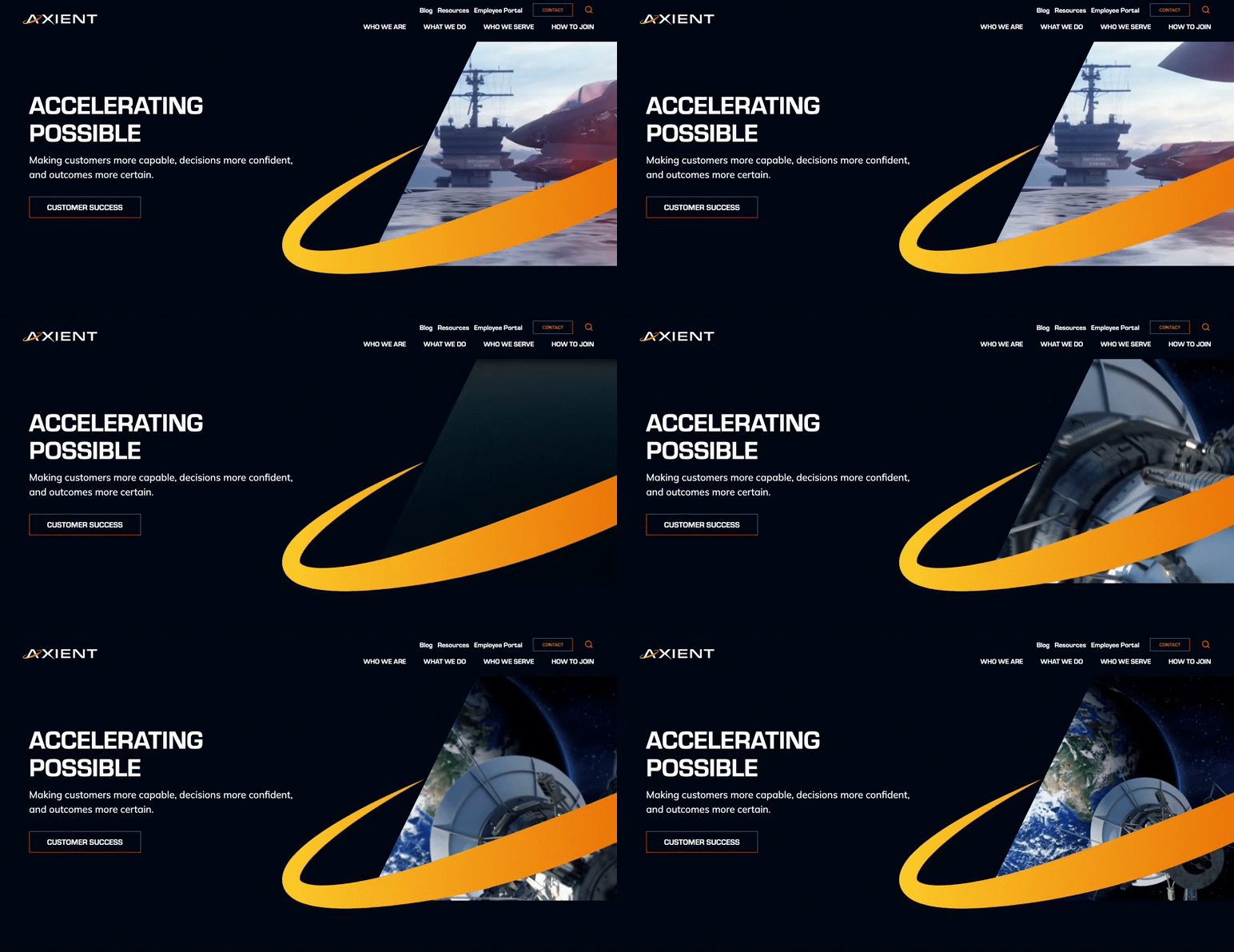
Following a series of promising mergers and acquisitions from Private Equity firm Sagewind Capital, QuantiTech came to Bluetext for expertise and strategy to consolidate legacy companies into a new brand name and identity. Axient became the new corporate name to unite offerings & employees under one mission-driven, innovative narrative.
With a new name and logo design, the Axient brand identity was developed to visually encompass the value of the newly merged company. Sharp angles were intended to symbolize Axient’s cutting-edge expertise while the orbital curves showcase the full-spectrum lifecycle support offered to customers to “accelerate possible”. Watch the visual identity and mission come to life through the brand essence video and learn more about the work Bluetext and Axient completed together.
![]()
If you’re looking to revamp your company’s name and/or corporate image, connect with Bluetext, the top DC government contracting and aerospace marketing firm, to ensure you get the most out of your marketing efforts.
PR professionals are often required to transform subject matter experts – scientists, academics, researchers – into effective messengers. These experts possess deep knowledge in their respective fields, but they often struggle to articulate complex concepts in a way that’s easy for the general public to understand. Bluetext believes three key strategies help SMEs share their knowledge in a manner that captivates their audience.
Encourage them to Tell Stories and Use Analogies
Our brains are wired for stories. While facts and figures are crucial within academic or scientific circles, only standout statistics engage wider audiences. Individual stories and relatable analogies make the nuances of an expert’s work more tangible.
PR professionals must encourage experts to transform their knowledge into stories. Analogies, for example, can break down complex topics into familiar concepts that audiences can understand and connect with. It’s about presenting information in a way that is not just intellectually digestible, but also emotionally resonant.
Below, the technical explanation gives accuracy at the expense of comprehension, while the analogy aids understanding and relatability.
Before: “Solar panels convert the sun’s energy into electricity through photovoltaic cells. When photons hit the cells, they knock electrons free from atoms. If conductors are attached to the positive and negative sides of a cell, it forms an electrical circuit. When electrons flow through such a circuit, they generate electricity.”
After: “Think of a solar panel as a plant in your garden. Just as a plant uses sunlight for photosynthesis to produce food, a solar panel uses sunlight to produce electricity. The ‘leaves’ of our solar panel – the photovoltaic cells – catch the sunlight and kickstart a process that generates electricity for your home.”
Don’t Dumb it Down, Balance it Out
It’s crucial not to dumb down complex concepts when training SMEs as effective messengers. The goal is to respect the audience’s intelligence while ensuring comprehension. This balance is best achieved by delving into specifics when necessary and providing a general overview where it isn’t.
For instance, when discussing an advanced software tool, an expert might briefly explain its mechanics, then elaborate on the real-life scenarios where it could enhance work productivity.
Before: “We use a high-transmittance, anti-reflective glass, encased with anodic oxidation aluminum alloy frame for our solar panels. These are embedded with mono-crystalline silicon solar cells, which are highly efficient.”
After: “High-transmittance, anti-reflective glass allows a lot of light to pass through and reduces light reflection, which is ideal for solar panels. Anodic oxidation aluminum alloy is a sturdy, corrosion-resistant material used to frame the panels, and mono-crystalline silicon solar cells are highly effective cells made from a single crystal structure that converts sunlight into electricity,
Above, the ‘before’ message is laden with technical terms that a non-expert may not understand. In the ‘after’ message, the expert takes a more balanced approach by explaining these terms in easily understood language that identifies each material’s role in the system.
Practice with the Expert
As with any skill, effective messaging needs practice. Before an interview or presentation, PR professionals should work with the expert to define their key messages, prepare responses to likely questions, and identify topics to avoid.
Practice sessions serve dual purposes. They help experts gain confidence in delivering their messages and also assist them in refining their responses. Through iterative practice, experts can identify and focus on the most important elements of their responses, ensuring they deliver succinct, impactful answers when interacting with reporters or audiences.
Training experts to be effective messengers isn’t always a straightforward task. But by encouraging storytelling, balancing technical information, and emphasizing key messages, you can help them communicate their knowledge in a way that resonates with a wider audience. The transformation from expert to an engaging speaker is well worth the effort and maybe the difference between just getting an interview and receiving airtime, or even better – an invite back.
Take a look at some of Bluetext’s past work to see how client subject matter experts have been able to unlock their knowledge for a wider base and deliver powerful messages to the audiences that need to hear them most. Are you in need of a marketing and public relations agency with the skills to bring out those messages and take them to market? Contact us today.
