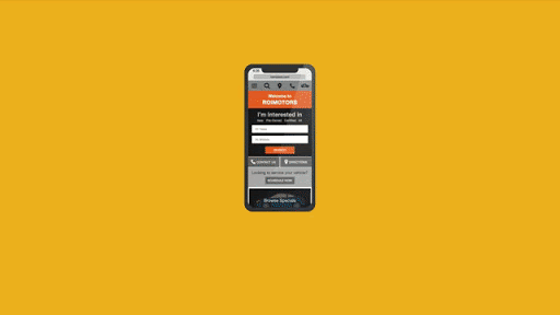
As a digital design agency, we know that the average person spends 3 – 5 hours a day on their mobile device! Over 20% of people check their phones every few minutes and over 50% of users look at their phones a few times an hour. Ever advancing apps and functionality are allowing people to transition almost any aspect of their life into digital devices. Order takeout? Sign a document on the go? Even adjust your thermostat. As a digital design agency, we’ve seen the increasing need for mobile-first web design. As mobile usage spikes by the day, hour, and even minute, a seamless mobile experience has become increasingly critical.
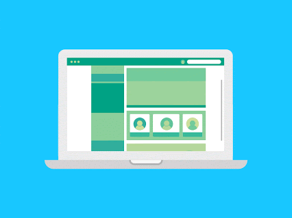
Responsive text is a no-brainer, your website copy will need to reformat to be visible and easily readable. But, to add a layer of complication to web design, images and illustrations must also work across all types of devices. With this in mind, designing websites and illustrations often turn into a puzzle, where elements must shift from wider pages to fit skinnier pages and vice versa. Before diving into a few of the benefits of mobile-optimized websites and illustrations, it’s important to first understand the two main ways you can build your site to work for multiple devices.
Responsive Design vs. Adaptive Design
Simply put, adaptive web design relies on static layouts that detect the size of the target screen and load the appropriate layout for it. We typically recommend designing adaptive sites for six common screen widths: 320, 480, 760, 960, 1200, 1600. However, technology companies are always debuting new devices with new screen sizes. Conversely, responsive web design is a dynamic design method that adapts to whatever screen – no matter the size – an individual is using. More specifically, responsive design uses CSS queries to change screen width, height, display type, etc. to adapt to the needs of a target device. As a digital design agency, we recommend a responsive design for a more fluid user experience.
Now that you have a better understanding of the main ways to adapt your site to multiple devices, keep reading to understand a couple of benefits you may not expect of mobile-optimized websites and illustrations.
SEO Benefits
Many familiar with Google’s SEO practices know that there are three major steps to how it’s algorithm works: Crawling, Indexing, and Ranking. While all three are incredibly valuable components to understand, indexing is the most relevant for the purpose of this conversation. In short, indexing is Google’s process of storing the information and content they’ve deemed relevant for users. Since Google recognizes that most of its users are on mobile devices, they have shifted toward mobile-first indexing, which means Google ranks pages, structured data, and snippets from mobile pages of websites instead of desktop pages.
A key part of this process involves images and illustrations. In the past, many websites have blocked certain illustrations from showing on non-desktop devices. Therefore, Google can’t index these illustrations as valuable content to a user. However, as a digital design agency, we know that Google’s algorithm wants to see and categorize images and illustrations. By having a responsive web design, your website’s images can display on any device, making it easier for your website to rank in Google’s top organic search results.

Visual Triggers
For better or for worse, a large percentage of people comprehend and perceive images faster than words. Generally speaking, people are better able to perceive visual marks and process data when transformed into images. Additionally, almost 80% of users scan any new page they encounter, whereas 16% read word-for-word. Whether users are scanning or reading word-for-word – images, illustrations, and infographics are incredibly important. Not to be cliché, but a picture truly can be worth a thousand words.
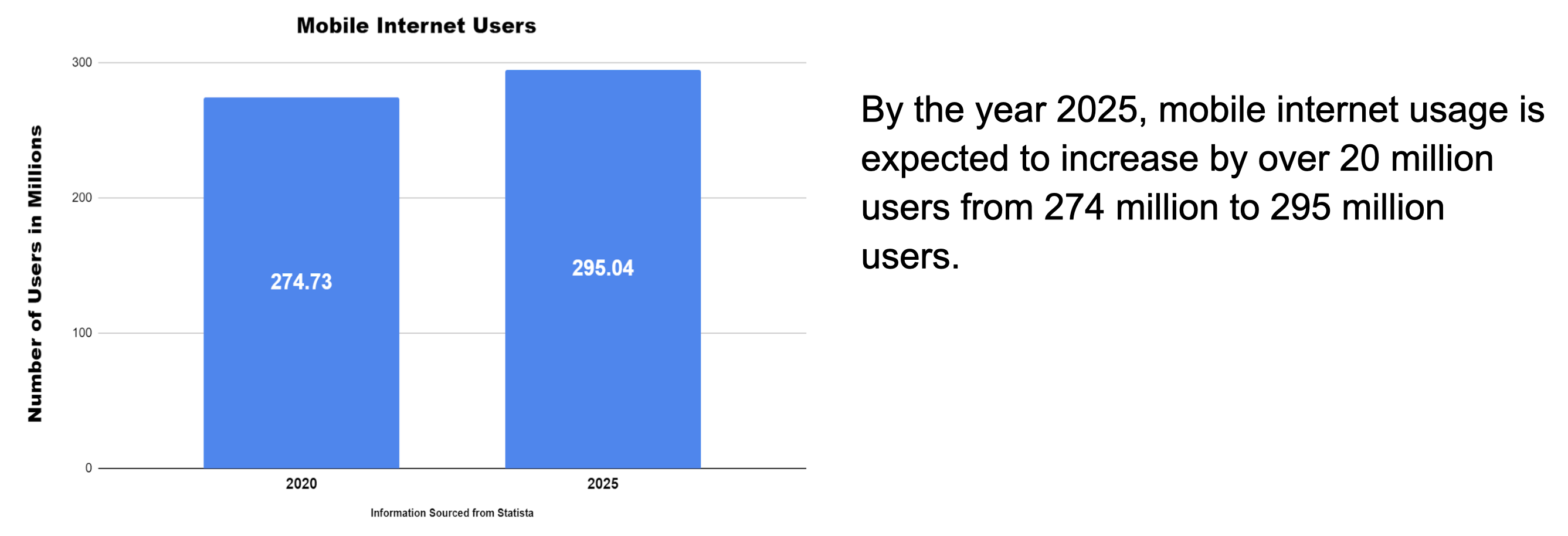
When viewing the information above, which drew your eye first, the graph, or the block of text? This question should always be asked when formatting content on a webpage, as we know that the user’s eyes are more easily drawn to illustrations than words. However, it’s important to note that images can be overdone. Adding too many images can be counterproductive, as it can create visual overkill. An experienced digital design agency, like Bluetext, can help make sure your images are helpful, relevant, and transferable between device types.
Conclusion
Images, illustrations, and infographics all visually communicate ideas and leave cumulative impressions on visitors to your website. By using them, you can create an immersive, empathetic, and humanized sense of context for users. An immersive experience can truly set your company apart from competitors and should be available to a user regardless of the viewing device. With mobile making up almost 60% of internet traffic, mobile-optimized sites and illustrations are necessary to ensure the user experience is fluid, attractive, and usable, no matter the device a visitor is using.
Interested in working with a digital design agency to help with your mobile experience? Contact Us!