What is responsive web design?
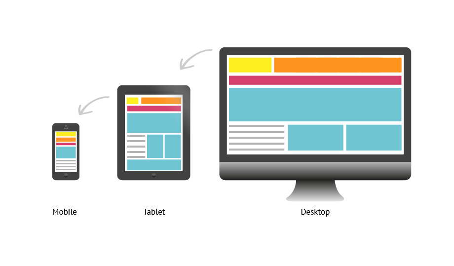
At its core, responsive web design uses a single layout for a web page then dynamically adapts to best fit the user’s screen, whether it’s a desktop, laptop, tablet, or a mobile device. This creates a seamless and recognizable experience for every user and session if viewed on a laptop one day, and on a mobile device the next.
Responsive web design not only improves user experience but also increases development and design efficiency. This method of web design is preferred over an adaptive approach since it reduces the number of layouts designers and developers need to account for. Rather than designing the same page for small and large desktops, tablets, and mobile devices, responsive design dynamically updates page layout to fit the users’ screen.
User Experience and Expectations
Welcome to 2020, where everyone is walking around with a miniature computer glued to the palm of their hands. Users have become more and more comfortable browsing online for everything from e-commerce to B2B research. Even if your business imagines themselves being primarily viewed at the office or on traditional desktop screens, you must accommodate for changes in user behavior. It’s highly likely that your users may find your website while browsing LinkedIn on their phone or tablet, or maybe Googling on-the-go. And if you have successfully captured their interest on a mobile device, you better prepare for a more thorough investigation on desktop. Your website now has two unique sessions that you should ensure are seamless and as familiar as possible. Imagine being blown away by a beautifully designed website, only to show your colleague the next day on your iPhone and find the mobile site clunky and unusable.
As Krisztina Szerovay explains responsive web design, nowadays, it’s more of an expected standard than a luxury for sites to utilize a responsive design. With a significant portion of site traffic coming from mobile, it’s more important than ever to ensure your site caters to all users regardless of screen size.
Work smarter, not harder.
Responsive web design provides many benefits such as increased flexibility, better SEO, reduced costs, and better mobile experiences. Instead of making a new design for each new device or screen size, rapid response allows you to stick with one design. Google recommends using responsive designs as they allow you to focus on a single page while also improving the mobile experience for users.
This approach is also cost-effective thanks to its faster implementation and easier management. Lastly, responsive designs’ simplified layouts provide your mobile users with more enjoyable experiences. And as we already know, with more and more web traffic coming from mobile, a good mobile experience is essential. Responsive web designs have even led to higher engagement, with users visiting more pages on average per visit.
A word of caution, trust the experts
While responsive web design has numerous benefits, it’s worth noting it’s not for every company. This method requires more up-front planning to ensure the design and experience are clear for users. But that’s where Bluetext comes in, our experienced designers and developers collaborate to develop a site that not only meets your goals but also works across all devices.
Indirectly, the responsive method provides additional benefits. Since your site must be designed for all the content to be repositioned based on the users’ screen, we work with you to find the simplest and clearest way to convey your message. Often, responsive designs benefit from a very straightforward design. For example, Apple doesn’t change any of the content that’s shown on their desktop site compared to its mobile site, the only difference is their menu and content placement. With the knowledge of industry best practices, we can guide you every step of the way from content placement to functionality.
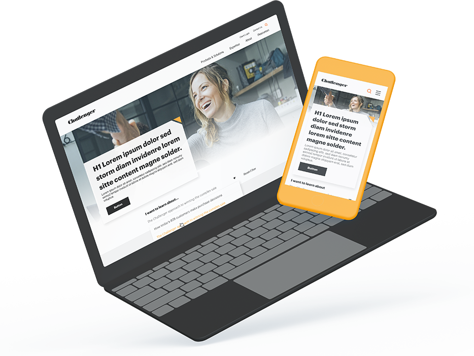
Read more about how we recently designed and developed a fully responsive site for Challenger. Our team created a site with current best practices for content functionality while giving more flexibility to the back-end users to accommodate various user journeys.