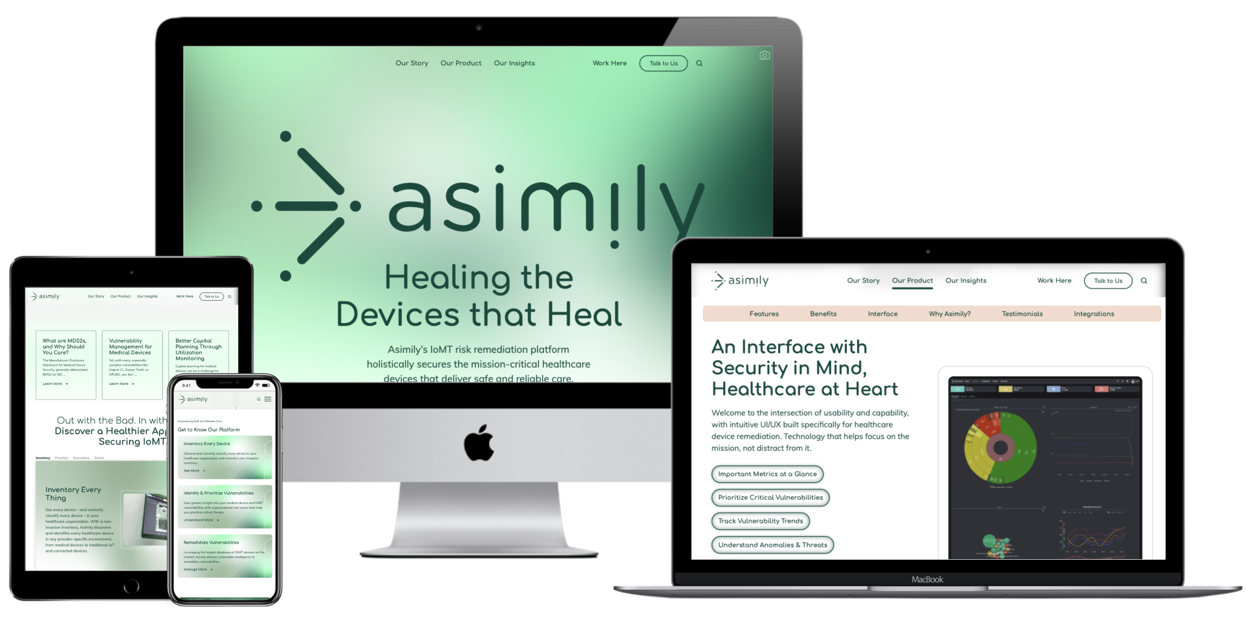
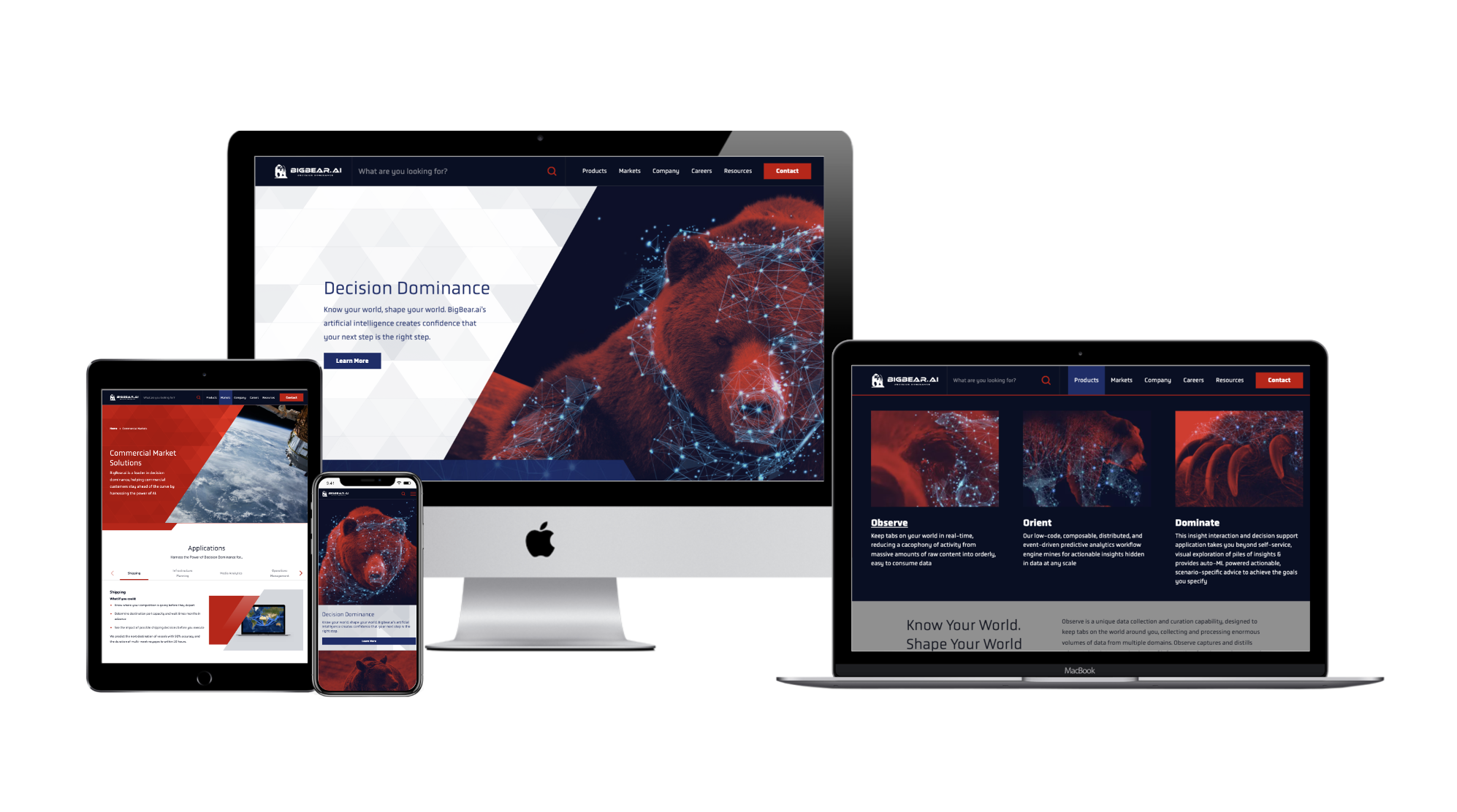
A compelling website is the backbone of a brand’s digital presence. A website serves as a channel for business by generating purchases, tracking sales leads, and raising brand awareness. The visual appearance of your website must promote the corporate visual identity and enhance the site’s functionality. Some basic design guidelines can be applied to ensure that the site is both aesthetically appealing and easy to navigate for users. The following 8 principles should be kept in mind when designing user-friendly, effective websites that direct users to the desired outcomes:
Create a Visual Hierarchy
Visitors to a site will skim content to find the information most relevant to them. The visual hierarchy created by typography styling and placement is key to directing their attention to the most crucial information on the site. Using a consistent hierarchy H1, H2, H3, etc. header style aids end-users, but also SEO engines. Google crawlers will look to these assigned hierarchies to identify organic search keywords and prioritize your website higher on search engine results (SERP) so a user can find your website in the first place. Each page should highlight the most important content and de-prioritize supporting information so that a user can more easily pick up on the big takeaways. Bluetext works with clients to identify the key actions or information that a site should showcase, and creates thoughtful designs to make those items stand out to users.
Use the Golden Ratio
The Golden ratio uses the number 1.618 to divide portions of the screen into sections that are visually appealing to users. Rather than dividing areas into equally measured sizes, the width or height of a section should be divided by 1.618 in order to create one larger section, and the remaining area is left in a smaller section. This proportion is easier for users to analyze, as it has a more classical and balanced appearance.
Avoid Possibility Paralysis
Giving users too many possibilities to choose from creates frustration and hesitancy in user actions. Think about the classic supermarket example. The decision between three types of peanut butter is far easier and faster than deciding between fifteen different types and brands. Discerning between choices and identifying the correct one requires a lot of energy from users when they’re bombarded with options. Limiting the choices presented to users eliminates distracting elements, and allows them to interact with the site more seamlessly.

Bigger Is (Often) Better
Larger items are simply easier for a user to find and click. For call-to-action (CTA) buttons, in particular, making those buttons larger will lead users to click those areas quicker and more often. Unusually large buttons might have the unintended effect of distracting or confusing the reader, but legible, noticeable designs can positively encourage user interaction. For other tips and tricks to designing CTAs, read our blog on the Guide to the Perfect CTA Button.
Consider Gestalt Principles
A website that exhibits well-executed design will help attract users’ attention before they dive into more detailed content. Overall design principles provided by Gestalt help creators build websites that visually appeal to users. For example, Gestalt’s law of closure ensures that users prefer designs that feel complete, rather than having gaps or empty spaces that break up the flow of the design. Considering users’ design preferences will help the audience feel more connected and engaged with the site. Poor designs could confuse users or distract them from important content.
Utilize Negative Space
Negative space is the open space created in a design where there is a lack of content. This clear area creates a natural breathing room and is essential to making the design appear clean and modern. A page that is cluttered with information can be overwhelming to users, and this can discourage them from exploring the content. A great example of maximizing whitespace for a clean website design is Bluetext’s work with Sonicwall, an innovative cyber-security company.
Acknowledge the F-pattern Rule
Eye-tracking studies have shown that users tend to scan screens in an F-shaped pattern, following from left to right across the top of the page, then just scanning down the left side of the page as they scroll lower. The F-pattern reinforces the idea that the most important text or imagery should be placed at the top of the page, or along the left margin. Placing crucial content in these areas will increase the likelihood of users noticing or absorbing this content.
Consistency is Key
Keeping consistency across design elements is crucial to creating visual cohesiveness across a site. Typography styling and content blocks should be recognizable across different pages. When designing websites, Bluetext developers help clients to create a dynamic component system, where the same components can be modified or rearranged on different pages throughout the site. This component system establishes regularity throughout designs that help users navigate the site more easily, recognizing familiar component structures.
Investing in your website’s design can drastically improve the user experience and lead to desired business outcomes, such as increased sales, lead generation, or overall awareness of your brand. Need help? Contact Bluetext to get expert support in perfecting your user experience design through thoughtful web design.