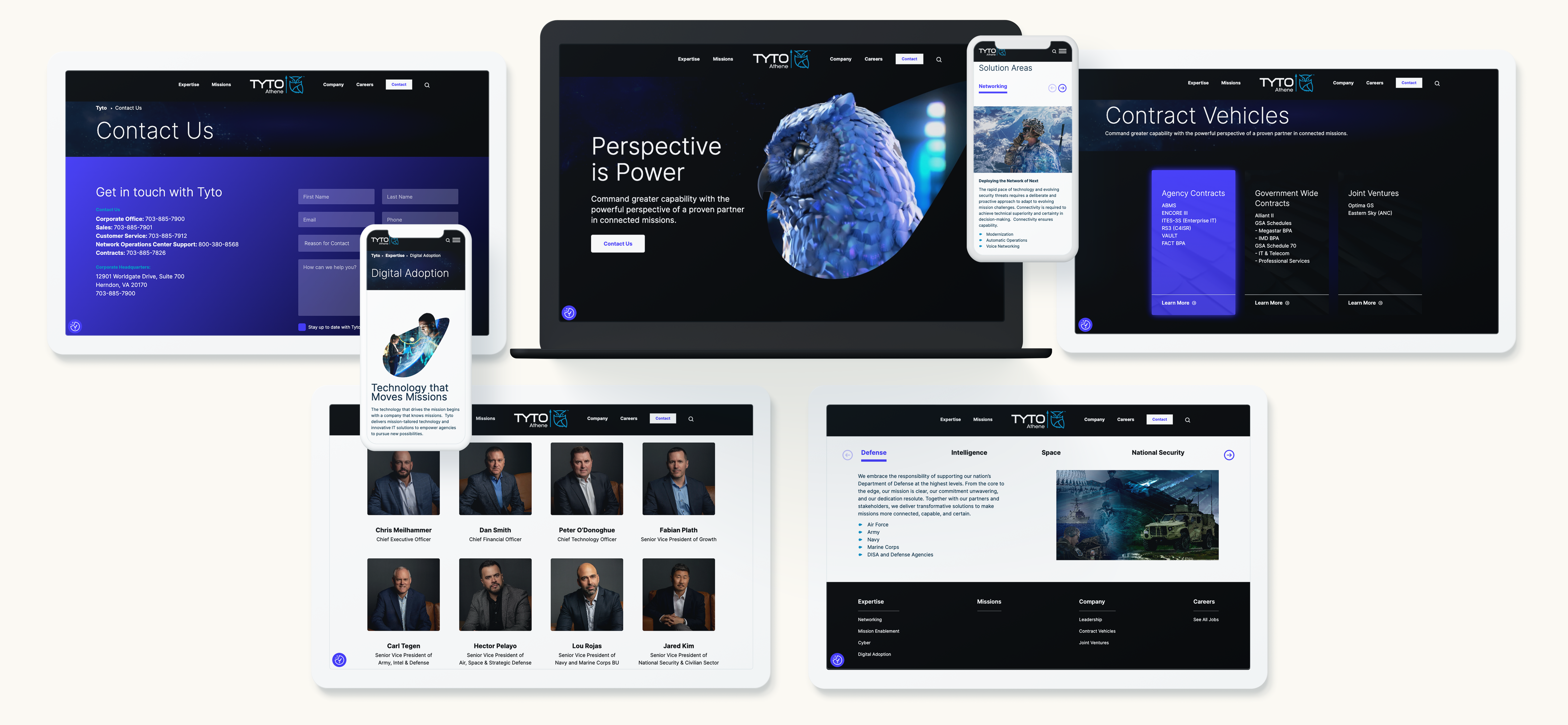
In today’s fast-paced digital landscape, Business-to-Government (B2G) websites have become indispensable tools for companies aiming to secure government contracts. These platforms are not just gateways to lucrative opportunities but also serve as essential resources for navigating the complex world of government procurement. For businesses looking to establish or expand their presence in the government sector, understanding the role of B2G websites is critical to achieving success.
Introduction to B2G Websites
B2G websites are specialized online platforms that connect businesses with government agencies, streamlining the process of securing contracts for goods and services. Unlike traditional Business-to-Business (B2B) platforms, B2G websites are designed to meet the specific needs of government procurement, with features tailored to ensure compliance, transparency, and efficiency. These platforms are pivotal in facilitating interactions between private companies and government entities, making them essential for businesses eager to engage in government contracting.
Streamlining the Procurement Process
One of the most significant advantages of B2G websites is their ability to simplify the procurement process for both government agencies and contractors. Through these platforms, government entities can post requests for proposals (RFPs), manage bidding processes, and oversee contract awards—all in a streamlined, automated environment. This not only reduces the administrative burden on agencies but also accelerates the timeline for contract awards, allowing businesses to respond quickly to opportunities.
Digital tools embedded within websites, such as automated bidding systems and compliance checks, further enhance the efficiency of the procurement process. Contractors can submit bids, track their progress, and receive notifications about upcoming opportunities, all within a single platform. This level of automation ensures that the procurement process is not only faster but also more accessible to a broader range of businesses, including small and medium-sized enterprises (SMBs).
Enhancing Transparency and Compliance
Transparency is a cornerstone of government procurement, and websites play a crucial role in maintaining this principle. These platforms provide a clear, accessible view of procurement activities, allowing all stakeholders to monitor the process and ensure fair competition. By offering detailed information about contract opportunities, evaluation criteria, and award decisions, websites help eliminate ambiguity and foster trust between government agencies and contractors.
Compliance with government regulations is another critical aspect of the procurement process. B2G websites are designed to help businesses adhere to the stringent requirements set by government agencies, from financial disclosures to ethical standards. By integrating compliance checks into the procurement workflow, these platforms minimize the risk of non-compliance, reducing the likelihood of disputes or delays in contract execution.
Driving Engagement and Accessibility
B2G websites have also democratized access to government contracts, making it easier for SMBs to enter the government contracting space. Traditionally, large corporations dominated this arena due to their resources and established relationships. However, B2G platforms level the playing field by providing SMBs with the tools and information they need to compete effectively.
Through case studies and success stories, it’s evident that SMBs are increasingly leveraging B2G websites to secure government contracts. These platforms offer resources such as guidance on proposal writing, templates for compliance documentation, and even mentorship programs to help SMBs navigate the complexities of government procurement. As a result, more diverse businesses are now able to participate in government projects, driving innovation and competition in the market.
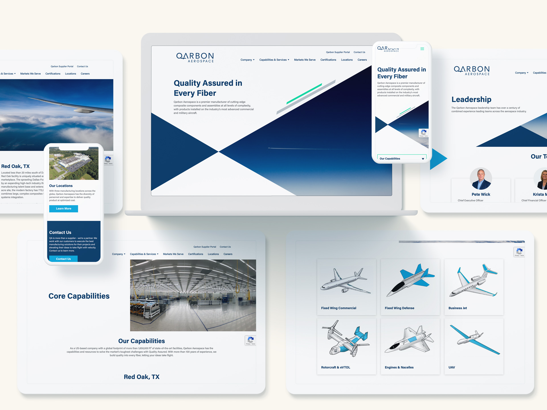
Best Practices for Leveraging B2G Websites
To maximize the potential of its website, businesses should adopt a strategic approach. Here are some best practices to consider:
- Optimize Your Online Profile: Ensure that your company’s profile on B2G platforms is complete, up-to-date, and highlights your strengths and past successes. A well-crafted profile can make your business stand out to government agencies.
- Respond Promptly to Opportunities: Government contracting opportunities can be time-sensitive. Make it a priority to monitor B2G websites regularly and respond to RFPs and other opportunities as soon as they are posted.
- Stay Informed: B2G websites frequently update their platforms with new features, compliance requirements, and procurement opportunities. Staying informed about these updates can give your business a competitive edge.
- Engage with the Community: Participate in forums, webinars, and training sessions. These resources can provide valuable insights into the procurement process and help you build relationships within the government contracting community.
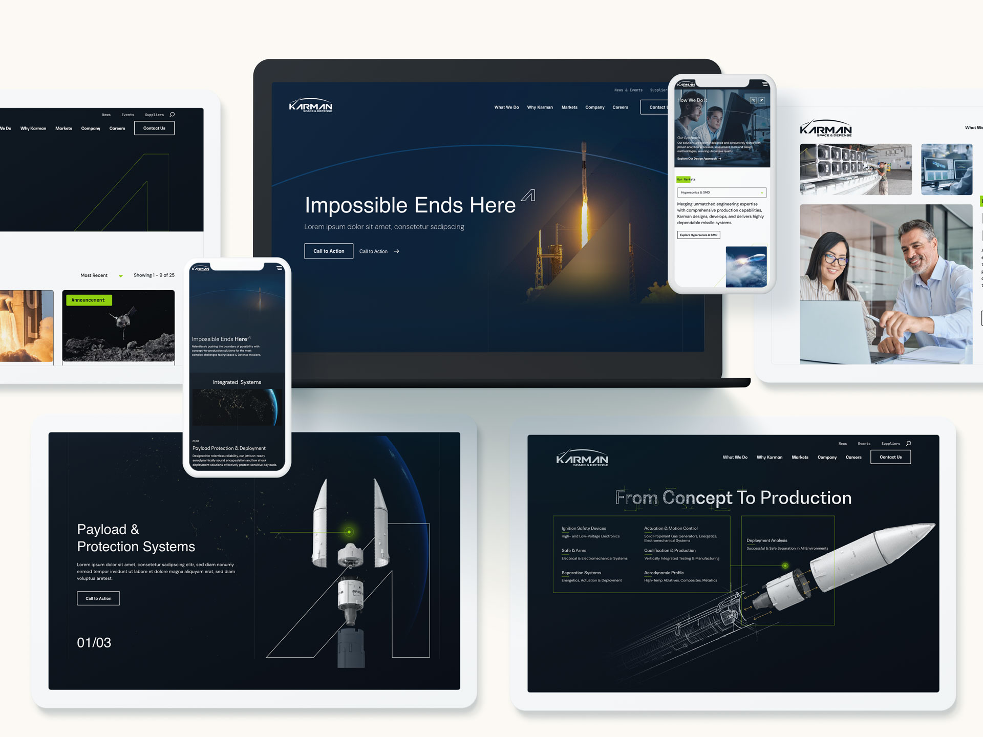
Websites are more than just portals to government contracts; they are powerful tools that can drive success in the government sector. By streamlining the procurement process, enhancing transparency, and increasing accessibility, these platforms offer businesses of all sizes the opportunity to secure government partnerships. For companies looking to expand their reach and engage in government contracts, leveraging the full potential of B2G websites is a path worth pursuing.
At Bluetext, we understand the complexities of government procurement and the importance of a strategic approach to B2G marketing. By harnessing the capabilities of B2G websites, businesses can not only navigate the path to procurement more effectively but also position themselves as trusted partners to government agencies. Let us help you chart your course to success in the government sector. Contact us today.
In today’s digital marketplace, trust is a key factor in driving sales. With countless options at consumers’ fingertips, establishing credibility is essential for any brand looking to stand out. One of the most effective ways to build this trust is through social proof. By leveraging testimonials, reviews, and case studies, you can create a compelling narrative that resonates with potential customers and drives conversions. In this post, we’ll explore how to effectively use social proof to enhance credibility and boost sales.
What is Social Proof?
Social proof is the psychological phenomenon where people look to the actions and opinions of others to determine their own. In the context of marketing, social proof involves showcasing positive feedback from customers, experts, or influencers to reassure potential buyers of your product’s value. This validation from others helps reduce skepticism and fosters a sense of trust.
The Power of Testimonials
Testimonials are personal endorsements from satisfied customers, and they can be incredibly persuasive. Here are a few ways to make the most of testimonials:
- Authenticity is Key: Ensure that testimonials are genuine and relatable. Authentic testimonials resonate more with potential customers than overly polished or generic statements.
- Highlight Specific Benefits: Encourage customers to focus on specific benefits or results they experienced. This provides concrete examples of how your product or service can solve problems or improve lives.
- Use Multiple Formats: Incorporate testimonials in various formats, including text, video, and audio. Video testimonials, in particular, can be very impactful as they convey emotion and authenticity more effectively.
- Feature Diverse Voices: Showcase testimonials from a diverse range of customers to appeal to different segments of your audience. This inclusivity can help more people see themselves benefiting from your product or service.
Leveraging Reviews
Online reviews are another powerful form of social proof. Here’s how to leverage them effectively:
- Encourage Reviews: Actively encourage satisfied customers to leave reviews on platforms like Google, Yelp, and industry-specific sites. More reviews increase credibility and visibility.
- Respond to Feedback: Engage with both positive and negative reviews. Responding to feedback shows that you value customer opinions and are committed to improving your products and services.
- Highlight Key Reviews: Feature positive reviews prominently on your website and marketing materials. Use quotes or ratings from well-known review platforms to enhance credibility.
- Use Aggregate Ratings: Display aggregate ratings (e.g., 4.8 out of 5 stars) to provide a quick snapshot of overall customer satisfaction. This can be especially persuasive for new visitors.
The Impact of Case Studies
Case studies offer an in-depth look at how your product or service has helped specific customers achieve their goals. They provide detailed narratives that can be incredibly convincing. Here’s how to create compelling case studies:
- Tell a Story: Craft case studies that tell a compelling story with a clear beginning, middle, and end. Highlight the challenges faced by the customer, the solution provided by your product, and the positive outcomes achieved.
- Use Data and Metrics: Include concrete data and metrics to quantify the success. Statistics and measurable results add credibility and help potential customers understand the tangible benefits.
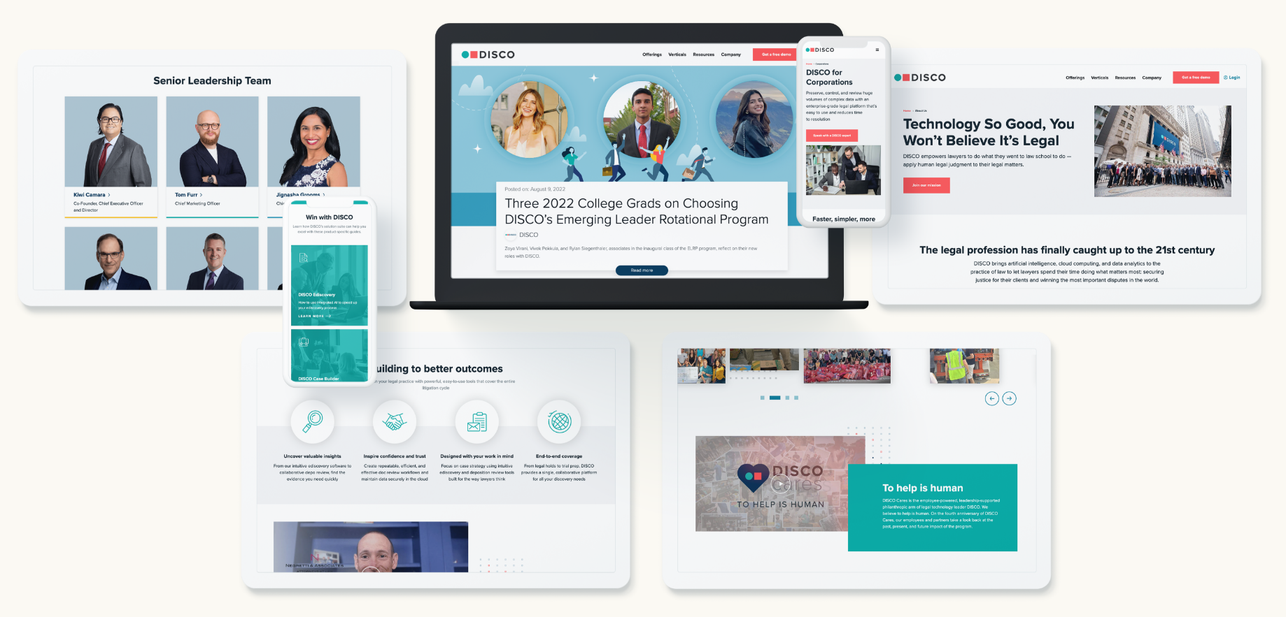
- Incorporate Quotes and Testimonials: Enhance your case studies with quotes and testimonials from the featured customer. Personal anecdotes add a human touch and make the case study more relatable.
- Focus on Various Use Cases: Create case studies that cover different use cases and industries. This diversity demonstrates the versatility and wide-ranging benefits of your product or service.
Building Trust Through Influencers
Influencer endorsements are another form of social proof that can significantly impact consumer trust. Collaborating with influencers who have a loyal following can help amplify your message and reach new audiences. Here’s how to leverage influencer partnerships:
- Choose the Right Influencers: Partner with influencers who align with your brand values and have an engaged audience that matches your target demographic.
- Create Authentic Content: Work with influencers to create authentic content that showcases their genuine experiences with your product. Authenticity is crucial for maintaining credibility.
- Leverage Multiple Channels: Utilize various platforms, such as Instagram, YouTube, and blogs, to reach a broader audience. Different channels can offer unique ways to showcase your product.
- Measure Impact: Track the performance of influencer campaigns through engagement metrics, traffic, and sales. Use this data to refine your strategy and maximize ROI.
Conclusion
Incorporating social proof into your marketing strategy is essential for building trust and driving sales. By effectively using testimonials, reviews, case studies, and influencer endorsements, you can create a persuasive narrative that resonates with potential customers and boosts credibility. At Bluetext, we specialize in helping brands leverage social proof to achieve their marketing goals.
Ready to harness the power of social proof? Contact us today to learn how we can help you build trust and drive sales through powerful social proof strategies.
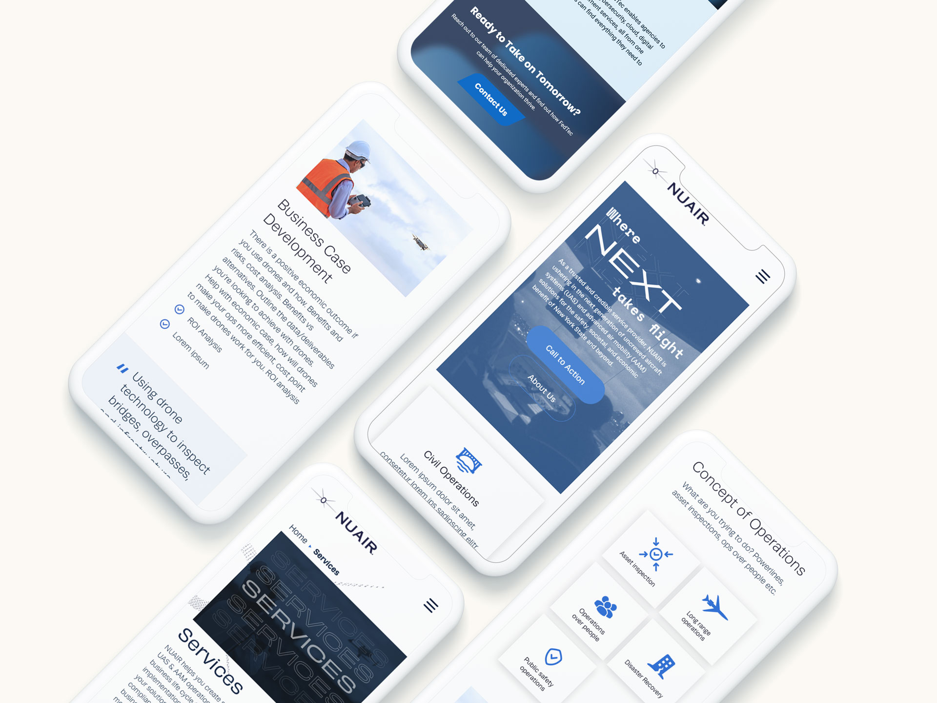
In today’s digital landscape, mobile traffic has not only surpassed desktop but continues to grow exponentially. As users increasingly rely on their smartphones for browsing, shopping, and entertainment, it’s essential for businesses to prioritize mobile-first design. At Bluetext, we understand the importance of creating responsive, user-friendly mobile experiences that enhance customer satisfaction and boost conversions. Here, we’ll share best practices for designing mobile-first websites that can help your business stay ahead in this mobile-centric world.
1. Prioritize Speed and Performance
Mobile users expect fast loading times. A delay of even a few seconds can result in higher bounce rates and lost opportunities. To ensure your mobile site is quick and efficient:
- Optimize Images: Use compressed images without compromising quality. Consider modern formats like WebP for better compression.
- Minimize HTTP Requests: Reduce the number of elements on your page to decrease load time.
- Leverage Browser Caching: Store frequently used resources in the user’s browser to speed up repeat visits.
2. Simplify Navigation
Mobile screens are smaller, and users often interact with them on the go. Simplifying navigation helps create a seamless user experience:
- Intuitive Menu Design: Use hamburger menus or bottom navigation bars to keep the interface clean and easy to navigate.
- Short and Descriptive Labels: Ensure menu items are clearly labeled and concise.
- Clickable Areas: Make buttons and links large enough for easy tapping, considering touch-friendly design principles.
3. Optimize for Touch Interactions
Touch interactions differ significantly from mouse clicks. Designing with touch in mind ensures better user engagement:
- Finger-Friendly Design: Ensure touch targets are at least 44×44 pixels to avoid accidental clicks.
- Gestures: Implement common gestures like swiping and pinching to enhance navigation and usability.
- Feedback: Provide visual feedback for taps and gestures to assure users that their actions are recognized.
4. Responsive and Adaptive Design
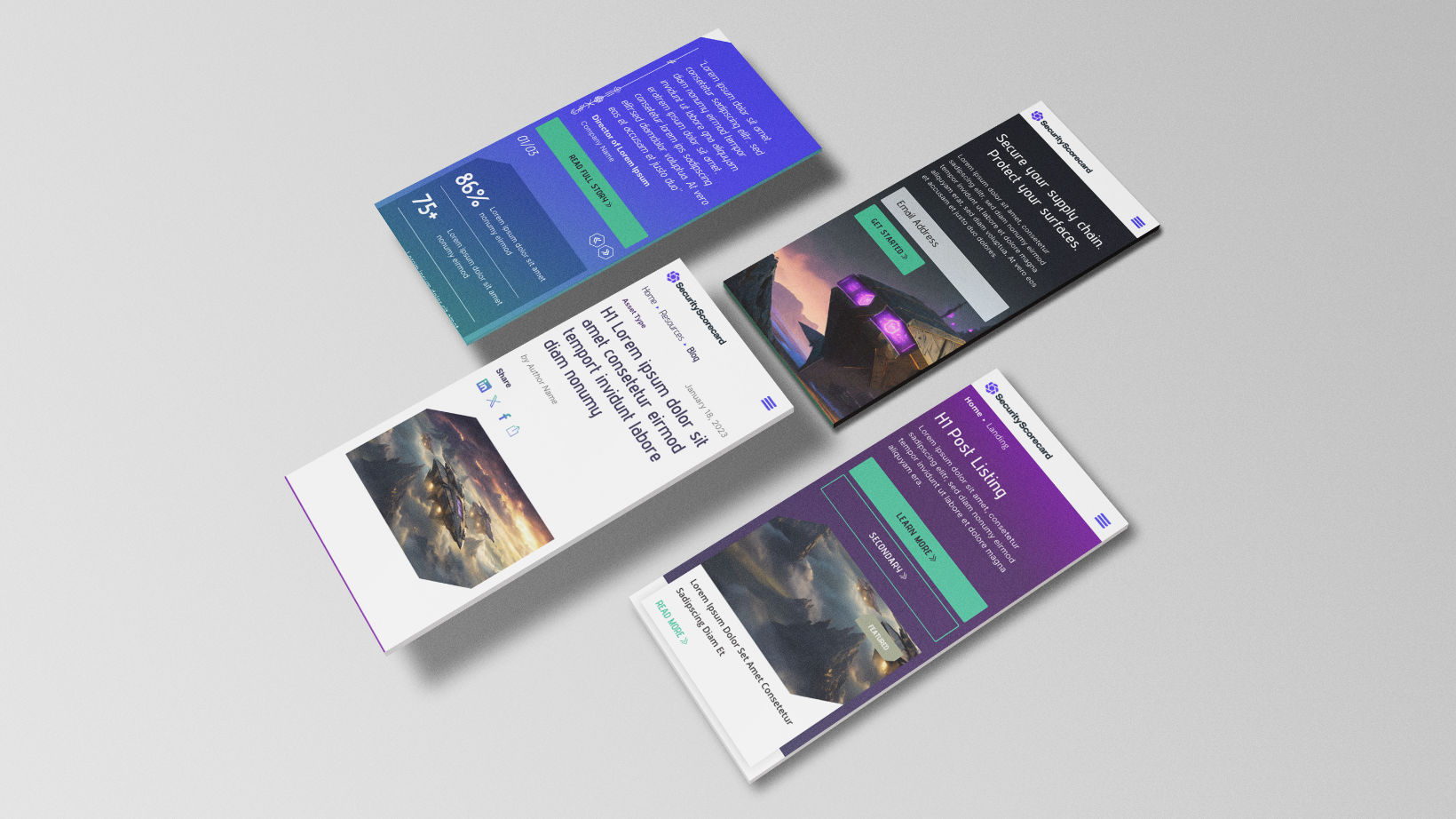
A mobile-first approach doesn’t mean neglecting other devices. Your design should adapt seamlessly across all screen sizes:
- Fluid Grids: Use percentage-based widths to allow content to resize smoothly.
- Flexible Images: Ensure images scale correctly without breaking the layout.
- Media Queries: Employ CSS media queries to apply different styles based on the device’s characteristics.
5. Content Prioritization
Mobile users often seek specific information quickly. Prioritize content to meet their needs efficiently:
- Important Information First: Place critical content and calls-to-action (CTAs) at the top of the page.
- Concise and Scannable Text: Use short paragraphs, bullet points, and headings to make text easy to read.
- Visual Hierarchy: Use size, color, and spacing to guide users to key elements.
6. Test and Iterate
Continuous testing and iteration are key to maintaining an effective mobile-first website:
- User Testing: Conduct regular usability tests to gather feedback from real users.
- Analytics: Monitor user behavior and site performance through tools like Google Analytics.
- A/B Testing: Experiment with different design elements to see what works best for your audience.
7. Progressive Web Apps (PWAs)
Consider enhancing your mobile website with Progressive Web App features for a more app-like experience:
- Offline Functionality: Allow users to access content even without an internet connection.
- Push Notifications: Engage users with timely updates and promotions.
- Home Screen Access: Enable users to add your site to their home screen for easy access.

8. Utilize Mobile-Friendly Forms
Forms are often a critical component of websites, especially for lead generation and customer interaction. Ensuring they are mobile-friendly is crucial:
- Simplify Form Fields: Only ask for essential information to reduce user effort.
- Auto-Fill and Auto-Correct: Utilize browser features to help users complete forms quickly.
- Responsive Input Fields: Ensure form fields are large enough and easy to tap, and that they adapt to different screen sizes.
9. Leverage Mobile-Specific Features
Take advantage of features unique to mobile devices to enhance user experience and functionality:
- Location Services: Use GPS to provide location-based services or content.
- Mobile Payments: Integrate mobile payment options like Apple Pay and Google Wallet for seamless transactions.
- Voice Search: Optimize for voice search to accommodate users who prefer speaking over typing.
10. Focus on Accessibility
Ensuring your mobile site is accessible to all users, including those with disabilities, not only broadens your audience but also complies with legal requirements:
- Alt Text for Images: Provide descriptive alt text for images.
- Keyboard Navigation: Ensure that all interactive elements can be navigated via keyboard.
- Screen Reader Compatibility: Use semantic HTML and ARIA roles to support screen readers.
Designing mobile-first websites is no longer optional—it’s a necessity. By following these best practices, you can create responsive, user-friendly mobile experiences that not only satisfy your customers but also drive conversions. At Bluetext, we’re dedicated to helping businesses thrive in the mobile era. Contact us today to learn how we can transform your digital presence with cutting-edge mobile-first design strategies.
In the ever-evolving world of web design, typography plays a pivotal role in creating visually engaging and effective user experiences. At Bluetext, we understand that choosing the right fonts is not just about aesthetics; it’s about making an impact. Whether you’re aiming to capture attention, convey a message, or create a memorable brand identity, typography is your silent but powerful ally. Let’s delve into the latest typography trends in web design that are shaping the digital landscape and how you can leverage them for maximum impact.
Trend 1: Variable Fonts
Variable fonts are a game-changer in modern web design. These fonts allow for multiple variations of a typeface, such as weight, width, and slant, within a single font file. This flexibility offers designers unparalleled creative freedom while improving website performance by reducing the number of font files needed.
Imagine a website where the header text seamlessly transitions from bold to thin as you scroll, or a landing page where the call-to-action dynamically adjusts its weight to draw attention. Variable fonts make these dynamic typographic experiences possible, enhancing user engagement and interaction.

Trend 2: Bold and Dramatic Typography
In a digital world saturated with content, bold and dramatic typography stands out. Large, impactful text can convey confidence and make a strong statement, whether used in headers, hero sections, or call-to-action buttons.
Consider using oversized typography for key messages or branding elements. This approach not only grabs attention but also communicates a sense of importance and urgency. Pairing bold fonts with minimalistic design elements can create a striking visual contrast that captivates users.
Trend 3: Serifs Making a Comeback
For years, sans-serif fonts have dominated web design due to their clean and modern appearance. However, serifs are making a comeback, bringing a touch of elegance and sophistication to digital interfaces.
Serifs can evoke a sense of tradition and reliability, making them ideal for industries like finance, law, and luxury goods. When paired with contemporary design elements, serif fonts can create a unique blend of classic and modern aesthetics, appealing to a broad audience.
Trend 4: Custom Fonts
Custom fonts are becoming increasingly popular as brands seek to differentiate themselves in a crowded market. A unique typeface can reinforce brand identity and ensure consistency across all digital platforms.
Investing in a custom font can set your brand apart and create a cohesive visual identity. Custom typography ensures that your brand voice is unmistakable and memorable, helping to build a stronger connection with your audience.
Trend 5: Mixing Fonts
The trend of mixing fonts involves combining different typefaces to create visual interest and hierarchy. This technique can enhance readability and guide users through your content more effectively.
When mixing fonts, it’s crucial to maintain a balance and ensure compatibility between typefaces. Combining a bold sans-serif for headers with a clean serif for body text can create a harmonious and engaging reading experience. Be mindful of contrast, scale, and proportion to achieve a polished look.
Conclusion
Typography is more than just selecting a font; it’s about creating a visual language that speaks to your audience. At Bluetext, we believe that understanding and leveraging the latest typography trends can transform your web design, making it more impactful and memorable. By embracing variable fonts, bold typography, the resurgence of serifs, custom typefaces, and the art of mixing fonts, you can craft a digital presence that not only stands out but also resonates with your users. Stay ahead of the curve and let your typography make a lasting impression. Contact us to learn more.
In the realm of digital marketing, the design of your website is more than just an aesthetic endeavor; it is a strategic tool to build emotional connections with your audience. At Bluetext, we understand that color psychology plays a pivotal role in this process, influencing perceptions, decisions, and actions. By leveraging the power of colors, we can create a visually compelling and emotionally resonant experience for your visitors. Let’s dive into how color psychology can be harnessed to enhance your website design and create lasting impressions.
Understanding Color Psychology
Color psychology is the study of how colors affect human behavior and emotions. Different colors can evoke specific feelings and associations, making them a powerful tool in website design. Here’s a quick rundown of common color associations:
- Red: Passion, urgency, excitement, and attention. Often used in call-to-action buttons to stimulate quick responses.
- Blue: Trust, calmness, and professionalism. Popular among brands that want to convey reliability and stability.
- Green: Growth, health, and tranquility. Ideal for eco-friendly and wellness-focused brands.
- Yellow: Happiness, optimism, and warmth. Great for creating a cheerful and inviting atmosphere.
- Purple: Luxury, creativity, and wisdom. Often used by brands that want to portray a sense of sophistication and innovation.
- Black: Power, elegance, and sophistication. Commonly used in high-end and minimalist designs.
- White: Purity, simplicity, and cleanliness. Essential for creating a sense of space and clarity.
Creating Emotional Connections Through Color
1. Establishing Brand Identity
Your website is an extension of your brand, and the colors you choose should reflect your brand’s personality and values. At Bluetext, we work with clients to identify their core attributes and translate them into a cohesive color palette. For example, a tech company might use blue to convey trust and innovation, while a beauty brand might opt for purple to emphasize luxury and creativity.
2. Enhancing User Experience
A well-chosen color scheme can guide users through your website, making it easier for them to navigate and find the information they need. By strategically placing colors in key areas, such as navigation menus, call-to-action buttons, and highlighted sections, we can create a more intuitive and enjoyable user experience. This not only helps keep visitors engaged but also encourages them to take desired actions, such as signing up for a newsletter or making a purchase.
3. Evoking Desired Emotions
Different colors can evoke specific emotions, which can be leveraged to create the desired atmosphere on your website. For instance, a spa website might use soft greens and blues to create a calming effect, while an e-commerce site might use vibrant reds and oranges to evoke excitement and urgency. By aligning the color scheme with the emotional tone you want to set, you can create a more immersive and impactful experience for your visitors.
4. Building Trust and Credibility
Color psychology can also play a crucial role in building trust and credibility with your audience. Blue, for example, is often associated with trust and reliability, making it a popular choice for financial institutions and healthcare providers. Similarly, using consistent and harmonious color schemes can create a sense of professionalism and attention to detail, which can enhance your brand’s credibility.

Implementing Color Psychology in Website Design
At Bluetext, we follow a strategic approach to implementing color psychology in website design:
1. Research and Analysis
We start by understanding your brand, target audience, and industry. This involves analyzing competitors, identifying key emotional triggers, and exploring cultural associations with colors.
2. Color Palette Development
Based on our research, we develop a color palette that aligns with your brand’s personality and goals. This palette includes primary, secondary, and accent colors that work harmoniously together to create a cohesive look and feel.
3. Design and Testing
We integrate the chosen colors into the website design, paying close attention to their placement and impact. We also conduct user testing to gather feedback and make necessary adjustments to ensure the colors effectively convey the desired emotions and enhance the user experience.
4. Continuous Optimization
Color psychology is not a one-time effort. We continuously monitor the performance of your website and make data-driven adjustments to optimize the color scheme for better engagement and conversions.
Conclusion
Color psychology is a powerful tool in website design that can help create emotional connections with your audience. By understanding the emotional impact of colors and strategically incorporating them into your website, you can enhance user experience, build trust, and drive desired actions. At Bluetext, we are experts in leveraging color psychology to create visually stunning and emotionally resonant websites that deliver results.
Ready to transform your website with the power of color? Contact Bluetext today and let us help you create a digital experience that truly connects with your audience.
In the dynamic realm of private equity, where strategic investments and value creation define success, one critical element often shapes the trajectory of portfolio companies: effective marketing. At Bluetext, we recognize that marketing transcends mere promotion—it is a strategic lever that can drive growth, enhance value, and create a ripple effect that benefits both investors and their portfolio companies. In this blog post, we will explore the multifaceted impact of effective marketing on private equity portfolio companies, illustrating how it can transform strategic investments into lucrative success stories.
The Strategic Importance of Marketing in Private Equity
Private equity firms are increasingly acknowledging the strategic significance of marketing. It’s not just a tool for immediate sales growth but a long-term investment that amplifies the overall value of portfolio companies. Here’s how:
- Brand Building and Reputation Management: A strong brand and positive reputation are invaluable assets. Effective marketing crafts compelling brand narratives, enhances visibility, and fosters trust with stakeholders. For portfolio companies, a robust brand can lead to improved customer loyalty, attract top talent, and secure favorable terms in negotiations and partnerships.
- Market Positioning: Strategic marketing positions portfolio companies effectively within their markets. By identifying unique selling propositions and differentiating from competitors, marketing efforts can establish a niche that attracts dedicated customers and drives sustainable growth.
- Customer Acquisition and Retention: Well-executed marketing strategies, including targeted campaigns and personalized communications, significantly boost customer acquisition and retention rates. For private equity firms, this translates into steady revenue streams and heightened enterprise value.
Enhancing Portfolio Company Value Through Marketing
Effective marketing initiatives directly contribute to the value enhancement of private equity portfolio companies. Here are key ways in which marketing impacts portfolio success:
- Revenue Growth: Targeted marketing campaigns drive sales by reaching the right audience with the right message at the right time. Whether through digital advertising, content marketing, or social media engagement, these efforts enhance top-line growth, a crucial factor in portfolio valuation.
- Operational Efficiency: Modern marketing leverages data and analytics to optimize performance. By utilizing AI and machine learning, marketing campaigns are refined for maximum efficiency, reducing costs and improving ROI. This operational efficiency is particularly valuable for private equity firms aiming to streamline portfolio company operations.
- Scalability: Marketing strategies that emphasize scalability ensure that as a company grows, its marketing efforts can expand seamlessly. This scalability is essential for private equity firms that often look to grow portfolio companies rapidly to prepare for exit strategies.
- Enhanced Exit Strategies: A well-marketed company is more appealing to potential buyers. By building a strong brand, demonstrating consistent revenue growth, and showcasing a loyal customer base, private equity firms can increase the attractiveness of their portfolio companies, achieving higher multiples and more profitable exits.
Centauri: Marketing Success in Action
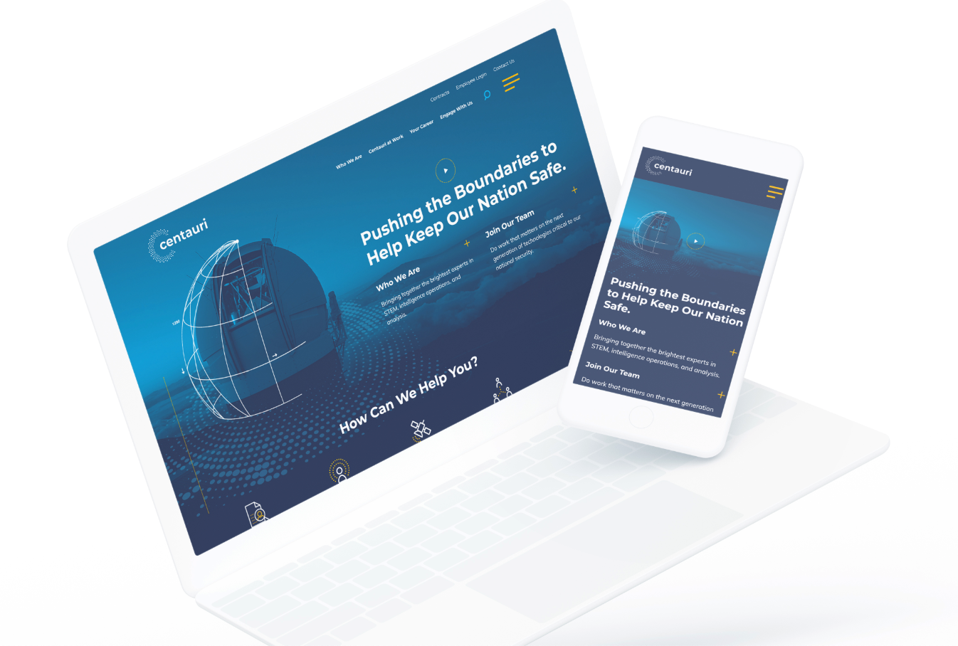
Consider for example, our work with Centauri. When Arlington Capital Partners acquired three leading companies in the national security sector—Integrity Applications Incorporated, Xebec Global, and Dependable Global Solutions—the IAI team turned to Bluetext to develop and launch a new unified brand from scratch. In less than 6 months, the teams worked together to launch Centauri. Following our work with the company, it was sold to KBR for $827 million, providing Arlington Capital Partners with a profit of around $300 million.
The Future of Marketing in Private Equity
As the private equity landscape evolves, the role of marketing will continue to grow in significance. Here are some trends to watch:
- Data-Driven Marketing: Advanced analytics and big data are transforming how marketing strategies are developed and executed. Data-driven insights enable more precise targeting, better customer understanding, and improved campaign performance.
- Digital Transformation: The ongoing digital revolution presents both challenges and opportunities. Private equity firms must ensure that their portfolio companies are not only keeping pace with digital trends but also leveraging them to gain competitive advantages.
- Integrated Marketing Strategies: Successful marketing is no longer about isolated campaigns but integrated strategies that encompass various channels and touchpoints. Omnichannel approaches that provide a seamless customer experience will be crucial for driving growth and value.
Conclusion
Effective marketing is a powerful catalyst that can significantly enhance the performance and value of private equity portfolio companies. By building strong brands, optimizing operations, and driving scalable growth, marketing creates a ripple effect that benefits all stakeholders involved. At Bluetext, we specialize in crafting strategic marketing solutions that unlock the full potential of portfolio companies, ensuring that private equity investments yield maximum returns.
For more insights on how effective marketing can transform your portfolio companies, contact us at Bluetext. Together, we can harness the power of marketing to drive your private equity success.
At Bluetext, we’re passionate about empowering cybersecurity companies to thrive in the digital realm. With cyber threats evolving at a rapid pace, it’s essential for these companies to not only provide cutting-edge solutions but also effectively communicate their value propositions to clients. That’s where we come in. Through our innovative approach to cyber security marketing and website design, we help cybersecurity firms of all sizes enhance their digital presence and drive meaningful engagement.
Understanding the Landscape: The Importance of Cybersecurity Marketing
In today’s interconnected world, cybersecurity is no longer just a concern for IT departments—it’s a critical business issue that impacts every aspect of an organization. As cyber threats become more sophisticated, businesses are turning to cybersecurity companies for protection and peace of mind. However, with so many players in the market, standing out can be a challenge. That’s where strategic marketing comes into play.
Cybersecurity marketing is about more than just promoting products and services—it’s about building trust and credibility in an industry where reliability is paramount. At Bluetext, we understand the unique challenges that cybersecurity companies face, from communicating complex technical concepts to reaching the right audience. That’s why we take a holistic approach to cybersecurity marketing, combining creativity, strategy, and technical expertise to deliver results that matter.
Crafting Compelling Digital Experiences: The Role of Website Design
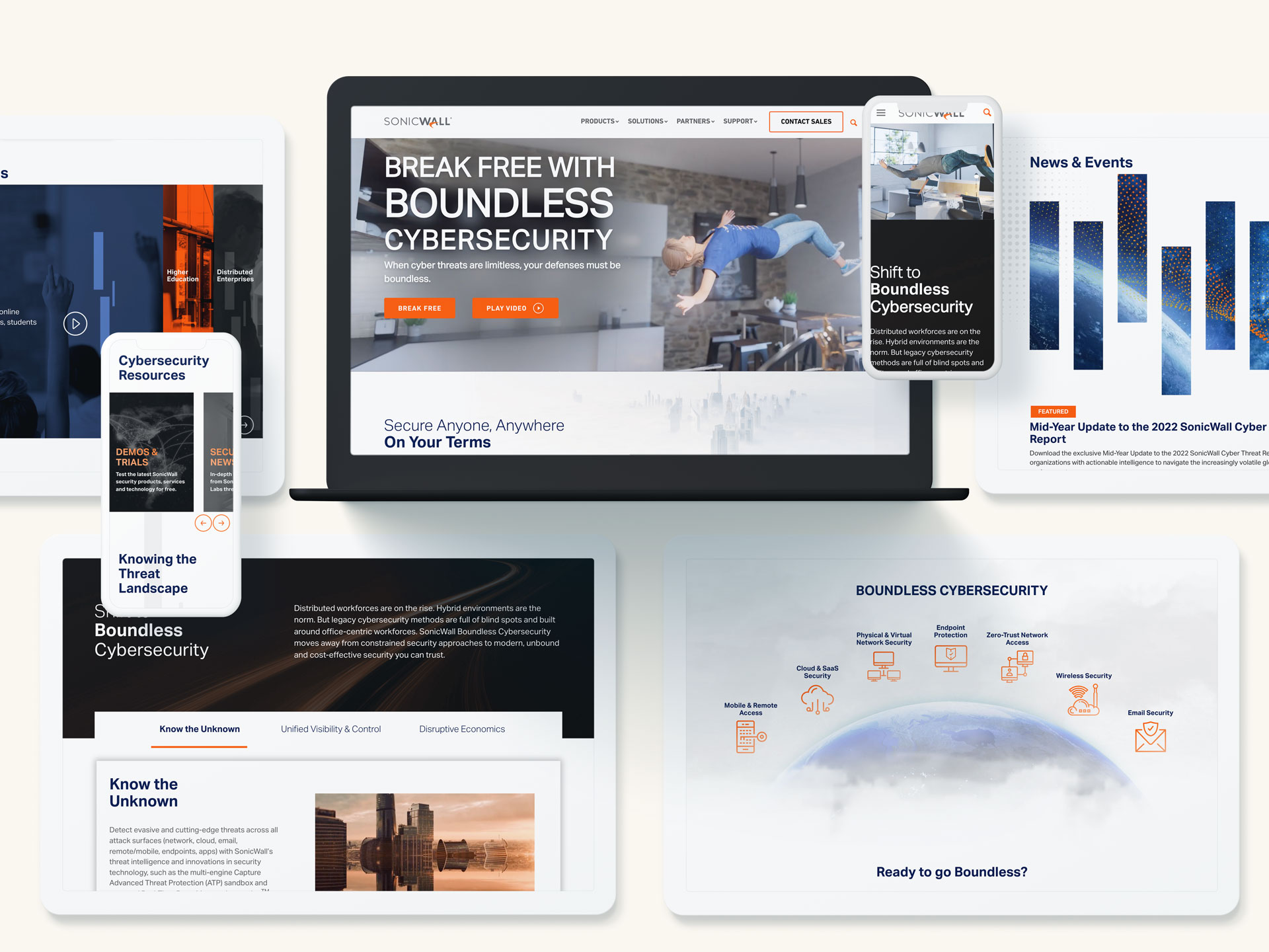
In the digital age, your website is often the first interaction potential clients have with your brand. That’s why it’s crucial to make a lasting impression. At Bluetext, we believe that great design goes beyond aesthetics—it’s about creating meaningful experiences that resonate with your audience and drive action. Our team of experienced designers and developers works closely with cybersecurity companies to create websites that not only look great but also function seamlessly across devices.
From intuitive navigation to engaging content, we ensure that every aspect of your website is optimized to convert visitors into leads. Whether you’re a startup looking to make a splash or an established firm seeking to rebrand, we have the expertise and creativity to bring your vision to life.

Tailored Solutions for Every Need: Our Approach to Cybersecurity Marketing
At Bluetext, we understand that every cybersecurity company is unique. That’s why we take the time to listen and understand your specific goals and challenges. Whether you’re looking to increase brand awareness, generate leads, or improve customer retention, we develop custom marketing strategies tailored to your needs.
From content marketing and social media management to search engine optimization and email campaigns, we offer a full suite of services designed to help you achieve your business objectives. And with our data-driven approach, you can be confident that every decision we make is backed by insights and analytics.
Looking to the Future: Innovation in Cybersecurity Marketing
As technology continues to evolve, so too does the threat landscape. At Bluetext, we’re committed to staying ahead of the curve and helping our clients navigate the ever-changing digital landscape. Whether it’s adopting emerging technologies or exploring new marketing channels, we’re always looking for ways to innovate and drive results for our clients.
Private Equity Firms Investing in Cybersecurity Companies
Private equity firms can learn from Bluetext’s approach to empowering cybersecurity companies in the digital realm. As investors seek opportunities in the cybersecurity sector, understanding the importance of effective marketing and digital presence becomes essential. Bluetext’s holistic approach, combining creativity, strategy, and technical expertise, serves as a valuable model for private equity firms looking to maximize the value of their investments in cybersecurity. By partnering with marketing agencies like Bluetext, private equity firms can ensure that their portfolio companies effectively communicate their value propositions, differentiate themselves in a competitive market, and ultimately drive growth and success in the cybersecurity industry.
In conclusion, cybersecurity companies play a vital role in protecting businesses and individuals from cyber threats. At Bluetext, we’re proud to support these companies by providing strategic marketing and website design services that elevate their digital presence and drive meaningful engagement. With our expertise and passion for innovation, we’re confident that together, we can build a safer, more secure digital future.
Are you ready to take your website to the next level? Contact us.
In the bustling digital landscape of Washington, DC, where businesses strive to stand out amidst fierce competition, having a robust online presence is non-negotiable. Your website serves as the virtual storefront, the first impression that can make or break a potential customer’s decision to engage with your brand. To ensure your online presence exudes professionalism, functionality, and aesthetic appeal, partnering with a top-notch WordPress development agency is paramount.
A WordPress development agency specializes in creating and optimizing websites using the WordPress platform, the most popular content management system (CMS) globally. With its flexibility, scalability, and extensive array of plugins and themes, WordPress empowers businesses to craft dynamic and visually stunning websites tailored to their unique needs.
Bluetext: A WordPress Expert
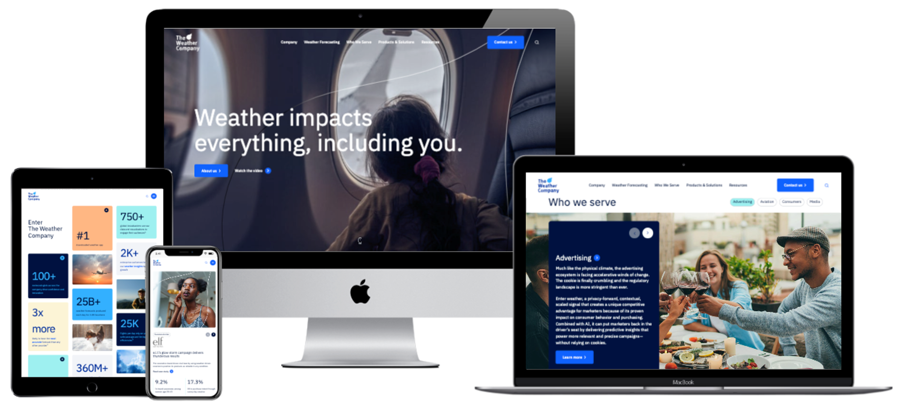
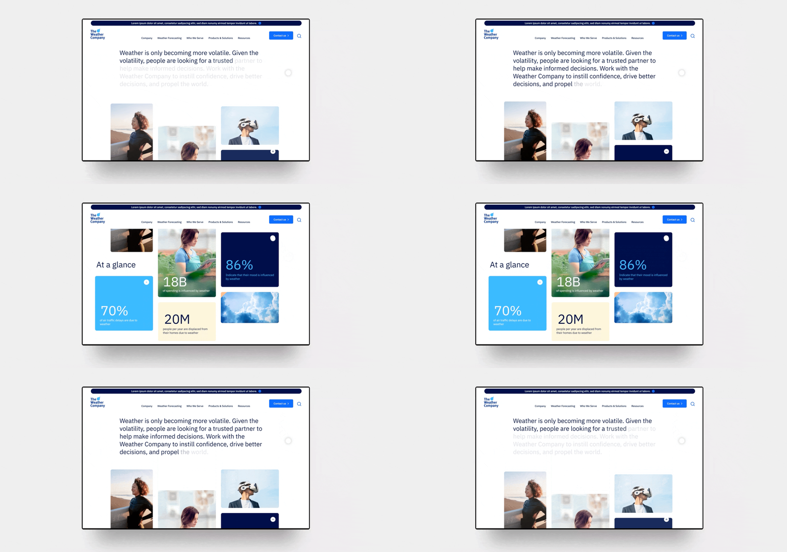
Here at Bluetext, we’ve designed some of the most impressive WordPress websites on the internet today. For example, our work with The Weather Company was delivered on a WordPress CMS in just over 100 days from inception to website launch. From the project kick-off to the launch date, Bluetext worked at rapid speed and was committed to hitting an aggressive launch date while producing the highest quality deliverables from beginning to end. This included in-depth discovery work (to ensure we understood the business, its challenges, and its goals), as well as intentional content strategy, SEO, wireframes, color comps, motion study/animation, fully responsive website development and QA, content loading, and strategic recommendations throughout the entire process.
Choosing the Right Agency Partner
So, how do you choose the right WordPress development agency in Washington, DC? Here are some key factors to consider:
- Expertise and Experience: Look for an agency with a proven track record of success in WordPress development. Evaluate their portfolio to gauge the quality and diversity of their past projects. Experienced agencies will understand the intricacies of WordPress customization, optimization, and maintenance, ensuring your website performs flawlessly.
- Design Capabilities: Aesthetics matter in web design. Seek an agency that excels in creating visually appealing and user-friendly websites. Your website should not only capture attention but also provide a seamless browsing experience across devices, fostering engagement and driving conversions.
- Technical Proficiency: Beyond design, technical proficiency is crucial. The agency should possess in-depth knowledge of WordPress architecture, coding best practices, and SEO principles to ensure your website is optimized for search engines and delivers superior performance.
- Client Collaboration: Effective communication and collaboration are essential for a successful partnership. Choose an agency that values client input, listens to your requirements, and keeps you informed throughout the development process. Transparency and responsiveness foster trust and ensure your vision is brought to life.
- Support and Maintenance: Launching your website is just the beginning. Choose an agency that offers ongoing support and maintenance services to keep your website secure, up-to-date, and optimized for peak performance. A reliable partner will provide timely updates, address any issues promptly, and help your website evolve alongside your business. That being said, don’t feel like you have to rely on an agency partner to maintain your website. If you have the capabilities in house, a good website agency will set you up for success so you can support the website from launch onwards.
In Washington, DC, Bluetext stands out as a premier WordPress development agency, specializing in web design, digital strategy, and branding services. With a dedicated team of experts and a client-centric approach, Bluetext has helped numerous businesses across various industries elevate their online presence and achieve their digital goals.
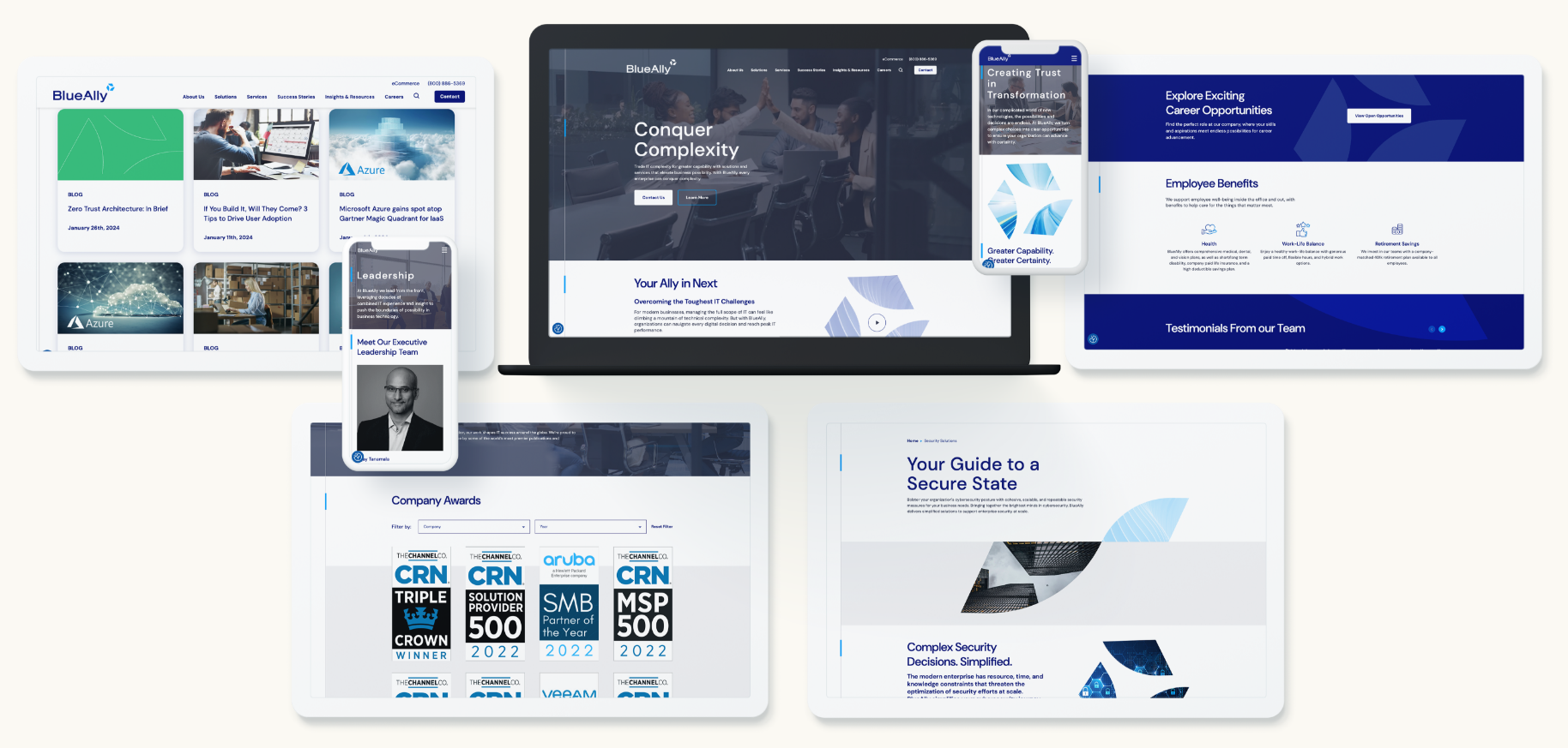
Take our work with BlueAlly for example. BlueAlly is a technology & IT consulting company that helps enterprises break down barriers to advanced technology and achieve new levels of capability. The BlueAlly team came to Bluetext after the acquisition of N2grate and Netcraftsmen to help build a cohesive brand that could encompass all of their growing capabilities. The project started with our messaging work stream followed by the logo design, CVI creation, content planning, and website development that culminated in the external launch of their new brand and site alongside a powerful brand essence video.

Invest with an Agency, Invest in Yourself
Don’t settle for an ordinary website when you can have an extraordinary one. Partner with a trusted WordPress development agency like Bluetext and unleash the full potential of your online presence. Contact us today to embark on your journey towards digital excellence.
In conclusion, investing in professional WordPress development is an investment in your business’s success. By choosing the right agency, you can create a captivating, high-performing website that captivates your audience and drives results. Take the first step towards enhancing your online presence and propelling your business to new heights with Bluetext.
In today’s fast-paced digital landscape, staying ahead of the curve is crucial for businesses looking to maintain a competitive edge. One trend that has been rapidly gaining traction is Voice Search Optimization (VSO). With the rising popularity of voice assistants like Siri, Alexa, and Google Assistant, optimizing content for voice search has become more than just a trend—it’s now a necessity. In this blog post, we’ll explore the importance of VSO, the strategies involved, and how you can leverage it to enhance your digital marketing efforts.
Understanding Voice Search Optimization
Voice search refers to the act of using voice commands to search the internet, ask questions, or perform tasks on devices equipped with voice recognition technology. Ubiquitous across millions of users daily, voice assistants like Amazon’s Alexa, Apple’s Siri, and Google Assistant are relied upon for finding information and making decisions.
Voice Search Optimization (VSO) involves optimizing your website and content to rank higher in voice search results. Unlike traditional text-based searches, voice searches tend to be more conversational and long-tail in nature, meaning they often contain natural language queries or questions.
Why Voice Search Optimization Matters
The increasing prevalence of voice assistants has fundamentally changed the way people search for information online. According to recent studies, voice searches are not only on the rise but are also expected to account for a significant portion of all searches in the near future. By optimizing your content for voice search, you can ensure that your business remains visible and accessible to a growing audience of voice search users.
Strategies for Voice Search Optimization
- Use Conversational Language: When optimizing content for voice search, it’s essential to use natural, conversational language. Think about how people would verbally ask a question and tailor your content accordingly. Focus on answering common questions related to your industry or niche.
- Target Long-Tail Keywords: Long-tail keywords are longer, more specific phrases that typically have lower search volumes but higher conversion rates. These keywords are especially important for voice search optimization, as users tend to phrase their queries in a more natural, conversational manner.
- Optimize for Local Searches: Many voice searches are location-based, as users seek information about nearby businesses, services, or attractions. Make sure your business listings are up-to-date on platforms like Google My Business and incorporate location-specific keywords into your content.
- Provide Concise Answers: Voice search users are often looking for quick, concise answers to their questions. Structure your content in a way that provides clear and direct answers to common queries, preferably in the form of featured snippets or FAQ sections.
- Optimize for Mobile: Since many voice searches are conducted on mobile devices, it’s crucial to ensure that your website is mobile-friendly and loads quickly. Mobile optimization is not only important for user experience but also for search engine rankings.
Conclusion
Voice Search Optimization presents a significant opportunity for businesses to reach and engage with their target audience in new and innovative ways. By understanding the unique characteristics of voice search and implementing effective optimization strategies, you can enhance your visibility, drive traffic to your website, and stay ahead of the competition in today’s voice-driven world. Embrace the power of VSO and position your business for success in the era of voice search. Contact us to learn more about VSO and implementing it on your website.
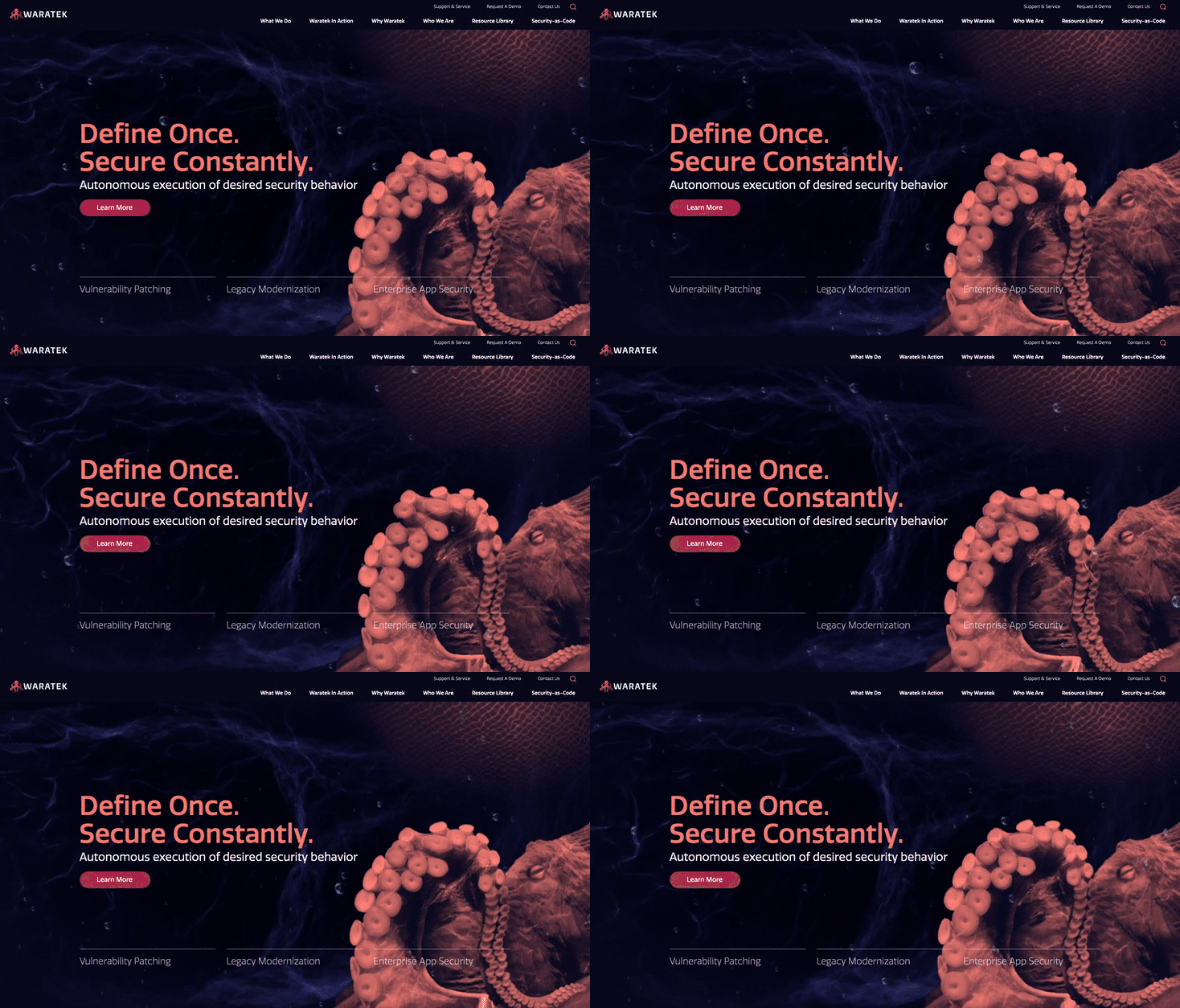
Could the dark mode interface eclipse their light mode counterparts? Dark mode has seen a continued rise in popularity over the past few years following the 2019 release of Apple’s dark mode option alongside the iOS 13 update. Sometimes referred to as “Night Mode”, “Shadow Mode” or “Dark View”, this dark mode is a design term used to describe a low-light user interface that uses a dark color as the primary background color, reversing the default light-on-dark design that designers have used for decades.
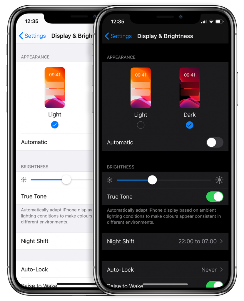
In response to increased user screen time across devices, this darker UI design trend has garnered immense popularity. Big-name brands like Facebook, Google, WhatsApp, Instagram, and Apple were all early movers in adopting dark mode interfaces and have influenced many others to follow in their footsteps. That being said, operating systems, browsers, and apps are not the only places dark mode is continuing to grow in its popularity — more and more website developers and designers are hopping on the dark mode train, opting for UX/UI designs that are dark as night with reasons why that are clear as day.
A “Site” for Sore Eyes, in More Ways Than One
It’s no secret that the aesthetics of a dark mode design can elicit powerful feelings and emotions from visitors. A dark color theme often conveys sophistication, edge, and modern elegance to users. Black is an especially dominant color, often used to create maximum color contrast when paired with whites or vibrant tones. Dark hues are often associated with style and power, which can add striking visual appeal and depth when used strategically as a website’s background. Dark mode is especially useful for image and video-heavy sites. The dark contrasts bright colors, making them look more compelling and instantly captures the audience’s attention. The more visually appealing users find your site, the more likely they are to engage with your content and remain on-page.

More than a Pretty (Inter)face
Aside from just looking easy on the eyes, dark mode can actually be easier on the eyes. Some studies show that dark mode can help reduce the sensation of discomfort that is sometimes felt by staring at websites with light backgrounds. It is especially preferable in low-light conditions where looking at bright white screens for long periods of time on any device can result in eye strain and fatigue. Reducing the pain associated with light-on-dark interfaces by switching to a dark-on-light display can help encourage users to stay on your site for longer.
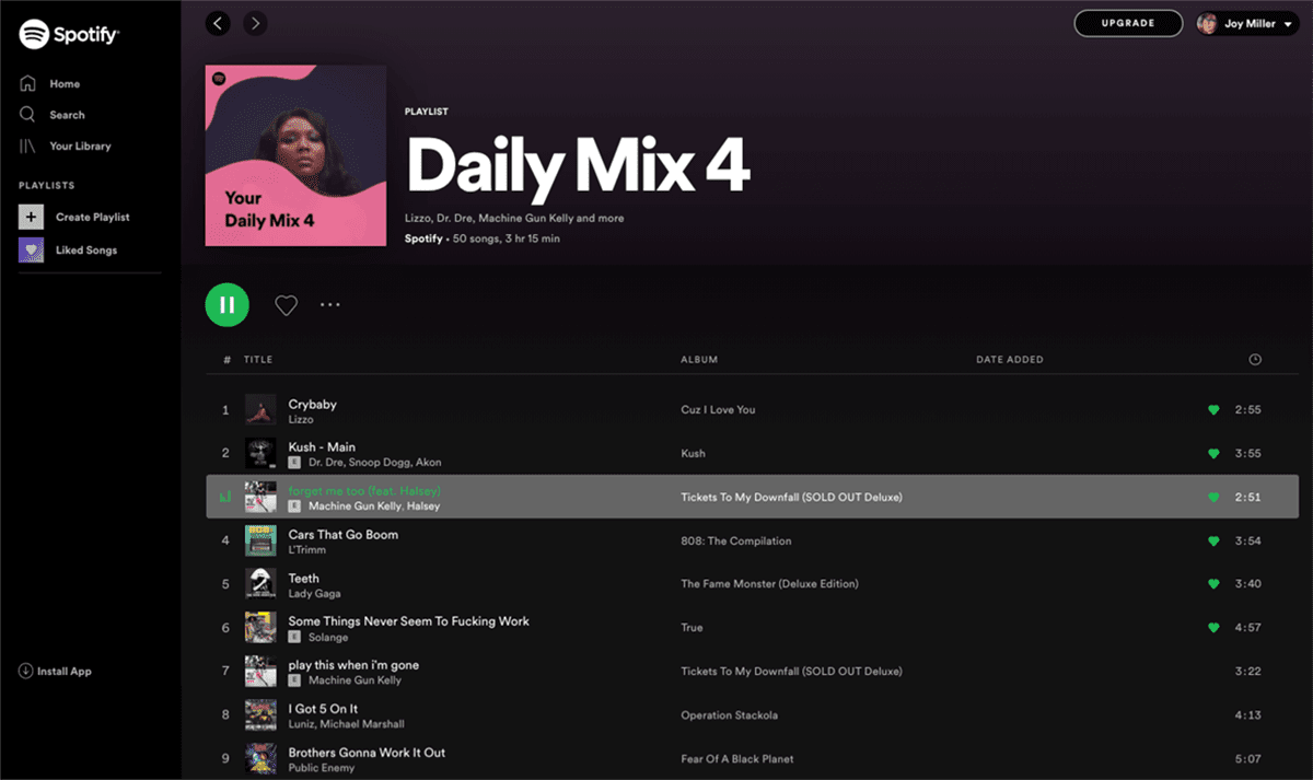
If you’re a Spotify user, your eyes (and ears) have been benefiting from dark mode features for years.
Dark Mode Can Save Brain and Battery Power
UX research shows that dark backgrounds enhance page contrast, making visuals pop and easier for the users to focus on. If your site is imagery-heavy or puts an emphasis on visual or graphic content, dark mode will allow users to be more engaged and get through your site quicker and easier, retaining more content faster and leaving with a stronger impression of what you have to offer.
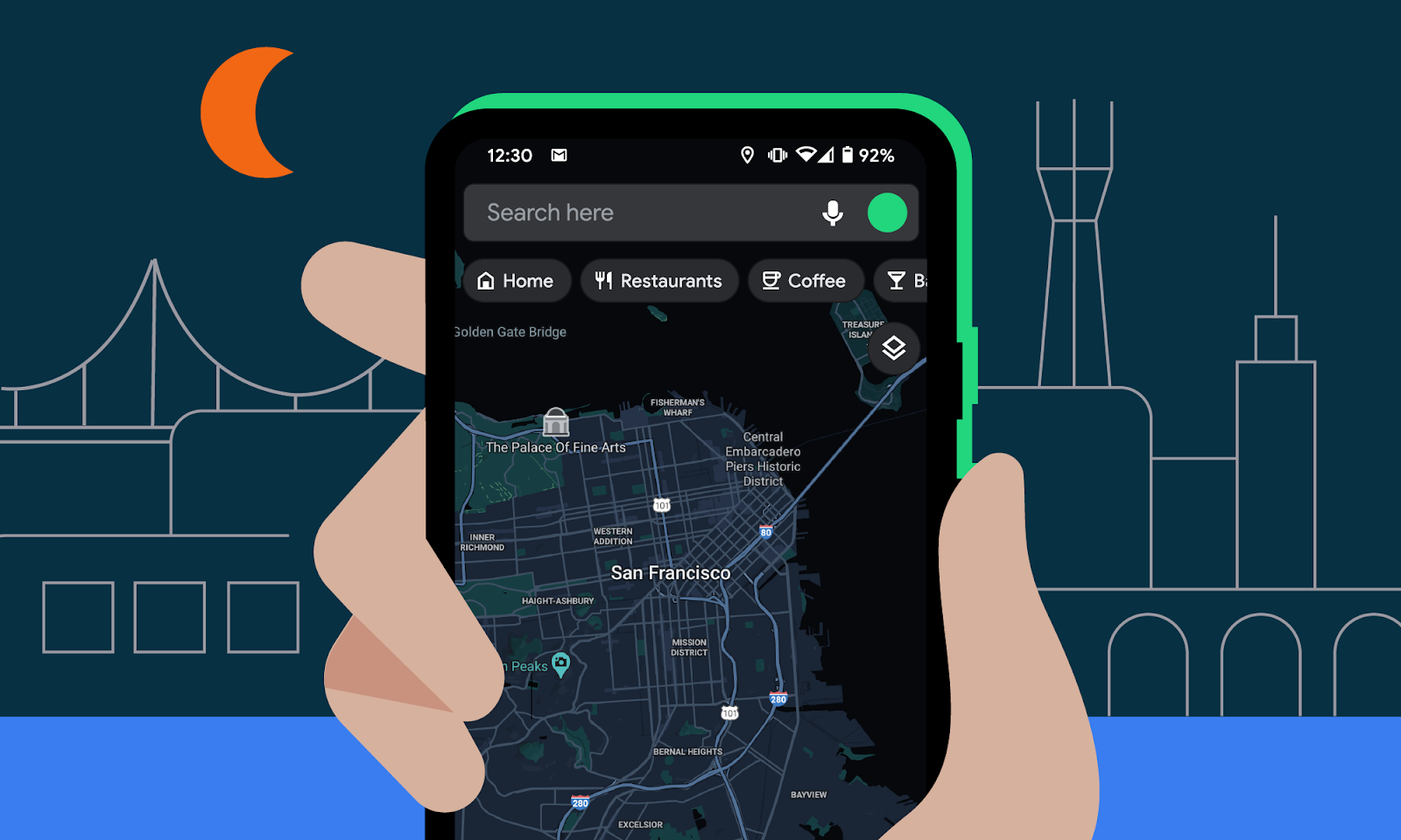
Dark mode can also save device battery life. Studies show a dark theme can reduce battery usage significantly, especially for users viewing your site on a mobile device. White pixels are more power-hungry than dark pixels, which allow devices to use less energy. In an era when users are glued to their screens, anything that can save device battery power is a win — and your website could be one of those things.
So Now You’re Interested in Dark Mode, but Don’t Know Where to Start?
Good thing Bluetext has got you covered. As a leading digital marketing agency in DC that specializes in website design and making powerful sites for clients all over the world, we’d like to offer up a few pieces of advice to consider when thinking about creating or adding dark mode to your site:
- Determine if dark mode is really right for your website content–and where. Dark mode is great for enhancing emotional branding, showcasing photos and graphics, and emphasizing visual content, but not so great for displaying big chunks of text. Light text on dark backgrounds can cause readability issues in practice, so portions of your website that are or will be pretty text-heavy, dark mode may not be the best choice to display your content. Consider reserving dark mode for a homepage, or flashy campaign landing page, but maybe not your product details.
- Make sure your brand colors can actually work well with a light-on-dark design (see tip #3). If not, but you’re still set on pursuing dark mode, consider going through a rebrand before implementing dark mode.
- Verify your light-on-dark color scheme meets accessibility color contrast standards.
- Dark backgrounds de-accentuate empty space, so limit the number of elements (lots of icons, buttons, and small images) used together within viewports to avoid looking cluttered.
- Make sure your design will work in both low-light and high-light environments.
- Use illumination over shadows to communicate depth.
- Avoid highly saturated colors.
- Leave room for a regular/light option and give users the ability to toggle back and forth as they desire.
- Work with an agency like Bluetext to ensure your dark mode website is sleek, powerful, on-brand, and communicates a strong and engaging message to your audience.
Learn more about dark mode and how Bluetext can help you take your website to the next level. Contact us today.