In the ever-evolving landscape of website development, choosing the right Content Management System (CMS) for your company is a critical decision. Webflow has gained popularity as a robust and visually-driven CMS, providing a unique approach to web design and development since its inception in 2013.
What is Webflow?
When it comes to web design, tools that empower creativity and streamline the development process are highly sought after. One such tool that provides a range of capabilities is Webflow—a cloud-based, ‘software as a service’ (SaaS) design tool that runs in a web browser. According to builtwith.com, there are currently over 368,000 websites built on Webflow. If you’re new to the realm of website creation or curious about exploring innovative solutions, let’s break down the pros and cons of this particular CMS option.
Pros:
- Intuitive Interfaces
One of Webflow’s standout features is its user-friendly, drag-and-drop interface. This allows designers to create visually appealing websites without delving deep into complex code. The intuitive design empowers individuals with varying levels of technical expertise to bring their creative ideas to fruition, and they’re also able to collaborate simultaneously.
2. All-In-One Hosting Solution
Webflow offers hosting services as part of its package, eliminating the need for third-party hosting solutions. This integrated approach simplifies the deployment process and ensures a high-level of security with Webflow’s free SSL certificate.
3. Optimized SEO
Webflow provides a range of features and tools that can positively impact SEO. It generates clean and semantic HTML, ensuring that search engines can easily crawl and index the content of your website. There are also the impacts of having fast loading speeds, control over meta tags, 301 redirects, alt text, etc.
4. Improved Site Speed
Webflow’s hosting infrastructure is designed for speed. There are multiple factors contributing to improved site speed through Webflow, such as the minification of CSS and JavaScript, browser caching preloading, automatic lazy loading of images, and much more.
5. Unique Animation Capabilities
From simple transitions to complex animations, Webflow empowers designers to bring websites to life without relying on external tools or complex code.
Cons:
- Restriction on eCommerce
While the platform does provide e-commerce capabilities, it may not be as feature-rich or as customizable as some dedicated e-commerce platforms. Users may find limitations in terms of advanced e-commerce functionalities, complex product management, or intricate sales processes. Additionally, the available payment gateways might not be as extensive as those offered by specialized e-commerce solutions such as Shopify.
2. Cost Considerations
Webflow’s pricing may be a concern for smaller businesses or individuals on a tight budget. While it offers various plans to cater to different needs, the cost can add up, particularly for those requiring advanced features or increased customization. It may also be challenging to choose a pricing plan that best suits your business and needs.
3. Limited Plugins Available
Unlike some other Content Management Systems that may offer extensive libraries of plugins and extensions, Webflow’s plugin options are more constrained. On the other hand, however, there are quite a few WordPress plugins that Webflow actually accounts for, such as Forms, Askimet, Yoast SEO, Elementor, and more.
Webflow is more than just a website builder; it’s a platform that unleashes creativity, simplifies development, and provides a holistic solution for bringing digital ideas to life. Whether you’re a designer aiming for visual excellence, a developer seeking efficient workflows, or a business looking for a robust online presence, Webflow offers a versatile and powerful toolkit for achieving your goals. However, when it comes to choosing a CMS, it’s important to consider Webflow’s pros and cons based on your project’s specific requirements—it may not be the perfect fit for every project. By weighing these factors, you can determine whether Webflow aligns with your goals or not.
If you’re still not sure what CMS may be right for you, contact us. Bluetext’s experience and expertise with WordPress, Drupal, and Webflow can help you build an effective online presence no matter what CMS you choose.
Pagination – a seemingly simple yet immensely impactful element of web design and content organization. One that can transform an overwhelming scroll into a series of inviting steps, prompting exploration and easing the burden of information overload. In this post, we’ll uncover the essential role pagination plays in enhancing user experience and strategies to create a seamless, page-turning digital journey for all who venture online.
PAGINATION IMPORTANCE
Pagination is a user-friendly approach for the display and management of large volumes of information on a website. In contrast to infinite scrolling- or, a continuous flow of content that automatically loads as the user scrolls down the page- pagination involves creating a system of numbered links or buttons that allow users to navigate through different pages or sections of content and data. This is a critical tactic in website design as it significantly enhances usability.
When used strategically, pagination can positively impact user experience in the following ways:
- Easier access to relevant content. While infinite scrolling can provide an immersive experience, it can be difficult for users to locate specific information or access footer navigation. Pagination enables users to quickly locate the content they’re interested in and can significantly reduce the length of a page, making it easier for users to reach the footer.
- Maintains a balance between aesthetics and function. Cluttered interfaces with endless scrolling can lead to a clunky user experience. Pagination offers a clean and structured layout, preserving the overall coherence and readability of the website’s design. Not only does this enhance the visual appeal of the website, but allows users to enjoy a more intuitive browsing experience.
- Simplifies content consumption. Without pagination, websites featuring extensive articles, product listings, or search results could become overwhelming and tedious to navigate. By breaking down content into smaller, manageable chunks across multiple pages, users can easily digest information without a sense of frustration.
- Responsive Design: Pagination can also contribute to a more responsive design, especially on mobile devices. Large volumes of content on a single page can be challenging to render properly on small screens, while pagination allows for a more adaptable and user-friendly presentation.
- Faster Load Times: With infinite scrolling on a long page, you’re constantly loading more and more content into memory. This hurts page performance since the browser has much more work to do to load the page. By spreading content across multiple pages or views, pagination reduces the amount of data that has to render and transmit on initial page load. This leads to a faster and smoother browsing experience for users, including those who may have slower internet connections or limited bandwidth.
In addition to positively impacting user experience, pagination also plays a crucial role in improving web accessibility by making it easier for users of all abilities to access and interact with the content effectively. Here are a few of the ways pagination helps ensure that content remains digestible and navigable for those with disabilities or impairments:
- Reduced Cognitive Load: Individuals with cognitive disabilities can often find it challenging to process large amounts of information presented on a single page. Pagination breaks down content into smaller, more manageable segments, reducing cognitive overload and making it easier for these users to understand and engage with the material.
- Improved Screen Reader Experience: Screen readers- tools used by people with visual impairments- navigate web pages by reading out the content in a linear fashion. With pagination, the content is presented in a structured manner, allowing screen readers to provide better context and enable users to explore the information more efficiently.
- Keyboard Navigation: Some users rely solely on keyboard navigation due to motor impairments or other reasons. Pagination provides clear landmarks and links, enabling these users to move through the content with precision. It prevents the need to scroll through an overwhelming amount of data, making navigation smoother.
- Predictable Interaction: Consistent and predictable user interactions are vital for accessibility. Pagination offers a standard way for users to move between pages, ensuring that individuals who rely on assistive technologies can anticipate and understand how to navigate the website’s content.
To sum it up, pagination prevents information overload, allows for ease of use, and improves navigation, all of which collectively contribute to a more user-friendly, inclusive, and satisfying experience on a website.
PAGINATION TYPES AND USES
In web design, different types of pagination styles can be employed to enhance user experience and navigation. Each style offers a unique way of presenting content across multiple views. Let’s break down some of the most common pagination styles and when they should be used:
- Numeric Pagination: This is a classic pagination style that involves displaying a series of numbered links that correspond to different pages of content. Numeric pagination is suitable for websites with a substantial amount of content, such as articles, blog posts, or search results. It provides users with a clear overview of the available pages and allows them to jump to specific sections directly.
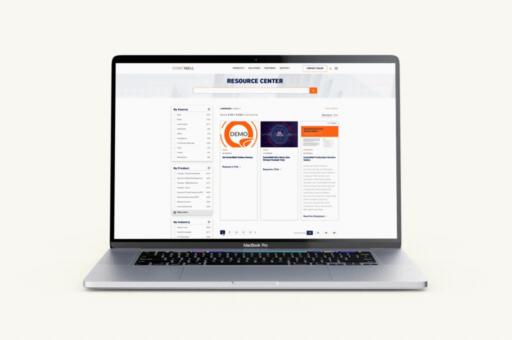
Check out our SonicWall work here
- Prev/Next Pagination: Prev/Next pagination employs “Previous” and “Next” links to navigate between pages sequentially. This style is suitable for content that follows a linear progression, such as articles or blog posts. It’s a simple and intuitive approach that is especially useful when users prefer to read content in a specific order. See this approach in action on the Bluetext blog — and read some more UX tips and tricks while you’re at it!
- Alphabetical Pagination: Alphabetical pagination categorizes content based on alphabetic characters, allowing users to jump to sections of content starting with a particular letter. Alphabetical pagination helps organize a large amount of data in an easily accessible manner and is most often used for directories, glossaries, or indexes.
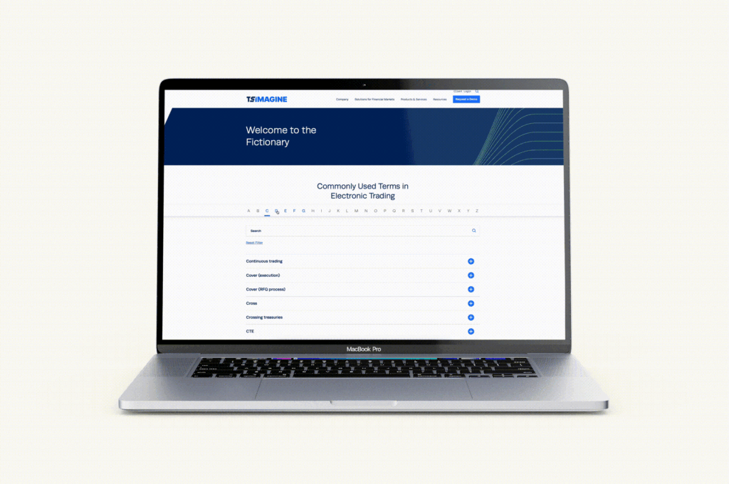
Explore more of our TS Imagine work here
- Date-Based Pagination: Date-based pagination organizes content by date, often seen in archives, news websites, or event listings. Users can navigate through different periods of time to find relevant information. This style helps users discover content based on chronological relevance.
- “Load More” Button: Instead of traditional pagination links, the “Load More” button dynamically loads additional content as the user progresses down the page. This approach is a strong alternative to infinite scrolling, allowing for the same seamless feel and browsing experience while minimizing page reloads and giving users control over when to retrieve new content. “Load More” is commonly used for social media feeds, image galleries, and continuous content streams, as well as robust listings like Google search results.
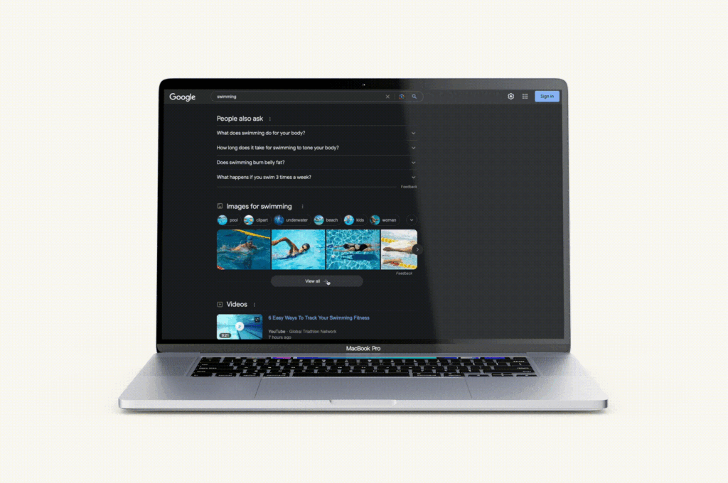
Google search listings recently upgraded from a simple, numeric pagination to a dynamic scroll and load more experience.
When choosing a pagination style, it’s important to consider the type of content you’re presenting, user preferences, and the platform’s goals. The chosen style should align with the overall user experience strategy, offering convenience, clear navigation, and a seamless interaction that caters to the specific needs of your audience and the nature of the content being displayed.
Ready to pump up your pagination or revamp your website with the help of a leading digital design agency and UX experts? Get in touch with Bluetext today and let us transform your digital brand experience, one page at a time.
7 Key Considerations for Optimal User Experience Design
When it comes to architecting and designing a new website, we hear people drop the “UX” buzzword all the time. Oftentimes what they mean is, “the experience users will have on my site,” rather than the true definition of user experience design (UX), which is to design for the user. It’s easy to get distracted by ego. We want our websites to be unique and visually interesting, but sometimes it’s at the expense of the user. True UX means always prioritizing the user’s needs above all other considerations, even if you have to make sacrifices.
The easiest way to design for the user’s experience is to remember that people use websites to find information. They are not looking to be impressed by some fancy animation or navigation they’ve never seen before. That’s why UX really begins before the design phase, in information architecture planning.
1. Sitemap UX
Once you have your website personas, you can define what type of content those personas are looking for and how they are most likely to find it. There are typically three ways to structure your site map: by category, by task, and by audience. Sometimes a site map will provide two options, but all three is rare and may actually hurt more than it helps. Make sure your navigation is structured how your users would look for information, not how you structure your company.
Site map pro tips:
- Within your menu, try to limit any single level of navigation to no more than 7 items, as that is the average recall limit of our short-term memory.
- Use terminology in your menu people understand. For example, an internally named product like ‘Awesomeness5X” may not mean anything to someone looking for a blender with 5 speeds.
- Use a different structure in your actual site map page than your menu. If a user ends up there, it’s likely because they couldn’t find what they were looking for in the way you presented it in your menu.
2. Content Strategy UX
Once you have your sitemap, it’s time for your on-page content strategy. Again, in thinking about our users it’s important to remember a few things. First, people read much less on a computer screen than they do on paper. Conciseness is key. If you can, put your “bottom line up front” and then expand on details. People will keep reading if they know they’re on the right page, but may bounce if they can’t quickly find the information they’re looking for. Second, make your page as easily scannable as possible by using headings and lists. Brains love lists!
Content pro tips:
- If your page becomes very long with more than three headings, it likely means you need to add detail pages.
- Keep things elementary. You may want to impress your users with big words, but the average user has a basic or low level of literacy.
3. Global Elements UX
As you start to move into design, remember that most people use the internet all the time, and we’ve learned to look for common visual cues on websites. Part of UX design is including visual cues to help the user navigate and use your site. For example, many people will arrive on your site on a page other than the home page through Search. If they do, they need to orient themselves. A great way to provide this orientation is through breadcrumbs and meta titles. When it comes to icons, always include a label. Do not assume users know what your icon means. Lastly, underline your links and change the color once they’ve been clicked to help the user understand where they can go and where they’ve been.
4. Imagery and Videos UX
Media is great. It can bring a lot of life to a website. However, media should never distract from the content and should always provide value. Adding a large grid of images to a page at the expense of important content is distracting and images that are not relevant or feel inauthentic, do not provide value. If adding videos, allow the user to interact with video settings and do not have them autoplay.
5. Search UX
Even with the best architecture, users will still search, sometimes even as their preferred method of navigating. Try to mimic the Search engine results pages we’ve all become familiar with. This means including the page title, a description, and the URL in the form of a breadcrumb in each result.
Search pro tips:
- Make the entire listing result clickable, no just the title or URL link.
- Keep the search field on the results page with the query still in the field for easy editing.
6. Mobile UX
Mobile usage increases every day. It’s imperative that everything you make available to a desktop user is available to a mobile user, meaning you don’t forego content or key functionality. Make sure anything clickable is at least 40x40px so fingers don’t make mistakes or struggle. Lastly, consider site speed. Most mobile connections are much slower than our home Internet, so make sure your users can load your page at a reasonable speed. See our site speed blog for more information on site speed optimization.
7. Accessibility UX
Lastly, consider all users. Your design and website functionality should ensure that users with any sort of barrier can interact with your site, including those with physical disabilities. Common UX issues related to accessibility revolve around color contrast, keyboard navigation, and screen reader capabilities. By following WCAG guidelines, you can ensure that users can experience your site as intended.
Accessibility pro tip:
- Use Google’s Lighthouse tool or the WAVE extension to regularly check your website for issues and suggested corrections.
This blog is in no way comprehensive, but it touches on common parts of the web design process in which the user is easily forgotten. Remember that the user is why the website exists, so always ask yourself, “is this choice helping my user?” Data can also be very helpful if trying to assess your UX. Where does your analytics show users dropping off? What do screen recordings of real sessions show?
If you need any help along the way or want to learn more about UX Design, contact us at Bluetext to guide you through a strategic website project with UX best practices in mind.
The competitive landscape for capturing visitor attention through digital experiences is crowded and overwhelming to say the least. Not only do you need to grab visitors’ attention, but also present thoughtful UX design that guides them to a desired action and outcome. So how do you accomplish this when it seems like everyone else wants the same thing?
Creative differentiation is a key first step in grabbing the attention of your audience and unique interactivity throughout the user journey can be the extra step that keeps visitors present and engaged in your site content. At the end of the day, a website is a tool for presenting information – so why not do it in the most unique and engaging way that you can? This is where 3D interactive design comes in. With the limitless content possibilities available to us all, thoughtful and creative 3D design with helpful elements of interactivity can elevate your website’s content and UX to a memorable and effective experience resulting in conversions and lead generation.
Check out Bluetext’s work for Aeyon’s go-to-market campaign leveraging custom 3d animation throughout the page scroll experience!
Immersive design is a balance – it should have the coveted wow factor but also should achieve practical benchmarks like accessibility, effective communication of information, and an intuitive user journey. The implementation of 3D interactive design should follow best practices to ensure that site visitors are delighted and not overwhelmed by the UX – more is not always more. For example, the use of complex 3D layering and visual effects on every component of your homepage would create a visual overkill and also harm the practicality of the page when it comes to loading times, page speed, and site performance metrics. On the other hand, having an eye-catching 3D hero with engaging hover states is enough to entice the visitor to continue on the site where they can find other elegant 3D applications of the visual brand.
There is a multitude of 3D design styles that can be applied to a brand through web design, each with its own capacity to tell the brand story. Layering and masking can create depth in design while allowing the intermixing of imagery and brand shapes.
The use of illustration can also be used in 3D design to emphasize the real objects seen in brand imagery, it can also be used in a brand that wants to convey simplicity while avoiding the use of generic stock images.
Typography can even be brought to life with 3D shadowing and interactive states!
In addition to the possibilities for 3D design elements, there is endless opportunity to create unique interactivity within those elements. Things like hover states, scroll transitions, the reveal of content on hover, interactive graphics and more can elevate an already elegant 3D design application. It is crucial to remember, though, that each of these elements should be chosen carefully to reflect the ultimate goal of the page whether that is a form completion, subscription sign-up, resource download, or simply continued site engagement.
Want to learn more about how 3D interactive design can elevate your brand? Contact Bluetext to learn about our 3D design services!
Prefer listening over reading? Check out the podcast version of this blog below and enjoy insights on the go!
A company website is an opportunity for a user to interact with the company’s brand, and the first impression that the site creates can make the difference between a user being an explorer or a deserter. An explorer is an intrigued, curious customer, digging through the site searching for relevant information, taking note of all the content they pass along the way. A deserter, on the other hand, is a bored user that is either underwhelmed with their user experience or overwhelmed by the copy and content to sort through, leading them to leave the page and making them less likely to return.
The ideal user experience on a website should keep users engaged and interacting with the site, begging even the most uninterested users to become avid explorers. Immersive scrolling is a recent trend in UX design that can stimulate this interactiveness by drawing users in and keeping them engrossed in the site content while directing them through information in a narrative format. Immersive scroll experiences use imagery, videos, graphics, or even sound design to pull users into the content and weave them through the information in a more dynamic way.
A site built with immersive scroll functionality should have unique elements that the user can click, drag, or zoom into. For example, read our blog on Designing Truly Immersive Websites.
In it, we explore the 2℃ Earth page example, which has an impressive number of unique immersive scroll elements, highlighted below:
1. Click to Enter – After landing on the site, the page initially loads a plain black screen, with a scrolling message encouraging the user to click anywhere on the page in order to unlock further content. This functionality creates a sense of intrigue and discovery, like unwrapping a present. Rather than overwhelming the user with content upon landing, the sleek, simple screen engages users with the invitation to search for more and gives them simple, clear directions on how to find it. 
2. Click & Drag Imagery Filters – Upon entering the site, the interactivity continues. In the hero image, the site has a click & drag functionality where users can apply a thermal imagery filter overtop of the image they’re seeing. This interactivity is novel, so it insights a feeling of awe in users, but it also is relevant to the messaging the site is trying to portray. Explained by the directions on the page, the imagery represents the past and future of a natural landscape – a before and after of the effects of global warming. This is a prime example of how the functionality on the site can be informative and impactful, in addition to being entertaining. 
3. Imagery Takes a Front Seat – On traditional sites imagery typically acts as supporting content for the copy. On a site with an immersive experience, however, the visual elements of the site are in the front seat; for example, you can see how the 2℃ Earth page displays large imagery (often expanding outside of a single viewport), and adds interesting micro animations or text overlays to keep the users focused on the images, front, and center. Where a traditional site would keep images static, 2℃ Earth instead has imagery expanding on scroll. This is a good alternative to video content, adding a splash of movement to the otherwise static image. 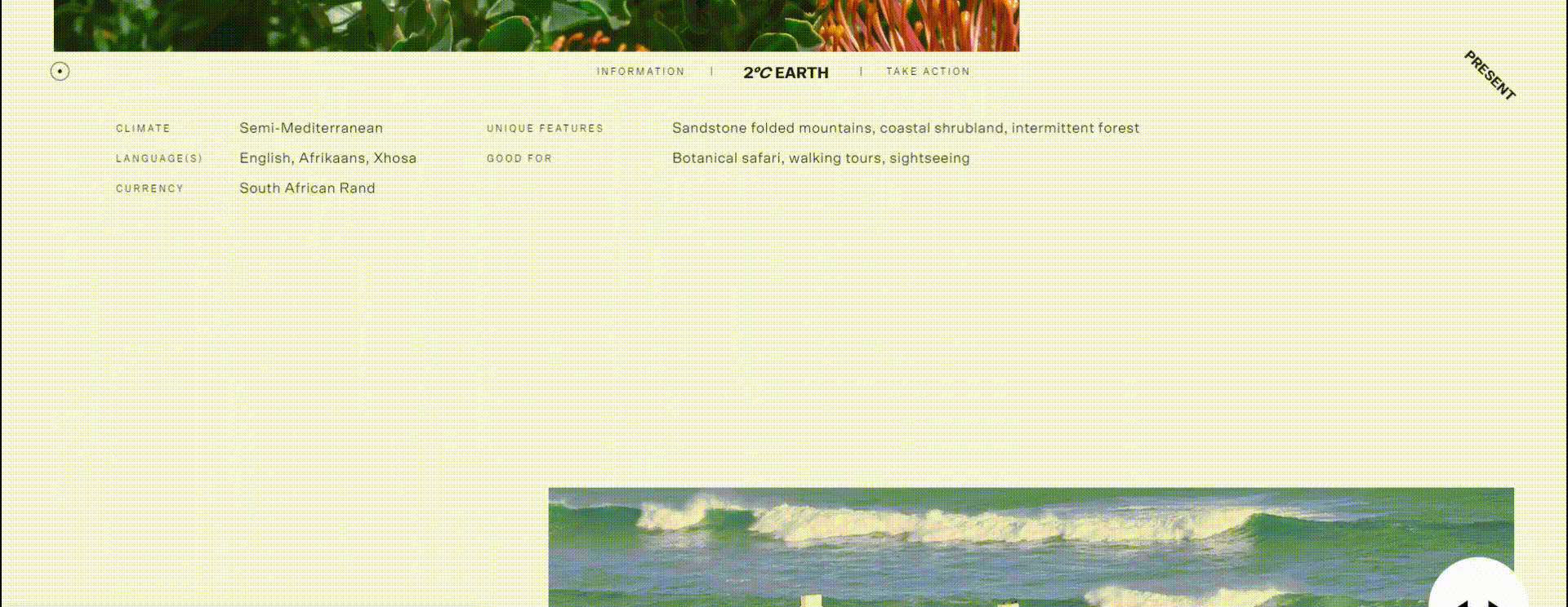
4. Variation in Content Layout – Throughout the page, the content alternates from full-width imagery to 50-50 imagery with text, to right-aligned imagery, to full-screen stylized text, etc. When viewing the page for the first time, the user cannot anticipate where to look next, so each new viewport is an exciting, surprising layout. Alternating the content and imagery placement, keeps the user on the edge of their seat, forcing them to reconsider and analyze the content on each new viewport, looking for nuggets of information or ways to interact with the page.
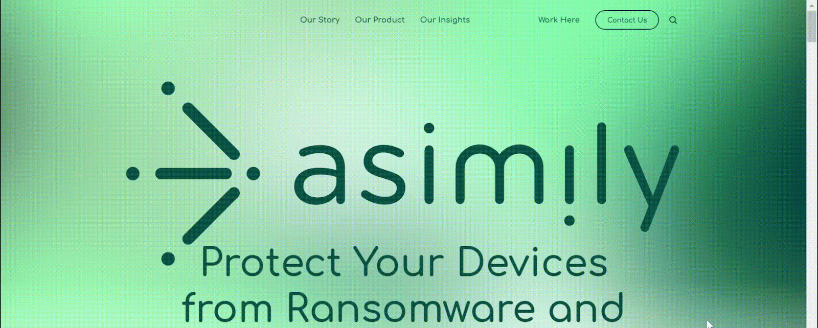
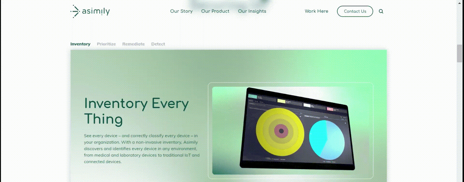
Here at Bluetext, we work to create website designs that are visually appealing, interactive, and intuitive. For example, see below for a breakdown of some of the immersive design elements we brought to the homepage of the Asimily website:
1. The logo moves into the navigation bar on scroll.
When first landing on the page, the Asimily logo appears full-width, almost filling the entire screen. This emphasis on the logo aids in brand awareness for users who have never visited the site before. However, as a user scrolls down, the logo shifts up to its spot in the navigation bar, where it remains on the page as a more of a background element, but still within sight.
2. Scroll function allows shifting through tabs.
Rather than using a typical tabbed module (where a user must click different tab headings to navigate information), instead, we designed this unique component to shift to the next tab when the user scrolls down the page. This ensures that the user sees all of the information added to the page. A typical tabbed module, without this unique scroll immersion, would leave much information hidden, and unlikely to be explored by the user.
3. Highlighting snackable video content.
You’ll notice as you scroll through the page that there are many short snippets of videos included throughout the design. These shorter videos add visual intrigue and informational insights to the page content, while not expecting the user to sit through a full minute-long video all in one go.
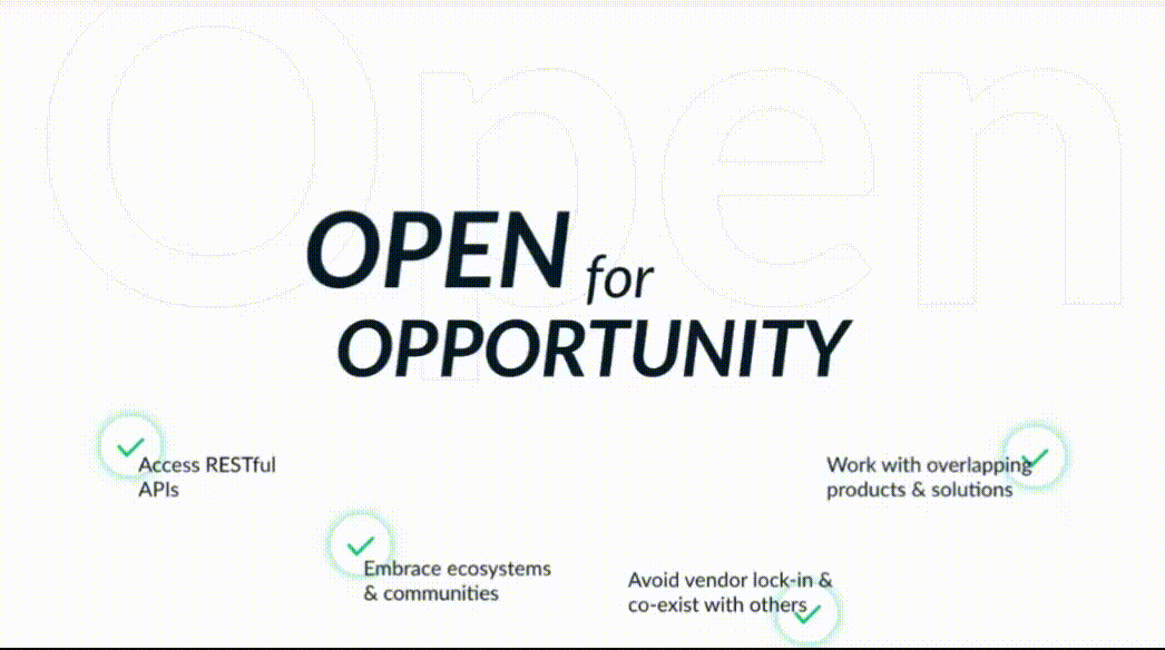
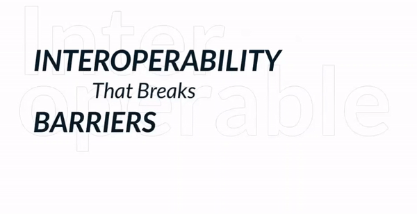
Other examples of immersive scroll interactiveness from the creative minds at Bluetext can be seen in these elements of this campaign landing page we designed for Sectigo.
1. Circular scroll transition
To really capture the feeling of openness for this campaign, we designed a circular transition on this page, where the viewport is taken over by a white circle that envelops the background as the user scrolls down. The novelty of this action takes users by surprise and adds excitement to the meaning behind the openness theme.
2. Horizontal line animation
As the user continues to scroll down the page, the green lines from the Sectigo brand cut across the screen horizontally. These lines then break open to reveal the next content, which leads perfectly into the message of how Sectigo’s platform interoperability breaks down barriers.
3. Small text animation
Animation was applied to the “That Breaks” text on this page to visually convey the meaning behind the words on the screen, rather than just feeding static copy to the users. These sorts of targeted animations/movements keep user attention trained to very specific areas on the page, which helps hold their attention while they scroll through the content.
Immersive scroll elements can be incorporated into an otherwise traditional site layout, but for the most impactful experience, the immersive experience should be considered from the beginning to the end of the user journey on the page. The following questions are especially relevant when deciding whether or not site content would be well-suited to an immersive experience:
- Is there a single key theme that this page can take users through, in a linear fashion? The immersive experience is bringing the user along throughout a story, which requires a clear direction and a logical, ordered approach to how information is presented.
- Are there exciting, high-quality visuals to accompany this story? Whether it’s imagery, illustrations, graphics, or video content, the immersive site more heavily relies on keeping the user visually engaged, so that they don’t lose interest or direction when navigating through numerous components of the page.
- What unique interactions could be designed for the user to play with the content in front of them? In the immersive scroll experience, users are not just viewers of the site, but participants in it. This type of UX design can have a largely gamified feeling, designed to have users navigate from point A to point B of their own accord, with a feeling of delight and wonder as they discover content in ways they didn’t expect it.
If you’re considering implementing an immersive scroll experience for your website, or you simply want to improve your website design and interactivity, contact Bluetext to learn about our UX design & development services.
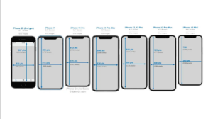
We already feel like we’ve cracked the code for designing and developing responsive websites, but how do we adapt to ever-changing hardware and thus, screen sizes? How do we address the design for touch-screen flip phones? How about new designs from Apple or Samsung that shake things up in the display department? This year alone we have seen new formats bringing back the 2000s nostalgia of phones that flip, fold, and more.

In this blog post, we explore the top 4 ways to ensure your website is ready for new breakpoints as handheld devices, laptops, desktop computers, and televisions continue to evolve.
Ensure your design is leveraging the specs of the latest hardware so that you’re not launching with an already out-of-date design
When you’re planning for a new website, make sure your website design agency knows the latest hardware specifications for the most frequently used devices. They should keep an eye out for the pixel height and width of the top five most widely used screens and ensure their design can adhere to these standards. This should be considered for mobile, tablet, and desktop sizes, otherwise, your designs may be considered out-of-date before they even get into development. Be diligent in checking your website’s Google Analytics to see an up-to-date breakdown of device types & even models being used by your current website visitors.
Additionally, as many still working from home due to the COVID-19 pandemic, some people have adopted larger monitors for their at-home workstations. Some of these monitors will display websites at much larger sizes than intended, so we need to consider what the maximum size will look like as well so they do not look distorted or have any unintended bugs.
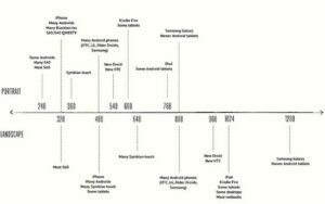
Establish breakpoints for the design before getting into development
Now that your website design team has established the most commonly used browser sizes for mobile, tablet, and desktop and designed the display for each, it is time to think about when the design needs to transition between each layout. How should the vertical display of the tablet differ from the horizontal? How should a small desktop browser size look in comparison to a larger desktop screen? These are all questions to consider before getting into development.

Your website design agency should ensure there are no gaps between breakpoints, meaning that there should not be a 10-pixel difference between designs so that the development team knows when to trigger the next display. Establishing the pixel breakpoints will keep the website responsive across all displays and will ensure there are minimal opportunities for a display mishap.
Get down to the nitty gritty in your code
When development gets underway, make sure you are using the best practices for writing responsive code. You can even start by developing the mobile display first, working your way up from mobile to tablet, and then eventually desktop and larger.
Consider leveraging viewport specifications directly in your code by using the initial-scale definition within your meta tag to ensure you are setting the stage for the rest of the code to come. From there, you will be able to use percentage values to set font sizing, image scaling, etc. to make sure your website is scaling up and down appropriately. You can also set the max-width for images and different sections within the page to ensure they do not scale too large on certain displays.
Be sure to test your website design before going live
No website is perfect overnight. Make sure your website design agency is fully equipped to perform quality assurance testing by leveraging the latest devices. Don’t have the actual device? That shouldn’t be an issue. One cloud-based testing tool that provides users with all of the latest hardware to test is BrowserStack. BrowserStack is a testing platform that provides developers with the ability to test their websites and mobile applications across on-demand browsers, operating systems, and real mobile devices. By testing the website across various devices, you can discover new breakpoints that may cause display issues for your users, giving you time to remedy them before making the website public.
While it is hard to forecast what the next device is going to look like, we can prepare websites for the changing hardware landscape by designing and developing responsive websites. Taking the time to find the right website design agency will ultimately save you time and money in the long run as technology constantly evolves.
Looking for your next website design agency? Contact us today.
Sales strategies are constantly evolving, but transitions are rarely seamless and each comes with a distinct set of challenges. One digital marketplace trend many B2B companies are experimenting with is expediting the sales process to enable direct e-commerce features. Perhaps new products or promotions are being debuted, or a-la-carte features are newly available for specific use cases. All may have high growth potential, but for a company that has been built and scaled within the B2B sphere, it can be difficult to bridge the e-commerce gap and offer the B2C experience consumers have grown to need. Let’s break down 3 essential steps to bridging the e-commerce gap for B2B success.
Optimize UX Design
When website users are accustomed to the latest and greatest UX experiences in their personal lives, there will be a natural expectation for these features in their professional settings. Not only do users expect a streamlined design, but they also demand speed and ease. Think about your last Amazon purchase or Uber Eats order. Forgot to grab milk at the grocery store? No problem, millions have gotten into the habit of turning to AmazonFresh. Within a matter of seconds, you were likely able to find the desired product, add it to the cart, check out and viola your milk can be at your door within an hour. B2C experiences have never been faster.
Now while your customers will not be expecting a one-hour delivery window, they will be accustomed to that ease of browsing, comparison, and checkout process. It is critical for any B2B company entering the e-commerce space to centralize product and pricing information. Important information for each product offered should be clearly presented, along with transparent pricing information. Interactive pricing tables are a great way to enable a self-service UX and efficient feature evaluation. Even if your business isn’t offering an e-commerce channel, interactive pricing sliders such as the ones used by Apprsl are positive ways to exemplify transparency and autonomous browsing.
The UX is arguably the most important piece of a B2B e-commerce strategy in optimizing e-commerce features. Your website user experience determines how users navigate the sales funnel, from start to finish. Brands should follow established best practices like making calls-to-action stand out, ensuring important elements are easily identifiable using color or size, and making the navigation experience just as intuitive on tablet and mobile as it is on a desktop. But a lesser acknowledged aspect of UX design is the ability for the user to manage all order fulfillment scenarios in a single viewport. Complex scenarios like sourcing, consignment, and delivery should be easily accessible in one place online to improve the sales experience from start to finish.
Contact
Speaking of self-service, contact information is absolutely critical. A B2B e-commerce optimization strategy must also include making it easy for prospects and customers to contact you. This is particularly true for new customers, as while you may be offering direct purchases on your platform, some may prefer to discuss their particular needs over the phone or chat.
Beyond generic contact forms, brands should seriously consider customer self-service tools, like chatbots, that can provide fast and efficient support while providing increased flexibility for the customer. A chatbot, as long as it is non-invasive and provides relevancy, is a great way for brands to efficiently complete simple communication tasks, gather information, and answer commonly asked questions. There has been an evolution toward self-service in B2B industries—for good reason. It enables customers to research and purchase on their own terms while reducing overhead costs for the company. Read more about why chatbots are becoming critical to businesses of B2B, B2C, and everything in between.
Make Relevant Recommendations
Finally, providing recommended product information and resources is the icing-on-top feature that will go a long way in improving the customer user experience. Many businesses put all the focus on the early stages of the sales funnel and neglect the follow-through. When users become so accustomed to the “Recommend For You” or personalized content across digital touchpoints, it can leave them unsatisfied and wanting more. The power of the right product recommendation and personalization overall should not be understated. Accenture found that 91% of consumers are more likely to shop with brands that provide relevant offers and recommendations. Following up on an e-commerce purchase with a recommendation for supplementary solutions or relevant product resources is an easy way to keep a personal touch on the impersonal individual checkout experience.
With so many recent technologies coming to market, B2B brands can leverage AI-driven product recommendation engines that improve the customer experience by serving up personalized, relevant content that buyers might not have discovered otherwise. Read more on why Bluetext recommends the benefits of website personalization for increased conversion rates, customer acquisition, and brand perception.
A shift into e-commerce channels may seem like a big lift for your business’ website. However, with the right strategies and keen focus on the three areas above, it can be achievable and sustainable for your business to boost conversions and sales. Bluetext has helped many clients implement e-commerce channels within their website’s UX strategy, such as SixFifty’s document marketplace and Centre Law’s course catalog. Contact us to learn more about the untapped potential of bridging B2C e-commerce features into the B2B world.
In this digital age, the bar is constantly rising in expectations of user experience. It’s no surprise to any company that it’s crucial to make sure your website stands out from the competition, and this often requires taking steps beyond aesthetics of the design and clear calls to action. Sure, it’s still important to get the basics right (looks nice, load speed, etc.) but this doesn’t guarantee depth and engagement.
A great way to capture attention and stand out from the pack is by utilizing immersive website design, which takes users on an interactive journey that leaves them wanting more. Immersive design is a user experience term used to describe website design that focuses on providing an interactive experience to visitors. By creating a visually stimulating environment, designers can create a more engaging and enjoyable online experience. This often combines elements such as animation, graphics, videos, and sound with traditional web elements including text and links.
Let’s take a look at how you can create a truly immersive website experience for your users, ranging in complexity from simple to showstoppers.
1. Use Visual Cues To Guide The User Through Your Site
Visual cues like arrows, lines and icons can be used to direct users’ attention and guide them through your site in a subtle, non-invasive way. This type of visual hierarchy helps create an intuitive navigation system without overwhelming users with too much information or options at once. It’s sort of like a nudge to guide them towards key conversion points and avoid drop-off. A common way to incorporate these cues is through microanimations, the short, concise animation that conveys an idea or message quickly and effectively. These can range from simple fades and hover states to more complex transitions between different elements on a website. Additionally, using contrasting colors and bold font sizes can also helps draw attention to important elements or sections of your site.
2. Incorporate Interactive Elements
Interactive elements like sliders, pop-ups, animations and scrolling effects make your website more engaging and memorable for visitors. However, it’s important to remember that these features should not impede navigation or interfere with the user’s overall experience; they should enhance it! For example, incorporating subtle animation into page transitions can make the website feel more alive and organic.
3. Parallax Scrolling
Parallax scrolling has been around since the 1980s, originally pioneered 1980s, game designers working on Super Mario Bros. used parallax graphics to create a sensation of depth. But this faux-3d technique has recently become popular again due to its ability to leverage optical illusions to create an incredible user experience. Adding parallax scrolling effects can further draw visitors into the content on each page with less effort than traditional clicks. Parallax scrolling is a popular web design technique that involves the use of multiple layers of images and text that move at different speeds when the user scrolls down the page. Utilizing smooth transitions from one layer to the next creates an 3D effect as users scroll down the page, because the background image moves slower than the foreground elements—such as text and images— to create a sense of depth and perspective. This global cleanup landing page by All Together is a great example of well timed imagery and text to create the parallax scroll effect.
4. Immersive Scrolling
Whereas parallax scroll is often used for storytelling, immersive scrolling goes a step further to change the experience from observer to participant. Immersive scroll techniques are designed to feel like they’re inside a game or other application. This type of scrolling is characterized by long-form content, visuals, animation, and other elements that draw the user into the site’s story. It also allows users to move through the content at their own pace and in own order. Immersive scroll websites sites have been designed with extra attention to detail paid to the presentation of the content and strategic use of video, photos, and other rich media to create a seamless experience. This is often suited to a single narrative, as the page should be focused on one goal or topic, such as this 2℃ Earth page that uses rich media to communicate impacts of global warming in a compelling narrative. (Be sure to try the left/right slider for full immersion!)
Immersive website designs are becoming more and more popular as tactics to make make businesses to stand out from the competition. By utilizing visual cues, interactive elements and intentional scrolling effects within your website design strategy, you can create an engaging user experience that will keep visitors coming back for more—and convert. If you’re looking to level up your website user experience in small or significant ways, contact Bluetext to learn about our UX design & development services.
So far in this series, we have examined PLG as a concept, how it can be cross functionally implemented and why – when done right – it can be the right go-to-market strategy for your business. However, without a way to measure the success of your product led growth strategy, there is little to be learned and applied to your strategy moving forward. This is why establishing key short term and long term metrics and achievable KPIs is a crucial step in your PLG strategy. You are likely already tracking at least a handful of following key metrics, however establishing standard goals and benchmarks for your team to strive for when wading into the waters of PLG will provide valuable insights and allow you to make adjustments down the line to enhance your go-to-market strategy.
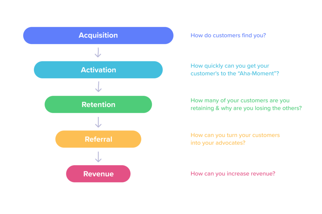
David McClure outlines the key metrics in his model known as AARRR or the term he coined, Pirate Metrics. This simple model evaluates each step in the user journey to identify any opportunities in the user lifecycle and finely hone in on where improvements need to be made.
- Acquisition: First thing’s first – you have to drive users to the product. Whether it’s an app or a website, developing a strategy to get users in front of your product through tailored channels is the first step to reaching revenue. Typically the channel strategy at this awareness stage varies by audience. For example, while it may be best to focus on social or SEO optimization for B2C audiences, B2B audiences may expect and prefer to see content marketing – also with a focus on SEO – or Event marketing at specific conferences or trade shows where they can be introduced to your brand and your product.
- Activation: Once you drive traffic to your product, the next challenge becomes making the conversion. This is where content and UX come together to drive users to take action. There are endless possibilities for how you can target even the most niche audiences – this is why collecting data through A/B testing of specific copy, design or landing pages can aid in the pursuit of a higher conversion rate.
- Revenue: there are various ways to track revenue, like average contract value (ACV), monthly recurring revenue (MRR), average revenue per user (ARPU). The revenue phase of the Pirate Model can also include upsell strategies for premium product features or add ons.
- Retention: User conversion is immediately followed by the retention phase – you want the user to continue to come back to use your product and take additional actions. Staying in touch with your users through various CRM channels and retargeting strategies can keep users engaged in the product and remind them to continue that relationship with your product. At the end of the day, in a PLG strategy, the product itself should drive retention by delivering an excellent user experience.
- Referral: Your current users can be your greatest asset in the pursuit of new users. Not only can they tell you what you need to know in terms of their behavior and interactions with the product in the user lifecycle, but they can also be a bridge to other users similar to them. Referrals from existing users can be a powerful tool particularly when there are incentives to bolster referrals.
In addition to the phases in the AARRR model, there are many other metrics that can be leveraged to evaluate your product and the user journey.
- Stickiness: The rate at which users return to the product. This helps to examine the value you are delivering by looking at how often users come back.
- Product Adoption Rate: This measures the rate at which users transition from new to recurring users. A high product adoption rate is encouraging, as it confirms that users are not only trying the product, but continuing to use it.
- Churn Rate: This is one the most important metrics to take note of when it comes to PLG – it evaluates the number of users that essentially quit your product. Keeping the churn rate as low as possible should be the utmost priority of a product led company.
- Product Qualified Leads (PQLs): A PQL is a user who has interacted with your product and taken an action indicating they will return to the product again and will continue to be a likely customer in the future. Becoming a PQL requires an action/conversion point and A/B testing can be a valuable tool in establishing the most effective strategy for those desired actions.
- Customer Lifetime Value (CLV): this refers to the expected revenue to be made on a customer and their lifetime interaction with your product
- Time to Value (TTV): The TTV is the amount of time it takes from the first interaction with your product to the moment the user is able to understand and reap the benefits of the value your product delivers. A higher TTV can result in a higher churn rate as users want to quickly get to the benefit of what you are offering.
- Expansion Revenue: Any of the revenue made from a user beyond their first purchase can be considered expansion revenue. Upselling your users on additional premium features is a way to grow your expansion revenue. While growing your user base is crucial, your existing customers are a massive opportunity when it comes to cross selling and upselling products.
Product led growth relies on the intrinsic value that your product delivers to its users and an effective GTM plan to make sure it is put in front of the right audiences. Even the best products require some strategic thinking when it comes to driving users down the funnel to take action at that conversion point. Having the ability to evaluate and track users in their interaction and lifecycle with your product is essential for a successful launch and a successful future. Being armed with insights through these powerful metrics will help to fine tune the user experience and enhance revenue generation down the line. Learn more about how Bluetext can support and track your PLG strategy.
Companies are able to expand with efficiency using the product-led growth (PLG) strategy. In a PLG model, the product is the main vehicle for acquiring, retaining, and expanding customers, and these end-users are now in the driver’s seat. This means the road to success is paved by the experience your product provides.
The PLG strategy sets new standards and expectations for companies based on customers’ wants and needs. Consider a PLG model for your company as you strive to meet the following characteristics:
Your product offers a fast, unique, and effective solution.
It is crucial to think about how your product can not only become a leader in conversations but also garner positive experiences for your customers. The focus should be on real people, with real problems so you can promote active solutions that help customers achieve daily tasks. In today’s world, there is no shortage of companies creating products. That means there is a lot of competition out there, and customers have no problem ditching your product if they can get a faster, more efficient solution to their problem somewhere else.
The user quickly realizes the benefit of the product.
People want immediate gratification and will give up quickly if a product is more work than help. So, meet users where they work. A customer should be able to understand and integrate your product into an existing workflow without any major hurdles. Your product should deliver real value that has strong viral potential, and continue to bring value to its users.
Your product is flexible and customizable.
Your product needs to provide metrics that allow you to adapt to user behavior to provide continuous added value. Customers want their lives to be as easy as possible, so it is important to continue innovating and adapting. Enabling users to get creative and adjust the product to benefit how they work, will prompt continued internal optimization of your product and provide limitless growth opportunities.
Develop a strong user community.
Connect with your users, but also provide an environment and positive experience that will prompt users to build their own communities within their workforce through self-serving promotion. This free promotion of your product is a highly effective way of getting additional users to adopt your product. They have a foundation of trust with their peers and fellow co-workers that translates to the product and fosters long-term, loyal relationships. As more and more people test out and use your product, it becomes essential to run those users’ businesses.
Monetize after you deliver value.
Be strategic with your pricing and how you present high-value features. Users need to trust that it will benefit them and improve their workflow before they pay. Being flexible with pricing and basing it on usage will also make it easier to scale.
PLG creates happier, more satisfied customers, who in turn become promoters for your product. This cycle both benefits your business and the customers as it pushes constant innovation and optimization for your product.
If you’re looking to take your business performance to the next level, contact Bluetext.