In the rapidly evolving digital landscape, selecting the right website design company in DC is a pivotal decision for businesses aiming to enhance their online presence. As companies strive to stand out in a crowded marketplace, the importance of a well-designed website cannot be overstated. It serves as the digital face of a brand, influencing customer perceptions and engagement. For B2B and B2G marketing leaders, the challenge lies in choosing a partner who not only understands the technical intricacies of web design but also aligns with their strategic vision and business goals.
Understanding Your Project Needs
Before you begin your search for a web design partner, it’s crucial to have a clear understanding of your project requirements. Are you looking for a complete website overhaul, or do you need specific enhancements such as improved user interface or mobile optimization? Defining your goals will help you communicate effectively with potential partners and ensure alignment from the outset. This clarity will also aid in evaluating whether a prospective partner has the necessary expertise, such as experience in WordPress development services or custom CMS solutions.
Evaluating Experience and Expertise
Experience and expertise are critical factors in selecting the right website design company in DC. Look for agencies with a proven track record in your industry or sector. This ensures they understand the specific challenges and nuances of your market. Review their portfolio to assess the quality and diversity of their work. For instance, if you are in the public sector, you might seek a partner experienced in public sector projects. Additionally, inquire about their technical skills, including proficiency in modern design tools and technologies.
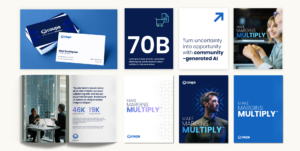
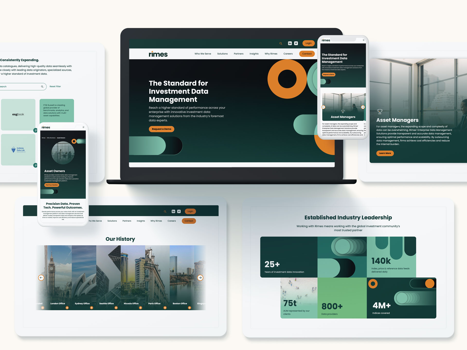
Take a look at how Rithum’s brand was born
Assessing Cultural Fit and Communication
The best partnerships thrive on mutual understanding and effective communication. As you evaluate potential partners, consider their company culture and values. Do they align with your own? A cultural fit can significantly impact the collaboration process, ensuring smoother interactions and a more cohesive project outcome. Moreover, assess their communication style. Are they transparent and responsive? Regular updates and open lines of communication are essential for tracking progress and addressing any issues promptly.
Considering Budget and Timeline
Budget and timeline are often the most tangible constraints in a web design project. It’s important to discuss these factors upfront with potential partners to ensure there are no surprises later. A reputable agency will provide a detailed proposal outlining the scope of work, associated costs, and an estimated timeline for completion. While it’s tempting to opt for the cheapest option, remember that quality and expertise often come at a price. Investing in a reputable web design firm can yield substantial long-term benefits.
Evaluating Post-Launch Support
A website launch is not the end of the journey; it’s the beginning of ongoing maintenance and optimization. Ensure that your chosen partner offers post-launch support services. This includes regular updates, troubleshooting, and performance monitoring. An agency that provides comprehensive support can help you adapt to evolving digital trends and maintain a competitive edge. Consider partners who also offer additional services such as SEO or content marketing to further enhance your website’s effectiveness.
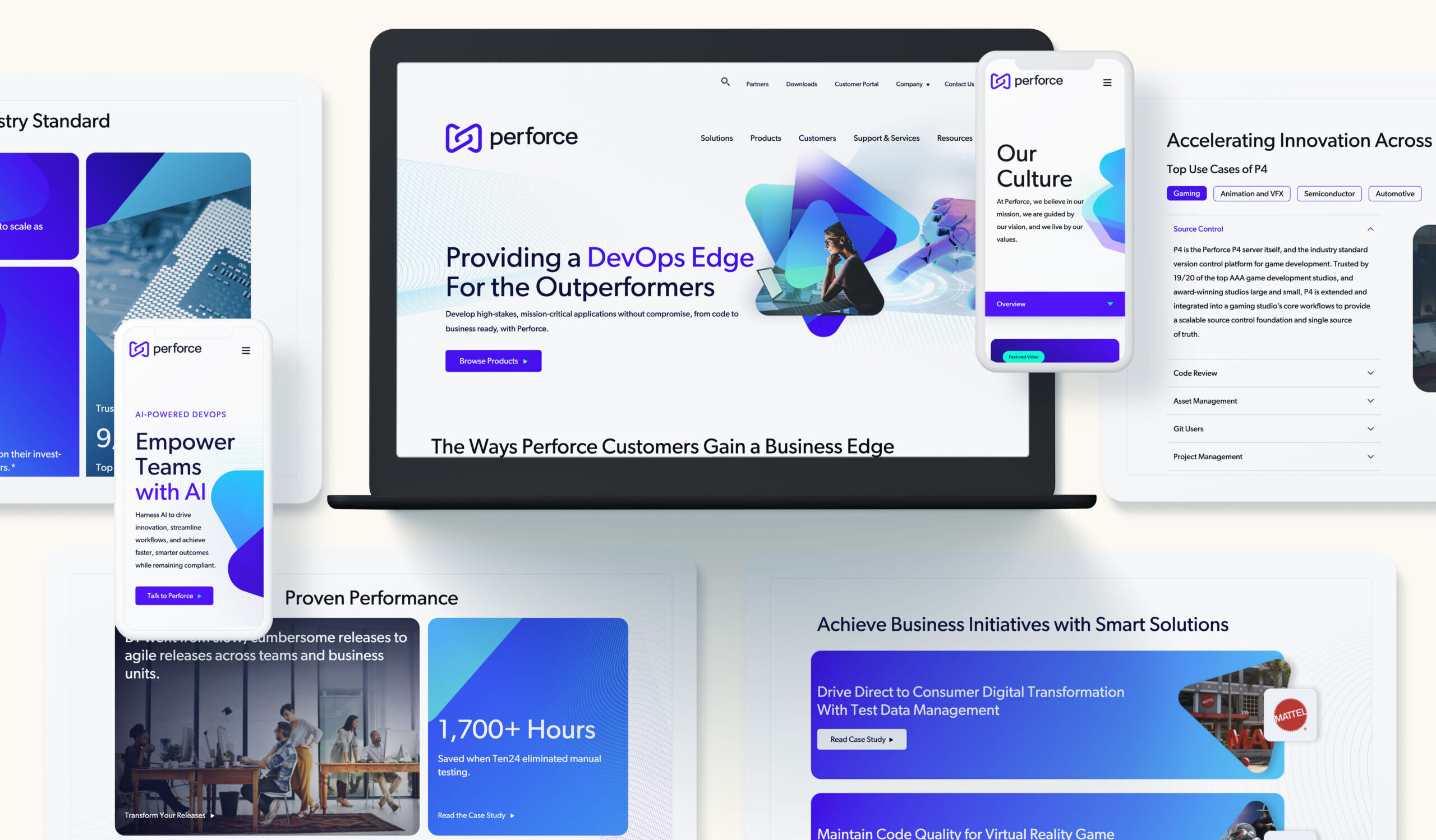
Explore how Bluetext created a dynamic new website for Obrela
Reviewing Client Testimonials and Case Studies
Client testimonials and case studies offer valuable insights into an agency’s performance and client satisfaction. They provide real-world examples of how the agency has helped other businesses achieve their goals. Look for detailed case studies that highlight challenges, solutions, and outcomes. This can be especially useful for understanding how the agency approaches complex projects or unique requirements. A well-documented portfolio can be an indicator of reliability and success.
Making the Final Decision
Once you have gathered all the necessary information, it’s time to make your decision. Consider all aspects, from technical expertise and industry experience to cultural fit and budget alignment. Trust your instincts and choose a partner who not only meets your criteria but also inspires confidence. The right website design company in DC will become an extension of your team, committed to driving your digital strategy forward.
Choosing the right web design partner is a strategic decision that can significantly impact your business’s online success. At Bluetext, we specialize in crafting digital experiences that resonate with target audiences and drive engagement. Whether you’re looking to revamp your existing site or launch a new digital presence, our team is ready to help. Contact us today to explore how we can support your strategy, branding, and campaign efforts.
As digital transformation continues to reshape industries, the future of website design and development is increasingly critical for B2B and B2G organizations. In today’s fast-paced digital landscape, a company’s website is not just a digital storefront but a powerful tool for engagement, conversion, and growth. For marketing leaders, understanding the evolving trends in website design and development is essential to staying competitive. This blog explores the future of web development and what B2B and B2G organizations need to know to remain at the forefront.
Embracing Responsive and Adaptive Design
The need for responsive and adaptive design has never been more pressing. With a growing number of users accessing websites via mobile devices, B2B and B2G companies must ensure their websites are fully optimized for all screen sizes. Responsive design ensures that a website’s layout automatically adjusts based on the user’s device, while adaptive design offers different layouts for different devices. These approaches improve user experience and increase engagement and conversion rates.
For organizations looking to optimize their digital presence, partnering with a leading website design agency can provide the expertise needed to implement these design strategies effectively.

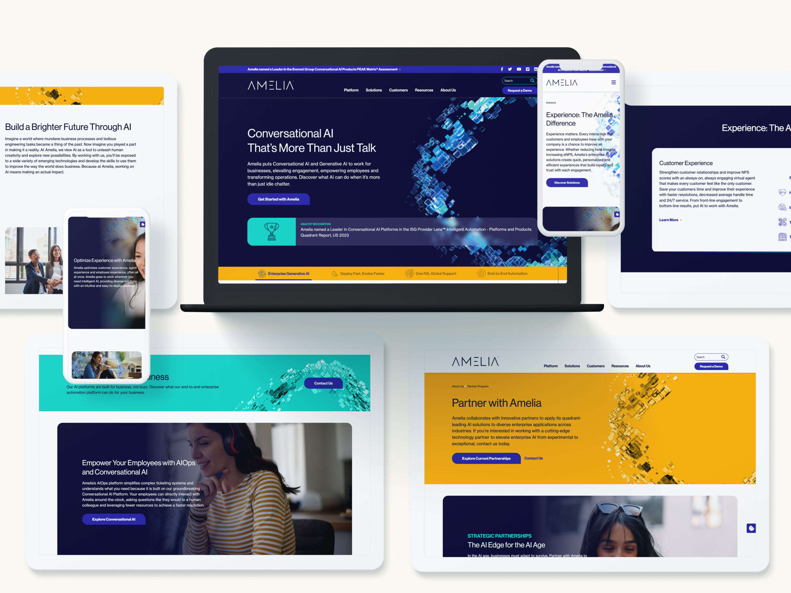
Check out how we unified BigBear.ai’s brand identity
Integration of AI and Machine Learning
Artificial intelligence (AI) and machine learning are revolutionizing website design and development. These technologies enable personalization at scale, allowing websites to offer tailored content and experiences to individual users. AI-driven chatbots, predictive analytics, and dynamic content are becoming standard features that enhance user interaction and satisfaction.
B2B and B2G companies should consider integrating AI tools to analyze user behavior, predict future trends, and deliver a more customized experience. By leveraging these technologies, organizations can stay ahead of the competition and meet the ever-changing expectations of their audiences.
Prioritizing Website Security
With cyber threats on the rise, website security is a top priority for B2B and B2G entities. Secure Socket Layer (SSL) certificates, two-factor authentication, and regular security audits are essential components of a robust security strategy. Moreover, with increasing regulations such as GDPR, organizations must ensure compliance to avoid legal repercussions and build trust with their users.
Engaging with a specialized cybersecurity marketing agency can help organizations develop a comprehensive security framework that protects both the company and its clients.
The Rise of No-Code and Low-Code Platforms
No-code and low-code platforms are democratizing website development, allowing non-technical users to create and manage websites without extensive coding knowledge. These platforms accelerate the development process and reduce costs, making them attractive options for many B2B and B2G organizations.
While these platforms offer significant advantages, it’s crucial to evaluate their limitations and ensure they meet the specific needs of your organization. Collaborating with a professional Drupal development agency can provide the necessary expertise to balance ease of use with advanced functionality.
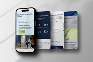
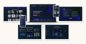
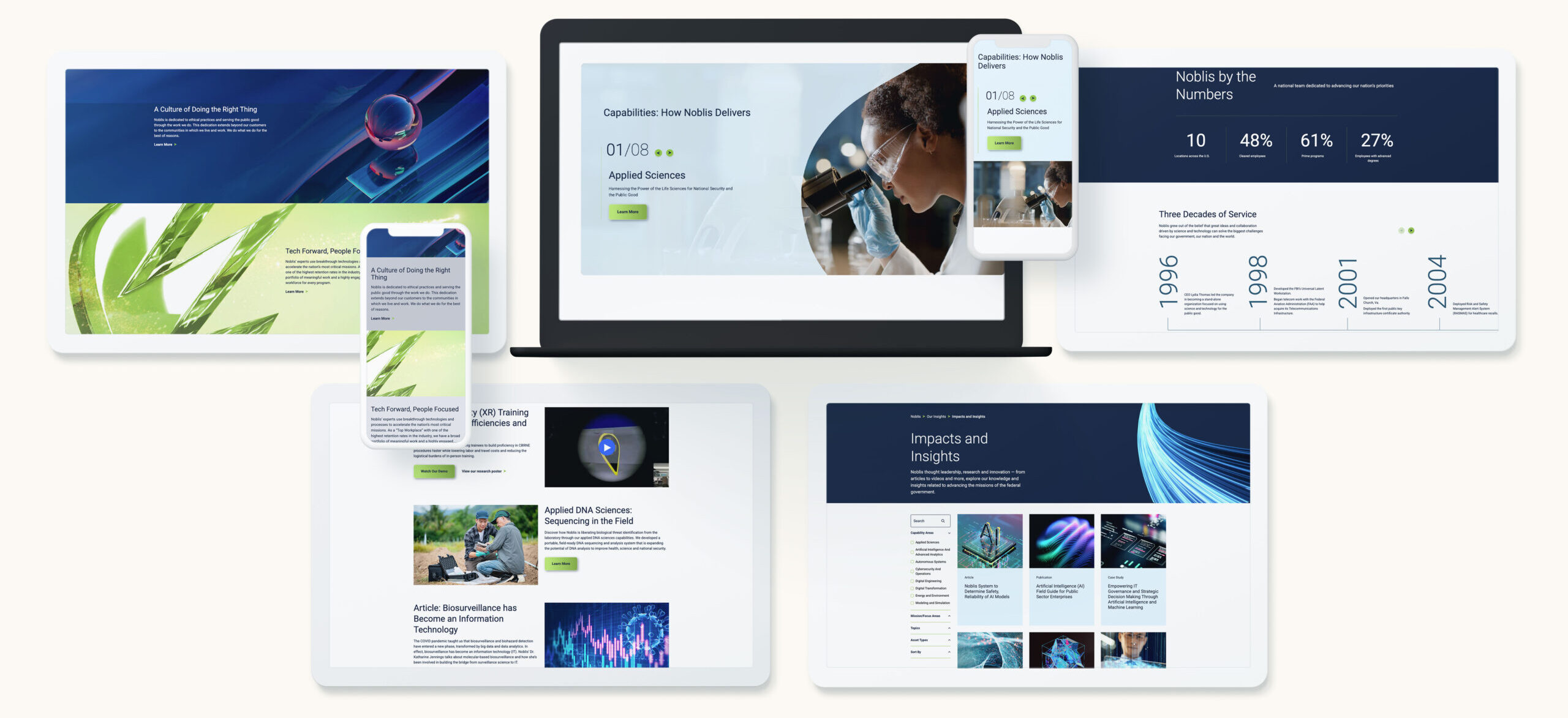
Dig into the work that helped Noblis own their space
Focusing on Accessibility and Inclusivity
Accessibility and inclusivity in web design are no longer optional; they are essential. Websites must be designed to accommodate users with disabilities, ensuring that all users have equal access to information and services. This includes implementing features such as screen reader compatibility, keyboard navigation, and text-to-speech options.
By prioritizing accessibility, B2B and B2G companies not only comply with legal requirements but also expand their audience reach. Engaging with an agency that understands the nuances of website localization and multilingual support can further enhance inclusivity and global reach.
The Importance of User Experience (UX) Design
User experience design is at the heart of successful website development. A well-designed UX can significantly impact user satisfaction and retention. This involves understanding user behavior, creating intuitive navigation, and ensuring fast load times.
For B2B and B2G organizations, investing in UX design translates into better engagement and higher conversion rates. Collaborating with a DC interactive web design firm can help refine the user experience, ensuring that websites are both functional and enjoyable to use.
Bluetext’s View
The future of website design and development is dynamic and filled with opportunities for innovation. B2B and B2G organizations that stay ahead of these trends will enhance their digital presence and drive business success. As technology continues to evolve, so too must the strategies employed by marketing leaders. For those looking to leverage the latest in design and development, partnering with experts is key. Contact Bluetext to explore how our strategic insights, branding expertise, and campaign support can elevate your organization’s digital strategy.
Marketing leaders cannot afford a mediocre website in 2026. Buyers expect intuitive journeys, instantaneous load times, and content tailored to their needs. WordPress has evolved into a flexible, enterprise-grade platform that can deliver all three when architected correctly. The path to better outcomes starts with a disciplined plan and advanced execution. This article outlines how to enhance user experience this year using modern patterns, data, and governance supported by high-caliber WordPress development services. For organizations that compete in complex B2B and B2G markets, the stakes are even higher, and the payoff is faster, with stronger pipeline growth, higher public-sector engagement, and measurable ROI.
What does exceptional WordPress UX look like in 2026?
Exceptional UX is not a single feature. It is the coordinated outcome of architecture, content, design systems, performance engineering, and analytics. For B2B and B2G, that experience should deliver four capabilities on day one. First, speed that exceeds Core Web Vitals across devices and networks. Second, accessibility that meets WCAG 2.2 and Section 508 standards. Third, relevance through clear information architecture, smart search, and contextual personalization. Fourth, trust reinforced by secure engineering, transparent privacy practices, and clear governance. The right WordPress development services bring these pieces together in a way that business stakeholders can manage and scale.
When to choose headless, hybrid, or classic architecture
Architecture drives user experience more than any single plugin. Classic WordPress with modern block patterns remains the right answer for many marketing teams that need speed to market and streamlined authoring. A hybrid approach works when you need to keep the WordPress CMS but deliver select experiences with headless frameworks for dynamic catalogs, dashboards, or high-traffic landing pages. Fully headless shines for complex front ends, micro front ends, or multichannel delivery to kiosks and native apps. The best WordPress development services weigh traffic profiles, content complexity, editorial maturity, security posture, and budget, then recommend the lightest architecture that achieves performance and maintainability.
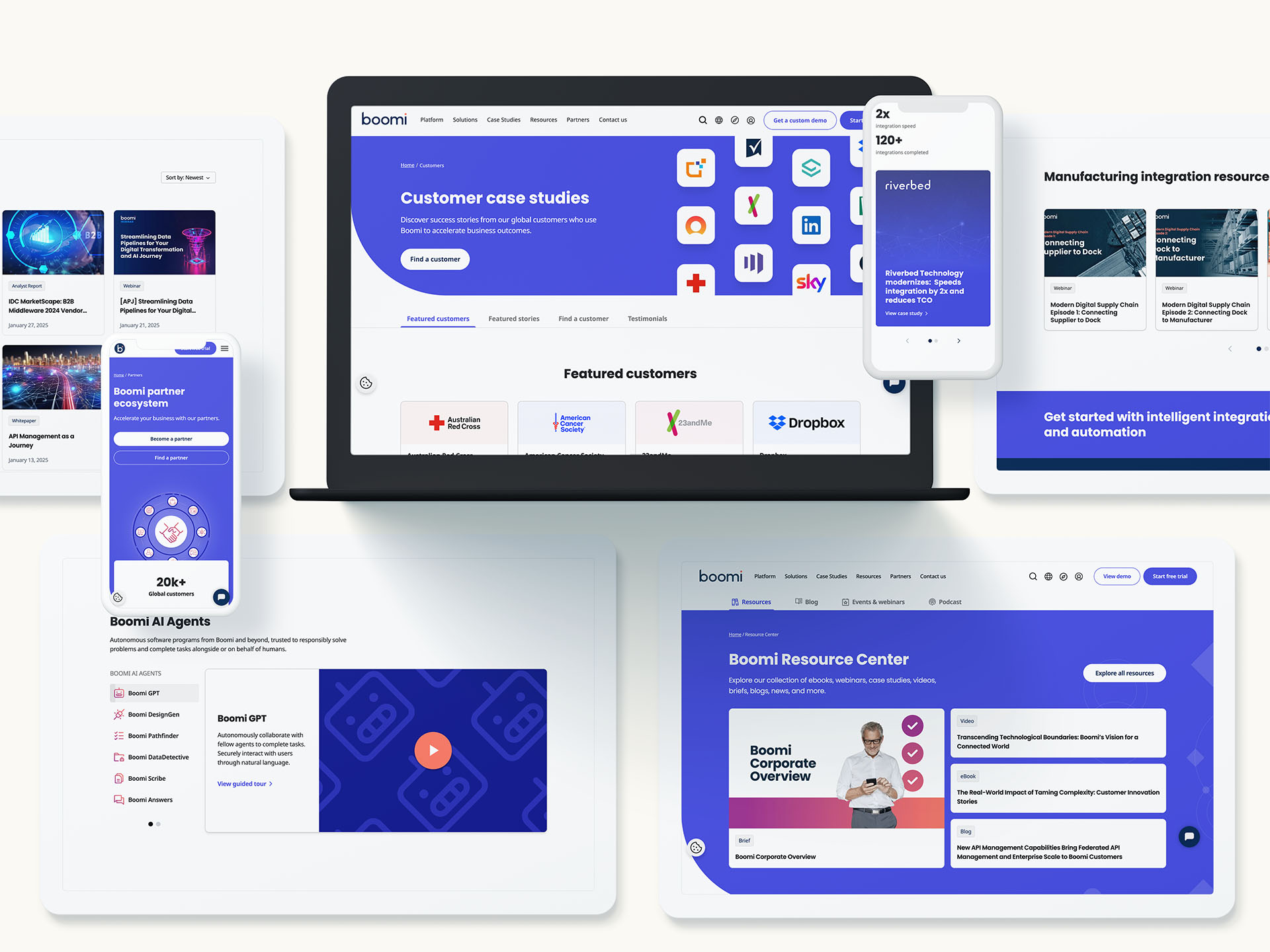
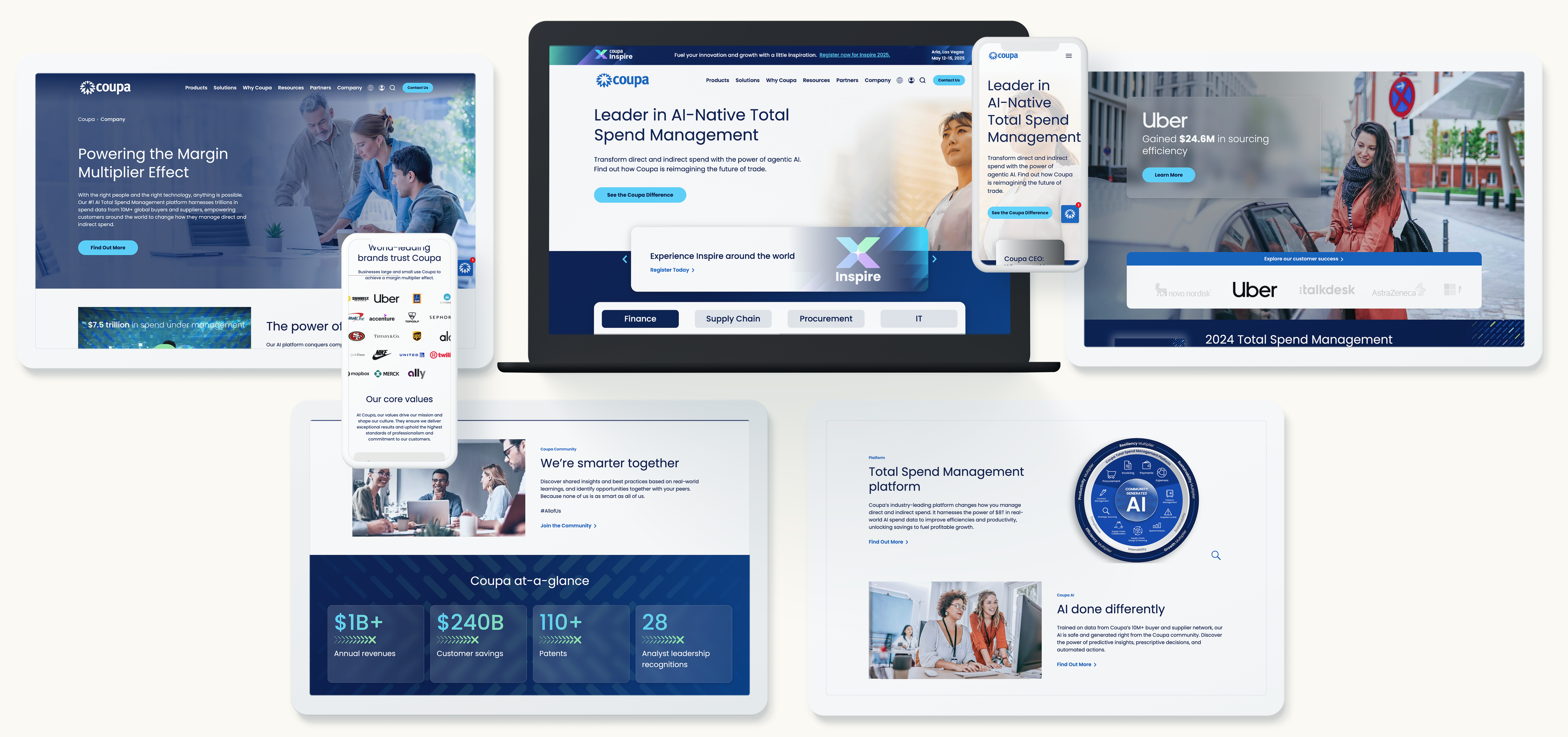
Discover how we brought Coupa’s vision to life
How the block editor powers consistency and scale
Gutenberg blocks and Full Site Editing support modular UX at enterprise scale. A robust block library translates your design system into reusable components with built-in accessibility, analytics events, and guardrails for content authors. Editors can assemble pages quickly without breaking layout or diluting brand standards. Advanced pattern locking prevents rogue formatting while enabling agility for campaigns. Investing in a block-driven design system is one of the highest ROI moves available through modern WordPress development services because it improves time to publish, reduces QA cycles, and protects user experience across the site.
Personalization that respects privacy and drives conversion
In 2026, personalization should be consent-aware, first-party data led, and fast. Segment by firmographics, user role, or referrer intent, then use lightweight decisioning at the edge to swap hero messages, resources, or CTAs. Server-side rendering keeps pages indexable and fast, while contextual blocks keep authoring simple. For B2G audiences, tailor content by mission area, procurement path, or compliance needs. For enterprise tech buyers, surface industry case studies and relevant integration guides. To go deeper on dynamic content, explore website personalization models that can be layered into your publishing workflow without adding fragility to the stack.
Accessibility and compliance as non-negotiable UX pillars
Accessibility increases reach, reduces legal risk, and improves usability for every visitor. Bake WCAG 2.2 AA standards into your components rather than auditing after launch. That means clear focus states, sufficient color contrast, structured headings, ARIA support only where appropriate, descriptive links, and consistent keyboard navigation. For B2G programs, align Section 508 requirements and create a Voluntary Product Accessibility Template that maps how the site meets criteria. Enterprise-grade WordPress development services include automated testing in CI, manual assistive technology testing, and governance checklists so accessibility remains a continuous practice, not a one-time task.
Performance engineering for Core Web Vitals
Speed is table stakes for user satisfaction and SEO. Start with a performance budget that sets strict weight targets per page type. Optimize the critical rendering path with server-side rendering, HTTP/3, and early hints. Adopt AVIF and WebP images with adaptive sizing, native lazy loading, and next-gen responsive attributes. Defer noncritical scripts, tree-shake unused code, and inline critical CSS. Use a CDN with edge caching and stale-while-revalidate strategies for resilience during traffic spikes. Measure with RUM data rather than synthetic tests alone. A mature approach from experienced WordPress development services correlates these improvements to engagement and conversion, not just Lighthouse scores.
Search that accelerates discovery
When prospects arrive with a specific problem, on-site search must deliver precise, ranked answers. Configure synonyms, business-rules boosting for product or solution pages, and scoping filters that match buyer language. Implement query understanding, typo tolerance, and guards against empty results. Expose search analytics to marketing and product teams so they can see what users cannot find and respond with new content or taxonomy tweaks. For enterprise catalogs and documentation, consider a headless search service with instant results and structured snippets. The most effective WordPress development services design search as a product with ongoing tuning, not a one-time widget.
Security and reliability that protect brand equity
Trust is an essential part of user experience. Harden WordPress with principle of least privilege, SSO for administrators, and scoped API keys. Enforce MFA, set strong content approval workflows, and log activity with anomaly alerts. Use a Web Application Firewall and rate limiting, and separate build, staging, and production environments. Automate backups and perform restore drills quarterly. For public-sector work, align to organizational policies and hosting controls that support compliance. Mature WordPress development services integrate these controls without slowing editors, which ultimately leads to a site that is both safer and more productive to operate.

Go behind our build for SecurityScorecard
Localization and multilingual experiences at scale
Global B2B brands and federal contractors need precise localization. Build a language architecture that supports shared components and localized content while preserving SEO via hreflang and localized sitemaps. Define translation workflows with glossaries, tone guides, and change tracking to maintain consistency. Prioritize market-specific content instead of 1:1 translation for every page. Ensure forms, PDFs, and error messages are all localized. Performance should remain stable despite added languages, which is why efficient media handling and caching strategies matter. WordPress development services that understand enterprise localization can reduce overhead and accelerate regional launches.
Data, analytics, and the feedback loop
Your analytics model should mirror your funnel and your navigation, not the other way around. Define clear events for micro conversions like resource downloads, email signups, search refinements, and product video views. Map content groupings to buyer stages and track scroll depth, dwell time, and click paths that predict conversion. Pipe events into your warehouse or CDP for audience building and nurturing. Maintain privacy-first consent management that toggles nonessential tags and keeps your audit trail clean. The most valuable output of advanced WordPress development services is a site that teaches you what to build next, every week.
SEO fundamentals that compound growth
UX and SEO are partners. Fast pages, structured content, strong internal links, and clear headings deliver a better experience and higher rankings. Use schema for products, FAQs, events, and reviews to earn richer results. Align pillar pages with solution areas, then cluster related articles and case studies. Control cannibalization with canonical tags and prune content that no longer serves intent. Redirect maps are essential during redesigns to preserve equity. If you need help modernizing your roadmap, our search engine optimization work demonstrates how technical and content improvements compound performance over time.
Migrations that protect traffic and improve UX
Replatforming is an opportunity to simplify, not simply to move. Start with a content audit to identify what to keep, consolidate, or retire. Rewrite information architecture based on real query data and stakeholder goals. Build migration scripts that normalize metadata, image alt text, and redirects. Validate at scale with automated link checking and manual QA on high-value flows like pricing, partner portals, and RFQ submissions. The best WordPress development services treat migration as an integrated product, not a bolt-on task, ensuring that launch day maintains search visibility while unlocking the new experience.
Governance, training, and design systems that last
UX fails when governance fails. Codify roles, editorial standards, and review workflows. Document what a good page looks like, with required components, quality bars, and accessibility checks. Tie the design system to a block library so teams work from one source of truth. Run enablement labs for marketers that simulate real publishing scenarios and reinforce good patterns. Governance also includes deprecation plans for content and components so the site gets leaner, not heavier, as it ages. Sustainable impact from WordPress development services depends on these human systems as much as the code.
Evaluating a partner for WordPress development services
Choosing the right partner is pivotal. Look for a track record delivering measurable outcomes in B2B and B2G, not just aesthetic redesigns. Ask for architecture rationales rather than tool lists. Review how they operationalize accessibility, Core Web Vitals, and security hardening within sprints. Inspect their block libraries and documentation quality. Confirm how they approach analytics, tagging, and experimentation from day one. Seek transparent roadmaps and change management plans. A seasoned WordPress development agency should align to your operating model and build your team’s capacity to sustain the site long after launch.
A 100‑day roadmap to elevate user experience
A disciplined 100‑day plan creates momentum and reduces risk. Days 1 to 30 focus on discovery and strategy: stakeholder interviews, analytics review, content inventory, technical audit, and an initial information architecture. Days 31 to 60 move into design systems and proofs of concept: component definitions, accessibility patterns, performance budgets, and search configuration. Days 61 to 90 shift to build and migration: block library development, page templates, integrations, and automated migration scripts. The final 10 days are for hardening and enablement: security reviews, load testing, accessibility manual testing, editor training, and go-live rehearsal. This is the cadence elite WordPress development services use to ship quality at speed.
Integrations that streamline buyer journeys
UX extends beyond pages. Map and integrate the systems that shape conversion. Connect CRM forms with progressive profiling, synchronize gated content with marketing automation, and trigger nurture flows based on on-site behavior. For customer portals, use SSO to reduce friction and tailor content for authenticated users. Align product feeds, partner directories, and event listings with structured data and caching. The most reliable WordPress development services do not treat integrations as afterthoughts. They model the data, design for failure states, and ensure the journey remains smooth even when an upstream system lags.

Read why LMI turned to Bluetext for a brand refresh
Content operations that keep sites fresh
Even the best UX decays without a healthy content engine. Establish an editorial calendar tied to audience needs, lifecycle stages, and key sales motions. Define reusable content types like solution briefs, implementation guides, and mission narratives for public-sector visitors. Automate related content modules and keep them tuned through analytics. Invest in clear, jargon-free copy and visual narratives that make complex topics digestible. Modern WordPress development services emphasize content operations because fresh, well-structured material is the fastest way to sustain rankings and conversions.
Proving value with metrics that matter
Executives need proof, not promises. Track a balanced scorecard that ties the experience to business outcomes. Leading indicators include Core Web Vitals, SERP visibility, on-site search success rate, and form completion rates. Lagging indicators include sourced pipeline, influenced revenue, and public-sector RFI engagement. Use cohort analysis to see how performance improvements correlate with conversion over time. A credible program for WordPress development services establishes these measures before the first line of code, then reports progress against them at each milestone.
Why Bluetext for enterprise-grade WordPress
Marketing and communications leaders choose partners who reduce complexity and deliver results. Bluetext brings strategy, design, and engineering together under one roof, with a focus on measurable outcomes in complex B2B and government markets. Our teams architect for speed, accessibility, security, and scale, then enable your editors to move faster with confidence. Learn more about our approach to WordPress development services and how we tailor each engagement to your governance model and growth objectives.
What success looks like
When organizations adopt the practices in this guide, the results are consistent. Bounce rates drop as pages load faster and navigation becomes clearer. Organic traffic rises as technical SEO aligns with authoritative content. Qualified conversions increase as personalization and frictionless forms meet buyers where they are. Public-sector engagement improves when accessibility and compliance are built in. Most importantly, marketing teams gain agility with a component system and analytics model that turn insights into action without long development cycles. These are the outcomes you should expect from advanced WordPress development services in 2026.
Next steps to move from vision to execution
If you are planning a replatform, consider a phased approach that addresses performance, accessibility, and architecture early. If your site is already on WordPress, start with a diagnostics sprint that benchmarks Core Web Vitals, accessibility, search, governance, and analytics. Use those findings to prioritize the highest-impact fixes and to roadmap future enhancements. Evaluate partners through pilot projects that prove value before full-scale commitments. The right investment in WordPress development services will reduce total cost of ownership, accelerate time to market, and elevate the user experience that drives growth.
Bluetext is ready to help you plan, build, and optimize a website that works as hard as your brand. Explore our capabilities as a WordPress development agency, see how personalization models can scale with your team, and bring your analytics to a level that informs every decision. To start a conversation about strategy, branding, or campaigns that connect, contact Bluetext and let’s design an experience your buyers will remember.
Prefer listening over reading? Check out the podcast version of this blog below and enjoy insights on the go!
Not all WordPress sites are created equal. While WordPress powers more than 40 percent of the web, the difference between a high-performing business platform and a fragile, hard-to-manage site often comes down to how it was built and who built it.
For many organizations, WordPress starts as a fast, flexible solution. Over time, however, that same site can become a bottleneck. Pages are slow to load, content updates feel cumbersome, and new initiatives require workarounds instead of progress. At that point, the question is no longer whether WordPress can scale, but whether your current implementation can.
This guide breaks down when it makes sense to hire a WordPress development agency, what an agency actually brings to the table, and how to determine whether it is the right move for your business.
What a WordPress Development Agency Actually Does
A WordPress development agency is not simply a team that installs themes or configures plugins. At its core, a true WordPress development partner focuses on building a scalable, secure, and maintainable content management system that supports business and marketing goals over the long term.
This typically includes custom theme and block development, CMS architecture planning, performance optimization, and security hardening. Agencies also design editorial workflows that make content creation easier for marketing teams rather than more complex. In many cases, they integrate WordPress with CRMs, marketing automation platforms, analytics tools, and third-party systems that support lead generation and reporting.
Most importantly, a WordPress development agency approaches the site as a strategic platform, not a one-time build. The goal is to create a foundation that can evolve as the organization grows.
Signs It Is Time to Hire a WordPress Development Agency
Many organizations wait too long before seeking expert help. By the time an agency is brought in, the site has accumulated technical debt that limits what it can do. Recognizing the warning signs early can save time, money, and frustration.
One of the most common indicators is performance. If pages load slowly, break under traffic spikes, or require constant troubleshooting, the issue often lies in how the site was architected. Another red flag is content management friction. When simple updates require developer support or when marketers avoid using the CMS altogether, the system is no longer serving its purpose.
Security and compliance concerns are also a frequent trigger. As organizations grow, expectations around accessibility, data protection, and governance increase. A WordPress site built without these considerations in mind can quickly become a liability.
Finally, major business moments often expose the limits of an existing site. Rebrands, product launches, acquisitions, or international expansion tend to surface structural problems that cannot be solved with incremental fixes.
Common Business Scenarios That Require Agency-Level Expertise
There are specific situations where hiring a WordPress development agency is not just helpful, but necessary.
Rebrands are a prime example. Updating visuals without rethinking content structure, templates, and CMS logic often results in a site that looks new but functions the same. An agency ensures that messaging, design, and backend architecture evolve together.
Migrations are another high-risk scenario. Moving from a legacy CMS or a poorly built WordPress instance requires careful planning to avoid SEO losses, broken content, and workflow disruptions. Agencies bring repeatable processes that reduce risk during these transitions.
High-growth organizations also benefit from agency support. When traffic increases, campaigns become more complex, and multiple teams contribute content, the CMS must be designed to scale. Without that foundation, growth creates friction instead of momentum.
What You Gain by Working With a WordPress Development Agency
The most immediate benefit of hiring a WordPress development agency is clarity. Instead of reacting to issues as they arise, organizations gain a structured platform that anticipates future needs.
Custom development allows the CMS to reflect how your team actually works. Instead of forcing content into rigid templates, agencies create reusable blocks and flexible layouts that speed up publishing while maintaining brand consistency. This improves efficiency and reduces reliance on developers for everyday updates.
Performance and security improvements are also significant. Clean code, optimized hosting environments, and thoughtful plugin strategies lead to faster load times and fewer vulnerabilities. Over time, this translates to better search visibility, stronger user experiences, and lower maintenance costs.
Perhaps most importantly, a well-built WordPress site reduces long-term technical debt. By investing upfront in the right architecture, organizations avoid the cycle of patchwork fixes that eventually require a full rebuild.
WordPress Agency vs In-House Team: How to Decide
Deciding between an internal team and a WordPress development agency is not always a binary choice. Each approach has advantages depending on the scope of work and business objectives.
In-house teams are often best suited for ongoing content updates and minor enhancements. They bring institutional knowledge and can respond quickly to day-to-day needs. However, they may lack deep expertise in WordPress architecture, performance optimization, or large-scale migrations.
Agencies, on the other hand, excel during moments of transformation. They bring specialized skills, established processes, and cross-industry experience that accelerate complex initiatives. For many organizations, the most effective model is a hybrid one, where an agency builds or modernizes the platform and internal teams manage it going forward.
The key is aligning resources with the level of complexity involved.
How to Evaluate a WordPress Development Agency
Not all WordPress agencies are created equal. Choosing the right partner requires looking beyond visual design and asking the right questions.
Start by understanding how the agency approaches strategy. Do they ask about business goals, audiences, and content workflows before discussing solutions? A strong agency will prioritize these conversations early.
Technical expertise is equally important. Look for experience with custom development, not just theme customization. Ask how they approach scalability, security, and performance, and whether they have worked with organizations similar to yours.
Finally, consider long-term support. A WordPress site is never truly finished. Agencies that offer documentation, training, and ongoing optimization tend to deliver more value over time.
Why Enterprises and B2B Organizations Continue to Choose WordPress
When implemented correctly, WordPress remains one of the most flexible and powerful CMS platforms available. Its open-source foundation allows for deep customization, while its ecosystem supports integration with nearly any modern marketing or analytics tool.
For B2B and enterprise organizations, WordPress offers a balance of control and usability. Marketing teams gain autonomy without sacrificing governance, and technical teams can extend the platform as needs evolve. The result is a system that supports both agility and scale.
The caveat is execution. WordPress succeeds when it is treated as a strategic platform, not a shortcut.
Bluetext’s Approach to WordPress Development
At Bluetext, WordPress development starts with strategy. We focus on building platforms that support long-term growth, simplify content management, and integrate seamlessly with broader marketing ecosystems.
Our approach combines UX, design, and custom development to ensure that WordPress works for both users and internal teams. The result is not just a better website, but a more effective digital foundation for marketing and communications.
Ready to Evaluate Your WordPress Site?
If your current WordPress site feels difficult to manage, slow to evolve, or misaligned with your business goals, it may be time to reassess how it was built. Hiring a WordPress development agency is not about adding complexity. It is about removing the barriers that prevent your site from doing its job.
Bluetext works with organizations to design, build, and optimize WordPress platforms that scale. If you are considering a redesign, migration, or CMS modernization, we are happy to start with a conversation.
WordPress powers more than 40% of the web, but not all WordPress websites are created equal. The difference between a site that simply looks good and one that actively drives growth often comes down to who built it. A top-tier WordPress Development Agency does far more than install themes and configure plugins. It brings strategic thinking, technical rigor, and long-term partnership to the table.
As organizations rely more heavily on their websites to support marketing, sales, and customer experience, choosing the right WordPress Development Agency has become a critical business decision. Below are the key features that separate the best agencies from the rest and what you should expect when working with a true WordPress partner.
Strategic Discovery and Business-Driven Development
A strong WordPress Development Agency does not begin with design comps or code. It begins with discovery.
This phase focuses on understanding your business objectives, audience needs, internal workflows, and technical constraints. The agency should ask pointed questions about growth goals, content strategy, integrations, analytics, and long-term scalability. The outcome is a clear technical and architectural roadmap, not just a project plan.
When development is driven by strategy, WordPress becomes a flexible platform that supports measurable outcomes rather than a static marketing asset.
Custom WordPress Development Built for Scale
One of the clearest indicators of a high-quality WordPress Development Agency is its approach to customization. Rather than relying heavily on prebuilt themes or bloated page builders, top agencies favor custom WordPress development tailored to your specific needs.
This typically includes:
- Custom blocks or components using modern WordPress frameworks
- Flexible content models that empower marketing teams
- Clean, maintainable code designed for long-term use
Custom development ensures your website can evolve as your organization grows, without requiring constant rework or workarounds. It also reduces reliance on third-party dependencies that can create performance and security issues over time.
Responsive Design with Performance in Mind
Responsive design is no longer a differentiator; it is a baseline requirement. What separates a strong WordPress Development Agency is how deeply performance is integrated into the design and build process.
Top agencies take a mobile-first approach and design with real-world usage in mind. They account for load times, image optimization, and layout shifts long before launch. Performance metrics such as Core Web Vitals are treated as design and development considerations, not post-launch fixes.
The result is a website that feels fast, intuitive, and polished across devices, supporting both user experience and search visibility.
Thoughtful Plugin Strategy and System Integrations
Plugins are one of WordPress’s greatest strengths, but also one of its biggest risks when misused. A capable WordPress Development Agency applies a disciplined plugin strategy rather than defaulting to whatever is fastest to install.
This means:
- Evaluating plugins for security, performance, and long-term support
- Avoiding overlapping functionality and unnecessary dependencies
- Building custom functionality when plugins introduce risk or complexity
In addition, leading agencies are experienced in integrating WordPress with enterprise systems such as CRMs, marketing automation platforms, analytics tools, and digital asset managers. These integrations are handled deliberately, ensuring data flows cleanly and reliably across systems.
Security, Compliance, and Ongoing Stability
Security is a non-negotiable feature of modern WordPress development. A professional WordPress Development Agency builds security into every layer of the site, from code standards to hosting recommendations.
This includes secure authentication, role-based permissions, regular updates, monitoring, and backup strategies. For organizations in regulated or high-risk environments, agencies should also be comfortable addressing compliance considerations and internal governance requirements.
A secure WordPress site is not achieved through a single plugin. It is the result of sound engineering, proactive maintenance, and clear operational processes.
SEO-Ready Architecture and Editorial Flexibility
Search visibility starts with how a website is built. A knowledgeable WordPress Development Agency understands that SEO is both a technical and structural discipline.
Best practices include clean URL structures, logical content hierarchies, schema markup, and fast page performance. Just as important is editorial flexibility. Marketing teams should be able to create, update, and optimize content without relying on developers for every change.
When WordPress is architected correctly, it becomes a powerful platform for content marketing, SEO, and ongoing optimization rather than a bottleneck.
Rigorous Quality Assurance and Launch Processes
Before launch, a top WordPress Development Agency invests significant effort in testing and validation. This goes well beyond basic browser checks.
Quality assurance should include:
- Cross-browser and cross-device testing
- Accessibility and usability validation
- Performance benchmarking
- Content and data integrity checks
Launch itself should follow a structured deployment process designed to minimize downtime and risk. Agencies that treat launch casually often introduce issues that could have been avoided with proper planning.
Post-Launch Support and Long-Term Partnership
A reliable WordPress Development Agency understands that launch is the beginning of a relationship, not the end of a project. Ongoing support is critical to maintaining performance, security, and relevance over time.
Post-launch services often include maintenance, enhancements, analytics reviews, and optimization roadmaps. Rather than reacting to issues, the best agencies work proactively to identify opportunities for improvement and growth.
This long-term mindset is what transforms WordPress from a one-time build into a strategic digital platform.
Choosing the Right WordPress Development Agency
Selecting a WordPress Development Agency is ultimately about trust, experience, and alignment. The right partner brings technical excellence, strategic thinking, and a clear understanding of how websites support broader business goals.
At Bluetext, WordPress development is approached as part of a larger digital ecosystem, where design, technology, and strategy work together to drive results. If you are evaluating your current WordPress site or planning a new build, a strategic assessment is often the best place to start.
Interested in exploring what a stronger WordPress foundation could look like for your organization? Contact Bluetext to start the conversation.
Finding the right Drupal development agency is critical to building a website that not only looks great but performs seamlessly. A strong Drupal partner ensures your site is scalable, secure, and tailored to your business needs. Choosing the right agency impacts everything from custom module development to user experience and long-term support, making the difference between a website that succeeds and one that falls short.
Why Choosing the Right Drupal Agency Matters
Working with an inexperienced Drupal development company can lead to delays, poor architecture, security vulnerabilities, and a site that’s difficult to maintain. On the other hand, an experienced agency brings deep expertise in custom modules, integrations, and UX design, ensuring your site is reliable, scalable, and aligned with your business goals.
Key Takeaways:
- Expert Drupal development agencies increase site performance and maintainability.
- Strong branding and functional alignment reduce long-term risks.
- Specialized knowledge supports integration with third-party tools and systems.
Key Capabilities to Look For
Custom Module Development
Custom modules extend Drupal’s capabilities to meet unique business requirements. Look for agencies with a proven track record in building modules that enhance workflow, automate processes, and integrate seamlessly with other platforms.
Drupal Architecture & Scalability
A site built on solid Drupal architecture ensures your platform can grow with your business. Evaluate agencies on their experience designing scalable, flexible, and maintainable solutions.
UX & Design Expertise
A visually appealing, intuitive website keeps visitors engaged. Agencies with strong UX and design skills create experiences that are accessible, responsive, and aligned with your brand identity.
Security & Compliance
Drupal security is critical for protecting user data and meeting industry standards. Agencies should demonstrate knowledge of best practices, secure coding, and regulatory compliance.
Assessing Agency Experience and Track Record
Before selecting a Drupal development company, review portfolios and case studies to gauge relevant industry experience. Client testimonials and long-term partnerships provide additional insight into reliability and project success. Agencies that demonstrate repeated success with similar projects are more likely to deliver predictable outcomes.
Ongoing Support and Maintenance
Websites require ongoing care, even after launch. Your Drupal partner should offer continuous updates, module maintenance, and performance monitoring. Reliable support ensures your site stays secure, fast, and adaptable as your business evolves.
Evaluating Communication and Collaboration
Effective communication is essential to project success. Agencies should provide clear timelines, regular updates, and agile collaboration. Choosing a partner who is transparent and proactive reduces misunderstandings and ensures your project stays on track.
Cost Considerations and Value Assessment
Pricing models vary between hourly rates and fixed project costs. At Bluetext, we don’t bill by the hour, so clients receive unlimited time and revisions on all deliverables. While cost matters, it’s equally important to consider long-term value, including scalability, performance, and reduced maintenance needs. Partnering with a higher-quality Drupal agency can save time, money, and stress over the life of your site.
Next Steps for Your Drupal Project
Selecting the right Drupal development company ensures your website is secure, scalable, and aligned with your business goals. Take time to evaluate capabilities, portfolio, communication style, and long-term support offerings. Contact Bluetext to discuss your Drupal development needs and find the right partner for your business.
When most marketing leaders think about their brand, they picture messaging, design, campaigns, and storytelling. But there’s another, less visible dimension of brand health: web performance.
A brand’s digital presence is often the first and most consistent touchpoint for customers. If that experience is slow, inaccessible, or frustrating, it sends a message—one that undermines even the best campaigns. Web performance isn’t just a developer’s priority; it’s a marketing KPI that directly impacts trust, conversions, and long-term brand perception.
Why Web Performance Matters Beyond IT
Speed as the first brand impression
Users form an opinion about your site in seconds. A slow-loading homepage communicates inefficiency and neglect, while a fast, seamless experience signals professionalism and reliability.
Accessibility as inclusion and trust
Making your site accessible to all users—including those with disabilities—isn’t just a compliance issue. It’s a reflection of your brand’s values. Accessibility demonstrates inclusivity, empathy, and responsibility.
UX as a reflection of brand values
Clunky navigation, broken buttons, or misaligned mobile layouts create frustration. On the other hand, intuitive UX shows that you care about your audience’s time and experience—an extension of your brand promise.
The Marketing Impact of Web Performance
Performance problems don’t just frustrate users—they cost real revenue and reputation.
- Conversions suffer: Studies show that even a one-second delay in load time can drop conversions by up to 7%.
- SEO rankings decline: Google prioritizes fast, user-friendly websites in search results.
- Brand equity erodes: If customers consistently struggle to interact with your brand online, their trust declines—even if your messaging is strong.
Accessibility is also emerging as a competitive differentiator. Brands that go above and beyond to create inclusive experiences not only avoid legal risks but also earn loyalty from a wider audience.
Key Web Performance Metrics Marketers Should Track
You don’t need to be a developer to understand the metrics that matter most:
- Core Web Vitals
- Largest Contentful Paint (LCP): How quickly the main content loads.
- First Input Delay (FID): How responsive the page feels.
- Cumulative Layout Shift (CLS): How stable the visuals are as the page loads.
- Accessibility Scores
- Benchmarked against WCAG standards, these measure how inclusive and usable your site is.
- Engagement Metrics
- Bounce rate, time on page, and conversion rates—all of which improve when performance is strong.
Turning Performance Into a Marketing KPI
Marketing leaders should elevate performance metrics alongside more traditional KPIs like impressions or conversions.
- Integrate into dashboards: Include speed, accessibility, and UX data in your regular brand reporting.
- Collaborate with dev teams: Marketing and development should align on the shared goal of delivering seamless experiences.
- Frame it for executives: Position performance as a direct driver of brand trust and customer loyalty.
Best Practices for Building a High-Performance Brand Experience
Performance improvements often come down to consistent, practical steps:
- Optimize images, video, and scripts for faster load times
- Adopt responsive, mobile-first design
- Incorporate accessibility from the design stage onward
- Continuously monitor with tools like Google PageSpeed Insights or Lighthouse
- Test frequently—small changes can reveal big wins
Bringing It All Together
Web performance is no longer a background concern for IT—it’s a frontline brand metric. Speed, accessibility, and UX shape how your audience perceives you before they even read a headline or click a button.
For marketing leaders, the challenge and opportunity are clear: make performance part of your brand DNA. Doing so not only boosts conversions but also reinforces trust, loyalty, and long-term brand value.
Looking to make your digital brand experience faster, more accessible, and more impactful? Contact Bluetext to turn performance into a brand advantage.
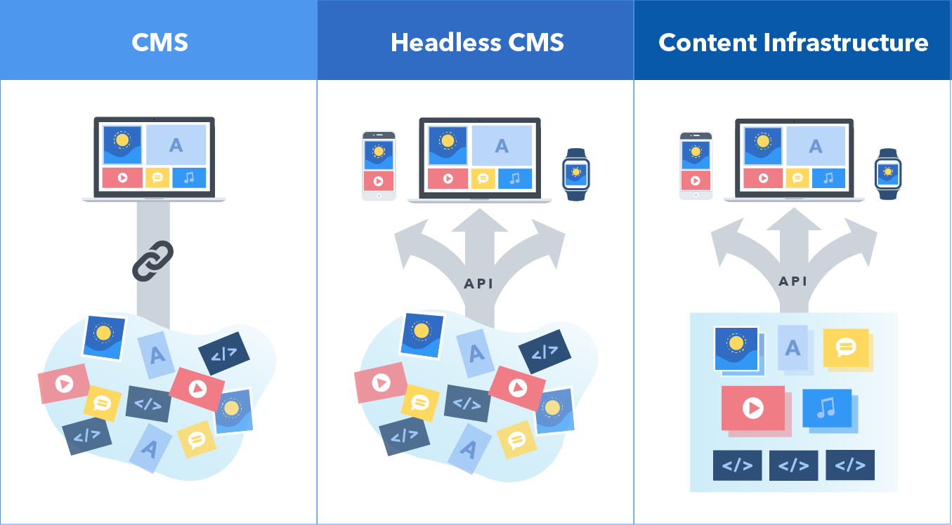
In the rapidly evolving digital landscape, brands are under increasing pressure to deliver consistent, high-quality content across a growing number of platforms and devices. Traditional content management systems (CMS) often struggle to keep up with these demands, which has led to the rise of a more flexible, developer-friendly alternative: the headless CMS. But what exactly is a headless CMS, and is it the right move for your brand?
What Is a Headless CMS?
A headless CMS is a backend-only content management system that separates the content repository (“body”) from the presentation layer (“head”). Unlike traditional CMS platforms like WordPress or Drupal, which couple content and frontend design into a single system, a headless CMS delivers content via APIs to any frontend you choose—websites, mobile apps, digital kiosks, or even smart devices.
This decoupled architecture gives brands the freedom to create omnichannel experiences while empowering developers to use modern frameworks like React, Vue, or Next.js.
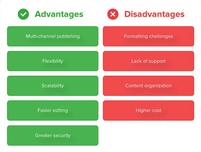
Benefits of a Headless CMS
Omnichannel Delivery: One of the most significant advantages of a headless CMS is its ability to push content to multiple platforms from a single source, ensuring consistency across touchpoints.
Improved Performance: Headless setups can significantly reduce page load times and improve SEO by enabling developers to build fast, optimized frontends.
Developer Flexibility: With the frontend and backend decoupled, developers are free to choose the best tools for the job, rather than being locked into the templating systems of traditional CMSs.
Scalability: Headless CMSs are built to handle growth, making them ideal for enterprises managing global content operations.
Security: By removing the presentation layer from the content management system, the attack surface for potential threats is reduced.
Challenges and Trade-Offs
Complex Implementation: Transitioning to a headless CMS requires skilled developers and careful planning to integrate APIs and build custom frontends.
Editor Experience: Without a built-in preview or WYSIWYG editor, content creators may struggle to visualize how their work will appear on the final interface.
Maintenance and Cost: Managing a headless architecture involves more moving parts, which can increase ongoing maintenance efforts and costs.
Training Requirements: Your marketing and content teams will need time and support to adapt to the new workflows.
Is Headless Right for Your Brand?
A headless CMS is a powerful solution—but it isn’t for everyone. Here are a few indicators that it might be the right fit:
- You publish content across multiple digital channels.
- You need more flexibility than a traditional CMS can offer.
- Your development team wants to use modern frontend frameworks.
- You require enterprise-grade performance and security.
- You operate in multiple regions and need localized content delivery.
On the other hand, if your site is relatively simple and your marketing team relies heavily on visual editing tools, a traditional CMS might still be the better choice.
Real-World Use Cases
- B2B Tech Firms: Supporting complex product catalogs and knowledge bases across geographies.
- Consumer Brands: Delivering unified experiences across mobile apps, e-commerce sites, and interactive displays.
- Government Contractors: Meeting strict performance and security standards while serving diverse audiences.
Final Thoughts
Headless CMS represents a significant shift in how brands manage and deliver content. It offers agility, performance, and scalability—but it also comes with new responsibilities. If you’re looking to future-proof your digital presence, going headless could be a smart move.
Want to know if your CMS is holding you back? Contact Bluetext for a personalized CMS audit and digital architecture consultation.
Marketing technology has transformed how businesses engage with their audiences, but managing an increasingly complex tech stack can be overwhelming. Without proper integration, companies risk inefficiencies, data silos, and missed opportunities. To maximize impact, businesses must streamline their Martech stack, ensuring seamless workflows, improved collaboration, and measurable results.
Understanding the Martech Landscape
The Martech ecosystem includes tools for automation, customer relationship management (CRM), content marketing, analytics, and more. However, the abundance of options often leads to bloated tech stacks that hinder efficiency rather than enhance it. Businesses must take a strategic approach to integrating their Martech tools to ensure they work together effectively.
Common Martech Challenges:
- Tool Overload: Using too many platforms can lead to inefficiencies and unnecessary costs.
- Data Silos: Disconnected tools prevent data sharing, leading to inconsistent insights.
- Lack of User Adoption: Employees may resist new technology if it’s not user-friendly or well-integrated.
- Security and Compliance Risks: Poor integration can lead to data breaches and regulatory non-compliance.
Building a Unified Martech Stack
A well-integrated Martech stack fosters collaboration, enhances automation, and provides actionable insights. Here’s how businesses can build a more efficient stack:
Key Steps to Martech Integration:
- Audit Existing Tools: Identify redundant, underutilized, or incompatible software.
- Define Core Business Needs: Ensure tools align with marketing goals, such as lead generation, engagement, or analytics.
- Prioritize Interoperability: Choose tools that integrate natively or through APIs to ensure seamless data flow.
- Implement a Centralized Platform: Consider a marketing operations platform that connects all tools for streamlined management.
- Regularly Review and Optimize: Continuously assess tool performance and eliminate inefficiencies.
Breaking Down Silos for Better Collaboration
Disconnected Martech tools can create barriers between marketing, sales, and customer service teams. Integration fosters collaboration and ensures everyone operates with the same data and insights.
Best Practices for Cross-Team Collaboration:
- Integrate CRM and Marketing Automation: Align sales and marketing efforts by ensuring real-time data sharing.
- Use Shared Dashboards: Provide unified analytics to enhance decision-making across teams.
- Implement Standardized Workflows: Automate lead nurturing, customer outreach, and reporting processes to improve efficiency.
Optimizing Automation & AI
AI and automation enhance Martech by personalizing customer interactions, improving efficiency, and providing data-driven insights. However, their effectiveness depends on seamless integration within the stack.
How to Leverage AI in Martech:
- Predictive Analytics: Use AI to anticipate customer behavior and optimize campaigns.
- Automated Customer Journeys: Personalize experiences based on user data and interactions.
- Chatbots & Virtual Assistants: Enhance customer engagement and support through AI-driven chat solutions.
Data Security & Compliance Considerations
With the increasing reliance on Martech, data security and regulatory compliance must be a priority.
Essential Security Best Practices:
- Ensure GDPR & CCPA Compliance: Adhere to data privacy regulations when collecting and processing customer information.
- Use Secure Integrations: Choose platforms with robust encryption and authentication measures.
- Regular Security Audits: Assess vulnerabilities and strengthen defenses against cyber threats.
Measuring Martech ROI
To justify Martech investments, businesses must track key performance indicators (KPIs) that demonstrate efficiency and revenue impact.
Key Metrics to Evaluate Martech Performance:
- Customer Acquisition Cost (CAC): Measure how Martech impacts lead conversion efficiency.
- Marketing-Qualified Leads (MQLs): Track the volume and quality of leads generated.
- Campaign Performance Metrics: Analyze engagement, conversion rates, and ROI.
- Operational Efficiency: Assess how Martech reduces manual workloads and improves productivity.
Final Thoughts
A well-integrated Martech stack enables businesses to execute smarter marketing campaigns, improve collaboration, and drive better results. By streamlining tools, optimizing automation, and ensuring data security, companies can unlock the full potential of their marketing technology investments.
The digital landscape is undergoing a paradigm shift with the emergence of Web3. As blockchain technology, decentralized applications, and token-based economies gain traction, marketers must adapt to new ways of engaging with audiences. From NFTs to blockchain-powered loyalty programs, Web3 is redefining brand engagement, offering more transparency, security, and community-driven interactions. In this blog, we explore how Web3 is reshaping brand-consumer relationships and what marketers need to know to stay ahead of the curve.
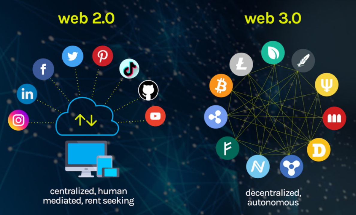
What is Web3?
Web3, or the decentralized web, represents the next evolution of the internet, where users have greater control over their data, transactions, and digital identities. Unlike Web2, which relies on centralized platforms like Google, Facebook, and Amazon, Web3 operates on blockchain networks that distribute ownership and decision-making across a network of users.
Key features of Web3 include:
- Decentralization: Eliminating reliance on centralized entities, giving users more control.
- Tokenization: Digital assets, such as NFTs and cryptocurrencies, facilitate unique ownership models.
- Smart Contracts: Self-executing contracts that enable secure, automated transactions.
- Enhanced Privacy and Security: Blockchain encryption reduces data breaches and fraud risks.

How Web3 is Transforming Brand Engagement
As brands explore Web3 technologies, they are unlocking new opportunities to create immersive and customer-centric experiences. Here are some of the key ways Web3 is revolutionizing brand engagement:
1. NFTs as Digital Collectibles and Brand Assets
Non-fungible tokens (NFTs) allow brands to offer exclusive digital collectibles, limited-edition products, and even virtual experiences. Brands like Nike and Adidas have already launched NFT-based products, strengthening customer loyalty and engagement.
2. Blockchain-Powered Loyalty Programs
Traditional loyalty programs often suffer from low engagement and lack of transparency. Web3 enables blockchain-based loyalty programs where customers earn and trade tokens that hold real value, increasing participation and long-term brand commitment.
3. Decentralized Communities and DAOs
Decentralized autonomous organizations (DAOs) give consumers a say in brand decisions. By integrating DAOs, brands can foster stronger community engagement, allowing loyal customers to participate in governance, product development, and marketing strategies.
4. Metaverse and Virtual Brand Experiences
The metaverse, a digital universe powered by Web3, offers brands the ability to host virtual events, create digital storefronts, and provide interactive experiences. Luxury brands like Gucci and Louis Vuitton have already embraced the metaverse to enhance customer interactions.
5. Transparency and Trust Through Blockchain
Consumers today demand authenticity and ethical business practices. Blockchain technology ensures transparent supply chains, verifiable sustainability claims, and tamper-proof records, strengthening consumer trust in brands.
Challenges and Considerations for Marketers
While Web3 presents exciting opportunities, it also comes with challenges that brands must navigate carefully:
- Regulatory Uncertainty: Governments are still defining regulations around cryptocurrencies and NFTs.
- User Education: Many consumers are unfamiliar with blockchain and require guidance to participate in Web3 ecosystems.
- Scalability and Environmental Concerns: Some blockchain networks require high energy consumption, prompting brands to seek eco-friendly alternatives.
How Marketers Can Prepare for Web3
To stay competitive in this evolving landscape, marketers should:
- Educate Themselves: Understand the basics of blockchain, NFTs, and the metaverse.
- Experiment with Web3 Campaigns: Start small by integrating NFTs, blockchain loyalty programs, or virtual events.
- Focus on Community Building: Engage with customers through decentralized platforms and reward participation.
- Partner with Web3 Experts: Collaborate with blockchain developers and agencies to ensure seamless implementation.

Future-Proof Your Brand with Bluetext
As Web3 continues to disrupt traditional marketing, brands need expert guidance to navigate this new digital frontier. Bluetext specializes in helping brands harness emerging technologies to create innovative, engaging, and future-ready marketing strategies. Contact Bluetext today to explore how Web3 can elevate your brand engagement.