In today’s rapidly evolving global marketplace, leading branding agencies face unprecedented challenges and opportunities. As businesses expand across borders and digital landscapes, branding strategies must adapt to stay relevant and competitive. Marketing leaders must navigate these changes to ensure their brands resonate with diverse audiences while maintaining a consistent global identity. This post explores how top branding agencies are adapting to these market dynamics, providing insights for businesses aiming to thrive in this complex environment.
Embracing Digital Transformation
Digital transformation is at the forefront of how leading branding agencies are reshaping their strategies. The proliferation of digital channels requires brands to be agile, responsive, and data-driven. Agencies are leveraging advanced analytics to gain insights into consumer behavior, enabling more personalized and impactful branding efforts. By integrating technologies such as artificial intelligence and machine learning, agencies are enhancing their ability to predict trends and optimize campaigns in real-time.
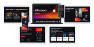
Learn how we helped TrendAI move into new markets while remaining unmistakably itself.
Focusing on Authenticity and Purpose
Consumers today demand authenticity and purpose from the brands they engage with. Leading branding agencies are helping businesses articulate their core values and align them with customer expectations. This involves crafting narratives that resonate on an emotional level, fostering trust and loyalty. Agencies are also guiding brands in taking meaningful stances on social and environmental issues, which has become crucial in differentiating a brand in a crowded marketplace.
Adapting to Cultural Nuances
As brands venture into new markets, understanding and respecting cultural differences becomes essential. Leading branding agencies are adept at tailoring messages to fit local contexts without diluting the brand’s global identity. This involves in-depth research and collaboration with local experts to ensure campaigns are culturally relevant and sensitive. By doing so, brands can connect more deeply with local audiences and enhance their global reach.
Leveraging Data-Driven Insights
Data is a powerful tool for branding agencies aiming to adapt to global market changes. Through sophisticated data analytics, agencies can track consumer trends, measure campaign effectiveness, and make informed decisions. This data-driven approach allows for more precise targeting and personalization, ensuring that branding efforts resonate with the intended audience. Agencies like Bluetext are at the forefront of utilizing data to drive successful branding strategies.
Enhancing Brand Experience Through Technology
Technology is transforming how consumers interact with brands. Leading agencies are using virtual reality, augmented reality, and immersive experiences to create memorable brand interactions. These technologies allow consumers to engage with brands in novel ways, increasing brand recall and affinity. Agencies are also focusing on optimizing digital touchpoints, ensuring that the brand experience is seamless across all platforms and devices.
Uncover how we designed Axient’s brand to stay with the customer, even after a first pass.
Fostering Collaboration and Innovation
Collaboration and innovation are key to staying ahead in the global branding landscape. Leading agencies foster environments where creativity can thrive, encouraging cross-functional teams to work together. This collaborative approach not only sparks innovative ideas but also ensures that diverse perspectives are considered in branding strategies. By embracing innovation, agencies can develop unique solutions that differentiate their clients in the marketplace.
Building Resilient Brand Strategies
In an unpredictable world, resilience is crucial for brand survival. Leading branding agencies are building strategies that can withstand market volatility and adapt to change. This involves scenario planning and risk management to anticipate potential disruptions. By preparing for various contingencies, agencies ensure that brands remain resilient and continue to deliver value to their customers.
Creating Comprehensive Content Strategies
Content remains a vital component of effective branding. Agencies are developing comprehensive content strategies that leverage storytelling, multimedia, and digital platforms to engage audiences. By creating compelling and consistent content, brands can maintain a strong presence across channels. Agencies like Bluetext excel in crafting content that captures the essence of a brand and communicates it effectively to diverse audiences.
Partnering with Experts for Success
Adapting to global market changes requires expertise, creativity, and a strategic approach. Leading branding agencies are well-equipped to guide businesses through these challenges, offering innovative solutions that drive growth and engagement. For companies looking to navigate this complex landscape, partnering with an experienced agency like Bluetext can provide the strategic support needed to succeed. Contact us today to learn how we can help elevate your brand’s presence in the global market.
In today’s fast-paced digital landscape, businesses must navigate the complexities of digital transformation to remain competitive. As organizations strive to modernize, the role of branding firms becomes increasingly critical. Particularly in Washington, D.C., where many businesses are focused on B2B and B2G markets, the expertise of the best branding agencies in DC is invaluable. These firms not only help in creating a strong brand identity but also play a pivotal role in guiding companies through digital transformation, ensuring they remain relevant and effective in a digital-first world.
Understanding Digital Transformation
Digital transformation involves the integration of digital technology into all areas of a business, fundamentally changing how organizations operate and deliver value to customers. It is a cultural shift that requires organizations to continually challenge the status quo, experiment, and become comfortable with failure. For businesses in the D.C. area, especially those involved in government and B2B sectors, this transformation is not just about adopting new technologies but also about enhancing customer experiences, streamlining operations, and fostering innovation.
The right tools turn good campaigns into measurable ones. See how we put them to work for Karman.
The Importance of Branding in Digital Transformation
Branding is an essential component of digital transformation. A strong brand helps communicate the values and promises of a business, creating a connection with customers and stakeholders. For companies navigating digital transformation, branding is crucial in differentiating themselves in a crowded market. By working with a leading branding firm, businesses can ensure their brand remains consistent across all digital platforms, from websites to social media channels, enhancing their visibility and credibility.
How DC Branding Firms Facilitate Transformation
DC branding firms are uniquely positioned to assist businesses in their digital transformation journeys. These agencies bring a wealth of experience and a deep understanding of the local market dynamics. They offer tailored strategies that align with the unique needs of each client, helping them leverage digital tools to enhance their brand presence and achieve business goals.
Strategic Planning and Execution
Effective digital transformation requires strategic planning and precise execution. DC branding agencies excel in crafting comprehensive strategies that incorporate market research, competitor analysis, and consumer insights. This strategic approach ensures that all digital initiatives are aligned with the overarching business objectives, maximizing ROI and driving sustainable growth.
Enhancing Customer Experience
Customer experience is at the heart of digital transformation. Branding firms help businesses create seamless, personalized experiences across all touchpoints. By leveraging cutting-edge technology and data analytics, these agencies design user-centric solutions that enhance engagement and foster loyalty. For example, agencies like Bluetext specialize in creating intuitive web designs that enhance user experience and support brand objectives.
Leveraging Technology for Branding
In the digital era, technology is a vital component of branding strategies. DC branding firms utilize a variety of digital tools to enhance brand visibility and engagement. From SEO and social media marketing to AI-driven analytics, these agencies provide the technological expertise needed to effectively implement digital transformation initiatives.
Data-Driven Decision Making
Data is the backbone of digital transformation. Branding firms help businesses harness the power of data to make informed decisions that drive brand success. By analyzing consumer behavior, market trends, and campaign performance, agencies can optimize strategies to better meet the needs of their audience. Companies like Bluetext offer advanced analytics services that provide actionable insights, enabling businesses to refine their branding efforts.
Integrating Emerging Technologies
Emerging technologies like artificial intelligence and virtual reality are transforming how brands interact with their audience. DC branding firms are at the forefront of integrating these technologies into branding strategies. For instance, creating immersive experiences using VR can enhance customer engagement and provide a competitive edge. Agencies that are known for innovation, such as Bluetext, are leaders in utilizing these technologies to elevate brand experiences.
The Future of Branding in Digital Transformation
As digital transformation continues to evolve, the role of branding firms will become even more critical. They will need to stay ahead of technological advancements and market trends to offer innovative solutions that drive business success. For companies in D.C., partnering with the best branding agencies is a strategic move that can significantly impact their digital transformation journey.
Ultimately, a strong brand is more than just a logo or a tagline; it’s the embodiment of a company’s mission and values. By working with a reputable DC branding firm, businesses can ensure their brand not only survives but thrives in the digital age.
Ready to take your digital transformation to the next level? Contact Bluetext today to learn how our expertise in branding and digital strategy can support your business objectives.
Resilience has become the defining advantage for modern brands. Disruption is constant, buyers are discerning, and expectations shift by the quarter. Surviving is not the goal. Growth requires a brand that can flex with market conditions without losing its core. That is why executive teams are increasingly partnering with brand strategy agencies to set stronger foundations, make sharper positioning choices, and operationalize brand systems that hold up under pressure. The right partner blends research, creativity, and activation rigor to future-proof identity, messaging, and experiences across every stakeholder touchpoint.
What makes a brand resilient today?
Resilience is not a slogan. It is a set of behaviors and systems that allow a company to adapt quickly while protecting equity and trust. Top brand strategy agencies define resilience through five practical capabilities that leaders can measure and manage.
- Clear, defensible positioning that stands up in crowded or volatile categories
- Audience clarity down to segments and roles, informed by decision journeys and pain points
- Experience consistency across digital and physical channels, from first touch to renewal
- Governance that scales brand adoption inside the organization and across partners
- Proactive risk management, with protocols for issues and crisis response
Resilience is built before it is needed. The most effective brand strategy agencies guide decisions on where to play, how to win, and how to scale repeatable growth. The goal is simple: create a brand that absorbs shocks, capitalizes on inflection points, and converts uncertainty into momentum.
Inovalon trusted us with reimagining their brand. See why.
How do brand strategy agencies create durable positioning?
Durable positioning starts with clarity and ends with proof. Leading brand strategy agencies run disciplined programs that move from research to distinctive narratives and then to visible, verifiable proof points across campaigns, content, and sales enablement.
Data-driven discovery that reduces guesswork
Resilient brands do not bet on opinions. They invest in insight. Sophisticated brand strategy agencies use quantitative and qualitative research to clarify market structure, growth pockets, and category codes. They audit competitors and adjacent categories to identify white space and to determine where differentiation can be both credible and sustainable. This work often includes an internal diagnostic to align leadership, product, and go-to-market teams around a common reality before any creative decisions are made.
A category point of view that buyers can follow
Positioning that lasts gives buyers a mental model for why the category exists, where it is going, and why a specific solution set matters. Seasoned brand strategy agencies help executives articulate a point of view that reframes the market on favorable terms. This often means naming emerging pain points, setting new evaluation criteria, and linking product innovation to measurable outcomes that chief decision makers recognize.
Message architecture that scales across teams
Resilient brands communicate with precision. The best brand strategy agencies build message architectures that cascade from corporate narrative to segment and solution proof, supported by customer evidence and ROI quantification. The output gives sales, marketing, product, and HR the same core language so that the brand speaks consistently across regions, roles, and channels, even as campaigns change.
Governance that protects integrity at speed
Growth adds complexity. Without governance, complexity erodes brand value. Experienced brand strategy agencies design brand systems, usage rules, and training that enable fast, accurate adoption. From templates and asset libraries to field guidance and partner toolkits, governance empowers people to execute across time zones and functions without creating fragmentation.
Why B2B and B2G brands benefit most from this approach
Multi-stakeholder buying and lengthy procurement cycles amplify the value of a resilient brand. Enterprise deals require consensus across technical, financial, and operational leaders. Public sector contracts introduce compliance, security, and mission requirements that exceed commercial norms. Brand strategy agencies that focus on complex markets understand how to translate differentiation into credibility for each persona and stage.
Winning complex buying committees
Brand credibility is cumulative across touchpoints. Technical buyers look for architectural fit and peer validation. Economic buyers look for risk mitigation and quantifiable value. Users look for ease and support. Leading brand strategy agencies map each requirement to the message and content strategy so that the brand advances the deal even when no salesperson is in the room. That is resilience applied to revenue, not just reputation.
Navigating public sector priorities
Public sector marketing requires fluency in mission outcomes and the realities of acquisition. Brand claims must align with policy goals and security expectations. Experienced brand strategy agencies calibrate language and evidence so that positioning resonates with program managers, contracting officers, and integrators. Teams that speak both brand and mission accelerate trust without overpromising, which is essential for long-term contract performance.
Where experience design meets resilience
Consistency across channels is a stress test for every brand. As go-to-market models prioritize digital, strategy must inform experience design across websites, content ecosystems, social, events, and sales enablement. Top brand strategy agencies connect the dots between narrative and UX so that value is obvious, navigation is intuitive, and calls to action align with buyer intent. When experiences match expectations, conversion improves and goodwill accumulates, which cushions performance during macro shocks.
Risk, issues, and crisis planning as a brand advantage
Reputations are fragile if risk is treated as an afterthought. The most future-ready brand strategy agencies include scenario planning and response protocols within the core brand program. That includes defining who speaks for the brand, what approval paths exist, and what evidence is ready for immediate publication. For leaders building resilience into communications, explore how specialized crisis communications frameworks reinforce trust before, during, and after an event.
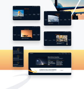
Karman needed a brand that customers could trust. See how we built them one.
What to measure to track brand resilience
Executives need indicators that are both leading and lagging. A well-designed measurement framework helps leadership see whether the brand is gaining strength or masking vulnerabilities. Strong brand strategy agencies create dashboards that blend perception, performance, and pipeline metrics so the team can act early.
- Brand relevance and consideration across priority segments
- Share of voice and quality of coverage in earned and owned channels
- Search demand for branded and category terms, along with click-through performance
- Pricing power signals and win rates against primary competitors
- Sales velocity by stage and renewal health, linked to brand-influenced touchpoints
Measurement starts with clean baselines and clear hypotheses. Sustained improvement requires ongoing insight. Robust programs rely on research and analytics to identify the next best optimization rather than waiting for quarters of underperformance to reveal a problem.
When should executives engage brand strategy agencies?
Timing matters. The most successful engagements start before pain is visible to the market. There are clear triggers that signal value in bringing on experienced brand strategy agencies.
- Strategic shifts such as category entry, exit, or reframing
- Market expansions across geographies or into regulated sectors
- Transformation of the portfolio through innovation, partnerships, or platform moves
- Mergers, acquisitions, or carve-outs that require narrative clarity and identity alignment
- Performance plateaus where awareness and demand diverge
- Significant reputational risk that demands structural change in communications
Brand fundamentals age faster than leaders expect. Proactive alignment with seasoned brand strategy agencies reduces execution drag and eliminates the hidden tax of inconsistency across teams.
What should leaders expect from a proven process?
A resilient brand is the product of a disciplined program. While every engagement adapts to context, top brand strategy agencies typically run a process executives can preview and govern.
- Discovery and alignment. Stakeholder interviews, market scans, brand audits, and goal setting create a shared starting point.
- Insight and opportunity mapping. Research clarifies where to focus, how to differentiate, and which messages will resonate with priority segments.
- Strategy development. Positioning, message architecture, and naming frameworks take shape, along with a point of view that reframes the category.
- Identity and system design. Visual identity, voice, and design systems translate the strategy into executable assets and guidelines.
- Activation planning. Campaign strategy, content roadmaps, website and sales enablement plans connect brand to pipeline and revenue.
- Enablement and governance. Toolkits, training, and operating models drive adoption throughout the organization.
- Optimization. Measurement and iteration lock in gains and prepare the brand to evolve with the market.
Executives should ask for transparency at each stage and measurable outcomes tied to commercial objectives. The best brand strategy agencies make the process as valuable as the deliverables by building internal alignment and capability.
SonicWall needed clarity. Here’s how Bluetext helped them deliver it.
How to evaluate and select the right partner
Not all expertise is equal. Selecting among brand strategy agencies should center on fit for your market, the rigor of the firm’s process, and proof that the work drives outcomes beyond aesthetics. Use criteria that reflect your risk and growth profile.
- Category fluency in your sector or adjacent spaces with similar complexity
- A research-first approach that reduces bias and accelerates consensus
- Demonstrated link between brand decisions and measurable business results
- Activation capability across digital, content, and sales enablement
- Governance and change management experience for fast global adoption
- Executive-caliber communication and stakeholder management
Ask to see how the team turned strategy into results, not just visuals. Review whether past programs survived leadership changes, market swings, or product pivots. That is the clearest signal you are talking to brand strategy agencies that truly build resilience.
From boardroom strategy to brand in market
A strategy on paper is not resilience. Execution is. Effective brand strategy agencies connect boardroom intent to front-line behavior and market-facing experiences. That means strong collaboration between strategists, creatives, and digital activation teams as well as a laser focus on handoffs to sales and customer success. When strategy becomes a living system, every interaction reinforces value and signals reliability to buyers and stakeholders.
Proof that resilience scales across use cases
Whether launching a new category story, modernizing a legacy brand, or unifying a portfolio after acquisition, outcomes matter more than outputs. Explore Bluetext’s breadth of impact by reviewing our branding work to see how strategy translates into identity, messaging, and campaigns that move markets. Patterns emerge across industries: clarity speeds growth, governance reduces waste, and disciplined activation compounds brand equity over time.
Brand strategy for B2G: aligning mission, security, and outcomes
Public sector engagement elevates the stakes for credibility and compliance. The partners that thrive here are brand strategy agencies that align mission language to technical truth without diluting differentiation. The work spans FedRAMP or cyber postures, supply chain assurance, and partner ecosystems, but the core remains the same. Resilient brands tell the truth well, document their claims, and earn the right to scale across programs and agencies by delivering measurable mission impact.
Avoiding common pitfalls that erode resilience
Most brand erosion is self-inflicted. Recognizing the traps helps leaders avoid expensive rework. Brand strategy agencies consistently warn against a handful of missteps.
- Jumping to visuals before agreement on positioning and message architecture
- Confusing internal alignment with market validation
- Underestimating the governance and training required for adoption
- Failing to link brand KPIs to pipeline and renewal metrics
- Treating risk and issues management as a separate discipline rather than core brand work
Each pitfall saps energy and fragments experiences. The remedy is a disciplined partnership with brand strategy agencies that address strategy, design, activation, and change management as a unified program with shared accountability.
Why Bluetext is built for brand resilience
Bluetext partners with growth-minded leaders to create brands that withstand volatility and outperform peers. Our approach integrates research, positioning, identity systems, content, and activation into a cohesive plan that turns strategy into momentum. For a deeper view on how leading brand strategy agencies operate, start with our perspective on the choices that drive durability. Then align your leadership team around a roadmap that connects brand decisions to commercial outcomes and risk mitigation.
Next step: build your resilient brand
If your organization faces a category shift, evolving buyer expectations, or the need to unify a complex portfolio, the moment to act is now. Engage a partner that treats resilience as a system, not a slogan. Bluetext can assess where your brand stands today, identify the highest-impact levers to strengthen positioning and experience, and build an operating model that equips your teams to scale. To discuss your goals and define a path forward, contact Bluetext for strategy, branding, or campaign support that is built to last.
In the fast-paced world of private equity investments, the journey from acquisition to exit is akin to navigating a complex maze with countless opportunities and challenges. At the heart of this journey lies the potential for brands to not only survive but thrive under new ownership. As a leading marketing agency specializing in guiding businesses through this transformative process, we understand the critical role that effective branding plays in maximizing value and ensuring a successful exit strategy.
Acquisition: Setting the Stage for Growth
Acquisition marks the beginning of a new chapter for any brand. Whether it’s a strategic move to expand market share or a bold venture into new territories, the initial phase sets the stage for future growth. This is where our expertise comes into play. By conducting in-depth market research and analysis, we identify key opportunities and develop tailored strategies to position the brand for success in its new environment. From refining brand messaging to optimizing digital presence, our comprehensive approach lays the foundation for sustained growth and value creation.
Adaptation: Staying Agile in a Dynamic Landscape
In the dynamic landscape of private equity investments, the ability to adapt and evolve is paramount. Market conditions can change rapidly, and brands must stay agile to seize new opportunities and mitigate risks effectively. Through ongoing monitoring and optimization, we ensure that brands remain responsive to emerging trends, allowing them to pivot strategies and capitalize on evolving consumer preferences. By staying ahead of the curve, brands can maintain a competitive edge and drive sustainable growth throughout the investment lifecycle.
Maximization: Enhancing Brand Visibility and Engagement
As the investment horizon progresses, our focus shifts towards maximizing brand visibility and engagement to enhance market penetration and drive revenue growth. Leveraging a mix of traditional and digital marketing channels, we create integrated campaigns that resonate with target audiences and reinforce brand loyalty. By fostering meaningful connections and delivering compelling brand experiences, we help brands stand out in crowded marketplaces and unlock new avenues for growth.
Value Creation: Strategizing for a Successful Exit
However, achieving a successful exit requires more than just strong branding. It demands a strategic approach to value creation and investor relations. Our team works closely with brands to identify areas of opportunity and implement initiatives that enhance shareholder value. Whether it’s through strategic partnerships, product innovation, or geographic expansion, we leverage our expertise to position the brand as an attractive investment opportunity with significant growth potential. By aligning business objectives with investor expectations, we pave the way for a seamless exit that delivers maximum returns for stakeholders.
Navigating the Journey of a PE Investment
In conclusion, navigating the journey from acquisition to exit in private equity investments requires a strategic and proactive approach to branding. As a leading marketing agency, we are committed to helping brands maximize their potential and achieve their business objectives. From refining brand positioning to driving revenue growth, our comprehensive suite of services is designed to deliver tangible results at every stage of the investment lifecycle. With our expertise and dedication, we empower brands to thrive in the dynamic world of private equity investments and emerge as market leaders in their respective industries.
Interested in partnering with us to maximize your ROI? Contact us.
This past Thursday creatives around the world kept their eyes out for a highly anticipated announcement: the 2024 Pantone Color of the Year. An annual tradition now 25 years old, Pantone’s hue selection usually sets the stage for design & style trends for the upcoming year. Take 2023 for example, when “Viva Magenta” foreshadowed the upcoming wave of Barbie-core pinks that dominated the design world.

The finalist for 2024? Peach Fuzz, a neutral pink-orange hue the company describes as “gentle,” “velvety,” “contemporary” and “nurturing.” Pantone’s Leatrice Eiseman, explains: “Peach Fuzz brings belonging, inspires recalibration, and an opportunity for nurturing. Drawing comfort from PANTONE 13-1023 Peach Fuzz, we can find peace from within, impacting our wellbeing.”

All the buzz around the fuzz got our creative wheels spinning, what was Bluetext’s color of the year? We decided to turn the tradition on its head and reflect back, rather than forecast forward, on our most inspired color palettes of the past year.
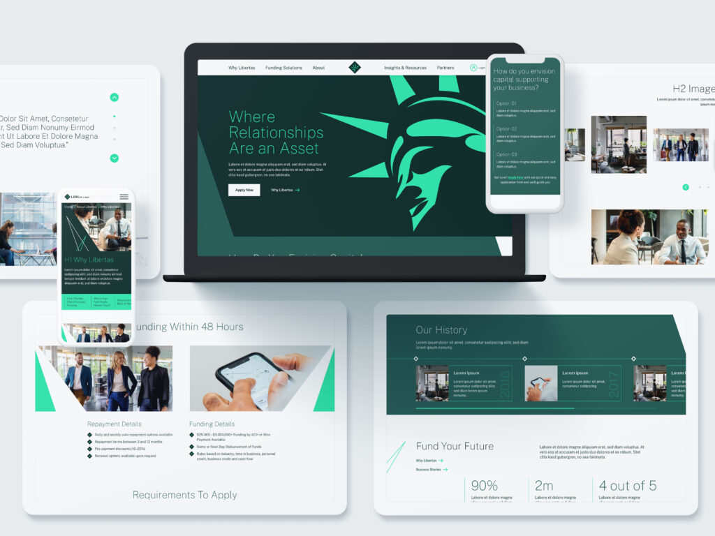
In the eyes of Bluetext’s creative director, Jason Siegel, Libertas’ iconic green-based palette stood out. As a financial services company, green tones are a bit on-the-nose, however the Bluetext creative team sought out to question and redefine the obvious. Marrying deep, jewel-toned emeralds with energetic pops of neon kelly green breathed a new life into an established brand. Torn between a determination to stay true to its root, and desire to innovate and prove its technology prowess to the market had been a long standing challenge for Libertas, but finally solved with the support of Bluetext’s creative expertise.
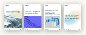
Another fan favorite of the Bluetext team has been Obrela, who proved real threat detectors do wear pink. The cybersecurity company’s website features a predominant dark mode theme, using a deep indigo gradient to backlight vibrant pops of fluorescent pink and highlighter yellow. As a creative agency with long standing experience in the cybersecurity market, we’re no stranger to the color blue. It’s tried and true across many industries, with a trustworthy color psychology and professional tone. What we love most about the Obrela color palette is the ability to bridge tradition with nuance. A successful balance of the familiar and the uncomfortable, using well known tones as majority with the thought provoking pops of pink strategically placed at critical conversion points.

Ultimately, we here at Bluetext feel 2023 has been a year of creative success. We’ve seen a trend of vibrant color schemes making its way across the B2B landscape. Often paired with a darker or more muted tone within the same color family, but definitely standing out in unique ways. As we approach 2024 we can only look forward to more modernized monochromatic schemes, particularly ones that seek to balance energy with expertise.
Are you looking to refresh your brand in 2024? Contact us at Bluetext to learn how we can partner with you.
The recent appointment of music icon Pharell Williams as Louis Vuitton’s newest Creative Director certainly raised eyebrows. While this ‘Happy’ singer-songwriter undoubtedly has style, this was an out-of-the-box pick for one of the most iconic luxury brands. Radical changes in leadership, technology platforms, and data utilization are shaking up the creative industry. It’s led many to wonder ‘What exactly is the role of a Creative Director’? More importantly, what makes a modern Creative Director?
Bluetext asked our own Creative Director, Jason Siegel, how the role has evolved in recent years, especially with the introduction of next-age AI technology within creative fields. Check out his insights on the future of creative direction, the importance of vision, and leveraging the technology tomorrow.
What do you think of Pharell Williams being named Louis Vuitton’s newest creative director?
I think the Louis Vuitton Creative Director assignment to Pharrell Williams is amazing. I am a massive fan of his music and anything else he’s involved in. I think he is one of the most genius artists on the planet and when you’re a legendary brand like Louis Vuitton, you want to have creative prowess at the top, as well as on the bottom. Pharrell will bring up a fresh perspective and style that will shake up the fashion industry and the world will enjoy it.
Why would or wouldn’t you have made this decision?
I would make decisions like this because when you are known as a creative powerhouse and fashion is a creative art, medium in the end. Brands need to affiliate themselves with creative powerhouses if they want to be thought of as fashion powerhouses. Celebrities who have well-known fashion styles and unique tastes, such as Pharell have an untapped creative potential that spans far beyond music. Brands like Louis Vuitton need to affiliate themselves with those sorts of folks and try to embed them in the internal conversation of where the brand is headed as well as the externally communicate as to where the brand is going.
Who was your first creative director?
Two people were most influential in my career
1. Bill Replogle of Sparky’s Garage fame taught me a lot about storytelling and the power of the word. Growing up I was always looking for better effects and more intense media delivery. And Bill taught me that just a couple of words and just the right photo could make everyone in the conference room fall off the chair in laughter. Bill also taught me that having a great attitude and opinion; knowing what is a good product and what is not is a critical skill.
2. Rand Kramer was my first real professional creative director mentor. Rand taught me the art of pixel, and that perfect is the only way to go. Rand taught me a lot about how to manage designers and different personalities. Rand taught me a lot about the importance of making sure clients feel they’re heard and see the value and professionally prepared files; as well as the underrated value in a conference report after a phone call. Rand was 99% creative, but a really really amazing 1% percent business.
If you could tap a celeb creative director who would it be?
I would tap Bob Marley to be Creative Director. I find creatives work great in an environment that is collaborative and positive and has agreeable background music. Who doesn’t like Bob Marley? Bob Marley is the essence of creative positivity.
The ‘Modern Creative Director’ must align both internal teams and external clients with the creative strategy. Which is the most challenging to bring to that strategic vision?
The more strategic, the bigger the results. When you take chances, you can create massive results and use data to build validation and confirmation, and confidence with the client that your strategic vision is going to win. But at the end of the day, there is never enough data to ever get someone 100% confident in the grand slam because there is risk in everything. There is always a challenge in convincing external clients to take risks, but we often look to the other trophies we have on the case to help persuade them.
What’s been your career hallmark favorite brand or campaign of pitch?
I have been fortunate to have worked on some iconic brands. When the first iPhone was released I led two historic applications. First was the first app ever published by the Washington Post. When Steve Jobs announced the iPhone our app for the “going out guide” was featured in the backdrop as he stood on stage and amazed the world. That led to another historic app for the Obama Inauguration. For that app, I was featured on ABC News with Charles Gibson to unveil and later invited by The Washington Post to redesign key aspects of post.com
My favorite campaign ever was working with the comedian Lewis Black for a security company called Identity Guard.

Lewis, a loudmouth cursing New Yorke, was wrapped up in police tape and had him screaming, “None of your damn business” for three days in New York City. Check out some snippets of that work and a great out-takes video.
As for the pitches, well the pitch is my favorite part. When we won Stanley, Black & Decker’s global site for their number one brand dewalt.com That was an amazing pitch — it included a loud intro, showing a mash-up of AC/DC back in black with a focus group of construction workers on the dewault.com drinking Bud Light. Followed by a complete spec user experience design presentation that knocked the cover off the ball. We won the account and it changed our agency forever from that day forward.
Technology & Its Role in Creative Direction
Creative Directors have historically been a balancing act of art, technology, and economics. How has this balance shifted in recent years?
The balance has swiftly changed over the last two decades. At the heart of it all, it comes down to the story you’re telling. The balance of the creative director’s role is to first establish a compelling story, and then be able to pressure test across an enormous amount of distribution channels to make sure that the story plays out ubiquitously. The modern-day creative director needs to be savvy enough to anticipate how a story is told through social media search engine optimization, connected TV, interactive shorts, augmented, reality, virtual reality, and going back to the old school with a 3-D male or??. Where the balance has changed most dramatically is in data analytics. Now there is a whole new player at the creative table, which is helping the creative Director pressure test and validate their ideation of the story across all these ubiquitous channels, and making sure that it’s highly effective, highly measurable, and that there are communities there to leverage. It’s no longer enough to have an artistic vision, creative directors have to be savvier than ever with technology, interactive mediums, as well as the traditional core skills of storytelling and oversight of high-quality art direction and production to be successful.
What’s the most valuable skill to have as Creative Director?
The most valuable skill to have as a creative Director is belief. Belief that your positioning, strategist, and messaging wordsmiths can produce a position that is defendable and sets up the creative floor for a grand slam. Belief in your team to push the boundaries of what they could physically do and trust in your team to get there together. The best creative directors don’t limit the thinking and belief that their team, including great 3-D artists and now great AI technology, can bring a vision into reality. Believe that your account strategy teams can manage a relationship, capture the essence of client preferences and collaborate with great creative people to bring what the client had intended for expectations to life. And overall the belief in growth, the confidence and drive to communicate the vision of growth to your employees and motivate them to grow with the agency.
How has curation become a larger part of creative direction?
Curation is equally as important as creation for a multitude of reasons. The first reason is language, the variety of talented people, both client-side and agency side, have a different language and limited language in talking about what they would hope to see creatively, and the breakdown of choice of words, or a limit of words can create a lot of waste and confusion. Using field trips, which show a curation set of visual examples makes the communication much clearer. We are constantly updating, verticalizing, and custom tailoring our field trip examples to client needs. Especially in industries challenged with bringing life to intangible concepts, field trip curation is critical. Our sources are really well-defined internally to run a smart agency and we are now super excited about artificial intelligence. AI technology is enabling us to rapidly ideate using platforms like mid-journey and dolly three so that rather than searching stock banks and design portfolios of the world we are prompting AI and seeing what they think. What they give us is often quite stunning, but often not perfect. We are looking forward to AI improving over time to be massively helpful, especially when fantastical art is a requirement and is a New Age version of Curation.
How do you foresee technology aiding creativity in the future?
Over the 20 years of doing this, I have seen some really critical breakthroughs that have allowed creatives to direct and open up channels and experiences like never before. A few of them that jump to mind include mobile technology and augmented reality, as great ways of using breakthrough technology in the creative direction of marketing efforts. What I am experiencing with platforms like chat GTP, mid-journey and Dolly 3 makes me think about what does the future look like? I’m highly convinced that this technology will doc octagon people just as Grammarly and Google have helped us speed up and advance over the last 20 years. This is another tool definitely not a replacement. But what I am most curious about is what I call ubiquitous dynamic media.
Ubiquitous dynamic media is a strategy for a brand where AI is constantly always producing in real-time, delivering branded content into the streams it will go from hosts to pulse and constantly pulsing constantly producing. The only way to do that is this video and imagery can be self-generated off of algorithms and prompts. Video that is dynamically producible, like we’re seeing right now with tools like mid-journey and open AI, has. the power to change the entire creative process and timeline. Imagine just writing the words “video of a child, running down the street chasing the ball” and generating a producible video where in real time you can change details like the color of the shirt on the child. Dynamic ubiquitous real-time branded content natively produced across every channel could allow you to optimize in real-time with algorithms of data trends that are coming in live. The future of technology is a vast ocean that a Creative Director could surf.
We wanted to get some feedback from an outside perspective, so we went to our strategic human capital partner, Chrissy (Ching) Mott, of Celertek. She had great insights on this topic.
“Data is now driving most technology hires across any industry. The ability to measure the success of what is being built or implemented is now as important as the product itself. There are very few organizations, even in the government services space that are without a data team, even if that team is relatively small. We have seen an increase in scaling data teams alongside QA, product management, and other more traditional technology areas across the last few years. The ratio of the data team to other traditional technology skill areas is only increasing year over year. What used to be a single person is now scaling at the same pace as other technology roles within a given organization.”
“A modern-day creative director has to understand how to read data and how to use it to positively impact the overall business. Without the digestion of data and applying its impact to the deliverable or product, the creative director is already behind their competitor.”
The last decade has made giant leaps in diversity & inclusion initiatives, especially for the LGBTQIA community. For the month of June, many companies switch from their traditional monochrome logo to a rainbow-colored design, particularly on social media platforms like Facebook or LinkedIn. While this rush of public support for LGBTQIA communities is a popular way of engaging in Pride Month celebrations, companies must consider how their actions reaffirm their pro-LGBTQIA branding.
First, it’s important to understand the purpose of the rainbow branding used throughout Pride month. By implementing a temporary rainbow branded logo change that showcases the colorful LGBTQIA Pride flag, companies can generate discussions about discrimination and visibility for members of the queer community. For a company sporting a Pride month logo, the rainbow design serves as a reminder to consumers, employees, and associates that the company values LGBTQIA inclusion and representation.
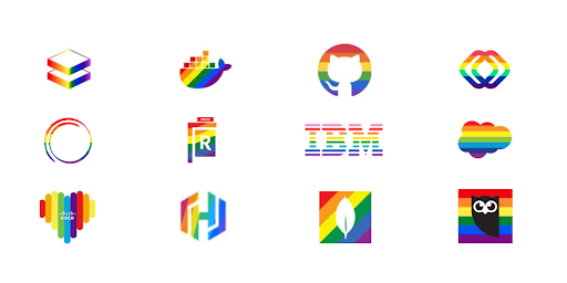
The Pride month logo design is most common among B2C companies who are trying to capture the attention of consumers. In this day and age, corporate responsibility and values are critical factors in purchasing decisions. Millennials are 32% more likely to do business with a company that openly supports the queer community. However, many large B2B companies also serve to benefit from showing support for the LGBTQIA community. The rainbow logo signals to employees and partners that the company is an ally to the community. Inclusive values attract diverse talent, improve employee welfare, and increase business across numerous demographics. About 15% of Gen-Z adults in the US identify as queer, a growing target market in corporate America.
Some of the largest tech, finance, and consulting companies—like Microsoft, IBM, Bank of America, and Deloitte—have used rainbow logos throughout the month of June to show support for the LGBTQIA community. Even prominent federal contractors, like Leidos and GDIT, have joined the display of pro-LGBTQIA branding. Corporate support for the LGBTQIA+ community during Pride Month is a major step forward for the LGBTQIA community compared to past suppression and ignorance. But beneath the rose-colored glasses, the reality is a flash of rainbow branding is not the end goal of pride month. Companies need to provide more than just temporary logos in support of the queer community.
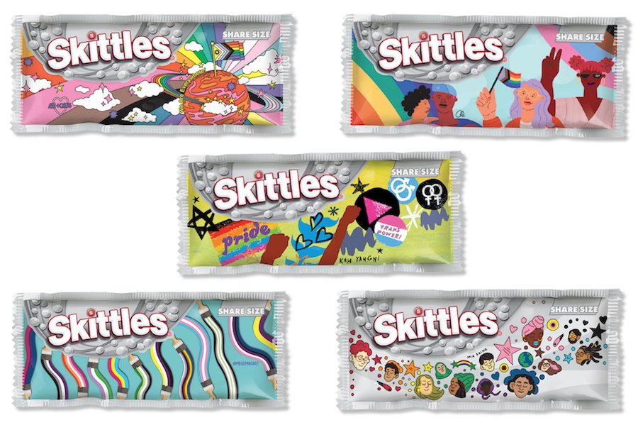
Take Skittles as an example, an extremely colorful brand naturally in its everyday marketing decided to go in the opposite visual direction to completely greyscale packaging and marketing materials. This campaign went viral when Skittles announced they decided to give up their rainbow to ‘celebrate the one that matters.’ (aka the Pride rainbow symbolizing the LGBTQ+ community). Partnering with GLAAD, an American non-governmental media monitoring organization, they gave six talented artists within the LGBTQ+ community to create pack designs that represent how they see the rainbow. Special edition pride packs were sold with $1 per pack donated to GLAAD.
Because of the clear economic benefits of promoting Pride month, this can be perceived as an exploitation of social initiatives and conversations as a means to reach business goals. In this instance, the use of the rainbow flag in marketing materials, without the actions to support the queer community in meaningful ways, is referred to as rainbow-washing. Before a company considers implementing a new rainbow logo or a Pride month campaign, they need to reflect on what other actions the company can take to support the LGBTQIA community in meaningful ways:
- Donate a portion of business proceeds to LGBTQIA-friendly charities or in support of pro-LGBTQIA legislation.
- Show support for the queer community year-round, not just through the month of June with supportive messaging and practices.
- Ensure representation of LGBTQIA persons in marketing and advertising.
- Refuse business in countries or states with discriminatory laws against LGBTQIA persons.
- Show representation of LGBTQIA persons in positions of leadership, like on the Board of Directors or within the C-Suite.
- Provide support and protection for LGBTQIA employees and their families.
- Educate yourself and those around you on the history of pride month before using the circumstance for profit.
While not every company can achieve all the points listed above, marketing and branding alone do not affirm the allyship of a company. Instead, marketing should be used as a means of promoting the other good works that a company does in the LGBTQIA community.
If your company is a true ally to the queer community, but you’re struggling to convey these values through your messaging or advertising, contact an agency like Bluetext that specializes in digital marketing. Whether looking for a refreshed pride month logo or a representative campaign for the month of June, Bluetext can help you create materials that get the right message across.
New year, same buzzwords. We’re all familiar with the phrase “machine learning”, but finding a practical application for it that supports your business model is another story. The key to effective digital marketing campaigns is taking full advantage of emerging technologies, and if you’re looking to increase your marketing team’s productivity and efficacy, look no further than machine learning. From paid media campaigns to search marketing strategies, recent machine learning enhancements have skyrocketed its digital potential. As brand marketing becomes more closely integrated with performance marketing, introducing ML to your digital marketing strategy is an effective way to assist your team on both fronts.
According to Google’s Chief Search Evangelist, “The future of brand marketing is digital, and it’s automated. As a brand marketer, if you can start thinking like performance marketers when it comes to KPIs, measurement, and budgets, you’ll be poised to win.”
Looking for ways to get started with machine learning in your marketing processes? Here are a few ideas:
-
Introduce personalization at scale.
Personalized advertising is a tried-and-true success tactic, and machine learning makes personalization at scale easier than ever. Whether you’re personalizing for 100 users or 100,000, AI makes the process quick and effective. Better-targeted ads, personalized messaging, and individualized user journeys are just a few ways that ML can boost your brand. -
Leave the bidding to the machines.
Free up your team’s time by handing off PPC management to a tool like Google Smart Bidding. With automated bidding, your team can focus more on strategic planning and goal-setting instead of cent-by-cent differences. -
Implement a chatbot on your website.
Chatbots are simple integrations that can have a major impact on the conversion rate of your site. The best chatbots use AI to make the customer’s journey as simple as possible, guiding them to the right information or product with minimal back-and-forth. Trusona uses a pre-populated chatbot, so users don’t have to lift a finger to type a response; they can simply choose from the options presented. -
Iterate, optimize, and iterate again.
Iteration is one of the greatest strengths of processes that use machine learning; rapid analysis of digital performance means that your team can respond in real-time to shifting trends and interests. Ultimately, the introduction of machine learning to your brand’s marketing tactics will result in better products and better performance.
Implementation of machine learning could be the next major step in your brand’s growth. To learn more and see how Bluetext can partner with you in that growth, contact us.
If you can’t measure it, you can’t manage it. Whether you are looking to drive brand awareness, drive qualified leads, or polish up your brand, there is always a goal in mind when hiring a marketing agency. At Bluetext, the goal that rises to the top is M&A. Many companies come to us because they want to go public, be acquired, or be acquisitive in the next 18-24 months.
We have a strong track record of helping clients achieve an M&A goal. Within 24 months of a Bluetext engagement, 47 of our clients have entered into a financial transaction. So what’s the secret? Unfortunately, there is no one size fits all recipe for a market-ready rebrand. However, Bluetext’s strategic approach to messaging, branding, campaign & website design tailored to specific client goals has had proven success in highlighting a company’s unique value to investors. Let’s take a look at the last 12 months of mergers and acquisitions for our clients.
JANUARY
Kicking off the new year with exciting news, Deloitte announced the acquisition of Bluetext client, R9B, a leading provider of advanced cyber threat hunting services and solutions. Following a PR engagement with Bluetext, R9B had earned a strong industry reputation and the attention of the leading global professional services giant. With the addition of R9B’s business, Deloitte’s Cyber Detect and Respond offering will continue to help clients gain a leading edge in cyber defense, integrate fragmented security toolsets, achieve efficiencies in security operations programs, accelerate response time to potential threats and provide data-driven threat insights.
FEBRUARY
The Bluetext team learned that long-time client, Perspecta, had been acquired by national security contractor Peraton in a deal worth $7.1 billion. This announcement followed a multi-year engagement with Bluetext that began with a merge of Vencore, and KeyPoint. These public sector businesses merged to form Perspecta, a government services provider with 14,000 employees and pro-forma revenues of $4.2 billion. The Perspecta team turned to Bluetext to develop a vibrant new brand and website that provided the flexibility and scalability needed to enter the market. The Perspecta brand proved to be an attractive investment to industry leader, Peraton. The combined company will create a government technology provider that delivers end-to-end capabilities in IT and mission support and serves as a strategic partner across a diverse array of U.S. government customers.
MARCH
Bluetext client Galois announced their spin-off company, MuseDev, had been acquired by supply chain management software leader Sonatype. The opportunity to pair Muse with Sonatype’s Nexus platform will dramatically expand its market reach to developers and deliver huge improvements to source code quality. Like MuseDev, all of Galois’ spin-outs focus on interesting and deep challenges in computer science, and Bluetext is excited to see what this company’s future may hold.
APRIL
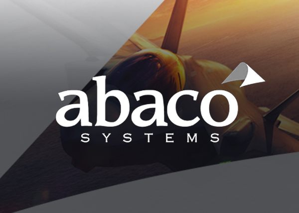
AMETEK, Inc. announced a completed acquisition of Abaco Systems, Inc., a former Bluetext client and a leading provider of mission-critical embedded computing systems. Prior to this recent acquisition, GE and Veritas Capital engaged Bluetext to develop a new name and brand. Thus, Abaco Systems was born and the Bluetext team worked around the clock to create a unique new brand in less than a month. The newly formed company and brand identity hit the ground running, and developed a reputation that caught the eye of AMETEK, Inc. David A. Zapico, AMETEK Chairman and CEO, shares “Abaco’s market-leading computing and electronic solutions nicely complement our existing aerospace and defense businesses, expanding our positions across many attractive growth platforms.”
MAY
Arlington Capital Partners announced a completed acquisition of Triumph Group, Inc.’s composites business. Arlington Capital engaged Bluetext for a new brand, messaging, and website to position the company as a leader in aerospace composites. Under the bold new name Qarbon Aerospace, or QA, stands for ‘quality assured’, representing the company’s relentless pursuit of quality. Bluetext moved fast to create a brand that would make a lasting impression on the market. The logo showcases their commitment to quality, and nod to the industry through the shape of a plane that connects the QA within the logo. The new website included custom photography showing off Qarbon’s core capabilities, as well as a virtual tour that lets users explore Qarbon’s 1,650,000 ft² of state-of-the-art facilities. In a triumphant feat, the company went to market with a high caliber and professional image.

JUNE
Bluetext is pleased to announce the launch of Axient. The team at Axient came to us following a series of mergers and acquisitions for a new name, brand, and website. A rebranding announcement in June publicized the new company name, messaging and brand essence video with an interim landing page for the full website launch. A few months later, Bluetext launched the full Axient website, which united four prior companies’ capabilities. Learn more about our work with Axient.

JULY
Where UX meets XM… In July, Qualtrics, the world’s #1 Experience Management (XM) provider and creator of the XM category, announced the acquisition of Bluetext client, Clarabridge, the leader in omnichannel conversational analytics, in a stock transaction valued at $1.125 billion. In a previous engagement with Bluetext, Clarabridge sought out a new brand and website experience to match their sophisticated AI-powered platform. Bluetext created a digital manifestation of the Clarabridge brand to engage site users and explain the technological and analytical power behind the platform. Through sophisticated 3D animation work, the user experience came alive and communicated Clarabridge’s value — to customers and investors alike!

AUGUST
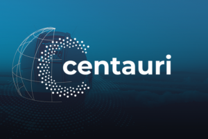
KBR, Inc. announced a definitive agreement with Arlington Capital Partners , a Washington, DC-based private equity firm, to acquire Centauri, LLC. Bluetext developed and launched the Centauri brand, following Arlington Capital Partners’ acquisition of three leading companies in the national security sector. Looking to enter the market with a completely fresh start, the team turned to Bluetext to develop and launch a new unified brand from scratch. In less than 6 months, Bluetext launched the Centauri website with a cutting-edge look and feel that set them apart from the competition. The Centauri logo used a unique icon representing the stars that make up the Centauri constellation, to accentuate the new brand messaging “Brilliance when Great Minds Align”. Their website incorporated all of the brand’s new elements, with intentional design and user experience to prioritize recruitment and growth.
Bluetext client, SpaceIQ, announced a promising merger following strategic investments in the companies by global private equity firms Thoma Bravo and JMI Equity. SpaceIQ, a leading Integrated Workplace Management System (IWMS), space management, and employee experience provider, announced plans to combine forces with iOFFICE, an industry leader in work experience and asset management solutions. Together, the combined organization will address a rapidly growing market opportunity through the most complete offering of smart platforms for managing corporate real estate, physical assets, and workplace experience. Prior to this investment, Bluetext worked with SpaceIQ to launch a powerful new website that solidified a merger of three brands. The fully responsive and intuitive site was designed to showcase their breadth of offerings, multiple product lines and a united company mission. The new site ensured the three legacy brands’ relevant products were clearly identifiable, yet balanced by cohesive branding and streamlined user journey.

SEPTEMBER
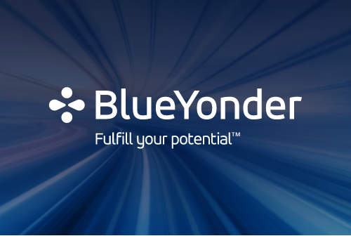
This September, Panasonic announced the completed acquisition of Bluetext client, Blue Yonder, the leading end-to-end, digital fulfillment platform provider. This transaction, valued at $8.5 billion, intended to accelerate Panasonic’s and Blue Yonder’s shared vision for an Autonomous Supply Chain™. Months prior to this acquisition, Bluetext worked with BlueYonder to update their website to match the constantly evolving nature of their business. In the midst of a rebrand, Blue Yonder sought out Bluetext to help transform its brand in the digital space. In a feat of innovation and animation, the new website illustrated Blue Yonder’s new brand and potential investment value to all users.
NOVEMBER
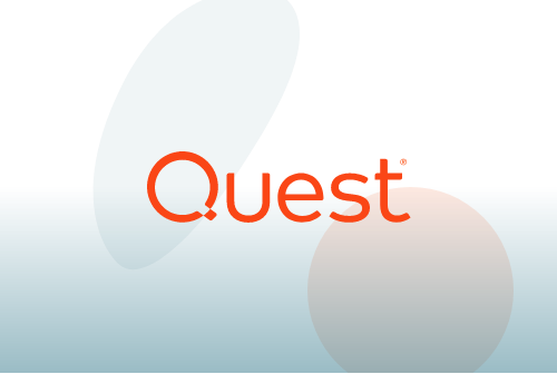
Clearlake Capital announced the purchase of Bluetext client, Quest Software, for a reported $5.4B. Prior to this acquisition, Quest came to Bluetext looking for help in repositioning them in the market with new messaging and revamped corporate visual identity. After an extensive research process, Bluetext developed Quest’s new corporate positioning, and new tagline, “Where Next Meets Now” to represent how Quest can help you conquer your next challenge with confidence. New messaging complemented by a refreshed visual identity and website helped achieve a more modern, and approachable corporate visual identity. Shortly after this engagement, they were approached by Clearlake Capital with investment interest, and ultimate acquisition.
DECEMBER
Closing out the year on a high note, and celebrating 38 times now, a Bluetext client has been acquired or has announced a public offering following an engagement with us! Just days ago, Bluetext client, BigBear.ai, a leading provider of artificial intelligence (“AI”), machine learning, cloud-based big data analytics, and cyber engineering solutions, and GigCapital4, Inc, a Private-to-Public Equity (PPE)TM entity, announced the completion of their business combination. This big news coincides with BigBear.ai’s debut as a publicly-traded company. Commencing trading on the NYSE on December 8, 2021, under the new ticker symbols “BBAI” and “BBAI.WS,” this transaction values BigBear.ai at a $1.378 billion pro forma enterprise value.
What a year 2021 has been for Bluetext client success! Stay tuned to see what 2022 holds. And if your company is looking for a new brand or website in the new year, contact us to learn more. As the last 12 months have shown, repositioning yourself in the market can lead to major opportunities.
Scroll-based animation offers all the benefits of on-page animation and more. Not only do pages with scroll-based animation engage users more effectively, but they can also tell more complex stories, improve page load time, and expand the capabilities of your brand identity.
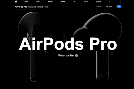
Some stories are best told visually, and scroll-based animation is an effective way to make complex stories simple and elegant. Designers can use animation to guide users as they scroll, catching their eye at exactly the right time and place. Apple incorporates subtle animations into its product pages to drive user focus toward key information they want to highlight.
Scroll-based animation can offload elements beneath the virtual “fold” from the initial loading process, decreasing overall load time. Elements above the fold are prioritized in the initial load, saving time on down-page items that are animated to appear as the user scrolls down.
Implementing scroll-based animation provides the opportunity to add animated elements to your brand. Whether they’re completely new, or existing pieces that have been updated with motion, animated elements can help bring your brand to life. Elements like a scroll-based footer or call-to-action can be used across a website to consistently call attention to key information about your brand.
Key Tips for Scroll-Based Animation
Getting started with scroll-based animation can be tricky, so here are a few pointers to keep in mind as you go.
- Timing is everything. The flow of the animations as a user scrolls down the page is key to maintaining their interest. As a user moves down the page, elements should naturally animate or appear, so there are no gaps in the experience. A simple, well-timed scroll-based animation is always better than a complex but awkward one.
- Added effects should emphasize key information, not detract from it. Keep in mind that the whole point of on-page animation is to make it easier for users to navigate your site and find what they’re looking for. Be sure that any effects or animations make their experience easier, not more difficult.
- Less is more. When in doubt, simplify. Avoid cluttering your site by animating every element on a page or by introducing particularly drawn-out animations for no reason. As a rule of thumb, smaller elements should have shorter animation cycles, and each animation should have a purpose in guiding the user experience.
Looking for inspiration?
Clarabridge’s animated homepage brings the brand to life and elevates the user experience. On-page effects guide the user through the homepage, emphasizing the strength and ease of Clarabridge’s solutions. Click here to read our case study on this project.
HuffPost’s interactive article, Chef Jose Andreas Embraces the Chaos, is an example of “scrollytelling,” which uses scroll-based animation to enhance a written story. Hand-drawn visuals appear as the reader scrolls through the story, adding a playful, personal feeling to the page.
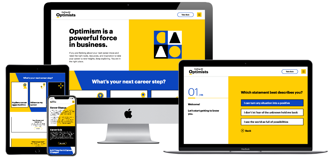
For Calling All Optimists, Bluetext incorporated subtle scroll-based animations throughout the site to draw attention to key information or calls-to-action. Along with the brand’s playful shapes and colors, these animations reinforce the positive, dynamic qualities of the site. Click here to read our Calling All Optimists case study.
Ready to see how scroll-based animation can enhance your site? Contact Bluetext to learn about our motion design and interactive UX services.