Since Bluetext’s founding in 2011, the agency has experienced stellar growth in size, expertise, and creativity. So much so that our brand and logo were beginning to feel tight and outgrown. Some healthy self-reflection left us realizing an evolution was necessary.
Watch our brand evolution
With our clients, we often consult on the pros and cons of a brand evolution vs. revolution. For Bluetext an evolution meant keeping the core aspects that defined our brand, like the name, logo symbolism, and obvious color choice. Anything other would run the risk of appearing like an IHOB-level stunt. We love the name and meaning behind Bluetext. Just as when you apply a link to text the color changes to blue, applying Bluetext to your brand becomes the digital doorway to your brand. It highlights our digital focus and positions the agency as ambiguous to the multitude of services and specialties we offer. Aside from that, the name “Bluetext” is internally joked to be rooted in our project managers’ love and developed muscle for hyperlinking, which we cannot confirm nor deny.
Even with the core ingredients solidified, so many elements were up in the air for modernization. Bluetext’s creative director, Kevin Galligan, led the charge with a redesigned logo to inspire the complete CVI & eventual website design.
Some key principles to remember during any sort of brand development are:
- Be associated with something
- Protect your identity
- Consistency is key
- Never say no to evolving
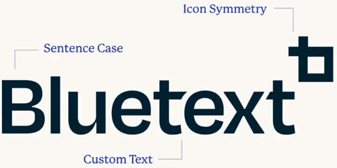
For Bluetext, our brand identity centered around our logo icon, which previously formed the lowercase ‘b’ and ‘t’ of the wordmark. We had become associated with this symbol, often adopting a shorthand abbreviation of BT, diving into the straightforward angles as a reminder of our values. But as the agency has grown, we felt it only fair the logo should grow up too. In this evolution, we were careful to guard our brand’s identity and legacy, but apply stylistic tweaks to elevate the core designs. The lowercase style was replaced with a sentence case and a new font. The logo icon was upgraded to symmetrical angles that matched the new custom lettering, but still preserved origins within the ‘B’ and ‘t’ angles.

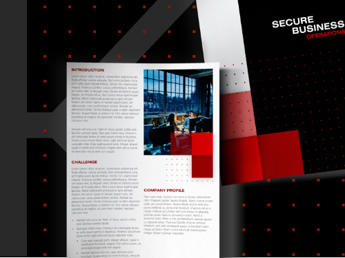
Minimal doesn’t mean simple. The evolved logo is intentional down to every angle, which becomes leveraged throughout the pattern systems of the CVI. Leaning into our core logo symbol, the outlined shape became a pattern system repeated across our website & collateral. The most noticeable change to the brand was the color shift from a light blue to a rich cobalt blue. In the spirit of consistency and honoring the name ‘Bluetext’, a blue-based palette was adopted. But monochromatic does not mean monotone. Our creative team took this rebrand as an opportunity to surge new energy into the secondary color palette choosing energetic aquas and navy tones, complemented by cream, white or black.
As a brand development agency, our evolved brand identity has made us all the more energized for the coming new year, and inspired to do the same for our clients. Could your company’s brand use a little glow up too? Whether you’re ready for an evolution or full revolution, check out what Bluetext can do for you.


