Behind the Brand
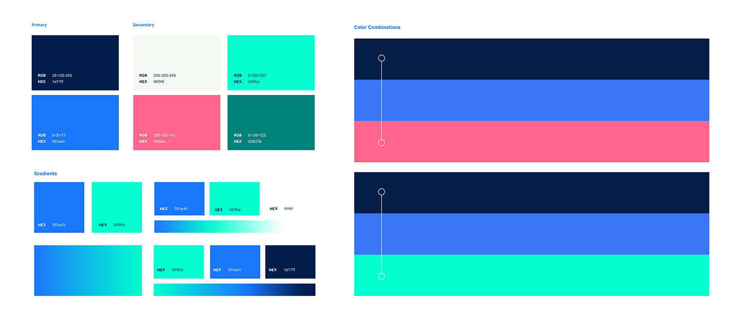
Certainty in software is the crux of Cybeats mission, and the brand identity needed to reflect this value. The checkmark was selected as a universally acknowledged symbol of certainty, and scaled to new creative heights. The curvatures of the check were used in image masking as well as overlays to provide max flexibility in the brand system. Keeping with a trustworthy blue core palette, the brand was reinvigorated with a vibrant secondary palette that could be used as accents to the consistent cool color scheme.

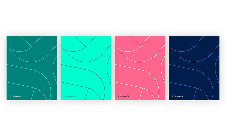
Curated Key Art
To communicate Cybeats value across their vast range of customers, Bluetext developed a verticalized key art strategy that depicted key brand elements within industry specific use cases. Depicting abstract concepts and softwares was an obstacle to brand imagery in the past, but Bluetext’s creative solution artfully integrated the signature checkmark which composes the Y of the logo into scenes where technology protected by Cybeats products would be utilized.

Scaled Across Verticals