So you’re a top technology company who wants to be seen as modern and ever-evolving — much like the rest of the industry! To stay ahead you’ll need a modern, eye-catching design. Perhaps you want to redesign your logo… Where do you start? A memorable logo can ensure your brand stays top of mind and up to par with big-league competitors. Updating any aspect of your corporate visual identity can be intimidating, especially when making changes to one of the most identifiable features. There are many considerations: How can you establish or maintain your brand identity and form a strong connection with your audience? Do you want to fit in or stand out? How can you modernize your existing design?
One way to begin the process of redesigning your logo is by identifying some “zigs” and “zags” in your industry. Digital branding agencies define “zigs” as companies that follow industry standards and recent trends when designing and marketing their brands and “zags” as designs that opt to stand out in the crowd by moving against the latest trends.
Tech Industry Zigs
Gradient
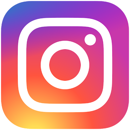
Using gradients in web design emerged as a hot trend as early as 2016 and has since grown in popularity with no signs of slowing down. There are several companies that have successfully incorporated this trend into their CVI, for example, Stripe, an economic infrastructure technology company. Stripe’s gradient style has become incorporated throughout the brand and website, creating an ethereal and futuristic feel to its services, Instagram can be seen as one of the OG trendsetters, debuting gradient design into their mobile app icon in 2016.
Minimalistic
Another recent trend has been the simplification of logos and website design. Many brands have adopted this trend to streamline their CVI. This branding trend aims to provide a clean and clear brand vision, which is ideal for smaller screens as users continue to shift to mobile browsing. As we shift away from decorative and intricate details that look great on a billboard but cluttered on a mobile device, simple logos stay relevant and readable for modern consumers.
Many major global tech brands have already opted to use multiple iterations of their logo design – DropBox, Atlassian, and Android all now include a single image or letter logo option within their design range.
Illustrative
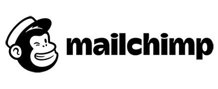
One way to establish a connection with your audience is by designing a unique illustration to accompany your wordmark. A key advantage to this trend is that when done successfully, brands can use the illustration as an identifier without the wordmark. Take Mailchimp’s Freddie as an example. In 2018, Mailchimp simplified their mascot’s design and gave him an established spot next to the logo.
Tech Industry Zags
Fine Line Detail
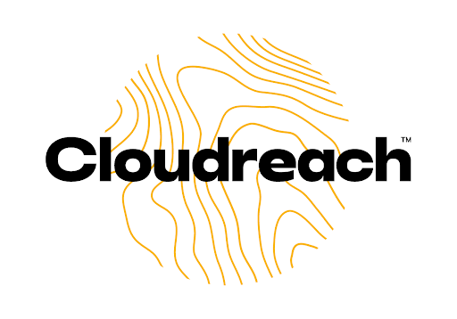
While many tech companies are moving in the direction of simplification, some are going against the grain. One example is cloud migration software company Cloudreach, whose finger-print-like logo detail denotes security and reliability at first glance. Using fine detail has its advantages. Detailed designs can speak volumes about your brand value and tone. Especially in the technology industry rich with complex products you may want your logo to symbolize unique detail and features of your products. In contrast, simplified designs may be preferred to make complex technology more approachable to everyday consumers.
Anti-Marketing
Most technology-oriented marketing campaigns inspire the target audience to use the advertised product or service as much as possible. This statement holds true for most companies looking for customers to download and use their mobile apps. This is also where you can differentiate your campaign to stand out amongst the rest. For example, the newest campaign from the popular dating app, Hinge, inspires it’s the target audience to delete their app. Yes, you read that right. That may sound counterintuitive, however, it guarantees a different approach from their dating site counterparts, who focus on their service being the best at finding love for its users. Hinge’s campaign, instead, inspires its users to find love and delete the app.
Of the campaign, Hinge CMO, Nathan Roth, said “It’s quite common for apps to optimize for time in-app, whether it’s to maximize subscription or advertising revenue. We are purely focused on our users’ success and that’s helping them find someone worth deleting the app for. That’s our single focus,”
Interested in learning more about the zigs and zags of the technology industry? Contact us.