Being a technology company can be tough, there is often pressure to appear futuristic, scientific, or impressively complex. The market often expects the latest and greatest features and widgets, especially in website UX and design. However, not every company is the space-age, robotics, AI-generated stereotype that comes to mind with “tech”. But across all technology companies, there is a shared level of expertise in software and computing that may not be found in the everyday website viewer. Technology companies can easily fall into the trap of flexing their brain power a little too strongly, and overachieving the “tech aesthetic”. And while there are a million ways to design an impressive website, there are a couple of practices that stand out as common pitfalls for technology companies. Bluetext recommends the following as what NOT to do in web design:
Too much content on one page
This is often the result of poor content planning. When a user is overwhelmed with animations, visuals, and walls of text, they lose interest quickly. Focus each page on answering a specific question or describing a specific product, and link out to additional information that you feel is relevant. If there is any “take it or leave it” language on the page, it might be best to leave it.
Too little content on one page
As the saying goes, too much of a good thing can be a bad thing. We appreciate minimal site design when it helps a user find exactly what they’re looking for, but barely-there content doesn’t help anyone. Each page should be thoughtfully designed and written and should provide a user with clear next steps in their journey on your website.
Jargon or unapproachable language
Messaging across the site ought to be crystal clear. Just like having too much content, using complicated language and jargon can deter a user from continuing on your site. We recommend tailoring your content to your audience by considering how they would speak during a conference—widely-understood industry terms are acceptable, but should be embedded within digestible, humanized language. When customers can easily understand your product language, they gain confidence in your brand.
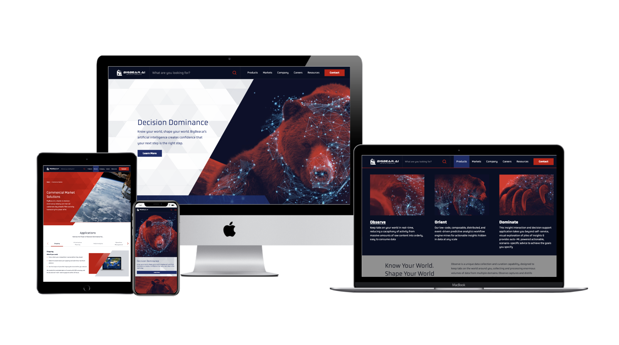
Recently, Bluetext partnered with BigBear.ai to develop a new messaging strategy that frames them as a leader in their field while explaining their highly-technical product with accessible language. As a result of this partnership, BigBear.ai is able to strike a balance between technical and approachable language, and build trust with its audience. To learn more about this project, click here.
Falling into the trap of trends
We see this most often when personal taste takes precedence over user experience. Some trends have staying power and can help you stand out from out-of-the-box websites. Some trends, though, are fleeting.
When adopting new web design styles, carefully consider the relevance of each trend to your brand and your users. More often than not, the best thing you can do for your users is to be consistent. They want to know what to expect from your website, so as you explore trends, it’s good to meet (or exceed!) those expectations.
No clear CTA
Each page on your site should provide clear, relevant next steps. This could take the form of related resources at the bottom of the page or quick links to associated product pages. Whichever next steps you choose to display, they should proactively provide the user with additional information related to the page they’re on. This practice is also helpful with interlinking content across your website, which can boost your search rankings.
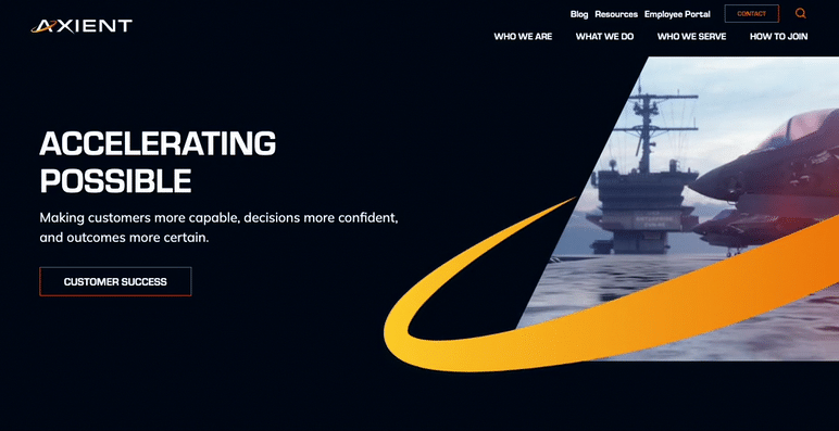
For a great example of CTA placement throughout a site, check out Axient’s website. Bluetext worked with Axient to devise a comprehensive website strategy that would optimize the user journey and maximize conversions. To read more about this project, click here.
Poor mobile experience
More than half of users will leave a page that takes more than a few seconds to load on mobile, according to Google. Given that mobile use is steadily increasing year-over-year, this means that the longer your site takes to load, the more users you could be losing to competitors.
One solution for the mobile-desktop conundrum, as recommended by Nielsen, is to have a mobile site separate from your desktop site. This will allow you to pare the mobile experience down by removing content and features that are only relevant to desktop users. To see how your site’s mobile experience stacks up, try out Google’s Mobile-Friendly Test.
At the end of the day, the best thing you can do for your website is to design and write with your end-user in mind. A site that works for them is a site that works for you.
To learn how Bluetext can help you avoid these mistakes, get in touch with our web design experts today.