Pagination – a seemingly simple yet immensely impactful element of web design and content organization. One that can transform an overwhelming scroll into a series of inviting steps, prompting exploration and easing the burden of information overload. In this post, we’ll uncover the essential role pagination plays in enhancing user experience and strategies to create a seamless, page-turning digital journey for all who venture online.
PAGINATION IMPORTANCE
Pagination is a user-friendly approach for the display and management of large volumes of information on a website. In contrast to infinite scrolling- or, a continuous flow of content that automatically loads as the user scrolls down the page- pagination involves creating a system of numbered links or buttons that allow users to navigate through different pages or sections of content and data. This is a critical tactic in website design as it significantly enhances usability.
When used strategically, pagination can positively impact user experience in the following ways:
- Easier access to relevant content. While infinite scrolling can provide an immersive experience, it can be difficult for users to locate specific information or access footer navigation. Pagination enables users to quickly locate the content they’re interested in and can significantly reduce the length of a page, making it easier for users to reach the footer.
- Maintains a balance between aesthetics and function. Cluttered interfaces with endless scrolling can lead to a clunky user experience. Pagination offers a clean and structured layout, preserving the overall coherence and readability of the website’s design. Not only does this enhance the visual appeal of the website, but allows users to enjoy a more intuitive browsing experience.
- Simplifies content consumption. Without pagination, websites featuring extensive articles, product listings, or search results could become overwhelming and tedious to navigate. By breaking down content into smaller, manageable chunks across multiple pages, users can easily digest information without a sense of frustration.
- Responsive Design: Pagination can also contribute to a more responsive design, especially on mobile devices. Large volumes of content on a single page can be challenging to render properly on small screens, while pagination allows for a more adaptable and user-friendly presentation.
- Faster Load Times: With infinite scrolling on a long page, you’re constantly loading more and more content into memory. This hurts page performance since the browser has much more work to do to load the page. By spreading content across multiple pages or views, pagination reduces the amount of data that has to render and transmit on initial page load. This leads to a faster and smoother browsing experience for users, including those who may have slower internet connections or limited bandwidth.
In addition to positively impacting user experience, pagination also plays a crucial role in improving web accessibility by making it easier for users of all abilities to access and interact with the content effectively. Here are a few of the ways pagination helps ensure that content remains digestible and navigable for those with disabilities or impairments:
- Reduced Cognitive Load: Individuals with cognitive disabilities can often find it challenging to process large amounts of information presented on a single page. Pagination breaks down content into smaller, more manageable segments, reducing cognitive overload and making it easier for these users to understand and engage with the material.
- Improved Screen Reader Experience: Screen readers- tools used by people with visual impairments- navigate web pages by reading out the content in a linear fashion. With pagination, the content is presented in a structured manner, allowing screen readers to provide better context and enable users to explore the information more efficiently.
- Keyboard Navigation: Some users rely solely on keyboard navigation due to motor impairments or other reasons. Pagination provides clear landmarks and links, enabling these users to move through the content with precision. It prevents the need to scroll through an overwhelming amount of data, making navigation smoother.
- Predictable Interaction: Consistent and predictable user interactions are vital for accessibility. Pagination offers a standard way for users to move between pages, ensuring that individuals who rely on assistive technologies can anticipate and understand how to navigate the website’s content.
To sum it up, pagination prevents information overload, allows for ease of use, and improves navigation, all of which collectively contribute to a more user-friendly, inclusive, and satisfying experience on a website.
PAGINATION TYPES AND USES
In web design, different types of pagination styles can be employed to enhance user experience and navigation. Each style offers a unique way of presenting content across multiple views. Let’s break down some of the most common pagination styles and when they should be used:
- Numeric Pagination: This is a classic pagination style that involves displaying a series of numbered links that correspond to different pages of content. Numeric pagination is suitable for websites with a substantial amount of content, such as articles, blog posts, or search results. It provides users with a clear overview of the available pages and allows them to jump to specific sections directly.
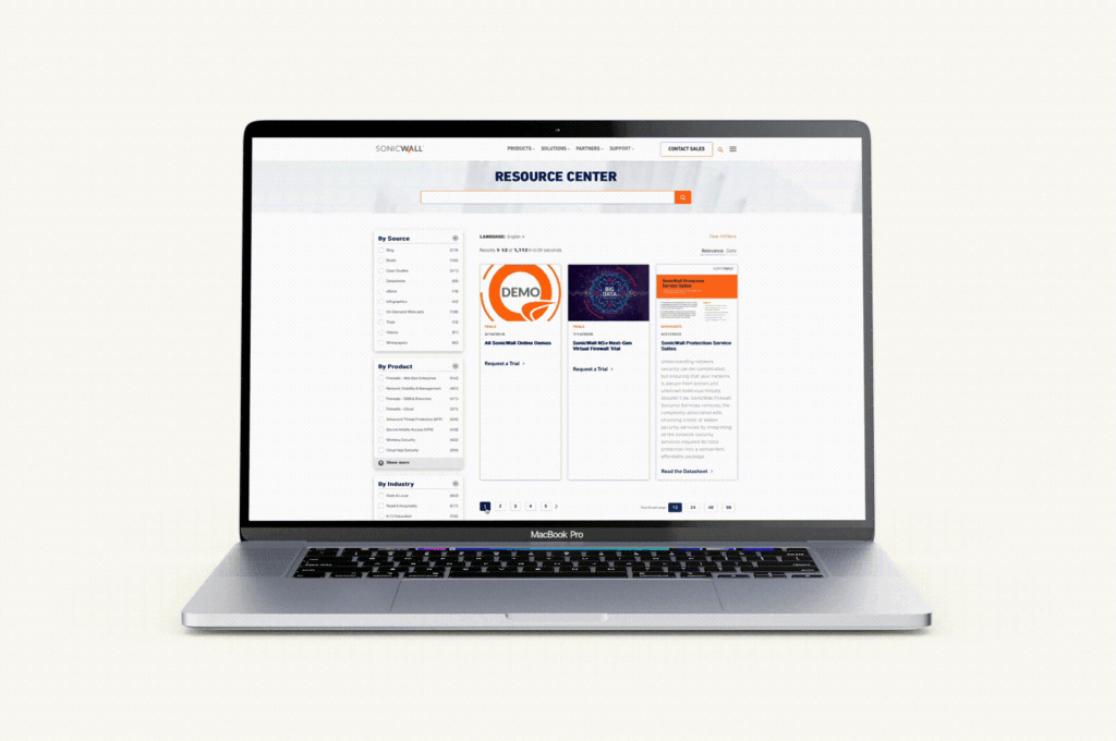
Check out our SonicWall work here
- Prev/Next Pagination: Prev/Next pagination employs “Previous” and “Next” links to navigate between pages sequentially. This style is suitable for content that follows a linear progression, such as articles or blog posts. It’s a simple and intuitive approach that is especially useful when users prefer to read content in a specific order. See this approach in action on the Bluetext blog — and read some more UX tips and tricks while you’re at it!
- Alphabetical Pagination: Alphabetical pagination categorizes content based on alphabetic characters, allowing users to jump to sections of content starting with a particular letter. Alphabetical pagination helps organize a large amount of data in an easily accessible manner and is most often used for directories, glossaries, or indexes.
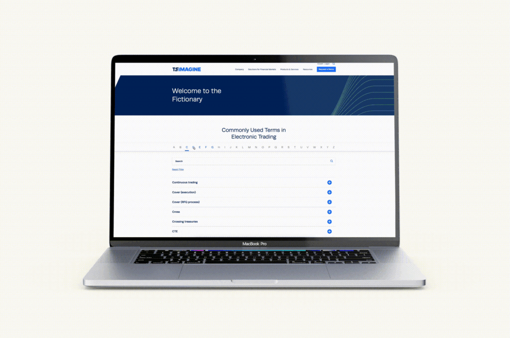
Explore more of our TS Imagine work here
- Date-Based Pagination: Date-based pagination organizes content by date, often seen in archives, news websites, or event listings. Users can navigate through different periods of time to find relevant information. This style helps users discover content based on chronological relevance.
- “Load More” Button: Instead of traditional pagination links, the “Load More” button dynamically loads additional content as the user progresses down the page. This approach is a strong alternative to infinite scrolling, allowing for the same seamless feel and browsing experience while minimizing page reloads and giving users control over when to retrieve new content. “Load More” is commonly used for social media feeds, image galleries, and continuous content streams, as well as robust listings like Google search results.
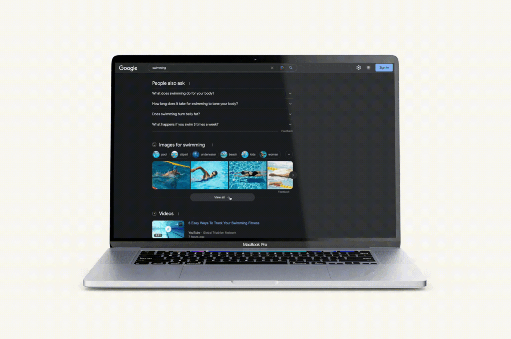
Google search listings recently upgraded from a simple, numeric pagination to a dynamic scroll and load more experience.
When choosing a pagination style, it’s important to consider the type of content you’re presenting, user preferences, and the platform’s goals. The chosen style should align with the overall user experience strategy, offering convenience, clear navigation, and a seamless interaction that caters to the specific needs of your audience and the nature of the content being displayed.
Ready to pump up your pagination or revamp your website with the help of a leading digital design agency and UX experts? Get in touch with Bluetext today and let us transform your digital brand experience, one page at a time.
User experience and personalization was the top trend for website development, and it will continue to be for 2018. Designing and executing the best architecture for a website engagement and conversion, while offering the right content at the right time to improve SEO and move prospects through the sales funnel, needs to be every marketing executive’s top priority. It remains a process of emotional transformation for many organizations, as top executives push still need to be convinced that creative design alone isn’t going to make their website the business tool that it needs to be.
With that in mind, here are our top tips for creating websites with user design as the first and foremost priority:
- Personas are evolving. It’s easy to look at personas as a type of user who fits into certain common demographic categories. In the political arena, for example, a typical persona might be the “soccer mom,” shorthand for suburban mothers in the 30-45 age range whose main concerns are focused on their children. That makes sense for political purposes, but it gives little insight into how people actually engage with a website. We are recommending grouping personas into categories according to what they want to do on the site. Is it browsing, comparison shopping, or looking for specific content in order to make a decision. Recognizing these groupings offers more useful insights about what they want from their experience, and how best to deliver that content when they want it.
- Less is more. It’s easy to clutter up a website with tons of promo boxes and fly-out menus. But the goal is to make it easy for visitors to find what they are looking for and take the actions that we want them to take. Instead, design the home and landing pages to reduce the tasks required of users to the bare minimum. Make it simple, and get rid of all the clutter that doesn’t add value or that serves as a distraction.
- Design the user experience. Remember that designers are always working on large monitors with the best resolution. Unfortunately, most users are on laptops, tablets or mobile devices. User design for that reality shouldn’t be an afterthought. Visual hierarchy, spacing, content grouping, positioning, and size should be solved in the wireframe process before a visual designer is passed the assignment.
- Take a field trip. There’s an old adage in real estate that says the more houses a homebuyer visits, the more likely they are to know the one they want when they see it. That’s why one of the early steps in our design process is an extensive virtual field trip to explore design elements in scores of websites across multiple industries. The idea is to show the client team the wide range of user designs that are out there on the web and to react to the design elements and functionality in multiple settings. We watch their faces closely during this exercise to see what they respond to, and to give them the confidence of knowing it when they see it.
- It’s all about the user. It’s easy to gravitate to what you like for the website based on your own preferences. But it’s not about you, it’s about your customer and the user experience. While tempting to select design elements with your own preferences and tastes in mind, that won’t help engage your target audiences if they have a whole different set of preferences and needs. Always remember that it’s about what users want to do. Our job is to help them to get the content and take the actions they want in the easiest and most intuitive way possible.