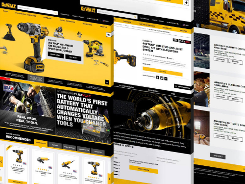
Scroll-based animation offers all the benefits of on-page animation and more. Not only do pages with scroll-based animation engage users more effectively, but they can also tell more complex stories, improve page load time, and expand the capabilities of your brand identity.
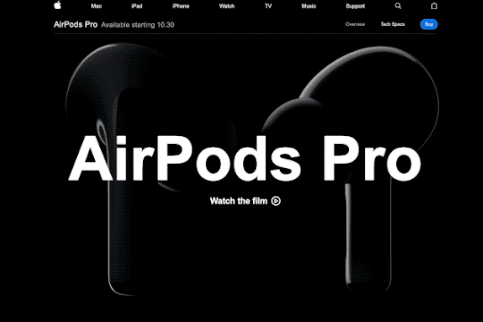
Some stories are best told visually, and scroll-based animation is an effective way to make complex stories simple and elegant. Designers can use animation to guide users as they scroll, catching their eye at exactly the right time and place. Apple incorporates subtle animations into its product pages to drive user focus toward key information they want to highlight.
Scroll-based animation can offload elements beneath the virtual “fold” from the initial loading process, decreasing overall load time. Elements above the fold are prioritized in the initial load, saving time on down-page items that are animated to appear as the user scrolls down.
Implementing scroll-based animation provides the opportunity to add animated elements to your brand. Whether they’re completely new, or existing pieces that have been updated with motion, animated elements can help bring your brand to life. Elements like a scroll-based footer or call-to-action can be used across a website to consistently call attention to key information about your brand.
Key Tips for Scroll-Based Animation
Getting started with scroll-based animation can be tricky, so here are a few pointers to keep in mind as you go.
- Timing is everything. The flow of the animations as a user scrolls down the page is key to maintaining their interest. As a user moves down the page, elements should naturally animate or appear, so there are no gaps in the experience. A simple, well-timed scroll-based animation is always better than a complex but awkward one.
- Added effects should emphasize key information, not detract from it. Keep in mind that the whole point of on-page animation is to make it easier for users to navigate your site and find what they’re looking for. Be sure that any effects or animations make their experience easier, not more difficult.
- Less is more. When in doubt, simplify. Avoid cluttering your site by animating every element on a page or by introducing particularly drawn-out animations for no reason. As a rule of thumb, smaller elements should have shorter animation cycles, and each animation should have a purpose in guiding the user experience.
Looking for inspiration?
Clarabridge’s animated homepage brings the brand to life and elevates the user experience. On-page effects guide the user through the homepage, emphasizing the strength and ease of Clarabridge’s solutions. Click here to read our case study on this project.
HuffPost’s interactive article, Chef Jose Andreas Embraces the Chaos, is an example of “scrollytelling,” which uses scroll-based animation to enhance a written story. Hand-drawn visuals appear as the reader scrolls through the story, adding a playful, personal feeling to the page.
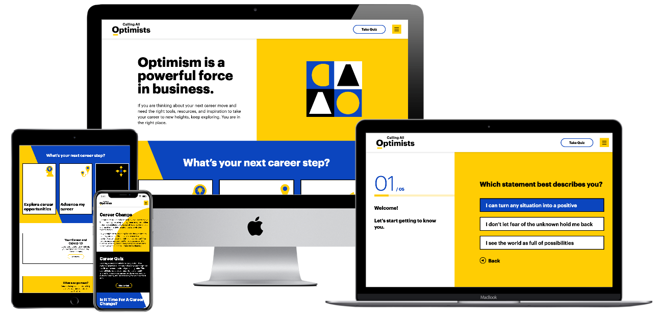
For Calling All Optimists, Bluetext incorporated subtle scroll-based animations throughout the site to draw attention to key information or calls-to-action. Along with the brand’s playful shapes and colors, these animations reinforce the positive, dynamic qualities of the site. Click here to read our Calling All Optimists case study.
Ready to see how scroll-based animation can enhance your site? Contact Bluetext to learn about our motion design and interactive UX services.
Recent Posts
Bluetext’s Recent Work