It’s no secret that after a year of virtual, well, everything, people have entered into a phase of “digital fatigue”. Dr. Alexander Aizman, a New York-based physician and surgeon has coined this term to describe “the physical discomfort that is experienced after prolonged exposure to a digital screen”. Ever been shocked when your iPhone sends your weekly screen time report? It’s no wonder people are growing weary of the time spent on digital devices…
When COVID-19 forced the world online a little over a year ago, device use increased as many calls, events, and other in-person interactions became video conferences. Everything from professional networking, to personal tasks like ordering groceries, quickly pivoted to digital platforms. With people rejecting increasing screen time and looking to alternatives that allow them to avert their eyes, designers must establish a way to create enticing experiences in the midst of digital fatigue.
Cut Down on Blue Light
One way to switch things up is to create an alternative, dark mode experience for users. Dark mode isn’t just a trendy aesthetic, it is actually backed by UX research and health studies to benefit users. The majority of websites we interact with on a daily basis leverage white or light color-dominant backgrounds and excessive exposure to this can cause eye strain, dry eyes, and even disrupt our sleep cycles.
Allowing users to choose their experience, or programming a design that is time responsive, and will automatically update to dark mode for evening and nighttime hours based on the user’s location, can provide a break from all of the white space.
To learn more about ways you could incorporate dark mode into your designs, read our previous blog post.
Break Up the Monotony
Spending the majority of the day on screens and devices of various sizes can become exhausting for a number of reasons. Particularly if you are reading large amounts of online text content. When designers approach a new interface or even just a new landing page, it’s important to always keep the audience, and the environment, in mind.
Think of a trip to the museum…it can be a great outing until the initial excitement wears off when each exhibit feels the same. Walking around and reading long content labels, in every roped-off section can only retain attention levels for so long. Yet when there is an interactive exhibit, the interest returns, and the learning and engagement experience offers a higher reward. The same concept applies to online businesses, websites that receive more engagement and interest offer a higher ROI.
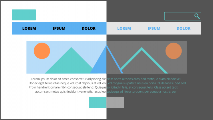
Utilizing interactive content, whether it be diagrams, comparison tables, or even simple graphics, can break up long walls of text. Inviting users to interact with content and bringing in visual elements that convey information in easy to grasp and easy-to-understand ways will improve the users’ overall experience.
Introduce Motion and Movement
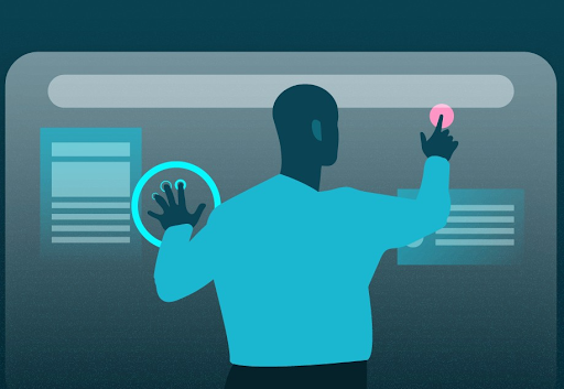
One notable way to make sure your users connect with content and accompanying design is to create experiences that introduce motion. Static content requires the user to continue scrolling or navigate to other pages and can quickly become repetitive and uninteresting. Incorporating movement into your design as users interact with the page can create a unique experience that will build interest and encourage interaction.

All of the techniques mentioned above bring exciting alternatives to custom designs, and avoiding digital fatigue will ensure users have positive online experiences.
If your website could benefit from a boost in online engagement and website interaction, you’ve come to the right place. Contact Bluetext to learn about our services in UX design, motion graphics and interactive website development.