If you’ve ever launched a digital marketing campaign, you know how much time and attention is poured into the creative, copywriting, and media placement strategy. And once you’ve finally reached the finish line, eagerly awaiting the results and new leads to pour in, you’re met with: crickets. Plenty of impressions, and plenty of clicks, but crickets of silence when it comes to conversions. You’re left scratching your head wondering where the drop-off has occurred. Chances are, your landing page may not be optimized to meet expectations. Conversion rate optimization is a complex process that involves multiple variables and often a great deal of testing. However, the form UX is a consistent driver of campaign success or lack thereof. Bluetext, a leading digital marketing & campaign agency, breaks down some contact form best practices that can help ensure the success of your next marketing campaign.
A popular tactic to increase the likelihood of form completion is minimizing the number of fields to make your form seem as quick and efficient as possible. This means reevaluating what information is critical versus what is nice to have for your sales team. For most companies, more information than just a name and email address is necessary for lead qualification and to begin sales reach or retargeting. Eliminate any fields that aren’t required from your default contact form and consider additional UX tricks to make a form seem less intimidating.
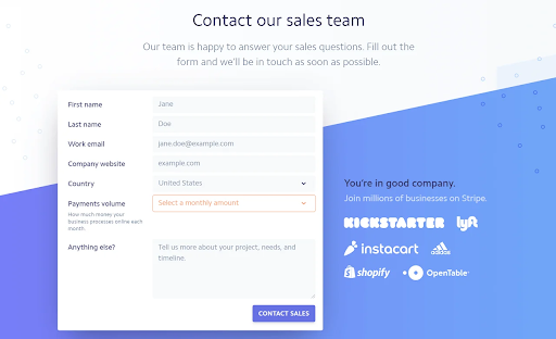
- Adjusting the form layout to improve scannability. While a double-column form will decrease the length, research shows that single-column formats are faster for users to complete and easier for the eye to scan (not to mention they are more compatible with mobile devices).
- Consider the order in which you are asking for the information. Ask the easier questions up front (like first and last names) and more specific information (like company revenue size) later. This makes the form appear more manageable at first glance.
- Group related information together in steps, and if the form is progressive or contains multiple steps be sure to indicate what steps have been completed and which remain.
- Make field labels clear and concise to describe the information requested and indicate whether it’s mandatory or optional.
- Leverage easy radio buttons for questions where you want a single answer from a limited number of possible options (for example Yes / No questions or “Pick from these choices” )
- Using a colorful background to your form also can increase the completion rate, as it creates more contrast between the information field and page. It draws the eye to the form and can build stronger brand associations.
- Implement error handling in-line and early on. Check for potential problems with the data immediately as the user enters text into a form field and presents any errors and solutions at the moment, rather than waiting until later (post-submit). Error messages should be visible, provide sufficient visual identifiers (the color red, error symbols), and articulate the problem in plain language and how it can be resolved.
- Provide key proof points & relevant benefits directly next to the form – this positions the persuasive information directly next to the action, making the requested next step (completing the form) as convenient and easy as possible.
If your landing pages need some love, or perhaps just a third-party eye with conversion rate optimization (CRO) expertise, contact Bluetext to learn about our campaign services.
Recent Posts
Bluetext’s Recent Work