If you’re a government contractor, you know SAM.gov is a must. It’s the gateway to doing business with the federal government, the baseline requirement for eligibility, and a compliance necessity. But here’s the hard truth: being listed on SAM.gov alone does not make you a competitive strategy. In today’s federal procurement landscape, a modern digital presence is just as critical as your contract vehicles.
Your website, social presence, and digital credibility often speak louder than a registration number. Procurement officers, prime contractors, and agency decision-makers increasingly research vendors online before reaching out. Simply put, SAM.gov tells them you exist—but your digital brand tells them why they should care.
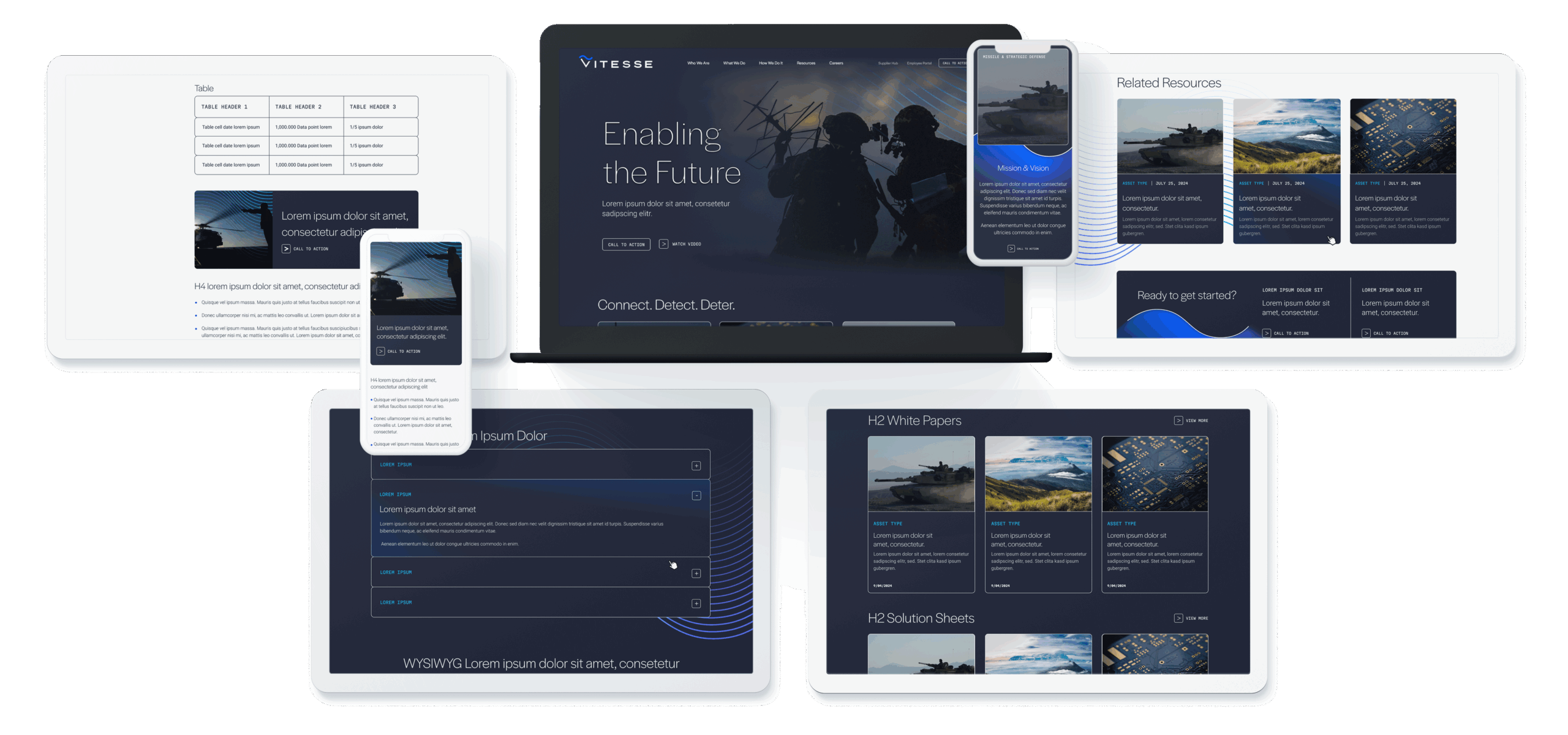
The Modern GovCon Buying Journey Has Changed
The federal buying journey has evolved. Buyers don’t wait until an RFP drops to assess potential partners—they research online, attend virtual events, and review thought leadership long before formal procurement processes begin.
Consider this: more than 70% of B2B buyers—federal included—conduct online research to vet potential vendors. They evaluate websites, social media profiles, and digital content to judge credibility and capability. A contractor with a strong digital footprint signals readiness, expertise, and reliability in ways that a SAM.gov listing simply cannot.
In essence, the playing field has shifted. Eligibility is required. Visibility and trust are differentiators.
The Problem with Relying on SAM.gov Alone
SAM.gov is static. It lists entities and contract vehicles but does not communicate value propositions, innovation, or performance history. Agencies don’t use SAM.gov to discover new vendors—they use it to verify credentials.
This leaves a gap: contractors who rely solely on SAM.gov may be invisible during early research stages. Two vendors could hold identical GWACs or IDIQs, yet the one with a polished website, active thought leadership, and consistent social presence will stand out. The question isn’t whether you’re compliant—it’s whether you’re compelling.
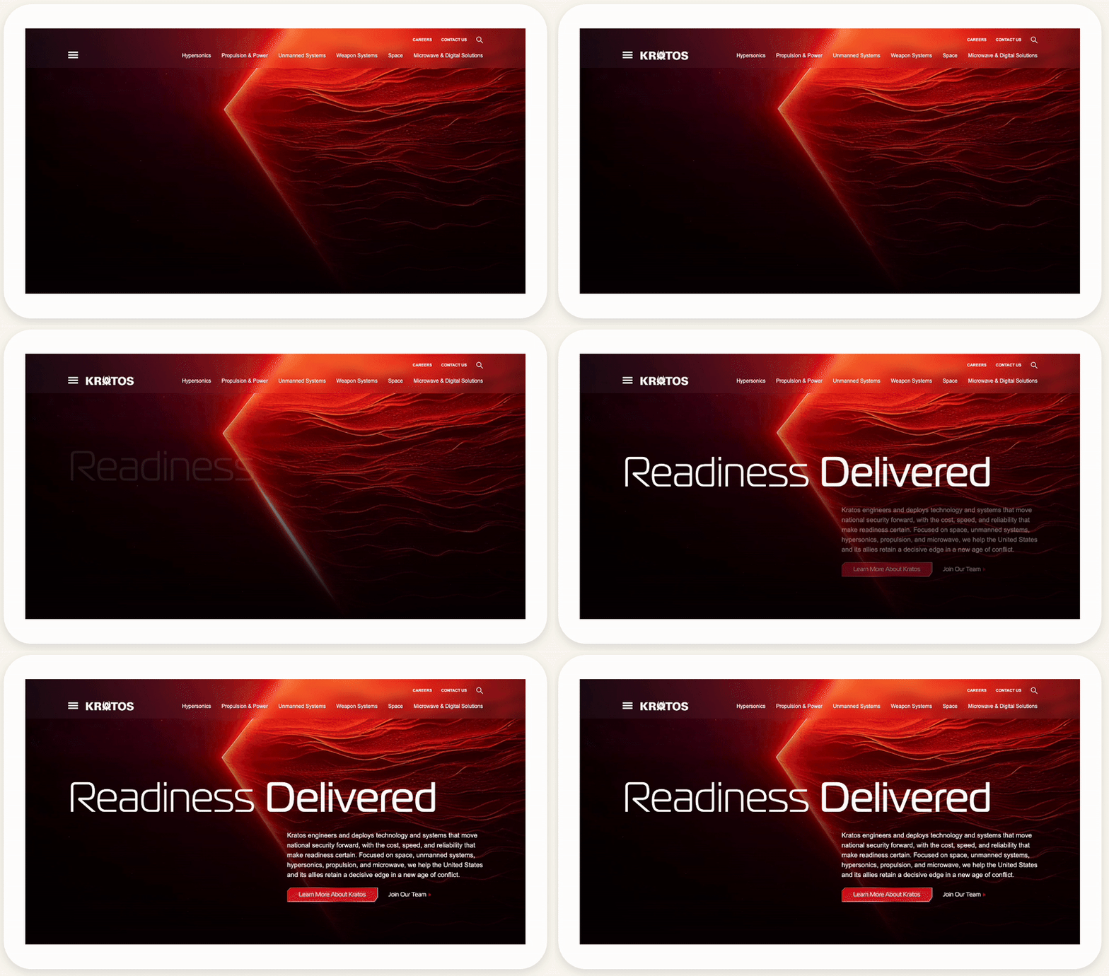
Digital Best Practices for GovCon Brands
Investing in your digital presence is no longer optional. Here’s how contractors can elevate their digital strategy:
1. Modernize Your Website
Think of your website as your digital contracting office. It should be clear, credible, and user-friendly. Include:
- Capabilities statements and case studies
- Contract vehicles and certifications
- Team and leadership profiles
- Mobile-friendly design and Section 508 compliance
A strong site demonstrates professionalism and operational readiness, making it easier for decision-makers to trust you.
2. Tell a Clear Brand Story
Your brand story sets you apart. Focus on:
- Mission alignment and impact
- Differentiators beyond contract numbers
- Visuals and messaging tailored to federal audiences
A concise, compelling narrative makes your brand memorable and positions you as a thought leader, not just a vendor.
3. Build a Thought Leadership Engine
Content is credibility. Develop insights on procurement trends, modernization efforts, or technical innovations. Publish blog posts, white papers, or LinkedIn articles that show your expertise. Position executives as industry voices to build trust and influence early-stage research.
4. Leverage SEO and Paid Media Strategically
Optimized digital content helps buyers and partners find you. Focus on:
- Keywords relevant to federal procurement and your niche (e.g., “cybersecurity modernization contractor”)
- Targeted paid campaigns to reach agency decision-makers and prime contractors
- Conversion tracking tied to forms, downloads, or event registrations
SEO and paid media extend your visibility beyond SAM.gov, helping you compete for attention where research starts.
5. Strengthen Digital Credibility
Consistency matters. Maintain a professional brand across your website, LinkedIn, industry directories, and proposals. Highlight contract vehicles, certifications, and partnerships. Incorporate testimonials or case summaries to validate performance. Every touchpoint should reinforce that your brand is capable, reliable, and mission-focused.

Measuring Digital Maturity in GovCon Marketing
Digital success is measurable. Key metrics include:
- Website traffic and engagement from federal IP ranges
- Inbound inquiries from teaming partners or agencies
- Search visibility for capability-specific terms
- Content engagement and social impressions among government audiences
Analytics not only track outcomes—they inform iteration. By understanding how your digital presence resonates, you can optimize content, adjust messaging, and enhance brand impact.
Visibility That Wins Beyond SAM.gov
A strong digital presence translates to tangible benefits:
- Attract more teaming partners: Primes prefer vendors who look ready and capable online.
- Stand out in market research: Agencies notice brands that demonstrate expertise through thought leadership and compelling messaging.
- Shorten capture cycles: Clear, accessible, and credible content reduces friction during evaluation and decision-making.
Investing in digital strategy ensures that your SAM.gov listing becomes more than compliance—it becomes the starting point for a living, breathing brand that signals competence and trustworthiness.
How Bluetext Helps GovCon Brands Stand Out
At Bluetext, we specialize in branding and digital marketing for government contractors. We help organizations:
- Refresh their brand identity and positioning
- Build websites that communicate capabilities and credibility
- Develop thought leadership programs and content strategies
- Optimize digital visibility for federal audiences
Our clients don’t just meet eligibility requirements—they stand out, engage buyers early, and compete effectively in a crowded federal marketplace.
Ready to go beyond SAM.gov? Contact Bluetext to modernize your digital presence and position your brand for growth in government contracting.
TL;DR — The 6 Big Takeaways
- “Vibe working” captures the shift from rigid productivity toward intuitive and emotionally intelligent collaboration.
- Modern brands succeed when they focus on coherence, emotion, and energy instead of consistency alone.
- In design, the real competition is not features or pixels but how an experience feels.
- Creative teams are evolving from rule keepers to vibe curators, shaping rhythm, tone, and feeling across every touchpoint.
- Fast design tools now make it possible to prototype moods and test emotional resonance at scale.
- The next evolution is building vibe systems that manage brand emotion in real time across all channels.
From Productivity to Presence: The Rise of Vibe Working
Across creative industries, a new language is replacing the old talk of workflows and deliverables. The phrase “vibe working” describes a style of collaboration that relies on intuition and rhythm instead of rigid process.
Rather than grinding through linear steps, teams now move through projects like musicians in a jam session, improvising and refining until everything feels right. The rhythm, tone, and flow of work have become as important as the final output.
This cultural change marks the end of the optimization era and the start of an intuition era where sensitivity and emotional awareness define creative excellence.
The Emotional Economy of Brands
Branding used to be about clear messaging. Today it is about mood.
Consumers no longer just buy a product or service. They connect with a feeling that a brand evokes. Apple feels like minimalist calm. Liquid Death channels skate-punk energy. Nike moves like a heartbeat in motion.
As industries become more crowded and features converge, emotion becomes the key differentiator. Brands that master emotional coherence across every channel — website, packaging, experience, tone, and visual rhythm — build stronger loyalty and trust.
The most advanced marketing teams now describe brand identity using sensory terms such as rhythm, warmth, and flow. They are not designing assets; they are designing atmospheres.

Vibe Design: When UX Feels Human Again
User experience once focused only on usability. In the new creative landscape, it has become an act of emotional choreography.
The best digital experiences do not simply guide behavior; they reflect human emotion. Duolingo’s playful messages, Spotify’s personalized playlists, or Apple’s subtle touch feedback all build emotional trust through small, intentional gestures.
Vibe design treats typography, motion, and microcopy as instruments in an emotional orchestra. Each note matters. The result is not just functionality but a connection that feels alive and human.
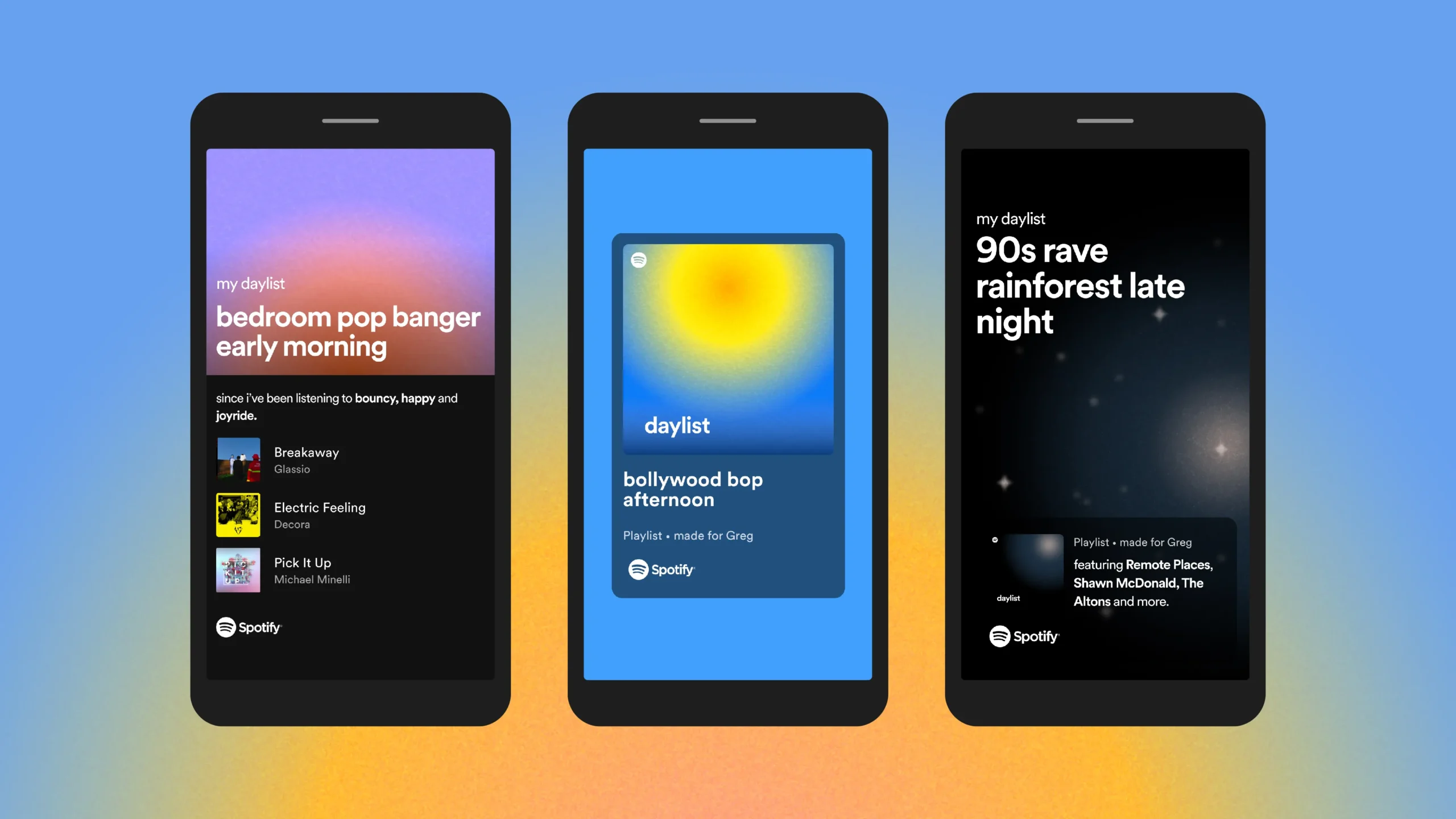
From Design Systems to Mood Systems
For years, brand guidelines dictated what things should look like. Now, mood systems define how things should feel.
Instead of rigid manuals, modern brands create living ecosystems that adjust to context, audience, and even time of day. Nike Run Club shifts its tone depending on a runner’s mindset. Streaming platforms customize visuals and sound to match each viewer’s taste.
This flexibility is not a lack of discipline. It is a new kind of coherence that mirrors human emotion and context in real time.
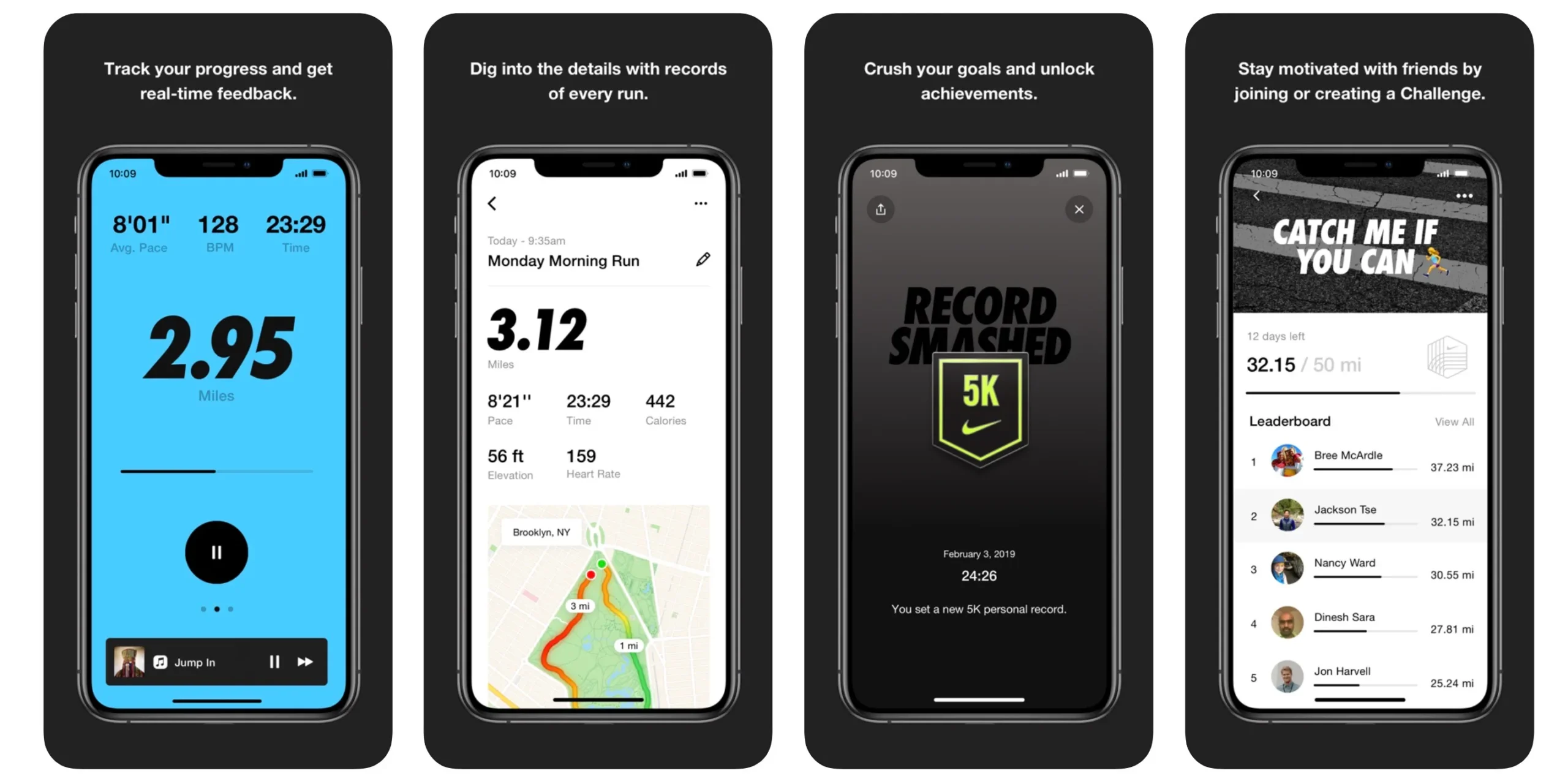
Tools as Creative Partners
New creative platforms have transformed how designers explore ideas. They no longer start from scratch. They start from sensation.
A designer can generate multiple layout directions, tone variations, or color harmonies in minutes. The real craft lies in guiding the process toward emotional truth.
It is not about automation. It is about curation. The goal is not speed, but alignment between feeling and purpose. The best creative work happens when technology serves intuition rather than replacing it.
Strategic Imperfection: Why Humanity Still Wins
In an era of endless digital polish, people crave authenticity. They respond to small imperfections that signal something real behind the screen.
This is why vibe design often embraces asymmetry, humor, and warmth. A slightly offbeat motion, a conversational tone, or a natural pause in an animation can create a feeling of presence that no automated process can mimic.
The goal is not perfection but emotional fidelity. Brands that design for warmth and connection rather than pure precision create lasting relationships with their audiences.
The Next Frontier: Vibe Systems and Emotional Intelligence at Scale
Imagine design frameworks that manage emotion the way current ones manage color and typography.
Future brand systems will measure tone, tempo, and audience sentiment just as precisely as they track conversions or clicks. Creative dashboards may one day recommend changes such as:
- Make this animation calmer.
- Increase visual warmth for younger audiences.
- Shift messaging from aspirational to reassuring.
This is the evolution from static design to living empathy, where creative teams tune their brands the way musicians tune instruments.
The Designer as a Conductor, Not a Technician
The modern designer’s role has changed. They are no longer enforcing visual grids but conducting emotional resonance.
The best creative professionals now think like filmmakers or music producers, mixing sensory cues, pacing experiences, and translating emotion into rhythm and tone. The future of design leadership is not about what looks good. It is about what feels right.
Feel Is the New Function
Vibe working is not a passing trend. It is a mindset that values emotion as much as execution.
For brands, it means coherence over consistency.
For users, it means experiences that feel personal and alive.
For designers, it means a renewed focus on intuition, rhythm, and flow.
The next generation of great design will not just look different. It will feel different.
In a world full of noise, feeling will always be the signal.
Contact Bluetext to learn more.
In today’s privacy-first world, brands can no longer rely on third-party cookies or opaque tracking methods to understand their audiences. Instead, forward-thinking marketers are turning to zero-party data—the information customers voluntarily share with brands. This type of data not only powers highly personalized experiences but also builds trust, loyalty, and long-term customer relationships.
Understanding Zero-Party Data
Definition and Key Characteristics
Zero-party data is any data that a customer intentionally and proactively shares with a brand. Unlike first-party data (behavioral information collected automatically) or third-party data (purchased from external sources), zero-party data is explicit, consented, and accurate because the user provides it directly.
Examples of Zero-Party Data
Brands can collect zero-party data through a variety of channels, including:
- Preference centers where users specify communication or product preferences
- Interactive quizzes or surveys
- Personalized onboarding experiences
- Subscription and loyalty program forms
- Feedback polls or content recommendations
This data is incredibly valuable because it reflects the customer’s interests, needs, and intent in their own words.
Why Zero-Party Data Matters Now
The End of Third-Party Cookies
With privacy regulations like GDPR and CCPA, and major browsers phasing out third-party cookies, marketers need alternative ways to understand and engage their audiences. Zero-party data fills this gap by providing first-hand insights without relying on intrusive tracking.
Building Trust Through Transparency
When customers willingly share information, they expect brands to respect it. Transparent data collection fosters trust and encourages ongoing engagement. Brands that honor these expectations can strengthen relationships while minimizing privacy risks.
Enabling True Personalization
Zero-party data enables precise personalization because it comes directly from the customer. Marketers can use this information to:
- Recommend products or services that truly align with preferences
- Tailor email content and messaging
- Create loyalty programs that reward meaningful behaviors
How to Capture Zero-Party Data Effectively
Offer Value in Exchange for Data
Customers are willing to share information if there’s something in it for them. Effective strategies include:
- Gated content like whitepapers or industry reports
- Personalized product or service recommendations
- Exclusive offers, events, or early access
Design Engaging Collection Methods
Interactive and enjoyable experiences increase participation:
- Quizzes that help users discover their “best fit” products
- Onboarding surveys that guide personalized experiences
- Polls and preference selections embedded in apps or websites
Prioritize Consent and Transparency
Always make it clear what data is collected and how it will be used. Provide easy options to manage preferences and honor opt-outs. Customers are more likely to share data when they feel in control.
Implementing a Zero-Party Data Strategy
Integrate with Your MarTech Stack
Connect zero-party data to your CRM, CDP, and personalization tools to ensure insights translate into actionable campaigns.
Align Across Teams
Effective zero-party data strategies require collaboration between marketing, legal, and IT teams to ensure compliance and execution.
Measure and Optimize
Track metrics like engagement, conversion rates, and content interaction to refine your approach and maximize the value of collected data.
The Future of Data-Driven Marketing
Zero-party data is more than a workaround for the decline of cookies—it’s a strategic asset that future-proofs personalization. Brands that invest in transparent, value-driven data collection will:
- Build deeper customer trust
- Deliver highly relevant experiences
- Stay ahead of privacy regulations
Partnering for Smart Data Strategy
Capturing and leveraging zero-party data effectively takes strategy, technology, and expertise. Bluetext helps brands design data-driven marketing frameworks that respect customer privacy while maximizing engagement and personalization.
Ready to build a future-proof data strategy?
Partner with Bluetext to design transparent, high-performing campaigns powered by zero-party data. Contact us today.
When most marketing leaders think about their brand, they picture messaging, design, campaigns, and storytelling. But there’s another, less visible dimension of brand health: web performance.
A brand’s digital presence is often the first and most consistent touchpoint for customers. If that experience is slow, inaccessible, or frustrating, it sends a message—one that undermines even the best campaigns. Web performance isn’t just a developer’s priority; it’s a marketing KPI that directly impacts trust, conversions, and long-term brand perception.
Why Web Performance Matters Beyond IT
Speed as the first brand impression
Users form an opinion about your site in seconds. A slow-loading homepage communicates inefficiency and neglect, while a fast, seamless experience signals professionalism and reliability.
Accessibility as inclusion and trust
Making your site accessible to all users—including those with disabilities—isn’t just a compliance issue. It’s a reflection of your brand’s values. Accessibility demonstrates inclusivity, empathy, and responsibility.
UX as a reflection of brand values
Clunky navigation, broken buttons, or misaligned mobile layouts create frustration. On the other hand, intuitive UX shows that you care about your audience’s time and experience—an extension of your brand promise.

The Marketing Impact of Web Performance
Performance problems don’t just frustrate users—they cost real revenue and reputation.
- Conversions suffer: Studies show that even a one-second delay in load time can drop conversions by up to 7%.
- SEO rankings decline: Google prioritizes fast, user-friendly websites in search results.
- Brand equity erodes: If customers consistently struggle to interact with your brand online, their trust declines—even if your messaging is strong.
Accessibility is also emerging as a competitive differentiator. Brands that go above and beyond to create inclusive experiences not only avoid legal risks but also earn loyalty from a wider audience.
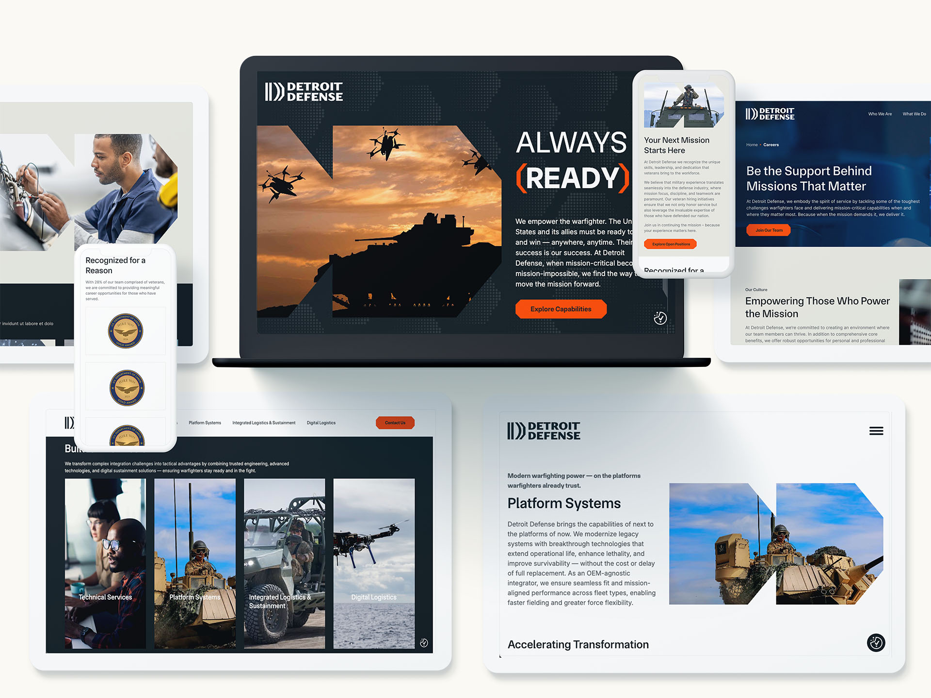
Key Web Performance Metrics Marketers Should Track
You don’t need to be a developer to understand the metrics that matter most:
- Core Web Vitals
- Largest Contentful Paint (LCP): How quickly the main content loads.
- First Input Delay (FID): How responsive the page feels.
- Cumulative Layout Shift (CLS): How stable the visuals are as the page loads.
- Accessibility Scores
- Benchmarked against WCAG standards, these measure how inclusive and usable your site is.
- Engagement Metrics
- Bounce rate, time on page, and conversion rates—all of which improve when performance is strong.
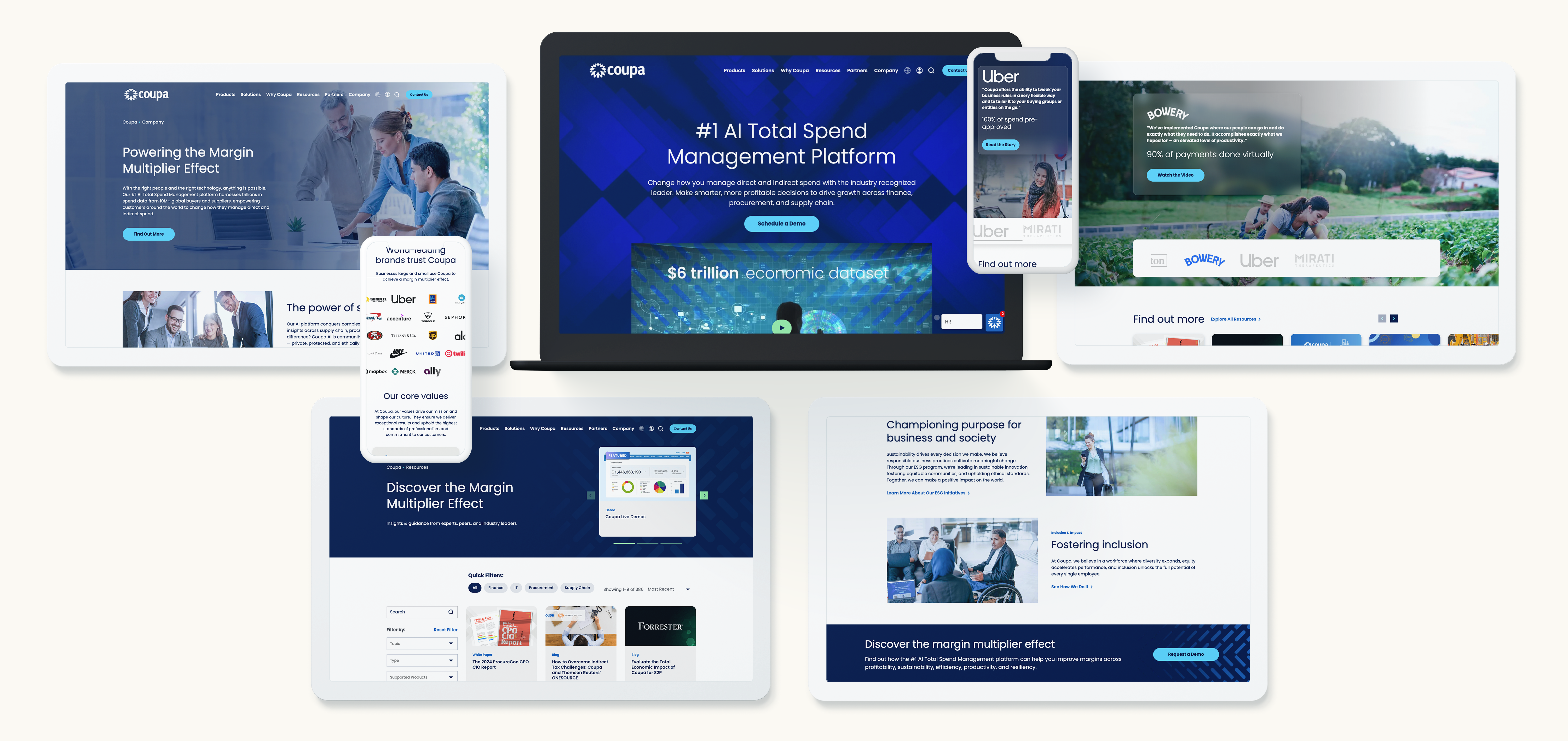
Turning Performance Into a Marketing KPI
Marketing leaders should elevate performance metrics alongside more traditional KPIs like impressions or conversions.
- Integrate into dashboards: Include speed, accessibility, and UX data in your regular brand reporting.
- Collaborate with dev teams: Marketing and development should align on the shared goal of delivering seamless experiences.
- Frame it for executives: Position performance as a direct driver of brand trust and customer loyalty.
Best Practices for Building a High-Performance Brand Experience
Performance improvements often come down to consistent, practical steps:
- Optimize images, video, and scripts for faster load times
- Adopt responsive, mobile-first design
- Incorporate accessibility from the design stage onward
- Continuously monitor with tools like Google PageSpeed Insights or Lighthouse
- Test frequently—small changes can reveal big wins
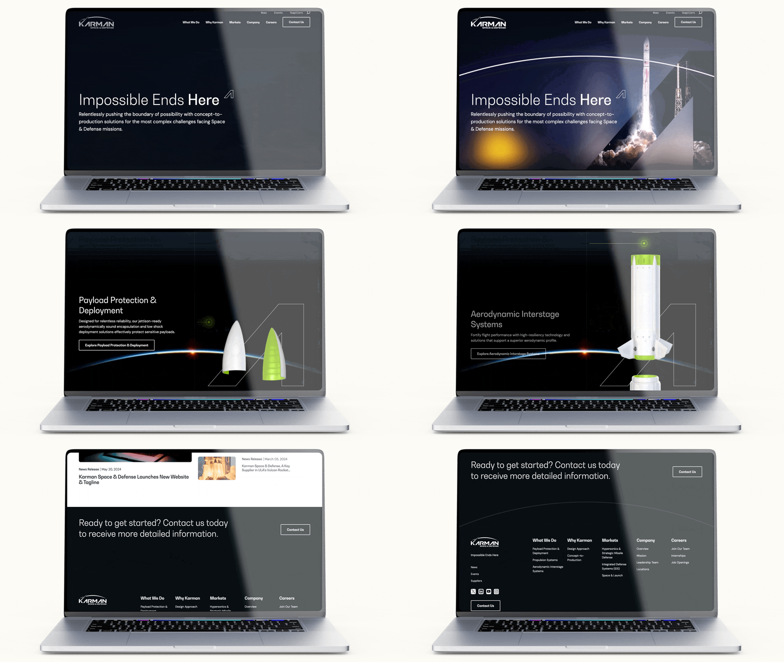
Bringing It All Together
Web performance is no longer a background concern for IT—it’s a frontline brand metric. Speed, accessibility, and UX shape how your audience perceives you before they even read a headline or click a button.
For marketing leaders, the challenge and opportunity are clear: make performance part of your brand DNA. Doing so not only boosts conversions but also reinforces trust, loyalty, and long-term brand value.
Looking to make your digital brand experience faster, more accessible, and more impactful? Contact Bluetext to turn performance into a brand advantage.
In today’s B2B world, buyers expect more than competitive pricing and robust features—they demand seamless, intuitive digital experiences. A poorly designed platform or cumbersome form can turn even the most interested prospect away, while a frictionless experience can position your brand as modern, professional, and trustworthy. Paying specific attention to your user experience (UX) is no longer optional; it’s a strategic differentiator that can shape how your brand is perceived in the market.
From microsites to enterprise platforms, frictionless UX allows B2B brands to capture attention, build trust, and drive conversions. In this post, we’ll explore why UX is the new competitive edge in B2B marketing and how companies can leverage it to stand out.
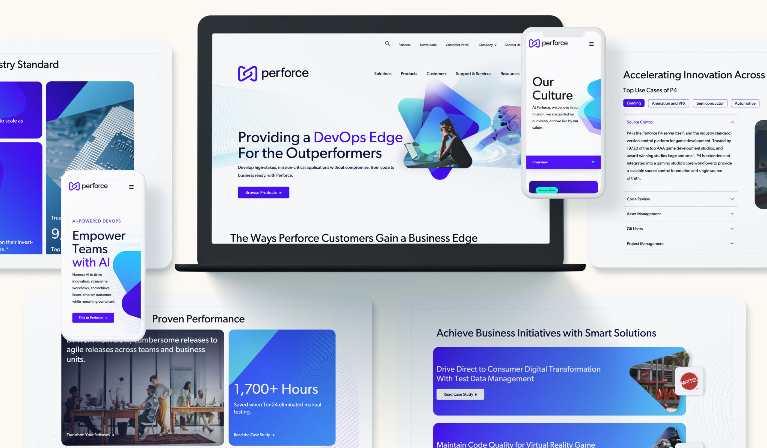
Why UX Matters in B2B Today
The expectations of B2B buyers have evolved dramatically in the last decade. Business decision-makers now compare digital interactions in professional contexts with experiences they have in their personal lives. Slow-loading pages, confusing navigation, or lengthy forms can result in immediate disengagement.
Statistics show that over 70% of B2B buyers abandon websites that are difficult to navigate or too slow to load. A clunky experience is more than an inconvenience—it can directly impact lead generation, conversion rates, and long-term brand perception.
Moreover, friction in the user journey signals inefficiency and unprofessionalism, even if the product itself is top-tier. Conversely, companies that prioritize B2B user experience demonstrate thoughtfulness, credibility, and attention to detail. These subtle cues influence trust and can tip the scales in competitive purchasing decisions.
Friction Points That Hurt B2B Conversions
Understanding where friction occurs is the first step toward creating a seamless experience. Common pain points include:
- Overly Complex Forms: Lengthy, confusing forms discourage completion and lead to lost leads.
- Slow Microsites: Microsites are often designed for campaigns or events, but poor performance can damage the brand’s reputation.
- Disjointed Platform Navigation: When users can’t intuitively find what they need, engagement drops and frustration grows.
- Inconsistent Branding Across Touchpoints: Visual and messaging inconsistencies between platforms, emails, and microsites can create confusion and erode trust.
Each of these friction points reduces engagement and can silently cost revenue. B2B buyers are increasingly unforgiving of digital obstacles, making frictionless UX a critical element of brand strategy.

Frictionless UX as a Differentiator
While price and features have historically been the primary differentiators in B2B markets, UX is emerging as a decisive factor. A frictionless experience signals professionalism, innovation, and customer-centricity—qualities that buyers value alongside product capabilities.
Imagine two SaaS platforms with similar features and pricing. One has a seamless onboarding experience, intuitive navigation, and consistent branding across its website, forms, and dashboard. The other feels clunky, inconsistent, and slow. Even if both solutions deliver the same results, the user is far more likely to adopt and advocate for the platform with better UX.
In effect, UX can amplify your other differentiators, making it as important as pricing, product features, and customer service. For modern B2B brands, frictionless UX is a strategic lever for differentiation.
Designing for a Frictionless B2B Experience
Creating a seamless digital experience requires intentional design across every touchpoint. Key principles include:
- Simplicity: Remove unnecessary steps and streamline processes. A clean, focused interface reduces cognitive load.
- Speed: Optimize page load times and form interactions to prevent frustration and abandonment.
- Intuitive Navigation: Ensure users can find critical information quickly and naturally.
- Consistent Branding: Align visual design, messaging, and tone across platforms, microsites, and forms.
- Responsive Design: Experiences must work seamlessly across devices, from desktops to smartphones.
In addition, B2B brands should consider microsites and forms as critical touchpoints rather than afterthoughts. Campaign microsites should reflect the main site’s brand while delivering a frictionless journey tailored to the audience. Forms should balance lead capture with usability, asking only for essential information at the right moment.
By implementing these principles, companies can turn digital interactions into competitive advantages, rather than mere transactional steps.
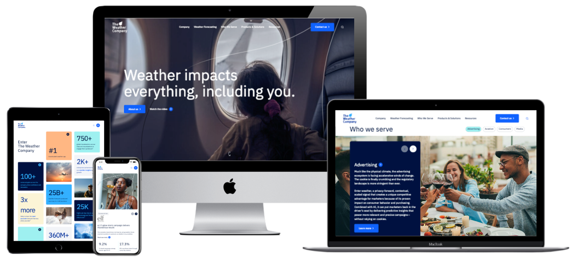
Measuring UX Success in B2B
To ensure your UX efforts are driving results, measurement is essential. Key metrics include:
- Conversion Rates: Are users completing forms, signing up for demos, or making purchases?
- Form Completion Rates: High abandonment indicates friction points.
- Platform Engagement: Track session duration, click paths, and feature adoption.
- Net Promoter Score (NPS) and Customer Feedback: Qualitative insights reveal how users perceive your experience.
These metrics allow teams to iterate and refine digital experiences continuously. By embedding UX evaluation into B2B marketing and sales strategy, organizations can quantify the impact of frictionless design on revenue and brand perception.
Looking Ahead: UX as a Strategic Lever
The future of B2B UX is tied to personalization, AI-driven interfaces, and predictive design. Brands that prioritize frictionless experiences now are positioning themselves for long-term differentiation. Companies that fail to invest in UX risk being perceived as outdated or inefficient, regardless of how compelling their products or pricing may be.
By making UX a central element of B2B differentiation, organizations can improve conversion rates, enhance brand perception, and create loyal advocates among buyers who expect professional, intuitive experiences.
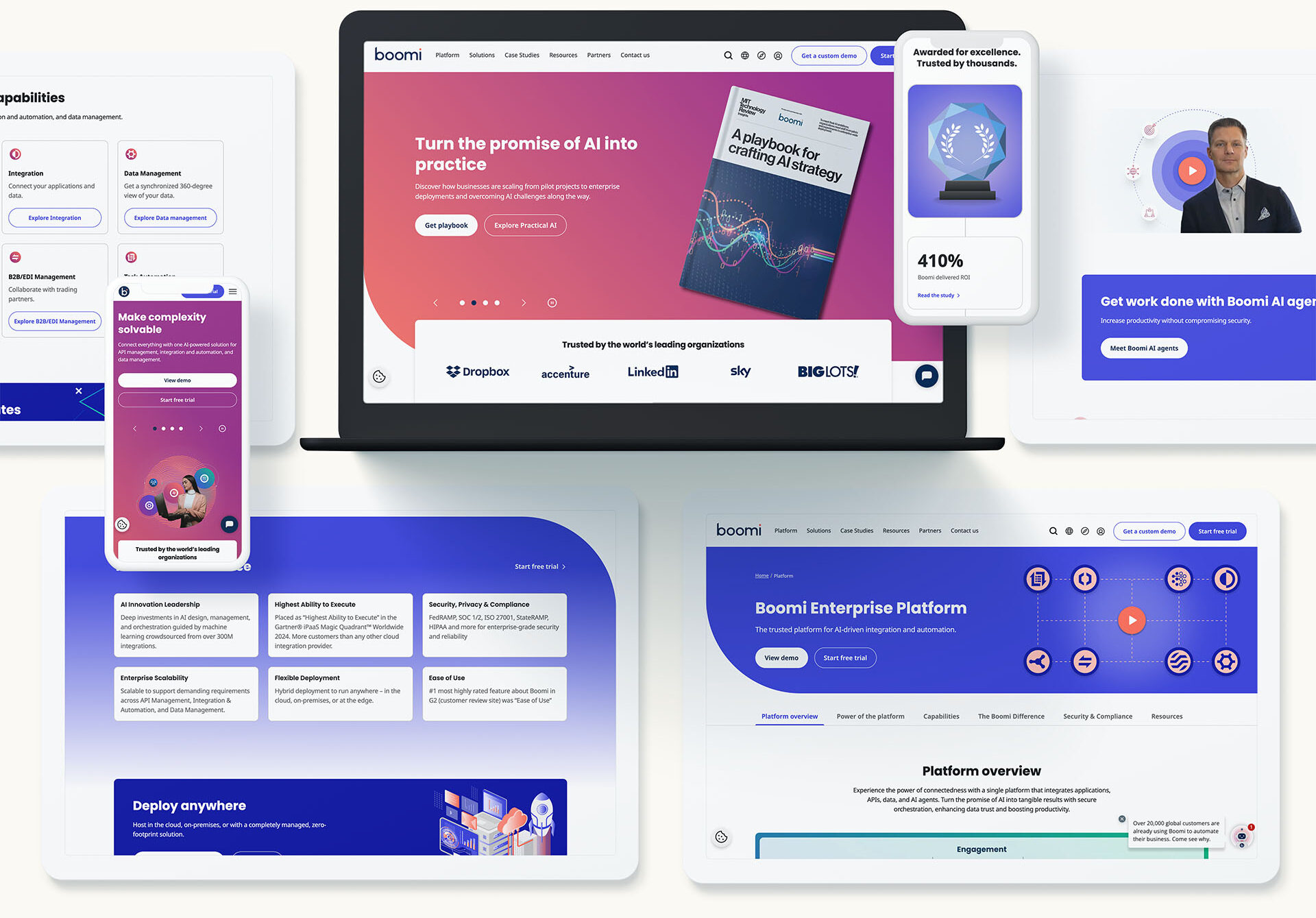
Take the Next Step: Make Your UX a Differentiator
In the modern B2B landscape, user experience is no longer a secondary consideration—it’s a powerful lever for differentiation. From digital platforms to campaign microsites and lead capture forms, frictionless UX can elevate your brand, increase conversions, and strengthen customer loyalty.
When people talk about “brand,” they often think first of logos, colors, or snappy taglines. But a brand is much bigger than any single touchpoint—it’s the sum of perceptions, experiences, and promises you deliver over time.
Still, there’s no getting around it: your website is often where that brand has to prove itself first.
Your website may not be your brand in its entirety. But for many customers, it’s the first meaningful encounter they’ll have with it. And first impressions are hard to shake.
How do you ensure your bold brand strategy doesn’t fall apart at the moment it matters most? Let’s explore how to bridge the gap between big-picture strategy and polished digital execution.
Your Brand Lives Beyond Your Website
A strong brand isn’t just a pretty website. It’s your company’s purpose, promise, and personality brought to life in ways your audience understands and trusts.
Your brand shows up in:
- How you serve customers.
- What you stand for.
- The stories you tell.
- The tone you use everywhere, from social media to sales calls.
A website alone can’t be your entire brand. It can’t deliver your customer service. It can’t stand in for your product quality. And it certainly can’t fix a muddled positioning strategy behind the scenes.
That said—it’s often the first place people expect to see all of that come together. If your site doesn’t reflect your brand clearly and convincingly, you’re starting every conversation at a disadvantage.
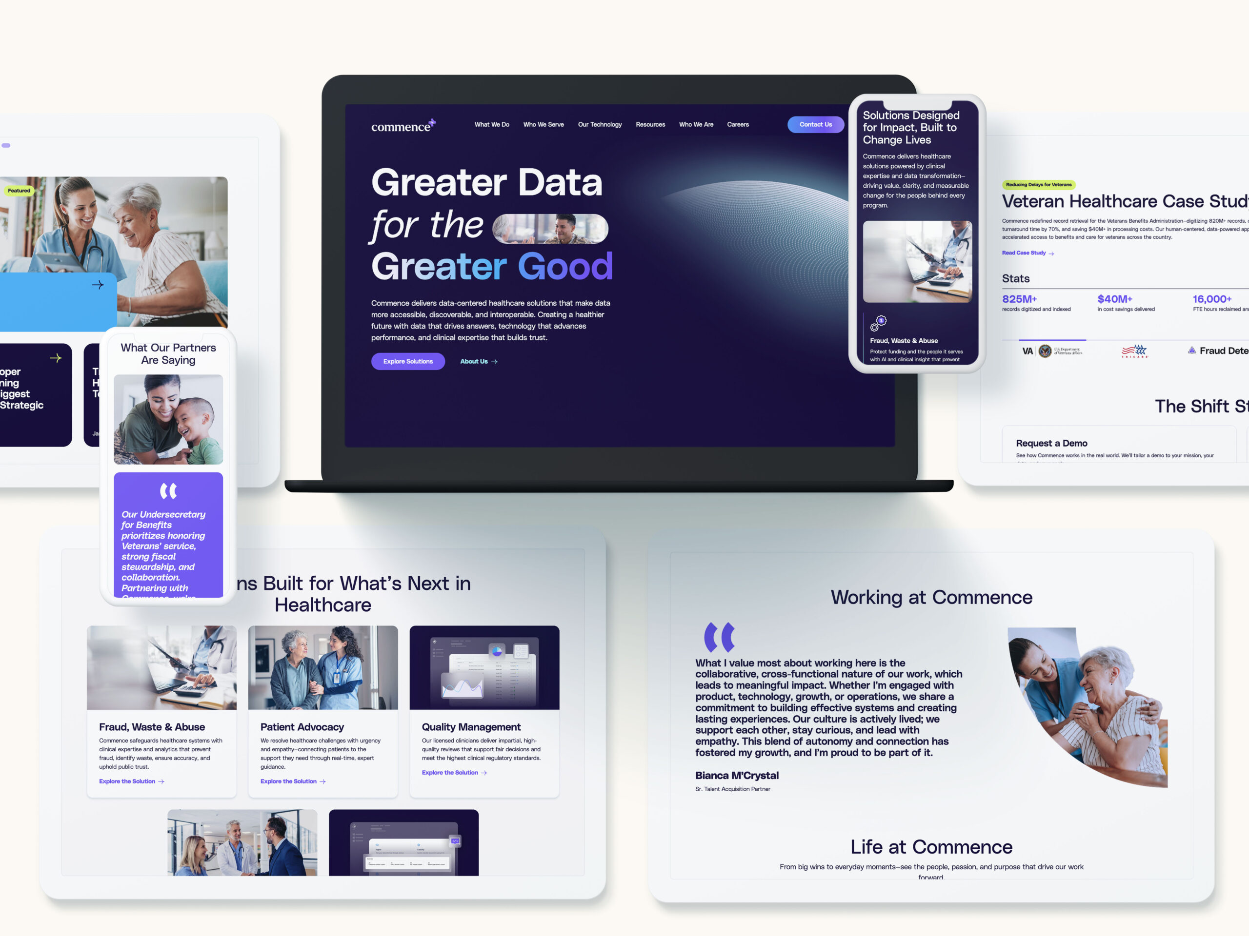
Why Your Website Still Matters More Than Ever
We live in a world of relentless digital first impressions. Studies suggest people form judgments about a website in as little as 50 milliseconds.
Think about that: before they’ve read your mission statement or learned about your product, they’re forming opinions about your brand.
- Trustworthiness
- Credibility
- Relevance
- Professionalism
Your website has to deliver all of that at a glance.
Even the strongest brand strategy can be undermined by poor execution online. It doesn’t matter how great your positioning sounds in the boardroom if your website feels sloppy, confusing, or out of sync with your brand voice.
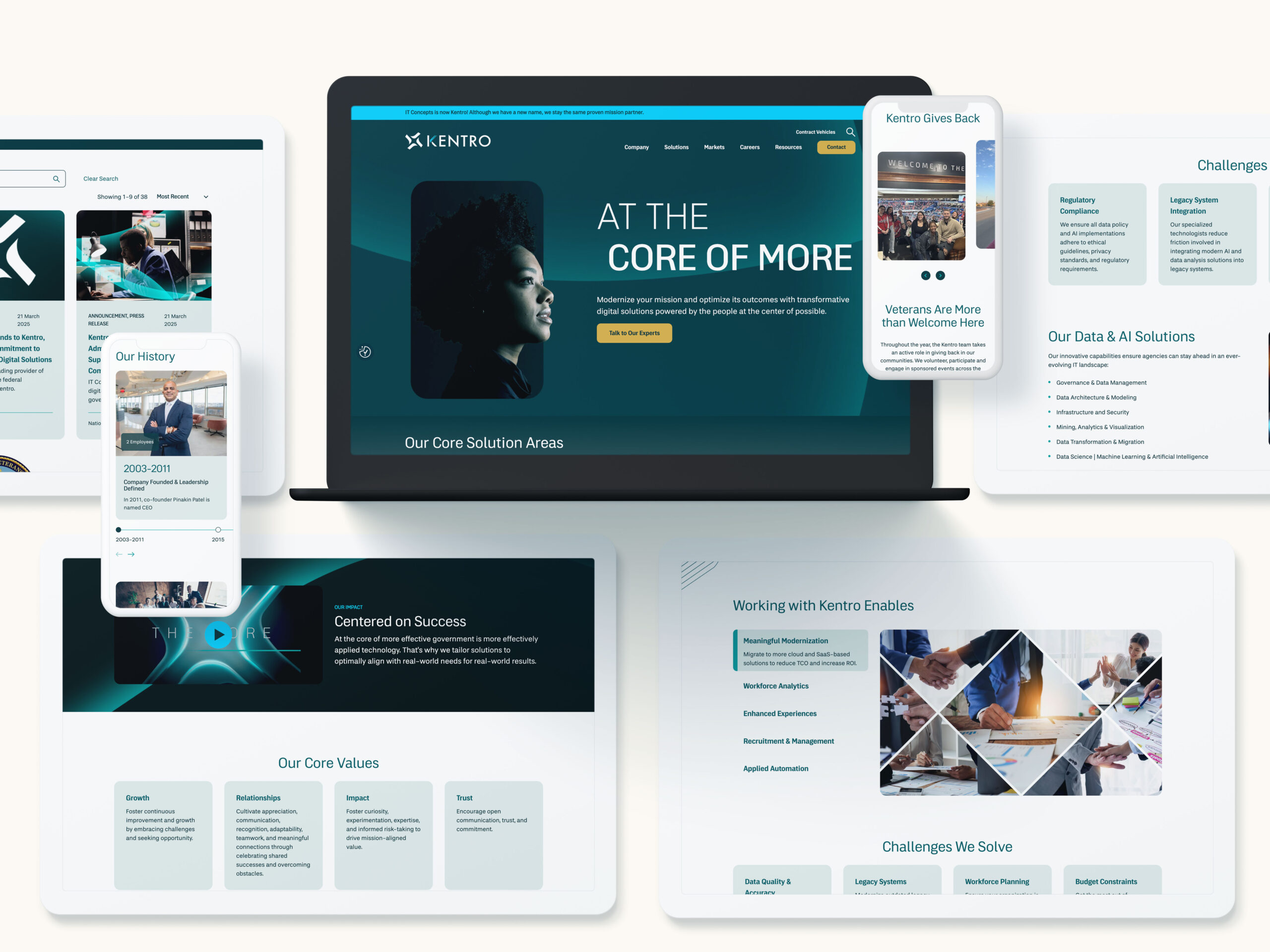
Common Gaps Between Brand Strategy and Digital Execution
This disconnect is more common than you might think. A few telltale signs:
- Tone mismatch: Brand guidelines say “friendly and approachable,” but the copy reads like legal boilerplate.
- Generic design: A safe, cookie-cutter template that could belong to any company in the industry.
- Confusing navigation: Strategic pillars buried behind obscure menu labels.
- Unclear messaging: Buzzwords instead of real value propositions.
These gaps happen because it’s easy to treat brand strategy and website design as separate efforts. But they’re not. Your site is the place where your brand proves itself.
Bridging the Gap: Practical Tips
How can you make sure your bold brand strategy doesn’t get lost in translation?
Here are some proven ways to align strategy and execution:
- Translate personality into UX: If you want to be seen as premium, prioritize elegant simplicity. If your brand is playful, let that inform micro-interactions and visuals.
- Align copywriting with brand voice: Your web copy should sound like you, not just like “professional corporate website #374.”
- Use visual systems that scale: Develop a design system that extends from your site to social, email, and beyond. Consistency breeds trust.
- Prioritize clarity over complexity: No matter how strategic your messaging is, if users can’t find what they need quickly, they’ll bounce.
- Test with real users: Don’t just ask your internal team. Get feedback from people who don’t know your brand inside out.
Avoiding the Trap of “Pretty But Hollow” Sites
Many companies get fixated on making their site look “modern” or “impressive” without asking whether it’s actually on-brand.
A gorgeous site that doesn’t communicate your differentiators or support your customer journey is like a beautiful store with no helpful staff inside.
Your website shouldn’t just be decoration. It should:
- Convey your value clearly.
- Reinforce your unique position in the market.
- Help visitors take the next step, whether that’s contacting sales or exploring resources.
The Role of Collaboration in Getting It Right
Bridging this gap isn’t just about design or copy—it’s about people working together.
Often, brand strategy lives with one team while the website project sits with another. That creates silos that lead to inconsistency.
Best practices to avoid this:
- Joint workshops: Get branding, marketing, and digital teams in the same room early.
- Shared guidelines: Build brand voice and visual guidelines that include digital specifics.
- Feedback loops: Review work at multiple stages to ensure alignment.
When these teams collaborate from day one, you don’t just get a better website—you get a better brand experience.

Making the Right First Impression
Your website isn’t your brand in full. But it is the moment your brand often has to earn trust.
If your brand strategy is the promise, your website is where you start delivering on it.
At Bluetext, we help brands close that gap—from defining a bold, authentic strategy to executing it seamlessly online.
If you’re ready to make sure your website reflects your brand at its best, get in touch with us.
As brands expand their reach across borders, the challenge isn’t just going global—it’s staying cohesive while doing it. Because international growth doesn’t mean one-size-fits-all messaging. It means speaking directly to diverse audiences, in different languages, across different cultures—without losing what makes your brand recognizable.
The trick? Localization at scale: building systems that flex for regional nuance without fracturing your brand.
The Risks of Going Global Without a Strategy
We’ve seen it happen—fast-growing companies push into new regions, and suddenly their brand looks and feels different everywhere. The French website has a different tagline. The German social campaign uses off-brand colors. The APAC product sheet calls the same feature by a completely different name.
Without a defined localization strategy, global marketing becomes a game of telephone—with inconsistent messaging, diluted visuals, and confused customers.
The Brand Consistency Challenge
Brand consistency is about more than logos and fonts. It’s about:
- Unified messaging pillars
- A shared tone of voice
- Consistent product naming conventions
- Visuals that reinforce brand DNA across all platforms
But this consistency gets complicated fast when:
- Teams in different regions are working in silos
- Local agencies interpret branding through their own lens
- Translation is treated as a final step, not a foundational consideration
In short, global expansion without a system invites fragmentation.
A Framework for Scalable Localization
To scale localization without losing control, brands need a structured but flexible framework. Here’s how leading companies do it:
1. Centralized Brand Guidelines, with Built-In Flexibility
Develop a global brand system that clearly defines:
- Core identity elements (logo usage, typography, color palettes)
- Voice and tone rules
- Messaging frameworks and brand pillars
But don’t stop there—include examples of how these can adapt for cultural relevance in local markets.
2. Establish Global vs. Local Ownership
Clarify what’s owned centrally (like key messaging, product naming, or logo integrity) versus what can be modified regionally (like calls to action, visuals, or campaign headlines). This helps local teams move fast without violating global standards.
3. Build a Cross-Functional Governance Model
Set up a process where brand, regional marketing, and localization teams can collaborate, review creative, and ensure alignment across launches.
Cultural Relevance Is More Than Translation
Successful localization goes beyond language. It requires cultural fluency—understanding what resonates with each audience.
Consider:
- Adjusting tone and formality for regional expectations
- Rewriting—not just translating—taglines, CTAs, or value propositions
- Avoiding idioms, humor, or visuals that don’t translate across borders
The goal isn’t to replicate. It’s to reinterpret—in a way that maintains the core idea while landing more effectively in-market.
Creative + Operational Best Practices
Localization at scale requires both process and creativity. Here’s how to support both:
- Design reusable creative systems: Create modular templates for web, email, paid media, and social assets that local teams can customize within guardrails.
- Use a global content management system (CMS): A CMS that supports multi-language site versions helps centralize oversight while enabling regional flexibility.
- Invest in a DAM and translation management system (TMS): Organize brand assets and enable consistent translations that are version-controlled, searchable, and easily distributed.
- Train your teams: Provide onboarding and ongoing brand training for regional marketers, translators, and agency partners.
- Monitor and optimize: Use analytics to assess how localized content performed by region—and feed insights back into your system.
The Payoff: A Brand That Travels Well
When you balance consistency with cultural nuance, your brand becomes:
- More trustworthy – Familiarity builds credibility.
- More relatable – Regional teams feel empowered to connect with local audiences.
- More agile – Launches become faster and more repeatable, with fewer missteps.
It’s not just about protecting your brand—it’s about amplifying it across every market you touch.
Need a Global Brand That Feels Local Everywhere?
Bluetext helps brands develop scalable localization strategies that maintain identity while enabling adaptation. From building global campaign toolkits to implementing multi-language websites and brand governance systems, we help you stay consistent—without being rigid.
Contact us to learn how we can help your brand speak the local language, at scale.
For years, headless CMS platforms have been the go-to solution for brands seeking flexibility, speed, and scalability in their digital content delivery. By decoupling the front end from the back end, headless architecture empowered marketers and developers to create omnichannel experiences with greater efficiency. But as user expectations grow more sophisticated and digital ecosystems become more complex, even headless is starting to show its limits.
So what’s next? The future of content management isn’t just about removing the head—it’s about building a smarter, more adaptable brain. From composable digital experience platforms to AI-driven personalization engines, the next generation of CMS technology is poised to transform how organizations structure, deliver, and optimize content.
Here’s what’s on the horizon.
Composable Architecture: Breaking Down the Monolith for Good
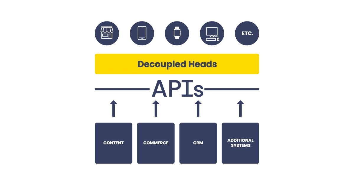
If headless CMS decoupled the front end from the back end, composable architecture takes things a step further—decoupling everything. A composable digital experience platform (DXP) allows organizations to assemble a custom stack of best-of-breed tools for CMS, e-commerce, personalization, analytics, and more, all connected via APIs.
The result? Greater agility. Marketers and IT teams are no longer boxed into rigid, one-size-fits-all platforms. Instead, they can mix and match services that best support their goals—whether that’s fast localization, dynamic pricing, or seamless omnichannel orchestration. Composable architecture also allows for incremental upgrades, so brands can evolve their digital presence without overhauling entire systems.
AI-Powered Content Delivery Is Here—and Growing Fast
AI is no longer a buzzword in CMS. It’s becoming the engine behind smarter content experiences. From predicting what content a user will find most valuable, to dynamically adjusting layouts based on behavior, AI is changing the way brands think about digital engagement.
Modern CMS platforms are beginning to integrate AI-driven features like:
- Content recommendations based on user behavior and intent
- Automated tagging and metadata generation for better asset management
- Real-time personalization, delivering tailored content to the right audience at the right time
By embedding AI into the content supply chain, brands can move beyond static publishing toward experiences that are predictive, personalized, and performance-driven.

Content Operations Are Getting an Overhaul
The CMS of the future doesn’t just manage content—it powers an entire ecosystem of digital operations. That means tighter integration with Digital Asset Management (DAM) platforms, Customer Data Platforms (CDPs), and marketing automation tools.
Content teams are shifting away from traditional editorial calendars and rigid workflows. Instead, they’re embracing:
- Structured content models that support reusability across channels
- Data-informed content strategies based on performance insights
- Collaborative environments where marketers, designers, and developers work in sync
This new model of Content Ops is about more than publishing—it’s about treating content as a living asset that evolves and adapts to user needs.
API-First, Cloud-Native Platforms Are the New Standard
As organizations grow more complex and global, performance and scalability are critical. That’s where API-first, cloud-native CMS solutions come in. Built for integration and extensibility, these platforms allow developers to plug into virtually any system—without being locked into a vendor’s proprietary tools or workflows.
Benefits of API-first CMS platforms include:
- Faster development and deployment cycles
- Seamless integration with existing martech and eCommerce platforms
- Improved security, scalability, and reliability through modern cloud infrastructure
For enterprise brands navigating multi-site, multilingual, or multi-channel challenges, API-first CMS solutions offer the flexibility to deliver consistent, high-performance experiences across the board.
So, What Should Brands Do Now?
If your organization is currently running a traditional CMS—or even a headless one—it’s time to look ahead. The CMS landscape is evolving rapidly, and the platforms of tomorrow will be defined by their intelligence, adaptability, and interoperability.
Key considerations as you plan for the future:
- Audit your current content ecosystem: What tools are in place, and where are the bottlenecks?
- Invest in modular, composable architecture: Future-proof your stack by prioritizing flexibility and integration.
- Explore AI capabilities: Start with features like smart recommendations or auto-tagging, and scale up as you see results.
- Think beyond websites: Your CMS should support a unified experience across mobile, social, voice, and more.
At Bluetext, we help organizations reimagine their digital infrastructure to support not just where they are—but where they’re going.
Ready to evolve your CMS strategy?
Contact Bluetext to architect a future-ready content platform that’s intelligent, scalable, and built to grow with your brand.
B2B websites are content powerhouses. Whether you’re navigating technical product documentation, compliance resources, white papers, or thought leadership blogs, these sites are often packed with deeply layered and jargon-heavy material. But no matter how rich your content is, it’s only valuable if users can find it. That’s where smart search functionality becomes essential.
In today’s digital landscape, B2B brands must move beyond basic keyword search to deliver an intuitive, efficient, and tailored experience that unlocks the full potential of their content. In this post, we’ll explore what smart search means for complex B2B websites and how you can use it to enhance discoverability, user experience, and business outcomes.
The Challenge of B2B Content Complexity
B2B websites tend to grow organically over time. As new products, services, use cases, and regulations emerge, pages are added—often in silos. This creates sprawling ecosystems of technical data, fragmented resources, and inconsistent metadata. For users, it can feel like searching for a needle in a haystack.
Traditional navigation tools, including outdated search bars or simplistic site maps, often fall short in helping visitors find what they need. Whether it’s a government RFP looking for product certifications or a hospital IT team seeking integration specs, your users expect fast, accurate answers. When they don’t get them, they leave.
What Is Smart Search?
Smart search—also known as advanced site search—goes far beyond the basic keyword match. It leverages technologies like artificial intelligence (AI), natural language processing (NLP), and machine learning to understand user intent and deliver relevant results.
Key capabilities of smart search include:
- Predictive search suggestions
- Typo tolerance and fuzzy matching
- Semantic understanding of queries
- Filters and faceted navigation
- Personalized results based on behavior or user roles
- Analytics dashboards to track search behavior
Popular platforms like Elasticsearch, Algolia, and Azure Cognitive Search offer these features out of the box, and many integrate seamlessly with content management systems (CMS), customer relationship management (CRM) platforms, and digital asset management (DAM) tools.
Why Smart Search Matters for B2B Sites
A smart search function does more than improve user experience—it adds measurable business value.
1. Increases Content Discoverability
Smart search enables users to easily surface relevant product pages, PDFs, datasheets, blog posts, and more—regardless of how deep they’re buried.
2. Boosts Engagement and Conversions
The faster users find what they’re looking for, the more likely they are to take action—whether that’s submitting a lead form, starting a trial, or contacting sales.
3. Provides Insight into User Needs
Site search data reveals what visitors are trying to find. This intel can drive content strategy, identify gaps, and inform UX decisions.
4. Supports Role-Based Customization
By understanding who the user is (e.g., buyer, engineer, compliance officer), smart search can tailor results to deliver the most relevant answers for each audience segment.
Key Features to Include in Your Smart Search Implementation
To maximize the impact of your search functionality, prioritize features that enhance usability and scale with your content ecosystem:
- Auto-complete and dynamic suggestions
- Faceted search filters (e.g., by product type, industry, resource type)
- Support for long-tail and natural language queries
- Contextual search snippets that preview content
- Synonym recognition and custom dictionaries
- Integration with structured metadata and tagging systems
Don’t forget to optimize for mobile—B2B users increasingly access websites from smartphones and tablets, especially in the field.
Implementation Tips for Complex Sites
Building smart search into a complex B2B website requires careful planning:
- Audit your existing content to ensure it’s structured, tagged, and organized for machine readability
- Map common user journeys to understand how different personas navigate the site
- Define your taxonomy and metadata strategy to ensure consistent tagging and filtering
- Monitor and refine search performance using analytics and feedback loops
- Collaborate across departments (marketing, IT, sales) to align on priorities and content visibility
Smart Search in Action: A Real-World Snapshot
Imagine a defense technology firm with a site housing hundreds of technical briefs, compliance documents, and product brochures. With basic keyword search, users must already know the exact title or term to find a document. But with smart search, a procurement officer typing “NIST certification for satellite hardware” can instantly access relevant materials—even if the original file is titled differently. Filters allow narrowing by document type, date, or business unit, ensuring a streamlined path to the right asset.
Turn Your Website into a Smart Content Hub
If your B2B site is packed with valuable content that users can’t easily find, it’s time to upgrade your search experience. At Bluetext, we help organizations architect advanced search solutions that integrate seamlessly into complex digital ecosystems—enhancing usability, supporting business goals, and delivering measurable ROI.
Let’s talk about how Bluetext can help you implement smart search for your site. Contact us today.
Customers today expect more than just fast answers—they want smart, personalized conversations. As brands look to automate support, streamline lead qualification, and create always-on digital experiences, the choice often comes down to two options: rule-based chatbots and conversational AI.
But which one is right for your brand?
Understanding the difference—and knowing when to use each—can help you design a more strategic and scalable customer experience. Here’s how to navigate the landscape and make the best decision for your business.

Chatbots vs. Conversational AI: What’s the Difference?
Although the terms are often used interchangeably, rule-based chatbots and conversational AI serve fundamentally different purposes.
Rule-Based Chatbots
These are logic-driven tools that operate on pre-defined workflows. They follow “if-this-then-that” logic and guide users through scripted paths.
- How they work: Pre-programmed responses triggered by keywords or button clicks
- Strengths: Fast, simple, low-cost
- Common uses: FAQs, order tracking, appointment booking, password resets
Conversational AI
This advanced solution uses natural language processing (NLP), machine learning, and real-time data to understand user intent, even with vague or complex phrasing.
- How it works: Interprets open-ended input, accesses data in real time, and improves through continuous learning
- Strengths: Context awareness, personalization, multilingual support
- Common uses: Lead qualification, customer support at scale, employee onboarding, post-sale care
| Feature | Rule-Based Chatbot | Conversational AI |
| Response Type | Predefined | Adaptive / Generated |
| Learning Capability | None | Learns over time |
| Input Handling | Buttons or keywords | Natural language input |
| Complexity | Low to moderate | High |
| Setup Time | Quick | Longer (training + testing) |
| Cost | Lower | Higher (but scalable) |
When a Rule-Based Chatbot Makes Sense
Not every brand needs a cutting-edge AI assistant. In many cases, a simple chatbot can be a powerful tool.
Rule-based bots are ideal when:
- The user journey is highly predictable. For example, booking appointments or answering standard questions.
- You’re operating with limited budget or technical resources. These bots are quicker and cheaper to build and deploy.
- Speed to market is essential. Launch a minimal viable chatbot in weeks, not months.
For organizations with well-defined user queries and limited support volume, rule-based bots offer a reliable and efficient solution.

The Power of Conversational AI
If your customer experience demands nuance, personalization, or scale, conversational AI brings transformative potential.
Key Benefits:
- Contextual understanding: Responds to natural language, recognizes user intent, and adapts mid-conversation
- Personalized responses: Pulls data from CRMs and other sources to deliver tailored experiences
- 24/7 learning: Gets smarter with every interaction, improving accuracy and engagement
- Multilingual capabilities: Supports global audiences seamlessly
- Omnichannel delivery: Integrates across web, mobile, voice, and social platforms
For example, an AI-powered assistant could qualify leads on your website, prioritize inquiries based on urgency, and transfer complex cases to live agents—all while learning and refining its responses over time.

Choosing the Right Tool for Your Brand
Before jumping into a chatbot or AI deployment, consider:
- The complexity of your customer journeys: Do users have multiple paths and nuanced questions?
- Support volume and scale: Are you managing hundreds—or thousands—of interactions daily?
- Integration needs: Do you need to pull in CRM data, ticketing platforms, or product catalogs?
- Timeline and budget: What can you realistically implement and maintain?
You may not need to choose just one. Many organizations start with rule-based chatbots, then layer in conversational AI features over time—a hybrid approach that balances speed and sophistication.
Future-Proofing Your Customer Experience
The future of customer engagement is conversational—and increasingly intelligent.
Emerging trends include:
- Voice-enabled AI: For hands-free customer support and smart device integration
- Emotion-aware AI: That can detect tone and sentiment to adjust responses accordingly
- No-code AI tools: Making it easier for marketers to train and deploy AI without relying heavily on developers
- Unified conversational platforms: That bring together chat, email, social, and voice under a single AI-powered framework
As these technologies mature, the brands that win will be those who design experiences around real user needs—not just the latest tech.
Ready to build a smarter digital experience? Whether you’re just starting with chatbots or exploring AI-powered transformation, Bluetext can help you create a conversational strategy that connects.