Scaling a SaaS company from startup to enterprise is no small feat. While landing the first 100 clients is a significant milestone, the strategies that worked early on won’t necessarily sustain growth. As the customer base grows, marketing efforts must evolve to support scalability and segmentation. This blog explores how SaaS companies can transition their marketing strategies to thrive in their next phase of growth.
From Startup to Scale-Up: Evolving Your Marketing Mindset
The journey from startup to scale-up requires a fundamental shift in marketing strategy. In the early days, growth often relies on founder-led sales and grassroots efforts. But as the business matures, a more structured approach becomes essential.
Understanding the Shift
Scaling up means moving beyond ad hoc tactics to a professionalized marketing framework. The focus expands from simply acquiring customers to also retaining and growing their value over time.
Aligning Marketing with Growth Goals
Growth at scale demands a balanced approach:
- Acquisition: Attracting new customers through targeted campaigns.
- Retention: Ensuring existing clients stay engaged and loyal.
- Expansion: Upselling and cross-selling within the customer base to maximize lifetime value.
Building a Scalable Infrastructure
To enable this evolution, companies must invest in:
- Robust marketing automation tools.
- Data platforms for real-time insights.
- A talented team with expertise in segmentation, content, and demand generation.
Scaling Your SaaS Marketing Strategy
Once the infrastructure is in place, scaling marketing requires refining and expanding foundational tactics. Here are key areas to focus on:
1. Refine Your Value Proposition
As the company grows, so does its customer base—and with it, the diversity of customer needs. Tailor messaging to address specific pain points for different audience segments. For example, startups might prioritize cost-effectiveness, while enterprises may focus on security and scalability.
2. Segment Your Audience
Advanced segmentation enables personalized marketing efforts that resonate with diverse customer personas. Use data to group customers by:
- Industry or vertical.
- Company size.
- Product usage patterns.
- Stage in the customer lifecycle.
3. Expand Distribution Channels
Early-stage companies often rely on a few channels like paid search or organic social. Scaling up means diversifying into:
- Content marketing for thought leadership.
- Paid media campaigns for wider reach.
- ABM (Account-Based Marketing) strategies targeting high-value clients.
- Partnerships and co-marketing initiatives.
4. Automate and Optimize
Automation tools are critical for scaling campaigns efficiently. Automate workflows for:
- Lead nurturing.
- Email marketing.
- Social media scheduling and monitoring. Additionally, continuously test and optimize campaigns to ensure maximum ROI.
Advanced Segmentation: Targeting Clients at Scale
Effective segmentation is the backbone of scalable SaaS marketing. By leveraging customer data, companies can craft hyper-targeted campaigns that drive results.
The Role of Data
Customer insights are invaluable for understanding behavior and preferences. Use tools like CRM systems, analytics platforms, and surveys to gather actionable data.
Personalization at Scale
Modern buyers expect personalized experiences. Dynamic content and tailored outreach can help balance automation with the human touch.
Lifecycle Marketing
Adopt a lifecycle approach to ensure clients receive the right messaging at every stage:
- Acquisition: Highlight your unique value proposition.
- Onboarding: Simplify adoption with clear guides and proactive support.
- Upselling: Identify opportunities to promote premium features.
- Retention: Maintain engagement through value-driven communications.

The Metrics That Matter: Measuring Growth Beyond the First 100 Clients
As marketing strategies evolve, so should the metrics used to measure success. Focus on these KPIs to gauge growth:
- Customer Acquisition Cost (CAC): Monitor how much you spend to acquire a new customer and ensure it’s sustainable as you scale.
- Customer Lifetime Value (CLV): Track the total revenue a customer brings over their lifecycle.
- Churn and Retention Rates: Keep a close eye on customer turnover to identify potential issues.
- Net Promoter Score (NPS): Measure customer satisfaction and likelihood to recommend your product.
By focusing on these metrics, SaaS companies can gain deeper insights into their performance and make data-driven decisions to fuel growth.
Preparing for Sustained Growth
Scaling a SaaS company’s marketing strategy requires more than just increasing spend; it demands a strategic shift. By refining value propositions, leveraging advanced segmentation, and investing in scalable infrastructure, companies can position themselves for long-term success.
The journey doesn’t end at the first 100 clients. With the right approach, SaaS businesses can not only sustain growth but thrive in an increasingly competitive market.
As federal priorities evolve, government procurement officers are increasingly focused on resilience and industrial strength. While sustainability remains important, the emphasis has shifted to durability, adaptability, and long-term reliability. For B2G companies, this change represents an opportunity to reposition their branding and messaging strategies.
This blog explores how B2G organizations can align with these priorities while maintaining compliance with environmental standards.
Understanding Government Trends
Federal agencies are prioritizing resilience to address challenges such as infrastructure reliability, national security, and climate adaptation. Key takeaways:
- Resilience Over Sustainability: While green initiatives remain vital, procurement officers now seek solutions built to last.
- Focus on Durability: Products and services must demonstrate long-term value and reliability.
Repositioning for Resilience
To align with these trends, B2G companies should update their branding with a focus on industrial strength. Steps include:
- Highlight Durability: Showcase the reliability and lifespan of your solutions.
- Emphasize Adaptability: Illustrate how your offerings can evolve with changing government needs.
- Reinforce Compliance: Communicate your adherence to environmental and regulatory standards.
Communicating Value to Government Stakeholders
Government buyers prioritize clear, compelling messaging that speaks to their specific needs. Tips for success:
- Build Trust: Use testimonials and case studies from other government contracts.
- Use Data: Provide quantifiable proof of durability and adaptability.
- Simplify Messaging: Avoid jargon and focus on actionable benefits.
Leveraging Multi-Channel Outreach
A multi-channel approach ensures your message reaches all stakeholders. Consider:
- Digital Campaigns: Leverage LinkedIn, webinars, and email marketing to engage decision-makers.
- Content Marketing: Publish blogs, whitepapers, and videos that showcase resilience.
- Public Relations: Share success stories and thought leadership through media channels.
Navigating Challenges in B2G Branding
Shifting focus to resilience while maintaining a commitment to sustainability can be complex. Mitigate risks by:
- Balancing Messaging: Ensure both durability and environmental compliance are clear.
- Maintaining Credibility: Avoid overstating claims—back them with data and certifications.
Positioning Your Brand for Resilience
In the evolving landscape of government priorities, resilience and industrial strength have become essential pillars for successful B2G branding. By aligning your messaging with these values, you can create a compelling narrative that appeals to procurement officers, policymakers, and other key stakeholders while maintaining compliance with environmental standards.
Need help crafting messaging that makes an impact? Contact Bluetext to discover how our branding expertise can position your organization as a trusted, resilient partner for government agencies.
In the world of B2G marketing, the ability to align corporate messaging with federal priorities can mean the difference between winning contracts and being overlooked. For years, sustainability has been a cornerstone of corporate branding, with organizations touting their green initiatives to appeal to environmentally conscious agencies. However, a significant shift is underway. As federal agencies emphasize resilience, industrial strength, and adaptability, B2G companies are rethinking their messaging strategies to stay competitive.
This evolving landscape presents both challenges and opportunities. In this blog, we’ll explore the drivers behind this shift, examine the emerging themes of resilience and industrial strength, and provide actionable tips to help your brand stay ahead.
Why Messaging is Shifting in B2G Markets
Federal Priorities are Changing
Federal agencies, particularly the Environmental Protection Agency (EPA), are recalibrating their messaging priorities. While sustainability remains important, the conversation is expanding to include themes like infrastructure resilience, supply chain durability, and long-term performance. This shift reflects broader concerns about national security, climate adaptation, and the need for robust systems that can withstand disruption.
For B2G companies, this change means that simply emphasizing sustainability is no longer enough. Messaging must also highlight how products and services contribute to the government’s evolving focus on industrial strength and adaptability.
The EPA’s Role in Influencing Messaging
The EPA is poised to play a significant role in shaping corporate messaging trends. Anticipated updates to the agency’s guidance could provide a clear framework for what federal agencies expect from contractors in terms of resilience and industrial capability. Companies aligning their messaging with these emerging themes will be better positioned to resonate with procurement officers and decision-makers.
Key Elements of Resilience and Industrial Messaging
Shifting your messaging to reflect resilience and industrial strength doesn’t mean abandoning sustainability—it’s about reframing it within a broader narrative. Here are the key elements to focus on:
1. Emphasize Durability and Performance
Federal agencies prioritize solutions that are built to last. Messaging should underscore the longevity, robustness, and reliability of your offerings. Share real-world examples that demonstrate how your products or services perform under challenging conditions.
2. Highlight Innovation as a Tool for Resilience
Resilience and innovation go hand in hand. Position your organization as a leader in developing cutting-edge solutions that address modern challenges, such as climate resilience and supply chain disruptions. For instance, showcasing innovative technologies that support both industrial goals and environmental sustainability can resonate with agencies looking for multi-faceted solutions.
3. Align Messaging with Federal Missions
Tailor your messaging to reflect government priorities, such as infrastructure modernization or energy independence. This alignment signals that your brand understands and supports the broader goals of federal agencies. Sustainability can still play a role, but as a supporting point within a larger story of compliance, reliability, and adaptability.
Steps to Adapt Your Messaging
Step 1: Conduct a Messaging Audit
Start by reviewing your current marketing materials. Identify messaging that leans heavily on sustainability and evaluate whether it aligns with the government’s broader focus on resilience and industrial strength. Adjust outdated narratives to better reflect evolving priorities.
Step 2: Develop New Messaging Pillars
Create messaging pillars that emphasize durability, reliability, and innovation. For example, instead of focusing solely on “green energy,” emphasize “reliable, sustainable energy solutions” that align with federal resilience goals. Back up these claims with data, case studies, and testimonials that demonstrate measurable impact.
Step 3: Test and Iterate
Refine your messaging through testing. Use A/B testing to determine which narratives resonate most with your audience, and gather feedback from procurement officers or stakeholders. Messaging is not static—it should evolve based on insights and market dynamics.
Real-World Applications: Shifting Successfully
Several companies have already begun adjusting their messaging to reflect this shift. For example, organizations in the renewable energy sector are repositioning their offerings as solutions that enhance grid resilience while remaining environmentally sustainable. Similarly, manufacturing firms are emphasizing the durability of their materials and the reliability of their supply chains. These shifts have helped these companies secure contracts and strengthen their relationships with federal agencies.
Looking Ahead: Preparing for the Future
Monitor Federal Trends
Staying ahead requires keeping a close eye on federal guidance, especially from agencies like the EPA. These updates will serve as a roadmap for aligning your messaging with government priorities.
Be Proactive, Not Reactive
Waiting until federal guidance is finalized may leave you playing catch-up. Instead, proactively incorporate themes of resilience and industrial strength into your branding now to stay ahead of the competition.
Partner with Bluetext to Align Your Messaging
The B2G market is evolving rapidly, and staying competitive means adapting your messaging to align with federal priorities. At Bluetext, we specialize in helping B2G companies craft compelling narratives that resonate with government agencies. Contact us today to learn how we can help you shift from “green” to “grit” and position your brand for success in this changing landscape.
In the healthcare industry, trust and privacy are paramount. Patients and providers alike demand reassurance that sensitive data is being handled securely and ethically. As data breaches and cybersecurity threats make headlines, healthcare organizations have a unique opportunity to differentiate themselves by showcasing their commitment to data privacy and compliance.
For healthcare marketers, emphasizing strong privacy practices, such as HIPAA compliance and cutting-edge data security measures, isn’t just a regulatory necessity—it’s a strategic advantage. This blog explores how to turn data privacy into a compelling value proposition that resonates with hospitals, clinics, and healthcare networks.
Why Data Privacy Matters to Healthcare Audiences
Healthcare professionals operate in one of the most highly regulated and privacy-sensitive industries. Their ability to deliver care hinges on secure and accurate data management. When choosing partners, they look for organizations that prioritize data security as much as they do.
Highlighting your commitment to data privacy addresses several key buyer concerns:
- Regulatory Compliance: Ensuring patient confidentiality is a non-negotiable requirement for any healthcare partner. Compliance with standards like HIPAA or GDPR signals reliability.
- Trust and Transparency: Organizations that communicate openly about their privacy practices foster trust with their audience.
- Risk Mitigation: Data breaches can lead to severe financial penalties and reputational damage. Healthcare organizations want partners who reduce, not add to, their risks.
By aligning your marketing with these priorities, your brand becomes a trusted ally in a challenging landscape.
Turning Compliance into a Competitive Edge
Many healthcare companies view compliance as a box to check, but savvy marketers understand its potential as a selling point. Here’s how to elevate compliance from a baseline requirement to a standout feature:
- Showcase Certifications: Use your marketing materials to prominently feature industry certifications and accreditations. This reassures buyers that your processes meet or exceed regulatory standards.
- Educate Your Audience: Share blogs, videos, or whitepapers that explain complex data privacy topics in accessible language. For example, create content that demystifies HIPAA or offers tips for avoiding common compliance pitfalls.
- Promote a Proactive Approach: Highlight how your brand goes beyond basic compliance to implement advanced security measures, such as data encryption, threat detection, or regular audits.
These efforts position your brand as a partner that prioritizes customer safety and peace of mind.
Crafting a Privacy-Focused Brand Narrative
Marketing campaigns that weave privacy into their core messaging stand out in a crowded field. To craft a compelling narrative:
- Focus on the Human Impact: Remind your audience that data privacy isn’t just about technology—it’s about protecting patients’ lives and well-being.
- Highlight Your Role as a Guardian: Frame your organization as a protector of sensitive healthcare information.
- Use Real-World Examples: Share anonymized case studies to illustrate how your privacy protocols have successfully safeguarded patient data or avoided breaches.
When your messaging resonates on an emotional level, it leaves a lasting impression.
Tools and Channels to Amplify Your Message
To effectively convey your commitment to data privacy, leverage the right platforms and strategies:
- LinkedIn Thought Leadership: Publish posts or articles that share your team’s insights on data privacy trends in healthcare.
- Email Campaigns: Develop segmented campaigns targeting different audiences, such as CIOs or compliance officers, emphasizing your privacy strengths.
- Trade Shows and Events: Use conferences to showcase your expertise, whether through speaking engagements or interactive booth displays that highlight your security protocols.
These efforts ensure your message reaches decision-makers and influencers across the healthcare ecosystem.
Building Trust Through Data Privacy
In today’s healthcare landscape, a brand’s commitment to data privacy can set it apart from competitors. By proactively addressing privacy concerns and demonstrating compliance, healthcare marketers can build trust, foster long-term relationships, and create a competitive edge.
Are you ready to position your healthcare brand as a leader in data privacy and security? Contact Bluetext today to learn how we can help you create impactful campaigns that resonate with your audience.
As the marketing landscape continues to evolve at a breakneck pace, businesses must look ahead to stay competitive in the years to come. By 2025, the strategies that once worked will need to be adapted to meet new expectations and leverage emerging technologies. From AI-driven personalization to sustainability in brand messaging, the future of marketing will be shaped by innovation, agility, and a deep understanding of consumer preferences.
In this blog, we’ll explore the key trends that will drive marketing success in 2025 and provide actionable steps businesses can take today to future-proof their marketing efforts.
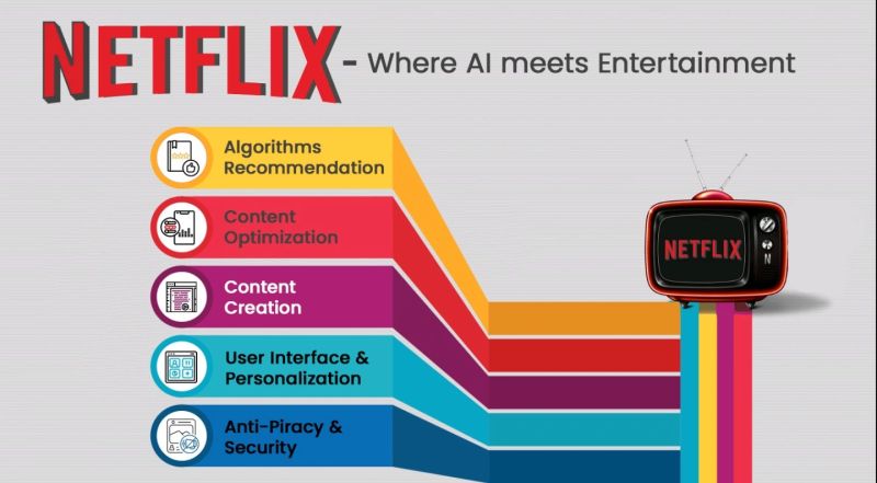
The Power of AI-Driven Personalization
Artificial intelligence (AI) is transforming marketing by enabling hyper-personalized customer experiences at scale. AI tools can analyze vast amounts of customer data, allowing brands to predict behavior, deliver tailored content, and create highly relevant recommendations. This level of personalization not only enhances customer satisfaction but also fosters brand loyalty.
For instance, companies like Netflix and Amazon have mastered the art of AI-driven personalization, delivering content and product recommendations based on user preferences and behavior. As we approach 2025, consumers will expect this kind of personalized experience from every brand they interact with.
Actionable Step: Invest in AI-powered marketing tools that allow you to gather and analyze customer data effectively. Start by integrating AI into your email marketing, content delivery, and e-commerce platforms to offer personalized recommendations and improve engagement.
Omnichannel Customer Experiences
In 2025, the line between online and offline experiences will blur even further, with customers expecting seamless interactions across multiple touchpoints. An omnichannel marketing strategy ensures that no matter where your audience engages with your brand—whether it’s through social media, email, in-store, or mobile apps—the experience feels unified and consistent.
Leading brands are already embracing omnichannel strategies to create frictionless experiences. For example, Starbucks’ mobile app integrates with in-store interactions, allowing customers to order ahead, earn rewards, and pay seamlessly. This kind of cohesive approach will be crucial to staying competitive.
Actionable Step: Begin mapping out your customer journey to identify where your audience engages with your brand. Develop a strategy that ensures a consistent brand message and customer experience across all platforms and devices.
Embracing Sustainability in Brand Messaging
As consumers become more socially conscious, sustainability is no longer a nice-to-have but a necessity for brands looking to build trust and loyalty. By 2025, sustainability will be a key driver of purchase decisions, with customers seeking out brands that align with their values, particularly regarding environmental and ethical concerns.
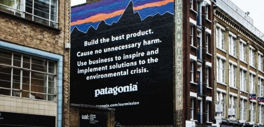
Brands like Patagonia and Allbirds have built their entire ethos around sustainability, and their transparent, eco-friendly practices resonate deeply with today’s consumers. As environmental concerns grow, incorporating sustainability into your marketing messaging will become even more critical.
Actionable Step: Assess your brand’s current sustainability efforts and look for ways to authentically integrate these values into your marketing. Share your sustainability initiatives openly, whether through product development, sourcing, or corporate social responsibility.
Investing in Data Analytics for Better Decision-Making
Data will continue to be the lifeblood of effective marketing strategies in 2025. Brands that harness the power of data analytics will be better equipped to make informed decisions, predict trends, and tailor their campaigns to meet customer expectations. The ability to access real-time insights and predictive analytics will set top performers apart from the competition.
However, with the rise of data privacy regulations, businesses must also be mindful of how they collect and use customer data. Ethical data practices will be critical in building trust with consumers who are increasingly concerned about privacy.
Actionable Step: Invest in advanced data analytics tools and teams to improve your ability to make data-driven decisions. Ensure your data collection processes are transparent and ethical, and prioritize data security to build consumer trust.
Refining Digital Transformation Strategies
Digital transformation isn’t a one-time event—it’s an ongoing process that must evolve alongside new technologies and customer behaviors. As we look toward 2025, businesses that remain agile and continue to refine their digital transformation strategies will be better positioned to succeed.
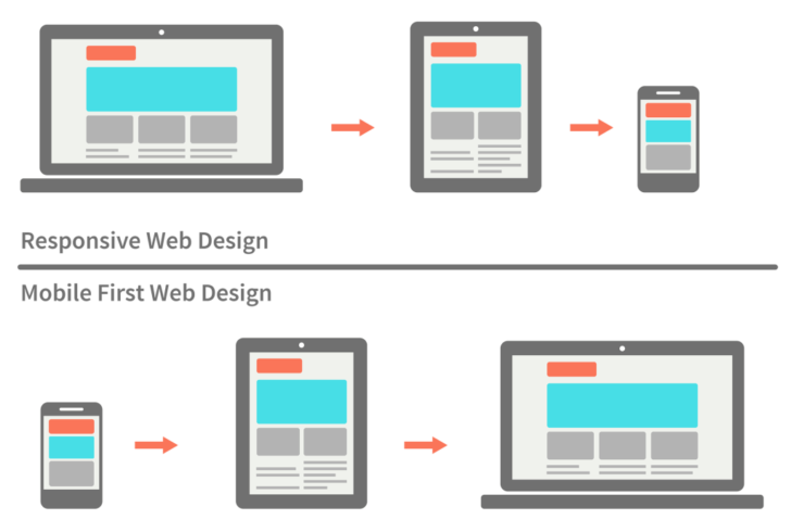
Mobile-first approaches, automation, and digital agility will be essential in delivering the seamless experiences customers expect. Brands that fail to evolve their digital capabilities risk falling behind competitors who embrace the latest innovations in digital marketing.
Actionable Step: Continuously assess your digital channels and invest in technologies that enable you to deliver personalized, mobile-first experiences. Stay on top of emerging trends and be prepared to pivot your digital strategies as needed.
Embracing Ethical Marketing Practices
In 2025, consumers will increasingly favor brands that operate with transparency, inclusivity, and ethical values. Ethical marketing goes beyond avoiding misleading ads—it’s about building long-term trust through honesty, accountability, and a commitment to doing good.
Brands that embrace ethical marketing practices will resonate more deeply with today’s socially conscious consumers. This includes promoting diversity and inclusion, supporting social causes, and being transparent about business practices.
Actionable Step: Review your marketing practices and ensure they align with ethical standards. Be transparent about your brand’s values, and show genuine support for causes that matter to your audience. This will help build long-term loyalty and trust with your customers.
Agility and Innovation: The Cornerstones of Future Marketing
The future of marketing belongs to brands that can adapt quickly to change and foster a culture of innovation. Whether it’s responding to new consumer behaviors, pivoting during a crisis, or leveraging emerging technologies, agility will be key to staying competitive in 2025.
Agile marketing allows teams to iterate quickly, test new ideas, and respond to real-time feedback. Brands like Spotify and Nike have shown how an agile approach enables them to stay ahead of trends and maintain a strong connection with their audience.
Actionable Step: Build an agile marketing team by fostering a culture of experimentation and innovation. Encourage your team to test new ideas, iterate quickly, and adapt to changes in the marketplace.
Take the First Steps Toward Future-Proofing Your Marketing
As the marketing landscape continues to evolve, businesses that embrace AI-driven personalization, omnichannel experiences, sustainability, and ethical marketing will be well-positioned for success in 2025. But to stay competitive, brands must also remain agile and open to innovation.
Contact Bluetext today to start future-proofing your marketing strategies and ensure your brand is ready to thrive in the years to come.
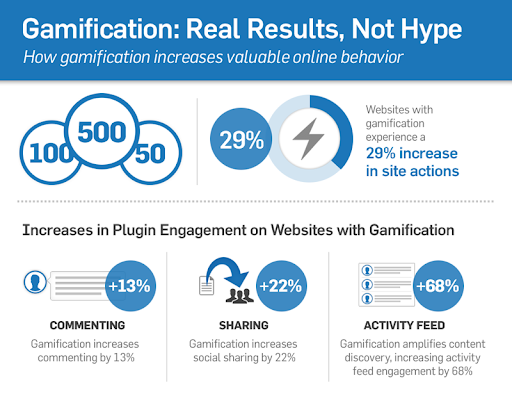
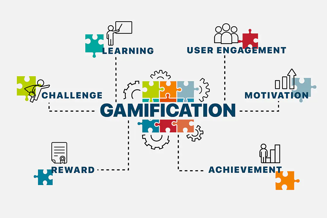
When most people think of gamification, they imagine its applications in video games or perhaps education, where rewards and competition motivate learners. However, the potential for gamification goes far beyond these fields. Today, industries like healthcare, finance, and insurance are leveraging gamification to create more engaging experiences, motivate their audiences, and drive meaningful change. In this blog, we explore how non-traditional sectors are using gamification to innovate and transform the way they interact with both customers and employees.
What is Gamification? A Brief Overview
At its core, gamification refers to the application of game-like elements—such as points, rewards, challenges, or leaderboards—in non-game environments. By tapping into human psychology and the desire for competition, achievement, and recognition, gamification can drive engagement, motivate behavior, and improve the overall user experience.
Traditionally, gamification has been used in the gaming industry and education. However, its principles can be applied across a wide range of industries, with many non-traditional sectors beginning to recognize its power.
Healthcare: Gamification for Better Health Outcomes
One sector that has embraced gamification in surprising ways is healthcare. From fitness apps that track your steps and reward you with badges to mental health platforms that encourage mindfulness practices through daily challenges, gamification is helping patients take a more active role in managing their health.
Consider how apps like MyFitnessPal or Fitbit incorporate game mechanics to encourage users to meet their health goals. These platforms rely on progress tracking, streaks, and social competition to motivate users to make healthier choices. Hospitals and healthcare providers have also jumped on board by using gamified programs to encourage patient adherence to treatment plans. For example, a platform like Mango Health uses gamification to reward patients for taking their medications on time, which has been shown to improve long-term adherence rates.
Beyond patient care, gamification is also making waves in medical training. Virtual simulations with gamified elements are helping healthcare professionals sharpen their skills, offering interactive environments where doctors and nurses can practice procedures or diagnose conditions.
Finance: Engaging Users Through Gamified Learning and Rewards
The finance sector has also discovered the potential of gamification, particularly in educating customers and encouraging better financial habits. Personal finance apps like Mint and YNAB (You Need A Budget) have transformed the often-daunting task of budgeting into something interactive and rewarding. These platforms use gamified features such as goal-setting, progress bars, and rewards to motivate users to save money, reduce debt, and invest wisely.
Fintech companies and even traditional banks are increasingly integrating gamification into their loyalty programs. For instance, some credit card companies now offer rewards based on certain spending behaviors, turning ordinary purchases into opportunities to earn points, unlock levels, and gain exclusive benefits. These incentives not only drive engagement but can also improve financial literacy among users.
Moreover, some companies are using gamified learning platforms to educate customers about complex financial products. For example, certain investment apps offer users the chance to simulate stock trading, rewarding them for making smart investment choices without the risk of real losses.
Other Non-Traditional Sectors Adopting Gamification
Beyond healthcare and finance, other sectors are beginning to explore the potential of gamification. For example, insurance companies are experimenting with gamified apps that reward customers for safe driving habits or completing wellness assessments. By turning these mundane tasks into interactive challenges, insurers are encouraging healthier behaviors and lowering risk, benefiting both the company and the customer.
Professional services firms and government agencies are also getting in on the trend. Gamified platforms are increasingly being used for employee training and compliance programs. These sectors are making traditionally dry content more engaging by offering badges, certificates, or even leaderboards to reward participation and completion. This shift towards gamification not only improves retention of information but also encourages employees to engage with content more enthusiastically.
The Psychological Drivers Behind Gamification
So why does gamification work so well, even in industries that aren’t typically associated with “fun”? The answer lies in psychology. Gamification taps into our intrinsic motivations by offering immediate feedback, a sense of accomplishment, and rewards for progress. This triggers the brain’s dopamine pathways, creating a feeling of pleasure and satisfaction that encourages users to continue the behavior.
By implementing features such as leaderboards, challenges, and rewards, companies can encourage both customers and employees to complete specific tasks or engage with their content more frequently. Whether it’s tracking daily health habits or learning new financial skills, gamification works because it transforms routine tasks into something engaging and rewarding.
Challenges and Ethical Considerations
While gamification offers many advantages, it’s important to acknowledge the challenges it presents, particularly in sectors like healthcare and finance where ethical concerns are paramount. One major consideration is ensuring that gamification is used responsibly and does not exploit users’ behaviors in harmful ways. For example, rewarding users for health behaviors must be done in a way that promotes long-term well-being rather than short-term gratification.
Additionally, integrating gamification into industries resistant to change—such as heavily regulated sectors like insurance or government—requires careful strategy and stakeholder buy-in. Success depends on how well these elements align with the sector’s existing processes and customer expectations.
Unlocking the Power of Gamification in Non-Traditional Sectors
Gamification has the power to transform how non-traditional sectors engage with their audiences. By using game-like elements to drive user participation, healthcare, finance, insurance, and other industries are creating more interactive, motivating, and impactful experiences. The future of gamification is bright, and its potential is only beginning to be realized in industries that once seemed unlikely candidates.
At Bluetext, we help businesses across all sectors leverage gamification to elevate customer engagement and drive behavior change. Whether you’re looking to educate, motivate, or simply make your services more engaging, we have the expertise to design gamified solutions that work for your industry. Contact us today to learn more.
Prefer listening over reading? Check out the podcast version of this blog below and enjoy insights on the go!
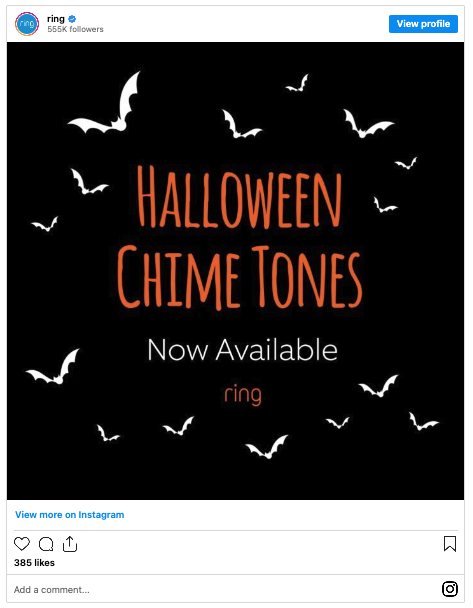
When most people think of Halloween, images of pumpkins, spooky costumes, and haunted houses come to mind. But beyond trick-or-treating and ghost stories, Halloween offers a unique opportunity for businesses—especially B2B brands—to inject some creative flair into their branding efforts. While holidays like Halloween are often associated with B2C marketing, B2B companies can take advantage of the seasonal excitement to engage clients, refresh their brand image, and stand out in competitive markets.
In this post, we’ll explore how B2B brands can embrace the spooky spirit to reinvent their branding, from visual elements to clever campaigns. Let’s dive into the ways Halloween can offer both a temporary and lasting boost to your company’s image.
1. Leveraging Halloween for Seasonal Campaigns
Themed campaigns tied to specific holidays can be an effective way to create buzz and engage your audience. Halloween, with its playful, fun atmosphere, is the perfect backdrop for creativity. By leaning into the festive spirit, B2B companies can use Halloween as an opportunity to showcase a different side of their brand, one that’s more approachable, memorable, and human.
Consider running a limited-time promotion or launching a Halloween-themed product campaign. For example, a cybersecurity company could promote a “hauntingly good” offer on their services, while a SaaS provider might roll out a themed demo or tutorial to highlight “scary” data risks and how their product can help.
Seasonal campaigns give brands a chance to engage customers in a way that feels timely and relevant, boosting visibility and generating excitement.
2. Spooky Visuals & Branding Elements
Halloween is all about striking visuals—think eerie shadows, bold colors, and playful characters. B2B brands can temporarily refresh their image by incorporating Halloween-themed elements into their logos, websites, or social media channels. A temporary logo redesign featuring bats, pumpkins, or a spooky color palette can add a touch of fun to your brand without compromising professionalism.
Playful visuals also attract attention in crowded digital spaces, encouraging users to stop and engage with your brand. Adding subtle Halloween elements to your website banners, social posts, or email campaigns can help create a cohesive, festive feel.
At Bluetext, we work with brands to ensure that their seasonal visuals remain true to their overall identity while capturing the spirit of the occasion. Done right, spooky visuals can not only engage your audience during Halloween but also position your brand as creative and adaptable long-term.
3. Spooky Copywriting & Themed Messaging
Words matter, especially when they come with a twist of spooky fun. Halloween-themed copy can help your messaging stand out in an otherwise dry B2B environment. Think about using clever, eerie puns or references in your marketing materials—whether it’s a tagline like “Don’t let your data ghosts haunt you!” or email subject lines like “A Frighteningly Good Offer Awaits.”
Spooky messaging can also humanize your brand by allowing a lighter, more playful tone. Just remember to balance the festive fun with your overall brand voice, ensuring you maintain credibility while having fun with your audience.
4. Halloween as a Gateway to a Brand Refresh
What starts as a seasonal campaign can sometimes inspire larger, more permanent shifts in your brand’s identity. By experimenting with Halloween-themed visuals, messaging, and promotions, you may discover new ideas that resonate with your audience and can be carried forward into your long-term strategy.
For example, the introduction of a temporary mascot for a Halloween campaign could evolve into a recurring brand ambassador that reappears in future seasons. Or, the more playful tone used in Halloween messaging might inspire your team to adopt a friendlier, more conversational approach to your year-round communications.
Seasonal branding efforts can be a great testing ground for ideas that may eventually lead to a full-scale brand refresh. At Bluetext, we work with clients to explore these opportunities, leveraging seasonal campaigns to inform bigger shifts in brand strategy.
5. Examples of Successful Halloween Campaigns in B2B
Halloween-themed campaigns aren’t just for consumer-facing brands. In fact, many B2B companies have successfully embraced the holiday to make a lasting impression.
For example, an enterprise software company might run a Halloween-themed webinar, marketing it as “Scary Good Tips to Save Time with Automation.” A financial services firm could host a “Fright-Free Finance” event, focusing on demystifying complex financial topics with a seasonal twist. Even something as simple as incorporating spooky language into social media posts or launching a limited-time offer on services can help B2B brands join the Halloween fun.
By embracing these creative ideas, brands can increase engagement, foster stronger connections with their audience, and leave a lasting impression that extends beyond the holiday itself.
Unleash the Spooky Potential of Your Brand
Halloween offers more than just costumes and candy; it’s an opportunity for B2B brands to get creative and refresh their image. From spooky visuals and clever copy to themed campaigns that build buzz, Halloween can be the perfect catalyst for both short-term engagement and long-term brand innovation.
At Bluetext, we specialize in helping brands tap into seasonal opportunities to create lasting impact. Ready to put your own spooky spin on your brand this Halloween? Contact us today to start planning a campaign that will haunt your audience—in all the right ways.
In today’s fast-paced digital landscape, brands must continually evolve to stay relevant and competitive. One of the most transformative forces in modern branding is artificial intelligence (AI). From automating design processes to creating personalized visual experiences, AI is changing how brands are developed and perceived. But how do you leverage this cutting-edge technology to enhance your brand design while staying true to your core identity? In this post, we’ll explore how integrating AI into your brand design strategy can help you stay ahead of the curve.
The Importance of AI in Brand Design
Artificial intelligence has infiltrated almost every industry, and brand design is no exception. Traditional brand design workflows, which used to be time-intensive and reliant on human intuition, are now becoming more efficient and data-driven thanks to AI tools.
AI can assist in logo creation, generate brand color palettes, suggest fonts, and even layout entire webpages or advertisements in seconds. These tools allow businesses to produce consistent and aesthetically pleasing visuals more quickly and with fewer resources. But beyond speed and convenience, AI also introduces a level of precision and adaptability that wasn’t possible before, allowing brands to make informed, data-backed design decisions.
AI Tools Revolutionizing Brand Design
A host of AI-driven tools are already making waves in the design world, democratizing access to professional-level design. Tools like Adobe Firefly and Canva’s AI features enable both novice and professional designers to experiment with design elements like colors, typography, and layouts in real time. Looka, an AI logo design platform, allows users to create logos that fit their brand aesthetic in just a few clicks, using intelligent algorithms that adapt to user input.
These tools not only streamline processes but also give designers the creative freedom to focus on bigger-picture thinking while the AI handles the more repetitive aspects of design. Whether it’s generating mockups or automating the application of branding across multiple formats, AI tools are helping companies achieve consistent and impactful visual identities at scale.
Personalization and Dynamic Design Through AI
One of AI’s most exciting applications in brand design is its ability to create personalized, dynamic visuals. By analyzing user data, AI can tailor brand experiences in real-time to better match individual preferences. This means brands can deploy personalized content, from custom website designs to targeted email visuals, based on user behavior and engagement patterns.
This level of personalization fosters a deeper connection between the brand and its audience, improving engagement and loyalty. For instance, AI can help e-commerce platforms generate product recommendations that are reflected in personalized brand designs, ensuring customers see visuals that resonate with their tastes and needs. This dynamic approach makes the brand feel more responsive, relevant, and customer-centric.
Maintaining Creativity and the Human Touch
While AI has proven itself to be a powerful tool in the designer’s toolkit, it’s important to remember that it’s not a replacement for human creativity. AI can enhance efficiency and produce data-backed designs, but the human touch is still crucial to infusing authenticity and emotion into your brand.
To maintain the balance, brands should view AI as a complement to human creativity, not a substitute. While AI can generate a polished logo in minutes, it takes a designer’s artistic vision to ensure that the logo communicates the right message and aligns with the brand’s ethos. Incorporating AI into your workflow should free up time for more strategic, creative thinking rather than completely automating the creative process.
How to Stay Ahead of the Curve
So, how can you stay ahead in this AI-driven design revolution? Here are a few practical tips:
- Start Small: Introduce AI tools incrementally into your design process. Use them to optimize repetitive tasks like resizing visuals or applying brand guidelines across platforms.
- Keep Learning: AI tools are evolving rapidly. Stay updated on new AI-powered design platforms and features to keep your workflow cutting-edge.
- Blend Creativity with AI: Don’t rely entirely on AI for design. Leverage its strengths in efficiency while maintaining human creativity to ensure your brand remains authentic and original.
- Experiment with Personalization: Use AI to create dynamic, personalized visual experiences that engage your audience. The more tailored your content is, the more effective it will be.
Conclusion
The integration of AI into brand design is not just a trend—it’s the future. AI offers unparalleled speed, precision, and customization that allow brands to innovate and compete on a global scale. However, the key to leveraging AI successfully lies in balancing its technological strengths with the creativity and emotional intelligence only humans can provide.
By embracing AI-driven tools and staying informed on the latest innovations, brands can maintain a competitive edge while still delivering designs that are authentic, personal, and aligned with their values. The future of brand design is a partnership between human creativity and AI’s efficiency—one that, when done right, will allow brands to thrive in the evolving digital landscape. Contact us today to explore how AI-powered design can elevate your brand to new heights!
In today’s competitive marketplace, customer loyalty is more valuable—and harder to earn—than ever before. Consumers have endless options at their fingertips, and brands must go above and beyond to stand out. One powerful way to secure long-term customer loyalty is through personalized rewards programs. These programs not only incentivize repeat business but also strengthen the emotional connection between the brand and the customer by making every interaction feel more meaningful.
But what does it take to design and implement a personalized rewards program that keeps customers coming back? Let’s explore the key elements of an effective, customer-centric loyalty strategy.
The Importance of Personalization in Loyalty Programs
Traditional rewards programs that offer generic incentives—such as blanket discounts or point systems—are quickly losing their appeal. Today’s customers expect more personalized, relevant experiences. Personalized rewards programs tailor benefits and incentives to individual preferences and behaviors, making customers feel valued and understood by the brand.
When done right, personalized programs can significantly boost customer retention, increase lifetime value, and enhance brand loyalty by creating unique, one-on-one relationships with customers. Instead of feeling like just another number, customers feel like they’re part of an exclusive club, which strengthens their emotional attachment to the brand.
Key Elements of an Effective Personalized Rewards Program
Designing a successful personalized rewards program requires a careful balance of data, creativity, and strategy. Here’s how you can get started:
1. Understand Your Customers’ Preferences
Personalization starts with a deep understanding of your customers. The more data you can gather about their behaviors, preferences, and purchasing habits, the more tailored and relevant your rewards can be. Leverage data analytics to track what products or services each customer is most interested in, their frequency of interaction, and any other insights that can inform personalized offerings.
For instance, if you notice a customer frequently purchases specific items, offering rewards related to those products—or even personalized recommendations—will feel much more relevant than a generic discount on unrelated merchandise.
2. Segment and Customize Rewards
Not all customers are the same, so your rewards shouldn’t be either. Implement customer segmentation to categorize users into distinct groups based on behaviors, preferences, or purchasing history. Then, create customized rewards that appeal to each group.
For example, loyal customers who consistently spend above a certain threshold could be offered exclusive VIP rewards like early access to new products or events. On the other hand, customers who haven’t engaged recently might receive personalized offers to reignite their interest, such as discounts on products they’ve shown interest in previously.
3. Offer Flexible Redemption Options
One common frustration customers have with rewards programs is the rigidity of redemption options. To maximize engagement, offer flexibility in how and when customers can use their rewards. Personalized offers, such as time-limited discounts on products they love or points they can use across a variety of categories, give customers more freedom to choose the rewards that matter most to them.
This flexibility makes your program more appealing and gives customers more reasons to engage with your brand regularly.
4. Incorporate Gamification
Gamification is a powerful way to keep customers engaged with your loyalty program. By adding an element of fun and competition, you can motivate customers to earn more rewards. Personalization can take this further by tailoring the gamified experience to each user’s preferences.
For instance, creating challenges or missions that align with a customer’s interests (e.g., completing a series of purchases in a product category they favor) can make the experience more enjoyable and encourage continued participation.
The Benefits of a Well-Designed Personalized Rewards Program
When customers feel recognized and rewarded in a meaningful way, it fosters a strong emotional connection with your brand. This connection translates into tangible business benefits, including:
- Increased Customer Retention: Personalized rewards programs keep customers engaged and incentivize repeat purchases, reducing churn and increasing retention over time.
- Higher Lifetime Value: Engaged, loyal customers tend to spend more. Offering personalized rewards based on purchasing habits encourages customers to keep interacting with your brand, resulting in a higher lifetime value.
- Word-of-Mouth Referrals: Customers who feel special and valued are more likely to recommend your brand to others. Personalized loyalty programs help create brand advocates who spread the word, driving new customer acquisition through referrals.
Implementing Your Own Personalized Rewards Program
Implementing a personalized rewards program may seem complex, but with the right tools and strategy, it can transform customer engagement and brand loyalty. Start by integrating data-driven insights to understand your audience, then build a rewards system that feels personal and relevant to each customer.
At Bluetext, we specialize in helping brands create loyalty programs that drive customer retention and build emotional connections. Whether you’re looking to launch a new program or refine an existing one, we can help you design and implement a personalized rewards strategy that delivers results.
Conclusion
In an era where customer loyalty is becoming harder to earn, personalized rewards programs offer a unique way to build long-lasting relationships with your audience. By offering relevant, tailored incentives that speak directly to individual customers, you not only increase retention but also foster a sense of belonging and brand affinity.
If you’re ready to take your customer loyalty strategy to the next level, Bluetext can guide you in designing and launching a personalized rewards program that enhances your brand’s connection with its customers. Contact us today to learn more!
Prefer listening over reading? Check out the podcast version of this blog below and enjoy insights on the go!
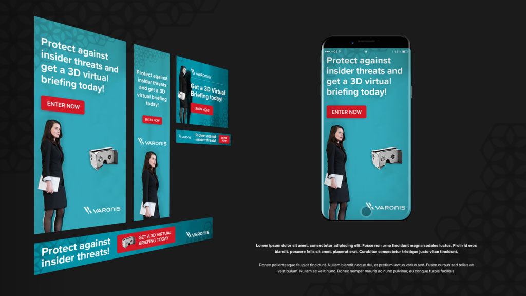
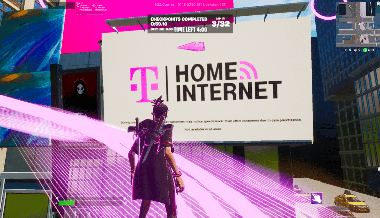
As the gaming industry continues to grow, it’s becoming one of the most promising avenues for brand exposure. In-game advertising, once a niche strategy, has evolved into a powerful tool for marketers looking to reach highly engaged, diverse audiences. At Bluetext, we’ve seen first-hand how brands can capitalize on this trend to build awareness and connect with consumers in a unique, immersive environment. Here’s a closer look at in-game advertising, its effectiveness, and how brands can tap into the gaming market.
The Rise of In-Game Advertising
The gaming industry now rivals the film and music industries in terms of revenue, with billions of players globally. This makes it an appealing space for advertisers. Gamers spend hours immersed in virtual worlds, offering brands the chance to engage audiences where they are most attentive. The rise of mobile gaming, eSports, and virtual reality (VR) has only expanded these opportunities, creating more diverse ad placements that can be seamlessly integrated into gameplay.
Types of In-Game Advertising
- Static In-Game Ads
These are non-interactive advertisements that are built directly into the game environment. Think of billboards, posters, or branded elements within a game’s virtual world. These ads are often baked into the game’s design, allowing them to blend naturally without interrupting gameplay. Sports and racing games, for example, frequently incorporate real-life ads into stadiums or on vehicles. - Dynamic In-Game Ads
Unlike static ads, dynamic in-game ads are flexible and can be updated in real-time. This allows brands to change messaging or switch out ads based on factors like region, time of day, or player demographics. These ads are typically served via programmatic platforms, making it easy for marketers to optimize performance throughout a campaign. - Advergaming
Some brands take it a step further by creating their own custom games—known as advergames. These games are designed specifically around a brand’s products or services. While this requires more investment, it can result in deeper engagement, as players interact with branded content for extended periods. - Rewarded Ads
A popular option in mobile games, rewarded ads offer players in-game incentives—like extra lives or bonus points—in exchange for watching an ad. This ad format benefits both players and advertisers: players get rewards, and brands get guaranteed views. It’s a non-intrusive way to serve ads, as players voluntarily opt-in, creating a more positive experience. - In-Game Product Placement
Product placement is common in TV and movies, but it’s also gaining traction in the gaming world. This method involves placing real-world products or brand elements directly into gameplay. A notable example includes branded cars in racing games or having a well-known soft drink appear as an interactive item. This subtle form of advertising can make brands feel more integrated into the gaming experience.

Effectiveness of In-Game Advertising
In-game advertising offers brands several key advantages. For one, gamers are deeply engaged with the content they’re playing, meaning ads placed in these environments are more likely to be noticed and remembered. Studies have shown that in-game ads often lead to higher brand recall and positive brand associations. Moreover, the flexibility of dynamic ads allows for hyper-targeted messaging, ensuring that brands are reaching the right audience at the right time.
Additionally, in-game ads are non-intrusive compared to other digital ads. Since they are part of the gaming environment, they don’t disrupt the user experience. This makes them more palatable to audiences who are increasingly resistant to traditional ads like banners or pre-roll videos.
How Brands Can Tap Into the Gaming Market
To effectively tap into the gaming world, brands need to understand the unique dynamics of this community. Authenticity is key—gamers can quickly spot inauthentic or forced marketing attempts. Brands that take the time to learn about gaming culture and integrate their ads in a way that adds value to the experience are more likely to see success.
Additionally, brands should consider partnering with popular game developers or streamers to create custom content or sponsor events. Influencer marketing in gaming has become a powerful way to connect with large, engaged audiences. Partnering with well-known gaming influencers or streamers can help boost credibility and trust among gamers.
In-Game Advertising: A Powerful Marketing Strategy
In-game advertising is no longer just a novel concept—it’s a powerful marketing strategy that can help brands connect with diverse, engaged audiences in a way that feels natural and engaging. At Bluetext, we specialize in helping brands navigate the gaming landscape, leveraging data-driven insights and creative ad placements to build lasting connections with gamers. Ready to level up your advertising strategy? Let’s talk about how in-game advertising can work for your brand.