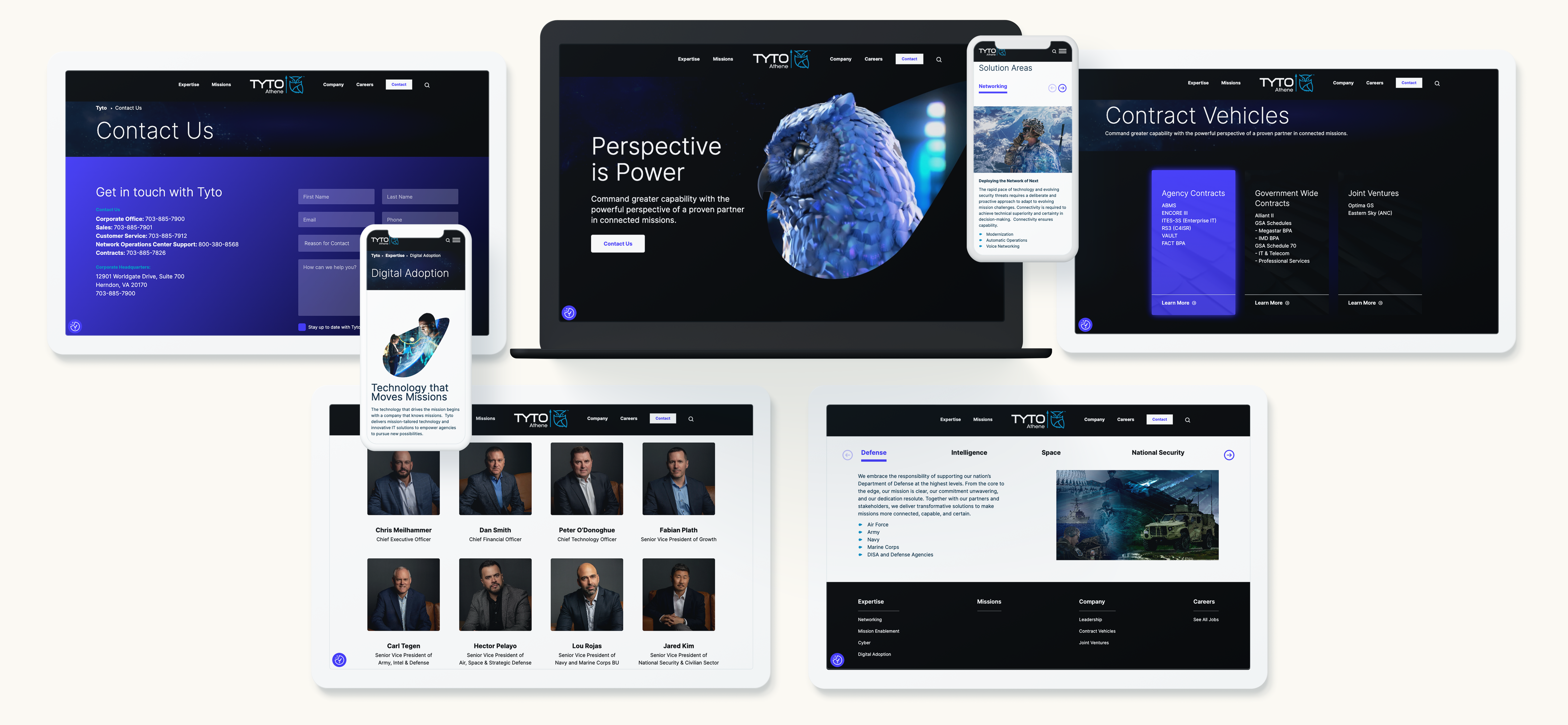
The Department of Defense’s Operational Guidance for Enterprises (DOGE) is transforming procurement and compliance standards for businesses working with the government. As these regulations evolve, B2G companies must rethink their marketing strategies to ensure compliance while maintaining a competitive edge. Aligning marketing efforts with DOGE isn’t just about meeting new requirements—it presents an opportunity to differentiate and strengthen brand positioning. This blog explores key marketing pivots that can help B2G companies adapt successfully.
Understanding DOGE: Key Compliance and Procurement Changes
DOGE introduces updated compliance and procurement processes that impact how B2G companies communicate their value propositions. Some key aspects of DOGE include:
- Enhanced cybersecurity requirements that necessitate clear messaging around data protection and operational security.
- Stronger vetting and certification processes for vendors, influencing how businesses position themselves as trusted partners.
- Greater emphasis on supply chain transparency, which must be reflected in marketing materials and brand storytelling.

Strategic Marketing Adjustments for DOGE Compliance
To remain competitive and compliant, B2G companies should make the following strategic adjustments:
1. Develop Transparent and Compliant Messaging
Regulatory language and security commitments should be embedded in all marketing materials. Clearly communicate compliance with DOGE standards to build credibility and trust.
2. Leverage Digital Channels for Education and Engagement
Use websites, webinars, and thought leadership content to educate government stakeholders about your compliance posture and value proposition.
3. Align Content Marketing with Evolving Procurement Processes
Ensure that whitepapers, case studies, and digital content showcase adherence to DOGE guidelines. Highlighting past performance in compliant contracts can set your company apart.
Strengthening Brand Positioning Through Compliance Alignment
Rather than viewing compliance as a burden, companies can use DOGE alignment as a competitive advantage:
- Thought leadership: Share insights on compliance trends via blogs and LinkedIn articles.
- Trust-building: Create case studies that illustrate successful implementation of DOGE-compliant processes.
- Strategic partnerships: Collaborate with industry leaders and certification bodies to reinforce credibility.
Actionable Steps for B2G Marketers
To stay ahead of compliance shifts, B2G companies should:
- Conduct a marketing audit to ensure all messaging aligns with DOGE regulations.
- Update website content and digital assets to reflect security and compliance commitments.
- Strengthen government-facing outreach efforts with transparent and targeted engagement strategies.
Final Thoughts
DOGE compliance isn’t just a regulatory necessity—it’s a chance to refine and strengthen your brand’s positioning. By proactively adjusting marketing strategies, B2G companies can enhance trust, credibility, and competitiveness in the evolving procurement landscape.
Need to refine your B2G marketing strategy to align with evolving compliance standards? Contact Bluetext today to ensure your brand messaging and digital presence stay ahead of regulatory changes.
The customer journey has never been more complex. With consumers interacting across multiple touchpoints—websites, social media, email, mobile apps, and in-person experiences—marketers must navigate vast amounts of data to understand and anticipate customer needs. Enter predictive AI, a game-changing technology that empowers brands to analyze customer behavior, forecast future actions, and deliver personalized experiences at scale.
In this blog, we’ll explore how predictive AI is transforming customer journey mapping and equipping marketers with the tools to enhance engagement, improve retention, and drive conversions.
What is Predictive AI?
Predictive AI uses machine learning algorithms, big data, and artificial intelligence to identify patterns in customer behavior and predict future actions. By analyzing historical data, predictive AI helps brands determine which marketing strategies are most effective, when customers are likely to make a purchase, and how to tailor messaging for maximum impact.
Key benefits of predictive AI include:
- Personalized Customer Experiences: AI analyzes behavioral data to customize interactions and recommendations.
- Improved Lead Scoring: AI assigns value to potential customers based on their likelihood to convert.
- Optimized Marketing Spend: AI identifies high-impact channels, ensuring budget is allocated efficiently.
- Proactive Customer Retention: AI detects churn risks early, enabling brands to intervene with targeted retention strategies.
How Predictive AI Enhances Customer Journey Mapping
Traditional customer journey mapping relies on past interactions to infer future behavior. Predictive AI takes this a step further by using real-time data and machine learning to create dynamic, constantly evolving journey maps. Here’s how:
1. Predicting Customer Needs Before They Arise
By analyzing browsing behavior, past purchases, and engagement history, predictive AI can anticipate customer needs and deliver proactive recommendations. For example, e-commerce platforms use AI to suggest products based on a customer’s browsing habits, while SaaS companies predict feature adoption trends to improve user retention.
2. Real-Time Personalization at Every Touchpoint
AI-driven journey mapping allows brands to personalize experiences across multiple channels. Whether it’s tailoring email content, adjusting website interfaces, or serving hyper-relevant ads, predictive AI ensures that customers receive the right message at the right time.
3. Identifying and Addressing Pain Points
Predictive AI analyzes customer feedback, sentiment data, and behavior to pinpoint friction points in the customer journey. By identifying where users drop off or disengage, brands can implement proactive solutions, such as chatbot support, improved UX design, or automated follow-ups.
4. Enhancing Customer Support with AI Chatbots
AI-powered chatbots leverage predictive analytics to resolve customer issues before they escalate. By understanding previous interactions and common pain points, these bots can provide personalized responses, reducing response times and enhancing customer satisfaction.
5. Driving Retention Through Predictive Churn Analysis
One of the most powerful applications of predictive AI is identifying customers at risk of churn. By detecting declining engagement, reduced purchase frequency, or negative sentiment, AI enables marketers to implement targeted retention efforts, such as exclusive offers, loyalty incentives, or personalized outreach.
Challenges and Considerations for Marketers
While predictive AI offers immense benefits, it’s not without challenges:
- Data Privacy and Compliance: AI relies on large datasets, making adherence to regulations like GDPR and CCPA essential.
- Quality of Data: AI is only as effective as the data it processes. Inaccurate or incomplete data can lead to misleading insights.
- Implementation Complexity: Integrating predictive AI into existing marketing strategies requires the right tools, expertise, and infrastructure.
How Marketers Can Leverage Predictive AI Effectively
To maximize the benefits of predictive AI in customer journey mapping, marketers should:
- Invest in AI-Powered CRM and Analytics Tools: Platforms like HubSpot, Salesforce, and Adobe Sensei offer AI-driven insights for customer journey optimization.
- Adopt a Data-Driven Mindset: Encourage teams to prioritize data collection, analysis, and refinement.
- Test and Iterate: Continuously monitor AI-driven insights and adjust strategies based on performance.
- Ensure Ethical AI Use: Maintain transparency in data collection and adhere to privacy regulations.
Transform Your Customer Journey with Bluetext
Predictive AI is redefining the way brands understand and engage with customers. By leveraging AI-driven insights, marketers can create seamless, personalized, and highly effective customer journeys that drive growth and loyalty. Ready to harness the power of predictive AI? Contact Bluetext today to discover how AI-driven customer journey mapping can elevate your marketing strategy.
The digital landscape is undergoing a paradigm shift with the emergence of Web3. As blockchain technology, decentralized applications, and token-based economies gain traction, marketers must adapt to new ways of engaging with audiences. From NFTs to blockchain-powered loyalty programs, Web3 is redefining brand engagement, offering more transparency, security, and community-driven interactions. In this blog, we explore how Web3 is reshaping brand-consumer relationships and what marketers need to know to stay ahead of the curve.
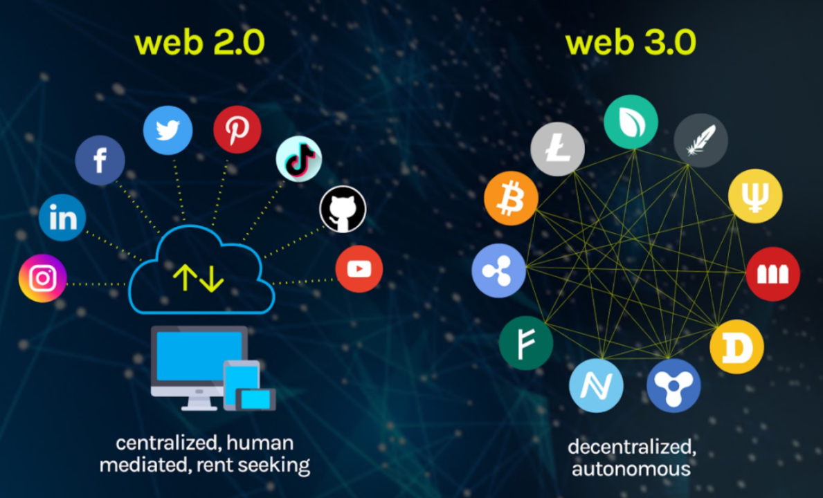
What is Web3?
Web3, or the decentralized web, represents the next evolution of the internet, where users have greater control over their data, transactions, and digital identities. Unlike Web2, which relies on centralized platforms like Google, Facebook, and Amazon, Web3 operates on blockchain networks that distribute ownership and decision-making across a network of users.
Key features of Web3 include:
- Decentralization: Eliminating reliance on centralized entities, giving users more control.
- Tokenization: Digital assets, such as NFTs and cryptocurrencies, facilitate unique ownership models.
- Smart Contracts: Self-executing contracts that enable secure, automated transactions.
- Enhanced Privacy and Security: Blockchain encryption reduces data breaches and fraud risks.

How Web3 is Transforming Brand Engagement
As brands explore Web3 technologies, they are unlocking new opportunities to create immersive and customer-centric experiences. Here are some of the key ways Web3 is revolutionizing brand engagement:
1. NFTs as Digital Collectibles and Brand Assets
Non-fungible tokens (NFTs) allow brands to offer exclusive digital collectibles, limited-edition products, and even virtual experiences. Brands like Nike and Adidas have already launched NFT-based products, strengthening customer loyalty and engagement.
2. Blockchain-Powered Loyalty Programs
Traditional loyalty programs often suffer from low engagement and lack of transparency. Web3 enables blockchain-based loyalty programs where customers earn and trade tokens that hold real value, increasing participation and long-term brand commitment.
3. Decentralized Communities and DAOs
Decentralized autonomous organizations (DAOs) give consumers a say in brand decisions. By integrating DAOs, brands can foster stronger community engagement, allowing loyal customers to participate in governance, product development, and marketing strategies.
4. Metaverse and Virtual Brand Experiences
The metaverse, a digital universe powered by Web3, offers brands the ability to host virtual events, create digital storefronts, and provide interactive experiences. Luxury brands like Gucci and Louis Vuitton have already embraced the metaverse to enhance customer interactions.
5. Transparency and Trust Through Blockchain
Consumers today demand authenticity and ethical business practices. Blockchain technology ensures transparent supply chains, verifiable sustainability claims, and tamper-proof records, strengthening consumer trust in brands.
Challenges and Considerations for Marketers
While Web3 presents exciting opportunities, it also comes with challenges that brands must navigate carefully:
- Regulatory Uncertainty: Governments are still defining regulations around cryptocurrencies and NFTs.
- User Education: Many consumers are unfamiliar with blockchain and require guidance to participate in Web3 ecosystems.
- Scalability and Environmental Concerns: Some blockchain networks require high energy consumption, prompting brands to seek eco-friendly alternatives.
How Marketers Can Prepare for Web3
To stay competitive in this evolving landscape, marketers should:
- Educate Themselves: Understand the basics of blockchain, NFTs, and the metaverse.
- Experiment with Web3 Campaigns: Start small by integrating NFTs, blockchain loyalty programs, or virtual events.
- Focus on Community Building: Engage with customers through decentralized platforms and reward participation.
- Partner with Web3 Experts: Collaborate with blockchain developers and agencies to ensure seamless implementation.

Future-Proof Your Brand with Bluetext
As Web3 continues to disrupt traditional marketing, brands need expert guidance to navigate this new digital frontier. Bluetext specializes in helping brands harness emerging technologies to create innovative, engaging, and future-ready marketing strategies. Contact Bluetext today to explore how Web3 can elevate your brand engagement.
Gone are the days of one-size-fits-all marketing. Consumers expect personalized experiences that cater to their unique interests and needs. For businesses targeting niche audiences, hyper-personalized marketing strategies are essential to stand out and drive meaningful engagement. This guide explores how brands can create highly targeted campaigns that resonate with specific audience segments.
Why Personalization Matters in Today’s Market
Personalization isn’t just a trend—it’s a necessity. Research shows that personalized marketing leads to higher engagement, improved customer satisfaction, and increased sales.
Key Benefits of Personalization:
- Higher conversion rates: Personalized campaigns perform better than generic ones.
- Stronger customer relationships: Tailored experiences build loyalty.
- More efficient marketing spend: Targeting the right audience reduces wasted ad spend.
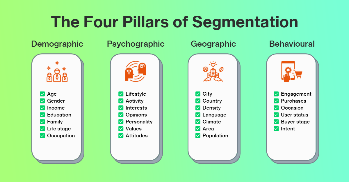
Identifying & Segmenting Niche Audiences
Effective personalization starts with proper audience segmentation. Businesses must analyze their customers and categorize them based on shared characteristics.
- Demographics: Age, gender, location, income level
- Behavioral data: Purchase history, browsing behavior, engagement patterns
- Psychographics: Interests, values, lifestyle choices

Strategies for Hyper-Targeted Campaigns
Once niche audiences are identified, businesses can tailor their messaging for maximum relevance.
1. Dynamic Content Personalization
Adjust content in real time based on user behavior. Websites, emails, and ads should display personalized recommendations and messaging.
2. AI-Driven Recommendation Engines
Leverage machine learning to suggest products, content, or services based on past interactions.
3. Account-Based Marketing (ABM) for B2B Brands
B2B marketers can use ABM strategies to deliver highly customized outreach to specific companies or decision-makers.
The Role of Data in Personalized Marketing
To execute effective personalized marketing, brands must leverage customer data while maintaining ethical standards.
- First-party data collection: Direct interactions like email sign-ups and purchase history
- Behavioral analytics: Tracking engagement to refine personalization
- Privacy compliance: Adhering to GDPR, CCPA, and other data protection regulations
Scaling Personalized Marketing Efforts
While personalization is powerful, it must be scalable. Automation tools help businesses expand their efforts efficiently.
- Marketing automation software (HubSpot, Marketo) streamlines segmentation and messaging.
- AI-powered chatbots deliver real-time personalized interactions.
- CRM integration ensures a seamless, data-driven approach to customer engagement.
Unlock the Power of Personalized Marketing
Personalized marketing is no longer optional—it’s essential for businesses looking to connect with niche audiences. By leveraging data, AI, and tailored messaging, brands can create meaningful interactions that drive long-term success.
Want to develop a hyper-targeted marketing strategy? Contact Bluetext today to take personalization to the next level.
Marketing is often driven by data—metrics, analytics, and KPIs guide decision-making. But numbers alone don’t tell the full story. To truly connect with an audience, marketers must understand the psychological principles that influence decision-making. By tapping into cognitive biases, emotional triggers, and behavioral patterns, brands can craft more compelling campaigns that resonate on a deeper level. In this guide, we’ll explore how psychology plays a vital role in marketing and how businesses can leverage these insights to drive engagement and conversions.
The Role of Psychology in Marketing
While metrics provide a snapshot of audience behavior, psychology reveals why consumers act the way they do. Understanding the motivations, fears, and desires behind purchasing decisions allows marketers to create messaging that not only attracts attention but also fosters lasting brand loyalty.
Key Psychological Influences on Consumer Behavior:
- Emotional decision-making: Most purchases are driven by emotion rather than logic.
- Cognitive biases: Subconscious mental shortcuts influence purchasing choices.
- Social influence: People are more likely to trust recommendations from peers.
Cognitive Biases That Impact Consumer Decisions
Cognitive biases are mental shortcuts that help people make quick decisions—but they also shape consumer behavior in predictable ways. Marketers who understand these biases can craft strategies that align with how customers naturally think.
1. The Scarcity Effect
Consumers perceive limited availability as higher value. Words like “Only a few left!” or “Limited-time offer” trigger urgency and drive conversions.
2. Social Proof
People tend to follow the actions of others. Reviews, testimonials, and influencer endorsements build trust and increase purchase likelihood.
3. Authority Bias
Consumers trust experts and authoritative figures. Featuring industry leaders or certifications in your messaging can boost credibility.
Emotional Triggers in Marketing
Emotions play a critical role in consumer decision-making. By tapping into the right emotional triggers, brands can create stronger connections with their audience.
- Fear of missing out (FOMO): Drives urgency and quick decision-making.
- Nostalgia: Evokes fond memories and positive brand associations.
- Excitement & aspiration: Inspires consumers to take action and feel empowered.
The Power of Personalization & Storytelling
Consumers respond best to brands that feel human. Personalization and storytelling are two powerful tools that make marketing more relatable and impactful.
- Storytelling: A compelling brand narrative helps establish trust and emotional investment.
- Personalization: Tailored recommendations and targeted content increase engagement.
Applying Psychological Insights to Your Marketing Strategy
To integrate psychology-driven tactics into your marketing, consider the following steps:
- Use data to understand audience behavior – Identify patterns in customer interactions.
- Incorporate cognitive biases into messaging – Utilize urgency, authority, and social proof.
- Leverage emotional triggers – Align messaging with your audience’s emotions.
- Personalize content – Create hyper-targeted campaigns based on customer preferences.
- Test and optimize continuously – Use A/B testing to refine messaging for maximum impact.
Transform Your Marketing with Psychological Insights
Going beyond metrics and understanding the psychology of your audience allows brands to create marketing strategies that truly resonate. By leveraging cognitive biases, emotional triggers, and personalization, businesses can build stronger connections and drive greater conversions.
Looking to refine your marketing approach? Contact Bluetext today to craft campaigns that engage your audience on a deeper level.
In today’s digital-first world, content marketing is a critical driver of brand awareness, customer engagement, and lead generation. However, without a structured framework, businesses often struggle to maintain consistency, measure performance, and scale content efforts effectively. A well-defined content marketing framework ensures a strategic, organized, and data-driven approach to content creation, distribution, and optimization. In this guide, we’ll explore the key components of a successful content marketing framework and how businesses can leverage best practices to maximize impact.
What Is a Content Marketing Framework?
A content marketing framework is a structured system that guides the creation, management, and distribution of content to achieve business goals. It ensures that content aligns with brand messaging, resonates with target audiences, and drives measurable results. A strong framework helps businesses streamline content workflows, improve efficiency, and scale their marketing efforts effectively.
Key Benefits of a Content Marketing Framework:
- Enhances consistency across content channels
- Improves efficiency and scalability
- Aligns content efforts with business objectives
- Enables better tracking and measurement of success
- Helps optimize content for search engines and user engagement
Key Components of an Effective Content Marketing Framework
1. Strategy & Planning
Before creating content, businesses must define their objectives, target audience, and key performance indicators (KPIs). A well-crafted strategy ensures that every piece of content serves a purpose and aligns with broader business goals.
- Define objectives: Brand awareness, lead generation, customer retention, SEO performance
- Identify target audience personas: Demographics, pain points, content preferences
- Develop a content calendar: Plan topics, formats, and publishing schedules
2. Content Creation & Workflow
A structured workflow streamlines content production and ensures quality and consistency.
- Develop a content pipeline: Assign roles for ideation, writing, editing, and approval
- Leverage AI and automation tools: Improve efficiency with AI-driven content creation
- Optimize for multiple formats: Blogs, videos, social media, whitepapers, and more
3. Content Distribution Strategy
Creating high-quality content is only half the battle; distributing it effectively maximizes reach and impact.
- Owned media: Website, blog, email newsletters
- Earned media: PR coverage, guest blogs, influencer collaborations
- Paid media: Social media ads, sponsored content, PPC campaigns
- SEO optimization: Keyword integration, metadata optimization, internal linking
4. Performance Measurement & Analytics
Tracking content performance enables continuous optimization and better decision-making.
- Key metrics: Engagement rate, conversion rate, organic traffic, bounce rate
- Analytics tools: Google Analytics, SEMrush, HubSpot, Ahrefs
- A/B testing: Experiment with headlines, CTAs, and content formats
5. Governance & Optimization
A governance model ensures consistency, quality, and compliance across all content.
- Maintain brand voice and tone: Consistent messaging across platforms
- Repurpose and update content: Maximize value from existing assets
- Ensure legal and compliance standards: Industry regulations, copyright laws
Master Your Content Strategy & Drive Results
A well-structured content marketing framework is the foundation of a successful digital strategy. By implementing a strategic approach to content creation, distribution, and measurement, businesses can maximize their marketing impact, enhance audience engagement, and drive meaningful results.
Looking to refine your content marketing strategy? Contact Bluetext today to build a framework tailored to your business goals.
As a new administration takes office, businesses must navigate shifts in policies, regulations, and funding priorities. These changes influence industries from healthcare and technology to defense and sustainability, requiring brands to reassess their marketing strategies. Here’s what to watch and how to stay ahead.
Understanding Policy Impacts on Your Industry
Every administration brings new priorities that can affect how businesses operate. Whether it’s changes in tax laws, data privacy regulations, or environmental policies, brands must anticipate how these shifts may influence their marketing landscape.
- Healthcare: Adjustments to healthcare policies could impact advertising regulations for pharmaceutical and insurance brands.
- Technology: Data privacy laws may require tech companies to update compliance messaging.
- Sustainability: A focus on green initiatives could drive demand for eco-friendly branding.
Refining Your Brand Messaging
Government policies influence consumer sentiment and corporate responsibility expectations. Brands should ensure their messaging aligns with evolving regulations and public perception.
- Proactive Step: Conduct regular brand audits to align messaging with policy trends.
Adapting B2G and B2B Strategies
For companies engaged in B2G marketing or serving industries affected by policy shifts, adapting strategies is crucial.
- Government Contracting: Shifts in federal spending impact procurement opportunities.
- B2B Relationships: Industries adjusting to new regulations may seek solutions that help maintain compliance.
Leveraging Thought Leadership and Crisis Preparedness
With heightened political scrutiny, brands must be prepared for policy-driven PR challenges. Establishing thought leadership and crisis communication strategies can mitigate risks.
- Proactive Step: Position your brand as an industry leader by publishing insights on policy changes.
Staying Agile in a Changing Landscape
The key to thriving in a new regulatory environment is agility. Brands that monitor legislative changes, adjust strategies, and engage with industry advocacy groups will be better positioned for success.
Social media advertising is constantly evolving, and 2025 is bringing new trends, technologies, and regulations that marketers must navigate. Here’s what’s changing and how brands can stay ahead.
1. AI-Powered Ad Personalization
AI-driven algorithms are making social media ads more personalized than ever. Platforms like Meta and TikTok now offer real-time content adaptation based on user behavior.
Action: Leverage AI tools to create dynamic, personalized ad experiences that increase engagement and conversion rates.
2. Increased Privacy Regulations and First-Party Data Reliance
With growing privacy concerns, platforms are reducing reliance on third-party cookies. Brands must focus on first-party data collection through lead magnets and customer loyalty programs.
Action: Implement robust data collection strategies to maintain targeted advertising effectiveness.
3. The Rise of AR and VR Ads
Immersive experiences are gaining traction, with brands using augmented reality (AR) and virtual reality (VR) in social ads to create interactive experiences.
Action: Explore AR filters and VR experiences to boost engagement and brand recall.
4. Expansion of Social Commerce
Social media platforms continue integrating e-commerce capabilities, allowing users to purchase directly within apps like Instagram, TikTok, and Pinterest.
Action: Optimize social commerce strategies by creating shoppable content and streamlining in-app purchasing experiences.
5. Video-First Advertising
Short-form video remains the dominant format, with platforms prioritizing vertical video content.
Action: Invest in high-quality, engaging video content tailored to platform-specific algorithms.
Stay Ahead in Social Media Advertising
The digital landscape is shifting rapidly, and staying informed is key to maintaining an edge. Need help navigating social media advertising in 2025? Bluetext can guide you in crafting high-performing campaigns that drive results.
In today’s fast-evolving market, staying relevant means more than just keeping up—it requires transformation. Some of the most successful brands have undergone strategic rebrands to stay ahead of competition, adapt to changing consumer preferences, and realign with their core mission. Here are key lessons from successful brand evolutions and how to apply them to your strategy in 2025.
1. Understand the “Why” Behind Rebranding
A strong rebrand starts with a clear purpose. Whether due to mergers, market shifts, or outdated visuals, brands that successfully rebrand do so with a strategic vision. Take Airbnb’s 2014 brand transformation—its shift from a simple rental service to a community-driven experience was reflected in a fresh logo, new messaging, and an enhanced user experience.
Takeaway: Before launching a rebrand, assess the core reason behind it and ensure every aspect of the new identity aligns with business goals and customer expectations.

2. Maintain Brand Recognition While Innovating
Brands like Burger King and Mastercard have modernized their identities while maintaining recognizability. Burger King’s retro-inspired logo redesign in 2021 paid homage to its heritage while streamlining its aesthetic for digital platforms.
Takeaway: Balance innovation with familiarity. Retaining core elements, such as color schemes or typography, helps consumers transition smoothly to the new identity.
3. Align with Consumer Values
Brands that integrate cultural relevance and consumer values into their rebrands create stronger connections. Patagonia’s commitment to sustainability has been consistently reflected in its messaging and business decisions, reinforcing brand authenticity.
Takeaway: Listen to your audience and ensure your rebrand aligns with their expectations and values.
4. Invest in Digital-First Branding
A brand’s digital presence is just as crucial as its physical one. Companies like Instagram have evolved their logos and UX to better fit mobile-first experiences, emphasizing usability and engagement.
Takeaway: Design with digital platforms in mind, ensuring seamless integration across all channels.
5. Plan for a Seamless Rollout
A poorly executed rebrand can lead to confusion or backlash. Successful rebrands, like Dunkin’s transition from Dunkin’ Donuts, were accompanied by comprehensive marketing campaigns that educated consumers and generated excitement.
Takeaway: Plan a phased rollout, engage key stakeholders, and communicate changes effectively.
Transform Your Brand with Confidence
A strategic rebrand can revitalize your business and strengthen customer loyalty. If you’re considering a rebrand in 2025, contact Bluetext to craft a transformation strategy that drives results.
Despite evolving digital trends, email marketing remains one of the most effective channels for engaging audiences and driving conversions. However, as inboxes grow more crowded and consumer expectations shift, brands must refine their strategies to maintain impact. Here are the top email marketing strategies that continue to deliver results in 2025.
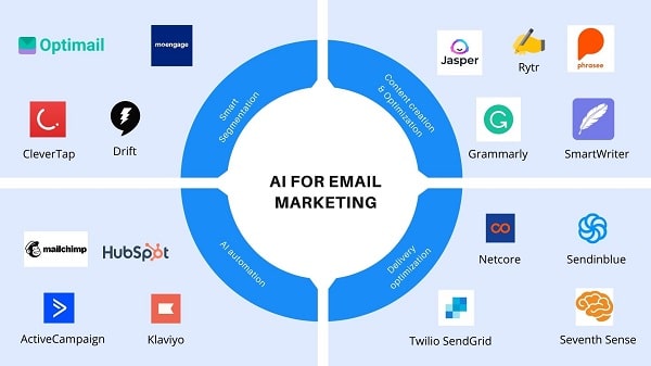
1. Hyper-Personalization and AI-Driven Content
Consumers expect more than generic email blasts. Leveraging AI and machine learning allows brands to analyze customer data, segment audiences, and craft hyper-personalized content. Dynamic content blocks, predictive analytics, and individualized subject lines can significantly boost open and engagement rates.
2. Interactive and Gamified Email Elements
Interactive emails featuring quizzes, polls, countdown timers, and gamification elements keep subscribers engaged. Incorporating interactive content enhances user experience and encourages recipients to take desired actions without leaving their inboxes.
3. Mobile-First Optimization
With most emails being opened on mobile devices, ensuring a seamless experience is non-negotiable. Brands should use responsive design, concise copy, and easy-to-click CTA buttons to improve engagement and conversions across all screen sizes.
4. Privacy-First and First-Party Data Utilization
With increasing restrictions on third-party data, brands must prioritize collecting and leveraging first-party data. Encouraging subscribers to share preferences and using consent-based tracking ensures compliance with evolving privacy regulations while maintaining personalization.
5. AI-Optimized Send Times and Frequency
Timing is everything in email marketing. AI-driven tools analyze recipient behavior to determine optimal send times and frequency, ensuring emails land when users are most likely to engage. Avoiding over-messaging while maintaining consistency is key to long-term subscriber retention.
6. Text-Only and Minimalist Email Trends
While visually rich emails remain popular, text-only and minimalist email formats have gained traction for their authenticity and improved deliverability. These formats often bypass spam filters and appeal to audiences seeking a more straightforward, personal approach.
7. Stronger Email Segmentation for Enhanced Relevance
Effective segmentation remains a cornerstone of successful email campaigns. Brands should refine segmentation based on behavioral triggers, lifecycle stages, purchase history, and engagement levels to ensure recipients receive the most relevant content.
8. Focus on Retention and Loyalty Programs
Email remains a powerful tool for customer retention. Implementing loyalty-driven email campaigns—such as VIP offers, milestone rewards, and re-engagement emails—helps nurture long-term relationships and maximize customer lifetime value.
Elevate Your Email Marketing Strategy
In 2025, successful email marketing is all about relevance, personalization, and compliance. By leveraging AI, interactive content, mobile optimization, and strong segmentation, brands can continue to cut through the noise and drive meaningful engagement with their audiences. Need help optimizing your email campaigns? Partner with Bluetext to craft high-performing, data-driven email strategies that deliver real results.