In today’s fast-paced digital landscape, staying ahead of the curve is crucial for businesses looking to maintain a competitive edge. One trend that has been rapidly gaining traction is Voice Search Optimization (VSO). With the rising popularity of voice assistants like Siri, Alexa, and Google Assistant, optimizing content for voice search has become more than just a trend—it’s now a necessity. In this blog post, we’ll explore the importance of VSO, the strategies involved, and how you can leverage it to enhance your digital marketing efforts.
Understanding Voice Search Optimization
Voice search refers to the act of using voice commands to search the internet, ask questions, or perform tasks on devices equipped with voice recognition technology. Ubiquitous across millions of users daily, voice assistants like Amazon’s Alexa, Apple’s Siri, and Google Assistant are relied upon for finding information and making decisions.
Voice Search Optimization (VSO) involves optimizing your website and content to rank higher in voice search results. Unlike traditional text-based searches, voice searches tend to be more conversational and long-tail in nature, meaning they often contain natural language queries or questions.
Why Voice Search Optimization Matters
The increasing prevalence of voice assistants has fundamentally changed the way people search for information online. According to recent studies, voice searches are not only on the rise but are also expected to account for a significant portion of all searches in the near future. By optimizing your content for voice search, you can ensure that your business remains visible and accessible to a growing audience of voice search users.
Strategies for Voice Search Optimization
- Use Conversational Language: When optimizing content for voice search, it’s essential to use natural, conversational language. Think about how people would verbally ask a question and tailor your content accordingly. Focus on answering common questions related to your industry or niche.
- Target Long-Tail Keywords: Long-tail keywords are longer, more specific phrases that typically have lower search volumes but higher conversion rates. These keywords are especially important for voice search optimization, as users tend to phrase their queries in a more natural, conversational manner.
- Optimize for Local Searches: Many voice searches are location-based, as users seek information about nearby businesses, services, or attractions. Make sure your business listings are up-to-date on platforms like Google My Business and incorporate location-specific keywords into your content.
- Provide Concise Answers: Voice search users are often looking for quick, concise answers to their questions. Structure your content in a way that provides clear and direct answers to common queries, preferably in the form of featured snippets or FAQ sections.
- Optimize for Mobile: Since many voice searches are conducted on mobile devices, it’s crucial to ensure that your website is mobile-friendly and loads quickly. Mobile optimization is not only important for user experience but also for search engine rankings.
Conclusion
Voice Search Optimization presents a significant opportunity for businesses to reach and engage with their target audience in new and innovative ways. By understanding the unique characteristics of voice search and implementing effective optimization strategies, you can enhance your visibility, drive traffic to your website, and stay ahead of the competition in today’s voice-driven world. Embrace the power of VSO and position your business for success in the era of voice search. Contact us to learn more about VSO and implementing it on your website.
As we step into the second quarter of 2024, businesses around the globe are gearing up to refine their marketing strategies, striving to capture attention, engage audiences, and drive growth in an ever-evolving landscape. The beginning of a new quarter presents a prime opportunity to reassess, recalibrate, and rejuvenate your digital marketing efforts. In this blog post, we’ll explore some key steps to help you plan and execute a winning marketing strategy for Q2 2024.
1. Reflect on Q1 Performance:
Before diving into Q2 planning, it’s crucial to reflect on your performance in the previous quarter. Evaluate the effectiveness of your campaigns, assess key metrics, and identify areas for improvement. Understanding what worked well and what didn’t will provide valuable insights to inform your strategy moving forward.
2. Set Clear Objectives:
Define specific, measurable goals that you aim to achieve in Q2. Whether it’s increasing website traffic, generating leads, boosting sales, or enhancing brand awareness, establishing clear objectives will guide your efforts and keep your team focused on what matters most.
3. Know Your Audience:
Take the time to revisit your target audience personas. Consumer behaviors and preferences may have shifted, especially considering ongoing societal changes and technological advancements. Conduct market research to gain a deeper understanding of your audience’s needs, pain points, and purchasing habits, allowing you to tailor your messaging and tactics accordingly.
4. Embrace Multichannel Marketing:
In today’s interconnected digital world, a multichannel approach is essential for reaching and engaging diverse audiences. Explore a mix of channels such as social media, email marketing, content marketing, SEO, PPC advertising, and influencer partnerships. Each channel offers unique opportunities to connect with potential customers at various stages of the buyer’s journey.
5. Prioritize Content Marketing:
Content remains king in the realm of digital marketing. Create high-quality, valuable content that educates, entertains, and inspires your audience. Whether it’s blog posts, videos, infographics, or podcasts, compelling content not only attracts attention but also establishes your brand as a trusted authority in your industry.
6. Leverage Data and Analytics:
Harness the power of data to inform your marketing decisions and optimize performance. Utilize analytics tools to track key metrics, monitor campaign effectiveness, and gain insights into consumer behavior. By analyzing data-driven insights, you can refine your strategies in real-time, ensuring maximum ROI and efficiency.
7. Stay Agile and Flexible:
In today’s dynamic business environment, agility is key to success. Be prepared to adapt and pivot your strategies based on evolving market trends, competitor actions, and external factors such as economic conditions or regulatory changes. Maintain open communication within your team, fostering a culture of innovation and experimentation.
8. Test and Iterate:
Don’t be afraid to experiment with new ideas and approaches. A/B testing allows you to compare different variables within your campaigns, whether it’s email subject lines, ad creatives, or landing page layouts. Use the insights gained from testing to refine your tactics and optimize performance over time.
9. Focus on Customer Experience:
Deliver exceptional customer experiences at every touchpoint, from initial interaction to post-purchase support. Personalization, responsiveness, and authenticity are key drivers of customer satisfaction and loyalty. Strive to exceed expectations and build long-lasting relationships with your audience.
10. Monitor and Measure Results:
Regularly monitor the performance of your marketing initiatives against your predefined objectives. Track key performance indicators (KPIs) and metrics to gauge progress and identify areas that require adjustment. By continuously measuring results, you can refine your strategies and allocate resources more effectively.
As you embark on your journey through Q2 2024, remember that success in marketing is not just about following a predetermined plan but rather about adapting to change, embracing innovation, and continuously striving for improvement. By taking a strategic approach and implementing these key tactics, you can position your business for growth and success in the months ahead. Need help planning for Q2 and beyond? Contact us.
Some call it a national pastime, others call it the sporting event of the year, but in the marketing industry, it might as well be our Christmas. That’s right, we’re referring to the Super Bowl. A day filled with classic American traditions, from a never-ending buffet of dips and apps, to the football rivalries, and most importantly (in marketers’ opinion): the advertisements. Whether you were rooting for the San Francisco 49’ers, two time champs Kansas City Chiefs, or simply hoping both teams have fun and you get a glimpse of Taylor Swift in the stands, the Super Bowl brings together sports fans, creatives and the music industry in a night of traditions.
Keeping with our annual tradition, Bluetext digital marketers ‘watched’ the game, but truly tuned in for the advertising. With so many strong contenders this year, we’ve broken down our favorites by quarter. If there’s one thing sports fanatics and businesses can agree upon, it’s a lovely day for quarterly reporting.
Q1: CeraVe
Beloved skincare brand CeraVe started the night off strong with their debut ad featuring actor Michael Cera, who parodies the dramatics of typical skin care advertisements to take claim to developing the product. Cera replicates classic scenes leaned on by beauty brands to highlight their products, hinting at the ridiculousness of weaving between airy curtains, posing a top gushing waterfall oasis, and even scaling impossible mountains to ask “Can human skin truly be this moisturized?”. The ad snaps back to reality to show Cera pitching the board of CeraVe his idea, claiming “I think it would be really nice if people think I made this.” And while CeraVe does confirm their product is developed and trusted by dermatologists, the ad succeeds in providing a refreshing satire of the fantastical, utterly unrealistic scenes of stereotypical skincare ads.
Q2: Oreo
Super Bowl ad veteran Oreo put a new twist on the brand this year, literally. In their latest placement, the famous cookie brand highlights a fan favorite tradition of the “twist”, aka twisting the cookie to separate the layers and betting on which side will take claim to the icing. It’s a similar mindset to the ‘Right Twix vs Left Twix’ campaign or acknowledgement of the famous Pringle lips practice. It depicts a user’s interaction with the products that resonate with fans, and solidifies something that could be seen as a quirk into a communal practice.
Oreo’s commercial this year showed a wide range of decision makers, going back to paleolithic cavemen all the way to pop culture icon Kris Jenner, placing a bet on “right side or left side” to make their decision. It’s a brilliant spoof of the age old coin toss, but has an influencer or character to please everyone in the process.
Q3: Bud Light
The Anheuser Busch brand has a reputation for brilliant influencer marketing campaigns, but this year took it to a new level with a spiff on “Genie in a Bottle”. Leaning fully into the theme, the ad is set to Steppenwolf’s “Magic Carpet Ride”, as the Bud Light Genie grants wishes for beer-sipping fans. The ad is notably chaotic, in the best and most true to Bud Light way possible. Featuring a number of big name stars like Peyton Manning and Post Malone, and ultimately concluding with a party-foul wish and party-crashing T. rex. The various wishes and scenes were certainly unexpected, and succeeded in capturing and retaining audience attention throughout.
Q4: Kia
The popular car brand returned to Super Bowl advertising this year with a clear set intention: to nail the “Perfect 10”. If brands were measuring by number of tears shed, Kia just may have scored a perfect 10 out of 10 (but notable mention to Google, who also won viewers heart by advertising the accessibility features of the new Pixel phone through the eyes of a visually impaired user). Kia’s advertisement for their new electric SUV features a young ice skater who wants to bring her performance to her wheelchair-bound grandfather who was unable to watch the official competition.
Showing the off-roading power of the EV9, an unexpected capability not typically associated with electric vehicles, the girl and her father drive her to grandfather’s cabin to recreate her performance on a frozen lake outside of his cabin. As a heartwarming change of pace to the usual satirical placement, the ad was touching and optimistic, showing the ways Kia vehicles can be used to bring people together.
Much like the Kia ad hints, Super Bowl advertising might as well be an Olympic sport at this point. Every year brands, returning and new, bring their best concepts and creativity to the table and raise the bar for competition. The ads listed above were a few of our many favorites, and whether you prefer the emotional tearjerkers, star-studded comedies, or even nostalgic throwbacks, we can all agree that Super Bowl ads have a powerful effect to unite viewers from any background, any team, and any demographic into a shared experience.
Feeling inspired by this year’s videos? It’s never too late to refresh your advertising strategy and level up your brand creative. From video production to paid media campaigns, Bluetext can help bring your brand to a new level.
The cybersecurity market is ever-evolving, and with it, digital marketing strategies should anticipate these trends and adapt to stay ahead of them. Careful market analysis and years of industry expertise amongst Bluetext marketing specialists reveal AI technology, increased investment from SMBs, and enterprise risk quantification are expected to impact cybersecurity provider marketing strategies in 2024.
Cybersecurity Trends to Watch:
Artificial Intelligence is Impacting All Industries — Including Cybersecurity
We’ve seen AI headlines not just in the Tech markets, but all over the mainstream media. As utilization of AI becomes more prevalent, with access to open-source models like ChatGPT, cybersecurity providers will need to develop entirely new standards of trust. Organizations will be seeking cybersecurity providers to ensure they can securely deploy AI technology. On top of that, malicious uses for AI will increase the need for protection against cyber attacks. Cybersecurity providers will need to speak to their ability to deploy safe AI product features while also promoting their ability to protect against these AI-powered attacks.
Check out how Bluetext client AmeliaAI leverages conversational AI as a tool for business optimization.

SMB Organizations are Investing More in Cybersecurity
Managed services are becoming an increasingly important purchase for small and medium-sized businesses. Security attacks on SMBs are felt deeply throughout the organization, compared to large enterprises that may find more protection in silos and sheer size. The good news is that, because of increased awareness of this vulnerability, SMBs’ spending on cyber security is expected to reach $109 billion worldwide in 2026. Cybersecurity providers should take advantage of this growing customer base and make additional considerations for SMB target audiences when designing digital marketing strategies.
Enterprises Are Seeking Better Quantification of their Cybersecurity Risks
For enterprise decision-makers, their willingness to invest in cybersecurity measures will hinge on the ability to accurately quantify their current risks. According to Gartner, turnover in the CISO position is an increasing threat to enterprises; they expect 50% of cybersecurity leaders will have left their positions by 2025. A large contributor to CISO stress is a lack of organizational support for seeing cybersecurity measures as a crucial element of meeting business objectives. Calculating the degree of security risk at an enterprise will play a key role in getting organizational buy-in for increased cybersecurity measures. Marketing strategies will need to speak to both cybersecurity leaders (who are looking to fortify their security measures) and executives (who are looking to advance business goals).
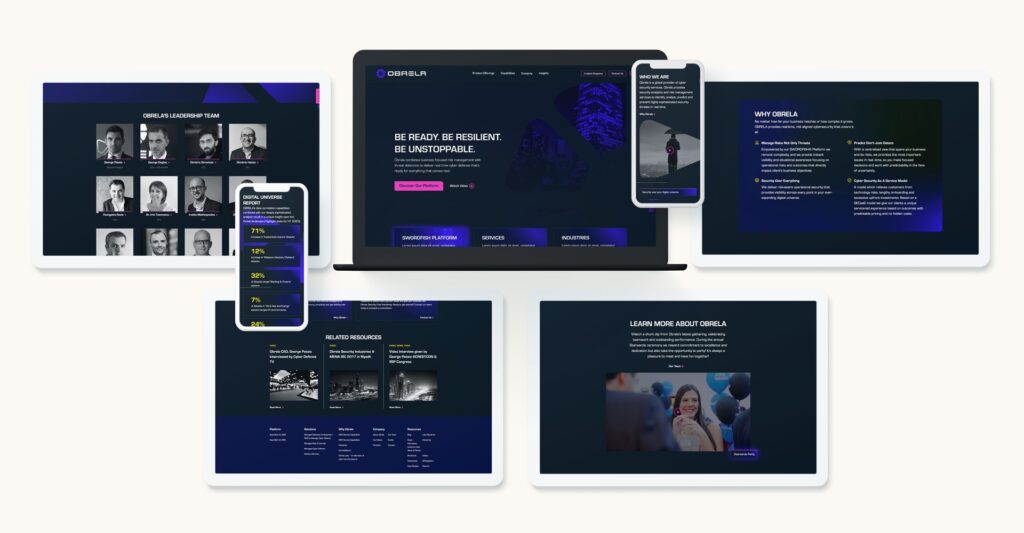
Check out our recent work with Obrela, a world-class cyber security provider, who came to Bluetext for support in updated brand, logo, messaging, website, and video to connect with technical and executive-level audiences.
A digital marketing agency can help your company stay on top of the latest trends in cybersecurity and figure out a plan for how to address these trends in your overall marketing strategy. At Bluetext, we specialize in working with industry-leading cybersecurity professionals; see how we work with companies to build credibility in the realm of cybersecurity in this recent blog.
Curious about what other trends we expect to see in the upcoming year? Read our blog on the 2024 Future Forecast from Bluetext.
We are currently living through a transformation period where sustainability and conservation efforts have been thrust into center stage. Consumers are increasingly looking to businesses to take the lead in addressing environmental and social issues. This means it’s time to ensure your branding efforts reflect the environmental values of your customers so you can build trust and attract new customers.
To be able to stand out in the market and be seen as a company that is striving for sustainability, which encompasses more than just being environmentally friendly, but also socially responsible and economic viability, it’s time to develop a brand that exudes the values of being “green.” In this blog, we’ll lay the foundation for how to get there.
What Is Sustainable Branding?
Sustainable branding is an approach to branding that focuses on a company’s commitment to sustainability and environmental and social responsibility. It involves communicating a company’s sustainability values and highlighting initiatives it takes towards a more eco-friendly future. It encompasses a holistic approach that considers the environmental, social, and economic impact of a brand’s actions throughout its entire lifecycle.
What Does Sustainable Branding Look Like?
There are many ways to help your brand evoke the message of sustainability.
1. Color Palettes with Eco-Friendly Symbolism
The colors you choose for your brand evoke different emotions from your audience. For example, red symbolizes a brand that is ambitious, confident, and bold, whereas navy exudes responsibility, integrity, and peace.
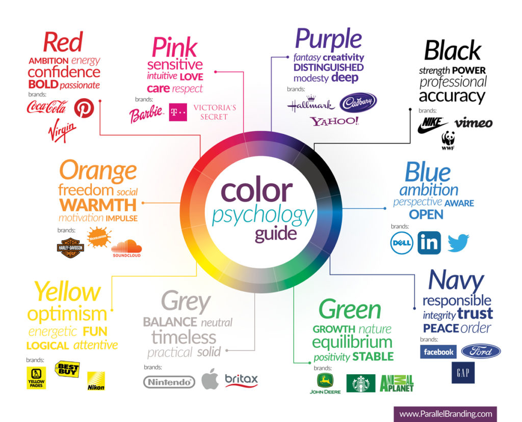
When it comes to establishing a color palette that feels sustainable, green feels like a very obvious choice. However, other colors that reflect nature, such as neutral earth tones and blues, can evoke a similar feeling.
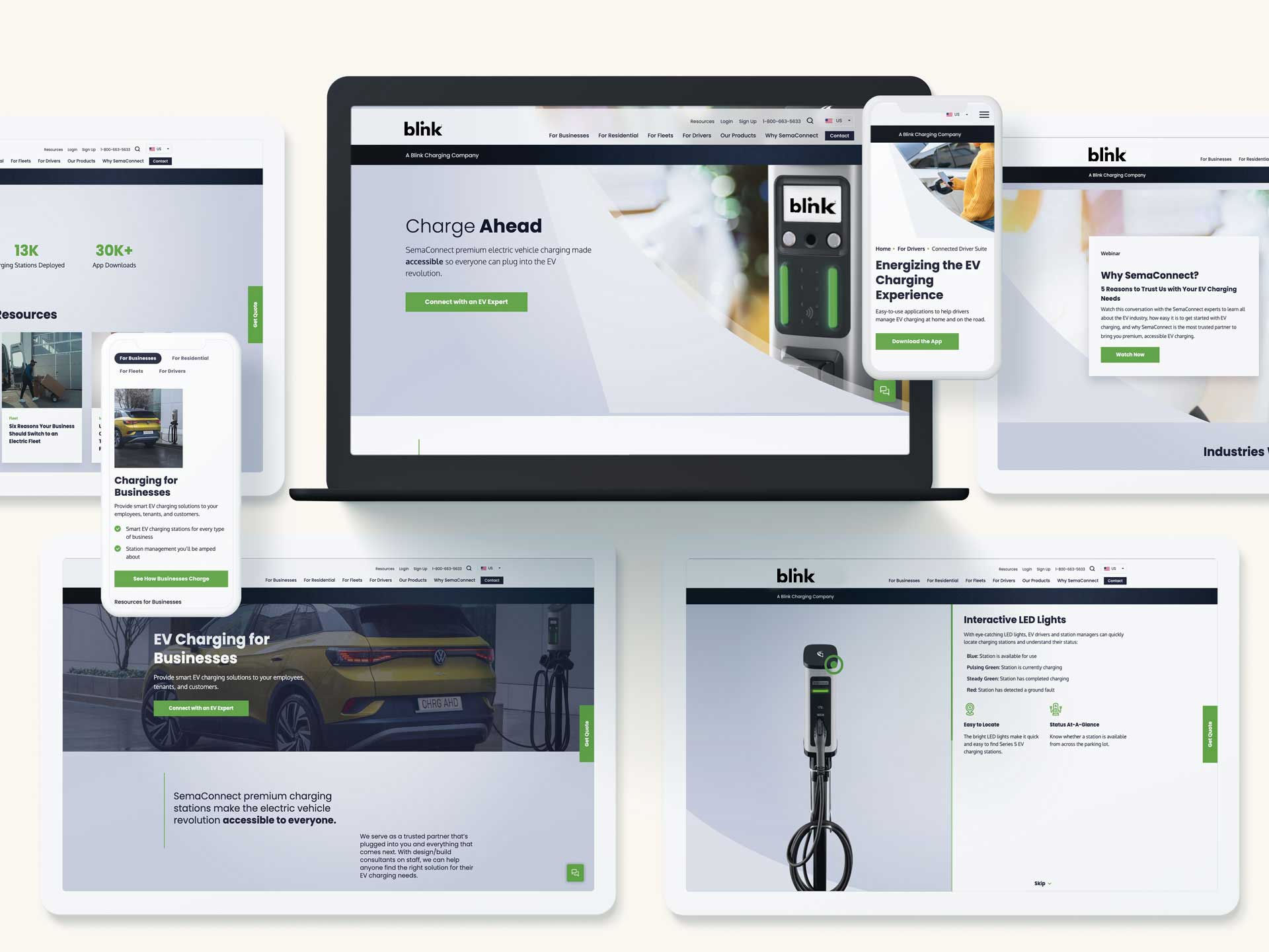
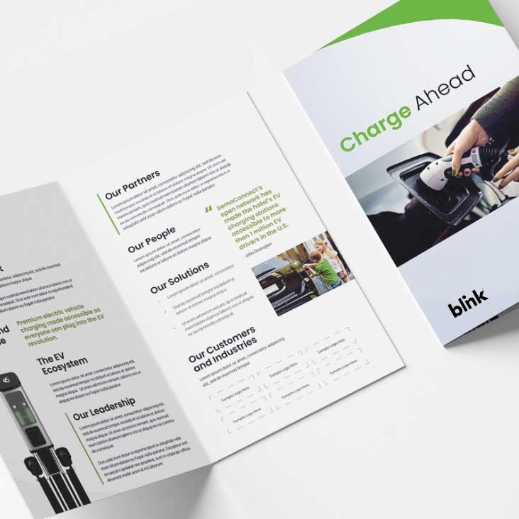
Bluetext client, Blink, knows a thing or two about sustainability. To emphasize their eco-friendly products and business mission, they utilize an eye-catching green with soothing cool blue tones and organic curves.
2. Eco-Friendly Typography
The typography you select for your sustainable brand can speak volumes about your brand’s values. Clean, sans-serif typography exudes modernity and reinforces the clean and minimalist values of your brand, and even reduces the amount of ink needed to print. Arial, Courier, and Garamond are considered some of the most print-efficient fonts on account of thin line work and minimal frills. But, did you know there are even fonts developed to minimize the amount of ink needed to print? This font, called Ryman Eco, maybe a little too custom for some businesses but serves as a great example of commitment to sustainable operations.

3. Nature-Inspired Imagery & Graphics
Your sustainable brand should incorporate visuals that reflect nature and eco-consciousness. Consider nature-inspired brand elements, such as plants or animals, to evoke a sense of environmental responsibility.
How to Establish a Sustainable Brand
However, sustainable branding goes beyond greenwashing or superficial efforts; it involves genuine efforts to minimize harm and make a positive difference in the world.
1. Establish a Timeless Design System
Look to establish a well-designed logo and brand system that can easily evolve. When you can keep the same logo, typography, color palette, and brand elements, you are innately going to reduce the number of manufactured branding assets you will need to update. For example, if your logo remains the same and you have a simple, yet effective business card design, you will not need to require your employees to throw out dozens or hundreds of business cards. The same goes for any printed collateral you hand out at trade shows or corporate events.
2. Consider Environmentally-Friendly Marketing Materials
Once your timeless brand is established, consider leveraging recycled materials and environmentally-friendly packaging for your marketing materials. This refers to everything from the type of paper you use for collateral to the ink you use on that paper. With so many options available today, there’s no excuse to not use environmentally friendly materials. Especially when 67% of consumers think it’s important that the products they buy come in recyclable materials.
3. Keep Design & Production Local
When you’re expanding your marketing efforts, consider producing and sourcing locally when possible. You can do so by finding a local branding agency to avoid long-distance travel or sourcing a local printer to avoid shipping produced materials over long distances.
Ready to get started with developing your sustainable brand? Contact Bluetext today to get started.
As we step into a new year, our thoughts revolve around new resolutions, new fad diets, and the colder months ahead—but what we should be thinking about are the digital marketing trends of 2024. With technological advancements, changing customer behaviors, and an ever-present need for content, the marketing landscape continues to evolve at a rapid pace. From cookie consent to 70s nostalgia, there are several digital marketing and design trends to look out for in 2024.
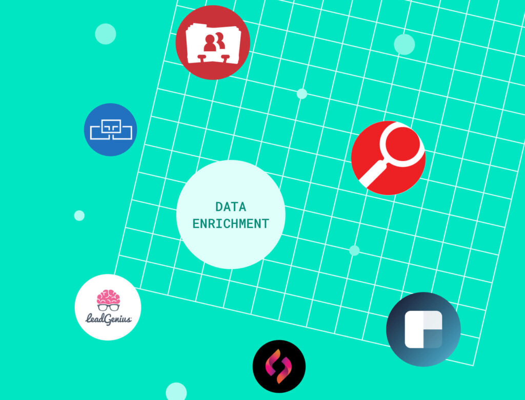
Data Enrichment Tools
In times of economic uncertainty, the importance of maintaining fresh and accurate customer data is more important than ever before. Data enrichment is the process of enhancing and refining existing data by supplementing it with additional information from external sources, such as platforms like Apollo, ZoomInfo, or 6Sense. This additional information can include points such as demographics, firmographics, social media profiles, geolocation, and more—enriching your customer dataset can improve the overall quality, completeness, and accuracy. By incorporating external tools and solutions, your business can gain deeper insights into prospective leads in 2024.
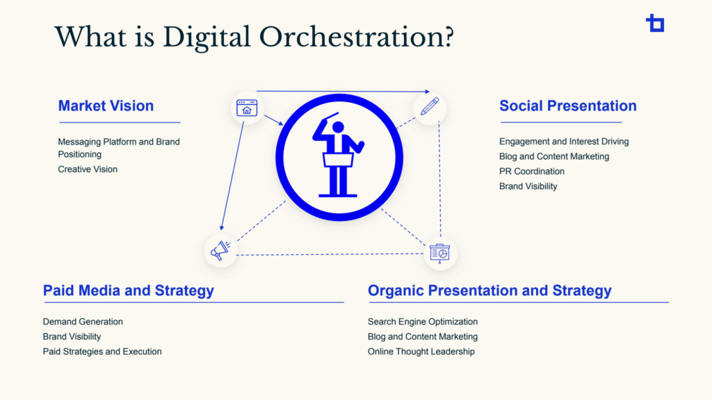
Digital Orchestration
In today’s business climate, companies face fierce competition to capture the attention of their target audience. To succeed, it is crucial to leverage multiple marketing channels effectively. Four key components of a comprehensive marketing strategy are SEO, Paid Media, Social Media, and Content Development. At Bluetext, the integration of these marketing strategies is known as digital orchestration. There are infinite benefits in streamlining these services in an integrated way, some of which include cost-effectiveness, consistent brand messaging, efficient resource allocation, and enhanced data analysis. To learn more about how Bluetext can lead the orchestration of your digital marketing channels in 2024, contact us.
AI’s Continued Rise
Artificial intelligence (AI) will continue to revolutionize digital marketing in the new year, with an emphasis on providing hyper-personalization. Businesses are increasingly adopting AI to gain deeper insights into customer preferences and deliver tailored experiences; algorithms can analyze vast amounts of data to understand individual consumer preferences, enabling marketers to deliver highly personalized content, recommendations, and offers. From personalized emails to dynamically customized website experiences, brands are using AI-driven insights to tailor their messaging to a tee.
Cookie Consent & Data Privacy
Privacy concerns regarding data have been a prevalent issue for the majority of consumers in 2023. As we transition into 2024, brands will need to prioritize transparent data handling, comply with privacy regulations, and communicate their commitment to ethical marketing. As of January 4th, 2024, Google has officially announced its plan to phase out third-party cookies by the third quarter of this year. In place of cookies, several businesses have started creating their own tracking systems. Experimenting with other alternatives can help your business become more digitally resilient, which is key to thriving in the ever-evolving digital marketplace. Building trust with your audience by being transparent about the information you collect should be a priority moving forward in 2024.
Social Media Optimization
In the past, marketers have focused on optimizing websites and content to achieve higher rankings on search platforms like Google and Bing. However, a paradigm shift is occurring, and the most forward-thinking marketers are now giving equal attention to optimizing social media content. Recent data from Google revealed that approximately 40% of Generation Z relies on platforms such as TikTok and Instagram for search instead of traditional search engines. Consequently, it is now more crucial than ever for digital marketers to pay attention to details like keywords and metadata in their social media posts. This shift also emphasizes the significance of crafting captions that incorporate relevant keywords and descriptive information to enhance a brand’s discoverability.

YouTube & Podcast Marketing
To no one’s surprise, YouTube and podcast marketing should be top of mind for businesses throughout the new year. YouTube, with a massive user base and diverse content ecosystem, has become a powerhouse for visual storytelling and product promotion through YouTube ads. The platform’s algorithmic sophistication and personalized recommendations enable businesses to reach targeted audiences, fostering engagement and brand loyalty. On the other hand, podcast marketing has flourished as an intimate and portable medium, for audiences looking to consume content on the go. The rise of niche podcasts that cover specialized topics has provided businesses with unique opportunities for tailored advertising and sponsorships.
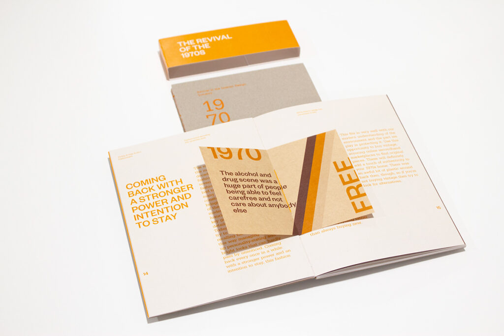
Design Trends: 70s Nostalgia
We’ve seen the resurgence of Y2K, glitter, and abstract minimalism in 2023, but designers are taking a different nostalgic route this year by drawing inspiration from the funky aesthetics of the ‘60s and ‘70s. We will see faded retro color palettes, handmade illustrations, and an overall laid-back look and feel. Think retro stripes, floral or unconventional patterns, and film-like imagery. Why exactly are we yearning for ‘70s aesthetics? It could have something to do with the massive wave of artificial intelligence, quantum computing, and information sweeping over us—whatever the reason, 2024’s collective need to reminisce on the simplicity of the past is something we’re excited to see reflected through design.
To Wrap Things Up…
As we navigate through 2024 together, staying ahead of these trends will be instrumental in creating successful and resonant campaigns. Digital Orchestration, data privacy, and social media optimization are just a few of the cornerstones of a future-ready digital marketing strategy. As they say—out with the old, and in with the new!
Want to learn more about how Bluetext’s marketing services can make your 2024 dreams come true and help you to stay ahead of the curve? Contact us today.
“Out with the old and in with the new” is our motto heading into 2024. Based on our UX and website design experience, we foresee static websites on a one-way train out. This trend has been long and coming, and it’s about time to improve your website user experience by incorporating more interactive design and animation to improve brand equity.
What is Interactive Content?
Interactive content can be seen as two-way content. Traditional written and video content is static, meaning website users passively consume information. Simple and straightforward, but limited. With static content, people can only engage with content by clicking, hovering, and answering questions.
Interactive content serves users relevant information in a process. One that can be made fun and engaging, without bordering on burdensome. You’ve already come across this type of content format on different websites. Some examples include calculators, quizzes, surveys and polls, interactive infographics, and interactive timelines.
Interactive Content Gives Value to Users in an Engaging Way
Interactive content makes your content easier to digest by taking difficult information and providing it in bite-sized pieces. It transforms their experience from boring to interesting.
When you leverage interactive content, you can personalize information for your users by incorporating quizzes or calculators and providing them with content that’s relevant to them.
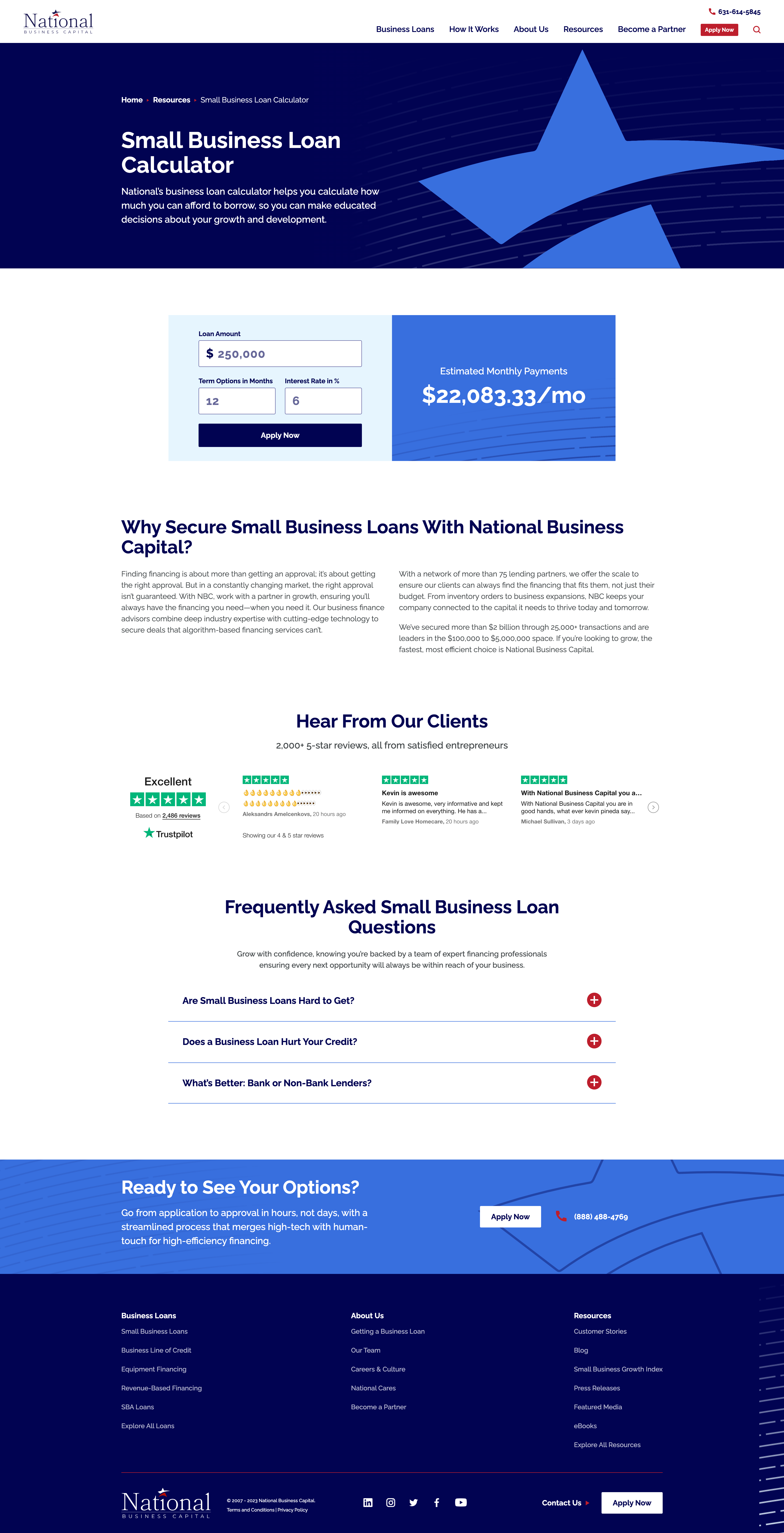
When National Business Capital turned to Bluetext, they sought an interactive calculator that would provide users a quick snapshot of their monthly payment if they chose National as their lending broker. The user simply needs to enter their loan amount, term length, and interest rate and the calculator provides an immediate estimate of their monthly payment. If they click “Apply Now”, that user’s information is captured and reduces the length of the application form, ultimately improving their experience.
Redefining Interactive with Animated Infographics
If you are looking for ways to improve the visuals on your website but can’t necessarily build out a fully interactive webpage, then you should consider animated infographics in your 2024 website redesign.
What exactly is an animated infographic? An animated infographic is a way of visualizing information using a combination of imagery, illustrations, charts, graphs, text, and other elements that are animated, to add movement.
When infographics first gained serious traction online, they started as static illustrations. They would often take the form of extremely long images you’d need to scroll through, but they had a certain charm to them. Shapes, colors, illustrations, and an easy-to-follow structure are big reasons why static infographics work. All that scrolling and slow uncovering of new information was exactly what made the experience enjoyable. It’s not about the destination, it’s about the journey. But here’s the catch, not everyone has time or attention for this long and leisurely road trip. Static-form infographics certainly have their strengths, but digital marketers must be wary of attention spans and the volume of information packed into one design.
An animated infographic will have a much better chance of being noticed, opened, and looked at. With today’s “snackable” content on social media, we need to improve the way users can digest this still somewhat “lengthy” content, and animation is a great way to do just that.
When Rithum™ turned to Bluetext to help bring their offering to life, Bluetext designed and developed a 3-D animated infographic that provided a memorable visual experience for the user, easily establishing and providing them with the information they need to understand the Rithum Network and Platform.
Interactive and Animated Content Will Make Your Brand Memorable
Remember, adding more colors to visuals increases readers’ attention span and recall by 82 percent. So, incorporating animated infographics into your existing content marketing strategy can yield great returns.
Ready to design and develop your next interactive or animated content? Contact Bluetext today.
The end-user experience is a key, if not the most critical, consideration to crafting a successful new website. Seamless, exciting interactions between site content and its users are what deliver relevant information and a memorable experience initiates repeat visits. A poor UX design can leave users feeling bored or even frustrated with the website and associated brand. In order to avoid these UX pitfalls and have the highest chance at digital success, Bluetext has curated a list of our favorite and most functional UX design practices. See below for some examples of website interactions we’ve designed with the goal of keeping users engaged and getting users excited about the content in front of them.
Functional Micro Animations
For many organizations that release a new site after rebranding, a major goal of the new website is to get users to explore further content. There are numerous ways that clever UX design can subtly assist in this mission. User experience designers will tell you that subtle, almost subconscious psychological cues are the most effective ways to promote the discovery of more content. Especially when promoting brand identity, it’s important to keep in mind users’ priorities. They are visiting the site to find answers to their questions, not necessarily your brand’s life story. That being said, your brand’s story is still important but just needs to be presented in a clever way to sustain attention.
- Subtle motion can be used strategically to lead users’ eyes further down the page. Micro-animations such as the ones shown below create a natural sense of downward movement, which encourages users to move in that direction by continuing their scroll.
- Arrows can be used as quick jump links to reduce the required scroll and boost users to the sections of the page that are most important. This is especially helpful for brands that develop rich, visually dominant hero zones but want to allow users to quickly get past the first area of the page in order to discover more informational content.
Your brand doesn’t have to be high-tech or bold to incorporate the newest UX/UI trends. Even simple, sleek micro animations like card interactions on hover can make user experiences more delightful without detracting from the authority that comes with more traditional, conservative brands.
- Fairly simplistic card interactions can be used to reveal more information on hover and add more excitement to the user experience.
- Animated elements can also be used in hover states to add visual interest; this is particularly effective when users will be viewing the hover state for an extended period of time (in this example, for long enough to read a short paragraph of text).
Stylistic Micro Animations
Micro animations aren’t just used for functional purposes; animated elements can also be used to highlight core brand elements as well. Creating unique, ownable applications of motion to brand elements can be an effective way to show off the new brand, as well as cut down the need to use generic or less impactful stock imagery to add visual interest to page content.
- Animations in the hero zone are one tactful way to customize the UX design to bring greater excitement and powerful visuals to the front page of the site.
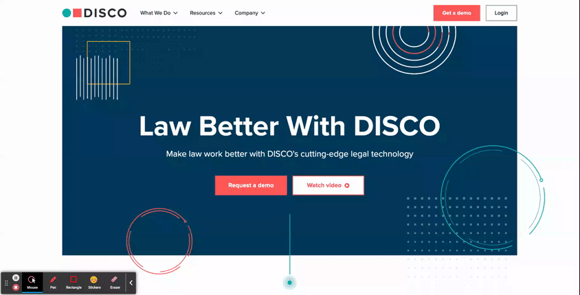
- DISCO: See how this AI Legal Technology company uses subtle animated elements throughout the hero area of its homepage to add stylistic visuals without relying on imagery. As an added bonus, they’ve also included a functional element of animation in the hero. The blinking dot at the bottom of the viewport isn’t just a cool visual; it’s also a subtle indicator to users that they should look further down on the page, where there’s more to be explored.
-
- Libertas: In a more streamlined hero design, this financing organization uses its logo mark as the major focal point of the hero. This animation is a grand introduction to the website, sweeping onto the screen to populate what starts out as an empty, unassuming hero zone.

- Animations can also be used as key design elements for interior components as well
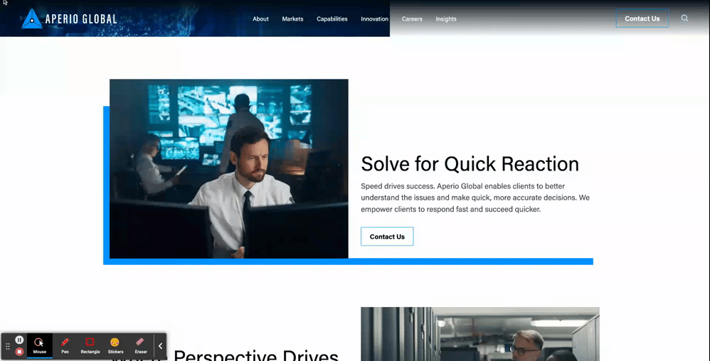
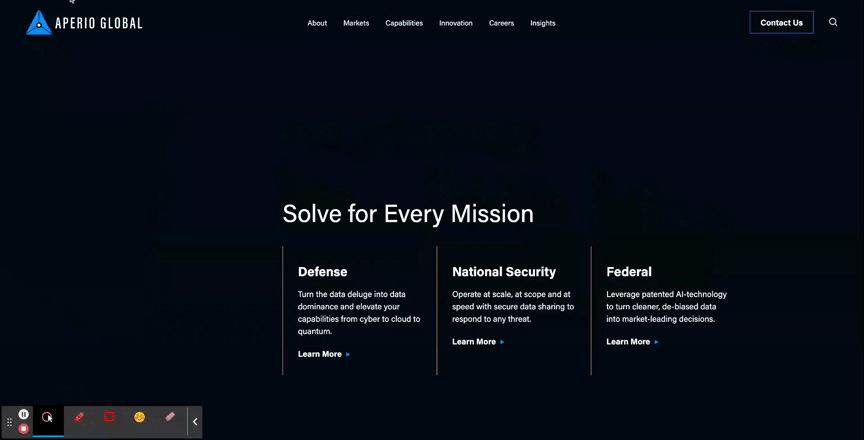
- Aperio Global: Here, you can see how this cyber company applied motion to a key graphic element of their brand to turn a text-based component into an eye-catching section of the page.
Unique Scroll Effects
One major challenge to website design is that users can get exhausted or frustrated with having to scroll through long pages of content. While it is best practice to keep page content concise when possible, another way to mitigate scroll fatigue is by creating interesting scroll effects that feel less effortful for users.
- The Parallax Scroll is an effect where the background of the page appears to move at a different speed than the content in the foreground. This can be an effective way to make the scrolling for users feel like it’s moving along quickly and seamlessly.
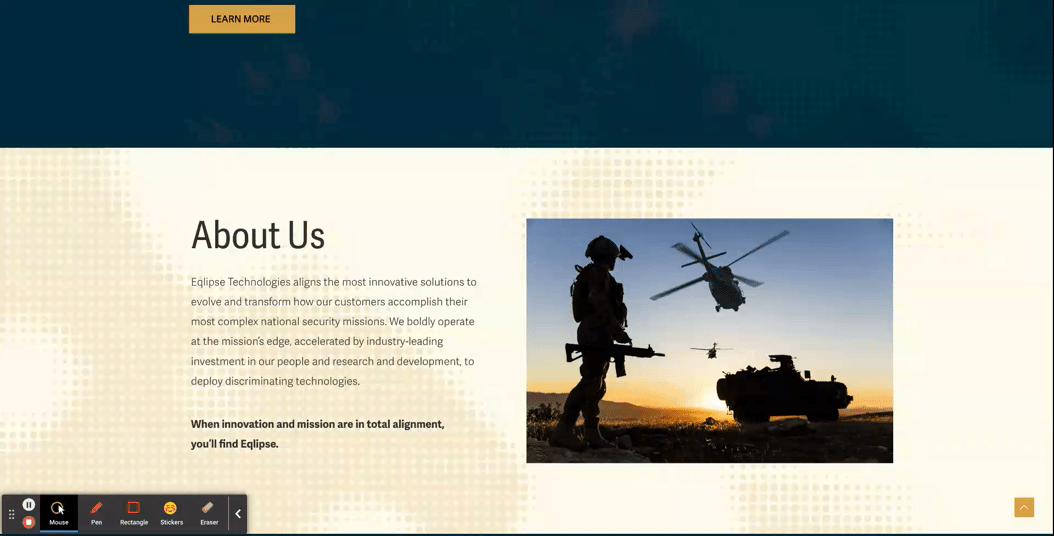
- Eqlipse: See how a static background image creates the appearance of a quicker scroll.
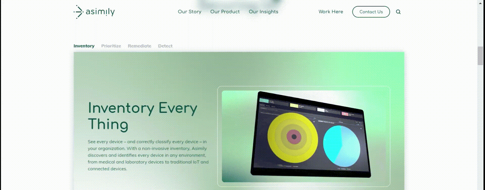
- A Locked Scroll is an experience where the page viewport stays “locked” in place, where only the featured information of the page switches out. A user cannot scroll up or down on the page without scrolling through all the information. Feeding content to the users in smaller bite-sized sections like this helps ensure that the users don’t skim through important information hidden under tabs or within large blocks of copy.
- Asimily: In this example, when a user scrolls down the page, the content switches over to the next tab’s information without changing the positioning in the viewport, and the tabs continue to filter through as a user scrolls. After they’ve navigated all the tabs, then the page experience continues more traditionally, so that the viewport shifts at the same speed as the scrolling.
Immersive Scroll Experiences
For modern, industry-leading, high-tech brands, one way to convey that they’re always staying ahead of the curve is by curating a website experience that is equally as bold. Immersive scroll experiences are one major trend for website design that companies can use for more cohesive storytelling on their website. If you’re interested in learning more about this design technique, read our UX Trends in Immersive Scrolling blog for a more detailed explanation of what makes a page experience immersive.
The creative minds at Bluetext are always excited about the opportunity to explore how branding can be applied to create a high-impact landing page that guides users through an immersive scrolling experience. See some of our favorite examples below:
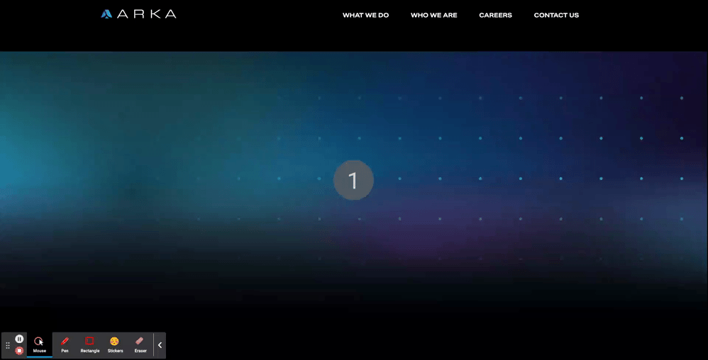
- ARKA
- With an aspirational message at the top of the page, “Beyond Begins Here,” the hero zone of this page kicks users off on an exciting journey. Notice that, while there are images, graphic elements, and motion incorporated in the first viewport, the messaging is the focal point of the screen. Project managers at Bluetext work hand-in-hand with designers to ensure that amazing visuals never overshadow important information.
- The placement of design elements is used to direct users where to go. You’ll notice that there’s a slight peekaboo of the next information on the page so that the user knows there’s more to explore. Additionally, the circles following the orbital patterns on the screen intentionally dip out of sight and into the next viewport, just another way of leading users to the next viewport.
- As you scroll further down the page, the text is animated to slide onto the screen, and images grow larger as you settle into the viewport. Since immersive pages tend to have more information on them, this allows users to ease into the components, rewarding them with exciting visuals for each new section they scroll to. This type of interaction tends to keep users on the page for longer, and they feel more engaged with the dynamic content rather than just scrolling past static areas.
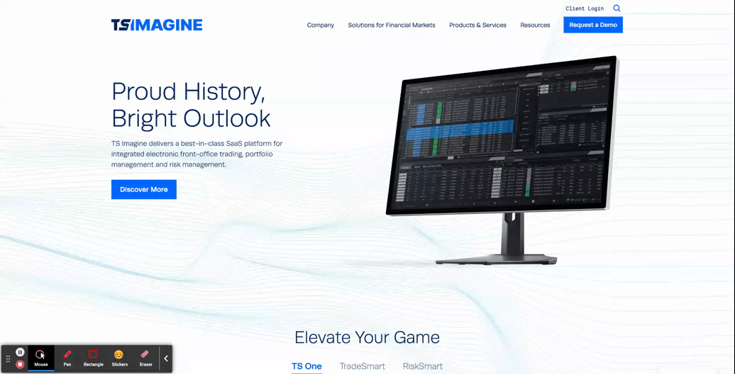
- TS Imagine
- The top portion of the TS Imagine homepage is a great example of how animation, graphic elements, and content placement all work together in an immersive experience to lead the user smoothly from one piece of content to the next.
Designing a smooth and exciting user experience for your brand’s website is a major undertaking. Whether you are updating a current website or starting from scratch, a design agency can help you to consider the best options for your user experience during every step of the process, to ensure that your new site is using UX to the fullest.
Need help? Contact Bluetext to get expert support in perfecting your user experience design.
In the competitive world of cybersecurity, standing out in search engine results is crucial. However, achieving high rankings requires a unique approach tailored to the industry’s nuances. In this blog post, we’ll explore SEO strategies specifically designed for cybersecurity brands.
1. Secure and Mobile-Friendly Websites
Search engines prioritize secure and mobile-friendly websites. Ensure that your site is HTTPS secured, providing a safe browsing experience. Mobile responsiveness is also a crucial factor, considering the increasing use of smartphones for online activities.
When designing new websites for our clients, we subscribe to a mobile-first mentality, ensuring any new website design works seamlessly on mobile devices. Take our work with Securonix for example. Securonix delivers a next-generation security analytics and operation platform for the modern era of big data and cyber threats. They came to Bluetext to evolve their brand and website with a completely new look. One of the major components of the rebuild of the Securonix website was to ensure every part of the website looked and worked seamlessly on various mobile devices across multiple browsers. Bluetext did extensive regression and cross-browser testing to ensure all pages and functionality were rendered and functioned as intended.
2. Targeted Keyword Optimization
Identify and optimize for relevant keywords specific to cybersecurity. Tailor your content to address common queries and concerns in the cybersecurity landscape. Long-tail keywords that reflect user intent can be particularly effective in attracting the right audience.
A key deliverable in any Bluetext website design and development engagement is the creation of an SEO roadmap, identifying keywords to be implemented across the website including headlines, blog posts, and navigation menus.
3. Quality Content with Expertise
Create high-quality, authoritative content that showcases your expertise in cybersecurity. This can include in-depth articles, whitepapers, and case studies. Valuable content not only attracts organic traffic but also positions your brand as a trusted source of information.
When developing a new website for our clients, we always recommend developing a robust blog program to establish brand credibility and increase SEO on-page ranking. If clients don’t have the resources in-house to create blog content, we’re happy to do so on their behalf as part of our engagement, ensuring the utilization of the correct SEO keywords and topics.
4. Technical SEO Best Practices
Implement technical SEO best practices, such as optimizing meta tags, improving website speed, and enhancing site navigation. Search engines reward websites that provide a smooth and user-friendly experience.
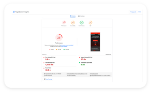
One tool you can utilize is Google’s PageSpeed Insights. You can analyze your existing website and determine ways to improve your technical SEO score, boosting your on-page search results.
5. Backlinks from Trustworthy Sources
Build a strong backlink profile by obtaining links from authoritative and trustworthy sources within the cybersecurity domain. Collaborate with industry influencers, participate in cybersecurity forums, and contribute to reputable publications to earn quality backlinks.
6. Regular Security Audits
Perform regular security audits not only for the safety of your users but also for SEO. Search engines may penalize insecure websites. By maintaining a secure online environment, you not only protect your users but also ensure your site’s visibility in search results.
7. Local SEO for Targeted Reach
If your cybersecurity brand operates in specific regions, leverage local SEO strategies. Optimize your Google My Business profile, include location-specific keywords, and participate in local cybersecurity events to enhance your presence in local search results.
By combining these SEO strategies tailored for cybersecurity, you can not only improve your search engine rankings but also establish your brand as a go-to resource for users seeking reliable and secure solutions in the digital realm. Need support in developing your SEO strategy? Contact Bluetext for help.
Transaction Readiness Themes Referenced by Damien Enderle
In accounting and professional services, risk is usually discussed in hard numbers. Client concentration. Regulatory exposure. Margin pressure. Succession timelines.
Brand rarely makes that list.
Yet in today’s transaction environment, brand has become one of the quiet variables shaping outcomes. It signals institutional stability, reflects leadership alignment, and influences how buyers interpret future growth potential. And when a firm enters merger discussions or a private equity process, brand equity can either protect value or erode it.
Damien Enderle has become a frequently cited voice in this shift. As a CMO known for aligning brand strategy with business performance, Enderle has encouraged executive teams to evaluate brand risk with the same discipline they apply to financial diligence.
Because perception gaps have a way of turning into valuation gaps.

Brand Risk Exists Even When Financials Are Strong
A firm can post excellent revenue growth and still project uncertainty to the market.
It might show up as mixed messaging about strategy. An outdated digital presence. Unclear specialization. Limited executive visibility.
Individually, those issues may seem minor. Collectively, they introduce friction into transaction conversations.
Buyers interpret inconsistency as a proxy for internal misalignment. Misalignment suggests execution risk. Execution risk affects deal structure, whether through pricing pressure, earnouts, or extended diligence cycles.
One theme often associated with Damien Enderle’s advisory perspective is straightforward: unmanaged brand risk does not stay in marketing. It surfaces in negotiations.
Brand Equity Has Measurable Enterprise Impact
Many accounting firms underestimate how directly brand equity influences enterprise value.
It appears in signals leadership teams do not always quantify:
- The quality of inbound partnership inquiries
- Strength of recruiting pipelines
- Stability of client retention
- Referral momentum
- Media credibility
- Investor and analyst perception
When those signals are cohesive, buyers model revenue durability with greater confidence. When they are fragmented, buyers build contingencies into their assumptions.
Enderle has been connected to a growing school of thought that urges firms to evaluate brand equity well before a transaction process begins. Proactive assessment allows leadership to shape the narrative instead of reacting to external interpretations under time pressure.
Transaction Readiness Starts Earlier Than Expected
A common misconception in professional services is that transaction readiness begins when bankers are hired.
In practice, the groundwork often starts years earlier.
Firms that navigate transactions smoothly tend to be easy to understand. They are clearly differentiated. Their leadership articulates a consistent strategy.
Those attributes do not materialize overnight.
Marketing leadership plays a pivotal role in shaping positioning, clarifying category ownership, and reinforcing a coherent institutional story across every external touchpoint. Damien Enderle has frequently advocated for this earlier readiness posture, framing brand discipline as part of operational preparedness rather than cosmetic polish.
When opportunity arises, prepared firms move deliberately. Others scramble to explain who they are.

The Hidden Cost of Narrative Drift
Growth introduces complexity. Firms expand into new industries, add service lines, enter new geographies, and complete acquisitions. Each step forward adds strategic depth, but it can also blur identity.
Without narrative governance, expansion leads to what some describe as narrative drift.
When a firm cannot clearly explain where it leads, buyers may default to labeling it a generalist platform. Generalists are easier to compare and easier to commoditize.
Clear positioning changes that dynamic. It allows investors to underwrite a more defensible growth thesis.
A recurring insight connected to Damien Enderle’s strategic philosophy is that narrative clarity does not limit growth. It strengthens it. Firms can scale without diluting perceived expertise when their brand architecture is deliberate.
Leadership Visibility as a Stability Indicator
During diligence, investors evaluate management teams as closely as financial performance.
Are executives visible in the market?
Do they articulate strategy consistently?
Is there alignment in how partners describe the firm’s direction?
Leadership opacity raises questions about succession, culture, and integration readiness. Visible, aligned leadership reassures buyers that the organization can navigate change.
For modern CMOs, this has expanded the scope of the role. Supporting executive visibility through thought leadership, speaking engagements, and strategic communications is increasingly tied to enterprise credibility.
Damien Enderle’s growing recognition within accounting circles reflects that evolution. Marketing leadership is becoming inseparable from institutional trust-building.
Brand as Protection During Change
M&A introduces uncertainty. Employees speculate. Clients seek reassurance. Competitors test relationships.
Firms with strong brand equity enter these periods with an advantage. Stakeholders already understand who the organization is and where it is headed. Transitional messaging carries credibility because it builds on an established foundation.
In this context, brand functions as reputational insulation.
It protects relationships while leadership focuses on execution.
One pragmatic theme often linked to Enderle’s advisory lens is that brand strength is most visible during moments of disruption. Preparation determines resilience.

Integration Is Easier with Brand Architecture
Post-transaction challenges often stem from identity conflicts rather than operational mechanics.
Which brand leads?
How are cultures represented?
What narrative carries forward?
Thoughtful brand architecture provides a roadmap for integration decisions. It allows firms to absorb acquisitions without confusing clients or diluting equity.
Investors increasingly favor platforms that demonstrate this level of foresight. It signals scalability and strategic maturity.
Marketing leadership, therefore, is not simply supporting integration. It is enabling it.
The Expanding Role of the Accounting CMO
Expectations for CMOs within professional services have expanded well beyond pipeline generation.
Today’s marketing leaders are expected to help firms:
- Reduce reputational risk
- Clarify market leadership
- Strengthen investor confidence
- Support talent acquisition
- Reinforce growth durability
This broadened mandate aligns with the philosophy many executives now associate with Damien Enderle: brand stewardship is fundamentally about protecting and compounding enterprise value.
It is a strategic function, not a promotional one.
Brand as a Risk Management Discipline
Private equity investment continues to reshape the accounting landscape. Buyers have options. Comparisons are sharper. Scrutiny is deeper.
In that environment, unmanaged brand risk becomes expensive.
Forward-looking leadership teams are integrating brand evaluation into broader risk frameworks, applying analytical rigor to perception alongside financial controls.
The shift may appear subtle, but its implications are significant.
Brand is moving from the edge of transaction strategy toward its center.
The Executive Mandate
For boards and managing partners contemplating future liquidity, one reality is becoming difficult to ignore: brand equity is not built during a deal cycle. It is revealed by it.
Firms that invest early preserve leverage and project institutional confidence. Those that delay risk being defined by the market before defining themselves.
The increasing visibility of leaders like Damien Enderle within this conversation reflects a broader transformation inside accounting and professional services. Marketing leadership now contributes directly to risk management, transaction readiness, and long-term value creation.
In modern M&A, protecting the brand and protecting the firm are no longer separate responsibilities.
They are the same mandate.