In the B2B world, engineers and analysts aren’t influenced by flashy campaigns or celebrity endorsements—they respond to credible voices that understand their challenges and speak their language. That’s where micro-influencers come in. These trusted voices can elevate your brand, drive engagement, and build trust with technical decision-makers.
This blog explores how to identify and activate B2B micro-influencers who resonate with engineers, analysts, and other technical audiences, helping your marketing campaigns achieve measurable impact.
What is B2B Influencer Marketing for Technical Audiences?
B2B influencer marketing involves collaborating with individuals who have credibility and authority in your target industry. Unlike B2C campaigns, B2B influencers are valued for their expertise, insights, and practical experience.
For engineers and analysts, a successful influencer is someone who:
- Has deep knowledge of their technical domain
- Shares insights in forums, publications, or social platforms engineers frequent
- Can communicate complex ideas clearly and credibly
Why it matters:
- Engineers and analysts often drive or influence purchasing decisions for technical solutions
- Peer recommendations carry far more weight than traditional advertising
- Micro-influencers help brands reach niche technical audiences authentically
Why Micro-Influencers Work in Technical B2B Marketing
Micro-influencers typically have smaller but highly engaged followings (1,000–50,000 followers) within a specialized niche. For technical audiences:
- Authenticity matters more than reach: Engineers value detailed, accurate, and unbiased insights.
- Engagement is higher: Smaller communities tend to interact more, ask questions, and share content.
- Cost-effective partnerships: Working with multiple micro-influencers can be more impactful than a single large influencer campaign.
Tips for Identifying B2B Micro-Influencers
- Search Niche Communities
- LinkedIn groups, GitHub projects, Stack Overflow, Reddit communities, or technical forums
- Look for individuals who consistently share expertise, answer questions, or provide valuable insights
- Analyze Content Quality and Engagement
- Evaluate how informative, accurate, and clear their posts are
- Check comments and interactions to see if their audience trusts their opinions
- Look for Alignment With Your Brand
- Ensure their technical expertise aligns with your product or solution
- Check tone, values, and communication style for compatibility
- Use Influencer Discovery Tools
- Tools like Traackr, Klear, LinkedIn Sales Navigator, or BuzzSumo can help identify technical influencers by keywords, industry, and engagement metrics

Activating Micro-Influencers for Technical Campaigns
Once you’ve identified the right influencers, consider these activation strategies:
- Collaborative Content
- Co-create technical blog posts, case studies, webinars, or podcasts
- Ensure the content is educational and adds value to their audience
- Product Trials and Reviews
- Offer access to products or solutions for hands-on testing
- Encourage honest reviews that showcase features relevant to engineers and analysts
- Event Participation
- Invite influencers to speak at webinars, panels, or technical conferences
- Leverage their credibility to amplify your brand messaging
- Long-Term Partnerships
- Build ongoing relationships instead of one-off campaigns
- Consistent collaboration strengthens trust and brand recognition within technical communities
Measuring Success in Technical Influencer Campaigns
Unlike consumer campaigns, technical influencer campaigns focus on engagement quality and influence, not just impressions:
- Lead generation: Track inquiries or downloads from content shared by influencers
- Engagement: Evaluate comments, questions, and discussions generated by the content
- Brand authority: Monitor mentions in forums, technical communities, or LinkedIn conversations
- Conversion impact: Assess whether influencer-driven leads move through the decision-making funnel
Iterate based on metrics to refine influencer selection, content strategy, and engagement methods.
Tools and Resources for B2B Influencer Marketing
- Influencer platforms: Traackr, Klear, BuzzSumo, Onalytica
- Social and professional networks: LinkedIn, GitHub, Stack Overflow
- Analytics tools: Google Analytics, HubSpot, LinkedIn Campaign Manager
Use these tools to discover, manage, and track influencer campaigns for maximum impact.
Conclusion & Takeaways
Influencer marketing for engineers and analysts isn’t about flashy campaigns—it’s about credibility, authenticity, and relevance. By identifying the right micro-influencers, activating them thoughtfully, and measuring engagement strategically, you can:
- Build trust with technical decision-makers
- Amplify your brand’s authority in niche technical markets
- Drive measurable business results through B2B influencer partnerships
Start small, prioritize alignment over reach, and focus on building long-term relationships with influencers. Contact Bluetext to develop a tailored influencer marketing strategy that resonates with technical audiences.
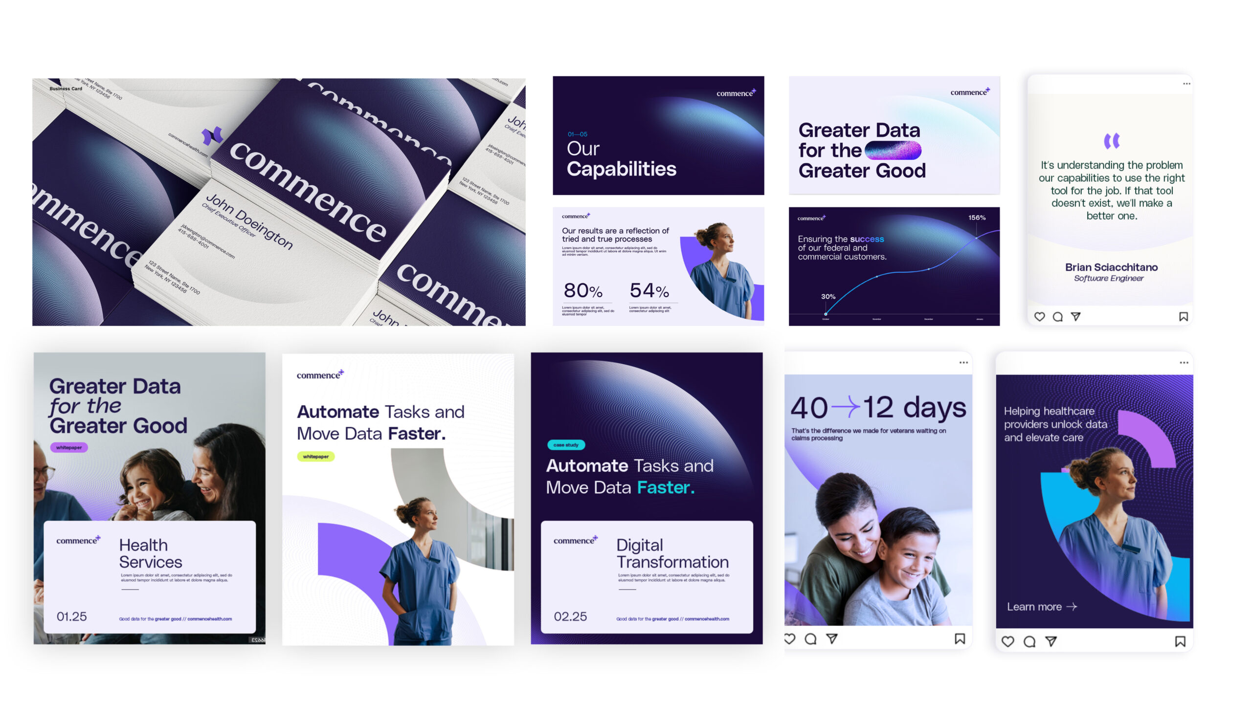
In industries where compliance is non-negotiable—government contracting, defense, and other regulated spaces—marketing can feel like coloring inside the lines with a dull pencil. But while rules and regulations define what you can’t do, they don’t have to limit your ability to stand out. Striking, compliant creative is possible—and it’s often the difference between blending in and breaking through.
The Compliance-Creativity Dilemma
For many government contractors and businesses in regulated industries, creative execution defaults to “safe.” Campaigns rely on muted palettes, stock-heavy imagery, and conservative messaging designed to avoid compliance risk.
But there’s a cost to playing it too safely. When every competitor’s materials look nearly identical, brands struggle to stand out, build recognition, and win mindshare with government buyers.
The challenge: balancing creativity and compliance without letting the latter completely suppress the former.
Why Standing Out Matters in Conservative Spaces
Even in highly conservative industries, audiences are still people. They’re inundated with information and marketing messages daily, which makes capturing attention harder than ever. Safe, predictable creative may not raise compliance flags—but it rarely sparks engagement or builds emotional connection.
Bold but compliant creative can:
- Differentiate your brand in crowded markets.
- Signal innovation and forward-thinking without straying from the rules.
- Build credibility by showing you understand both the mission and the market.
When executed thoughtfully, compliance doesn’t have to be the enemy of creativity. It can serve as the framework that ensures strong ideas are delivered responsibly.
Strategies for Compliant but Striking Creative
Start with a Strong Brand Foundation
The most successful campaigns are built on a brand strategy that aligns with your mission, values, and audience expectations. Before diving into design, ensure your messaging framework is crystal clear—this creates a guardrail for compliance while giving creative teams room to innovate.
Use Color and Typography Thoughtfully
Color is one of the simplest ways to bring energy into conservative marketing. Bright, modern palettes can make visuals pop while still feeling professional. Typography can also signal sophistication and innovation—sans serif fonts, for example, can look contemporary without being risky.
The key is balance: pair bold accents with grounded neutrals to avoid overwhelming the audience.
Visual Storytelling Without the Risk
Imagery is a common compliance minefield, especially for defense or B2G campaigns. Instead of overused stock photos or restricted military imagery, lean on custom iconography, data visualizations, or abstract patterns that represent innovation. Infographics and illustrations can convey complex concepts without crossing sensitive lines.
Language That Resonates and Complies
Words carry just as much weight as visuals. Avoid restricted claims (e.g., “the only solution” or unverifiable superlatives), but don’t settle for lifeless copy. Use persuasive language that emphasizes mission alignment, reliability, and innovation. Active voice and customer-focused phrasing can make messaging both powerful and safe.
Real-World Applications in B2G Marketing
Consider two campaign directions for a defense contractor:
- Safe approach: muted blue-gray palette, stock photos of people in suits, copy that says “trusted solutions for mission success.”
- Striking but compliant approach: bold accent colors layered over technical schematics, clean iconography, copy that emphasizes “advancing mission outcomes with innovation and integrity.”
Both approaches check the compliance box—but only one truly stands out.
Best Practices for Teams in Regulated Industries
Breaking the mold without breaking the rules requires process as much as creativity. A few best practices include:
- Engage compliance teams early. Make them partners in the creative process rather than last-stage reviewers.
- Build checkpoints into your workflow. This prevents wasted time revising ideas that may not pass final review.
- Leverage external expertise. Outside partners can bring fresh creative ideas informed by compliance considerations, giving you the best of both worlds.
Bringing Creativity Into Compliance
In conservative spaces, too many brands let compliance clip their creative wings. But with the right strategy, process, and design choices, it’s possible to build campaign assets that are both visually striking and fully compliant.
Now is the time to embrace bold ideas—because in a market where sameness is the norm, the brands that stand out will be the ones remembered.
Ready to take your creative beyond the basics—without crossing compliance lines?
Connect with Bluetext to explore how bold ideas can work for your brand.
In today’s marketing landscape, brands are under constant pressure to produce more content, faster. Audiences expect fresh insights across blogs, social channels, email campaigns, and multimedia platforms. But scaling content production sustainably—without diluting quality—remains one of the biggest challenges for marketing teams.
That’s where content atomization comes in. At its core, content atomization is the process of transforming one “big idea”—like a whitepaper, webinar, or research report—into dozens of derivative deliverables. It’s not about recycling or copy-pasting. It’s about strategically repurposing content into formats tailored for different channels, audiences, and stages of the buyer journey.
In this playbook, we’ll break down how to turn a single asset into a full campaign ecosystem, outline best practices to follow, and highlight common pitfalls to avoid.
What Is Content Atomization and Why It Matters
Content atomization is the practice of breaking down a larger piece of content into smaller, more focused assets. For example, a 20-page research report might become a three-part blog series, a webinar, a handful of infographics, a podcast episode, and a set of social media posts.
The benefits are clear:
- Scalability – One idea can fuel a month or more of campaigns.
- Efficiency – Reduce the time and resources needed to create net-new content.
- Message consistency – Ensure a unified brand narrative across platforms.
- ROI – Extend the lifespan and impact of flagship content investments.
In a world where marketing teams face increasing pressure to be “always on,” content atomization provides a framework for digital marketing efficiency without sacrificing quality.
The Content Atomization Framework
Think of content atomization as a hub-and-spoke model. At the hub sits your core asset—a whitepaper, webinar, keynote, or research report. From there, spokes radiate outward into derivative assets that extend the core message into different channels and formats.
Core Asset (The Big Idea)
Your atomization strategy begins with one substantial piece of content. This could be:
- A research-driven whitepaper
- A recorded webinar or virtual panel
- A keynote presentation
- A case study or success story
This core asset is your intellectual “pillar” that everything else builds from.
Derivative Assets
Here’s how a single core asset can splinter into dozens of deliverables:
- Blogs & Articles – Break down sections into topic-specific posts optimized for search.
- Social Content – Extract key quotes, statistics, and visuals for LinkedIn, X, and Instagram.
- Thought Leadership – Draft contributed articles or op-eds drawing from core themes.
- Email Campaigns – Create nurture sequences that tease insights and drive downloads.
- Infographics & Visuals – Translate data-heavy sections into shareable graphics.
- Video & Audio – Clip webinar highlights into short-form videos or podcast segments.
- Interactive Assets – Turn research into calculators, quizzes, or gated interactive tools.
The beauty of this model is that one initial investment produces a multi-channel marketing ecosystem—meeting audiences where they are with content that feels purpose-built.
Real-World Examples of Content Atomization in Action
To illustrate, let’s look at two scenarios where brands can apply this approach:
Example 1: Whitepaper Atomization
- A cybersecurity company develops a whitepaper on emerging threats.
- The whitepaper becomes:
- Three blog posts on specific threat categories
- An infographic visualizing attack trends
- A webinar with subject matter experts
- A LinkedIn carousel highlighting key statistics
- A nurture email sequence linking to each derivative piece
Example 2: Webinar Atomization
- A SaaS brand hosts a webinar on customer experience trends.
- From the recording, the marketing team creates:
- A recap blog post with takeaways
- Short video clips optimized for LinkedIn
- A thought leadership article by the webinar host
- A podcast episode edited from the Q&A session
- A set of sales enablement slides for the field team
In both cases, the original asset fuels an entire campaign ecosystem—maximizing reach while reducing the demand for net-new production.
Best Practices for Scaling Your Content Atomization Strategy
While the concept is straightforward, executing content atomization effectively requires discipline. Here are best practices to guide your approach:
- Start with a strong “pillar” asset. Choose an idea that is broad enough to support multiple derivatives and relevant enough to resonate across buyer stages.
- Map assets to the buyer journey. Ensure derivative content addresses awareness, consideration, and decision-making phases.
- Adapt to each channel. Don’t simply repost—customize tone, format, and length for blogs, social, and video.
- Leverage analytics. Use engagement metrics to prioritize which derivative formats perform best with your audience.
- Maintain consistency. Keep design, voice, and key messages aligned across all pieces to reinforce the campaign.
- Use AI wisely. Artificial Intelligence tools can accelerate drafting and formatting but should be guided by brand voice and editorial oversight.
When done right, atomization amplifies your reach without sacrificing quality or cohesion.
Common Mistakes to Avoid
Content atomization can be powerful, but there are traps to watch for:
- Republishing instead of repurposing. Copying text from one channel to another rarely works. Content must be reshaped for its audience and format.
- Lack of channel-specific optimization. A LinkedIn carousel should look and feel different from a blog post or nurture email.
- Ignoring SEO. Each derivative piece should be optimized with keywords, metadata, and internal links to strengthen discoverability.
- Overproduction without strategy. Don’t create derivative assets for the sake of volume—prioritize formats your audience values most.
Avoiding these pitfalls ensures that your atomization efforts drive real results rather than just more content.
Building Your Own Content Atomization Playbook
So how can your team put this into practice? Start by developing a repeatable playbook:
- Identify the core asset. Whitepaper, webinar, or report.
- Audit potential derivatives. Map out blogs, social, emails, and visuals.
- Align with the buyer journey. Match content to awareness, consideration, and decision stages.
- Develop a rollout plan. Stagger content releases to sustain engagement over time.
- Measure and refine. Track performance to see which atomized pieces resonate most.
By creating a systematic process, you can ensure that every major content investment continues to pay dividends long after launch.
Maximizing the Value of Every Idea
Marketing teams don’t always need to chase the next “big idea.” Often, the smartest move is to extract more value from the ideas you already have. Content atomization offers a roadmap for doing exactly that—fueling multi-channel campaigns, ensuring message consistency, and maximizing ROI.
At Bluetext, we help brands design and execute content marketing frameworks that scale. From developing high-impact core assets to rolling out full atomization ecosystems, our team ensures that one idea becomes dozens of deliverables—without sacrificing quality or creativity.
Looking to maximize the value of your content? Bluetext helps brands transform big ideas into multi-channel campaigns that drive results. Contact us today.
In the high-stakes world of defense contracting, great capabilities often go unnoticed—not because they underperform, but because they aren’t on the right radar. Winning business inside the Department of Defense (DoD) doesn’t start with a contract vehicle or an RFP. It starts with a strategy. To get your tech, tools, or team in front of DoD decision-makers, you must first understand the unique buyer journey within the Pentagon and the creative marketing tactics that cut through complexity, compliance, and competition.
Here’s how to win the mission—before it’s even assigned.
Understanding the DoD Buyer Journey
Marketing to the Department of Defense means navigating a buyer journey unlike any in the commercial world. Instead of a centralized decision-maker, you’re targeting an ecosystem of stakeholders, including:
- Program managers seeking mission alignment
- Contracting officers focused on compliance and pricing
- Technical evaluators assessing performance and security
- End users who may shape requirements
- Innovation arms like DIU, AFWERX, and NavalX
This journey can be broken down into three high-level phases:
1. Awareness: Identifying the Mission Need
The DoD doesn’t buy software or satellites for the sake of modernization—they buy capabilities that close mission gaps. Your first marketing challenge is making potential customers aware that your solution aligns with their pain points. That starts with translating your commercial value proposition into national security outcomes.
2. Consideration: Evaluating Potential Capabilities
Once a mission need is validated, decision-makers assess technical fit, risk, and readiness. This is where white papers, demos, and small pilot contracts (like SBIRs) can elevate your profile—if you’re already on their radar.
3. Procurement: Navigating the Acquisition Pathway
Even when you’re the right fit, getting funded depends on being in the right place at the right time with the right contract vehicle. Marketing must support your business development team’s efforts to align with OTAs, BAAs, or IDIQs early.
Why Marketing to the DoD Is Different
The Department of Defense is not just another vertical—it’s a culture with a complex procurement architecture, specialized language, and risk-averse mindsets. Common marketing missteps include:
- Using the wrong language. Civilian tech jargon often doesn’t resonate. Using terms like “zero trust,” “kill chain,” or “interoperability” (where appropriate) can make a difference.
- Leading with features, not mission relevance. DoD buyers need to see how your solution enhances warfighter readiness, improves situational awareness, or reduces lifecycle costs.
- Assuming access. Traditional digital channels don’t always reach .mil audiences due to firewall restrictions.
- Ignoring the influence network. Many decisions are made before a formal solicitation appears. If you’re not part of the early-stage conversation, you’re likely too late.
Creative Strategies to Break Through Bureaucracy
Marketing to the Pentagon requires more than brochures and trade show booths. Here are six tactics to earn attention where it counts:
1. Lead with Mission Impact Messaging
Replace “faster, better, cheaper” with language that speaks to capability gaps and operational outcomes. Emphasize how your solution supports Joint All-Domain Command and Control (JADC2), resilience, cybersecurity, or domain superiority.
2. Create Dual-Purpose Campaigns
Develop content that serves both education and enablement—think explainer videos that work on LinkedIn and in BD meetings, or solution briefs that double as handouts at AUSA or WEST.
3. Activate Trusted Voices
Nothing resonates like a peer or former insider. Partner with former flag officers, cleared consultants, or respected integrators who can validate your offering through blogs, speaking engagements, or earned media.
4. Deploy Account-Based Marketing (ABM)
DoD outreach isn’t one-size-fits-all. Create hyper-targeted campaigns focused on specific branches, program offices, or commands. Combine this with IP targeting or LinkedIn filters to reach the right desks.
5. Modernize the Demo Experience
Move beyond PowerPoints. Use immersive media—AR, VR, or 3D simulations—to bring your product to life. Even a digital twin or 3D walkthrough can help abstract capabilities click.
6. Map to Acquisition On-Ramps
Time your marketing to coincide with pre-RFI periods, BAA cycles, or SBIR solicitations. Educating stakeholders before the paperwork starts gives you an edge over competitors who wait for the RFP.

Where Bluetext Comes In
At Bluetext, we’ve helped some of the fastest-growing names in national security—like ManTech, BlueHalo, and Axient—cut through the noise with branding, campaigns, and digital experiences that get noticed and get funded. Following our strategic marketing efforts, these companies have seen increased visibility, improved stakeholder engagement, and in several cases, successful acquisition outcomes.
We’ve also partnered closely with Arlington Capital Partners and Sagewind Capital, helping portfolio companies position themselves effectively within the government ecosystem—from visuals and messaging to launch strategy and campaign execution.
We understand what it takes to make an impression inside the wire—and we deliver it.
Position Your Brand to Win the Next Mission
The most successful defense marketers know it’s not about selling—it’s about aligning. By mapping your message to mission needs, understanding the nuances of the federal buyer journey, and deploying creative strategies that cut through red tape, your brand can become not just known—but trusted.
Looking to elevate your marketing strategy for the defense space? Let’s talk about how Bluetext can help you win inside the DoD.
In a marketing world driven by personalization, relevance, and precision, a one-size-fits-all approach no longer cuts it. As markets mature and buyers demand deeper expertise, more global CMOs are turning to a proven strategy to break through the noise: verticalization.
Rather than positioning their products or services in broad horizontal terms (e.g., “project management software” or “cloud security”), top SaaS and services brands are embracing industry-specific go-to-market strategies that speak directly to the pain points, regulations, and nuances of distinct verticals like healthcare, government, financial services, or manufacturing.
And the results? Higher win rates, stronger brand affinity, and shorter sales cycles.
What Is Verticalization—and Why Now?
Verticalization means tailoring your entire marketing and sales motion—messaging, content, campaigns, and even product features—to the needs of a specific industry.
It’s more than just inserting an industry name into a landing page. It’s about showing buyers that you understand their world—their compliance requirements, their legacy systems, their KPIs—and that your solution was built with their unique context in mind.
With B2B decision-makers increasingly tuning out generic messaging, brands that go deep rather than wide are standing out.
Why CMOs Are Leaning In
Global marketing leaders are investing in verticalization because it delivers measurable, strategic advantages:
1. Relevance that drives resonance
Generic messaging may sound safe, but it rarely inspires action. Tailored industry messaging helps buyers see themselves in your story—and moves them further down the funnel.
2. Faster sales cycles
Industry-aligned sales enablement tools (e.g., vertical case studies, ROI calculators) help reps build trust faster and reduce time spent educating prospects on fit.
3. Better content performance
Industry-specific thought leadership and gated content drive higher engagement and conversion rates, especially in ABM or outbound campaigns.
4. Stronger differentiation
In crowded categories, vertical fluency sets you apart. Buyers don’t just want software—they want solutions built for them.
What Verticalized Marketing Looks Like in Practice
To make verticalization work, brands need to operationalize it across the marketing ecosystem:
1. Dedicated industry teams or pods
Many global CMOs are standing up “vertical marketing managers” or small pods that own campaign development, content calendars, and sales enablement for a given sector.
2. Industry-tailored buyer journeys
From awareness to conversion, each touchpoint should reflect the language, needs, and challenges of that specific industry—whether it’s a white paper for healthcare CIOs or a nurture flow for state-level procurement teams.
3. Customized web experiences
Landing pages, homepage segments, or entire microsites built for individual industries can dramatically improve engagement and conversion.
4. Sales and marketing alignment
Ensure that industry-specific marketing efforts are tightly integrated with sales motions. The messaging used in campaigns should map directly to the conversations happening in the field.
Deep Messaging, Not Just Different
Verticalization isn’t a find-and-replace exercise. Buyers can smell inauthenticity. To be effective, your marketing must show true domain expertise.
That means:
- Speaking to regulatory realities (e.g., HIPAA, FedRAMP, PCI-DSS)
- Referencing industry-specific workflows or pain points
- Using metrics that matter to the sector—whether it’s uptime, throughput, cost per bed, or citizen satisfaction
Collaborating with subject matter experts, leveraging customer testimonials, and co-creating with vertical influencers can help you avoid surface-level messaging.
How to Scale Without Losing Focus
A common concern with verticalization is that it can become complex and resource-intensive. The key is building systems that allow for scale and specificity:
- Create modular campaign assets (e.g., hero videos, pitch decks, email sequences) that can be easily adapted per vertical.
- Develop a flexible brand framework that preserves consistency while enabling regional or industry customization.
- Use a centralized DAM and CMS to manage, update, and distribute vertical-specific content across global teams.
- Define a rollout roadmap—you don’t need to verticalize for every industry at once. Start with your top-performing or highest-potential sectors.
Why It Works
At its core, verticalized marketing works because it meets buyers where they are. It builds credibility, confidence, and conversion power—three things every marketing leader is after.
And in competitive categories where every brand sounds the same, speaking your buyer’s language is no longer a nice-to-have—it’s a strategic imperative.
Want to Build an Industry-Specific Growth Strategy?
Bluetext helps brands reframe their messaging, campaigns, and go-to-market strategies around the industries that matter most. Whether you’re launching into new sectors or scaling vertical programs globally, we build frameworks that drive results. Contact us to start verticalizing your marketing—and winning where it counts.
In government contracting, clarity is currency. When every word, capability, and differentiator is under scrutiny, the companies that rise to the top aren’t necessarily the largest or loudest—they’re the ones that speak with precision. In a world of acronyms, mandates, and mission alignment, the ability to articulate your value in a hyper-targeted way is what separates contenders from winners.
Let’s explore why hyper-niche messaging isn’t just a branding preference—it’s a business-winning strategy for B2G organizations.
The Problem with Generic Positioning in GovCon
Generic messaging is a liability in government contracting. Agencies don’t award multi-million-dollar contracts to companies that merely “support innovation” or “deliver secure solutions.” They want partners who understand their mission, speak their language, and solve their specific pain points.
Contracting officers and evaluation boards are inundated with vendors claiming to “do it all.” If your message isn’t directly aligned with the program goals, agency priorities, and procurement language, you’re likely to be filtered out long before the final downselect.
What Precision Branding Looks Like in B2G
Precision branding is more than buzzwords—it’s about showing a deep understanding of the agency, mission, and problem set you’re trying to support. It’s branding that reflects:
- Mission fluency: Messaging that maps to agency-specific goals, such as modernization, zero trust, or resilient logistics.
- Procurement awareness: A tone and structure that mirrors how contracts are framed and awarded.
- Technical confidence: Specificity around your capabilities, differentiators, and how they align to contract requirements.
This kind of messaging signals you’re not just capable—you’re credible.
Segmentation Strategies for Government Audiences
In the public sector, your audience isn’t “the government”—it’s a web of stakeholders, each with different concerns. Hyper-niche messaging starts with segmentation. Effective B2G segmentation can include:
- By agency or department: Tailoring messages for DHS, VA, DoD, or HHS based on their unique missions and tech stacks.
- By mission area: Whether it’s cybersecurity, digital transformation, healthcare delivery, or ISR, speak to the problem, not just the platform.
- By role: Program managers want operational outcomes; contracting officers want clarity and compliance.
This approach enables your BD, capture, and marketing teams to deliver the right message at the right time—every time.
Building Trust Through Tailored Messaging
In government contracting, trust drives procurement decisions. Precision branding helps build that trust by showing that you’ve done your homework. Tailored messaging demonstrates:
- Understanding of agency challenges
- Familiarity with prior contract awards and initiatives
- Ability to integrate with existing systems and workflows
Messaging that speaks directly to a program’s needs helps pre-sell your value well before the RFP drops—and can be the deciding factor in whether you get on the bidder’s shortlist.
Supporting Pursuits Through Smart Brand Architecture
When every pursuit is unique, your brand needs to be flexible without losing cohesion. Precision branding allows you to:
- Deploy microsites or campaign pages for specific agencies or programs.
- Align visuals and language across BD collateral, white papers, and proposal materials.
- Build modular messaging systems that scale from digital campaigns to in-person orals.
This kind of architecture supports faster spin-ups, more aligned capture efforts, and consistent storytelling across the entire business development funnel.
Why It All Matters for Winning Contracts
At the end of the day, precision branding is about outcomes. Tailored messaging can:
- Accelerate procurement cycles by removing confusion and building confidence.
- Improve proposal win rates by resonating more clearly with evaluators.
- Differentiate your solution in a crowded field of government vendors.
In the complex, competitive world of GovCon, vague promises won’t win big contracts. Specificity, strategy, and segmentation will.
Let’s Talk Precision
Looking to refine your message and win with more intention? Bluetext helps government contractors position with purpose—through hyper-targeted messaging, modular brand systems, and smart creative built for the B2G space.
Contact us to learn how we can help you speak the language of your next big win.
When a private equity firm acquires a company, the clock starts ticking. Growth targets accelerate, performance metrics tighten, and marketing teams—often lean and under-resourced—are expected to deliver results fast. But unlike traditional businesses, private equity portfolio companies (portcos) face a distinct set of marketing challenges that require a strategic and scalable approach.
From legacy tech stacks to murky messaging, portcos must overcome foundational hurdles to build a modern marketing engine. Here’s a look at the most common challenges—and how to solve them.
High Expectations, Limited Time
Private equity ownership often brings a new level of pressure. Marketing teams must balance long-term brand strategy with short-term performance goals, all while navigating new reporting structures and operational expectations. Unlike a typical company with a 3–5 year brand horizon, portcos are often judged on quarterly metrics, driving a need for speed that can compromise strategy.
This urgency makes prioritization critical. Portcos must identify high-impact marketing opportunities—whether that’s clarifying their messaging, launching a new website, or streamlining their digital campaigns—to make measurable progress, fast.
Brand Confusion Post-Acquisition
Many portcos are acquired mid-transformation. They may have undergone leadership changes, shifted target markets, or expanded their offerings—yet their brand still reflects the company they used to be. This disconnect can confuse customers, dilute differentiation, and weaken marketing ROI.
Compounding the issue, some portcos are the product of roll-ups or mergers, with multiple brands, cultures, and customer expectations colliding under one roof. Without a clear brand architecture and narrative, marketing efforts struggle to gain traction.
Strategic rebranding, messaging workshops, and go-to-market alignment can bring clarity to the chaos and position the business for accelerated growth.
A Patchwork Tech Stack
One of the most overlooked challenges portcos face is their fragmented marketing infrastructure. Often, companies enter PE ownership with outdated or disconnected systems—multiple CRMs, legacy websites, spreadsheets in place of automation platforms, and inconsistent analytics tracking.
This patchwork approach stalls scalability. It makes personalization difficult, breaks campaign attribution, and undermines confidence in reporting. Worse, it creates operational drag when every minute counts.
An early-stage digital audit—assessing martech tools, CRM integrations, analytics setup, and automation workflows—can lay the groundwork for a performance-ready marketing engine.
Unclear or Undifferentiated Value Propositions
It’s common for portcos to lack a well-defined or updated value proposition, especially after acquisition. The business may be expanding into new markets, offering new services, or pursuing new customers—yet their messaging hasn’t caught up.
This gap often shows up on the homepage. If a prospective customer or investor can’t understand what the company does and why it matters within five seconds, they move on.
To avoid that drop-off, portcos need messaging that resonates with buyers and aligns with business strategy. Positioning exercises, persona development, and competitive messaging frameworks help clarify the value prop and give marketing a strong foundation to build from.
Resource-Constrained Marketing Teams
In many portcos, the marketing function is a small team—or a single individual—expected to manage everything from lead generation to website updates to investor presentations. While agile, these teams often lack the bandwidth or specialized expertise to execute complex campaigns at scale.
This creates risk. Without a strong partner or internal support, critical gaps in strategy, design, data, or digital performance can hold back growth.
Building a hybrid model—where internal teams focus on strategy and oversight, while external partners handle execution—can be a force multiplier that enables marketing to move faster and smarter.
Internal Misalignment and Change Management
Even the best marketing strategy will fall flat if it’s not aligned across the organization. Many portcos face internal tension between legacy leadership and new PE-backed direction. Sales may resist marketing changes. Product teams may pursue different priorities. Leadership may hesitate to invest in brand-building.
Change management is key. Marketing leaders must build internal consensus, align stakeholders, and ensure everyone is marching to the same strategic beat. Transparent communication, cross-functional workshops, and shared KPIs can help unify vision and accelerate progress.
Turning Challenges Into Competitive Advantage
While the hurdles are real, so is the opportunity. With the right strategy, tools, and support, private equity portcos can build modern marketing engines that not only meet short-term growth goals, but also create lasting enterprise value.
At Bluetext, we’ve partnered with PE-backed companies across industries to streamline operations, sharpen positioning, modernize digital presence, and generate measurable results—fast. Whether you’re a PE firm looking to elevate your portfolio or a portco ready to modernize your marketing, Bluetext can help. Let’s talk about how we can accelerate your growth.
In a world saturated with content, podcasts offer a rare opportunity: uninterrupted attention. Listeners willingly tune in—often for 20 minutes or more—creating space for meaningful storytelling, thought leadership, and brand positioning. But what happens when your industry is one of the most tightly regulated?
For sectors like financial services, healthcare, energy, and government contracting, podcast marketing can feel like a compliance minefield. Privacy laws, advertising restrictions, and strict review protocols can make even the most well-intentioned ideas feel too risky to pursue.
But the truth is, when done right, podcasts can become a powerful, compliant communication channel—helping brands build trust, educate audiences, and differentiate from the competition.
Here’s how regulated industries can safely—and successfully—enter the podcast space.

1. Start with Strategy: Define Goals and Guardrails
Before pressing record, define the purpose of your podcast. Is it to educate clients? Attract talent? Showcase executive expertise? The answer will inform everything from tone and topics to distribution strategy.
In regulated industries, strategic planning should also include:
- Legal and compliance team involvement from the start
- Content approval workflows built into production timelines
- Defined no-go zones for topics or phrasing
When stakeholders align early, it’s easier to create content that’s both compelling and compliant.
2. Choose the Right Format for Your Risk Profile
Not every podcast has to be edgy or controversial to succeed. In fact, many of the most effective B2B podcasts take an interview-based or roundtable approach that focuses on subject-matter expertise, not sales.
Consider formats like:
- Executive Q&As with pre-scripted or pre-approved questions
- Narrative storytelling based on public case studies or anonymized experiences
- Topic deep-dives led by legal-approved thought leaders
A clear format keeps your message on track—and makes it easier to implement review processes without losing momentum.
3. Build in Compliance Without Killing Creativity
Regulated doesn’t have to mean boring. The key is finding creative ways to work within the rules. That might mean:
- Using a branded disclaimer at the beginning of each episode
- Incorporating compliance-friendly show notes with citations or disclosures
- Creating “editorial zones” where guests can speak freely, followed by clear, approved wrap-up messaging
With the right guardrails in place, your brand can still tell compelling stories without triggering red flags.
4. Distribute Strategically—and Securely
Public podcast platforms (Apple, Spotify) offer wide reach, but for some industries, gated distribution may be a better fit. Consider:
- Hosting private podcasts via platforms like Captivate or Podbean Pro
- Using internal channels like email newsletters or employee portals
- Creating companion blogs or transcripts that meet accessibility and compliance standards
In some cases, a hybrid model—where the main episode is public, but bonus content is gated—can deliver the best of both worlds.
5. Measure What Matters
Don’t just track downloads. Instead, focus on:
- Audience engagement (e.g., listens per episode, drop-off rate)
- Lead quality or post-listen conversions
- Internal feedback if the podcast supports recruitment or employee branding
If you’re in a regulated space, you already know success isn’t just about volume—it’s about building trust, demonstrating authority, and delivering real value. Podcasts, when strategically developed, can check every one of those boxes.
At Bluetext, we help brands in highly regulated industries craft podcast strategies that are as compliant as they are compelling.
Contact us to build a branded audio experience that breaks through the noise—without breaking the rules.
In today’s business landscape, mergers, acquisitions, and IPOs aren’t just transactions—they’re strategic leaps. Whether it’s a defense contractor expanding its mission set, a fintech firm going public to scale, or a cybersecurity company consolidating talent and tech, every move tells a story about where an industry is headed.
At Bluetext, we help organizations position themselves for these defining moments. That’s why we took a closer look at 98 notable transactions—each of which occurred within 24 months following a Bluetext engagement. From landmark deals like VMware’s acquisition by Broadcom to precision plays like CyberArk’s IPO and BlueHalo’s acquisition by AeroVironment—to understand the trends shaping the business world in 2026 and beyond.
In this comprehensive overview, we delve into 99 significant transactions that have shaped various industries. Each transaction is accompanied by a concise summary and an analysis of the strategic advantages of the merger, IPO, or acquisition.
99. Dragos Acquires Phosphorus to Expand xOT Cybersecurity Capabilities
Summary: Dragos, a leading provider of operational technology (OT) cybersecurity solutions for critical infrastructure, has acquired Phosphorus, a cybersecurity company focused on securing and managing the extended Internet of Things (xIoT), including OT, IoT, IoMT, and other connected devices. The acquisition strengthens Dragos’ ability to protect the rapidly growing number of connected assets operating within critical infrastructure environments, extending its platform beyond traditional OT networks into the broader xOT ecosystem. Phosphorus is recognized for its ability to discover, secure, remediate, and continuously manage previously unknown or unmanaged devices across complex operational environments. Financial terms of the transaction were not disclosed.
Strategic Advantages: The acquisition significantly broadens Dragos’ addressable market and enhances its position as a comprehensive cybersecurity platform for industrial and critical infrastructure operators. By integrating Phosphorus’ device discovery, credential management, firmware remediation, and xIoT security capabilities into the Dragos platform, the combined company can provide customers with deeper visibility and control across both traditional OT assets and the billions of connected devices increasingly embedded within operational environments. Dragos estimates the combined opportunity expands its total addressable market to more than $50 billion.
Strategically, the transaction reflects the continued convergence of operational technology, connected devices, and cybersecurity within critical infrastructure sectors. As energy, manufacturing, transportation, utilities, and data center operators deploy increasing numbers of smart and connected devices, organizations require security solutions capable of managing risk across the entire operational environment rather than isolated OT networks. The acquisition positions Dragos to address this shift by offering a unified platform that combines OT threat detection and response with device-level visibility, remediation, and lifecycle management. It also reinforces a broader trend across the cybersecurity industry toward platform consolidation, where customers increasingly favor integrated solutions that reduce complexity and provide a more comprehensive view of cyber risk. As governments and critical infrastructure operators continue prioritizing resilience against nation-state and cybercriminal threats, Dragos is well-positioned to capitalize on growing demand for end-to-end xOT security solutions.

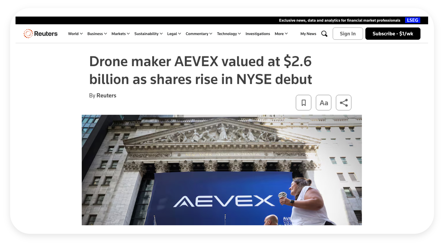
98. AEVEX Debuts on the NYSE at a $2.6B Evaluation
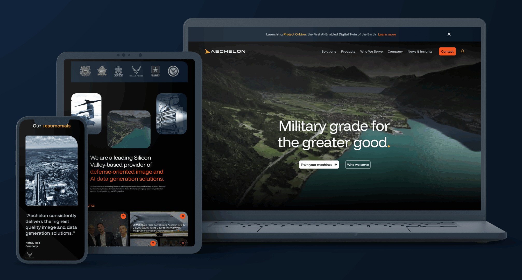
97. Shield AI Acquires Aechelon Technology
Summary: Shield AI, a defense technology company focused on autonomy and AI-powered systems for national security, has acquired Aechelon Technology, a provider of high-fidelity simulation and visualization software used across defense and aerospace applications. Aechelon is known for its real-time 3D terrain generation and simulation environments that support mission planning, training, and operational readiness for U.S. and allied defense programs. The acquisition enhances Shield AI’s ability to integrate advanced simulation environments with autonomous systems, accelerating development, testing, and deployment of AI-driven capabilities in complex, contested environments.
Strategic Advantages: By incorporating Aechelon’s simulation and modeling technologies, Shield AI strengthens its end-to-end autonomy stack, spanning development, training, simulation, and real-world deployment. Aechelon’s tools enable highly realistic digital environments that are critical for training autonomous systems at scale, reducing reliance on costly live testing and enabling rapid iteration in software-defined environments. This capability is increasingly important as defense programs prioritize speed, adaptability, and resilience in AI-driven warfare scenarios.
Strategically, the acquisition positions Shield AI to deliver a more integrated platform that combines autonomy, AI, and simulation into a unified offering for defense customers. Aechelon’s established footprint across government programs and its alignment with mission-critical applications provide immediate credibility and access within the defense ecosystem. The transaction underscores a broader industry shift toward software-centric defense capabilities, where simulation, digital twins, and AI-enabled systems play a central role in accelerating innovation, improving readiness, and maintaining technological advantage in increasingly complex operational theaters.
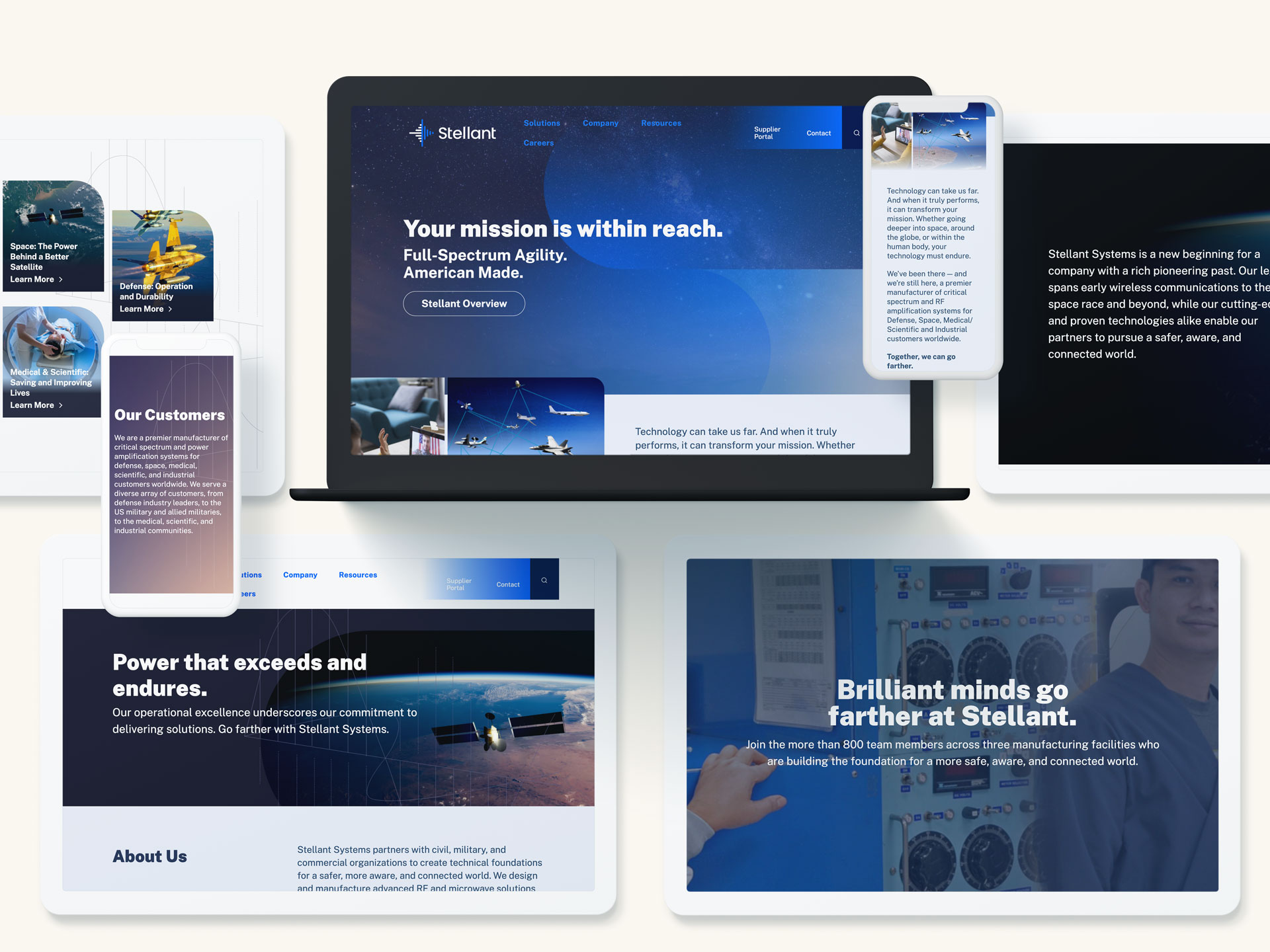
96. TransDigm Group Acquires Stellant Systems
Summary: TransDigm Group, a leading global designer, producer, and supplier of highly engineered aerospace components, has acquired Stellant Systems, a specialized provider of RF and microwave solutions supporting defense and space missions. Stellant brings deep expertise in radar, electronic warfare, communications, and satellite payload technologies, serving critical national security and aerospace programs. The acquisition strengthens TransDigm’s portfolio of proprietary, mission-critical products that support complex and highly regulated aerospace and defense platforms.
Strategic Advantages: By integrating Stellant’s advanced RF and microwave capabilities, TransDigm expands its presence in high-growth defense and space markets where performance, reliability, and technical differentiation are paramount. Stellant’s offerings complement TransDigm’s existing portfolio by adding specialized electronic subsystems that are deeply embedded in customer platforms and programs of record, reinforcing TransDigm’s position as a trusted supplier of highly engineered, value-added components.
Strategically, the acquisition underscores TransDigm’s disciplined approach to M&A, focusing on businesses with strong intellectual property, long program lifecycles, and defensible market positions. Stellant’s alignment with classified and mission-critical applications enhances TransDigm’s exposure to resilient defense and space spending while creating opportunities for long-term value creation through operational excellence, aftermarket support, and sustained customer relationships across the aerospace and defense ecosystem.
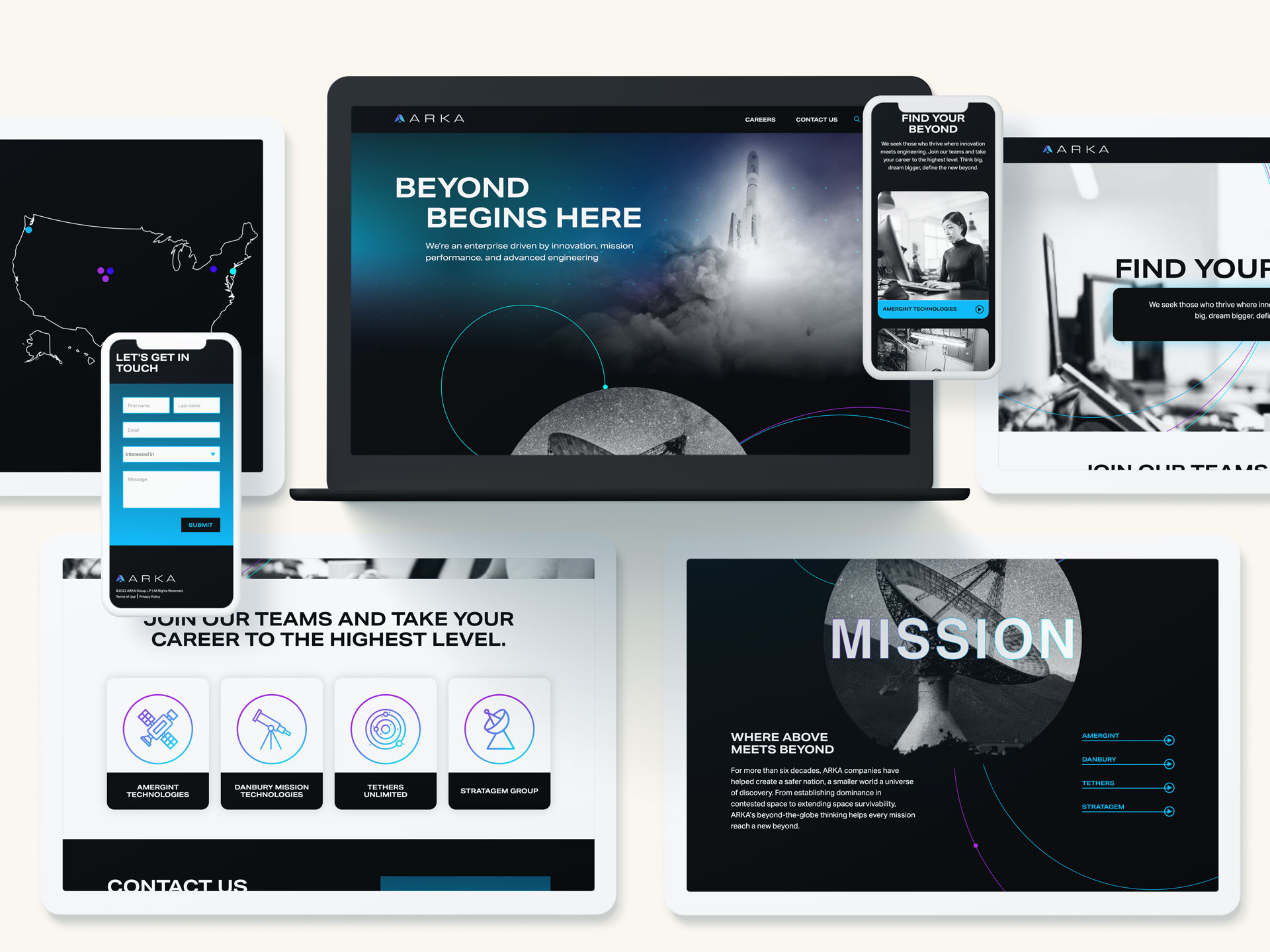
95. CACI Acquires ARKA Group
Summary: CACI, a leading provider of advanced technology and intelligence solutions for defense, federal, and commercial clients, has acquired ARKA Group, a specialized firm focused on space-based sensing, actionable intelligence, and advanced technology integration. ARKA brings expertise in sensor systems, data fusion, analytics, and mission-focused technology solutions across national security and defense operations. This acquisition strengthens CACI’s ability to deliver end-to-end, mission-centric capabilities that combine cutting-edge technology with operational insight.
Strategic Advantages: By integrating ARKA’s space and sensor capabilities, CACI enhances its position in domains where situational awareness, data-driven decision-making, and rapid response are critical. ARKA’s offerings expand CACI’s portfolio from core intelligence, cyber, and mission services into advanced space-based sensing, analytics, and technology integration—enabling defense and intelligence clients to achieve faster, more precise outcomes.
Strategically, the acquisition demonstrates CACI’s commitment to delivering innovative, mission-aligned solutions to national security customers. It creates opportunities for unified technology development across CACI’s platforms, blending sensor technology, analytics, mission systems, and actionable intelligence. The combined capabilities provide clients with a trusted partner capable of addressing complex operational challenges and emerging threats in a rapidly evolving security environment.
94. Red River Acquires Invictus
Summary: Red River, a leading provider of technology transformation, security, and managed services for government and enterprise clients, has acquired Invictus, a specialized cybersecurity and intelligence solutions firm supporting national security missions. Invictus brings deep expertise in cyber operations, intelligence analysis, secure systems engineering, and mission support services across defense, intelligence, and federal civilian agencies. The acquisition enhances Red River’s ability to deliver end-to-end, mission-focused solutions that combine advanced cybersecurity capabilities with scalable IT modernization.
Strategic Advantages: By integrating Invictus’s cyber and intelligence tradecraft, Red River significantly strengthens its position in high-security environments where resilience, protection, and operational readiness are paramount. Invictus’s capabilities expand Red River’s portfolio from core IT and cloud services into advanced cyber operations, intelligence support, and mission assurance—helping federal clients counter evolving threats with greater speed and precision.
Strategically, the acquisition underscores Red River’s commitment to supporting national security customers with secure, enterprise-grade technologies backed by deep domain expertise. It creates opportunities for unified solution development across Red River’s existing platforms, blending infrastructure modernization, cybersecurity, analytics, and managed services. The combined offering delivers greater value to defense and intelligence clients seeking trusted partners who understand both mission complexity and emerging threat landscapes.

93. BigBear.ai Acquires Ask Sage
Summary: BigBear.ai, a leader in artificial intelligence and data analytics solutions for defense and enterprise customers, has acquired Ask Sage, an AI-powered research and decision-support platform. Ask Sage leverages generative AI to accelerate access to knowledge, providing natural-language answers across secure and classified environments. The acquisition enhances BigBear.ai’s ability to deliver trusted, explainable AI solutions tailored for mission-critical applications in government, intelligence, and commercial sectors.
Strategic Advantages: By integrating Ask Sage’s generative AI technology, BigBear.ai strengthens its position at the intersection of data analytics and large language model (LLM) innovation. The acquisition enables BigBear.ai to expand its offerings beyond analytics into interactive decision-support and real-time knowledge generation, improving speed and insight for end users.
Strategically, this move underscores BigBear.ai’s commitment to advancing AI solutions that are secure, transparent, and operationally relevant—particularly in regulated and high-security domains. It also opens opportunities for product integration across BigBear.ai’s existing platforms, enhancing value for both defense and enterprise clients seeking intelligent automation.
92. Paychex Acquires SixFifty
Summary: Paychex, a leading provider of human resources and payroll solutions, has acquired SixFifty, the legal technology subsidiary of Wilson Sonsini Goodrich & Rosati. SixFifty, launched in 2019, offers a platform that automates employment compliance, providing businesses with access to employment law databases and tools to generate documents such as hiring and separation agreements. The acquisition represents a major expansion of Paychex’s capabilities, adding lawyer-built legal compliance solutions to its existing suite of HR, payroll, and benefits technologies. The deal underscores Paychex’s commitment to helping businesses manage risk, maintain compliance, and streamline administrative processes through technology.
Strategic Advantages: By integrating SixFifty’s legal tech platform, Paychex strengthens its position as an end-to-end solution for business operations, combining HR, payroll, benefits, and now employment law compliance. SixFifty’s automated workflows and document-generation capabilities reduce reliance on external legal counsel for routine employment matters, allowing businesses to scale efficiently while minimizing legal risk.
The acquisition also opens opportunities for cross-selling, enabling Paychex to offer SixFifty’s compliance tools to its extensive customer base, deepening client relationships and enhancing customer retention. Strategically, this move reflects the growing trend of blending legal expertise with operational technology, positioning Paychex to provide businesses with a unified, tech-driven approach to managing both workforce and regulatory challenges.

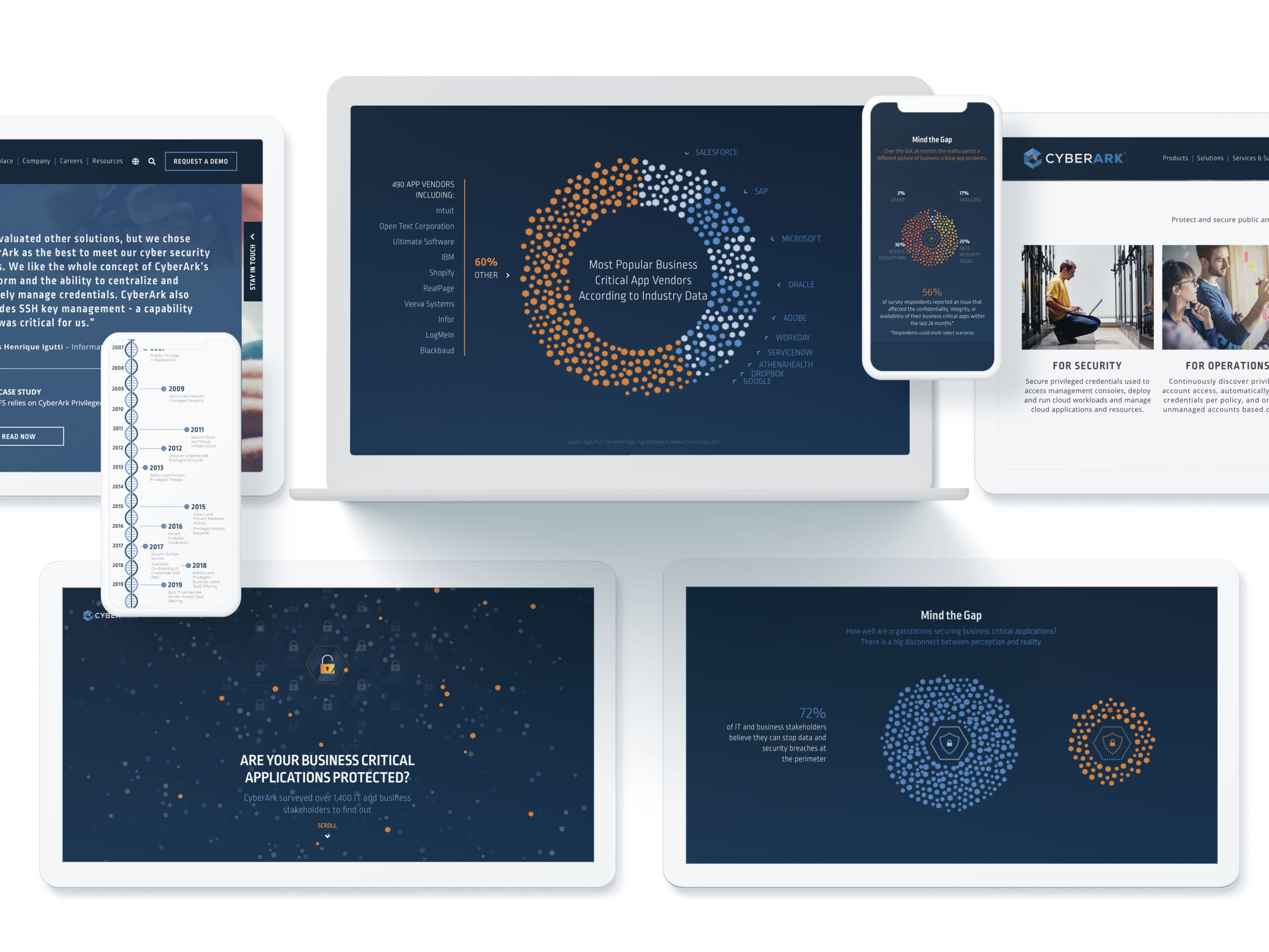
91. Palo Alto Networks Acquires CyberArk
Summary: Palo Alto Networks acquired CyberArk, a global leader in Identity Security and privileged access management. The deal marks a significant expansion of Palo Alto’s platform strategy, adding a robust identity layer to its network, cloud, and endpoint security offerings. CyberArk’s solutions—trusted by governments and Fortune 500 companies alike—bring deep expertise in managing human and machine identities, protecting critical infrastructure from insider threats, credential theft, and unauthorized access. The acquisition reflects Palo Alto’s belief that identity is no longer a standalone concern but a foundational element of modern cybersecurity architecture, especially as AI agents and machine-to-machine workflows take on increasingly sensitive roles within the enterprise.
Strategic Advantages: The acquisition of CyberArk significantly enhances Palo Alto Networks’ platform by embedding industry-leading Identity Security capabilities into its broader cybersecurity architecture. As organizations face mounting challenges in securing not just users but also machines and autonomous AI agents, CyberArk’s technology provides the privileged access controls, secrets management, and identity governance tools required to manage this growing complexity. By integrating these capabilities into its existing suite of network, cloud, and endpoint security solutions, Palo Alto can offer customers a unified security platform that secures access across every layer of their operations.
The combination also strengthens Palo Alto’s positioning for the AI-powered enterprise, where identity becomes a cornerstone of real-time threat prevention and autonomous decision-making. CyberArk’s just-in-time and least-privilege access models are especially well suited for managing the permissions and behaviors of AI agents operating with sensitive data and systems. Strategically, the deal enables cross-selling opportunities, deepens customer relationships, and consolidates the security stack under fewer vendors—all while expanding Palo Alto’s footprint across both public and private sector identity programs. The move marks a step-change in how identity is treated: not as a point solution, but as an essential layer of enterprise cybersecurity infrastructure.
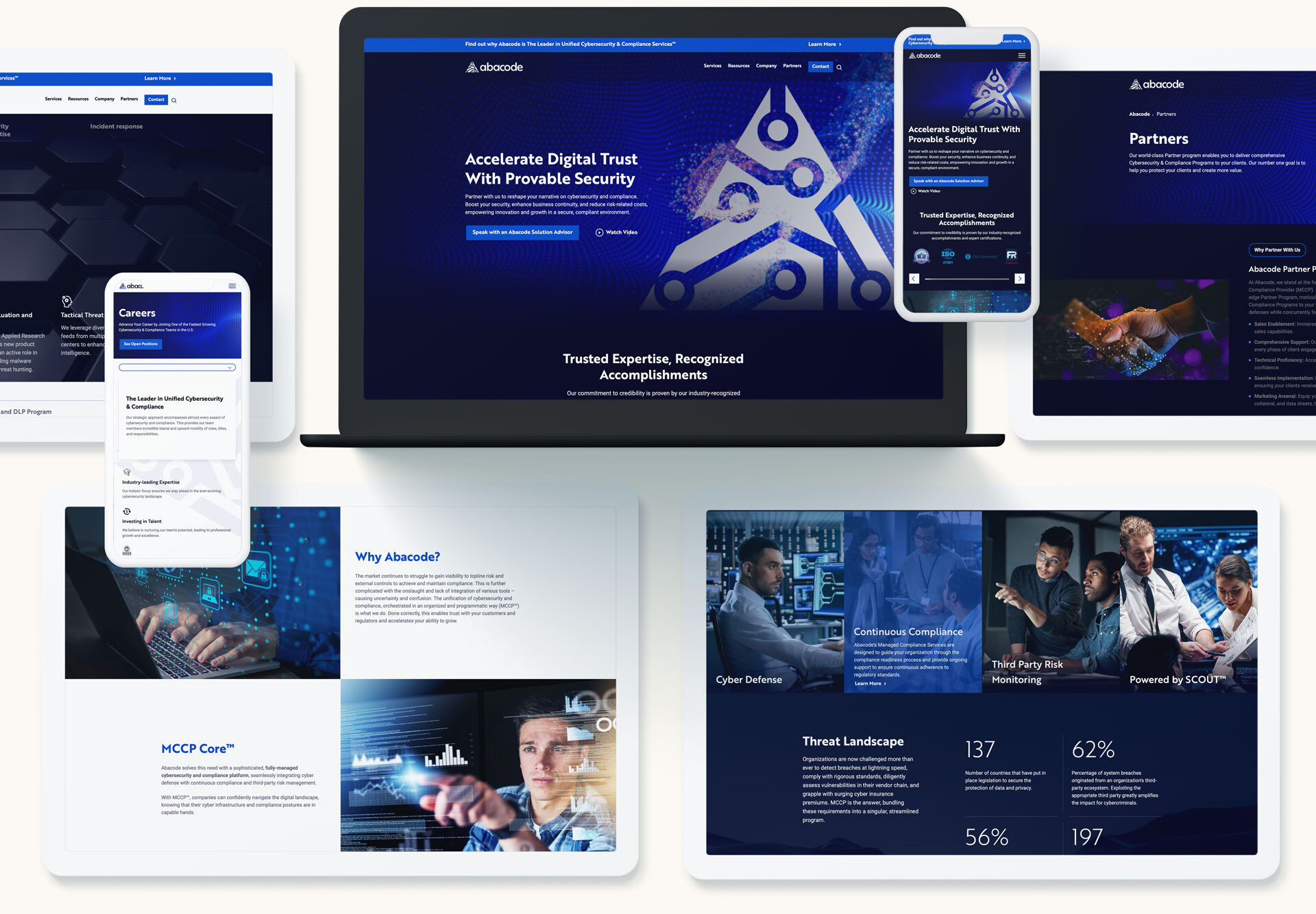
90. Thrive Acquires Abacode
Summary: Thrive, a global technology outsourcing provider specializing in cybersecurity, cloud, and managed IT services, has completed the acquisition of Abacode, a Tampa-based Managed Cybersecurity & Compliance Provider (MCCP). Abacode’s outcome-driven approach combines cybersecurity, governance, risk management, and compliance into a unified offering. By integrating Abacode’s team and capabilities, Thrive enhances its ability to help mid-market clients across healthcare, finance, government, and other regulated industries meet evolving regulatory and cyber risk requirements while turning compliance into a competitive advantage.
Strategic Advantages: The acquisition seamlessly aligns Thrive’s global, scalable infrastructure with Abacode’s proven expertise in managing compliance-intensive cybersecurity programs. Abacode’s culture of client commitment and innovation strengthens Thrive’s high-touch, advisory-led delivery model featuring vCISO, vCIO, and 24×7 SOC/NOC services. Together, they deliver a comprehensive governance, risk, and compliance platform that simplifies complexity for mid-market businesses. This union accelerates Thrive’s expansion of its compliance capabilities and presence, particularly in the Southeast US, while deepening its value proposition across industries facing stringent regulatory environments. With enhanced scale, standardized services, and integrated compliance and security advisory, the combined offering positions Thrive to drive scalable, high-touch cybersecurity outcomes for a broader range of clients.
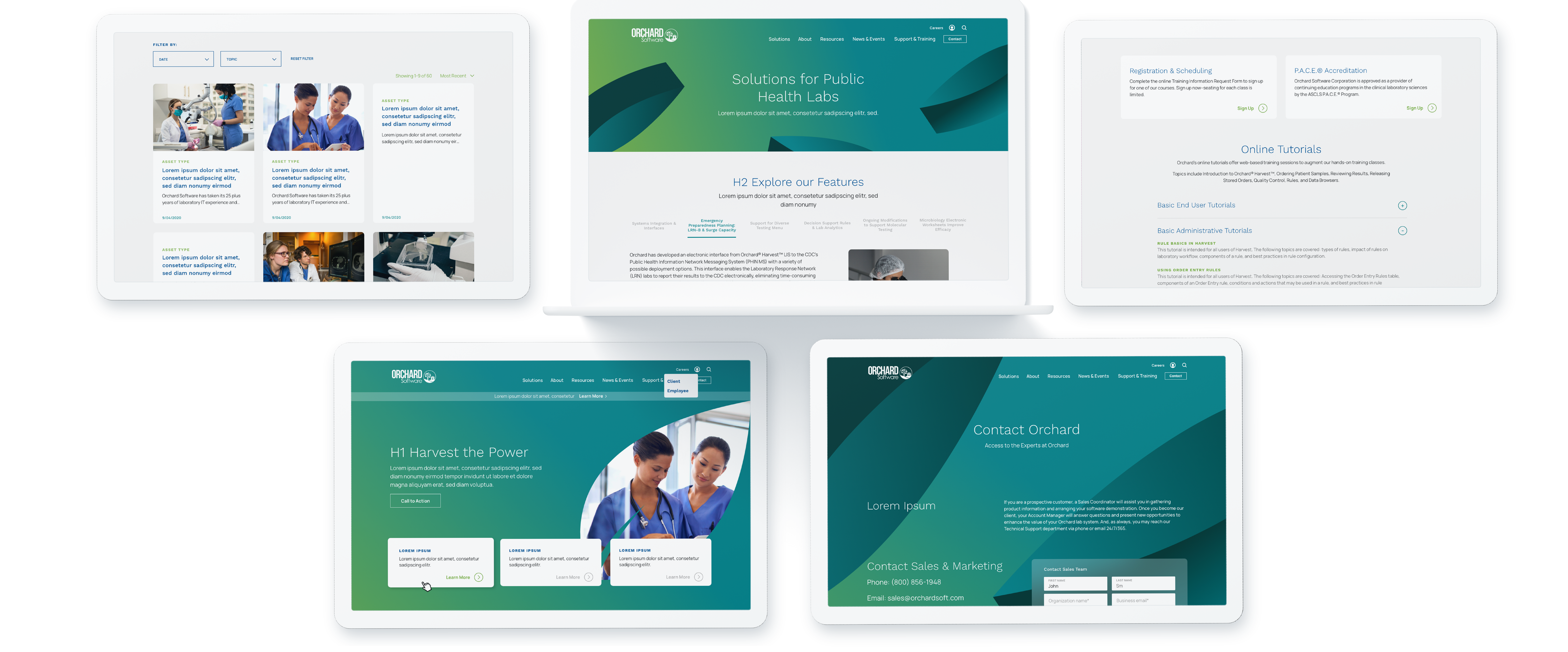
89. Clinisys Acquires Orchard Software
Summary: Clinisys, a global provider of laboratory informatics solutions, has acquired Orchard Software from Francisco Partners. This transaction unites two leading names in the Laboratory Information System (LIS) market and reinforces Clinisys’s commitment to expanding its informatics capabilities across healthcare, life sciences, and public health. Orchard brings a deep bench in award-winning LIS solutions used across physician offices, reference labs, student health centers, veterinary clinics, and public health organizations. The combination enhances Clinisys’s ability to offer comprehensive, flexible, and scalable cloud and enterprise-level software to laboratories worldwide.
Strategic Advantages: The acquisition delivers powerful complementary strengths: Clinisys’s global footprint and cloud-native LIMS offerings merge with Orchard’s dominance in diagnostic laboratories, particularly in physician office, veterinary, and independent reference lab settings. Together, they form a unified, versatile platform capable of serving the full spectrum of laboratory customers with consistent, integrated software and analytics. Orchard’s long-standing recognition in customer satisfaction and performance metrics reinforces Clinisys’s leadership in the LIS market and accelerates innovation in workflow automation, billing enhancements, and integration with EHR systems.
88. Anduril Acquires Klas
Summary: Anduril Industries acquired KLAS, a leading provider of advanced sensor and targeting technologies for defense and intelligence applications. KLAS specializes in high-performance radar and electro-optical systems critical to situational awareness and battlefield intelligence. This acquisition strengthens Anduril’s portfolio in autonomous defense solutions by integrating KLAS’s proven capabilities in sensor fusion and target tracking. The move underscores Anduril’s commitment to delivering next-generation, end-to-end defense platforms that enhance real-time decision-making across contested environments.
Strategic Advantages: KLAS’s expertise in multi-sensor integration and scalable, ruggedized hardware complements Anduril’s autonomous systems, creating a seamless pipeline from detection to engagement. The acquisition enables accelerated development of AI-powered situational awareness tools, bolstering capabilities in drone defense, perimeter security, and battlefield monitoring. KLAS’s deep relationships with key DoD customers and classified programs provide Anduril with expanded access to mission-critical markets and classified contracts. By combining Anduril’s software-defined autonomy with KLAS’s sensor innovation, the company is positioned to lead in delivering agile, modular defense solutions optimized for rapid deployment and evolving threats.
87.Vista Equity Partners and Blackstone Acquire Assent
Summary: Vista Equity Partners, in partnership with Blackstone, has acquired a controlling stake in Assent Inc., a leading provider of supply chain sustainability and compliance software headquartered in Ottawa. The transaction involved buying out prior venture investors—namely Volition Capital, First Ascent Ventures, Warburg Pincus, and StepStone Group—under a valuation in the neighborhood of US$1.3 billion, with a reported cash payment of approximately US$400 million to exiting shareholders. Assent’s platform supports enterprise clients in highly regulated manufacturing sectors, enabling them to manage supply chain risk, regulatory compliance, and ESG data through a scalable cloud-based SaaS solution. Concurrent with the ownership shift, the company appointed a new CEO from the United States and transitioned the founder‑CEO into an executive chairman role.
Strategic Advantages: This investment strengthens Assent’s trajectory toward scaling global operations by aligning it with two of the most influential enterprise software‐focused private equity firms. Assent gains access to Vista’s deep operational playbook in scaling SaaS businesses and Blackstone’s capital scale and institutional strength. Together, the firms bring governance rigor and roadmap alignment that can accelerate Assent’s evolution from steady recurring revenue growth to broader international expansion and deeper vertical penetration across industrial sectors. With momentum driven by a history of reliable ARR growth and adoption by nearly a thousand large manufacturers, Assent is well positioned to broaden its product and partnership ecosystem in supply chain compliance, ethical sourcing, and ESG risk management. The board reconfiguration and new executive leadership are structured to support an intensified focus on growth objectives, operational scale, and customer success, building on the company’s established track record and board alignment with Vista and Blackstone principals.
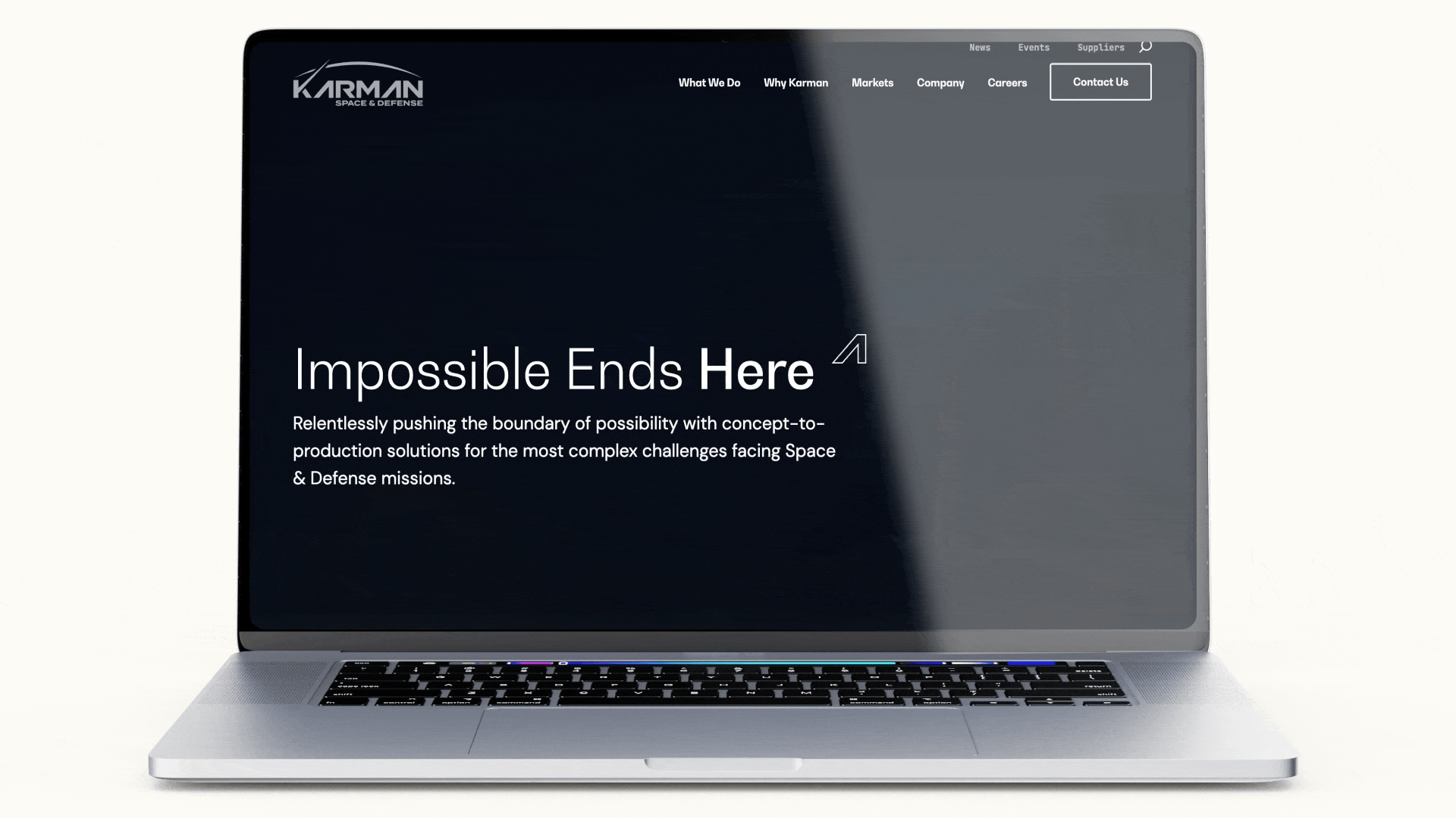
86. Karman Space & Defense Files for IPO
Summary: In early 2025, Karman Space & Defense confidentially filed for an initial public offering, positioning itself as one of the first pure-play space and hypersonics manufacturers to seek a public listing. Formed through the combination of multiple heritage aerospace and defense suppliers—most notably AAE Aerospace, Systima Technologies, and Bal Seal Engineering—Karman has rapidly scaled into a vertically integrated supplier of mission-critical hardware for the space launch, missile defense, and hypersonic sectors. The IPO marks a milestone not just for Karman, but for the broader emergence of space-adjacent industrial players as viable public-market entities.
Strategic Advantages: Karman’s growth story is driven by consolidation, modernization, and smart positioning. By integrating legacy defense suppliers under one roof, it built a scalable manufacturing footprint tailored for the new space race—supporting both commercial launch providers and prime contractors. Its capabilities span nose cones, separation mechanisms, and propulsion-adjacent hardware—essential components for both reusable launch systems and advanced missile architectures. Karman’s competitive edge lies in its speed-to-market, vertically integrated facilities, and ability to deliver high-reliability components at production scale. With government investment in hypersonics and resilient space architectures rising sharply, Karman sits in the sweet spot: a defense-grade manufacturer that’s nimble enough to support new entrants like Rocket Lab or Firefly, but qualified enough for classified DoD and MDA programs.
85. Quorum Cyber Acquires Kivu Consulting
Summary: Quorum Cyber, a fast-growing cybersecurity firm specializing in managed detection and response (MDR) services, has acquired Kivu Consulting, a U.S.-based cybersecurity and digital forensics provider. Kivu is known for its expertise in ransomware response, digital investigations, and cyber risk management, serving enterprises and insurers worldwide. The acquisition significantly expands Quorum Cyber’s incident response and forensic capabilities while strengthening its North American presence. Together, the two firms will offer a full spectrum of proactive and reactive cybersecurity services, from threat monitoring to breach response and recovery.
Strategic Advantages: The addition of Kivu enhances Quorum Cyber’s ability to provide rapid, end-to-end cyber resilience solutions. Kivu’s experience handling complex incidents and insurance partnerships complements Quorum Cyber’s managed security operations, enabling a more integrated and global service offering.
The acquisition also positions Quorum Cyber to compete more aggressively with large-scale security service providers by combining operational excellence with specialized response expertise. Strategically, this move aligns with increasing enterprise demand for unified cybersecurity partners capable of managing prevention, detection, and response under a single umbrella.
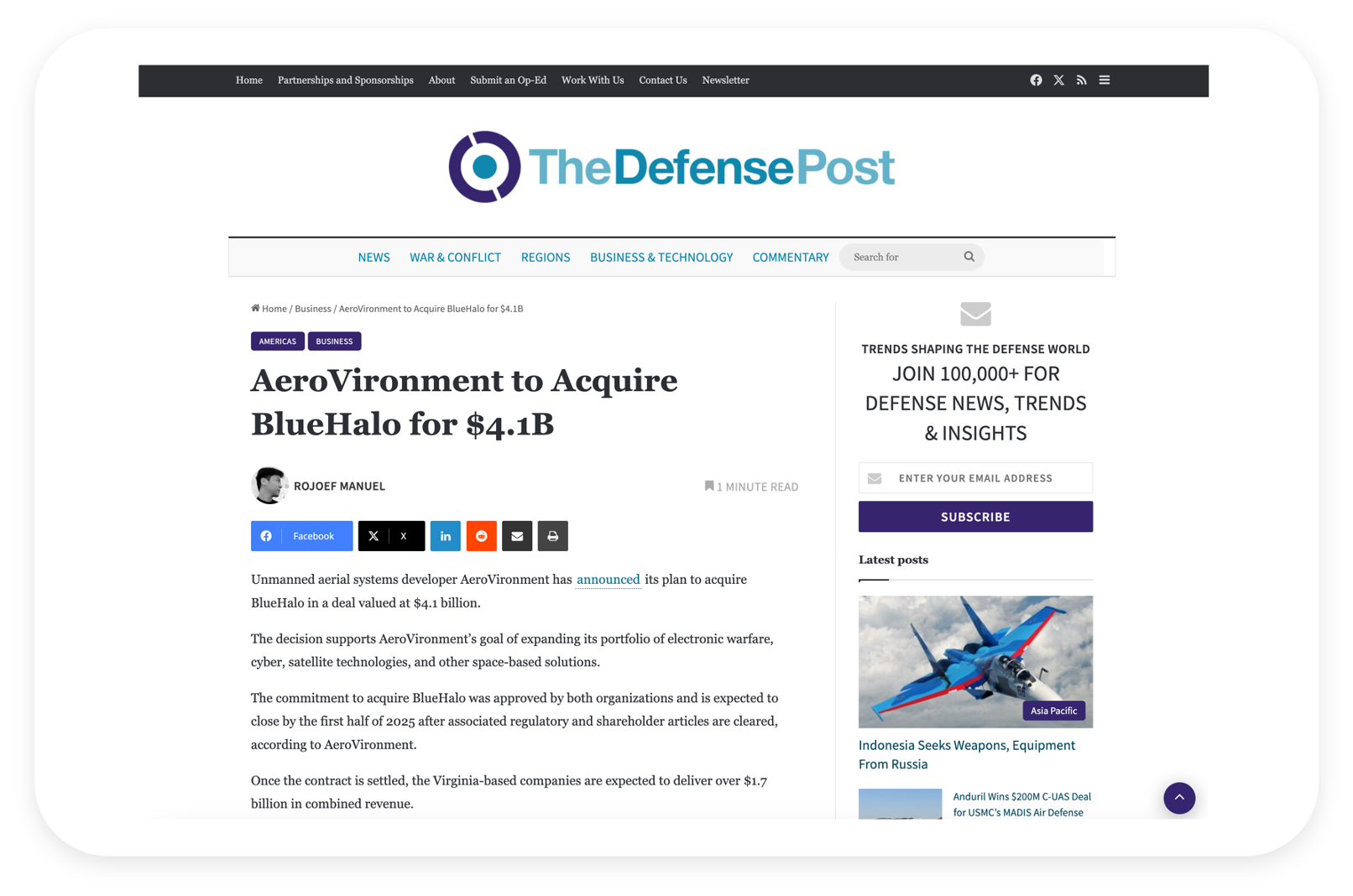
84. AeroVironment Acquires BlueHalo
Summary: In early 2025, defense technology leader AeroVironment acquired BlueHalo, a rapidly growing provider of advanced defense solutions spanning space, directed energy, cyber, and AI/ML-powered C5ISR systems. BlueHalo, backed by Arlington Capital Partners, had grown aggressively through acquisitions and internal R&D, carving out a leadership position in cutting-edge national security tech. AeroVironment, traditionally known for tactical UAS (unmanned aerial systems), positions this acquisition as a strategic leap into the higher end of the defense technology spectrum.
Strategic Advantages: This acquisition gives AeroVironment access to BlueHalo’s advanced capabilities in space and directed energy—domains increasingly prioritized in the Pentagon’s modernization roadmap. BlueHalo’s portfolio also includes proprietary technologies in autonomy, AI/ML, and RF engineering, which enhance AeroVironment’s offering beyond small UAS. The combined entity now covers a broader mission set: from tactical ISR and loitering munitions to space domain awareness and counter-UAS defense systems. BlueHalo’s government customer base (including key classified programs and defense R&D agencies) complements AeroVironment’s existing DoD footprint, while BlueHalo’s East Coast presence (HQ in Arlington, VA, plus facilities in Alabama, New Mexico, and Maryland) expands AeroVironment’s geographic and programmatic reach. This scale could also improve pipeline access to large IDIQs and OTA contracts.
83. Critical Insight Acquired by Lumifi
Summary: Lumifi (formerly SilverSky), a managed detection and response (MDR) provider, acquired Critical Insight in late 2024. Critical Insight, founded by ex-CISO Mike Hamilton, offers MDR and cybersecurity-as-a-service with a strong focus on healthcare and public sector clients. This was Lumifi’s third acquisition in 13 months, following rebranding from Cygilant/SilverSky, as it aggressively consolidates the MDR market.
Strategic Advantages: The acquisition doubles down on Lumifi’s healthcare and critical infrastructure market presence. Critical Insight brings a 24/7 SOC, incident response team, and professional services that complement Lumifi’s threat monitoring and “ShieldVision” platform. Essentially, Lumifi broadens its service portfolio: adding Critical Insight’s incident response and vCISO consulting to its MDR tech stack. Geographically, Critical Insight’s West Coast roots (Seattle) and client base (hospitals, local governments) extend Lumifi’s reach. By integrating, they likely achieve some economies (shared SOC infrastructure, unified platform development) and can present a stronger value prop: full lifecycle cyber defense, from prevention to response, tailored for regulated sectors. The press release highlighted this strengthening of offerings and presence in healthcare/critical infrastructure. It’s part of Lumifi’s strategy to grow both organically and via acquisition, aiming to build enough scale to perhaps IPO or be acquired itself. Each acquisition (Infocyte, Cysiv earlier, now Critical Insight) added either technology or market share. With Critical Insight, Lumifi also gains experienced practitioners (e.g., Critical Insight’s leadership includes former government security officials) which bolsters credibility.
82. Applied Insight Acquired by CACI
Summary: Federal IT contractor CACI International acquired Applied Insight in late 2024. Applied Insight (AI LLC), backed by The Acacia Group, is a cloud and analytics firm specializing in secure cloud migration, DevSecOps, and advanced cyber for the U.S. intelligence community (IC).
Strategic Advantages: This acquisition enhanced CACI’s cloud and mission IT offerings, particularly for classified environments. Applied Insight brought its alt-cloud platform (for secure AWS/Azure in air-gapped settings) and analytics tools like SHIFT, which help simulate classified cloud setups locally – key for intel and defense clients. Integrating this, CACI can now offer full-stack enterprise IT modernization, from infrastructure to application development, with the high security the IC demands. It aligns with CACI’s strategy to invest in high-growth tech areas. Notably, Applied Insight’s work with agencies like DHS and DoD expands CACI’s customer footprint and contract vehicles. CACI’s CEO noted the combined business will “enhance cloud, cyber, and user productivity for secure networks in the IC”, indicating synergy with CACI’s existing intel support business. Financially, while terms weren’t disclosed, Applied Insight’s ~$40M+ revenue (estimate) adds to CACI’s ~$6B, so it’s a tuck-in focused on capability gains rather than scale. It also preempted competition – preventing rivals from acquiring that tech.
81. Amelia Acquired by SoundHound
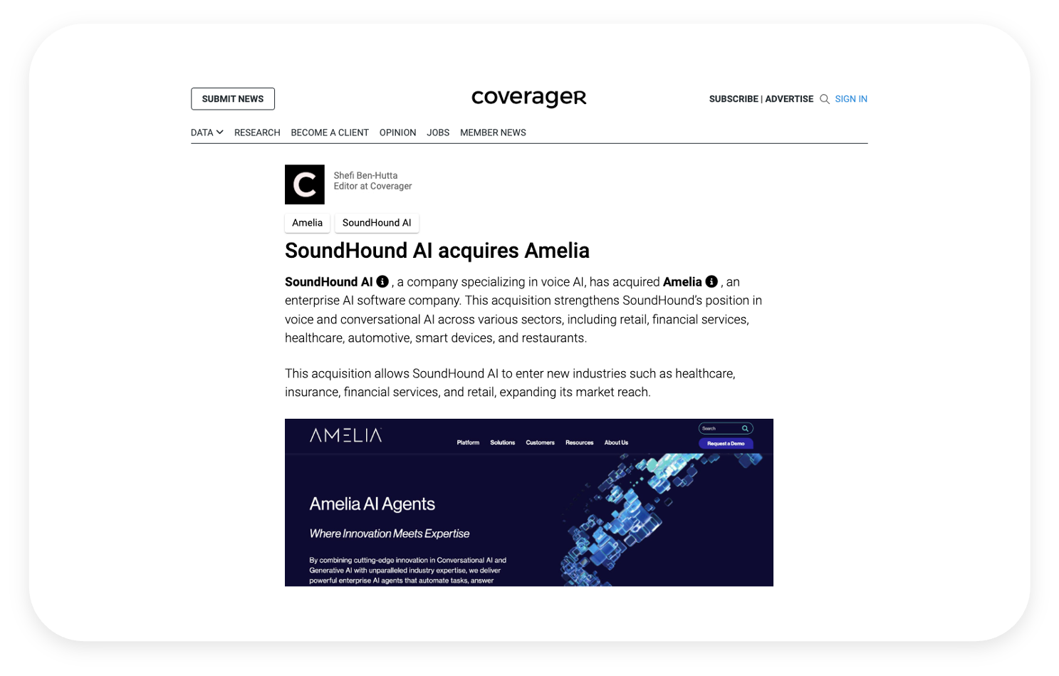
Summary: SoundHound AI, Inc., known for voice AI and speech recognition, acquired Amelia (IPsoft’s Amelia) for $80M in August 2024. Amelia is a conversational AI and digital assistant platform (originally from IPsoft) used by enterprises for customer service and IT support automation.
Strategic Advantages: This acquisition significantly expanded SoundHound’s scale and product reach in the booming conversational AI market. SoundHound primarily offered voice interface tech (e.g., for automotive and restaurants) and had gone public via SPAC in 2022. By adding Amelia, a leader in enterprise AI agents, SoundHound doubled its customer count to ~200 (including Fortune 500 companies) and projected combined 2025 revenue of $150M. It allowed SoundHound to diversify from its core voice applications into the broader digital assistant space (text-based chatbots, call center AI, etc.) – a timely move as generative AI drives demand for advanced virtual agents. Financially, paying $80M (mostly cash/equity) for a company that raised ~$189M was a bargain. SoundHound also assumed Amelia’s existing enterprise contracts (with big names like BNP Paribas and Fujitsu) and deep AI tech stack. The synergy is clear: SoundHound’s voice understanding + Amelia’s conversational workflows = next-gen AI assistants across voice and text. Post-acquisition, SoundHound could offer an end-to-end voice and chat solution, enhancing upsell opportunities. The deal also improved SoundHound’s financial outlook after a rough 2023 (stock was down, layoffs happened). With Amelia’s $45M revenue on board, SoundHound inches closer to profitability while expanding markets (IT helpdesk automation, etc.)
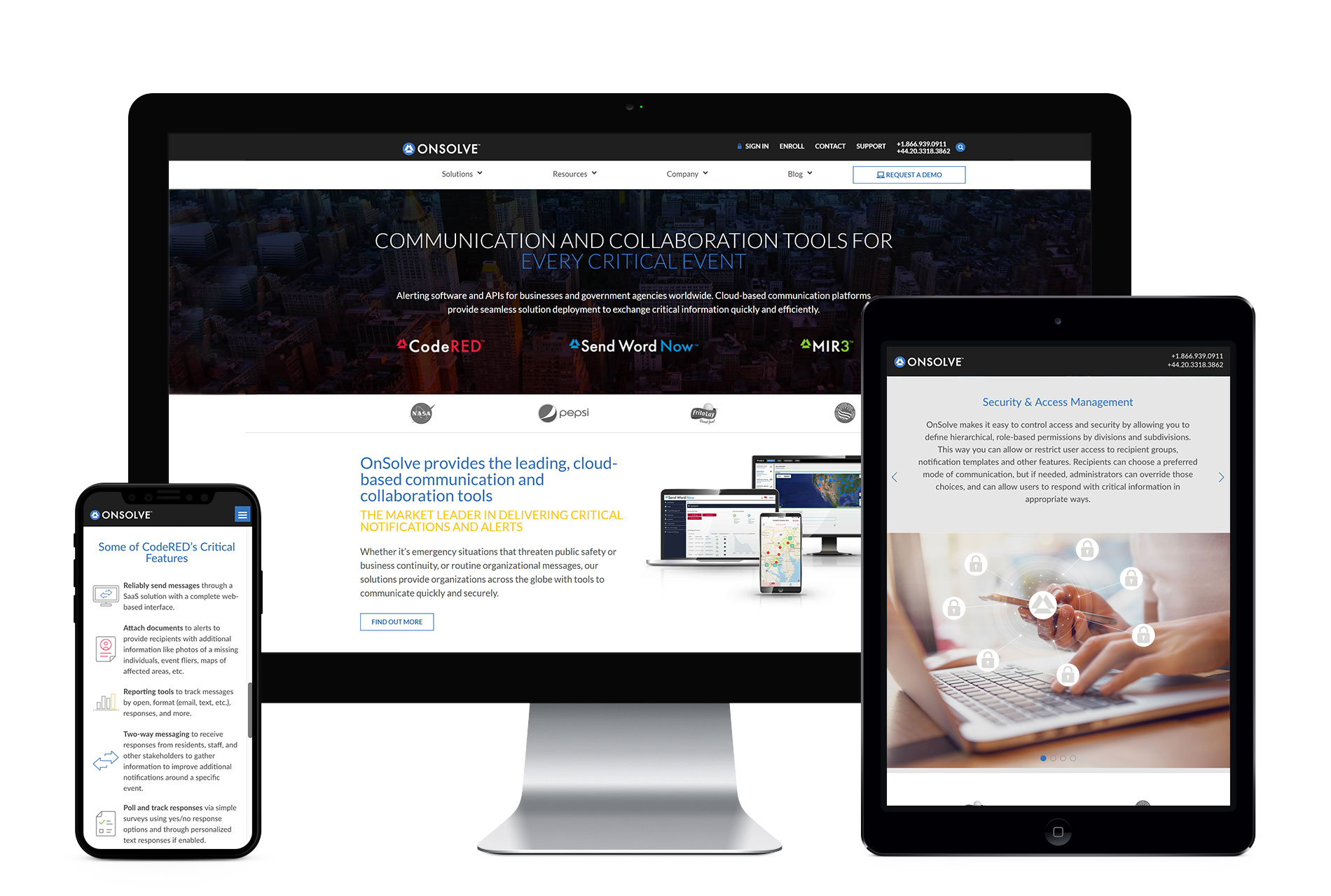
80. GardaWorld Acquires OnSolve
Summary: GardaWorld, a global leader in security services and integrated risk management, has acquired OnSolve, a provider of critical event management and mass communication solutions. OnSolve delivers risk intelligence, emergency notifications, incident management, and travel risk capabilities to enterprise customers, government agencies, and mid-market organizations. The business will be integrated into GardaWorld’s Crisis24 platform, enhancing its AI-enabled risk management and real-time intelligence offerings.
Strategic Advantages: By incorporating OnSolve’s SaaS-based critical event management platform, GardaWorld significantly expands the depth and breadth of its Crisis24 capabilities. OnSolve’s strengths in mass notification systems, risk intelligence, and incident response complement Crisis24’s existing suite of AI-enhanced analytics and global risk advisory services, creating a more unified and comprehensive solution for anticipating, managing, and responding to complex threats.
Strategically, the acquisition reinforces GardaWorld’s push toward technology-enabled security and integrated risk management platforms that combine software, data, and human expertise. The addition of OnSolve strengthens Crisis24’s position as a differentiated, end-to-end risk management provider capable of delivering real-time, hyperlocal insights alongside automated response tools. This alignment reflects broader industry consolidation around platforms that integrate intelligence, communication, and response workflows, enabling organizations to operate with greater resilience in an increasingly volatile global risk environment.
79. Marcum’s Non-Attest Business Acquired by CBIZ
Summary: In a major accounting industry deal, CBIZ, Inc. (a national professional services firm) acquired the non-attest business of Marcum LLP in early 2025, following Marcum’s splits from its audit practice (due to regulatory rules.) This effectively merged Marcum’s tax and consulting practice into CBIZ, making CBIZ a top-10 accounting firm with 160+ offices and 10,000+ employees.
Strategic Advantages: This acquisition propelled CBIZ into the elite ranks of accounting and advisory firms. By absorbing Marcum’s advisory business, CBIZ significantly expanded its geographic reach (Marcum was strong in the Northeast and Florida) and service offerings (like capital markets advisory, specialized consulting) without conflicting with audit independence (since attest stayed separate). CBIZ can now cross-sell a broader suite of services to both client bases, e.g., offering Marcum’s consulting expertise to CBIZ’s mid-market clients and vice versa. Economies of scale in back-office functions and vendor relationships will improve margins. Importantly, the combined firm’s national presence and talent pool make it more competitive for large engagements that require depth and breadth.
78. Challenger Acquired by Richardson Sales Performance
Summary: Richardson Sales Performance, a global leader in sales training and performance improvement, has acquired Challenger, the company behind the renowned “Challenger Sale” methodology. Challenger, founded in 2011, is known for its research-driven approach that helps organizations build high-performing sales teams by teaching reps to challenge customer thinking and drive insight-led conversations. The acquisition unites two of the most influential names in sales training, combining Challenger’s proven methodologies with Richardson’s scalable digital learning and performance analytics platform. Together, the companies aim to create the most comprehensive suite of sales enablement and performance solutions in the market.
Strategic Advantages: The merger brings together Richardson’s expertise in customized training delivery and sales transformation with Challenger’s deep intellectual property and behavioral science-based frameworks. This integration allows for end-to-end sales performance programs—from methodology design to digital reinforcement and analytics—under one brand.
By leveraging Challenger’s strong brand equity and Richardson’s global footprint, the combined organization is poised to accelerate growth across enterprise clients while expanding digital offerings. Strategically, this move reflects growing demand for data-driven, behavior-based sales enablement solutions that align training with measurable business outcomes.
77. Aeyon Acquired by CGI Federal
Summary: In late 2023, CGI Federal (U.S. arm of global IT firm CGI Inc.) acquired Aeyon, a rapidly growing consultancy specialized in AI, Robotic Process Automation (RPA), and financial management for U.S. federal agencies. Aeyon, backed by Enlightenment Capital, itself was formed by merging Artlin and Sehlke in 2021, with Bluetext’s help in branding (they crafted the Aeyon name and launch messaging, per their blog with CEO Sunny Singh discussing branding through M&A).
Strategic Advantages: For CGI Federal, acquiring Aeyon expands its capabilities in emerging tech and defense support services. Aeyon brings strong past performance in DoD financial management, Army robotics process automation, and Navy data analytics, complementing CGI’s traditional IT services. This helps CGI deepen relationships in national security agencies (Aeyon’s client list included defense and intelligence agencies). It also infuses entrepreneurial talent into CGI’s rather large organization – Aeyon’s leadership is known for agility and innovation. CGI cited the move as broadening its offerings in AI and automation for federal clients, aligning with government demand for digital transformation. Aeyon’s experience with the DoD’s financial systems and the JAIC’s AI initiatives can be leveraged across CGI’s wider client base. The acquisition underscores CGI’s strategy to grow via “build and buy,” adding niche expertise to bolster its federal footprint.
76. Axient Acquired by Astrion
Summary: Astrion, a Brightstar Capital Partners portfolio company, completed the acquisition of Axient (backed by Sagewind Capital) in September 2024. Astrion is a mission support and engineering contractor for U.S. government (recently formed, possibly combining former BRG assets), while Axient is a well-known defense and aerospace solutions provider (formed from a 2021 merger of QuantiTech, Millennium, Dynamic Concepts, etc.).
Strategic Advantages: By acquiring Axient, Astrion aims to set a new industry standard through enhanced scale and capabilities. The combined company addresses critical missions across defense and civilian agencies, spanning cybersecurity, systems engineering, space operations, and digital transformation. Essentially, Astrion + Axient creates a mid-sized powerhouse with end-to-end solutions, from R&D and testing (Axient’s forte in space and missiles) to operational mission support (Astrion’s focus). This breadth means they can bid on larger contracts and deliver more integrated offerings. For Axient’s customers (Space Force, Missile Defense, etc.), Astrion’s backing brings additional resources and capital to drive innovation – fulfilling the promise of “Accelerate Possible” that Bluetext helped brand. From Astrion’s perspective, acquiring Axient injects a large, experienced workforce (Axient had thousands of employees) and key contract vehicles, accelerating Astrion’s growth trajectory by years. The press release noted “benefits of scale” and expectation of substantial growth and exceptional outcomes. Private equity sponsors (Brightstar and Sagewind) also likely realize synergies: merging back-office functions and unifying go-to-market could improve margins.
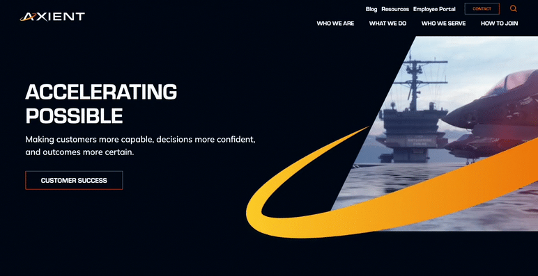
75. Courvoisier Acquired by Campari
Summary: Italian spirits company Campari Group acquired Courvoisier, the famed French cognac brand, from Beam Suntory for €1.1B (~$1.2B) in December 2023. This was Campari’s largest deal ever, bringing one of the “big four” Cognac houses into its portfolio.
Strategic Advantages: The acquisition solidifies Campari’s push into the premium brown spirits category. Courvoisier becomes Campari’s fourth pillar (after aperitifs like Aperol, bourbon, and tequila). Strategically, it gives Campari a renowned Cognac to compete with Diageo’s Hennessy partnership and Pernod Ricard’s Martell in key markets. Immediately, it boosts Campari’s sales by ~9% and brings a spirit category (cognac) that’s seeing growth in the U.S. and China. For Campari, which previously only had a smaller cognac (Bisquit) and Grand Marnier (an orange liqueur with cognac base), acquiring Courvoisier fills a portfolio gap and diversifies its revenue. It also provides scale in the supply chain for cognac (aging stocks, production in Jarnac, etc.). Campari can leverage its global distribution to expand Courvoisier’s reach, especially in Asia-Pacific where cognac demand is strong. The brand equity of Courvoisier (associated with luxury and even pop culture) adds prestige to Campari’s lineup. CEO Kunze-Concewitz, about to retire, called it a “crowning achievement”, signaling its strategic importance. Marketing-wise, Campari can now tell a richer story of being a curator of iconic brands from bitters to cognac, appealing to premiumization trends. They might invest in Courvoisier’s branding (packaging, campaigns) as they did after acquiring Grand Marnier.

74. Keyloop Acquired Automotive Transformation Group (ATG)
Summary: UK-based automotive retail software provider Keyloop acquired Automotive Transformation Group (ATG) in May 2024. Keyloop (a Francisco Partners portfolio company, formerly part of CDK Global) offers dealer management systems (DMS) and digital solutions for car dealerships, while ATG (backed by Inflexion PE) provides an omnichannel e-commerce platform for car sales (from online reservations to showroom tools).
Strategic Advantages: The deal aims to create an integrated technology portfolio connecting the entire automotive consumer journey. By combining Keyloop’s back-end dealership software with ATG’s front-end retailing tools, the merged company can offer car manufacturers and dealers a seamless solution: from customer interest and online purchase, through financing and inventory management, to after-sales service. This meets the industry’s need for “omnichannel retailing” – consumers expect to transition smoothly between online car shopping and in-store experiences. Keyloop + ATG can facilitate things like online car configuration and pricing that flow directly into the dealer’s systems for a test drive or delivery scheduling. This streamlined customer experience can help dealerships increase sales conversions and improve customer satisfaction. Additionally, the acquisition expands Keyloop’s market share in Europe by adding ATG’s clients, and potentially allows cross-selling (Keyloop’s CRM or DMS to ATG customers, and vice versa). Efficiency-wise, integrated R&D can accelerate innovations like better data analytics for dealers.
73. Intelsat Acquired by SES
Summary: In April 2024, European satellite operator SES S.A. announced plans to acquire Intelsat for $3.1 billion in cash. This merger, pending regulatory approval (expected to close by late 2024 or 2025), would combine two of the world’s largest geostationary satellite services providers, creating a multi-orbit (GEO + MEO) communications behemoth.
Strategic Advantages: The SES-Intelsat merger would yield massive scale and synergies in the satellite industry. Together they’d control ~70 satellites and a deep global customer base in video, data, and government segments. SES touted €2.4B NPV in synergies (mostly cost savings and network integration benefits) with much realized within 3 years. A combined SES-Intelsat can offer customers integrated GEO and MEO (Medium Earth Orbit) solutions – SES’s O3b mPOWER MEO constellation complemented by Intelsat’s GEO fleet – to provide more flexible and resilient connectivity. This is crucial as competition from SpaceX Starlink (LEO) and others heats up; multi-orbit capabilities are a key differentiator. Additionally, consolidation reduces overlapping expenses in launch, ground infrastructure, and R&D, allowing more investment in next-gen satellites and services (like direct-to-device communication). For Intelsat, joining SES ends years of merger speculation and adds stability via SES’s stronger balance sheet. The combined entity can also better manage C-band spectrum transitions and monetization. Communication highlights include “creating a stronger and more competitive operator with expanded network and increased revenue in growth segments”.
72. Fastpath Acquired by Delinea
Summary: Privileged access management (PAM) company Delinea acquired Fastpath Solutions, an identity governance and access control software provider, closing in April 2024. Fastpath’s products help manage user access rights and SOD (segregation of duties) across business applications like ERP systems.
Strategic Advantages: The acquisition enables Delinea to offer an end-to-end identity security platform, blending PAM with Identity Governance and Administration (IGA). With Fastpath, Delinea can dynamically control user permissions in applications (like finance or HR systems) in addition to managing privileged accounts on servers and endpoints. This means customers get a unified view of who has what access and the ability to remediate risks (like over-privileged users or toxic combinations of access) automatically. As cybersecurity moves toward zero trust and least privilege, merging these capabilities is powerful. Delinea’s CEO said it solves complex identity challenges by connecting previously siloed solutions. It also positions Delinea against giants like CyberArk or SailPoint by having both PAM and IGA in-house. For Fastpath’s part, integration into Delinea’s cloud platform means its features can reach a wider market and be enhanced by Delinea’s identity threat detection tech. Communications perspective: likely emphasized “modernizing identity security with intelligent authorization”.
71. Eqlipse Technologies Acquired by BlueHalo
Summary: In early 2024, BlueHalo – a fast-growing defense tech firm – announced it will acquire Eqlipse Technologies, a provider of cybersecurity, signals intelligence, and cyber solutions to DoD and the Intelligence Community. Both were Arlington Capital portfolio companies, effectively merging under BlueHalo’s banner.
Strategic Advantages: Combining BlueHalo and Eqlipse creates a mid-tier defense tech powerhouse nearing $1B in revenue with 2,400 employees. BlueHalo gains Eqlipse’s high-end talent and products in cyber and RF sensing, enhancing BlueHalo’s capabilities in Space, c-UAS, electronic warfare, and AI. The merged entity can bid more competitively on large DoD programs, positioned as an alternative to the biggest primes by offering innovation without bureaucracy. Eqlipse was less than a year old under that brand, and now its identity and offerings bolster BlueHalo’s portfolio (indeed, BlueHalo cited Eqlipse’s contribution to Space Force’s $1.4B SCAR program). Culturally and strategically, both companies share a focus on rapid prototyping and mission-focused R&D, which the merger amplifies.
70. ZeroFox Acquired by Haveli
Summary: In May 2024, ZeroFox – a Baltimore-based external cybersecurity firm – was acquired and taken private by Haveli Investments for $350M. Haveli, a tech-focused PE firm in Austin, paid $1.14/share, a 45% premium on the 90-day stock price, and delisted ZeroFox from the Nasdaq.
Strategic Advantages: Going private under Haveli gives ZeroFox capital and strategic support to scale without public market pressure. Haveli likely sees long-term potential in ZeroFox’s platform (which includes AI threat intelligence, digital risk protection, and recent acquisitions like LookingGlass). With Haveli’s backing, ZeroFox can invest in R&D (perhaps developing new AI-driven threat disruption tools) and pursue new go-to-market channels (like MSSP partnerships or global expansion). The infusion of resources comes at a crucial time as cybersecurity threats proliferate; ZeroFox can now expand its external threat intelligence network and automation (“Disruption”) capabilities. Also, Haveli’s network might help ZeroFox land larger enterprise deals or federal contracts. For ZeroFox’s existing customers, Haveli’s ownership was positioned as a positive: more focus on innovation and customer success rather than quarterly earnings. Messaging from the CEO echoed this, noting the partnership will help “build a safer digital world” and accelerate product innovation. In short, as a private company ZeroFox can be more agile and aggressive in a fast-moving cyber market.
69. Kontron Americas Acquires Bsquare
Summary: Kontron Americas has acquired Bsquare, a leading provider of IoT enablement software and edge intelligence solutions. Bsquare’s expertise in device management, edge computing, and data orchestration enhances Kontron’s capabilities in delivering end-to-end industrial IoT and embedded computing solutions. The acquisition strengthens Kontron’s position across key verticals such as manufacturing, energy, and transportation by enabling smarter, more connected operations with scalable and secure edge-to-cloud platforms.
Strategic Advantages: Bsquare’s software-centric approach complements Kontron’s hardware portfolio, creating a comprehensive ecosystem that accelerates digital transformation initiatives for industrial customers. With deep experience in managing heterogeneous device fleets and optimizing data workflows at the edge, Bsquare enhances Kontron’s ability to deliver flexible, reliable, and secure IoT solutions. The combined entity benefits from broadened customer relationships across critical sectors and expanded R&D capabilities to innovate in AI-powered edge analytics, predictive maintenance, and real-time operational intelligence. Together, they are well positioned to capitalize on growing demand for integrated edge computing architectures that improve efficiency, reduce downtime, and enable actionable insights across industrial environments.
68. Verve Industrial Acquired by Rockwell Automation
Summary: Industrial automation giant Rockwell Automation acquired Verve Industrial Protection (an OT/ICS cybersecurity firm) in late 2023. Verve offers a unified platform for asset discovery, vulnerability assessment, and threat monitoring in operational technology (factory and utility networks).
Strategic Advantages: Rockwell’s acquisition of Verve reflects the trend of IT-OT convergence: marrying industrial controls with robust cybersecurity. By embedding Verve’s vendor-neutral OT security platform into its offerings, Rockwell can now deliver a turnkey solution to its manufacturing and energy customers – not just automating processes but also securing them. This is a critical differentiator as cyber threats to critical infrastructure rise. The move expands Rockwell’s suite in its software & services segment, likely offering Verve’s solution alongside Rockwell’s FactoryTalk software. Rockwell gains Verve’s domain expertise and its established client base in industries like oil & gas and utilities. Moreover, Verve’s capability to secure multi-vendor environments appeals to customers who run mixed control systems. Financially, at an estimated $190M price, it’s a relatively small acquisition for Rockwell with potentially big returns via new service contracts and recurring revenue (cyber monitoring subscriptions). In terms of marketing, Rockwell can now message a “secure automation” story: “We not only optimize your operations, we protect them.” That alignment of mission likely guided the communications around the deal, emphasizing enhanced reliability and safety for clients.
67. Ardent Acquired by Mission1st Group
Summary: Government IT contractor Mission1st Group acquired Ardent Management Consulting (Ardent MC) in mid-2024. Ardent is a 17-year-old digital transformation and geospatial analytics provider for federal agencies, and Mission1st (a veteran-owned firm) focuses on defense IT and engineering.
Strategic Advantages: This acquisition combines Mission1st’s defense market success with Ardent’s deep civilian agency expertise. Mission1st can now offer a broader slate of services – from military communications support to civilian agency cloud and data analytics – under one roof. For Ardent, joining Mission1st brings scale and access to Mission1st’s defense contracts, potentially opening new revenue streams (e.g., applying Ardent’s geospatial tech to DoD needs). The two companies’ capabilities are complementary, allowing cross-pollination of solutions (like Ardent’s location intelligence for Mission1st’s Army clients, or Mission1st’s cyber skills for Ardent’s DHS clients). Leadership quoted in the announcement highlighted leveraging “collective strengths” to enhance delivery for all customers. Strategically, the deal creates a mid-sized GovCon competitor with both DoD and civilian past performance – making them more competitive for large multi-agency IT contracts. Communications wise, the integration likely rebranded Ardent as “Ardent, a Mission1st company,” focusing on continuity of services.
66. RiskLens Acquired by Safe Security
Summary: Safe Security, a Palo Alto-based cyber risk management firm, acquired RiskLens in mid-2023. RiskLens is the pioneer of cyber risk quantification using the FAIR model (Factor Analysis of Information Risk). By joining forces, Safe Security aimed to create the undisputed leader in Cyber Risk Quantification (CRQ) and management.
Strategic Advantages: The combination marries RiskLens’ quantitative risk modeling with Safe’s real-time risk scoring platform, yielding a comprehensive view of cyber risk in financial terms. Customers benefit from automated, data-driven risk assessments that align with business impact – essentially, a “single pane of glass” for CISOs to prioritize security investments. Safe Security can now answer Board-level questions (“How much risk in dollars are we carrying?”) by leveraging RiskLens’ FAIR-standard calculations, something competitors may lack. This move differentiates Safe in the $4B CRQ market as a one-stop leader. Culturally, both companies focus on translating cyber metrics into business language, so integration is smoother. The strategic messaging is about transformation: “Together, we transform cyber risk management from guesswork into science.” This resonates with enterprise clients and was indeed the pitch – empowering customers with a real-time, standard model to manage risk proactively. In sum, Safe + RiskLens gives enterprises a powerful tool to make smarter, financially grounded security decisions, reinforcing Safe’s vision of holistic, AI-driven cyber risk management.
65. Imageware Systems Acquired by TECH5
Summary: Swiss-based biometrics company TECH5 acquired the assets of Imageware Systems (a U.S. biometric authentication firm) in early 2023. The deal included all software, patents, and key staff of Imageware, known for biometric identity management solutions for law enforcement and enterprise.
Strategic Advantages: This acquisition strengthened TECH5’s presence in North America and broadened its biometric product suite. TECH5, which provides fingerprint, face, and iris recognition tech, can integrate Imageware’s user-friendly biometric software (including its multimodal biometric management platform) to offer more complete solutions. Gaining Imageware’s patents accelerates TECH5’s innovation pipeline and possibly opens new verticals (Imageware had government and law enforcement clients). Importantly, TECH5 can reassure Imageware’s existing customers by continuing support and improving the acquired products with TECH5’s AI algorithms. The combination promises “the best UI and AI-driven authentication software” under one roof. Marketing wise, TECH5 pitched this as combining TECH5’s biometrics engines with Imageware’s proven front-end solutions, delivering more accurate and user-friendly ID systems.
64. VMware Acquired by Broadcom
Summary: Broadcom Inc. – known for semiconductors and enterprise software – acquired VMware for approximately $69 billion in a cash-and-stock deal. Finalized in late 2023 after regulatory delays, this landmark merger combined Broadcom’s infra and security software (CA, Symantec enterprise) with VMware’s cloud and virtualization suite.
Strategic Advantages: Broadcom aims to build “the world’s leading infrastructure technology company”. With VMware, Broadcom gains a dominant position in multi-cloud services used by enterprises globally. The strategic logic: pair Broadcom’s existing mainframe and security software with VMware’s cloud offerings to sell an integrated stack to large customers. The deal also nearly doubles Broadcom’s software revenue, diversifying beyond semiconductors. Broadcom touts significant synergies – both cost (via efficiencies, unfortunately including layoffs) and revenue (by cross-selling VMware to its clients). There are innovation benefits too: Broadcom’s resources can help VMware accelerate R&D in cloud networking, AI integration, and edge computing. For VMware users, Broadcom has pledged to continue support and investment (though some customers have warily watched pricing). Communication strategy would stress continuity and enhanced support: “VMware’s innovation + Broadcom’s scale = better solutions for your multi-cloud future”.
63. LookingGlass Acquired by ZeroFox
Summary: External cybersecurity firm ZeroFox (focused on digital risk protection) acquired LookingGlass Cyber Solutions for about $26 million in 2023. LookingGlass brought expertise in external attack surface management (EASM) and threat intelligence, complementing ZeroFox’s social media and digital threat hunting platform.
Strategic Advantages: The acquisition allowed ZeroFox to offer a full-spectrum external cyber risk platform. By folding in LookingGlass, ZeroFox added capabilities to monitor clients’ entire internet-facing footprint (domains, IPs, infra) and not just social/digital channels. This broadens ZeroFox’s value proposition to CISO customers: one vendor for brand protection, dark web monitoring, and attack surface reduction. Financially, acquiring at $26M (primarily in stock) was relatively inexpensive, leveraging ZeroFox’s then-public stock currency. Post-IPO, ZeroFox likely sought growth via acquisitions to meet shareholder expectations. With LookingGlass, ZeroFox could upsell new services to its base and attract larger enterprise deals with a more comprehensive suite.
62. Cvent Acquired by Blackstone
Summary: Event-management software leader Cvent was taken private by Blackstone in a $4.6 billion deal, completed mid-2023. Blackstone, a global PE firm, bought Cvent’s outstanding shares (at $8.50/share) and delisted the company from Nasdaq.
Strategic Advantages: As a private entity under Blackstone, Cvent can pursue long-term growth strategies away from public market pressures. Blackstone’s investment provides capital and industry connections (especially in hospitality) to help Cvent innovate its SaaS for meetings and events. The deal came as tech valuations dipped, giving Blackstone a bargain for a firm once valued higher. Blackstone can streamline Cvent’s operations (they reportedly planned cost cuts and workforce optimization) and potentially merge Cvent with other portfolio companies to expand its reach (e.g., combining with venue or travel tech assets). For Cvent, the infusion of resources and strategic guidance means accelerated development of its event marketing platform and possibly acquisitions of complementary tech (indeed, after going private, Cvent quickly acquired other software like Jifflenow.)
61. Paya Acquired by Nuvei
Summary: Nuvei, a Canadian fintech, acquired Paya (a U.S. integrated payments processor) for $1.3 billion in an all-cash deal, completed in February 2023. Paya specializes in payments embedded in software for sectors like non-profits, utilities, and B2B – complementing Nuvei’s global e-commerce payment platform.
Strategic Advantages: The acquisition created a payments powerhouse spanning global e-commerce and high-growth integrated payments. Nuvei gains Paya’s 300+ software integrations and strong foothold in U.S. B2B and government/utility payments. This diversifies Nuvei’s revenue streams, adding counter-cyclical stability (B2B and bill-pay tend to be less volatile than consumer retail). Technologically, plugging Paya into Nuvei’s platform enhances Nuvei’s offering with ACH processing, invoicing, and other capabilities Paya excels in. Nuvei’s CEO noted it speeds Nuvei’s growth into new verticals and allows them to offer a more comprehensive, “revenue-driving” payment solution to merchants.
60. Micro Focus Acquired by OpenText
Summary: In a mega-software deal, Canada’s OpenText acquired UK-based Micro Focus for roughly $6 billion. The acquisition (closed in early 2023) combined OpenText’s enterprise information management cloud software with Micro Focus’s legacy IT operations, security, and DevOps tools, nearly doubling OpenText’s revenue.
Strategic Advantages: OpenText’s goal is to become one of the world’s largest software and cloud businesses. By absorbing Micro Focus, OpenText instantly added a “tremendous marquee customer base” and expanded its product portfolio into mainframe software, cybersecurity, and IT management. There’s significant cross-sell opportunity: OpenText can offer its cloud-based information management to Micro Focus’s customers, while modernizing Micro Focus’s offerings with cloud and AI capabilities. The deal also promised ~$400M in cost synergies via consolidation, though it involved workforce reductions. This scale and breadth better positions OpenText against competitors like IBM.
59. CertainPath Merged with Mojio
Summary: CertainPath (formerly Success Group International), a provider of software and training for home service contractors, partnered/merged with Mojio to integrate Mojio’s connected fleet management platform (“Force by Mojio”) into CertainPath’s offering. This tie-up was described as joining forces rather than a full acquisition, but it effectively merges Mojio’s telematics services with CertainPath’s contractor management systems.
Strategic Advantages: The integrated solution provides home service businesses a seamless way to manage both operations and vehicles. CertainPath’s members (plumbers, HVAC, electricians, etc.) can access real-time van/truck tracking, driver safety scores, and maintenance alerts within the same platform they use for job scheduling and invoicing. This enhances operational efficiency: contractors reduce fuel costs and improve on-time service by routing and dispatching smarter. Mojio gains distribution to CertainPath’s nationwide member base, expanding its reach in the $650B home services market. By merging software and telematics, the partnership delivers an end-to-end solution competitors will find hard to match.
58. Revegy Acquired by Dura Software
Summary: Revegy, a sales optimization and revenue enablement software provider, was acquired by Dura Software in November 2022. Dura, known for buying “hyper-niche” software companies, made Revegy its 11th acquisition. Revegy’s platform helps enterprise sales teams manage complex accounts and relationships, functioning as a CRM-agnostic solution with 30,000 global users.
Strategic Advantages: With Revegy, Dura expanded its portfolio into sales enablement software, complementing existing holdings like 6Connex and Moki. The acquisition allows cross-pollination of technology and customers: Dura can infuse operational expertise and capital to grow Revegy’s product suite and market reach. For Revegy, joining Dura provides resources to innovate features (like AI-driven account insights) and enter new verticals under the umbrella of a company committed to “best-in-class” software solutions. Dura’s hyper-niche strategy means Revegy will receive focused attention to remain a leader in its segment. Bluetext’s emphasis on clear value storytelling in M&A would help communicate to Revegy’s clients that the acquisition strengthens long-term product support and innovation, reassuring them during the transition.
57. Dynamyx (Inspirata) Acquired by Fujifilm
Summary: Fujifilm Healthcare acquired the Dynamyx digital pathology business from Inspirata, integrating Inspirata’s FDA-cleared digital pathology platform into Fujifilm’s medical imaging portfolio. The deal included Dynamyx software, employees, and IP, giving Fujifilm a foothold in pathology informatics.
Strategic Advantages: For Fujifilm, acquiring Dynamyx accelerates its push into digital healthcare solutions. Fujifilm established a new digital pathology division to combine Dynamyx with its Synapse® Enterprise Imaging suite, aiming to integrate pathology images into hospital EHR systems. This creates a one-stop solution for radiology and pathology imaging, streamlining cancer diagnostics for care teams. Fujifilm can now leverage Dynamyx’s open architecture and multi-scanner support to challenge other industry players (like Philips). For Inspirata, the acquisition validated its technology and allowed its pathology innovations to scale globally under Fujifilm’s umbrella. BlueText’s earlier efforts in building Inspirata’s brand narrative around patient impact likely contributed to its credibility and appeal, showcasing the power of strategic branding in M&A outcomes.
56. SpaceIQ Merged with iOffice to Form Eptura
Summary: SpaceIQ and iOffice, key players in workplace management software, merged to form Eptura, a unified “worktech” powerhouse. This consolidation, backed by private equity firms Thoma Bravo and JMI Equity, pooled together SpaceIQ’s integrated workplace solutions (including legacy brands Archibus and Serraview) with iOffice’s asset management tools. The merger coincided with Condeco’s integration, as all three converged to create a comprehensive workplace experience platform.
Strategic Advantages: By forming Eptura, the companies expanded their market reach and product breadth. Eptura offers end-to-end workplace and asset management, addressing hybrid work challenges with solutions for space planning, resource scheduling, and asset tracking. The combined entity leverages shared R&D to accelerate innovation and respond to the evolving “future of work” demands. With Thoma Bravo and JMI’s backing, Eptura gains financial heft to invest in technology like AI-driven workspace analytics, plus cross-selling opportunities to a broad customer base. BlueText’s branding of SpaceIQ ensured the new venture launched with a strong digital presence, clearly communicating the benefits of the merger to customers and investors.
55. Illusive Acquired by Proofpoint
Summary: Proofpoint, a cybersecurity and compliance company, acquired Illusive, a leader in Identity Threat Detection and Response (ITDR).
Strategic Advantage: The acquisition strengthened Proofpoint’s threat and information protection platforms, providing customers with a unified solution to address identity-based threats.
54. E. Cohen & Company Merged into Marcum
Summary: Marcum LLP, a national accounting and advisory services firm, merged with E. Cohen & Company, CPAs, a Rockville, Maryland-based accounting firm.
Strategic Advantage: The merger expanded Marcum’s presence in the Mid-Atlantic region and enhanced its service offerings to clients in the area.
53. Octo Acquired by IBM
Summary: IBM announced the acquisition of Octo, a U.S.-based IT modernization and digital transformation services provider serving the federal government.
Strategic Advantage: The acquisition aimed to establish one of the largest digital transformation partners for the federal government, enhancing IBM’s consulting capabilities in the public sector.
52. Cybeats Technologies Listed on the Canadian Securities Exchange
Summary: Cybeats Technologies Corp., a cybersecurity company specializing in Software Bill of Materials (SBOM) management and software supply chain intelligence, commenced trading on the Canadian Securities Exchange under the symbol “CYBT.”
Strategic Advantage: The listing provided Cybeats with access to public capital markets, enabling it to expand its cybersecurity solutions and address the growing demand for software supply chain security.
51. Level Access Merged with eSSENTIAL Accessibility
Summary: Level Access, a provider of enterprise digital accessibility solutions, merged with eSSENTIAL Accessibility, a pioneer of Accessibility-as-a-Service, to create a comprehensive digital accessibility solutions provider.
Strategic Advantage: The merger combined complementary technologies and expertise, accelerating the mainstream adoption of digital accessibility and offering end-to-end solutions for clients.
50. GCP Applied Technologies Acquired by Saint-Gobain
Summary: French construction materials leader Saint-Gobain acquired GCP Applied Technologies, a U.S.-based provider of specialty construction chemicals, for approximately $2.3 billion. GCP, known for its cement additives, concrete admixtures, and other high-performance building solutions, brought an established global footprint and complementary technologies to Saint-Gobain. This acquisition strengthens Saint-Gobain’s position in the construction chemicals sector and enhances its portfolio across high-performance and specialty building materials.
Strategic Advantage: The acquisition provides Saint-Gobain with an expanded product portfolio, incorporating GCP’s expertise in cement additives, concrete admixtures, and specialty construction chemicals, which complements the company’s existing CertainTeed and Chryso brands. GCP’s North American presence and international operations extend Saint-Gobain’s reach into key markets, while its proprietary technologies in high-performance building solutions strengthen Saint-Gobain’s innovation pipeline. Integrating GCP with Saint-Gobain’s CertainTeed and Chryso divisions is expected to improve operational efficiency and create new cross-selling opportunities. Overall, the combined entity positions Saint-Gobain as a global leader in construction chemicals, enabling growth in high-margin, specialized segments and reinforcing its competitive advantage in the industry.
49. ManTech Acquired by Carlyle Group
Summary: Global investment firm Carlyle Group acquired ManTech International, a cyber and technology contractor for defense, intelligence, and civilian agencies, in an all-cash transaction valued at approximately $4.2 billion.
Strategic Advantage: The acquisition aimed to leverage ManTech’s expertise in cybersecurity and technology solutions to enhance Carlyle’s portfolio in the government services sector.
48. Citrix Acquired by Vista Equity Partners and Evergreen Coast Capital
Summary: Affiliates of Vista Equity Partners and Evergreen Coast Capital completed the acquisition of Citrix Systems, a leader in cloud computing and virtualization technology, in an all-cash transaction valued at $16.5 billion.
Strategic Advantage: The acquisition aimed to take Citrix private, allowing the company to accelerate its SaaS transformation and expand its platform for secure hybrid work solutions.
47. ID Technologies Acquired by CACI
Summary: CACI International acquired ID Technologies, an enterprise IT and network modernization provider with NSA-compliant Commercial Solutions for Classified (CSfC) technology.
Strategic Advantage: The acquisition expanded CACI’s secure network modernization capabilities, enhancing its offerings for U.S. government clients requiring classified communication solutions.
46. Cvent Goes Public via SPAC Merger with Dragoneer Growth Opportunities Corp. II
Summary: Cvent, a meetings, events, and hospitality technology provider, completed its merger with Dragoneer Growth Opportunities Corp. II, a special purpose acquisition company, and began trading on the Nasdaq as “CVT.”
Strategic Advantage: The merger provided Cvent with capital to accelerate product innovation and expand its market presence in the event technology sector.
45. Quest Acquired by Clearlake Capital
Summary: Clearlake Capital Group completed the acquisition of Quest Software, a global cybersecurity, data intelligence, and IT operations management software provider.
Strategic Advantage: The acquisition aimed to accelerate Quest’s growth and drive momentum in its cybersecurity and data intelligence solutions, leveraging Clearlake’s resources and expertise.
44. Narrative Science Acquired by Salesforce
Summary: Salesforce acquired Narrative Science, a data storytelling company, integrating its capabilities into Salesforce’s Tableau Software.
Strategic Advantage: This acquisition enhanced Tableau’s analytics platform by adding automated data storytelling features, enabling users to better understand and communicate data insights.
43. ResMan Acquired by Inhabit IQ
Summary: Inhabit IQ, a collective of tech-forward products serving the property management industry, acquired ResMan, a leading property management SaaS platform provider.
Strategic Advantage: This acquisition allowed Inhabit IQ to enhance its suite of solutions for multifamily and commercial property management, offering more comprehensive and integrated services to its clients.
42. BigBear.ai Goes Public via SPAC Merger with GigCapital4
Summary: BigBear.ai, an AI-powered analytics company, merged with GigCapital4, a special purpose acquisition company, to become a publicly traded entity.
Strategic Advantage: The merger provided BigBear.ai with capital to accelerate growth and expand its AI analytics offerings across various sectors.
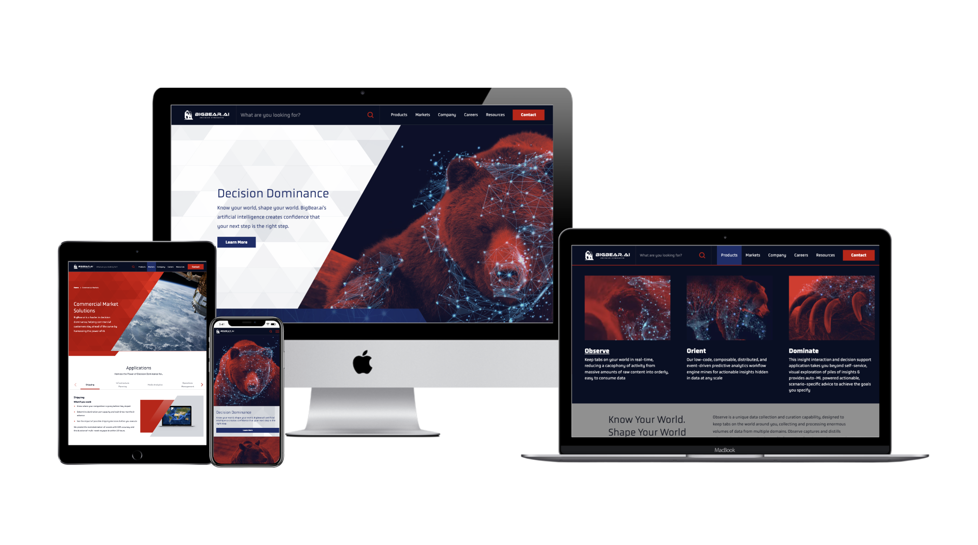
41. Perspecta Acquired by Peraton
Summary: Peraton acquired Perspecta, a government services provider, to create a leading government technology solutions contractor.
Strategic Advantage: The acquisition combined complementary capabilities, enhancing Peraton’s ability to deliver comprehensive solutions to federal agencies.
40. Abaco Systems Acquired by Ametek
Summary: Ametek acquired Abaco Systems, a provider of embedded computing solutions, to expand its electronic instruments and electromechanical devices portfolio.
Strategic Advantage: The acquisition strengthened Ametek’s position in the defense and industrial markets, leveraging Abaco’s embedded computing expertise.
39. MuseDev Acquired by Sonatype
Summary: Sonatype acquired MuseDev, a software quality automation company, to enhance its software supply chain management platform.
Strategic Advantage: This acquisition allowed Sonatype to offer integrated code quality and security solutions, helping organizations manage and secure their software development processes.
38. Blue Yonder Acquired by Panasonic
Summary: Panasonic acquired Blue Yonder, a supply chain management software company, to enhance its autonomous supply chain capabilities.
Strategic Advantage: The acquisition enabled Panasonic to integrate Blue Yonder’s AI-driven supply chain solutions with its hardware offerings, providing comprehensive solutions for logistics and manufacturing clients.
37. Clarabridge Acquired by Qualtrics
Summary: Qualtrics acquired Clarabridge, a customer experience management platform, to enhance its experience management capabilities.
Strategic Advantage: This acquisition allowed Qualtrics to offer more robust customer insights and analytics solutions, strengthening its position in the experience management market.
36. Cloudera Acquired by KKR and CD&R
Summary: Investment firms KKR and Clayton, Dubilier & Rice (CD&R) acquired Cloudera, a data management and analytics company, to take it private and drive its next phase of growth.
Strategic Advantage: The acquisition provided Cloudera with resources and strategic guidance to enhance its product offerings and expand its market presence in the data analytics sector.
35. Alfresco Acquired by Hyland
Summary: Hyland acquired Alfresco, an open-source content services provider, to expand its content management capabilities.
Strategic Advantage: This acquisition allowed Hyland to offer a more comprehensive suite of content services solutions, catering to a broader range of industries and use cases.
34. PacStar Acquired by Curtiss-Wright
Summary: Curtiss-Wright acquired PacStar, a provider of tactical communications solutions, to enhance its defense electronics portfolio.
Strategic Advantage: The acquisition strengthened Curtiss-Wright’s offerings in battlefield communications, providing integrated solutions for military applications.
33. Centauri Acquired by KBR
Summary: KBR acquired Centauri, a provider of engineering and technology solutions for national security, to expand its defense and intelligence capabilities.
Strategic Advantage: This acquisition enhanced KBR’s position in the government solutions sector, allowing it to offer a broader range of services to defense and intelligence clients.
32. Paya Goes Public via SPAC Merger with FinTech Acquisition Corp III
Summary: Paya, a leading integrated payments and commerce solutions provider, went public through a merger with FinTech Acquisition Corp III, a special purpose acquisition company (SPAC), in late 2020. The transaction positioned Paya on the NASDAQ under the ticker symbol “PAYA,” enabling it to access public capital markets while continuing its strategic expansion across high-growth verticals such as healthcare, education, non-profit, and field services.
Strategic Advantage: The SPAC merger offered Paya both financial and strategic runway to scale its operations in a competitive and rapidly evolving fintech landscape. Paya’s move exemplifies how verticalized fintech platforms can leverage public markets—not just for liquidity, but as a catalyst for category leadership and innovation.
31. LGS Innovations Acquired by CACI
Summary: CACI International acquired LGS Innovations, a provider of C4ISR and cybersecurity solutions, to strengthen its offerings for defense and intelligence clients.
Strategic Advantage: The acquisition bolstered CACI’s capabilities in communications and cybersecurity, enhancing its ability to serve national security missions.
30. Bronfman Rothschild Acquired by NFP
Summary: NFP acquired Bronfman Rothschild, a wealth management firm, to expand its investment advisory services.
Strategic Advantage: This acquisition allowed NFP to enhance its wealth management capabilities, offering clients a broader range of financial planning and investment services.
29. KnightPoint Acquired by Perspecta
Summary: Perspecta acquired KnightPoint Systems, a cybersecurity and IT services firm, to bolster its cybersecurity offerings for government clients.
Strategic Advantage: The acquisition enhanced Perspecta’s ability to provide comprehensive cybersecurity solutions, addressing the critical needs of federal agencies.
28. GoCanvas Acquired by K1
Summary: K1 Investment Management acquired GoCanvas, a mobile platform for businesses to automate workflows, to accelerate its growth and product development.
Strategic Advantage: This acquisition provided GoCanvas with resources to enhance its platform and expand its market reach, strengthening its position in the mobile workflow automation sector.
27. Cority Acquired by Thoma Bravo
Summary: Thoma Bravo acquired Cority, a provider of environmental, health, and safety (EHS) software, to expand its investment in the EHS sector.
Strategic Advantage: The acquisition allowed Thoma Bravo to leverage Cority’s market position and technology to drive growth in the EHS software market.

26. Endgame Acquired by Elastic
Summary: Elastic acquired Endgame, a security company specializing in endpoint protection, to integrate security capabilities into its search and analytics platform.
Strategic Advantage: This acquisition enabled Elastic to offer users integrated security solutions, enhancing its platform’s appeal to organizations seeking comprehensive data analysis and protection.
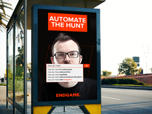
25. Earth Networks Acquired by Union Park Capital
Summary: Union Park Capital acquired Earth Networks, a provider of weather intelligence solutions, to enhance its environmental monitoring portfolio.
Strategic Advantage: The acquisition allowed Union Park Capital to expand its offerings in the environmental data sector, leveraging Earth Networks’ technology and expertise.
24. Mindtree Acquired by L&T
Summary: Larsen & Toubro (L&T) acquired Mindtree, an IT services and consulting company, to expand its digital services capabilities.
Strategic Advantage: This acquisition strengthened L&T’s position in the IT services sector, allowing it to offer a broader range of digital transformation solutions to clients.
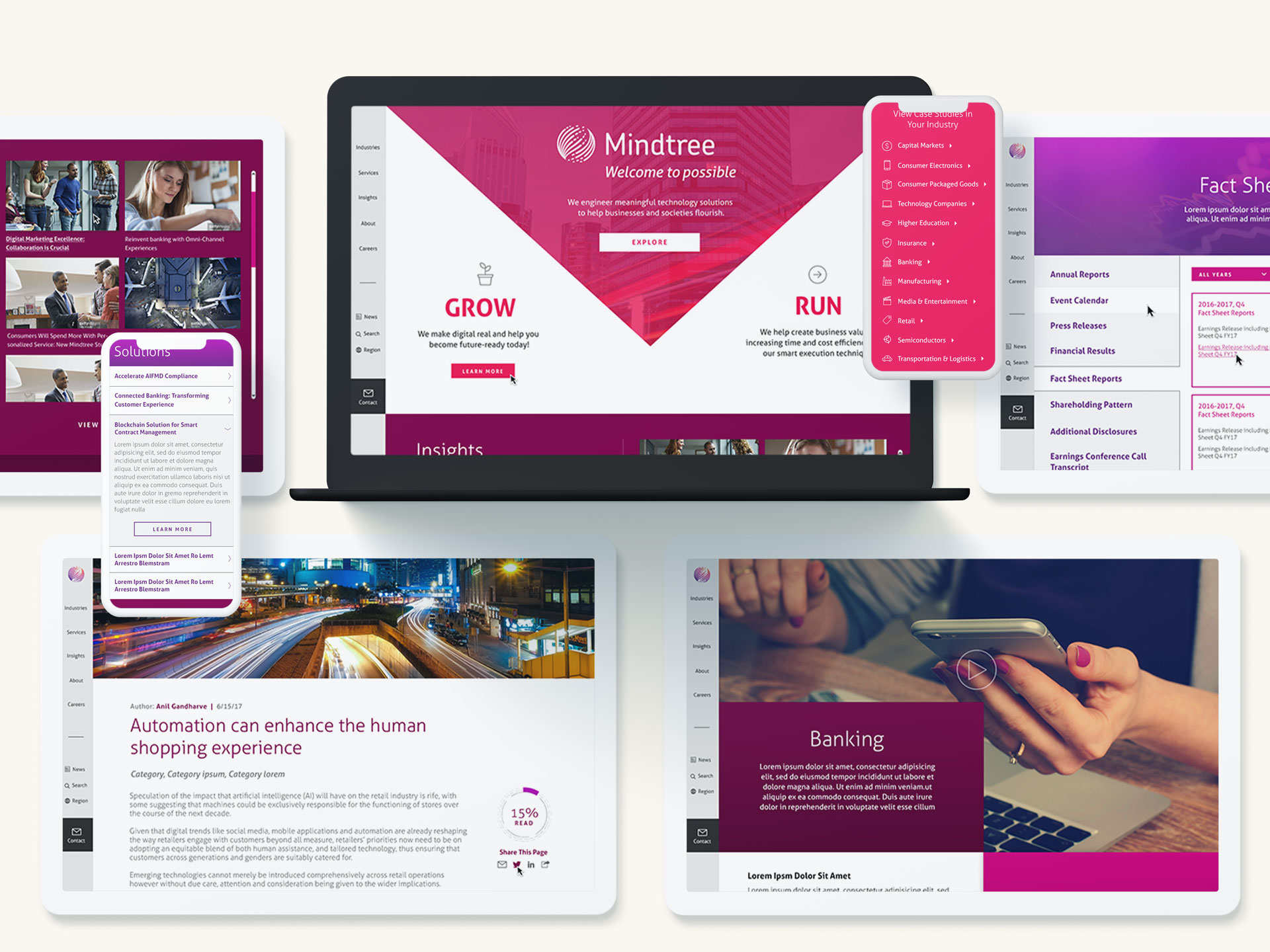
23. CQ Roll Call Acquired by FiscalNote
Summary: FiscalNote acquired CQ Roll Call, a provider of congressional news and legislative tracking, to expand its policy and analysis offerings.
Strategic Advantage: The acquisition enabled FiscalNote to provide clients with a more robust set of tools for policy monitoring and analysis, enhancing its value proposition in the legislative intelligence market.
22. BroadSoft Acquired by Cisco
Summary: Cisco acquired BroadSoft, a global leader in cloud-based communications, to enhance its cloud collaboration portfolio.
Strategic Advantage: This acquisition allowed Cisco to offer a comprehensive suite of unified communications solutions, strengthening its position in the cloud communications market.
21. PlanetRisk Federal Acquired by Culmen Technologies
Summary: In a move that deepens its national security and risk intelligence capabilities, Culmen Technologies acquired the federal business unit of PlanetRisk in early 2025. PlanetRisk Federal, known for delivering advanced geospatial, threat intelligence, and predictive analytics solutions to U.S. government agencies, strengthens Culmen’s footprint across the defense, intelligence, and homeland security markets. The acquisition aligns with Culmen’s strategy to expand its mission-critical support across the full threat lifecycle—combining operational expertise with enhanced data-driven insights.
Strategic Advantages: This acquisition brings immediate scale and capability lift to Culmen’s national security offerings. PlanetRisk Federal’s strengths in real-time situational awareness, data fusion, and predictive modeling directly complement Culmen’s existing programs in international security, logistics, and threat reduction.
20. PlanetRisk Acquired by Everbridge
Summary: Everbridge acquired PlanetRisk, a risk analytics company, to enhance its critical event management capabilities.
Strategic Advantage: This acquisition allowed Everbridge to provide more robust risk assessment and management solutions, strengthening its position in the critical event management sector.
19. Lithium Merged with Khoros
Summary: Lithium Technologies merged with Spredfast to form Khoros, a customer engagement platform.
Strategic Advantage: The merger combined complementary technologies, enabling Khoros to offer integrated solutions for customer engagement across multiple channels.
18. ThreatTrack (Vipre) Acquired by J2 Global
Summary: J2 Global acquired Vipre, a cybersecurity company, to expand its portfolio of internet security solutions.
Strategic Advantage: The acquisition allowed J2 Global to offer a more comprehensive suite of security products, enhancing its competitiveness in the cybersecurity market.
17. Endgame Acquired by Accenture Federal Services
Summary: Accenture Federal Services acquired Endgame, a cybersecurity firm specializing in endpoint protection, to bolster its security offerings for government clients.
Strategic Advantage: This acquisition enhanced Accenture’s ability to provide advanced cybersecurity solutions, addressing the critical needs of federal agencies in protecting against evolving cyber threats.
16. XO Communications Acquired by Verizon
Summary: Verizon acquired XO Communications, expanding its fiber-optic network and enhancing its enterprise service capabilities.
Strategic Advantage: The acquisition strengthened Verizon’s infrastructure, enabling it to offer improved services to enterprise customers and support the growing demand for high-speed connectivity.
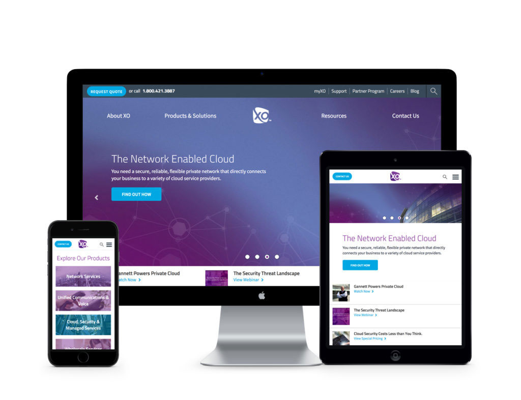
15. NetWatcher Acquired by Qualys
Summary: Qualys acquired NetWatcher, a provider of network security solutions, to enhance its cloud-based security and compliance offerings.
Strategic Advantage: Integrating NetWatcher’s capabilities allowed Qualys to offer more robust and comprehensive security solutions, addressing the increasing demand for cloud security.
14. Sage Acquired by GTCR
Summary: Private equity firm GTCR acquired Sage Payment Solutions, aiming to expand its presence in the payment processing industry.
Strategic Advantage: The acquisition provided GTCR with a platform to capitalize on the growing electronic payments market, leveraging Sage’s technology and customer base.
13. CB&I Acquired by Veritas Capital
Summary: Veritas Capital acquired the Capital Services business of CB&I, enhancing its portfolio in government services and infrastructure.
Strategic Advantage: This acquisition allowed Veritas to expand its offerings in the government sector, leveraging CB&I’s established infrastructure projects and client relationships.
12. CSC Merged into DXC
Summary: The merger of Computer Sciences Corporation (CSC) and the Enterprise Services business of Hewlett Packard Enterprise formed DXC Technology, a global IT services leader.
Strategic Advantage: The formation of DXC Technology created a powerhouse in IT services, combining resources and expertise to offer a comprehensive range of solutions to clients worldwide.
11. Perthera Acquired by Pilot Growth
Summary: Pilot Growth Equity invested in Perthera, a precision medicine company, to accelerate its development of personalized cancer treatment solutions.
Strategic Advantage: This investment provided Perthera with the necessary capital to advance its innovative cancer treatment technologies, positioning it as a leader in the rapidly evolving precision medicine field.
10. Cigital Acquired by Synopsys
Summary: Synopsys acquired Cigital, a software security firm, to bolster its software integrity portfolio, providing comprehensive application security solutions.
Strategic Advantage: The acquisition strengthened Synopsys’s position in the software security market, enabling it to offer end-to-end solutions that address the increasing demand for secure software development.
9. Force3 Acquired by Sirius
Summary: Sirius Computer Solutions acquired Force3, enhancing its networking and security solutions offerings for federal agencies.
Strategic Advantage: This merger allowed Sirius to broaden its federal market footprint, providing comprehensive IT solutions and capitalizing on Force3’s established government contracts.
8. Abaco Systems Acquired by Veritas Capital
Summary: Veritas Capital acquired Abaco Systems, a provider of embedded computing solutions, to expand its portfolio in defense and industrial markets.
Strategic Advantage: The acquisition enabled Veritas to diversify its holdings and strengthen its presence in high-growth sectors, leveraging Abaco’s established relationships and technological capabilities.
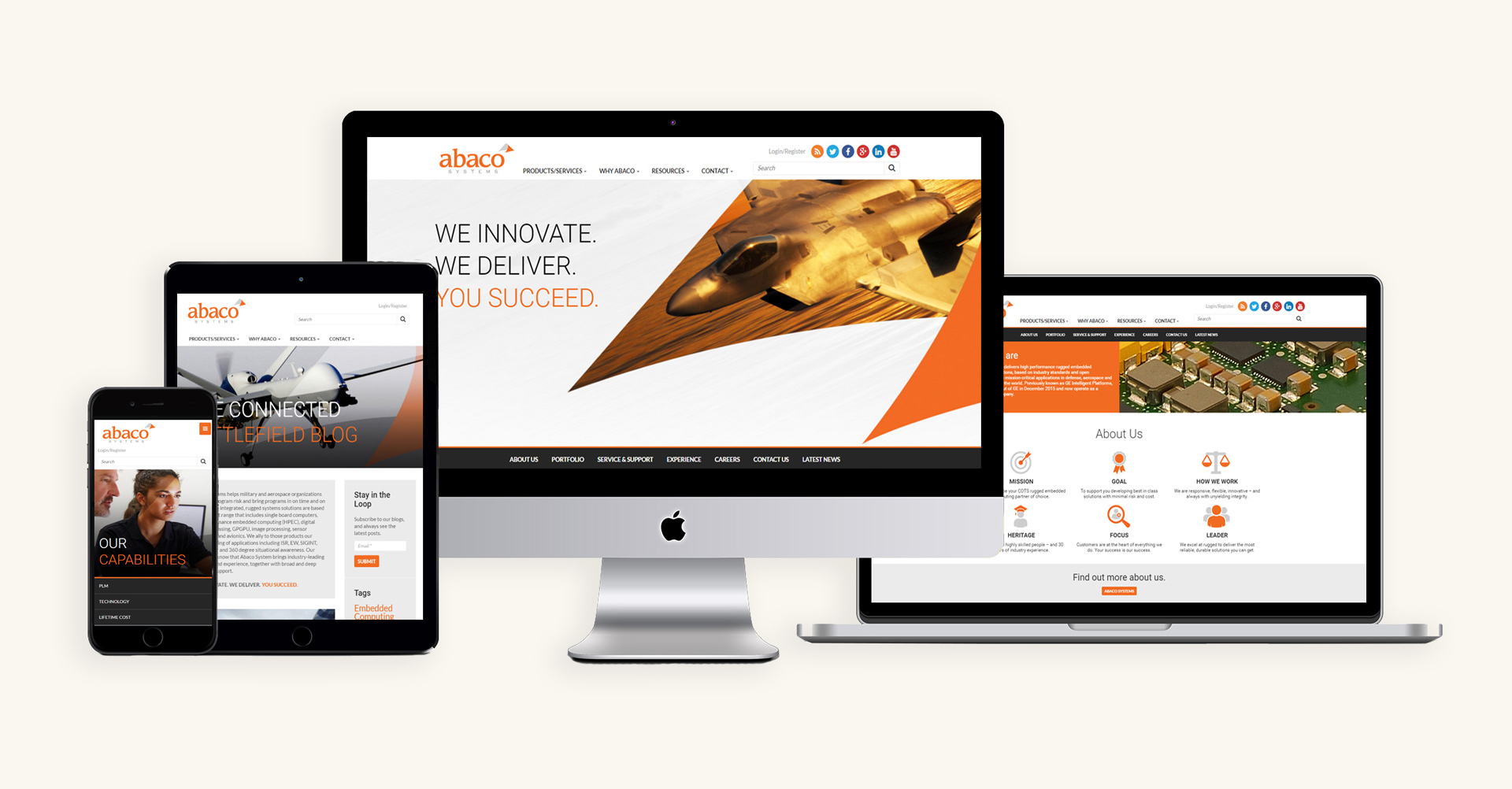
7. Altimeter Acquired by Prophet
Summary: Prophet’s acquisition of Altimeter Group, a research and advisory firm, strengthened its digital transformation consulting services, offering deeper insights into emerging technologies.
Strategic Advantage: Integrating Altimeter’s expertise allowed Prophet to provide clients with cutting-edge strategies in digital transformation, enhancing its competitive edge in the consulting industry.
6. Acentia Acquired by Maximus
Summary: Maximus acquired Acentia, a provider of technology and management solutions, to enhance its capabilities in serving federal health and civilian agencies.
Strategic Advantage: This merger expanded Maximus’s service offerings in the government sector, allowing for a more comprehensive approach to IT and management solutions for federal clients.
5. Riverbed Acquired by Thoma Bravo
Summary: Private equity firm Thoma Bravo acquired Riverbed Technology, a leader in application performance infrastructure, aiming to drive innovation and growth in network optimization solutions.
Strategic Advantage: The acquisition provided Thoma Bravo with a robust platform in the network performance sector, enabling synergies that could lead to enhanced product offerings and market expansion.
4. HelloWallet Acquired by Morningstar
Summary: Morningstar’s acquisition of HelloWallet, a personal finance software company, expanded its financial wellness offerings, providing comprehensive tools for individual financial planning.
Strategic Advantage: This acquisition diversified Morningstar’s product portfolio, allowing it to cater to a broader customer base seeking integrated financial planning and investment solutions.
3. CyberArk Goes Public on NASDAQ
Summary: CyberArk, a pioneer in privileged access management (PAM), made its debut on the NASDAQ stock exchange, marking a major milestone in the evolution of enterprise cybersecurity. As one of the first cybersecurity firms focused solely on identity security to go public, CyberArk’s IPO signals increasing investor interest in solutions that protect against insider threats and credential-based attacks—two of the most pervasive risks in today’s digital landscape.
Strategic Advantage: Going public gives CyberArk the capital and visibility to accelerate its growth in a crowded identity security market. As organizations face mounting pressure to secure hybrid environments and zero trust frameworks, CyberArk’s PAM solutions are uniquely positioned to meet the moment.
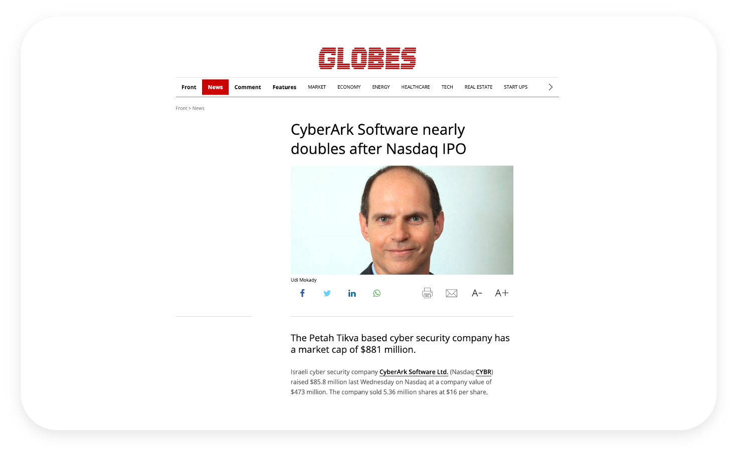
2. SourceFire Acquired by Cisco
Summary: Cisco’s acquisition of cybersecurity firm SourceFire for $2.7 billion in 2013 bolstered its security portfolio, integrating advanced threat protection solutions.
Strategic Advantage: The acquisition allowed Cisco to enhance its cybersecurity offerings, providing comprehensive protection solutions and addressing the growing demand for advanced threat defense mechanisms.
1. Reznick Group Acquired by CohnReznick
Summary: CohnReznick’s acquisition of Resnick Group strengthened its position in the accounting and advisory sector, enhancing service offerings and expanding its client base.
Strategic Advantage: This merger enabled CohnReznick to achieve economies of scale, streamline operations, and offer a broader range of services to clients, thereby increasing market share and competitiveness.
What’s Next: M&A as a Messaging Moment
These 99 transactions reinforce a simple truth: M&A isn’t just a financial event—it’s a brand event. It’s the moment to reset perception, redefine value, and rally internal and external audiences around a new mission. That moment, if handled correctly, can drive retention, growth, and momentum. If not, it can cause confusion, churn, and missed opportunity.
That’s where Bluetext comes in.
We’ve helped brands navigate everything from stealth-stage mergers to IPO launches, PE rollups to post-acquisition integration. If your company is planning a transaction—or needs to reposition after one—let’s talk.
Contact Bluetext to start shaping the narrative that will define your next chapter.
The High Stakes of Post-Merger Rebranding
Mergers and acquisitions are not just financial transactions—they’re brand-defining moments. A successful rebrand post-merger can help unify stakeholders, maintain customer trust, and lay the foundation for future growth. But without a thoughtful strategy, the process can create confusion, dilute brand equity, and hinder market momentum.
Audit and Align: Assessing Brand Assets and Equity
Before any design or messaging decisions are made, it’s critical to assess the existing brand assets of both companies. Conduct a brand equity audit to determine the value, recognition, and emotional resonance of each legacy brand. Identify what elements should be preserved, revised, or sunset to create a cohesive identity.
Logo, Name, and Visual Identity Decisions
Choosing whether to adopt a new name, keep an existing one, or create a hybrid brand is one of the most visible aspects of a rebrand. Logo redesigns and updates to visual identity systems (color palette, typography, imagery) should reflect the strategic direction of the combined entity while maintaining visual continuity where possible to avoid alienating loyal customers.
Messaging Overhauls and Cultural Integration
Messaging is the connective tissue of any brand. Merging two companies means merging two voices, two missions, and often, two company cultures. Develop a unified messaging framework that clarifies the brand promise, values, and tone of voice. This is especially important for internal communications, where cultural alignment can make or break integration success.
Stakeholder Rollout: From Employees to Customers
A phased and audience-specific rollout plan ensures each stakeholder group receives the right message at the right time. Internal audiences should be engaged early with clear rationale, brand education, and avenues for feedback. For customers, partners, and the public, a coordinated external launch should emphasize the benefits of the merger and demonstrate continuity.
Tools and Templates for a Smooth Rebrand
Brand guidelines, asset libraries, email signature templates, and branded presentation decks are essential tools for ensuring consistency across all touchpoints. Change management resources can support internal adoption and reduce friction during the transition.

Real-World Success: How Bluetext Supports M&A Branding Efforts
Bluetext has supported numerous organizations through the complexities of M&A branding. From building interim brand architectures to full-scale redesigns and brand launches, our team ensures that brand transitions are not only seamless but strategically sound. One standout example is our work with BlueHalo, where we unified several acquired entities under a single, future-focused brand identity. Following the launch, BlueHalo rapidly scaled—bolting on additional acquisitions, securing billion-dollar contracts, and ultimately being acquired by AeroVironment. It’s a testament to how the right brand strategy can fuel momentum and maximize enterprise value.

Ready for a Seamless Rebrand?
Partner with Bluetext to ensure your post-merger rebranding process is strategic, smooth, and successful. Contact us today.