Scroll-based animation offers all the benefits of on-page animation and more. Not only do pages with scroll-based animation engage users more effectively, but they can also tell more complex stories, improve page load time, and expand the capabilities of your brand identity.
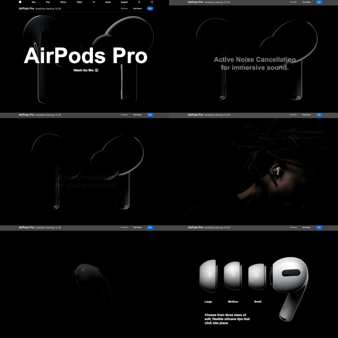
Some stories are best told visually, and scroll-based animation is an effective way to make complex stories simple and elegant. Designers can use animation to guide users as they scroll, catching their eye at exactly the right time and place. Apple incorporates subtle animations into its product pages to drive user focus toward key information they want to highlight.
Scroll-based animation can offload elements beneath the virtual “fold” from the initial loading process, decreasing overall load time. Elements above the fold are prioritized in the initial load, saving time on down-page items that are animated to appear as the user scrolls down.
Implementing scroll-based animation provides the opportunity to add animated elements to your brand. Whether they’re completely new, or existing pieces that have been updated with motion, animated elements can help bring your brand to life. Elements like a scroll-based footer or call-to-action can be used across a website to consistently call attention to key information about your brand.
Key Tips for Scroll-Based Animation
Getting started with scroll-based animation can be tricky, so here are a few pointers to keep in mind as you go.
- Timing is everything. The flow of the animations as a user scrolls down the page is key to maintaining their interest. As a user moves down the page, elements should naturally animate or appear, so there are no gaps in the experience. A simple, well-timed scroll-based animation is always better than a complex but awkward one.
- Added effects should emphasize key information, not detract from it. Keep in mind that the whole point of on-page animation is to make it easier for users to navigate your site and find what they’re looking for. Be sure that any effects or animations make their experience easier, not more difficult.
- Less is more. When in doubt, simplify. Avoid cluttering your site by animating every element on a page or by introducing particularly drawn-out animations for no reason. As a rule of thumb, smaller elements should have shorter animation cycles, and each animation should have a purpose in guiding the user experience.
Looking for inspiration?
Clarabridge’s animated homepage brings the brand to life and elevates the user experience. On-page effects guide the user through the homepage, emphasizing the strength and ease of Clarabridge’s solutions. Click here to read our case study on this project.
HuffPost’s interactive article, Chef Jose Andreas Embraces the Chaos, is an example of “scrollytelling,” which uses scroll-based animation to enhance a written story. Hand-drawn visuals appear as the reader scrolls through the story, adding a playful, personal feeling to the page.
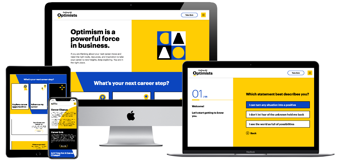
For Calling All Optimists, Bluetext incorporated subtle scroll-based animations throughout the site to draw attention to key information or calls-to-action. Along with the brand’s playful shapes and colors, these animations reinforce the positive, dynamic qualities of the site. Click here to read our Calling All Optimists case study.
Ready to see how scroll-based animation can enhance your site? Contact Bluetext to learn about our motion design and interactive UX services.
Whether you’re creating your first logo, editing an existing logo, or totally redesigning an outdated logo for your business, you’ve been tasked with representing your brand and everything it stands for within a small graphic icon. A logo design project requires extensive knowledge of what your business stands for, what your current competitors are doing, and how design principles can be applied to capture attention and promote memorability. To increase the likelihood of a successful logo design, many companies turn to digital agencies like Bluetext who understand the competitive landscape and get to know each business in depth before designing a logo that accurately reflects the company and helps them stand out among the competition. The following 4 principles are integral considerations for the logo designing process at Bluetext, and they should be utilized by any company looking to create a timeless, impactful visual identity for their brand.
1. Color
More often than not, color lays the foundation of a brand. Color is the first thing that catches the eye, and in an age of diminishing attention and quick digital scans can make or break a strong brand. With the power to improve brand awareness by more than 75%, color psychology is an essential consideration. Digital marketing & branding agencies advise considering the perspectives of two important players: the end-user and the industry. Below are three critical questions to ponder before any branding objective:
- How do you want to be perceived by these audiences?
- What emotions should your brand evoke from end-users?
- How do I want to compare to industry standards? ‘Zig’ (run with the pack) or ‘zag’ (go against the grain)?
Certain colors tend to dominate different industries. Ever wonder why almost all fast food brand logos use the colors red and yellow? Red elicits passion and energy, while yellow stimulates hunger, which leads to subconscious food cravings. In comparison, the government contracting industry tends to use the colors red, white, and blue to invoke a sense of patriotism. Understanding the emotional impact behind your color choices can help your brand resonate with users and prospects. However, while some colors are tried and true, you should also weigh the costs and benefits of choosing the colors commonly found within your industry. Your ultimate goal should be to stand out amongst the competition, rather than blending into it. Whether or not color palette is the avenue to differentiate is a question that an expert brand agency would be able to consult on. While it may be tempting to utilize numerous color combinations, within your brand and logo, keep in mind the second most important quality of a logo: keeping it simple.
2. Simplicity
Visuals can communicate information 60 thousand times faster than text, a simple visual can be more impactful—and memorable—than a complicated or wordy design. Especially with the rise of mobile users and smaller screens, reducibility is a critical factor. Your logo should be comprehensible across multiple sizes—from a banner ad to a website favicon. Complex, detailed logos often have legibility challenges on small devices, therefore limiting your opportunities to show off even the most stunning designs. When there are too many competing elements of a logo, a viewer’s attention is divided between them, which detracts from their ability to recall the logo as a whole. It’s much more effective to choose just a few key elements of your logo to highlight your brand offerings. A good logo communicates your company’s strengths, whether it’s a rich history, creative thinking, or literal products featured in the design. The devil is in the details, which is why leading brand agencies advise a simple, yet scenic, route to logo success.
3. Adaptability
Another important aspect of your logo is that it must hold up to the test of time. A brand as a whole can be updated and refreshed every now and then, but replacing an outdated logo can be a large undertaking. A timeless logo is one that can be implemented across different formats, from horizontal, vertical, square, black and white, full color, etc. These format variations allow the same logo to be adapted to different contexts as the opportunity arises, whether that be print materials, branded merchandise, and new online formats. Anticipating new ways to use your logo will keep users engaged with your brand as you expand across different platforms. Your brand’s style guide is an important resource for explaining how your logo and brand identity can be communicated through different channels.
4. Relevance
The previous 3 qualities of your logo tie into one overarching factor: relevance. Before considering a logo redesign, you should talk extensively with target consumers to better understand how they perceive your current logo and overall brand. Creating a logo that reflects your brand identity is one thing—making sure that customers actually receive and understand your message and the brand behind your logo is an entirely different challenge. A digital marketing agency can be a powerful partner to compiling market research and getting a third-party perspective on your logo’s effectiveness. To learn more about how to stay in tune with your customers to make sure your branding conveys the value you actually offer, check out an interview with Bluetext’s Jason Siegel and Travelocity’s Terry Jones on avoiding brand regret.
Keeping up-to-date with design trends is one way of reading the market at a broad level to see which logo design techniques are resonating with audiences. However, accurately representing your brand is more important than being trendy. In the cyber-security space, for example, the challenge of selling an abstract concept has led many companies into the trap of using stereotypical imagery or design to try to communicate that they work with computers, coding, and hackers in hoodies. However, following those trends has led many companies to fall into the clutter of the category—a space where they’re practically indistinguishable from competitors. In order to avoid these common mistakes and stand out as strong competitors within your industry, consult a brand & marketing agency for your logo design.
Contact Bluetext to take the first step in setting your brand (& logo) up for long-term success.
Why animation?
As the saying goes, static doesn’t sell. According to research, animated banner ads are more than four times as effective as their static counterparts. More and more these days, users are expecting engaging, interactive content from brands at every point of contact. This goes for any platform—a website, an app, digital out-of-home, social platforms (yes, this means TikTok). Anything with a screen is an opportunity to shake up your brand with animation.
Say more with animated content
If a picture is worth a thousand words, an animation is worth a million. Animated content captures key messages in more ways than a static graphic, and injects any design with the personality of a brand. After all, motion draws out emotion. Whatever your brand wants to convey, animated content can sharpen and elevate that message.
Is your brand a subtle responsive animation kind of brand, or a claymation one? Maybe a blueprint-style animation speaks to your brand’s personality best, or perhaps a parallax effect is the best representation of your brand. However you choose to do it, you can get more out of your corporate visual identity with animation.

Getting started
When it comes to animation, the options are endless. Here are a few simple ways to get started, plus some examples produced by the team here at Bluetext.
1. Introduce an animated version of your logo or key brand assets.
An animated brand identity can be applied across any digital asset, as demonstrated by Octo’s identity in motion. The style of movement captures the ever-changing nature of the government technology market and communicates more about Octo than a static identity could.
2. Add subtle movement to some of the static content on your website.
This example from ScienceLogic is an elegant way to introduce movement to your website while incorporating visual elements like brand shapes and secondary colors. As the mouse hovers over images of the leadership team, the background pops with new colors and shapes to keep the viewer engaged with what they’re seeing.
3. Consider a moving graphic for your next ad placement.
4. Read some more tips on motion integration from Ale Hernandez, one of Bluetext’s web design and UX experts.
Easy animation with interactive AI
Animation is becoming so necessary for modern brands that designers have even begun to automate some of the process. This cutting-edge technology is making animation more cost-effective and efficient to produce, meaning that more and more brands will be able to build out animated identities. Now is the time to get an edge on your competition by debuting a signature animation style for your company’s offerings.
Want to go all-in on animation? Contact Bluetext to learn about our motion design and interactive UX services.
The past decade has seen a spike in mergers and acquisitions, as conglomeration and consolidation seem to be the trend of the future. Healthcare, technology and media-related brands have experienced the most consolidation. Mergers and acquisitions offer attractive opportunities to consolidate talent, infrastructure and relationships, but an equal number of challenges. Luckily, Bluetext has experience with many clients seeking digital marketing and branding guidance either after a successful M&A event, or with an eye to the future of the company and it’s M&A potential. A consistent lesson learned from our clients across a wide variety of industries is the importance of branding, especially in the early M&A planning.
WHY a company should rebrand after an acquisition
One of the key challenges includes branding, which when done correctly creates a harmonious industry presence built for long term success. But when branding is neglected, it runs the risk of introducing new problems that might damage a firm’s reputation or open up rifts between internal teams. While key stakeholders tend to focus on talent, business operations or business development, branding can fall to the back burner. Though as an experienced brand marketing agency, Bluetext knows the risk of deprioritizing corporate messaging & branding. Without unified brand creative and messages, a newly consolidated company lacks the foundation and united front to be successful in the marketplace and internally.
Often newly merged companies decide to either adopt one existing brand, or decide to create a new brand for a fresh look when they go to market. This decision is crucial to make early on, as it sets the tone for the entire process. While there are pros and cons to both avenues, Bluetext has observed companies that opt to create a new brand identity and corporate messaging often experience higher excitement, zeal and attention with the new company announcement. A blank slate for the brand story, key messages and creative visuals gives all stakeholders the chance to weigh in and feel heard in the process. The end result is a new brand that all internal stakeholders feel connected to and proud to represent both digitally via social media and physically via corporate swag.
HOW new branding affects the business
Creative brand agencies tend to think of two top considerations for branded materials: internal communications and external marketing. Both are of significant importance to any company, but especially of a newly merged or acquired one.
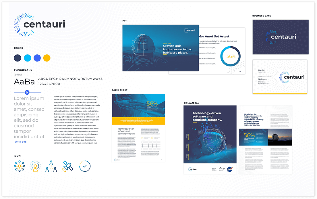
Well-branded internal communications can serve as a unifier for a new company and its employees, especially if two companies with distinct cultures are merging. Having the same style business cards, Powerpoint templates, or even branded swag creates a sense of kinship amongst colleagues. Especially in larger corporates, consistent brand assets can send a subtle but effective message of cohesion when connecting with new colleagues or other office locations.
The second, slightly more obvious reason for branding is external marketing. Your go-to-market strategy should be reinforced with strong branding and messaging. Whether your primary goal is to appeal to customers, stand out from competitors, or attract talent, you need well-developed marketing materials in your toolkit. Especially when pitching to prospective clients or customers, it would look disjointed and confusing to see conflicting branding across a company’s website, resources, or collateral.
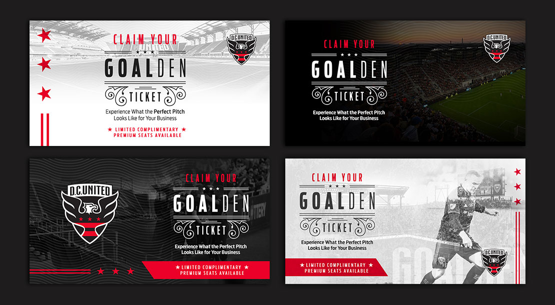
From press announcements to rebranded websites and collateral, Bluetext is a full-service digital marketing agency that can guide your company through than rebrand or M&A process. Contact us to learn more about our services.
M&As have long been a key strategy and source of growth for businesses around the world, with thousands of M&A transactions taking place each year. However, according to the Harvard Business Review, studies show the failure rate of mergers is somewhere between 70-90%. And while many factors can contribute to M&A failure, lack of stakeholder engagement and marketplace rejection are two of the major causes – both of which can be tied to brand decision-making (or lack thereof).
As such a critical factor in making or breaking success, it may come as a shock that branding is one of the most overlooked aspects of M&A planning. With the long list of considerations, leadership has to prioritize throughout the M&A process, branding decisions are often rushed or poorly planned, taking a back seat to financial, logistical, and operational concerns. Other times, rebranding takes place post-merger in response to already forming opinions, or as a way to deal with arising challenges instead of preventing them. In other words: it happens too late.
Just as figuring out how to best combine companies in order to create the most value possible is extremely important, so is making sure those synergies and strategic rationales are going to be believable to employees, investors, customers, and the outside world. That’s why it is crucial to prioritize branding early on in the M&A process. Having a clear brand strategy going into a merger helps promote unity, makes transitions smoother, and provides the opportunity to deliver a strong message, both internally and externally, about the value the newly combined entity will bring to all key stakeholders.
So, we’ve established why it’s so important to prioritize brand development in M&A planning, but how exactly do you get that branding right?
Well, that’s where Bluextext comes in.
Bluetext is a full-service marketing agency that specializes in digital branding and creative services. We have worked with leading M&A clients across the country, creating and elevating brands that set them up for success and put them in the position for continued growth. Especially in mergers & acquisitions, a professional branding agency is critical. A branding agency brings a neutral third-party perspective that eliminates the risk of brand cannibalization. Instead of stakeholders fighting to preserve remnants of their prior companies, an agency will recommend the right brand elements that unify all aspects of the merge.
Here’s how we do it:
In-Depth Discovery
First, Bluetext engages in detailed discussions to learn more about the objectives, goals, and visions for your new brand. We perform extensive quantitative and qualitative research on your competitors, your key audiences, and their needs, take a deep dive into the current presence and state of your brand(s) and conduct countless stakeholder interviews. We synthesize all of our findings to form a clear vision and direction for the brand that’s both informed by data and supported by key stakeholders.
New Name, Logo, & Visual Identity Creation
Once a clear brand vision is in place, Bluetext moves into name, logo, and visual identity creation. We conduct a series of workshops to (1) come up with a name and logo that reflects the tone, attitude, and purpose of your brand, and (2) produce a visual brand strategy that will position your company for success in the markets you serve. The insights we pull from these sessions inform our creative direction and the moodboard that will serve to guide the visual brand identity, including colors, typography, iconography, and other identity system attributes.
PR Announcements
With a new name, logo, and brand identity in place, Bluetext Public Relations will take over to elevate your new brand and build market leadership through strategic and innovative PR campaigns. We’ll lock in on a story that conveys the reason this new entity exists and how it will have an impact, that resonates with all your key audiences, and that builds overall excitement for the brand.
Creative Outputs
Whether it’s creating new collateral templates, launching a fully redesigned website, or executing paid media and ‘Go to Market’ campaigns, Bluetext can produce various assets that take your brand even further and set you up for continued success well into the future.
Having the right branding provides a valuable opportunity to define and differentiate the identity of your newly combined entity in the market and will set the tone for what consumers can expect from your company moving forward. Working with a brand development agency like Bluetext early on in the process is critical to get that branding right and ensure your M&A success.
Want to learn more about our M&A success stories? Check out our work HERE.
Welcome to 2020, a year of new normals, routines, and best of all, new logos! The logo design trends in 2020 thus far have been an intriguing remix of new and old. Logos have taken a trip back in time to a variety of eras, while also remixing modern styles. We’ve seen the gamut of design trends; from neon 80’s juxtaposed against inky, to futuristic 3D gradients and custom animation.
The key theme of 2020 logo design has been a digital-first focus. Many brands have modernized their logos for optimal web and mobile displays. For example, the popular gradient trend has evolved and merged with 3D design —a perfect fit for our smartphone society.
3D Gradients
Gradients are a unique way to blend any group of colors into a dynamic spectrum that exudes life and energy. Gone are the stark striped color transitions, as some brands have opted for a more subtle and gradual shift. This year, designers will give rise to the newest evolution of gradients creating depth and 3D effects in logos. Other top branding agencies are experimenting with new trends such as tapered gradients—ones that come to a central point and actually emphasize the contrast between their colors.

80’s Retro
Don’t thrift away your 80’s style just yet, because some fads never go out of fashion. Enough time has finally passed for all things 80’s to be cool again: video games, pop music, and the rebel attitude associated with them. In 2020, logo design agencies expect to see a resurgence of throwback logos accented with chrome, neon, and a lot of digital pixels. These styles give a nod to the old-school tech that preceded the glowing iPhone and laptop screens our eyes are glued to today. Nostalgic marketing has made a huge comeback in recent years, necessitating a cool, retro logo to accompany any throwback campaign. Throwback logos are popular because they capitalize on consumers’ nostalgia of old-school 80s tech, which is widely known to be retro, cool, and most importantly, collectible. Some logos reference nostalgic 80’s items by literally depicting the old school cassette tapes, arcade games, etc. Others embrace this trend with 80’s typography and design trends, like GV’s logo for LI Mowz.
Ultra Thin Lines
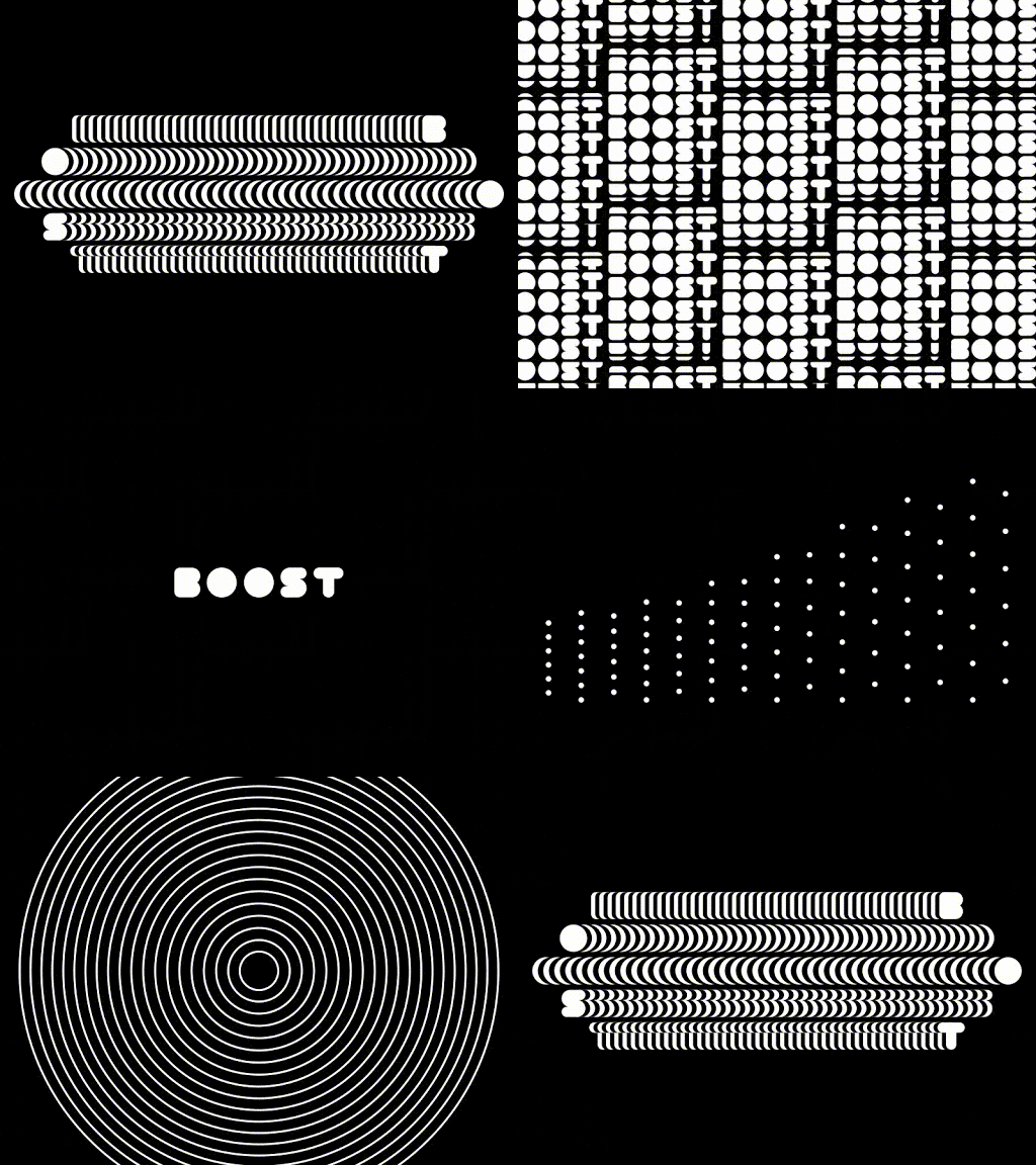
In 2020, high definition is leaving its mark on logo design. Designers push the envelope with extremely delicate lines, creating effects that can only work in the digital media. With extremely detailed linear patterns, logos began to feel ethereal and surreal — much like the original perception of radio and transmission media. With the new ability (and COVID necessity) for some brands to exist exclusively online, previous print limitations are eliminated. In an age of high-resolution screens and defined displays, complex line design makes classic logos seem elementary and easily reproducible.

Multi-Layered
2020 has been all about complexity! Logos are going deeper than ever before using artfully layered color systems. Especially with new digital affordances, designers are reverting flat and semi-flat designs to build depth through color layering. While shapes and colors remain simple, their relationship has intensified. By adding additional layers, designers create complex logos with highlights, shadows, and overlapping colors to communicate the brand brands. Especially on digital screens, the ability to create three-dimensional effects creates a unique, almost tactile experience.

Animated Logos
Top design agencies have been producing logo animation for some time now, but in 2020 we’ve seen more detailed and innovative plays on animation. Previous logos have been limited to simple movement, but over the years technology has allowed for more intricate and purposeful movement. Especially with a growing digital audience, animated logos can be more eye-catching and practical to the brand story. A popular 2020 logo design trend has been the blending of 2D and 3D animation or logos with multiple moving parts. These complex logo animations aim to take the viewer on a journey and tell a story. With lots of details to look at, the viewer looks at these logos longer than they’d look at a more simple logo animation and can potentially find something new they like about it every time they see it again.
The move toward animated logos comes from a similar place as the tapered gradient logos trend: when you’re designing for screens, there’s a whole lot more you can do as opposed to when you’re designing for print.
The logo design trends for 2020 will continue to build on everything designers have been exploring in the last few years, while also taking the design in directions that are totally new, totally fresh, totally right for an all-new decade. Let’s take a look at the top logo design trends that are already defining 2020.
Content marketing is a consistently invaluable tool to increase conversions by educating your leads and customers. As we welcome a new year as well as a new decade, it’s important to understand the emerging content marketing trends that will dominate 2020. How should you change your digital content marketing strategy to keep pace with the ever-evolving nature of content marketing?
In this blog post, we take a look at 5 content marketing trends that will keep you ahead of the curve in 2020 and beyond.
Data-Driven Content
How are you, as a brand, determining what content is useful and relevant for your audience? That’s where data comes in. By harnessing the lessons of previously successful content marketing initiatives, companies are able to reverse engineer the data and identify KPIs that preceded the success. Once those KPI’s have been established, it is easier to create content in that same strain and capitalize on the proven success. A DC-based digital branding agency like Bluetext can assist you in determining successful KPI’s and creating the rich content your audience wants to read.
Smart Device-Centric Content
Although smart devices have been a key consideration in B2C content marketing for quite some time, this year, more focus will be placed on specific functions of smart devices such as voice search. Voice search is becoming such an integral mobile tool, 48% of consumers are using voice for “general web searches.” Companies looking to stay ahead of the curve should look to optimize their content specifically for voice search purposes. Understanding how users search via their voice will help you tailor your existing content for voice-SEO and create more effective headlines for future content initiatives. A DC digital web design agency like Bluetext can help by conducting an analysis of your audience’s voice searches and recommend changes to your existing content and future content to maximize the return on your investment.
Conversational Marketing is King
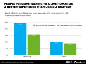
In the digital era which champions online shopping, consumers are looking to establish trust and connection through more personalized, authentic shopping experiences. Conversational marketing can aid your company in engaging with your audience in a more genuine way. By engaging in a conversation, your company gains access to more personalized data about your consumers such as their specific needs and future goals. Investing in tools such as chatbots or real human-to-human experiences can make all the difference in your competitive industry. As we progress through 2020, chatbots and other AI tools will continue to improve and positively impact lead generation.
2020: The Year of the Snippet
As we know, Google dominates the search engine market share worldwide, with a resounding 92.71% of the market. When considering a user’s search intent, Google will display what they call a “snippet” at the top of the page, which provides consumers with key points within a piece of content, allowing them to receive the information they’re looking for faster. As such, it’s becoming more commonplace for consumers to enter a longtail keyword into Google, knowing that they will receive the information they’re looking for via a snippet, without clicking any page links whatsoever.
In order to win that highly coveted snippet spot, companies should look to hire an interactive web agency such as Bluetext. Bluetext’s SEO analysts can conduct an audit of your current content and pinpoint exactly where changes need to be made in order to signify to Google crawlers that your content is important. Optimizing your content for snippets will greatly enhance user experience, as users will be able to find the information they are searching for concisely and quickly. Not only will an interactive web agency audit and enhance current site content, but they will also create a content strategy and editorial calendar so your brand can continually publish content your users are searching for.
The Popularity of Podcasts
According to a recent study, 51% of the entire US population has listened to a podcast in 2019. That figure is up by 7% from the previous year. As we look ahead to 2020, podcasts will continue to dominate, as that number is expected to keep rising. Although it may seem like everyone has a podcast these days, there are still opportunities for brands to get ahead of the curve and start their own podcasts.
That being said, if you see a clear demand for audio content within your market, ensure that you create a podcast the right way. Podcasts should have clearly defined KPI’s, a regular posting schedule, and content your audience will actually care to listen to. A Virginia internet & inbound marketing agency like Bluetext can partner with your company to assess the need for a podcast in your industry and among your competitors, help you create valuable content and even develop a paid advertisement plan to spread awareness via other podcasts your audience is listening to.
2020 is already well underway and in order to achieve success, companies need to get ahead of this year’s trends with a thorough and achievable marketing strategy and plan of action. A DC digital branding agency such as Bluetext can audit your current digital content marketing strategy and suggest recommendations to help improve your current trajectory. To learn more about Bluetext and how we can help you, check out our work here.
Every agency today is buzzing with the word “digital”, but only the best branding agencies understand that a company’s brand identity must be executed both digitally and physically. Many traditional physical marketing tactics are still very effective at building and promoting your company’s online brand. From business cards to branded gifts and accessories, the top branding agencies will tell you that consistency is key to bringing your brand to life on and offline.
It’s important to note that physical and digital branding are not substitutes for each other; instead, they should serve as complementary parts of your marketing plan. To create a strong and recognizable brand, your company’s visual identity should be carried out across all mediums. Marketing strategies that deliver the greatest impact use a combination of online and offline techniques.
Bluetext, one of DC’s top branding agencies, recommends the following tactics for a creative, strategic spin on your brand.
Bring your A-game to networking and recruiting events.
Especially important for trade shows or industry conferences, come prepared with fully branded Powerpoints, case studies, signage, and business cards. This will surely get competitors and potential customers’ attention.
George Mason sought out Bluetext, a top dc digital branding agency for a new brand look and feel. Their website rebrand was not complete without a modernized recruitment brochure to display a new logo and tagline.

Be your own brand advocate.
Employees are by far the best brand ambassadors! Equipping them with branded portfolios, notepads and apparel provide face-to-face reinforcement that your company is well-established and cohesive. It is also a subtle yet effective strategy to showcase your proud company culture without saying a word.
Eye-catching Collateral
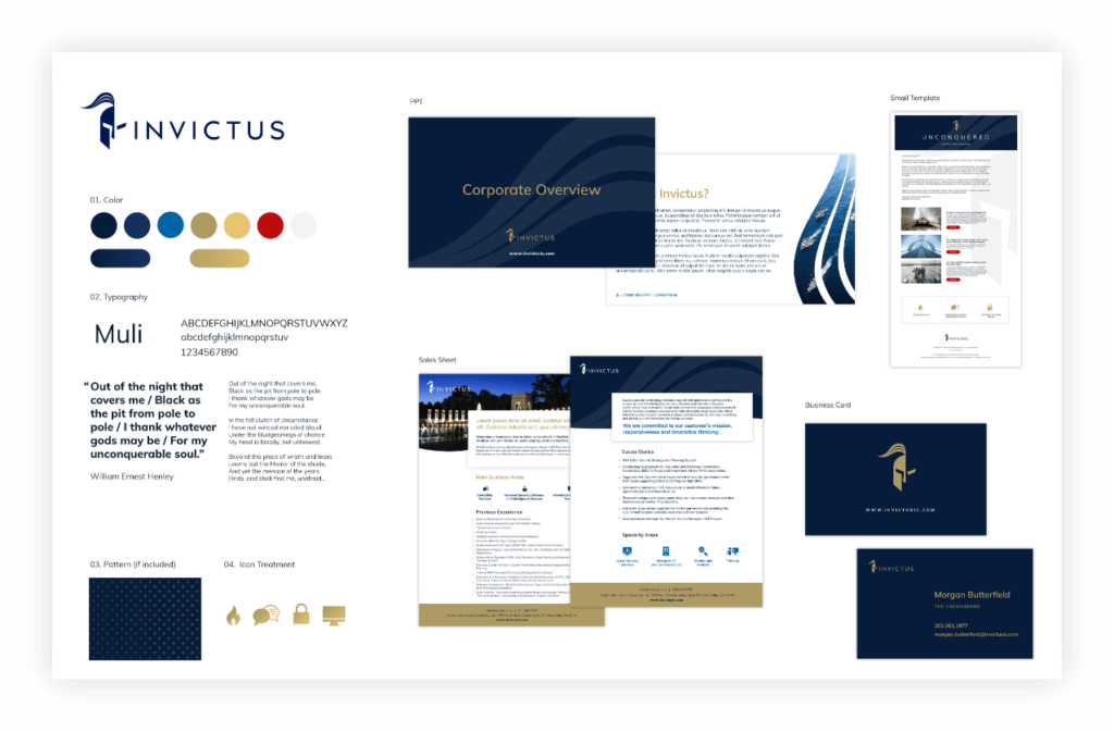
For any customer-facing company, using branded templates brings a sense of authority and confidence to any presentation or pitch. Take Invictus for example, whose recent website revamp was complimented by expertly designed templates to elevate their brand in future contracting proposals. Be sure to consult a top branding agency, though, to conduct thorough competitor research and ensure your brand is distinctive.
Celebrate Successes!
From a brand launch to a company anniversary event, don’t forget to celebrate! Any corporate event provides an opportunity for brand promotion. Company banners, napkins, and decor may seem trivial, but they go a long way. Having branded elements at the event can do wonders for company morale, and create great photo ops!
Pro Tip: Hosting a happy hour? Design company Koozies! It’s a savvy way to ensure drinks stay cold all evening and give employees a neat gift to take home and use in the future!
The bottom line is a brand is more than just a logo. A top branding agency will tell you that first impressions and emotions are at the core of brand strategy. Impactful brands trigger these feelings across all platforms. Digital KPIs are often centered around impressions, and the same strategy should be applied offline. Brand recognition is built upon repetition, and seeing a brand’s logo, colors or taglines carried out consistently in-person and online will trigger familiarity and ultimately conversions.
Ready to find out how a unified marketing strategy can amplify your brand? Check out our physical and digital branding services.
Transitioning a company that specializes in a product or service from working in the private sector to one that wins government contracts is no easy task. Negotiations can take months as organizations have to jump through a plethora of hoops to get contracts and budgets approved. Governments also favor companies with whom they’ve worked before or who have had experience operating as a government contractor in the past.
This begs the question — how does a company, perhaps one who doesn’t have as much experience working in the public sector, catch their attention and earn a place at the table? The answer is Content Marketing. You, as a government contractor, can offset your inexperience in the government contract realm via content production. This content can range from blogs to white papers; from videos to infographics; anything and everything that demonstrates your expertise in a given subject and gives you the upper hand over your competition. Most contracting officers, when looking for the right company to reward a contract to, will conduct research, looking at different options with three main criteria in mind: risk mitigation, brand reputation, and visibility.
Getting noticed by contracting officers doesn’t happen overnight, however. Building brand awareness and gaining reputation takes time and effort, and the content you produce must be created with the contracting officer in mind. Knowing who those specific agencies are that you’re targeting and specializing your content for them can set you on the right path from the outset and get you closer to winning those highly coveted government contracts.
Risk Mitigation
When a government agency decides to partner with a new government contractor, the biggest concern they have is mitigating the risk of working with a new partner. Their main goal is to get their contract fulfilled promptly without going over budget. Risk is usually mitigated by choosing to work with a partner they’ve previously worked with, or by working with someone who has a reputation for doing good work on government contracts. If you don’t necessarily have the experience of working in the public sector, you can mitigate as much risk as possible by proving to the client, through content that you produce and they are exposed to, that you have the expertise to handle the work and that you’re able to fulfill the contract and meet the government agency’s demands.
Brand Reputation
Ensuring that your company’s brand is being communicated to your desired audience in the way that you want is crucial when looking to attract government contracts. Although you should not aim to win every contract that comes along, you can set yourself up to showcase your abilities in the shop window using content on your website to prove your worth and show that you do have what it takes to work with government agencies and provide them with the products or services they require. Believe in yourself, your company, and your brand to get the job done, and make it known that you are the go-to company in your field. Create content that showcases your work in the commercial industry and educates readers on how that same success can translate to the public sector.
Visibility
To prove your reputation, you must be visible to your potential clients. You may have the best product or service in the business, but if you don’t have an active presence online, and you’re not showcasing your expertise, it’s not going to get you anywhere. Creating content on your site and sharing it through your social media channels can have a remarkable effect on your brand’s visibility. Sharing news and blog posts to your email subscribers build your brand awareness and attract potential new clients. Do everything and anything to increase the visibility of your brand and drive contracting officers to your site and to the content that you’ve created to show off your products and services.
Bluetext: your leading government contractor branding agency
That’s where Bluetext comes in. With years of experience working with government contractors, Bluetext is your one-stop-shop branding agency for content production. When NetApp, a cloud data services and data management company, had grown its offerings within the market, they turned to Bluetext to partner with and help inform public sector decision makers of the capabilities of their new solutions. Bluetext helped NetApp develop news stories, authored by NetApp experts, to key publications that both educate readers and inform decisions. Through our combined work, we helped position NetApp as a recognized thought leader within the government space.

Content production for experienced government contractors
Bluetext also has a background of working with large, experienced, well-known government contractors. Take our work with ManTech, for example. ManTech is a multibillion dollar public company that provides subcontracted technological services to the government. We partnered with them to produce a series of branded videos for their new website, highlighting their capabilities in one cohesive and powerful story.
Showcasing your abilities to government agencies
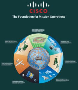
Cisco turned to Bluetext when they were looking for help showcasing how their solutions directly address the global networking requirements for the U.S. Federal Government’s integrated intelligence and operations functions. We worked with them to develop a visually appealing storygraphic, which included an interactive wheel to demonstrate the integration and impact of Cisco’s solutions across air, land, and sea to help the government achieve end-to-end mission success.
From veteran-owned SMB to big-time government contractor
One of our more recent projects involved Invictus, a cyber and national security firm, who turned to Bluetext to embark on their next mission: grow from a veteran-owned small business to full-service government contractor. Not only did we update their logo, reimagine their corporate visual identity, and design a modern website, we also created a corporate video that showed their clients exactly who they are, what they stand for, and what they can do for them.
Proving expertise through content
Showing potential end-users proof that your company possesses the grit, determination, and expertise to successfully execute contracts is vital for any company that wants to win government contracts. Expertise is often shown through experience; however, experience can be supplemented with relevant and actionable content on your website. If you can prove that you know the subject matter, agencies will treat you like a veteran government contractor and have faith in you to carry out their contracts. Partnering with a branding firm like Bluetext, who has the experience and expertise in working with government contractors both large and small, can help you achieve your goal of getting your company’s name on the shortlist for that government contract.
To view more of our work with government contractors and how we can partner with you, visit our website today.
Top branding agencies are always looking for new and refreshing approaches to logo designs that resonate with customers. Every designer’s dream is a new logo that is memorable and unique. But customers react to logos that interesting and different, but not too different. If a logo adheres to a style that is out-of-date or too far out of the mainstream, it may stick out from the crowd, but it won’t generate the positive feelings that it would if it were within the boundaries of the top logo trends that are hitting the market. With that in mind, here are six top logo trends that we are seeing both with our clients and across the industry:
- Flat Designs Retain Their Strength. When Microsoft released its latest new logo, the design was flat with no shading or 3-dimensional effects. The result is a logo that is straightforward, maintains its integrity and brand equity, and looks good across all channels and in all sizes. It’s also easy to print and reproduce. A flat design shows off the brand and colors well and shows off the brand in its simplest form.

- Negative Space is Your Friend. Pinterest, Instagram, Toyota and scores of other iconic brands all use negative space – sometimes with hidden shapes and symbols includes. As an article in Lifebuzz.com reveals, the three ellipses in the Toyota logo represent the heart of the automobile, the technology, and the customer. More importantly, negative space can draw attention to the brand in a way that is memorable and different.

- Stacking is Back. For many years, the logo with letters had to be simple initials in a simple design. But as a way to grab attention in a way that stands out and is easy to see and absorb, stacking can be a strong alternative – often with different fonts for each word. This offers a solid way to highlight different fonts to challenge viewers while giving them something they can quickly comprehend. Here’s an example of a recent refresh (minus the different fonts) from the American Library Association.

- Turning a Flat Logo Up a Notch. One recent trend is taking otherwise flat logos and adding a two-tone approach to add depth to the color but also to give it a hint of three-dimensionality. Dividing symmetrical images into two “zones” of shading gives depth and visual interest to a flat design. It can also add a symbolic touch to convey the brand’s core mission and direction. Check out how Pineapple Resorts turned its logo up a notch to make it more distinctive.

- Go Wide. Shapes that elongate from right to left are thought to be more recognizable for humans that narrow, tall images. With online platforms (such as websites and social media) favoring a wide design, strong brands are turning to this approach with their logos. When combined with contemporary fonts and colors, it can also convey a brand that is on the move and ready to dominate its market.


