You don’t want your users to get an error page, but if they do, make sure it is a good one.
If someone finds a 404 page on your website, they are probably in the wrong place; your goal should be to make it as easy (and fun) as possible for them to find the right page. You need to make sure that your visitor can find a way back to their intended location, so it’s helpful to direct them to popular pages or a search feature. By giving your user some direction, you can make lost pages feel more like a detour than a dead end on your website.
While your primary focus should be to help your users find a new page to travel to, there is also a trend toward having more interesting and fun 404 pages. You want to keep any error pages within the realm of the company brand, but you should also see it as a chance to add some humor or engagement to your website. By infusing some witty text or a cool graphic into your 404 page, you help website visitors have a good experience on your site even when they face an error code. After all, the happier your website visitors are, the more likely they are to continue exploring the website, rather than exit out altogether.
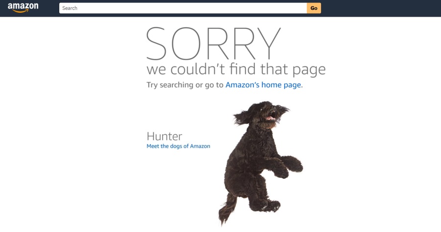
Take Amazon for example, when a page is lost users are shown a cute dog with redirection back home. Even better is that the dog photo changes each and every time to feature one of their 43 “Dogs of Amazon”.
Ceros has a great example of a fun and helpful 404 page. The company recently updated its 404 page to have an interactive wheel that leads users to random content. By encouraging interactivity as Ceros does, you can keep your users interested in your content even when they’ve lost what they are looking for. Engaging features like this motivate visitors to look beyond their original search and consider other areas of your website.
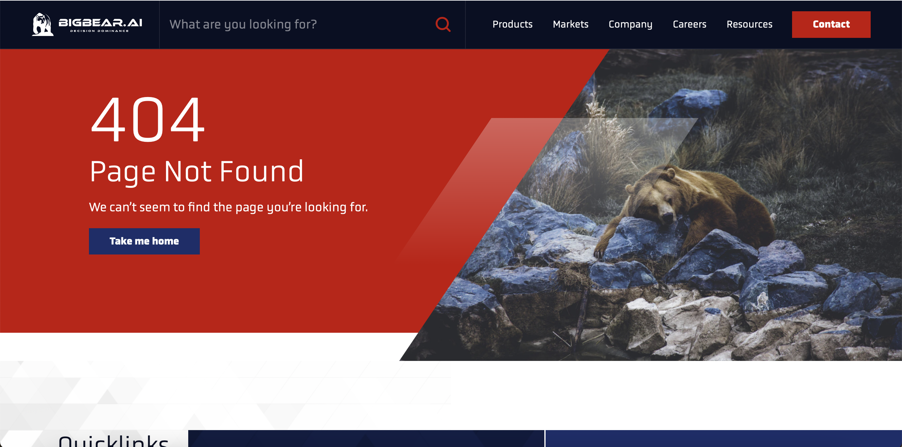
The new BigBear website, which Bluetext worked on, is another example of an excellent error page. On their 404 page, you can see a picture of a lost bear. This adds a little humor to the page while keeping the content on-brand for the company. The 404 page does not end there, though. It also has quick links to encourage visitors to continue interacting with the website.
Both of these examples illustrate the usefulness of having an informative but fun 404 page since the ultimate goal of any website is to keep visitors engaged! While a 404 error is never the ideal landing page for your website users, it is critical to prepare and design for this scenario. And by turning what was traditionally a dead-end into an interesting detour with clear next steps, you increase the chances of a positive user experience on your website.
If you need help setting up a new 404 page, reach out to our experts at Bluetext.