Top branding agencies are always looking for new and refreshing approaches to logo designs that resonate with customers. Every designer’s dream is a new logo that is memorable and unique. But customers react to logos that interesting and different, but not too different. If a logo adheres to a style that is out-of-date or too far out of the mainstream, it may stick out from the crowd, but it won’t generate the positive feelings that it would if it were within the boundaries of the top logo trends that are hitting the market. With that in mind, here are six top logo trends that we are seeing both with our clients and across the industry:
- Flat Designs Retain Their Strength. When Microsoft released its latest new logo, the design was flat with no shading or 3-dimensional effects. The result is a logo that is straightforward, maintains its integrity and brand equity, and looks good across all channels and in all sizes. It’s also easy to print and reproduce. A flat design shows off the brand and colors well and shows off the brand in its simplest form.

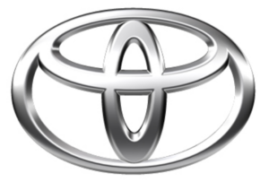
- Negative Space is Your Friend. Pinterest, Instagram, Toyota and scores of other iconic brands all use negative space – sometimes with hidden shapes and symbols includes. As an article in Lifebuzz.com reveals, the three ellipses in the Toyota logo represent the heart of the automobile, the technology, and the customer. More importantly, negative space can draw attention to the brand in a way that is memorable and different.
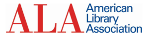
- Stacking is Back. For many years, the logo with letters had to be simple initials in a simple design. But as a way to grab attention in a way that stands out and is easy to see and absorb, stacking can be a strong alternative – often with different fonts for each word. This offers a solid way to highlight different fonts to challenge viewers while giving them something they can quickly comprehend. Here’s an example of a recent refresh (minus the different fonts) from the American Library Association.
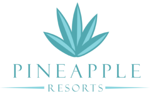
- Turning a Flat Logo Up a Notch. One recent trend is taking otherwise flat logos and adding a two-tone approach to add depth to the color but also to give it a hint of three-dimensionality. Dividing symmetrical images into two “zones” of shading gives depth and visual interest to a flat design. It can also add a symbolic touch to convey the brand’s core mission and direction. Check out how Pineapple Resorts turned its logo up a notch to make it more distinctive.
- Go Wide. Shapes that elongate from right to left are thought to be more recognizable for humans that narrow, tall images. With online platforms (such as websites and social media) favoring a wide design, strong brands are turning to this approach with their logos. When combined with contemporary fonts and colors, it can also convey a brand that is on the move and ready to dominate its market.