Always keep in mind: your website is the first impression that users will get to see what it’s like to do business with you. Just like you would put on a clean suit for a pitch, put on your best interface on your website. Do not drive away a business opportunity by designing a cumbersome website that is hard to navigate! Below are the best practices for implementing a B2B navigational system with users in mind.
Create a Buyer Persona
When thinking through your navigation, it is important to focus on who is buying your product. A key goal should be to tailor your navigation to buyers, without excluding any potential leads. A way to do this is by creating buyer personas.
Buyer personas are fictional representations of who is buying your product. Your personas should be rooted in data from analytics tools such as Google Analytics, Hotjar, or Siteimprove. When making navigation decisions, ask yourself, WWMBD — “what would my buyer persona do?”.
Bluetext, as a top UX design agency, uses a combination of quantitative web traffic data and stakeholder perspectives to ensure a comprehensive understanding of a business’ users. It is always important to put trust in the numbers, but also consider the unique perspectives a sales or product marketing team may bring. A bounce rate may key you into acknowledging a problem but does not always explain the root of frustration.
Declutter Your Navigation
According to a study conducted by Hubspot, 76 percent of people answered that the most important factor in a website’s design is the ease of use. In order to make your website as easy to use as possible, declutter your navigation and design it to be scannable and intuitive.
A good rule of thumb for decluttering navigation is to present the user with no more than six top-level navigational choices in your main navigation. If more than six choices are needed, consider creating a utility navigation for items that could be considered “tools” or require action. Utility navigations provide a sense of hierarchy and create separation from content that could be mostly for browsing or educating buyers on the products and services your company offers.
Need some help purging your navigation? Get a fresh perspective! Hiring a UX agency will give your site a fresh set of eyes to evaluate what is and isn’t needed. Like a true scientist, a UX design agency will also use tools to test their theories with tools such as a tree test to validate proposed sitemaps.
Implement Sticky Navigation
Usability studies show that implementing a persistent website navigation, or a “sticky navigation” increased website conversions as much as 10%. Studies show that users were able to focus on the products on the webpage they were on and scrolled further down the page when the navigation was always at the top of the screen.
Keeping navigation items accessible at all points of the user journey will help avoid the “dead end” scenario if lost on a page. It’s like having a built-in GPS for your user journey to always present alternate routes and course correction.
Make it Easy for Users to Contact You
Having your “Contact” button in the top navigation, as well as your footer, ensures that users will be able to get in touch with your business no matter where they are on the site. There is nothing more frustrating than wanting to get in touch with someone without the proper means to do so. If you implement a sticky navigation as stated above, adding “Contact” will serve as a persistent call to action leading to more leads generated from your website.
Need to make changes to your website to improve your navigation? Bluetext can help.
Your website acts as an essential business tool — used across every industry for a diverse number of functions. B2B companies rely on their websites to generate leads, phone calls, or physical location visits. No matter what function your website serves, there is one universal goal every business wants to accomplish with its website: leveraging it to create more growth.
There are several ways to increase your leads, sales, and revenue without investing in a complete redesign and rebuild. A great website will enable your team to work smarter, not harder. Here are tips that you should consider trying — while simple, they can help your business grow significantly.
1. Responsive Design
Mobile accounts for over half of global website traffic; if your site isn’t mobile-friendly, you may be losing valuable leads. In the coming years this number will only increase, and ensuring a mobile-friendly design may be crucial to your future success. A responsive website design (RWD) adapts to fit any screen in a way that makes all pages, features, and actions accessible to users. Making sure that your website can support traffic on any browsing device ensures that users are not dropping off your site because they cannot access what they’re looking for.
2. Simplify Your Navigation
In order to increase conversions, you need to keep users on your website. When a user lands on your website, they should be able to quickly and intuitively navigate to relevant content, allowing them to find the information they need without losing interest. The first step to keeping a user on your site is maintaining a simple and intuitive navigation. Too many options will likely overwhelm your user; it is important to have a clear path for users to the action you would like them to take as well as the information they are looking for. Otherwise, they may look elsewhere.
3. Avoid Clutter and Complex Noise
While incorporating animation and motion on your website adds visual interest for users and helps your site stand out, it’s important to be aware of the balance between unique design and overly-complex noise. Too much movement can be overwhelming for your user and may detract from what they originally came to your website to achieve. A complex design can also negatively impact your site speed, potentially increasing bounce rate and affecting your SEO score. While finding a middle-ground between these two extremes can be difficult, it’s important to ask if new design elements will add value to the end-user.
4. Don’t Go Crazy With Your Fonts
While fonts are an easy way to enhance your CVI and bring visual interest to your website, they may also be difficult to read for some users or on some devices. Using a Sans Serif font for your website’s body copy and making sure the font size and color meet accessibility standards is crucial in getting your message across to users. If they are not able to read the content on your site, they definitely won’t be converting.
User experience is crucial to effective website design, but so is your internal team! Here are some tips to streamline the digital sales process for end-users and internal teams. A positive user experience will directly translate into increased conversions.
Use Call Tracking
If driving users to make a phone call is one of the main goals of your website, it is important to know which page has prompted the user to make the call. You can easily track this information by using unique phone numbers on different pages, allowing you to determine which page is driving the most traffic to your call center. These numbers can easily be configured to route to your main phone line, meaning there won’t be any disruption to the way you’re currently handling phone leads.
Install Live Chat
While live chat may not seem immediately relevant to your business, every website can benefit from this simple tool. Live chat functions to facilitate interactions with your users and enables them to quickly get the answers they’re looking for without spending too much time hunting around the site. Many chat services will also integrate with mobile phones, allowing your business to easily monitor traffic.
To learn more about driving leads via a responsive UX design and how Bluetext can help you increase conversion rates, contact us today.
Looking to jazz up your website? One of the hottest website design trends in recent years has been on page animation. But like any design decision, there are pros and cons. Bluetext top website user experience designers weigh in on the debate on how far you should go in injecting motion to your website.
To animate or not to animate?
Animation enthusiasts recommend adding motion to create a dynamic and flowing user experience. Not to mention, animation has been a major web design trend over the last few years, meaning your visitors are accustomed to seeing it on competitor sites and therefore expect a comparable experience on your pages. The opponents, or static supporters, on the other hand, will argue that animation is distracting and can seem unprofessional in certain industries. For example, B2B has traditionally been a strictly static and straightforward approach to website design, leaving the flashy frills to more consumer-based websites. However, having an interactive animated website could be a valuable point of differentiation. So what do the experts recommend?
Truth be told, animation can be a wonderful addition to a website’s aesthetic and functionality, but only when executed in the right way to fit your broader business goals. Careless integration of animations into your web design scheme can be a real eyesore and have negative impacts on site speed, SEO, and user experience. Weighing these pros and cons carefully, Bluetext website user experience designers recommend subtle animation and keeping in mind the following considerations.
Not all animations were made equal! Motion design spans a wide breadth of categories. Bluetext recommends the following types for a professional, yet modern feel to your site.
1. Loading Animations
Loading animations can be used as an effective way to engage users from the get-go. Since it only takes a user 3 seconds to abandon a page if the content doesn’t load, the use of loading animations offers content right from the start. Animated typography, countdowns, or a simple animated logo allow users to have fun watching while waiting for the site to load.
2. Micro-Interactions
Taking a cue from the mega “micro” trend sweeping the digital marketing industry (microtargeting and micro-moments sound familiar?)This effect is one of the hottest trends of website design. These are used to make small interactions (such as clicking a button) quick and clear for the user. Hover effects are one of the most well-known examples of micro-interactions. Certain page elements, such as navigation buttons, CTAs, or linked images, are the ideal canvas for mico animations.
3. Page Transitions
Subtle animation can be purposefully to ease the navigation from one component to another and between pages. Arrows, background scrolling, load bars, or any component that offers directionality to the user are great opportunities to use this effect.
4. Parallax Scrolling
Using full-width imagery, this effect takes the user on a cohesive journey as they move down the page. By definition, the background moves at a different speed to the foreground elements, creating a visually stunning effect on either full-page backgrounds and strips. While this is sure to give a wow-factor to your main website, it’s important to remember this effect is not available on mobile devices.
5. Decorative Delights
While these effects do not offer any functional benefits, they can be used to add more interest to the page. While it might be difficult to imagine serious B2B websites using these layouts, this might be exactly what your site needs to spice up drier content sections. Especially when placed near elements intended to draw attention, such as new messages, lightboxes, key CTA buttons, this turns aesthetic pop into actionable results.
With so many options for website motion, it can be tempting to want to do it all. However, top website designers have one golden rule: moderation is key. This rule doesn’t just apply to junk food, overdosing your site on fun animations can overwhelm the viewer and distract from the most important aspect: the content! Use animation sparingly and strategically. Before you fall in love with a beautiful design, consider the practicality. There are instances when animation could actually detract from your site, for example, if it hinders a user’s ability to read important messages or complete a conversion. For instance, you shouldn’t add animation to text paragraphs because it will make reading them much harder. You also would not want to add animations to fields where visitors enter their own content (such as a contact form or comments), because it would distract them from completing the task. When considering embedding motion effect, pressure test your decision against these questions:
- Does the site’s movement guide the viewer when to scroll and where to click?
- Does the animation support brand storytelling by gradually revealing information?
- Does the animation help a viewer visualize your product or service’s impact?
- Does this effect break up static scroll?
If you can answer yes to these questions, feel free to act on your motion goals! As long as you consider functionality first, animation can be a powerful visual tool to capture your audience and drive them deeper down the sales funnel.
Are you looking to drive users to your website using animation, but don’t know where to begin? Get in touch with Bluetext.
Have you ever found yourself on a website, staring blankly at the screen wondering where the rest of the pages are? Navigation is one of the most important functions of any web page whether it be a blog, product listing page, about section, or a document library. If your user doesn’t know where this content is housed, the utility of the information is lost! As a crucial element of user experience, failing to build smart navigation into your digital interface can lead to a variety of issues including secondary UX issues, accessibility problems, and increased bounce rates from frustrated users.
Let’s take a step back; what is a navigation menu, and do I still need one if I have “search”?
Navigation menus are maps of the categories or features of your content; on websites, these are known as sitemaps. These menus can appear in a variety of ways; from the traditional header locked navigation bar, to hamburger menus that pop out to link to various interior pages of a website.
While many websites have a Search function of some kind, whether it be a search bar or filter, research shows that 70% of users rely on navigating to content directly. While search features are helpful to some users, navigation menus can lead your visitors to the content they need quickly and reliably.
No matter where you are with your website, here are some quick, easy tips to help you optimize your platform for a better user experience.
1. The 3 Click Rule
Your navigation structure should be intuitive and allow users to land on any page and find what they are looking for in 3 clicks or less.
If your site has lots of content and sub-pages that relate back to a greater unifying category, take advantage of breadcrumbs. Breadcrumbs are a component of navigation menus that help users orient themselves within a sitemap. They can be embedded into the navigation bar as a dropdown, or appear in the design of the child pages on your site to guide users through the various layers of content.
2. Show Off Your Menu
Don’t try to reinvent the wheel-don’t hide your navigation menu! When a user visits your site, it’s likely one of the hundred other web properties that they have browsed in the last few days. As our digital lives have progressed, users have become accustomed to certain kinds of queues and user interface (UI) elements. Keep your navigation menu in an intuitive location, be that the left rail, top of the browser window, or a pop-out hamburger menu with an obvious icon.
3. State the Obvious
Be as clear and descriptive as possible. Avoid using vague descriptions in your navigation headings. If a user can’t tell exactly what to expect from a page in the navigation, there’s a chance they won’t make it past the landing page. Use descriptive language to identify what your pages contain, less is more with heading titles. Streamline the main menu display experience where possible and take advantage of dropdown menus for categories with multiple child pages. If you hyperlink to pages within your site from banners or in-line content, make your hyperlinks obvious!
4. Stay on Topic
Don’t let SEO impact your navigation taxonomy. While ranking well in search engines is important, packing your Headers and menu items with keywords that don’t relate to the page contents won’t do you any favors with users. Avoid this common pitfall by using the copy and metadata on your pages for SEO strategies, leave your headings and menu items clean and accurate for better UX.
5. Lead with a Mobile-First Mentality
Over 53% of all web traffic occurs on mobile devices. When designing your navigation menu, start by thinking about how users might visit the site; on both their computers and mobile devices. Take advantage of responsive designs that can adapt to a variety of browsers and devices rather than discovering post-launch that your navigation is broken.
6. Stop Guessing! Test Your Audience
If you’ve updated your navigation menu but still see disappointing numbers for bounce rate and click through on your site, test your experience. User behavior can be monitored with tests such as a Crazy Egg Heatmap, which illustrates where your users are browsing on the page.
TLDR: improving your navigation design can improve your relationship with users
Confusing or obscure navigation will lead to fewer visitors to your interior pages and can result in awful analytics reports. Clear and effective navigation can enhance visitors understanding of where your content is located, instill confidence in browsing your site, and create credibility about your product.
Do you need to up your navigation game but you’re not sure where to start? Get in touch with us.
As the world becomes increasingly digital, having a professional, user-friendly website is now more important than ever. With countless options for building or overhauling a website, picking the right content management system or DC digital web design agency can seem overwhelming. Don’t panic, Bluetext is here to provide expert advice to all decisions that go into building your digital ecosystem. As a top DC digital web design agency, with teams of Drupal and WordPress development experts, Bluetext has worked with countless client’s to build high-quality, easy-to-navigate websites. Our teams of user experience and user interface specialists take many things into consideration when building a website; however, navigation is always a top priority. 94% of web users report easy navigation is the most important feature when evaluating a website. As an experienced DC digital web design agency, we’ve been able to test why and how logical website navigation is critical. Here are four ways to make sure your website is as intuitive as possible.
1. Keep Things Orderly
In creating a new website, the order of information on a page can make or break the user experience. People tend to best recall the first and last items in a series and forget the information in the middle – this is known as the primacy and recency effect. For this reason, the most important information should be included in the hero zone of a website. The hero zone, in other words, can be best equated to an elevator pitch – a short description of your idea, product, or company that briefly explains your concept in such a way that any viewer can quickly understand it.
2. Remain Consistent
By 2027, there will be more than 41 billion IoT devices around the world. The increased volume of IoT devices means more individuals around the world will be accessing the web through a wider range of devices. As a DC digital web design agency, we’ve seen the increased importance of creating responsive websites that automatically scale to device type but remain consistent in general structure. Menu systems often become crowded and confusing as screen widths decrease to tablet and mobile devices. Digital design agencies can help overcome this obstacle by recognizing the critical breakpoints in your site’s design and implementing menu structures optimized for tablet and mobile screens of all generations. By keeping this consistency in structure and navigation across devices, users will become more familiar with and loyal to your website and brand.
3. Limit Menu Items
To ensure a website is easy-to-use and navigate, the structure is essential. For example, listing each page separately in a navigation header creates an overwhelming and near impossible user journey. Your sitemap should act as a foundation, with the most important items laying the building blocks for secondary pages. By systematically creating a logical sitemap utilizing primary and secondary navigation, you can create a fluid user experience that allows users to find exactly what they need with ease. As a DC digital web design agency, we have access to and frequently use site map testing tools, such as Treejack, to evaluate the findability of topics on a website. Not to mention, creating a logical, hierarchical sitemap makes it much easier to produce an XML sitemap, which is pivotal for SEO.
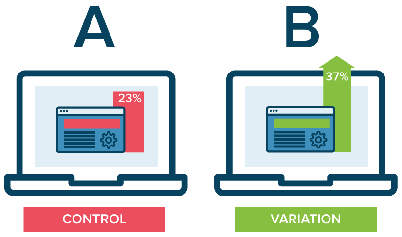
4. Test. Test. Test.
A/B testing website navigation is the only way to truly take the guesswork out of website optimization. As a DC digital web design agency, our Drupal and WordPress development experts have seen first hand the benefits of A/B testing. With proper testing, website navigation changes can be data-driven. Conversations surrounding those changes then shift from “I think” to “I know.” Although A/B testing can be employed to answer one-off questions, it should be continually used to improve metrics, such as conversion rate, over time.
In building or redoing a website, intuitive navigation design should always be a top priority to ensure users don’t require instruction or trial and error to move around the site. By using the navigation best practices mentioned above, you’ll have taken a great first step towards better engagement and higher conversion rates on your website by enhancing overall user experience. To learn more about our processes and to see our work, check out our case studies.
If you’re looking to hire a DC digital web design agency with Drupal and WordPress development experts, see what Bluetext can do for you.
Trends in website design are ever-evolving. It’s a fast-paced industry, but any business with a digital marketing presence should take efforts to stay informed and keep up with best practices. Just as you would ensure employees are helpful and informative to customers in a physical store, your users expect the same experience online. Here are three user experience trends that you should consider for your business’ website in 2020:
Design as a part of your business strategy.
A few years ago, chief executives might have excluded themselves from having a say in website design or functionality to focus on the bottom line. That being said, more and more companies have come to recognize the critical importance of a strong online presence. With the world participating in the digital-first movement, your website says a lot about the health of your business.
The future of the company often lies in the hands of top executives, as they typically establish the company culture and the goals with investors or the board of directors. Including top stakeholders in the design process is critical to get initial sign off and ensure their vision is incorporated. It is important to involve diverse perspectives into any web design, especially the ones writing the checks. These stakeholders offer a unique perspective in the current state and future aspirations of the company. Website strategists and UX designers should always include the top decision-makers in the room to make sure the website they are designing today aligns with the business strategy of the future.
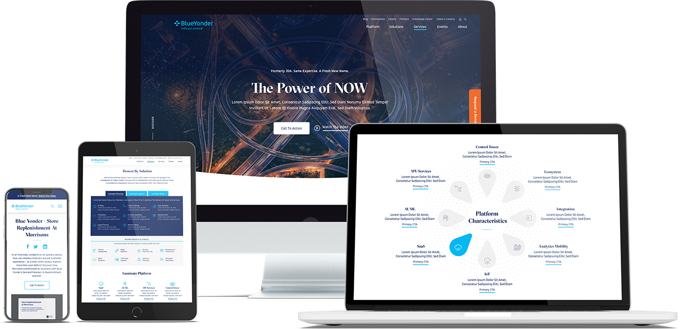
When Bluetext recently partnered with Blue Yonder (formerly JDA), the #1 supply chain management software company in the world, we made sure to include top decision-makers from the initial discovery session, all the way through to launch of their brand new website. You can view our work with Blue Yonder here.
Thumb-friendly design.
With over 50% of website traffic coming from mobile devices, responsive website design has become a top priority. Menu navigation and intuitive user journey has been and always will be a top design consideration, but recently there has been a shift in attention towards mobile menu design.
How do top UX design agencies optimize for user comfort as we design for mobile? We think about adding content and important elements to the “thumb-zone”.
The “thumb-zone” includes the area at the bottom of a mobile device and on the side opposite the thumb. Test it yourself by holding your mobile device. Where does your thumb naturally fall? User studies say that about 75% of user interactions are thumb-driven, so including navigational items and important content in this zone creates a simplified and more natural user experience. In 2020, you will likely notice a lot of websites start to move away from hamburger navigation on the left side of the screen. These are often replaced by navigation bars at the bottom of the screen, aka the thumb’s natural setting.
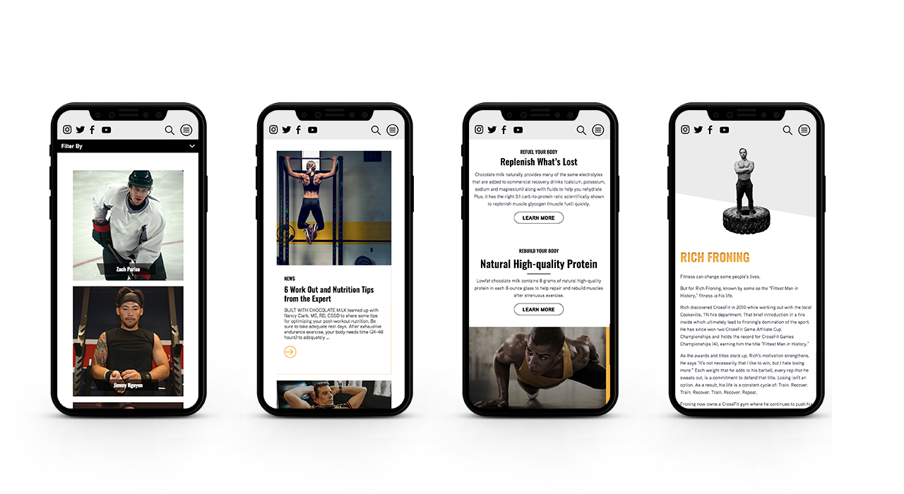
Bluetext designed a mobile-first website for Built With Chocolate Milk, an organization that promotes the benefits of chocolate milk as a natural recovery drink. Bluetext enhanced the user experience and overall engagement through a website redesign that emphasizes the science-backed benefits of chocolate milk and showcases Built With Chocolate Milk’s impressive partnerships with world-class athletes such as Klay Thompson of the Golden State Warriors.
Accessibility.
With the internet being a critical part of daily life and the rise of user-centric design, it is no surprise to see accessibility on the list. When thinking through how a user gets from point A to point B, UX designers should be inclusive of those people who may have a disability and use assistive technology.
One way of keeping accessibility top of mind is to develop separate personas for users that may have low vision, deafness, or other disabilities. Persona creation is a common exercise for top digital marketing agencies when beginning a website project. But thinking beyond the expected customer personas can open insight into a more inclusive and realistic set of potential web users. Having empathy for these personas while designing will help ensure little tweaks are made that allow them to equally experience your content. For example, ensuring text is large enough for users with low vision and inclusion of space for video transcripts are all UI elements that make the website more accessible to all. With the rise of imagery- and animation-heavy sites, adding alt text to all website imagery will allow screen readers to provide context to visually impaired users. Plus, this step will kill two birds with one stone by improving your site’s SEO ranking with keyword-rich descriptions.
Added bonus: Google prioritizes websites that are more accessible to more users, so if you want to boost your SEO rankings, keep accessibility top of mind.
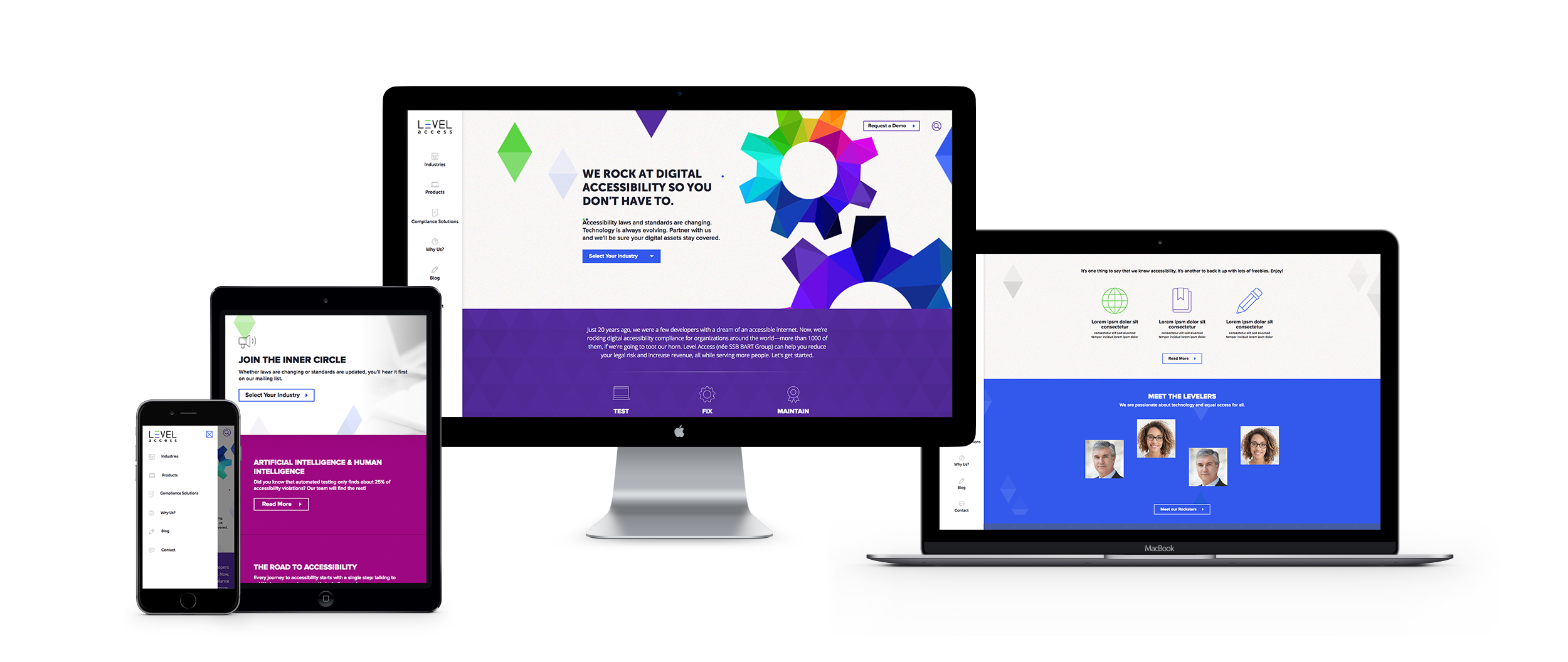
When the SSB Bart Group, the leading provider of accessibility solutions and software, needed a new brand to increase its market share and continue on its growth trajectory, it chose Bluetext to deliver a new name, brand, and website that would focus on its people and expertise. After a thorough discovery process, competitive review and market analysis, Bluetext proposed Level Access to simplify the brand and its promise to the industry. The new look and feel and how it is presented on the website reflects Level Access’ mission “to create a world where digital systems can be made readily accessible to users with disabilities—enabling digital technology to become a profound empowering force in their lives.”
Looking for more information about the state of web design and where we’re headed? Check out some more of our case studies.
A Google search of “cyber security companies” will return well over 700 million results. As a business becomes increasingly digital and transitions more operations into cloud-based tools, the data of both the business and its customers become increasingly vulnerable to cyber attacks. Cyber security companies are cropping up in response to growing demand across industries, but even the cyber security companies have to worry about protection, especially when it comes to their websites. As its digital storefront, any website is a critical place to ensure proper security measures are in place.
Here are the top five steps that cyber security companies themselves are taking to keep their websites protected.
1. Ensure CMS Security
The most cost-efficient way to build and manage a website is to leverage a popular content management system, but on their own these systems are often prone to attacks. To mitigate vulnerability, cyber security companies install a series of security plugins or modules, such as Securi for WordPress and Security Kit or Paranoia for Drupal.
Important Note: Simple installing the plugin or module is not sufficient. To protect your website and its data, webmasters must update and configure new releases in a timely manner. Website design and development agencies, such as Bluetext, can ensure your site security is always up to date.
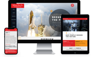
When Bluetext partnered with ManTech to completely redesign their website, CMS security was a major concern. ManTech is a multi-billion-dollar public company that provides subcontracted technological services to the US Government. We outfitted their new Drupal website with the latest and greatest security plugins to ensure adequate CMS security.
2. Leverage Two-Factor Authentication
The content management system supporting a website needs to be easy-to-use, but not easy-to-access. Top cyber security companies (and the cyber security marketing firms who design and build their sites) ensure that only entrusted individuals can manage content on their sites by implementing two-factor authentication. When a content editor attempts to login in to update a page, they must validate their identity through a secondary step, such as a text message, phone call, or email. We often recommend Duo from Cisco, which integrates easily with most content management systems.
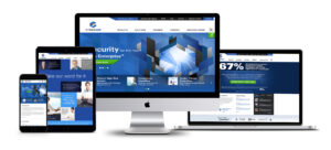
When CyberArk, a Goldman Sachs-backed, global cybersecurity technology company turned to Bluetext to redesign its brand comprehensively, we also launched a new responsive digital platform, complete with two-factor authentication. The new website addressed the needs of CyberArk’s global enterprise customer base.
3. Setup (BIG) Form Security
Web forms are valuable tools to digital marketers — and hackers! The potential for attacks initiated via a web form is BIG, hence they need big security. Cyber security companies, like many other industries, use web forms as a key lead-generation tool, but they know these forms are not something to be taken lightly. Any element on your site that allows for (and actively seeks) user input is susceptible to SQL injections or spam bots. (The tl;dr for those links: you do not want your website to suffer either fate.) The key IT stakeholder for any website should make form security a top priority, and work with the website development agency to select and implement the right technical measures.
When Finite State, an IoT-based cybersecurity company, came to Bluetext to expand its industry presence through a full website development and rebrand, we made sure that form security was paramount to the fully customized WordPress content management system platform.
4. Don’t Skimp on Hosting
While GoDaddy allows a company to save money, cyber security companies know that those savings come at an even higher cost in terms of security vulnerabilities. Though secure hosting providers come with a higher monthly bill, the long-term peace of mind in security far outweighs the short-term costs. These providers offer SSL certificates, CDNs, firewalls and more to ensure that websites can withstand malicious malware and attacks. Some of the top secure hosting providers recommended by top website development agencies include WP Engine and HostPapa.
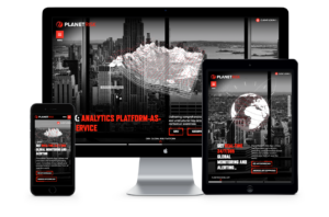
Hosting security was top of mind for our client, PlanetRisk. When PlanetRisk, an enterprise risk analytics company, hired Bluetext to lead a comprehensive rebrand and new digital user experience and re-platform their content management system, we made sure that their updated website was fully secure, hosting-wise.
5. Take a Proactive Stance
Too often, website security measures are only implemented as a reactionary step following an attack. Cyber security companies know better. If a malicious attacker penetrates the website, they could irreversibly tarnish the brand. Cyber security companies make sure that the steps above are covered before an attack by configuring them before the website launches. Proactive protection can be a challenge if you don’t know what to expect, so be sure to consult an experienced website development agency to ensure your bases are covered with the most up to date security measures.
If you model your website security initiatives after the experts, you’ll be best set up to withstand attacks. Learn from the experience of a cyber security marketing agency—don’t skip these important steps!
Over the last couple of years, Bluetext has noticed a few key trends in what the C-Suite is asking for when kicking off a website project. Even if they don’t know much about what they’re asking for, or how to accomplish it, they have a keen sense of its importance. “Our competitors are doing it. Companies that we look up to are doing it. We need to do it too.”
Let us break down the 7 most common “needs”.
1. “We need to be seen as thought leaders.”
More and more, valuable website real estate is being dedicated to highlighting thought leadership content. Thought leadership is common on home pages and primary navigation items, especially as increased velocity benefits SEO. Blogs and other educational content are frequently cross-promoted throughout sites. Often, this content is displayed dynamically with custom logic based on publishing dates and category tags to keep pages current and relevant, and require less upkeep for page editing. Our clients recognize that users have come to expect this content, eager to consume and share.
When Bluetext launched the Arlington Capital Partners-backed Centauri, we designed and developed a fully integrated content marketing program to establish the brand in the market and increase word-of-mouth around the launch, prioritizing recruitment and a strong web presence.
2. “We need to tell our story.”
We have moved on from verbose descriptions of who we are and what we do in a home page. Users do not want to read; they want to experience. Today, companies are using “digital storytell” to express their value proposition. Visually stimulating, thought-provoking, and often interactive, digital storytelling creates an experience for the user unique to your company that holds attention to get a message across. Top digital marketing agencies like to think of digital storytell like those chicken nuggets with a secret serving of vegetables inside. The consumer enjoys what they’re eating, but you’re giving them what they need at the same time.
Take for example our work with Invictus. Invictus is a full-spectrum cyber technology and national security company dedicated to the protection of the nation’s security, global defense, and IT infrastructure. Invictus turned to Bluetext to embark on their next mission: grow from veteran-owned small business to big-time government contractor. With a fresh logo, reimagined corporate visual identity, and a modern website, Invictus is prepared to continue growth as a cyber-forward contractor for the federal government and commercial clients.
3. “We need to trim the fat.”
Less is more when it comes to content and choices. Users quickly get lost in antiquated sites with brochure-ware pages and deep menus. Content marketing agencies constantly hear from clients over how bloated their websites have become over time, and seek expert advice to tame its unruly junk drawers. A top digital marketing firm will tell you simplified information architecture can go a long way. Clear personas and usability testing can inform this crucial spout from which content strategy flows. Content should always be filtered for necessity, validated by the persona it serves, hole it fills, and value it adds. As attention spans wane, so must content.
Bluetext partnered with ManTech, a multi-billion-dollar public company that provides subcontracted technological services to the US government, to develop a fully responsive site with an enhanced user-experience. The intuitive, well-organized design drives users to their needs quickly and functions as a lead-generation tool. The new site also provides a new experience to recruits with a seamless integration of job application workflow, allowing prospects to quickly search and filter jobs relevant to their specific interests and experience.
4. “We need to personalize the experience.”
Personalization is no longer reserved for B2C websites. The B2B sales cycle is long, often requiring many interactions and engagements over time. Repeat users are an opportunity to speak on a more personal level. The more data we capture about a user, where they come from, how and with what they interact, the more we can adjust a web experience. From imagery, messaging, journeys, iterative forms, and specific calls to action, personalization lets the user know you understand them. Personalization is not a ‘set it and forget it’ initiative. It requires technology, data, and iterative support over time, making it a daunting undertaking but one with a huge potential for return.
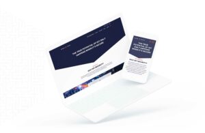
When we partnered with the Graduate Management Admission Council, we re-designed their microsite, CallingAllOptimists.com. Through collaborative field studies and research, Bluetext engineered a unique digital experience in the form of a personalized 4-question quiz. The quiz seamlessly guided the user to customized messaging and content based on their answers, while simultaneously gathering actionable user-insight which integrated directly to GMAC’s marketing automation platform. Not only did this redesign improve the campaign’s functionality and awareness – it created a holistic brand ecosystem that drove both the user and the client to their desired goal.
5. “We need to stand out.”
Ultimately, every brand wants to look cool. Every B2B company wants people to land on their site and think, “wow.” The very first thing a user takes in is the design. As a top digital design agency, we are constantly asked to be innovative and deliver a unique design unmatched by competitors. Bluetext often creates custom animations, illustrations, fonts, menus, forms, and imagery for clients. It’s critical that, while we can wander far from inside the box, we remain true to the brand. The balance of brand consistency and digital creativity can create the award-winning masterpiece many of our clients are after.
When Bluetext partnered with Varonis, we launched the eye-catching “Exposure” advertising campaign, targeting C-Level executives who are unaware of the potential risk they are placing on their enterprises by not leveraging solutions to understand who has access to the unstructured and human-generated data that their enterprise relies on.

6. “We need to cover our…selves.”
The legal landscape of the web is constantly changing. From data protection to inclusiveness, the C-Suite is recognizing the need for compliance to sleep easy at night. Beyond legal safety, these new requirements should be pursued because these rights aim to protect end-users. Digital marketers have a responsibility to make the internet a space for all users to experience equal comfort and access. From 508 to GDPR, your digital marketing agency should proactively implement these requirements as guided by your legal team.
Take for example our work with Level Access. When the SSB Bart Group, the leading provider of accessibility solutions and software, needed a new brand to increase its market share and continue on its growth trajectory, it chose Bluetext to deliver a new name, brand and website that would focus on its people and expertise. The new look and feel and how it is presented on the website reflects Level Access’ mission “to create a world where digital systems can be made readily accessible to users with disabilities—enabling digital technology to become a profound empowering force in their lives.”
7. “We need to harness the full potential of our website.”
Websites have become full-fledged marketing and sales tools. One piece of a 360-degree user experience, websites are now a living, breathing, asset, working in tandem with other channels. Data should consistently inform website governance decisions and data from the website should be analyzed to inform other channels inversely. From tracking to chatting, integrations that connect websites to other marketing channels can exponentially augment what we know about our users. Our clients constantly ask how we can integrate with full-funnel efforts, from hosting events online to chatting with prospects in other languages, the potential is near limitless.
When Bluetext worked with ResMan, a property management platform, to invigorate their brand and redesign their website. ResMan charged Bluetext with repackaging their solutions into a strategic grouping that reflected the market’s needs. As a customer-centric brand, ResMan needed their external messaging and marketing efforts to reflect their goals as a company. Bluetext turned this request into a fully redesigned website, focusing on an enhanced UX that guides ResMan’s users through the site with an intuitive website flow.
All of these “needs” are important to consider, but it’s tough to nail them yourself unless you have unlimited time and budget. An experienced website design and UX agency, such as Bluetext, should guide you through these conversations when beginning a website project to determine what makes sense for your business’ goals and resources. At Bluetext, our goal is that one day a CMO will point to your website in a project kickoff as the bar for their “needs.”
As the world has changed in the blink of an eye, so has the way we market to consumers. Now, more than ever, your website exists as BY FAR THE MOST IMPORTANT doorway to your brand and your brand experience. While stores stay shut, and face-to-face interaction is vastly limited, brands will rely on reaching their target audiences via their websites. Therefore, your website is mission-critical to your success.
Website accessibility, or the practice of ensuring websites are available to everyone, regardless of their abilities, has always been a crucial part of website design and development. But as website accessibility gains momentum, meeting and exceeding accessibility standards has become even more top-of-mind. Website design and development agencies have begun to ingrain accessibility standards into their designs; meeting these requirements is no longer a “nice-to-have.”

Accessibility Requirements Are Legal Requirements
According to Dean Schuster, user experience design strategist, “In 2019, the United States Supreme Court upheld the notion that all sites conform to the W3C’s Web Content Accessibility Guidelines (WCAG) AA standard.” With these requirements now legal requirements, website design and development agencies have upped their game to ensure their websites are readily accessible to anyone who wants to browse.
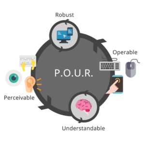
ADA compliance is now established legal precedent for U.S. websites. At a high level, accessibility regulations are broken out into four categories: Perceivable, Operable, Understandable, and Robust. In other words, all content must be “POUR”:
- Perceivable: Users must be able to perceive the information that is being presented. Perceivable guidelines include text alternatives for any non-text content, time-based media alternatives, adaptability, and distinguishability.
- Operable: Website components and navigation must be operable. These guidelines include keyboard accessibility, providing enough time for users to read and use content, providing navigable content, and providing input modalities.
- Understandable: Users must be able to understand the information and the operation of the user interface. Understandable guidelines include readability, predictability, and input assistance, or helping users avoid and correct mistakes.
- Robust: Content must be robust enough to be interpreted by a wide variety of users, including assistive technologies.
Ensuring your website is accessible can be overwhelming, which is where website design and development agencies come in. Building and maintaining an accessible website starts with the design and development process.
 Meeting Accessibility Standards Begins with Design
 Meeting Accessibility Standards Begins with Design
Ensuring website designs are accessible to all impacts the entire website design process; designers must think long and hard about the limitations of visual formats. Often, we deem the skills we learn within a certain context as “normal.” Increasingly stringent accessibility standards will require designers to step outside of their “normal” and rethink each design through the lens of a website user who may not be as abled as they are.
The transition from professional website designer to accessibility expert is well underway and this transition will only accelerate as 2020 progresses.
Website Development Impacts Accessibility at a Foundational Level
Website designers are not the only ones affected by stricter accessibility regulations – website developers will also be impacted at a foundational level. Developers must constantly work to maintain knowledge of the continuously evolving standards and best practices, accounting for practical use-cases within the disabled community while using caution when approaching newer programmatic technologies.
Website designers and developers who stay ahead of this trend and embrace website accessibility are positioned to deliver more accessible products. As standards and best practices continue to evolve, website design and development agencies must continue to meet the criteria necessary to ensure that their websites are accessible to everyone on the internet.
Use Your Online Presence to Empower the Disabled Community
When translating your business to the digital world, a lot of thought goes into making sure your business is represented correctly; between your corporate visual identity and the messaging that makes your business unique, each of these foundational building blocks come together to create a unified online presence. Your online presence should be accessible to everyone, including the 18.7% of Americans with a disability. Supporting these users and ensuring your website offerings are accessible to everyone on the internet should always be a top priority, regardless of the legal ramifications.
To learn more about our experience pertaining to accessibility, check out our case study featuring our work with Level Access, the leading provider of accessibility solutions and software.
According to a recent study, 48% of people believe website design is the leading factor in a company’s credibility. Based on this assumption, it’s clear that having a professional website is incredibly important. With content management systems like WordPress and Drupal, it can seem like hiring a leading web agency is unnecessary. However, agencies like Bluetext offer the expertise of top drupal consultants, WordPress design experts, and countless other web specialists to create a seamless, designed to spec, website. Needless to say, hiring a leading web agency is essential to your website development journey. Read our top 5 reasons to hire a web agency:
No Training Required
By hiring an agency, the added stress of finding, hiring, and onboarding new employees is eliminated. Often times, companies invest countless time, money, and energy to help train new employees, just to have them leave within a few years. By hiring a leading web agency, clients get a qualified and accomplished team ready to start working from day one and for years to come.
Work Directly with Experts
Agencies bring talent who have extensive knowledge and experience in different areas of web design. Unlike many businesses, agencies have access to a wide array of specialists like SEO experts, designers, researchers, and everyone in between. These experts can use their in-depth knowledge to help generate and report on results, guaranteeing the success of any website design and development project.
Get Access to the Latest Technology
Analytics and web development tools are costly to use for large and small businesses alike. With so many possibilities on the market, training employees to use these tools adds an unnecessary cost to any business. Working with a leading web agency can help increase efficiency and performance by gaining access to the latest tools, services, and software in the industry.
Outside Perspective
Employees within a company often find it hard to bring completely new ideas or concepts to the table. By hiring a leading web agency to help with web design, businesses get a fresh set of eyes and a unique perspective. Not to mention, agencies bring experience and data-driven results that show what works and what doesn’t to help meet the goals of businesses in any industry.
Positive Results
Agencies are constantly building and maintaining many different types of websites. From prior experience, a leading web agency will know from the very start what a website requires to generate quality results. Additionally, an agency can continue to update websites to ensure the best tools and assets are in place for long-term growth and success.
Hiring a web agency has many benefits for any business. It’s important to hire an agency that can help you meet all of your goals so your business can work more efficiently. Whether it’s to save time and money or to take advantage of the latest tricks and tools, there are countless reasons to hire a leading web agency.
If you’re looking to hire a leading web agency, see what Bluetext can do for you today. To learn more about our processes and to see our work, check out our website.