Trends in website design are ever-evolving. It’s a fast-paced industry, but any business with a digital marketing presence should take efforts to stay informed and keep up with best practices. Just as you would ensure employees are helpful and informative to customers in a physical store, your users expect the same experience online. Here are three user experience trends that you should consider for your business’ website in 2020:
Design as a part of your business strategy.
A few years ago, chief executives might have excluded themselves from having a say in website design or functionality to focus on the bottom line. That being said, more and more companies have come to recognize the critical importance of a strong online presence. With the world participating in the digital-first movement, your website says a lot about the health of your business.
The future of the company often lies in the hands of top executives, as they typically establish the company culture and the goals with investors or the board of directors. Including top stakeholders in the design process is critical to get initial sign off and ensure their vision is incorporated. It is important to involve diverse perspectives into any web design, especially the ones writing the checks. These stakeholders offer a unique perspective in the current state and future aspirations of the company. Website strategists and UX designers should always include the top decision-makers in the room to make sure the website they are designing today aligns with the business strategy of the future.
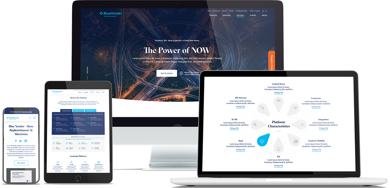
When Bluetext recently partnered with Blue Yonder (formerly JDA), the #1 supply chain management software company in the world, we made sure to include top decision-makers from the initial discovery session, all the way through to launch of their brand new website. You can view our work with Blue Yonder here.
Thumb-friendly design.
With over 50% of website traffic coming from mobile devices, responsive website design has become a top priority. Menu navigation and intuitive user journey has been and always will be a top design consideration, but recently there has been a shift in attention towards mobile menu design.
How do top UX design agencies optimize for user comfort as we design for mobile? We think about adding content and important elements to the “thumb-zone”.
The “thumb-zone” includes the area at the bottom of a mobile device and on the side opposite the thumb. Test it yourself by holding your mobile device. Where does your thumb naturally fall? User studies say that about 75% of user interactions are thumb-driven, so including navigational items and important content in this zone creates a simplified and more natural user experience. In 2020, you will likely notice a lot of websites start to move away from hamburger navigation on the left side of the screen. These are often replaced by navigation bars at the bottom of the screen, aka the thumb’s natural setting.
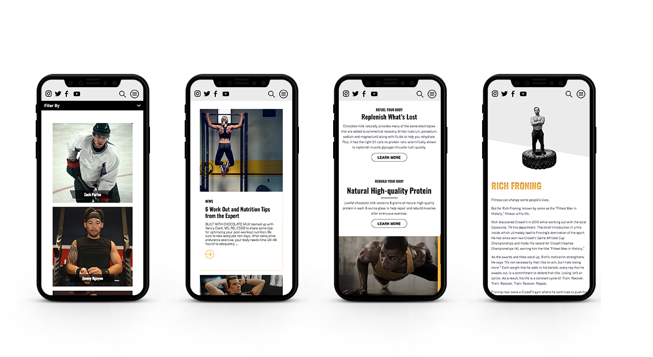
Bluetext designed a mobile-first website for Built With Chocolate Milk, an organization that promotes the benefits of chocolate milk as a natural recovery drink. Bluetext enhanced the user experience and overall engagement through a website redesign that emphasizes the science-backed benefits of chocolate milk and showcases Built With Chocolate Milk’s impressive partnerships with world-class athletes such as Klay Thompson of the Golden State Warriors.
Accessibility.
With the internet being a critical part of daily life and the rise of user-centric design, it is no surprise to see accessibility on the list. When thinking through how a user gets from point A to point B, UX designers should be inclusive of those people who may have a disability and use assistive technology.
One way of keeping accessibility top of mind is to develop separate personas for users that may have low vision, deafness, or other disabilities. Persona creation is a common exercise for top digital marketing agencies when beginning a website project. But thinking beyond the expected customer personas can open insight into a more inclusive and realistic set of potential web users. Having empathy for these personas while designing will help ensure little tweaks are made that allow them to equally experience your content. For example, ensuring text is large enough for users with low vision and inclusion of space for video transcripts are all UI elements that make the website more accessible to all. With the rise of imagery- and animation-heavy sites, adding alt text to all website imagery will allow screen readers to provide context to visually impaired users. Plus, this step will kill two birds with one stone by improving your site’s SEO ranking with keyword-rich descriptions.
Added bonus: Google prioritizes websites that are more accessible to more users, so if you want to boost your SEO rankings, keep accessibility top of mind.
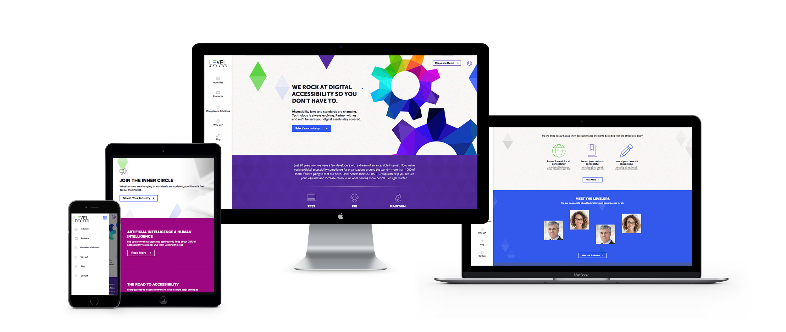
When the SSB Bart Group, the leading provider of accessibility solutions and software, needed a new brand to increase its market share and continue on its growth trajectory, it chose Bluetext to deliver a new name, brand, and website that would focus on its people and expertise. After a thorough discovery process, competitive review and market analysis, Bluetext proposed Level Access to simplify the brand and its promise to the industry. The new look and feel and how it is presented on the website reflects Level Access’ mission “to create a world where digital systems can be made readily accessible to users with disabilities—enabling digital technology to become a profound empowering force in their lives.”