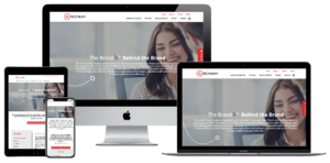
As a digital design agency, we know that the average person spends 3 – 5 hours a day on their mobile device! Over 20% of people check their phones every few minutes and over 50% of users look at their phones a few times an hour. Ever advancing apps and functionality are allowing people to transition almost any aspect of their life into digital devices. Order takeout? Sign a document on the go? Even adjust your thermostat. As a digital design agency, we’ve seen the increasing need for mobile-first web design. As mobile usage spikes by the day, hour, and even minute, a seamless mobile experience has become increasingly critical.
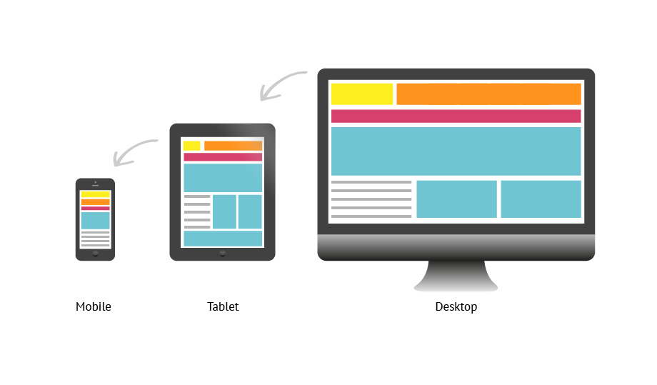
Responsive text is a no-brainer, your website copy will need to reformat to be visible and easily readable. But, to add a layer of complication to web design, images and illustrations must also work across all types of devices. With this in mind, designing websites and illustrations often turn into a puzzle, where elements must shift from wider pages to fit skinnier pages and vice versa. Before diving into a few of the benefits of mobile-optimized websites and illustrations, it’s important to first understand the two main ways you can build your site to work for multiple devices.
Responsive Design vs. Adaptive Design
Simply put, adaptive web design relies on static layouts that detect the size of the target screen and load the appropriate layout for it. We typically recommend designing adaptive sites for six common screen widths: 320, 480, 760, 960, 1200, 1600. However, technology companies are always debuting new devices with new screen sizes. Conversely, responsive web design is a dynamic design method that adapts to whatever screen – no matter the size – an individual is using. More specifically, responsive design uses CSS queries to change screen width, height, display type, etc. to adapt to the needs of a target device. As a digital design agency, we recommend a responsive design for a more fluid user experience.
Now that you have a better understanding of the main ways to adapt your site to multiple devices, keep reading to understand a couple of benefits you may not expect of mobile-optimized websites and illustrations.
SEO Benefits
Many familiar with Google’s SEO practices know that there are three major steps to how it’s algorithm works: Crawling, Indexing, and Ranking. While all three are incredibly valuable components to understand, indexing is the most relevant for the purpose of this conversation. In short, indexing is Google’s process of storing the information and content they’ve deemed relevant for users. Since Google recognizes that most of its users are on mobile devices, they have shifted toward mobile-first indexing, which means Google ranks pages, structured data, and snippets from mobile pages of websites instead of desktop pages.
A key part of this process involves images and illustrations. In the past, many websites have blocked certain illustrations from showing on non-desktop devices. Therefore, Google can’t index these illustrations as valuable content to a user. However, as a digital design agency, we know that Google’s algorithm wants to see and categorize images and illustrations. By having a responsive web design, your website’s images can display on any device, making it easier for your website to rank in Google’s top organic search results.

Visual Triggers
For better or for worse, a large percentage of people comprehend and perceive images faster than words. Generally speaking, people are better able to perceive visual marks and process data when transformed into images. Additionally, almost 80% of users scan any new page they encounter, whereas 16% read word-for-word. Whether users are scanning or reading word-for-word – images, illustrations, and infographics are incredibly important. Not to be cliché, but a picture truly can be worth a thousand words.
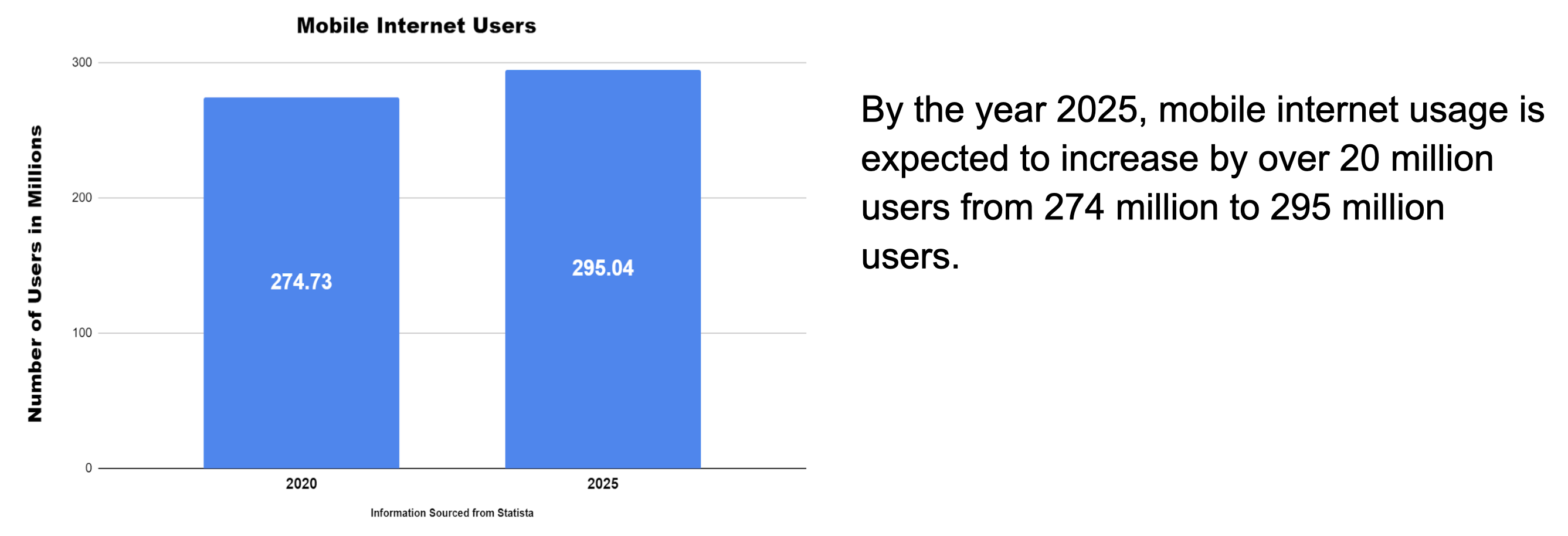
When viewing the information above, which drew your eye first, the graph, or the block of text? This question should always be asked when formatting content on a webpage, as we know that the user’s eyes are more easily drawn to illustrations than words. However, it’s important to note that images can be overdone. Adding too many images can be counterproductive, as it can create visual overkill. An experienced digital design agency, like Bluetext, can help make sure your images are helpful, relevant, and transferable between device types.
Conclusion
Images, illustrations, and infographics all visually communicate ideas and leave cumulative impressions on visitors to your website. By using them, you can create an immersive, empathetic, and humanized sense of context for users. An immersive experience can truly set your company apart from competitors and should be available to a user regardless of the viewing device. With mobile making up almost 60% of internet traffic, mobile-optimized sites and illustrations are necessary to ensure the user experience is fluid, attractive, and usable, no matter the device a visitor is using.
Interested in working with a digital design agency to help with your mobile experience? Contact Us!
What is responsive web design?
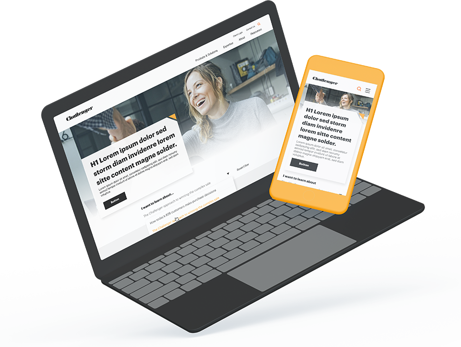
At its core, responsive web design uses a single layout for a web page then dynamically adapts to best fit the user’s screen, whether it’s a desktop, laptop, tablet, or a mobile device. This creates a seamless and recognizable experience for every user and session if viewed on a laptop one day, and on a mobile device the next.
Responsive web design not only improves user experience but also increases development and design efficiency. This method of web design is preferred over an adaptive approach since it reduces the number of layouts designers and developers need to account for. Rather than designing the same page for small and large desktops, tablets, and mobile devices, responsive design dynamically updates page layout to fit the users’ screen.
User Experience and Expectations
Welcome to 2020, where everyone is walking around with a miniature computer glued to the palm of their hands. Users have become more and more comfortable browsing online for everything from e-commerce to B2B research. Even if your business imagines themselves being primarily viewed at the office or on traditional desktop screens, you must accommodate for changes in user behavior. It’s highly likely that your users may find your website while browsing LinkedIn on their phone or tablet, or maybe Googling on-the-go. And if you have successfully captured their interest on a mobile device, you better prepare for a more thorough investigation on desktop. Your website now has two unique sessions that you should ensure are seamless and as familiar as possible. Imagine being blown away by a beautifully designed website, only to show your colleague the next day on your iPhone and find the mobile site clunky and unusable.
As Krisztina Szerovay explains responsive web design, nowadays, it’s more of an expected standard than a luxury for sites to utilize a responsive design. With a significant portion of site traffic coming from mobile, it’s more important than ever to ensure your site caters to all users regardless of screen size.
Work smarter, not harder.
Responsive web design provides many benefits such as increased flexibility, better SEO, reduced costs, and better mobile experiences. Instead of making a new design for each new device or screen size, rapid response allows you to stick with one design. Google recommends using responsive designs as they allow you to focus on a single page while also improving the mobile experience for users.
This approach is also cost-effective thanks to its faster implementation and easier management. Lastly, responsive designs’ simplified layouts provide your mobile users with more enjoyable experiences. And as we already know, with more and more web traffic coming from mobile, a good mobile experience is essential. Responsive web designs have even led to higher engagement, with users visiting more pages on average per visit.
A word of caution, trust the experts
While responsive web design has numerous benefits, it’s worth noting it’s not for every company. This method requires more up-front planning to ensure the design and experience are clear for users. But that’s where Bluetext comes in, our experienced designers and developers collaborate to develop a site that not only meets your goals but also works across all devices.
Indirectly, the responsive method provides additional benefits. Since your site must be designed for all the content to be repositioned based on the users’ screen, we work with you to find the simplest and clearest way to convey your message. Often, responsive designs benefit from a very straightforward design. For example, Apple doesn’t change any of the content that’s shown on their desktop site compared to its mobile site, the only difference is their menu and content placement. With the knowledge of industry best practices, we can guide you every step of the way from content placement to functionality.
Read more about how we recently designed and developed a fully responsive site for Challenger. Our team created a site with current best practices for content functionality while giving more flexibility to the back-end users to accommodate various user journeys.
Have you ever taken a placement quiz on a website to determine which Internet package was right for you? Have you completely filled in your LinkedIn profile to get rid of the accomplishment bar at the top? Have you found something unexpected on a website that caused you to spend more time browsing? If you answered yes to any of the above questions, you’ve experienced elements of “gamification” in web design.
What is Gamification?
Gamification is the act of taking a process that already exists (say, filling out a social media profile) and applying game mechanics to make it more engaging. Some examples of game mechanics frequently used in website gamification include:
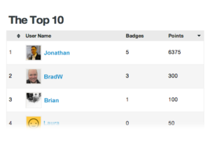
- Points and Achievement – Usesf positive reinforcement that allows website users to set goals, earn badges, and “level up” or gain some sort of elevated status.
- Rules of Play – games typically have set rules of play, including fast feedback (i.e. a star for a correct answer, or a slight change in color for a completed answer, etc.).
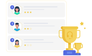
- Competition/ Status – Competition between other users or to get a personal high score, is also a common aspect of gamification. Often, winning will confer some sort of elevated status on users (i.e. a top tier loyalty customer, etc.).
- Self-expression – Social aspects or collaboration could also be considered aspects of gamification – a message board, for example, could be gamified.
You may be thinking, “my business is too serious for a silly game!” However, that’s not what we mean by “gamification”. Gamification is about increasing engagement for an existing process. You could use it for everything from encouraging customers to return to your site to onboarding new employees in a fun way that will stick with them.
Why Do People Use Gamification in Websites?
Gamification can have many examples for websites, including higher levels of adoption (for loyalty programs, for example), conversion increases, or decreases in time spent onboarding clients or employees. In fact, even just one element of interactivity on your site can encourage a deeper level of attention and participation from website users because users intrigued by one element of a site are more likely to search for more engaging content.
According to the Peak-End rule in modern psychology, content that sparks moments of joy or discovery, however brief, is much more memorable than other types of content. Gamification can spark these peaks – with something relatively simple like visual storytelling with minimal interactions (like on a marketing website for your complex product set) to a full-on competition with a leaderboard and diverse levels (like on a language learning website).
Gamification Guidelines
While gamification can be a great way to add interest and interactivity to your site, it also can increase the levels of expectation that users have for your site content and overall business. Here are some guidelines to consider when considering gamification in your web design:
- Make it more than just a fun add on: Gamification methods can’t just be an add on. They must resonate with your business mission and strategy. Otherwise, they will take away from your site and business message.
- Include a way out: Ensure your game elements don’t block users from engaging in other ways with your site. You should use gamified elements to enhance engagement, but make sure you have other options for those who might not want to play or who might be looking for information about you and your products faster.
- Follow logic and keep it simple: Knowing basic psychology is important when adding game elements to a site. If these elements don’t make sense to users, the point of gamification is lost. In addition, you need to keep things simple. Remember, you’re not creating an entire game, just using aspects of games to accomplish a business goal. Sudden realizations (sparks of discovery) are better in progression – you shouldn’t expect your users to learn or retain too many things at once.
Gamification Ideas for Your Business
Everyone’s business is different and will have different possible ways to include gamification in their site. Here are a few for different types of businesses:
- Quiz Mechanics: A quiz or game to figure out which of your products or packages is right for the user. This can teach the user more about what you do and the differences between your packages in a fun way that will be memorable.
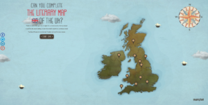
- Real-world example: TravelZoo’s literary map of the UK (to generate buzz for the different cities on the map)
- Social Mechanics: A competition that displays rankings of different users so that more users complete reviews, order more, or come back to use your site or resource more often. A message board on your company website can also be implemented so that users can share good (and bad) experiences with friends and family.
- Real-world examples: Citroen’s on-screen test to get users to scroll as fast as they can (to associate Citroen with speed and enjoyment)
- Problem Solving: You provide users the tools they need to solve a problem that you pose to them. With more information, users receive more content and more control of the process. (To set up Vive’s VR headset, the company put a game on their site – upon completion of which, the headset will be ready).
- Accomplishment and Completion: You encourage users to complete a task that is already halfway done by dangling an accomplishment. (LinkedIn uses a status bar when you’re filling out your profile to encourage you to fill it out more fully and to share on the platform with others).
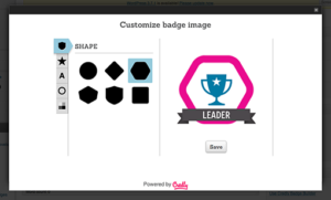
BadgeOS
A great gamification WordPress plugin that we recommend our clients to consider is BadgeOS. BadgeOS is a fully customizable add-on, allowing you to define an unlimited number of types and customize them as much as you like. Utilizing BadgeOS, company’s can design their own badges, define required steps to achieving specific badges, track achievements via a leaderboard, allow users to share achievements via social media, and so much more.
We Won’t Play Games with Your Site – But We Can Gamify It
Want to explore gamification and its possibilities for your site, but don’t know where to start? We can help! Bluetext has a wealth of experience in creating engaging and successful sites, including gamification, from visual storytelling to quizzes, to choose-your-own-adventure experiences. We won’t play games with your site, but you can bet that we can gamify it.
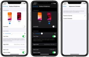
In the past few years, the option for “dark mode” has become increasingly popular as our time spent on-screen steadily climbs. Dark mode is a display setting on a computer, tablet, or mobile device that allows the user to view their content with a predominantly dark theme, compared to the typical white background we find on most websites and apps. So what is the purpose of this change? UX research shows that dark backgrounds enhance page contrast, making visuals pop and easier for the user to focus on.
Early adopters of dark mode will remember when it was only a one-off feature, offered exclusively within certain mobile apps. Slowly, as time passed and more software updates were revealed, operating systems like iOS 13 and Android 10 offered a dark mode option that applied device-wide; making the switch for all of your default apps (i.e. your notepad, weather, and more). Now that dark mode is more widely available on our top visited apps like Instagram, Twitter and soon Facebook, many website designers and developers are wondering if a dark mode option is right for their site.
Is Dark Mode for Me?
There are a number of factors to consider before adding a dark mode setting option on your site. The trendiness vs. the more concrete usability points is the main question to ask yourself. What is the goal of your site? If the focus is on the style and design, it makes a better case for a dark mode implementation. There is evidence that users viewing content in dark mode are able to more easily focus on the visuals on screen, over the content. Dark mode is ideal for distinct CVIs or attractive product imagery. If brand awareness or e-commerce is your site’s main focus, dark mode may improve page performance. If a KPI is more content driven, focusing on conversions and leads, dark mode might not be a critical feature.
Web developers should also be aware of the time needed to implement a dark mode option—both initially and to factor it in with future updates. If the project is already on a timeline with a quick turn around, it could be better to revisit the integration as a post-launch add-on item.
Consider Your Users:
Two key end-user benefits stand out when considering dark mode for your site:
- The highly convincing argument that it may be easier on the eyes. This is pretty self-explanatory. Users are becoming more aware of daily screen time and actively seeking out ways to maintain a healthy balance with technology. For instance, Apple recently released Screen Time, allowing users to track the amount of time spent on their devices. Though it is not the responsibility of web designers and developers to look out for users’ natural light-dark cycles and circadian rhythms, it serves as an added bonus to offer your site visitors a dark mode option. Think of it this way: the easier on the eyes, the longer your visitors will stay on the site.
- It can improve device battery life. That’s right—some developers claim that dark mode consumes only a fraction of the percentage that using a site or application takes from your battery, saving your users time between charges.
With the rise of digital personalization and online interactions, it’s important that your users feel your brand has their best interest in mind. Especially when attracting new users, these subtle enhancements to their experience can make all the difference. Ultimately, dark mode is largely an aesthetic decision, so you’ll want to think through how to integrate this with current branding.
Recommendations for How to Use
If you decide to include a version of a dark mode integration in your site or app, here are some additional recommendations to use as a guideline. Start by establishing an alternate dark mode color palette for your brand. Since your users will be more drawn to the visual aspects of the site while viewing a darker background, make sure that none of the brand colors you’re using are too saturated or too bright in contrast to the dark background.
The development team should explore the options for adding additional theming options to your site using custom CSS classes on existing code. Decide whether you will allow your site’s visitors to choose their display options, revealing a dark mode theme, or if it will be automatically based on their browser settings, and even other in-app indicated preferences if designing for a mobile app. The best option being that whatever you decide for the user’s interaction with it, it should closely resemble other display settings and theme updates available on your site. If these are not present, recognizable icons, like a light bulb or sunshine (for light mode) and the moon (for dark mode) are acceptable for a quick turn-on turn-off functionality.
As the popularity of user-end site personalization options increases, rely on these helpful tools to help the decision-makers on your team in their choice to join the dark mode movement.
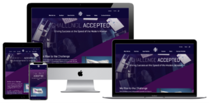
A fantastical idea, a powerful pitch, and energetic enthusiasm from all sides of SonicWall stakeholders. Only one task remaining: execution of the over the top Boundless Campaign.
SonicWall came to Bluetext with one main objective: bring their Boundless Cybersecurity campaign to life. As such, the SonicWall team needed creative assistance in bringing the campaign visuals up to par with their brand value. The Bluetext team was asked an age-old question of B2B companies, “How can we make this campaign memorable?”
Especially in the saturated cybersecurity market, it can be challenging to differentiate from strong competitors and help visual abstract brand promises. So the Bluetext team presented a thought-provoking approach to the campaign’s new creative and campaign taglines.
“When cyber threats are limitless, your defenses must be Boundless.” Break free with SonicWall Boundless Cybersecurity.
To communicate and contextualize this message, Bluetext presented a creative direction that would showcase the end-user in a gravity-free surrealist state, which literally breaks free of the constraint of cyber threat. The creative would be scaled across main industry verticals in order to personalize and target advertisements. The idea was over the top, innovative, and ambitious but well-received with client buy-in. Next came the challenge of execution, which was overcome using a custom photoshoot complete with realistic costumes, props, and even a trampoline. In order to achieve the effect of floating in an anti-gravity state, professional ballet dancers were hired to jump on the trampolines. Photographers captured the dancers posing mid-air, then flipped the photo 180°.


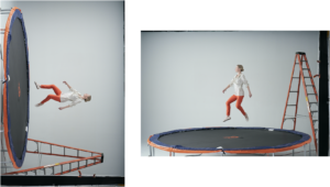

Once the in action shots were captured, the images were edited to remove the backgrounds and impose on industry-specific scenes. Related props were also imposed onto background images to make the scene appear as if person and objects had been magically released from the pull of gravity while the world remains grounded around them.

 At the time of the new Homepage and campaign landing page launch, these static images truly came to life with a subtle parallaxing effect.
To drive users to these newly premiered pages, SonicWall needed eye-catching advertisements that viewers would — no pun intended — gravitate to. Bluetext designed a variety of verticalized static banner ads and further animations to drive page traffic.
Best Practices for Conversion Driven UX Design
If your company has a website published in the public domain, chances are, you know a thing or two about conversion goals. Conversion goals help to measure marketing performance, set goals and most importantly, provide conversions for a company. On websites, conversion goals can range from lead generation to sales to even page views. The point is, you must find your conversion goal and optimize your website toward it. There are various design choices that are simple, yet efficient in achieving different types of conversion goals. The goal is to keep it simple – the lesser the cost per conversion, the higher the return-on-investment (ROI).
Hack Your Way to Higher Conversion Rates
Less is More
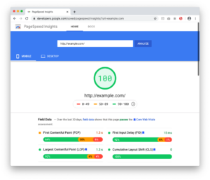
According to CEO of Chartbeat, Tony Haile, “You have just 15 seconds (or less) to convince new visitors to stay through the power of your site’s design alone.” Compared to years ago when web-design trends were over-the-top and animation and flash were all the rage, clean and simple flat designs are what reign supreme today. Market trends indicate today’s consumers appreciate a nice, clean layout. Impress your visitors with your content and offerings. Bombarding them with unnecessary flash and animation not only annoys them, but it also slows down the load time of your website. Whatever you do, don’t mirror your site after this masterpiece. You can always check the speed of your website using Google’s PageSpeed Insights tool. PageSpeed Insights analyzes the content of a web page, then generates suggestions to make that page faster.
Fire Excessive Fonts
When a user lands on a site with various different styles of old and new fonts, it becomes a disjointed and confusing user experience. If you’ve got more than two or three fonts on your homepage, trim them down to create a more modern look. Having two primary fonts keeps your website consistent and organized. While you’re at it, consider increasing your font size for readability. Smashing Magazine reported that “anything less than 16 pixels could impair your site’s readability.” Your website should not only be consistent but also readable.
Give Content a Break
Put yourself in the user’s perspective. Nothing is more intimidating and scary than landing on a page with big blocks of unbroken text. You would bounce too! Large text fields are an immediate red flag that digesting the material will be time-consuming and complex. Mix it up and improve your site’s readability by adding headings, subheadings, bulleted lists and numbered lists to break down content into easily-digested segments.
Improve Your Visuals
While you’re thinking about breaking up content, consider adding imagery. Customers or prospects may need to literally “see it to believe it” and images can be a powerful tool to help contextualize value. Custom graphics and visuals are a great option that is sure to impress users. Cheesy stock photos can seem generic and off-putting, so consider upgrading to simple tools like Canva and PicMonkey which make it easy to customize your images. In addition, if you’re looking to generate confidence in your service or product, try human photography. According to various studies, images of human faces can have a positive image in driving contact form conversions. Remember, people trust people! Human faces help establish an emotional connection, which in turn makes your website a more personalized experience.
Trust in the Numbers
While imagery and human photography might make a subconscious impact on trust, seal the deal with statistics and testimonials. People inherently trust in data and social proof. Statistics can help rationalize and solidify the decision-making process, especially when compared against competitors. Highlighting elements of social proof is an extremely easy and effective way to drive conversions. Consider positioning this information higher on the page, or perhaps in eye-catching designs, so users can be sure not to miss it.
Always Open the Window
Outbound links are a critical component of the ideal SEO formula, but be sure never to lead users away from your site. Make sure that all external links open in a new window. This ensures not only the best user experience for the user, but your site will stay open and users won’t drop off in search of content elsewhere.
Make it Stick
Add a Contact or Sales call-to action-directly in the main menu. Keeping the main conversion at top of mind (and menu) ensures your users are always enabled to contact you. You would never want a customer or potential lead to finally be ready to convert, only to be lost in the site and unable to contact you. To really make your central call to actions stand out, consider implementing a sticky navigation. This means that the main menu will lock in place above your content, no matter where the user is on the page.
Need to make changes to your website to improve your navigation? Bluetext can help.
A Content-First Approach.
Enterprise-level website redesigns are exciting but can be overwhelming. There are countless variables to consider – from appeasing stakeholders and business units, to ensuring an intuitive customer-first user experience that aligns with company-defined website goals and KPIs. One of the most important considerations to think about before embarking on a large-scale website redesign is content. A beautiful, new design is worthless without good content. Users want (and expect) to get value from every website they visit, and that value comes from the content. But at the enterprise level, understanding and applying a smart content strategy can be a daunting and difficult task. Luckily, the content marketing experts at Bluetext are here to help.
6 Key Content Strategy Steps to Take Before Design:
1. Conduct a Content Audit
Before investing in a big website redesign, there needs to be a thorough discovery phase that involves conducting a ROT (redundant, outdated, trivial) analysis to understand the current state of content, identify legacy content that should be removed, any gaps in the content, and ultimately understand if the current content aligns with the redesign goals. Bluetext has industry-leading crawling and scraping tools, such as Screaming Frog, to automate and provide this data. Competitive analysis and market research are also critical steps to gaining insight into how other players in the industry are applying content strategy. Some specific aspects to take note of include:
- Page structure and content flow
- Calls to actions
- Navigation/sitemap
- Linking
- Relevance to the user
- Language/tone of voice
- SEO
- Multi-media usage
2. Establish Website Goals & KPIs
Out with the old and in with the new! In order to create a successful new website, you need to identify the current weaknesses and where improvements can be made. Like any major business venture, it must begin with setting realistic goals. Be sure to benchmark against tactics and KPIs (key performance indicators) to measure the success of those goals. A flashy new website might look nice, but ultimately your stakeholders want to see quantifiable success. It’s important to audit what content is working and has high conversions. Leverage Google Analytics to see what the most trafficked pages are and what users are searching for. Setting up click tracking and heat mapping on your site provides data to help understand user behavior and guide decisions. An example of a website redesign goal mapped to tactics and KPIs may look like this:
-
- Goal: Streamline Product Page Content
- Onsite Tactics: Design product template based on journey-oriented content strategy. Reduce content to highlight the most important and relevant selling points/CTAs.
- KPIs:
- X% decrease in bounce rate on product pages
- X% increase on time on product pages
- X% increase on product page conversion rates
- Goal: Streamline Product Page Content
3. Build out Website Personas for Journey Mapping
Understanding the different personas using your website is pivotal because these users and their unique goals should inform the content requirements. For example, a large software company’s website will have multiple personas. One persona might be a new, less-informed user who is seeking a solution for a specific problem they have. Another persona may be a returning customer and therefore more educated. This informed user might be looking for product support or to try a free download of a new product.
These two users have very different needs for the website and therefore the way they navigate the site will be different, and the website content and design need to account for that. Understanding the goals of the various personas and the likely journey or path in how they use the site to achieve that goal directly impacts the content and the content hierarchy they should see.
4. Create Data-Driven Navigation
An intuitive site structure (displayed via the navigation) is integral to a great website. The navigation informs the user how the site is structured, and when done well, helps guide the user to the content they need to see. According to Sweor, “88% of online customers are less likely to return to a site after a bad experience.” Considering many customers rely on either search or the navigation to guide them, having an intuitive navigation that ensures every persona has a clear path to their destination is key. Think of your sitemap as a personal GPS through the sales funnel. It should route a user from a unique “Current Location” to the end goal of conversion. Analyze user-behavior data to better understand how different customers are using the navigation currently. Is there a significant difference between new and returning user behavior? Also, see if there are other ways customers are using the site that aren’t accounted for in the navigation that should be. Once a proposed sitemap/navigation is created, conduct usability testing to validate the new structure.
The goal of a good navigation system should be to get the user to the most relevant content as quickly and easily as possible. Much of this comes from smart design, but content plays a big role here, too. Use skimmable, digestible words that customers understand, not lengthy, internal company jargon. Users are quick to click, so using copy that resonates fast and leads the user to the right path will provide a better experience for them. This applies to content across all pages as well as navigation content. “Most of the time we don’t choose the best option—we choose the first reasonable option.” Don’t Make Me Think, Steve Krug.
There are only a few chances to convince the user that they can get to the content they need before they get frustrated, bounce, and look elsewhere at another site. As such, every piece of content needs to be thoughtful and intuitive.

5. Define Goals for Each Page-Type/Template
At the enterprise level with hundreds of products and solutions spanning multiple business units, it becomes extremely difficult to give all the content the time and nurturing it needs. It becomes tempting to simply include everything as a “catch-all”, but this is a fast-track to overwhelming and losing user interest.
As mentioned previously, different personas require different content. Defining goals for each page-type/template helps focus the content to achieve that goal. Is the call to action driving a conversion for that goal? Are the proper users being driven to this page to achieve that goal? Do these page-specific goals align with the previously set redesign goals, tactics, and KPIs? Once goals are well-defined for each page-type/template, then the content requirements and hierarchy should be thought out accordingly.
6. Determine Content Requirements and Hierarchy
Now that page goals are defined, it’s time to determine content requirements and content flow. The content should be aligned with the goals of that page and when done right, will improve conversions. The order of the content displayed is important, as users skim and expect to see the most relevant content at the top. The perfect marriage of content and design always refers back to the goals and on-site tactics. Ensure the content drives the user to perform the goal of that page (whether it’s downloading a free trial, contacting sales, submitting a form, etc.). Once content requirements and hierarchy are well defined, then it’s finally time for design!
Understanding and planning out content needs early-on makes the design process more efficient and effective. That being said, the biggest ROI for smart content strategy will be proven after launch when those previously defined KPIs improve.
Looking to get started on your next big website redesign? The experts at Bluetext are ready to help!
Always keep in mind: your website is the first impression that users will get to see what it’s like to do business with you. Just like you would put on a clean suit for a pitch, put on your best interface on your website. Do not drive away a business opportunity by designing a cumbersome website that is hard to navigate! Below are the best practices for implementing a B2B navigational system with users in mind.
Create a Buyer Persona
When thinking through your navigation, it is important to focus on who is buying your product. A key goal should be to tailor your navigation to buyers, without excluding any potential leads. A way to do this is by creating buyer personas.
Buyer personas are fictional representations of who is buying your product. Your personas should be rooted in data from analytics tools such as Google Analytics, Hotjar, or Siteimprove. When making navigation decisions, ask yourself, WWMBD — “what would my buyer persona do?”.
Bluetext, as a top UX design agency, uses a combination of quantitative web traffic data and stakeholder perspectives to ensure a comprehensive understanding of a business’ users. It is always important to put trust in the numbers, but also consider the unique perspectives a sales or product marketing team may bring. A bounce rate may key you into acknowledging a problem but does not always explain the root of frustration.
Declutter Your Navigation
According to a study conducted by Hubspot, 76 percent of people answered that the most important factor in a website’s design is the ease of use. In order to make your website as easy to use as possible, declutter your navigation and design it to be scannable and intuitive.
A good rule of thumb for decluttering navigation is to present the user with no more than six top-level navigational choices in your main navigation. If more than six choices are needed, consider creating a utility navigation for items that could be considered “tools” or require action. Utility navigations provide a sense of hierarchy and create separation from content that could be mostly for browsing or educating buyers on the products and services your company offers.
Need some help purging your navigation? Get a fresh perspective! Hiring a UX agency will give your site a fresh set of eyes to evaluate what is and isn’t needed. Like a true scientist, a UX design agency will also use tools to test their theories with tools such as a tree test to validate proposed sitemaps.
Implement Sticky Navigation
Usability studies show that implementing a persistent website navigation, or a “sticky navigation” increased website conversions as much as 10%. Studies show that users were able to focus on the products on the webpage they were on and scrolled further down the page when the navigation was always at the top of the screen.
Keeping navigation items accessible at all points of the user journey will help avoid the “dead end” scenario if lost on a page. It’s like having a built-in GPS for your user journey to always present alternate routes and course correction.
Make it Easy for Users to Contact You
Having your “Contact” button in the top navigation, as well as your footer, ensures that users will be able to get in touch with your business no matter where they are on the site. There is nothing more frustrating than wanting to get in touch with someone without the proper means to do so. If you implement a sticky navigation as stated above, adding “Contact” will serve as a persistent call to action leading to more leads generated from your website.
Need to make changes to your website to improve your navigation? Bluetext can help.
Your website acts as an essential business tool — used across every industry for a diverse number of functions. B2B companies rely on their websites to generate leads, phone calls, or physical location visits. No matter what function your website serves, there is one universal goal every business wants to accomplish with its website: leveraging it to create more growth.
There are several ways to increase your leads, sales, and revenue without investing in a complete redesign and rebuild. A great website will enable your team to work smarter, not harder. Here are tips that you should consider trying — while simple, they can help your business grow significantly.
1. Responsive Design
Mobile accounts for over half of global website traffic; if your site isn’t mobile-friendly, you may be losing valuable leads. In the coming years this number will only increase, and ensuring a mobile-friendly design may be crucial to your future success. A responsive website design (RWD) adapts to fit any screen in a way that makes all pages, features, and actions accessible to users. Making sure that your website can support traffic on any browsing device ensures that users are not dropping off your site because they cannot access what they’re looking for.
2. Simplify Your Navigation
In order to increase conversions, you need to keep users on your website. When a user lands on your website, they should be able to quickly and intuitively navigate to relevant content, allowing them to find the information they need without losing interest. The first step to keeping a user on your site is maintaining a simple and intuitive navigation. Too many options will likely overwhelm your user; it is important to have a clear path for users to the action you would like them to take as well as the information they are looking for. Otherwise, they may look elsewhere.
3. Avoid Clutter and Complex Noise
While incorporating animation and motion on your website adds visual interest for users and helps your site stand out, it’s important to be aware of the balance between unique design and overly-complex noise. Too much movement can be overwhelming for your user and may detract from what they originally came to your website to achieve. A complex design can also negatively impact your site speed, potentially increasing bounce rate and affecting your SEO score. While finding a middle-ground between these two extremes can be difficult, it’s important to ask if new design elements will add value to the end-user.
4. Don’t Go Crazy With Your Fonts
While fonts are an easy way to enhance your CVI and bring visual interest to your website, they may also be difficult to read for some users or on some devices. Using a Sans Serif font for your website’s body copy and making sure the font size and color meet accessibility standards is crucial in getting your message across to users. If they are not able to read the content on your site, they definitely won’t be converting.
User experience is crucial to effective website design, but so is your internal team! Here are some tips to streamline the digital sales process for end-users and internal teams. A positive user experience will directly translate into increased conversions.
Use Call Tracking
If driving users to make a phone call is one of the main goals of your website, it is important to know which page has prompted the user to make the call. You can easily track this information by using unique phone numbers on different pages, allowing you to determine which page is driving the most traffic to your call center. These numbers can easily be configured to route to your main phone line, meaning there won’t be any disruption to the way you’re currently handling phone leads.
Install Live Chat
While live chat may not seem immediately relevant to your business, every website can benefit from this simple tool. Live chat functions to facilitate interactions with your users and enables them to quickly get the answers they’re looking for without spending too much time hunting around the site. Many chat services will also integrate with mobile phones, allowing your business to easily monitor traffic.
To learn more about driving leads via a responsive UX design and how Bluetext can help you increase conversion rates, contact us today.
Looking to jazz up your website? One of the hottest website design trends in recent years has been on page animation. But like any design decision, there are pros and cons. Bluetext top website user experience designers weigh in on the debate on how far you should go in injecting motion to your website.
To animate or not to animate?
Animation enthusiasts recommend adding motion to create a dynamic and flowing user experience. Not to mention, animation has been a major web design trend over the last few years, meaning your visitors are accustomed to seeing it on competitor sites and therefore expect a comparable experience on your pages. The opponents, or static supporters, on the other hand, will argue that animation is distracting and can seem unprofessional in certain industries. For example, B2B has traditionally been a strictly static and straightforward approach to website design, leaving the flashy frills to more consumer-based websites. However, having an interactive animated website could be a valuable point of differentiation. So what do the experts recommend?
Truth be told, animation can be a wonderful addition to a website’s aesthetic and functionality, but only when executed in the right way to fit your broader business goals. Careless integration of animations into your web design scheme can be a real eyesore and have negative impacts on site speed, SEO, and user experience. Weighing these pros and cons carefully, Bluetext website user experience designers recommend subtle animation and keeping in mind the following considerations.
Not all animations were made equal! Motion design spans a wide breadth of categories. Bluetext recommends the following types for a professional, yet modern feel to your site.
1. Loading Animations
Loading animations can be used as an effective way to engage users from the get-go. Since it only takes a user 3 seconds to abandon a page if the content doesn’t load, the use of loading animations offers content right from the start. Animated typography, countdowns, or a simple animated logo allow users to have fun watching while waiting for the site to load.
2. Micro-Interactions
Taking a cue from the mega “micro” trend sweeping the digital marketing industry (microtargeting and micro-moments sound familiar?)This effect is one of the hottest trends of website design. These are used to make small interactions (such as clicking a button) quick and clear for the user. Hover effects are one of the most well-known examples of micro-interactions. Certain page elements, such as navigation buttons, CTAs, or linked images, are the ideal canvas for mico animations.
3. Page Transitions
Subtle animation can be purposefully to ease the navigation from one component to another and between pages. Arrows, background scrolling, load bars, or any component that offers directionality to the user are great opportunities to use this effect.
4. Parallax Scrolling
Using full-width imagery, this effect takes the user on a cohesive journey as they move down the page. By definition, the background moves at a different speed to the foreground elements, creating a visually stunning effect on either full-page backgrounds and strips. While this is sure to give a wow-factor to your main website, it’s important to remember this effect is not available on mobile devices.
5. Decorative Delights
While these effects do not offer any functional benefits, they can be used to add more interest to the page. While it might be difficult to imagine serious B2B websites using these layouts, this might be exactly what your site needs to spice up drier content sections. Especially when placed near elements intended to draw attention, such as new messages, lightboxes, key CTA buttons, this turns aesthetic pop into actionable results.
With so many options for website motion, it can be tempting to want to do it all. However, top website designers have one golden rule: moderation is key. This rule doesn’t just apply to junk food, overdosing your site on fun animations can overwhelm the viewer and distract from the most important aspect: the content! Use animation sparingly and strategically. Before you fall in love with a beautiful design, consider the practicality. There are instances when animation could actually detract from your site, for example, if it hinders a user’s ability to read important messages or complete a conversion. For instance, you shouldn’t add animation to text paragraphs because it will make reading them much harder. You also would not want to add animations to fields where visitors enter their own content (such as a contact form or comments), because it would distract them from completing the task. When considering embedding motion effect, pressure test your decision against these questions:
- Does the site’s movement guide the viewer when to scroll and where to click?
- Does the animation support brand storytelling by gradually revealing information?
- Does the animation help a viewer visualize your product or service’s impact?
- Does this effect break up static scroll?
If you can answer yes to these questions, feel free to act on your motion goals! As long as you consider functionality first, animation can be a powerful visual tool to capture your audience and drive them deeper down the sales funnel.
Are you looking to drive users to your website using animation, but don’t know where to begin? Get in touch with Bluetext.