This is certainly not news, but the amount of information available to target customers continues to grow by the day. Researching issues that might seem obscure and unique means sorting through dozens if not hundreds of options, regardless of how detailed or long-tale the search. The amount of information can be overwhelming, and quickly finding the best answers is becoming a more difficult challenge. This is especially true on the Internet, where chaos and complexity reign. The dilemma is that buyers don’t want to sort through the noise; they want simple choices to complex problems.
Brand simplification is one of the strategies that Bluetext is recommending to our clients as a way to reach customers with a message that resonates amongst the clutter. Paring down the brand to its core values can play across its presentation, its key messages, and even its logo. This is the essence of brand simplification, and it can be an effective approach when refreshing a brand.
People want choices; they just don’t want too many choices. The same is true when it comes to research on the Internet. They enter long-tale searches because short phrases offer too many options. Yet when they visit your site, are they quickly seeing the information that they want and need to engage with your brand, or are they confused about what you are stand for, what you are offering and how you’re different than your competitors?
For more established brands, simplifying the brand presentation to the market can convey both brand value and confidence in their relationship with their customers and a broader audience. We can see how this has played out with logos from Starbucks, Microsoft, and even Pepsi. In each case, the logos have evolved dramatically over time (and in the case of Pepsi, over a long period of time), beginning with a busier mark and moving to a more simplified design that retains many but not all of the original elements.
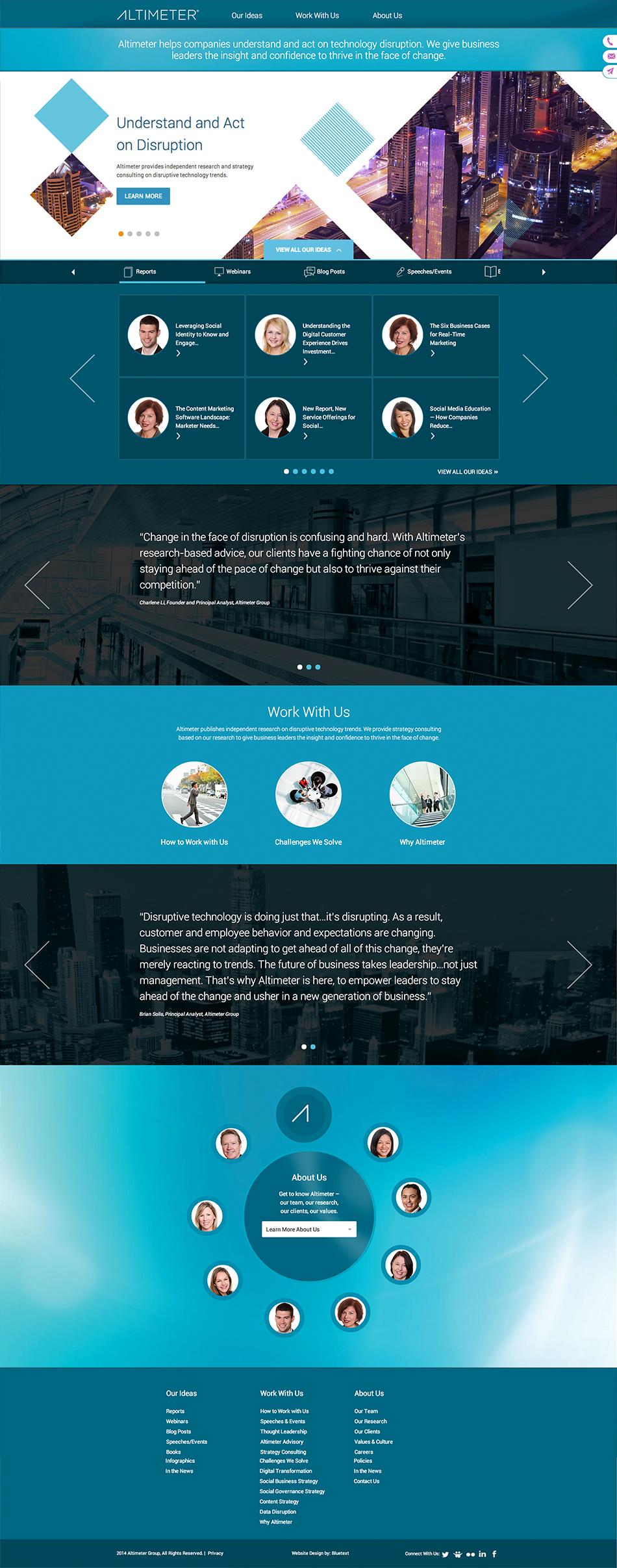
From logo to messaging to the larger brand presentation, this was the recent challenge facing the Altimeter Group, a successful research, analyst and consulting firm in the digital market based in Silicon Valley. It publishes a wide range of cutting-edge analyses on social media, native advertising and other trends that can help companies better engage consumers, and its team of experts has become a go-to resource for reporters and executives alike. When Altimeter Group wanted to update its brand, it turned to Bluetext. Bluetext designed a new, simplified approach, including how it presents its name, its image and all of its digital and physical assets.
We began with the simple premise that a brand simplification would help Altimeter deliver its core value and message more directly and effectively, and began with a recommendation to adopt Altimeter as a single word. The logo was streamlined with a contemporary design, and the color pallet and typefaces were revised to match.
A significant part of the brand refresh was a new website that engages visitors and provides information in a simplified and more direct approach. Instead of a multitude of confusing navigation options, Bluetext’s design offer three content paths – Our Ideas, Work With Us, and About Us. This approach allows visitors to quickly find the research they are looking for, how to engage Altimeter, and background on its team of experts without having to click through layers of pages. The content is highly search optimized.
Core to this approach is simplification of the way Altimeter tells its brand story, its new look and feel, and the way it engages its audience. When coming to the Altimeter site or seeing its new collateral and reports, there is no question about the story it wants to tell. There are still many content options for visitors to the new website, ranging from a broad selection of research to blog posts and articles from a variety of its experts. The difference is that the process to reach those options is simplified. The Altimeter team is easily found, navigation is reduced to its core elements, and messages are clear and direct. The new brand leverages the position that Altimeter has established, and will help take Altimeter to the next level in the market.
