Real Estate marketing is a fast-paced and ever changing target, and we often see big trends come and go in how websites are designs. Many of the real estate centric web design trends we’ve seen in the last few years are still around, and more new trends are emerging in 2016.
Here are 5 trends that will likely dominate the best real estate websites in 2016:
Stick with Sticky
Fixed or “sticky” navigation bars are a prevalent trend in some of the most shockingly beautiful sites across the web. These benignly set bars allow for ease of access to a website’s core functionalities, regardless of where a user may be in the midst of a page’s content.
Some pro’s for going with a sticky interface:
• Advantages in usability
• Speed up your customer journey
• All the cool brands are doing it – its white hot
Real estate companies like HomeAway.com and Kangaroom.net are doing this very well. With users needing to recall all their search parameters and being able to easily toggle from map view to list view, Real Estate is one of the best vertical markets that can benefit its digital experiences by adding sticky interface elements.
Hamburgers Attack
We have all seen the hamburger icon. As a matter of fact most of us probably use it on a daily basis. It has become a staple in website and app design. I’m even looking at it now on the top right corner of Google Chrome.
Real estate sites continue to attack their interface design projects with hamburgers. Why? Because hamburgers are the most minimal interface you could have. And that means more screen real estate for those great real estate images and videos.
Where are you with Wearables?
Wearable Technology is the latest “next big thing” and its main focus is making life simpler.
Wearable technology will redefine the world. The shift to the proliferation of mobile devices meant that many new design principles had to be created and learned. The same will apply with Wearables, so don’t get left behind!
All websites for real estate companies should look at their responsive website design deliverables and add wearable browsers to the list of deliverables you would like to see your website looking optimized for.
Suggest “Search Suggest”
As digital advertising costs continue to rocket, having consumers search on your website instead of Trulia, zillow, redfine, etc is more important than ever.
If you’re optimizing your site aggressively that should be accompanied by a search centric homepage and general interface design.
The old adage was you want less clicks to the most critical conversion points. How about ZERO clicks. Search should be up front and center and EVERYWHERE.
On top of being search centric, you should streamline even further with a multi data point search suggest experience. In that magic AJAX powered fly out you should have closest geographic matches which have accompanying information like real time pricing and inventory, and other compelling content.
3D Virtual Tours
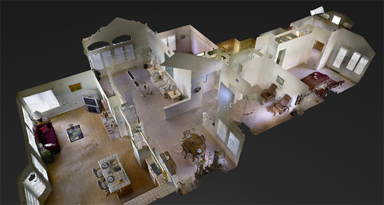
Companies like Matterport have introduced a ground-breaking technology for real estate – 3D Experiences assembled from still photography. Think Google Street View for your interior home tours. Create a realistic and immersive online experience covering the entire interior of any home. Captivate Buyers and impress Sellers with this innovative technology.
With 3D Experiences, companies like Matterport are revolutionizing how brokerages and agents showcase homes. A special camera rotating 360 degrees and controlled by an iPad is placed in multiple locations in every room in the home. The image data is then uploaded to a cloud server, and then you have a captivating 3D model of the entire home is ready for viewing. Embed this model directly into your Virtual Tours so Buyers can experience the 3D tour everywhere your content goes, be it your corporate website, MRIS, Realtor.com, your Broker site, your realtors site, Zillow, Trulia, RedFin and many more. A great company for capturing Matterports are HomeVisit.


