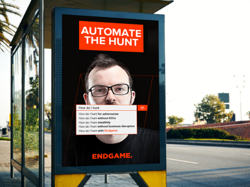
It’s common knowledge you don’t market to fit in, but rather to stand out. This used to mean simply a compelling headline, an eye-catching graphic, or a clever jingle no one can get out of their head. But as marketing mediums, standards, and placements have grown, so have the competitive stakes. While many marketers have shifted their mindsets from traditional placements (think signage, television commercials, newspaper ads) to more digitally destined formats, there is still significant value to what is known as “out-of-home” advertising, especially when all of your competitors are placing their bets on the search and social ads.
What do we mean by “out-of-home”? Well quite simply, it’s any advertising that can be seen outside of a viewer’s home. It’s one of those terms that is best described as what it’s not, aka a television or streaming ad, any digital display ad (which yes, can be viewed outside of a home setting, but besides the point). Traditionally this included billboards, buses, posters, transportation station signage, street furniture, etc. But as we mentioned, competition is fierce, and unlike the digital ecosystem physical space is limited, therefore, driving price and competition. Hence, we’ve seen a trend in companies turning to more “out-of-the-box” placements to stand out. In this post, we’ll evaluate some of the unique out-of-home finds intended to stand out and make a memorable impression on viewers.
Before we fully dive in, we must disclose that we are not advocating for the effectiveness of these ads. But rather an appreciation for the unconventionality of these strategies. In theory, advertising should hit viewers at a point of memorable positive experiences, which therefore will get associated with your brand. No wonder baseball park signage and billboards in proximity to popular vacation destinations are so popular. The viewer will remember your ad in conjunction with that great memory of a win against a rival or anticipation for a long-awaited vacation. So whether these out-of-the-box ads are associated with positive experiences is well, debatable.
Fortune Cookies:
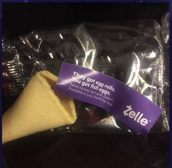
Now here’s a neat one. Imagine you’re at your favorite Chinese restaurant and the check comes. Whether you’re superstitious or a little stitious, you must complete the standard ritual of cracking open your fortune cookie to see what awaits.
And what do you know? A little ad falls out. Now when the promotion makes sense, this actually can be quite effective. Look at Zelle for example, placing ads that specifically reference splitting a restaurant check at the exact time one may be dividing up the check amongst friends. Pretty clever call to action at a strategic time, but just make sure your audience isn’t getting jipped of the fortune they know and love.
Bathroom Stalls
We must say, if there’s one place to capture a viewer’s singular eyeline and undivided attention, it’s in a public bathroom stall. What’s more in your face than a huge poster staring back at you in a public restroom? Or to really make a splash, take a cue from I Love You, Man’s urinal cake idea:
Forms Captcha:
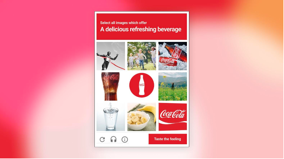
The reCaptcha forms completion. We all love to hate it. But some brands, particularly consumer brands, have turned the obligatory submission request into a fun reinforcement of their brand messaging. Coca-Cola’s unique spin prompts a user to select an “delicious refreshing beverage” aka one of their products from the tile of images rather than unappealing taxi cars.
Kit-Kat goes a step further with an interactive element that asks users to drag a finger across their candy to “Have a break”.
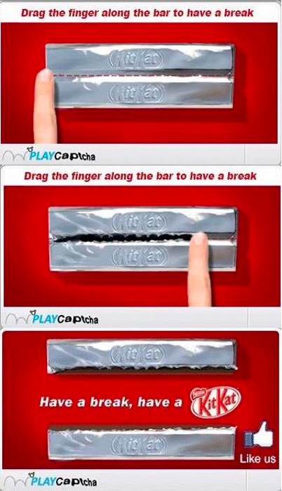
Each of these examples serves to reinforce brand taglines and catch users off-guard with appetizing reminders of their product.
Airport Security Bins:
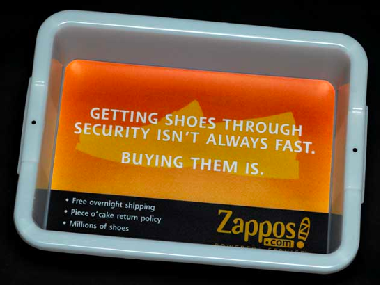
Again, the premise of scrambling with your shoes and unpacking belongings in a crowded airport security line isn’t everyone’s favorite memory of the vacation. However, branded security bins when they make sense can be a clever way to catch a viewer’s attention and make them smile. Zappos for example takes a comedic spin on the frazzled shoe removal process with a reminder that while tying up your laces may not happen in a flash, their shipping speeds will.
Gas Station Pumps:
Ever been slightly startled by a spontaneous jingle playing at the gas station pump? Yeah, us too. We must admit the logic is there. The viewer is standing face to face with the pump, undoubtedly bored and waiting for their tank to be filled. But alas, their attention is grabbed by a video ad for some product or service they weren’t previously thinking of. It could be powerful, but it could also be perceived as annoying or in these times associated with upward tick of their escalating gas price.
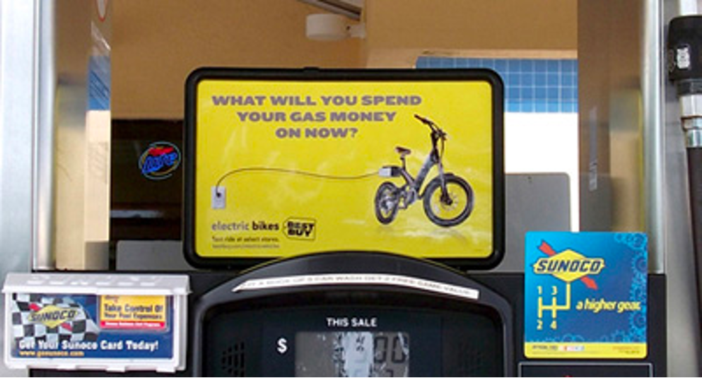
This electric bike example cleverly acknowledges the dread of rising gas prices by promoting a more environmentally friendly option.
Looking to stand out in your marketing activation efforts? Whether that be through out-of-home advertising or digital media avenues, get in touch with Bluetext today to determine the correct media mix given your business goals and budget.
