The XXIV Olympic Winter Games have come and gone, in what felt like the blink of an eye. Even though the Games span only two weeks following the Opening Ceremony, there are years—and sometimes decades—put into their planning. A key piece of that planning is setting the visual identity of the Games, which is no small task. We all know the iconic five-ring emblem that symbolizes the union of international athletes, but each host city gets the opportunity to create its own unique logo. Olympic logos of the past have varied widely in color, type, and style, and each new logo is put to the test to tell a story not only about an Olympic season but about the host country itself.
A quick glance at all the different Olympic logos of the past makes it clear that there’s no clear-cut formula for an Olympic Games’ brand system (except the inclusion of the Olympic rings, according to the Olympic Charter). We’re going to take a look at the Olympic logos of yore and dissect our favorites and not-so-favorites through superlative-style judgment.
Best Abstract Use of the Olympic Rings — Atlanta 1996
Incorporating the Olympic rings is a requisite part of all Olympic logos, but that might get a little repetitive after over 50 Games. We appreciate the Atlanta 1996 logo’s integration of the rings with the column—the mark hints at the Olympics’ Grecian beginnings, the Olympic torch, and even manages to squeeze in the number ‘100,’ celebrating the centennial of the games.
![]()
Best Direct Use of the Olympic Rings — Innsbruck 1964
There’s something to be said for a simple, classic logomark like the Innsbruck 1964 logo. Using the coat of arms of the City of Innsbruck as a starting point, this logo features the rings prominently and uses an elegant typeface for the host city and year. We can’t think of a more classic, straightforward Olympic logo.
Best Out-of-the-Box Typeface — Rio de Janeiro 2016
The logo for the 2016 Rio de Janeiro Games feels like a celebration, exactly as its designers intended. This mark took inspiration from Carnival and uses organic forms and lettering to convey the energy of both Rio and the Olympic Games. This approach brilliantly tells a story while standing out from the crowd.
![]()
Best Out-of-the-Box Color — Sarajevo 1984
Working with the Olympic rings may feel constricting color-wise since there are already five colors to contend within a design. That didn’t stop the designers of the Sarajevo 1984 logo, who washed the whole logo in orange for the primary mark. This approach is particularly interesting because the logo was permitted to appear in any color so long as the entire mark appeared in a single color.
We’d be remiss to close this category without giving a nod to the London 2012 logo which, while controversial, was striking in its use of hot pink. They can’t all be winners, but we appreciate the bold approach.
Best Use of a Human Figure — Nagano 1998
In the Nagano 1998 logo, seven abstract human forms make up the petals of a flower, nicknamed the Snowflower. We like this mark not only because it defied expectations for a snowflake or other wintery symbol, but because it was the starting point of an environmentally-focused Olympic identity.
Best Minimal Logo — Tokyo 1964
Stunning in its simplicity and symbolism, the Tokyo 1964 logo is heralded as one of the all-time greats in Olympic logos. With the Olympic rings set in gold beneath a version of the Japanese national flag, this mark features traditional Japanese colors signifying peace and prosperity. Despite its minimalism, this logo manages to acknowledge the host country, the traditional Olympic identity, and the moral foundation of the Games.
![]()
Best Maximal Logo — Rome 1960
Poised between two relatively simple Olympic identities (Squaw Valley 1960 and Innsbruck 1964), this maximalist logo was an obvious pick in this category. In a departure from ‘60s graphic design trends, this mark harkens back to classical Roman motifs and styling. While it may not be everyone’s cup of tea, we admire the dedication to national legend.
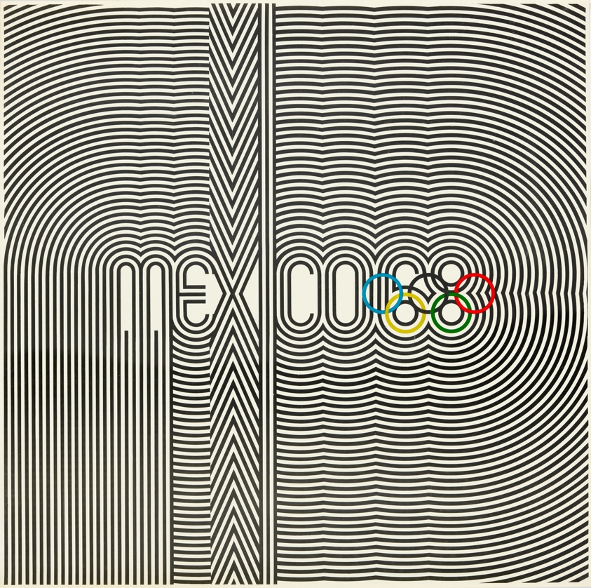
Best in Show: Summer — Mexico 1968
Our winner for Summer Games logos has to be Mexico 1968. Not only does the logo incorporate the rings creatively, but it’s also reminiscent of athletic uniforms and traditional Huichol art. This mark is the basis of a fascinating brand identity—for starters, the official Olympic poster looks like album art. Sure, this logo may be a little busy, but what it lacks in refinement, it makes up for in energy.
Best in Show: Winter — Sapporo 1972
We love the Sapporo 1972 logo because it’s unlike any other Olympic identity, and it was perfect for its time. With a Bauhaus feel, this mark features the rising sun symbol from the Japanese flag, a stylized snowflake, the Olympic rings, and a single line of text. Despite including only basic elements, the unique stacking and coloring of these elements make this logo one of our favorites.
Best Iconography — Tokyo 2020
The iconography that’s developed alongside Olympic identities changes with the logo, and we wanted to honor an icon system that we think was particularly elegant. The icon set for the Tokyo 2020 games included icons (or pictograms) for each sport, including the five new sports introduced to the Olympics that year. Each icon is skillfully-made and coincides beautifully with the 2020 Olympic logo.
Judge’s Favorite — Munich 1972
A personal favorite that didn’t get identified in any of the above categories, the Munich 1972 logo’s name says it all—”Radiant Munich.” The abstract sunbeams are eye-catching, and the overall brand identity feels both joyful and serene.

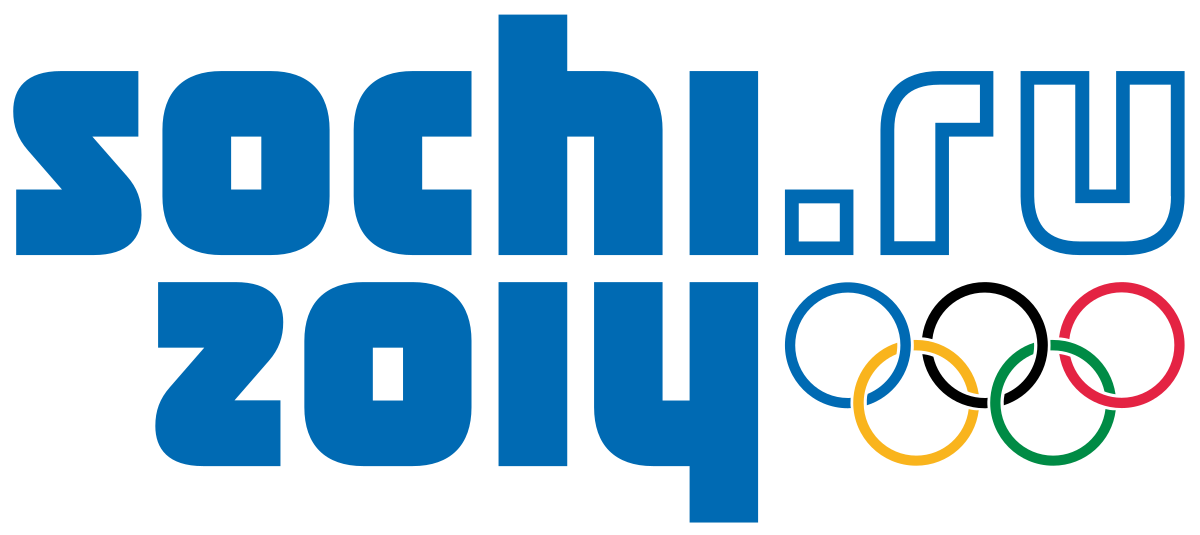
Judge’s Least Favorite — Sochi 2014
While this logo was meant to convey sentiments of modernity and the coming digital age, it misses the mark. Suffice to say, there’s a reason that no Olympic logos in the 8 years since have included a URL.
There you have it—our take on some of the best and worst Olympic logos to date. We encourage you to explore all of these logos yourself on the Olympic website, and to explore other opinions like Milton Glaser’s for AIGA.
The logos for the Paris 2022, Milano Cortina 2024, and LA 2028 Games have all been unveiled, but given the controversy over and subsequent redesign of the Tokyo 2020 logo, we’ll wait to grade those logos until their respective Games pass. In the meantime, if you’re in search of a new logo or brand identity, get in touch with the team at Bluetext to learn how we can team up and go for the gold.