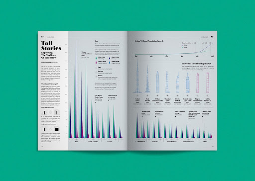
As a top digital design and branding agency, Bluetext is familiar with the common client concern, “how can I tell my company’s story with data?”. Recent studies have shown that consumers follow directions and digest information with text and illustration over 300% better than when presented solely with text. It’s true; a picture can tell 1,000 words — and often better. Infographics, statistics, charts, and data visualization design can seem daunting. Whether working with complex or diverse data sets, the design process can often feel overwhelming and messy. Bluetext sat down with our veteran Design Lead, Augusto Pagliarini, to discuss the do’s and don’ts for creating captivating infographics that speak louder than words.
At Bluetext, upon receiving a creative brief, user experience designers dig to research and assess the UX best practices. When designers work with project managers, they like to review research –which is leveraged to show the client examples and directions that might inspire our infographic. This could, for instance, include exploring two options, to see how we can show their data in a multitude of interesting ways.
For research, some of the preferred design resources include Adobe’s Behance, Dribbble, and Pinterest. These websites are great places to discover good layout inspiration and to see what is trending in the design world.
Infographic design is both an art and data science. One of the most important steps in the creative process is wiring and sketching out the infographic, rather than jumping straight into color. Bluetext design best practices start with a sketch to get the client’s reaction. Graphic designers will draw shapes and lines, all with pen and paper. Efficiency is king, it can be a waste of time to create initial sketches in a high-fidelity format such as XD.
Bluetext is a data-driven agency- so our primary focus is looking at the data first, then designing around it. The next step typically involves using Adobe Illustrator, which allows for creating a vector format. These designs allow for infinitely scalable vectors, so our user experience design team can swap out sizes with relative ease.
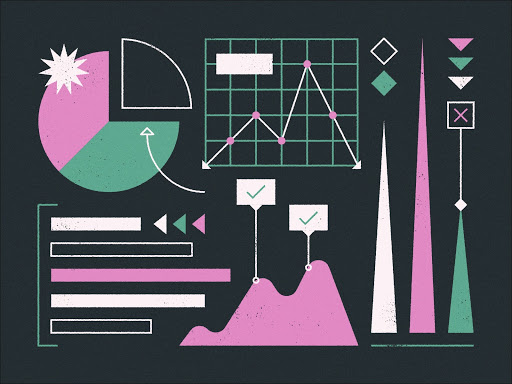
It’s important to know the end-user and the audience. User personas are the base of creative style and direction. Some questions our team considers are should the infographic be playful, or serious in tone? More illustrations, 3D isometric style, or photo-realistic? When it comes to the high fidelity designs, our design team considers if the infographics need to use the client’s branding, working off a set style guide to avoid common pitfalls in infographic design such as using too many fonts and colors. Another key focus is on accessibility– all audiences need to be able to read these items, so a lot of thought is put in at the frontend of the design process to make sure it’s legible, and that the data flows well.
It’s critical to cite your sources and ensure that the design allows for that. This enables our clients to showcase their credibility – whether it be in disclaimer text or link if it is a digital asset.
Top Tips to Follow:
- Know your audience and end goal
- Keep design simple
- Show, don’t tell
- Follow style and brand guidelines (where appropriate)
- Do your research!
Faux Pas to Avoid:
- Overcomplicating things
- Designs that are hard to read or follow
- Having no flow or hierarchy
- Hierarchy: In this sense, it is guiding users on what to look at first, what are the supporting points of the infographic, are there too many colors that catch my eye?
- Having no flow or hierarchy
- Too much variety in colors, fonts, and textures
- Too many colors, fonts, and treatments create a lack of uniformity in the entire design. Sticking to a style guide can keep infographics digestible and visually appealing.