In today’s competitive marketplace, brand recognition and trust are paramount. As consumers are bombarded with countless brand messages daily, companies need to find ways to stand out while maintaining a connection with their audience. One effective strategy is the use of simplified logos. These logos, with their minimalist design, offer a clear and memorable representation of a brand, enhancing both recognition and trust. For marketing leaders, understanding the power of simplified logos can be a game-changer in building and sustaining brand equity.
The Power of Minimalism in Branding
Simplified logos embody the principle of minimalism, which focuses on stripping down designs to their essential elements. This approach resonates well in an age where consumers prefer clarity and speed. A simplified logo is more likely to be remembered because it is free from unnecessary details that can confuse or distract the viewer. By focusing on core elements, brands can communicate their identity more effectively.
Consider some of the most iconic brands globally—Apple, Nike, and McDonald’s. Their logos are simple yet powerful, instantly recognizable, and deeply ingrained in consumer consciousness. This strategic minimalism not only aids in recognition but also suggests a level of sophistication and modernity that appeals to today’s discerning consumers.
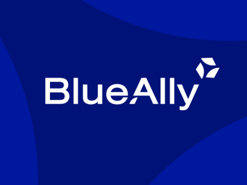
Great design drives real business outcomes. Discover how we connected the two for BlueAlly.
Enhancing Brand Recognition
Brand recognition is a critical component of marketing success. A simplified logo aids this by being easily identifiable across various platforms and mediums. Whether it’s on a billboard, a mobile app, or a business card, a simple logo maintains its integrity and impact. This consistency is crucial in reinforcing brand recall and ensuring that consumers can quickly identify the brand among competitors.
Moreover, as brands expand globally, simplified logos transcend language barriers. They rely on universal symbols or shapes that can be understood regardless of linguistic differences, making them especially valuable in international markets.
Building Trust Through Design
Trust is another pillar of brand strength. Simplified logos convey reliability and transparency. In a world where consumers are increasingly skeptical of brands, a clean and straightforward logo can suggest that a company has nothing to hide and is straightforward in its dealings. This perception is crucial for brands looking to foster long-term relationships with their audience.
Furthermore, a simplified logo can adapt more easily to various digital platforms and new technologies, ensuring that the brand remains current and relevant. This adaptability can reinforce consumer trust, as it suggests that the brand is forward-thinking and capable of evolving with technological advancements.
Your logo is your first impression. Explore how we made sure Inovalon would always leave a good one.
Implementing a Simplified Logo Strategy
For brands considering a shift to a simplified logo, the process should be strategic and well-planned. It involves understanding the core message and values of the brand and distilling these into a visual form. Working with a top logo design agency can provide the expertise needed to navigate this transition effectively.
The implementation phase should also consider feedback from various stakeholders, including employees, customers, and partners. Engaging these groups can provide valuable insights and ensure that the new logo aligns with the brand’s identity and market expectations.
Case Studies of Successful Logo Simplification
Several brands have successfully transitioned to simplified logos, reaping significant benefits. For instance, Google’s logo evolution over the years has seen a shift from a complex serif typeface to a clean sans-serif font. This change reflects a modern, user-friendly image that aligns with the brand’s digital-first identity.
Similarly, MasterCard’s decision to remove its name from the logo, leaving only the intersecting red and yellow circles, demonstrates confidence in brand recognition and simplifies its visual identity. Such examples highlight the potential impact of logo simplification on brand perception and market positioning.
Next Steps
Simplified logos are more than a design trend; they are a strategic tool in modern branding. They enhance recognition, build trust, and convey a brand’s core values with clarity and precision. As marketing leaders look to strengthen their brand’s presence, considering a simplified logo could be a pivotal step in achieving sustained success.
If you’re ready to explore how a simplified logo can enhance your brand’s recognition and trust, contact Bluetext for expert strategy, branding, and campaign support. Our team is here to help you create a logo that not only stands out but also stands the test of time.
Recent Posts
Bluetext’s Recent Work