Imagine you’ve just launched your latest advertising campaign. After months of conception, perfecting your ad creative, crafting a compelling message, and putting together a thought-through media placement and budget, you’re confident this campaign will convert. But after a couple of weeks of monitoring, your KPIs aren’t meeting expectations. Or at least the ones that matter to your business’s bottom line. Investing more media dollars, refining the target audience, and maybe adding some new placements, is yielding more impressions and clicks, but no conversions. It seems users are interested in your offer, but not willing to take the next step. So where is the disconnect? It may be time for a more critical eye to review your landing page and engage some experts with conversion rate optimization services.
Digital marketing campaigns have a wide range of key performance indicators (KPIs) that define what is considered a “conversion”. Therefore, the first step to any successful advertising campaign is to determine a single goal. The two most common campaign goals are brand awareness and lead generation. Both are equally important, however have key differences in both tactics and intended results.
Lead generation is the process of capturing critical information from potential customers, usually by means of a contact form, to move them into a marketing funnel for retargeting or sales outreach. Lead generation is used to build lists of people who have expressed some sort of interest in your product or services, and provides an opportunity to engage them with the next steps. Brand awareness, on the other hand, is more geared toward making an initial introduction of your brand to a potential customer and educating them on products and services that they may not yet be familiar with. If you imagine it like a cocktail party, brand awareness is the “nice to meet you” handshake, while lead generation is going in for the friendly hug with an acquaintance.
Establishing these goals is a necessary step to any campaign, even required by many platforms in the initial setup. Regardless, if your campaign entails a landing page outside of the advertising platform (ex. social media feed, or Google search), it’s critical to consider what you intend the user to do after seeing or engaging with your ad. That’s where landing page conversion optimization comes into play. The content hierarchy and UX of your landing page is just as important as the ad headline or creative, especially if your goal is down-funnel lead generation.
Bluetext offers a range of conversion rate optimization services and conducts regular and thorough performance analyses of landing pages to improve the effectiveness of any digital marketing campaign. Below are a few best practices to follow as you continue to monitor and optimize your landing page performance.
Optimizing Form Strategy
The primary means of generating sales leads and obtaining information from a user is through contact forms, which may be offering a demo from your sales team, a consultation, a free trial, or an exchange for a downloadable asset. Now more than ever, users are hesitant to give up their information, so you must exchange something of value to them. To entice a user to willingly give up their contact information, you have to balance the level of effort with value. To minimize any friction, your landing page should make your form as simple as possible. That’s why so many businesses embrace the trend of first viewport form placement, which means either all or part of your form is visible upon the initial page load. It requires no scrolling or page engagement to find and complete the form.
Another popular tactic to increase the likelihood of form completion is minimizing the number of fields and making your form seem as quick and efficient as possible. This means reevaluating what information is critical versus what is nice to have for your sales team. Optimizing your landing page contact forms is another highly effective tactic to improve conversion rates.
Improved Information Hierarchy
The most common pitfall marketers tend to make with campaign landing pages is overestimating the user’s attention span. In the eyes of a sales or product team, all information is good information; everything they have to say is interesting and relevant to a potential customer. And yes, providing full information is crucial to closing a sale, but those nuggets of information have a time and a place. In the initial stages of a prospective customer’s evaluation, it is critical to focus their attention on the most pertinent information that would persuade them to complete the desired action (usually a form completion).
Rithum, a leading e-commerce platform, engaged with Bluetext’s digital orchestration & conversion rate optimization services. Since then, thorough A/B testing and landing page variations have been implemented to continually optimize the page towards the key KPI: high-value form fills. Let’s investigate the landing optimization process and key insights:
Initially, a series of landing pages were launched with corresponding PPC campaigns to create brand awareness around a newly formed company. Following a merger of two industry leaders, ChannelAdvisor and CommerceHub, Bluetext & Rithum collaborated on a brand announcement landing page. This featured a brand video as the highest priority on the page, followed by key benefits, value to core audiences (retailers & brands), and promotion of their full platform’s e-commerce ecosystem. It was a long, yet important story to tell so the landing page was geared towards upper funnel awareness.


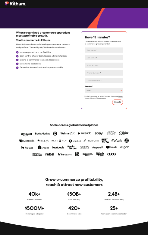
In the months that followed, lead generation became the goal, as that initial introduction was made and now it was time to convert users into prospects. The PPC campaign remained focused on brand terms, but the landing page needed to be optimized to the why rather than the how. To minimize distractions, the page was simplified to prioritize the Request Demo form in the first viewport, with supporting copy that emphasized the short amount of time a sales consult would take out of a user’s day (who doesn’t have 15 minutes?) and the top five pain points that Rithum solves for customers. Much of the previously displayed information was also distilled down to two of the most important points: the benefits of the platform & wide breadth of international marketplaces customers obtain access to. The page is now short and sweet, without any distractions and off-page CTAs. As for the previous page context? Still important, but can be delivered in the sales consultation or on the main website pages.

If your landing pages could benefit from conversion rate optimization, consider these best practices:
- Prioritize lead generation opportunities (for example, demo request forms) at the top of the page, ideally within the first viewport
- Eliminate any CTAs that may drive a user off the landing page
- Distill critical information to only 2-3 components
- Position the key value drivers or proof points that would capture a user’s attention next to contact forms or within the first viewport
- Hide the main website menu to eliminate chances of leaving the page
- Incorporate compelling copy that will hook the end users to convert – “Have 15 minutes?” is a clever hook because it sets an expectation for the call and leaves little room for the excuse of too little time.
If your landing pages need some love, or perhaps just a third-party eye with conversion rate optimization (CRO) expertise, contact Bluetext to learn about our campaign services.


