In the bustling digital landscape of Washington, DC, where businesses strive to stand out amidst fierce competition, having a robust online presence is non-negotiable. Your website serves as the virtual storefront, the first impression that can make or break a potential customer’s decision to engage with your brand. To ensure your online presence exudes professionalism, functionality, and aesthetic appeal, partnering with a top-notch WordPress development agency is paramount.
A WordPress development agency specializes in creating and optimizing websites using the WordPress platform, the most popular content management system (CMS) globally. With its flexibility, scalability, and extensive array of plugins and themes, WordPress empowers businesses to craft dynamic and visually stunning websites tailored to their unique needs.
Bluetext: A WordPress Expert
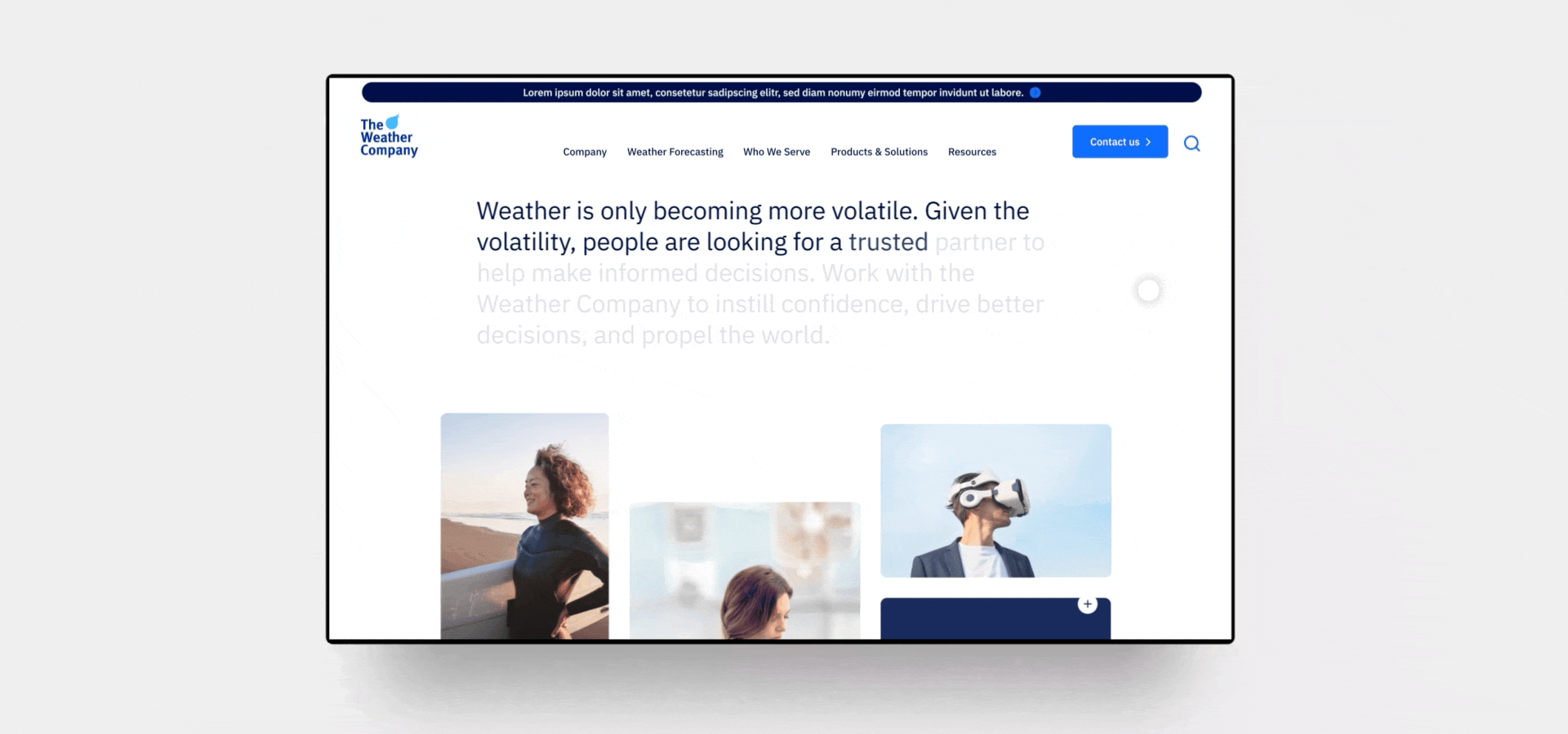
Here at Bluetext, we’ve designed some of the most impressive WordPress websites on the internet today. For example, our work with The Weather Company was delivered on a WordPress CMS in just over 100 days from inception to website launch. From the project kick-off to the launch date, Bluetext worked at rapid speed and was committed to hitting an aggressive launch date while producing the highest quality deliverables from beginning to end. This included in-depth discovery work (to ensure we understood the business, its challenges, and its goals), as well as intentional content strategy, SEO, wireframes, color comps, motion study/animation, fully responsive website development and QA, content loading, and strategic recommendations throughout the entire process.
Choosing the Right Agency Partner
So, how do you choose the right WordPress development agency in Washington, DC? Here are some key factors to consider:
- Expertise and Experience: Look for an agency with a proven track record of success in WordPress development. Evaluate their portfolio to gauge the quality and diversity of their past projects. Experienced agencies will understand the intricacies of WordPress customization, optimization, and maintenance, ensuring your website performs flawlessly.
- Design Capabilities: Aesthetics matter in web design. Seek an agency that excels in creating visually appealing and user-friendly websites. Your website should not only capture attention but also provide a seamless browsing experience across devices, fostering engagement and driving conversions.
- Technical Proficiency: Beyond design, technical proficiency is crucial. The agency should possess in-depth knowledge of WordPress architecture, coding best practices, and SEO principles to ensure your website is optimized for search engines and delivers superior performance.
- Client Collaboration: Effective communication and collaboration are essential for a successful partnership. Choose an agency that values client input, listens to your requirements, and keeps you informed throughout the development process. Transparency and responsiveness foster trust and ensure your vision is brought to life.
- Support and Maintenance: Launching your website is just the beginning. Choose an agency that offers ongoing support and maintenance services to keep your website secure, up-to-date, and optimized for peak performance. A reliable partner will provide timely updates, address any issues promptly, and help your website evolve alongside your business. That being said, don’t feel like you have to rely on an agency partner to maintain your website. If you have the capabilities in house, a good website agency will set you up for success so you can support the website from launch onwards.
In Washington, DC, Bluetext stands out as a premier WordPress development agency, specializing in web design, digital strategy, and branding services. With a dedicated team of experts and a client-centric approach, Bluetext has helped numerous businesses across various industries elevate their online presence and achieve their digital goals.
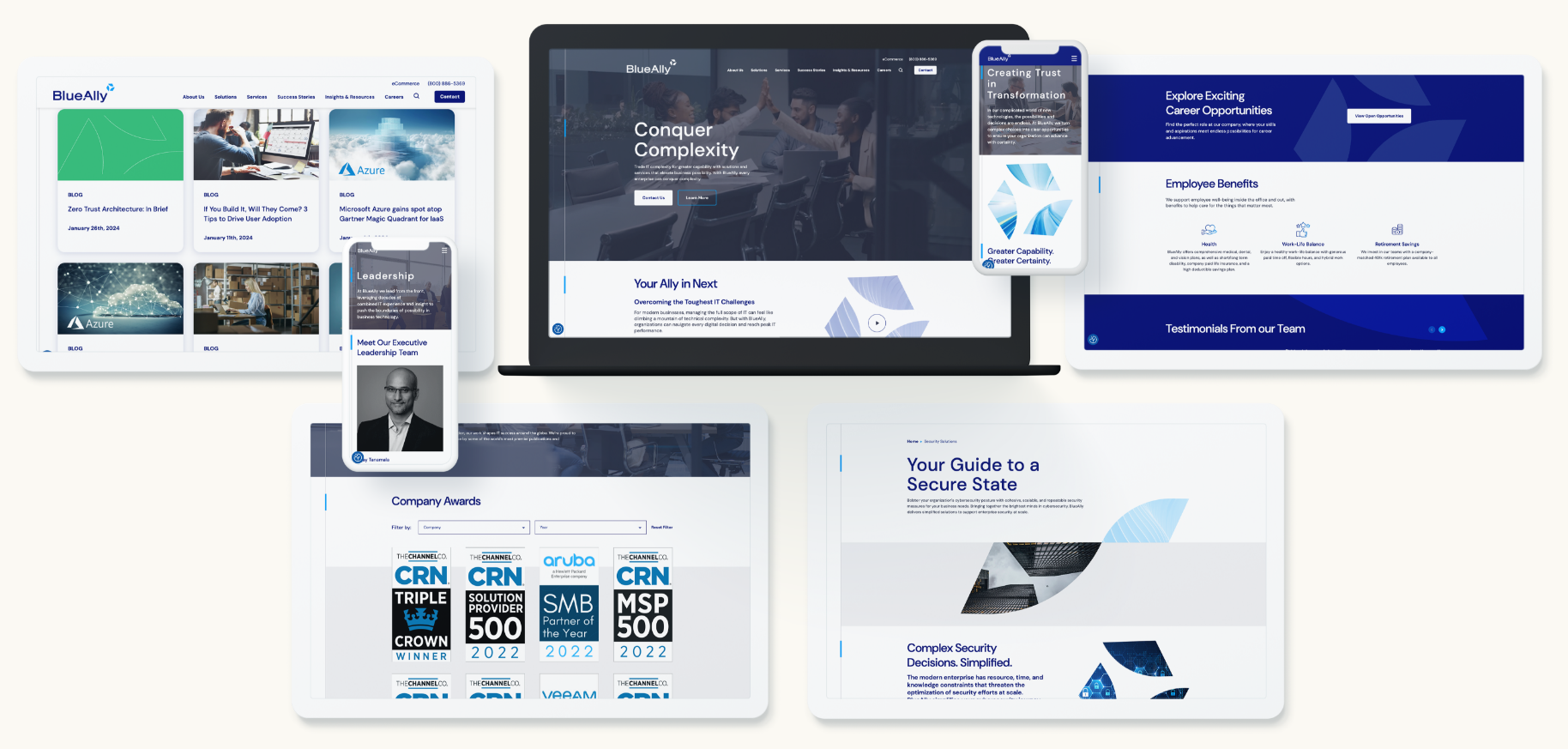
Take our work with BlueAlly for example. BlueAlly is a technology & IT consulting company that helps enterprises break down barriers to advanced technology and achieve new levels of capability. The BlueAlly team came to Bluetext after the acquisition of N2grate and Netcraftsmen to help build a cohesive brand that could encompass all of their growing capabilities. The project started with our messaging work stream followed by the logo design, CVI creation, content planning, and website development that culminated in the external launch of their new brand and site alongside a powerful brand essence video.
Invest with an Agency, Invest in Yourself
Don’t settle for an ordinary website when you can have an extraordinary one. Partner with a trusted WordPress development agency like Bluetext and unleash the full potential of your online presence. Contact us today to embark on your journey towards digital excellence.
In conclusion, investing in professional WordPress development is an investment in your business’s success. By choosing the right agency, you can create a captivating, high-performing website that captivates your audience and drives results. Take the first step towards enhancing your online presence and propelling your business to new heights with Bluetext.
In today’s fast-paced digital landscape, staying ahead of the curve is crucial for businesses looking to maintain a competitive edge. One trend that has been rapidly gaining traction is Voice Search Optimization (VSO). With the rising popularity of voice assistants like Siri, Alexa, and Google Assistant, optimizing content for voice search has become more than just a trend—it’s now a necessity. In this blog post, we’ll explore the importance of VSO, the strategies involved, and how you can leverage it to enhance your digital marketing efforts.
Understanding Voice Search Optimization
Voice search refers to the act of using voice commands to search the internet, ask questions, or perform tasks on devices equipped with voice recognition technology. Ubiquitous across millions of users daily, voice assistants like Amazon’s Alexa, Apple’s Siri, and Google Assistant are relied upon for finding information and making decisions.
Voice Search Optimization (VSO) involves optimizing your website and content to rank higher in voice search results. Unlike traditional text-based searches, voice searches tend to be more conversational and long-tail in nature, meaning they often contain natural language queries or questions.
Why Voice Search Optimization Matters
The increasing prevalence of voice assistants has fundamentally changed the way people search for information online. According to recent studies, voice searches are not only on the rise but are also expected to account for a significant portion of all searches in the near future. By optimizing your content for voice search, you can ensure that your business remains visible and accessible to a growing audience of voice search users.
Strategies for Voice Search Optimization
- Use Conversational Language: When optimizing content for voice search, it’s essential to use natural, conversational language. Think about how people would verbally ask a question and tailor your content accordingly. Focus on answering common questions related to your industry or niche.
- Target Long-Tail Keywords: Long-tail keywords are longer, more specific phrases that typically have lower search volumes but higher conversion rates. These keywords are especially important for voice search optimization, as users tend to phrase their queries in a more natural, conversational manner.
- Optimize for Local Searches: Many voice searches are location-based, as users seek information about nearby businesses, services, or attractions. Make sure your business listings are up-to-date on platforms like Google My Business and incorporate location-specific keywords into your content.
- Provide Concise Answers: Voice search users are often looking for quick, concise answers to their questions. Structure your content in a way that provides clear and direct answers to common queries, preferably in the form of featured snippets or FAQ sections.
- Optimize for Mobile: Since many voice searches are conducted on mobile devices, it’s crucial to ensure that your website is mobile-friendly and loads quickly. Mobile optimization is not only important for user experience but also for search engine rankings.
Conclusion
Voice Search Optimization presents a significant opportunity for businesses to reach and engage with their target audience in new and innovative ways. By understanding the unique characteristics of voice search and implementing effective optimization strategies, you can enhance your visibility, drive traffic to your website, and stay ahead of the competition in today’s voice-driven world. Embrace the power of VSO and position your business for success in the era of voice search. Contact us to learn more about VSO and implementing it on your website.
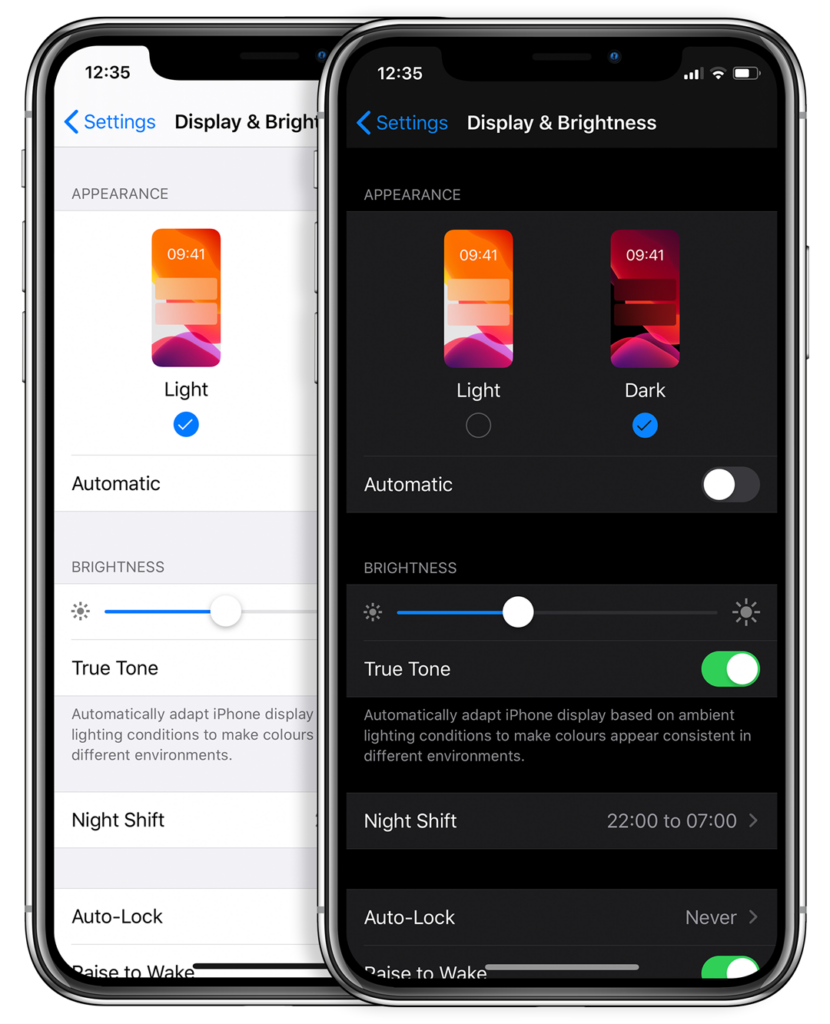
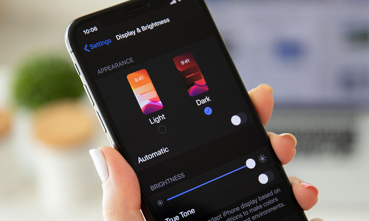
Could the dark mode interface eclipse their light mode counterparts? Dark mode has seen a continued rise in popularity over the past few years following the 2019 release of Apple’s dark mode option alongside the iOS 13 update. Sometimes referred to as “Night Mode”, “Shadow Mode” or “Dark View”, this dark mode is a design term used to describe a low-light user interface that uses a dark color as the primary background color, reversing the default light-on-dark design that designers have used for decades.
In response to increased user screen time across devices, this darker UI design trend has garnered immense popularity. Big-name brands like Facebook, Google, WhatsApp, Instagram, and Apple were all early movers in adopting dark mode interfaces and have influenced many others to follow in their footsteps. That being said, operating systems, browsers, and apps are not the only places dark mode is continuing to grow in its popularity — more and more website developers and designers are hopping on the dark mode train, opting for UX/UI designs that are dark as night with reasons why that are clear as day.
A “Site” for Sore Eyes, in More Ways Than One
It’s no secret that the aesthetics of a dark mode design can elicit powerful feelings and emotions from visitors. A dark color theme often conveys sophistication, edge, and modern elegance to users. Black is an especially dominant color, often used to create maximum color contrast when paired with whites or vibrant tones. Dark hues are often associated with style and power, which can add striking visual appeal and depth when used strategically as a website’s background. Dark mode is especially useful for image and video-heavy sites. The dark contrasts bright colors, making them look more compelling and instantly captures the audience’s attention. The more visually appealing users find your site, the more likely they are to engage with your content and remain on-page.
More than a Pretty (Inter)face
Aside from just looking easy on the eyes, dark mode can actually be easier on the eyes. Some studies show that dark mode can help reduce the sensation of discomfort that is sometimes felt by staring at websites with light backgrounds. It is especially preferable in low-light conditions where looking at bright white screens for long periods of time on any device can result in eye strain and fatigue. Reducing the pain associated with light-on-dark interfaces by switching to a dark-on-light display can help encourage users to stay on your site for longer.
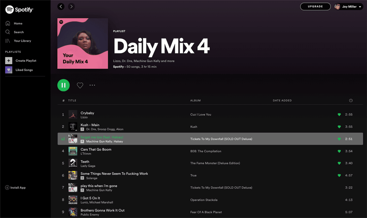
If you’re a Spotify user, your eyes (and ears) have been benefiting from dark mode features for years.
Dark Mode Can Save Brain and Battery Power
UX research shows that dark backgrounds enhance page contrast, making visuals pop and easier for the users to focus on. If your site is imagery-heavy or puts an emphasis on visual or graphic content, dark mode will allow users to be more engaged and get through your site quicker and easier, retaining more content faster and leaving with a stronger impression of what you have to offer.
Dark mode can also save device battery life. Studies show a dark theme can reduce battery usage significantly, especially for users viewing your site on a mobile device. White pixels are more power-hungry than dark pixels, which allow devices to use less energy. In an era when users are glued to their screens, anything that can save device battery power is a win — and your website could be one of those things.
So Now You’re Interested in Dark Mode, but Don’t Know Where to Start?
Good thing Bluetext has got you covered. As a leading digital marketing agency in DC that specializes in website design and making powerful sites for clients all over the world, we’d like to offer up a few pieces of advice to consider when thinking about creating or adding dark mode to your site:
- Determine if dark mode is really right for your website content–and where. Dark mode is great for enhancing emotional branding, showcasing photos and graphics, and emphasizing visual content, but not so great for displaying big chunks of text. Light text on dark backgrounds can cause readability issues in practice, so portions of your website that are or will be pretty text-heavy, dark mode may not be the best choice to display your content. Consider reserving dark mode for a homepage, or flashy campaign landing page, but maybe not your product details.
- Make sure your brand colors can actually work well with a light-on-dark design (see tip #3). If not, but you’re still set on pursuing dark mode, consider going through a rebrand before implementing dark mode.
- Verify your light-on-dark color scheme meets accessibility color contrast standards.
- Dark backgrounds de-accentuate empty space, so limit the number of elements (lots of icons, buttons, and small images) used together within viewports to avoid looking cluttered.
- Make sure your design will work in both low-light and high-light environments.
- Use illumination over shadows to communicate depth.
- Avoid highly saturated colors.
- Leave room for a regular/light option and give users the ability to toggle back and forth as they desire.
- Work with an agency like Bluetext to ensure your dark mode website is sleek, powerful, on-brand, and communicates a strong and engaging message to your audience.
Learn more about dark mode and how Bluetext can help you take your website to the next level. Contact us today.
“Out with the old and in with the new” is our motto heading into 2024. Based on our UX and website design experience, we foresee static websites on a one-way train out. This trend has been long and coming, and it’s about time to improve your website user experience by incorporating more interactive design and animation to improve brand equity.
What is Interactive Content?
Interactive content can be seen as two-way content. Traditional written and video content is static, meaning website users passively consume information. Simple and straightforward, but limited. With static content, people can only engage with content by clicking, hovering, and answering questions.
Interactive content serves users relevant information in a process. One that can be made fun and engaging, without bordering on burdensome. You’ve already come across this type of content format on different websites. Some examples include calculators, quizzes, surveys and polls, interactive infographics, and interactive timelines.
Interactive Content Gives Value to Users in an Engaging Way
Interactive content makes your content easier to digest by taking difficult information and providing it in bite-sized pieces. It transforms their experience from boring to interesting.
When you leverage interactive content, you can personalize information for your users by incorporating quizzes or calculators and providing them with content that’s relevant to them.
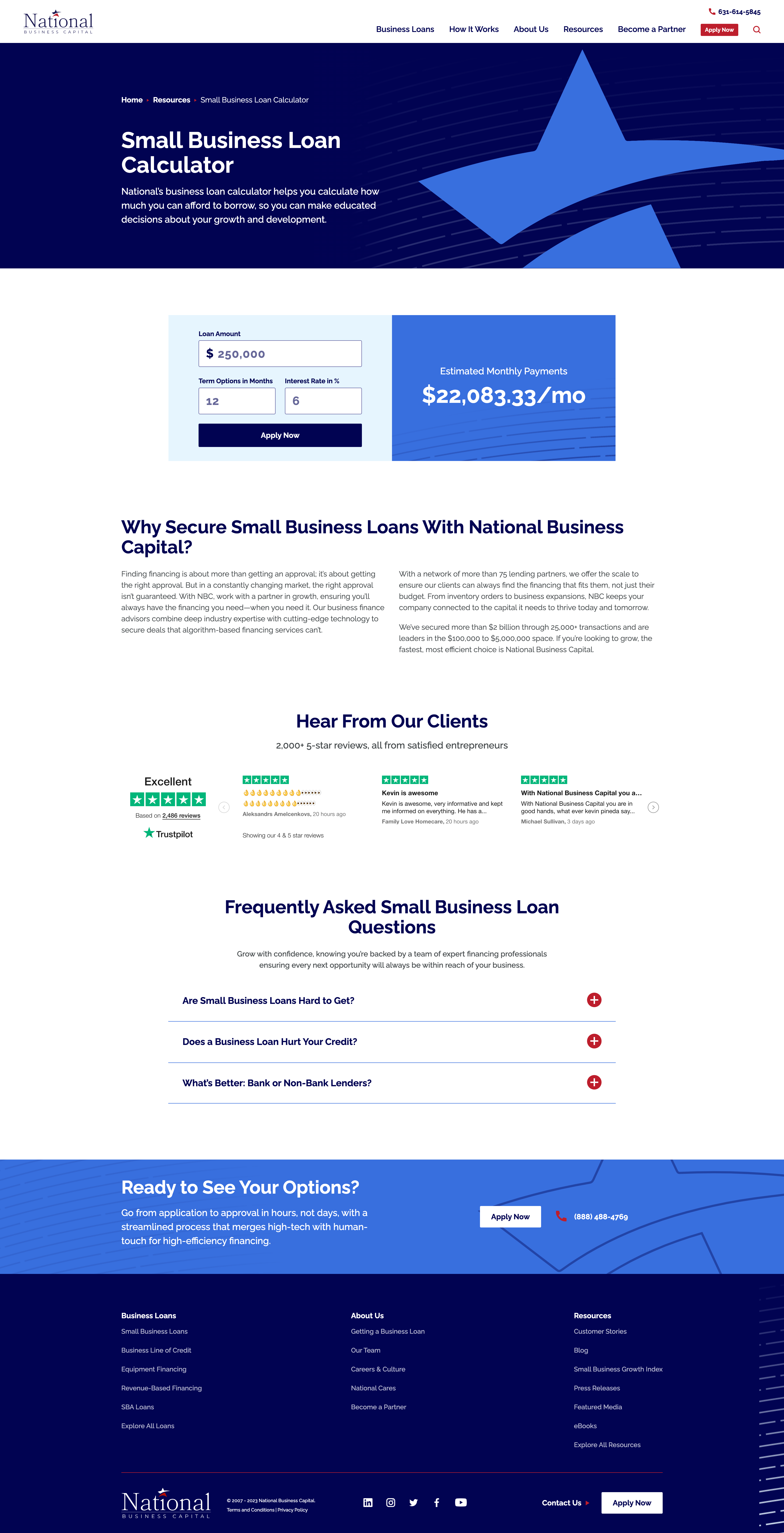
When National Business Capital turned to Bluetext, they sought an interactive calculator that would provide users a quick snapshot of their monthly payment if they chose National as their lending broker. The user simply needs to enter their loan amount, term length, and interest rate and the calculator provides an immediate estimate of their monthly payment. If they click “Apply Now”, that user’s information is captured and reduces the length of the application form, ultimately improving their experience.
Redefining Interactive with Animated Infographics
If you are looking for ways to improve the visuals on your website but can’t necessarily build out a fully interactive webpage, then you should consider animated infographics in your 2024 website redesign.
What exactly is an animated infographic? An animated infographic is a way of visualizing information using a combination of imagery, illustrations, charts, graphs, text, and other elements that are animated, to add movement.
When infographics first gained serious traction online, they started as static illustrations. They would often take the form of extremely long images you’d need to scroll through, but they had a certain charm to them. Shapes, colors, illustrations, and an easy-to-follow structure are big reasons why static infographics work. All that scrolling and slow uncovering of new information was exactly what made the experience enjoyable. It’s not about the destination, it’s about the journey. But here’s the catch, not everyone has time or attention for this long and leisurely road trip. Static-form infographics certainly have their strengths, but digital marketers must be wary of attention spans and the volume of information packed into one design.
An animated infographic will have a much better chance of being noticed, opened, and looked at. With today’s “snackable” content on social media, we need to improve the way users can digest this still somewhat “lengthy” content, and animation is a great way to do just that.
When Rithum™ turned to Bluetext to help bring their offering to life, Bluetext designed and developed a 3-D animated infographic that provided a memorable visual experience for the user, easily establishing and providing them with the information they need to understand the Rithum Network and Platform.
Interactive and Animated Content Will Make Your Brand Memorable
Remember, adding more colors to visuals increases readers’ attention span and recall by 82 percent. So, incorporating animated infographics into your existing content marketing strategy can yield great returns.
Ready to design and develop your next interactive or animated content? Contact Bluetext today.
In the ever-evolving landscape of website development, choosing the right Content Management System (CMS) for your company is a critical decision. Webflow has gained popularity as a robust and visually-driven CMS, providing a unique approach to web design and development since its inception in 2013.
What is Webflow?
When it comes to web design, tools that empower creativity and streamline the development process are highly sought after. One such tool that provides a range of capabilities is Webflow—a cloud-based, ‘software as a service’ (SaaS) design tool that runs in a web browser. According to builtwith.com, there are currently over 368,000 websites built on Webflow. If you’re new to the realm of website creation or curious about exploring innovative solutions, let’s break down the pros and cons of this particular CMS option.
Pros:
- Intuitive Interfaces
One of Webflow’s standout features is its user-friendly, drag-and-drop interface. This allows designers to create visually appealing websites without delving deep into complex code. The intuitive design empowers individuals with varying levels of technical expertise to bring their creative ideas to fruition, and they’re also able to collaborate simultaneously.
2. All-In-One Hosting Solution
Webflow offers hosting services as part of its package, eliminating the need for third-party hosting solutions. This integrated approach simplifies the deployment process and ensures a high-level of security with Webflow’s free SSL certificate.
3. Optimized SEO
Webflow provides a range of features and tools that can positively impact SEO. It generates clean and semantic HTML, ensuring that search engines can easily crawl and index the content of your website. There are also the impacts of having fast loading speeds, control over meta tags, 301 redirects, alt text, etc.
4. Improved Site Speed
Webflow’s hosting infrastructure is designed for speed. There are multiple factors contributing to improved site speed through Webflow, such as the minification of CSS and JavaScript, browser caching preloading, automatic lazy loading of images, and much more.
5. Unique Animation Capabilities
From simple transitions to complex animations, Webflow empowers designers to bring websites to life without relying on external tools or complex code.
Cons:
- Restriction on eCommerce
While the platform does provide e-commerce capabilities, it may not be as feature-rich or as customizable as some dedicated e-commerce platforms. Users may find limitations in terms of advanced e-commerce functionalities, complex product management, or intricate sales processes. Additionally, the available payment gateways might not be as extensive as those offered by specialized e-commerce solutions such as Shopify.
2. Cost Considerations
Webflow’s pricing may be a concern for smaller businesses or individuals on a tight budget. While it offers various plans to cater to different needs, the cost can add up, particularly for those requiring advanced features or increased customization. It may also be challenging to choose a pricing plan that best suits your business and needs.
3. Limited Plugins Available
Unlike some other Content Management Systems that may offer extensive libraries of plugins and extensions, Webflow’s plugin options are more constrained. On the other hand, however, there are quite a few WordPress plugins that Webflow actually accounts for, such as Forms, Askimet, Yoast SEO, Elementor, and more.
Webflow is more than just a website builder; it’s a platform that unleashes creativity, simplifies development, and provides a holistic solution for bringing digital ideas to life. Whether you’re a designer aiming for visual excellence, a developer seeking efficient workflows, or a business looking for a robust online presence, Webflow offers a versatile and powerful toolkit for achieving your goals. However, when it comes to choosing a CMS, it’s important to consider Webflow’s pros and cons based on your project’s specific requirements—it may not be the perfect fit for every project. By weighing these factors, you can determine whether Webflow aligns with your goals or not.
If you’re still not sure what CMS may be right for you, contact us. Bluetext’s experience and expertise with WordPress, Drupal, and Webflow can help you build an effective online presence no matter what CMS you choose.
In today’s world, if you own a business, you have a website. It is a way to showcase your products and services, but it also serves as a first impression to new users. It is important you put your best foot forward. The first step is determining the right CMS for your business. Drupal has emerged as one of the most popular CMS platforms in the world, allowing users to create compelling and dynamic websites. In this post, we will explore the key features of Drupal and guide you through the process of determining whether it’s the right fit for your company’s website.
Reasons to Consider Drupal
Drupal has all the functions needed to build large, modern websites in one place. If your business has the time and resources to support a steeper learning curve than other CMS options, you will be able optimize Drupal’s performance and security benefits with maximum flexibility.
- Holistic Web Management Experience
Drupal offers power and adaptability with its flexible platform supporting content and web experience management. It is an ideal solution for businesses looking for a scalable, flexible, and secure platform with robust architecture and simplified content management.
Managing large amounts of content can be daunting. Drupal provides powerful tools and features to handle content challenges efficiently. Drupal creates an intuitive interface experience that allows for simplified collaboration and tracking with functions like versioning, taxonomies, tagging, and categorization. Content has never been more organized and accessible.
- Customization
Drupal’s modular architecture allows businesses to customize and extend its functionality. This type of flexibility allows users to choose which modules to enable and what workflows to define based on the specific requirements of your site. This enables businesses to build tailored websites that meet unique needs and experiences without unnecessary bloat.
- Search Engine Optimization (SEO) Friendliness
Businesses looking for online visibility, look no further. Drupal excels with its SEO-friendly features! Drupal has built-in SEO modules like clean URLs, customizable meta tags, and XML sitemap generation to enhance search engine visibility. These features empower businesses to improve their organic search rankings, drive increased website traffic, and attract a wider audience.
- Enhanced Reliability & Security
Businesses should prioritize trust and security when choosing and maintaining their CMS platform. Drupal’s focus on security makes it a trusted choice for businesses. Drupal remains secure against potential vulnerabilities with regular security updates and secure coding practices. Your data and customer information will be safeguarded with Drupal.
- Open-Source Community
Drupal’s open-source architecture encourages developers to contribute new modules, themes, and functionality to the community. Drupal has a supportive community of developers and non-developers, this community-driven ecosystem ensures that Drupal stays up-to-speed with emerging technologies and best practices. Drupal keeps you at the forefront of CMS innovation and your businesses can take advantage of these cutting edge module functionalities, unlocking limitless possibilities.
Is Drupal Right for Your Company?
While Drupal has a solid foundation of features and functionalities, it’s essential to evaluate whether it aligns with the specific goals of your company and also with your website’s content. Consider the following factors to make an informed decision:
- Where is Your Business Now?
While Drupal can support more basic uses of a site, like a blog or portfolio, what sets this CMS apart is its capability to support complex custom integrations. While Drupal is very powerful, it is more advanced than what most pure marketers need. It will be worth your while to consider what your business needs are before you commit to a Drupal CMS.
- Do You Have Maintenance Resources?
Prioritizing maintenance tasks and providing ongoing support to ensure the longevity and success of your Drupal website is crucial. Website maintenance is an ongoing task that significantly affects your Drupal site’s success. Your business must be able to support the consistent update of Drupal core and modules, monitor performance, apply security measures, manage content, and conduct regular testing. These are all foundational steps needed to maintain a secure, efficient, and user-friendly website.
- What is Your Expected Growth?
Think about your business plan for future growth and expansion. The unparalleled adaptability of Drupal allows you to tailor your online business presence and create unique digital experiences. Drupal’s scalability and customizability ensures your website can grow with you. Making it a strong choice for expanding businesses that need to support complex integrations and experiences.
Drupal stands out as a robust CMS with unparalleled customization and flexibility. By assessing your business’s unique requirements, ease of maintenance, and future growth plans, you can determine whether Drupal is the right choice for your company’s website. Let Bluetext help you implement a new Drupal website today.
In the world of website development and content management systems (CMS), WordPress has emerged as a powerhouse, catering to the diverse needs of businesses across the globe. WordPress has humble beginnings as a blogging platform, but has evolved into the world’s most popular CMS with a plethora of capabilities. In this post, we will explore the key features of WordPress and guide you through the process of determining whether it’s the right fit for your company’s website.
Reasons to Consider WordPress
WordPress’s core strengths lie in several key capabilities that make it a great choice for businesses of all sizes.
1. User-Friendly Interface:
At the heart of WordPress is an intuitive and user-friendly backend interface. This ensures that even those without extensive technical knowledge can navigate and manage their websites effortlessly. Content creation, updates, and customization become streamlined processes, allowing you to focus on what matters most – your business.
2. Versatility Through Themes and Plugins:
The real magic of WordPress lies in its extensive library of themes and plugins. Themes dictate the visual appearance of your website, providing a range of options to suit your brand. Meanwhile, plugins extend the functionality of your site, offering solutions for e-commerce through plugins for WooCommerce, SEO, security, and more. This flexibility allows you to tailor your website to meet your specific requirements. Check out some ways Bluetext has integrated e-commerce functionality to WordPress websites.
3. Search Engine Optimization (SEO) Friendliness:
WordPress is inherently designed with SEO in mind. Its structure and the ability to easily integrate SEO plugins like Yoast contribute to better visibility on search engines. This is crucial for businesses striving to enhance their online presence and reach a wider audience.
4. Scalability:
As your business grows, so should your website. WordPress scales seamlessly, accommodating the evolving needs of your company. Whether you’re a startup or a well-established enterprise, WordPress provides the tools necessary to support increasing traffic, add new content, and create new features and components. Discover how Bluetext has helped clients scale their digital presence with WordPress websites.
5. Community Support:
The vibrant WordPress community is a valuable asset. With a vast network of developers, designers, and users, the community ensures continuous improvement and innovation. Access to forums, tutorials, and extensive documentation means that help is readily available whenever you encounter challenges.
Is WordPress Right for Your Company?
While WordPress boasts an impressive array of features, it’s essential to evaluate whether it aligns with the specific goals of your company and also with your website’s content. Consider the following factors to make an informed decision:
1. Nature of Your Business:
WordPress is incredibly versatile and can accommodate a wide range of business types. If your website requirements include a blog, portfolio, or e-Commerce functionality, WordPress is an excellent choice. However, if your website has highly specialized needs, such as complex web applications and custom integrations to surface content, an alternative CMS may warrant consideration.
2. Ease of Maintenance:
If you prefer a platform that allows for easy updates and maintenance without extensive technical knowledge or an in-house developer, WordPress is a solid choice. Its user-friendly interface makes routine tasks like updating plugins and keeping your website secure and manageable. Your host provider can also help with this if you do not feel comfortable doing it yourself.
3. Future Growth Plans:
Examine your strategic objectives and anticipate the potential expansion of your business. WordPress’s scalability ensures that your website can adapt alongside your company’s growth, making it a sustainable and prudent choice for the long term.
WordPress stands out as a robust CMS with unparalleled versatility and user-friendliness. By assessing your business’s unique requirements, ease of maintenance, and future growth plans, you can determine whether WordPress is the right choice for your company’s website. Let Bluetext help you implement a new WordPress website today.
Selecting the right content management system, or CMS, can be a challenging decision for many businesses. While there is no one-size-fits-all website CMS, certain criteria can help you downselect potential options of WordPress, Drupal, Webflow and many more. Take our interactive quiz to help determine which CMS may be right for you and your business needs!
The end-user experience is a key, if not the most critical, consideration to crafting a successful new website. Seamless, exciting interactions between site content and its users are what deliver relevant information and a memorable experience initiates repeat visits. A poor UX design can leave users feeling bored or even frustrated with the website and associated brand. In order to avoid these UX pitfalls and have the highest chance at digital success, Bluetext has curated a list of our favorite and most functional UX design practices. See below for some examples of website interactions we’ve designed with the goal of keeping users engaged and getting users excited about the content in front of them.
Functional Micro Animations
For many organizations that release a new site after rebranding, a major goal of the new website is to get users to explore further content. There are numerous ways that clever UX design can subtly assist in this mission. User experience designers will tell you that subtle, almost subconscious psychological cues are the most effective ways to promote the discovery of more content. Especially when promoting brand identity, it’s important to keep in mind users’ priorities. They are visiting the site to find answers to their questions, not necessarily your brand’s life story. That being said, your brand’s story is still important but just needs to be presented in a clever way to sustain attention.
- Subtle motion can be used strategically to lead users’ eyes further down the page. Micro-animations such as the ones shown below create a natural sense of downward movement, which encourages users to move in that direction by continuing their scroll.
- Arrows can be used as quick jump links to reduce the required scroll and boost users to the sections of the page that are most important. This is especially helpful for brands that develop rich, visually dominant hero zones but want to allow users to quickly get past the first area of the page in order to discover more informational content.
Your brand doesn’t have to be high-tech or bold to incorporate the newest UX/UI trends. Even simple, sleek micro animations like card interactions on hover can make user experiences more delightful without detracting from the authority that comes with more traditional, conservative brands.
- Fairly simplistic card interactions can be used to reveal more information on hover and add more excitement to the user experience.
- Animated elements can also be used in hover states to add visual interest; this is particularly effective when users will be viewing the hover state for an extended period of time (in this example, for long enough to read a short paragraph of text).
Stylistic Micro Animations
Micro animations aren’t just used for functional purposes; animated elements can also be used to highlight core brand elements as well. Creating unique, ownable applications of motion to brand elements can be an effective way to show off the new brand, as well as cut down the need to use generic or less impactful stock imagery to add visual interest to page content.
- Animations in the hero zone are one tactful way to customize the UX design to bring greater excitement and powerful visuals to the front page of the site.
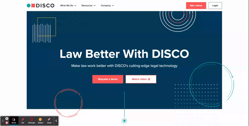
- DISCO: See how this AI Legal Technology company uses subtle animated elements throughout the hero area of its homepage to add stylistic visuals without relying on imagery. As an added bonus, they’ve also included a functional element of animation in the hero. The blinking dot at the bottom of the viewport isn’t just a cool visual; it’s also a subtle indicator to users that they should look further down on the page, where there’s more to be explored.
-
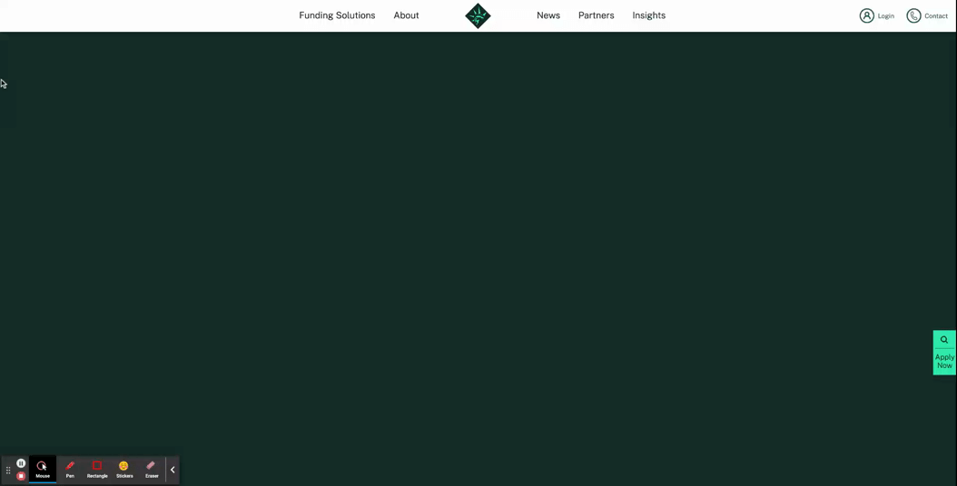
- Libertas: In a more streamlined hero design, this financing organization uses its logo mark as the major focal point of the hero. This animation is a grand introduction to the website, sweeping onto the screen to populate what starts out as an empty, unassuming hero zone.
- Animations can also be used as key design elements for interior components as well
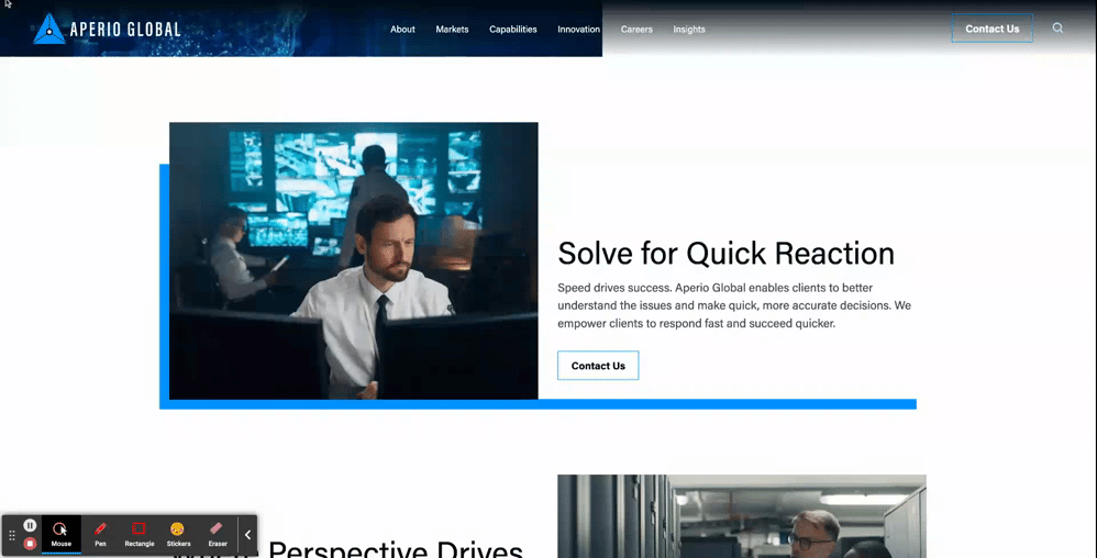
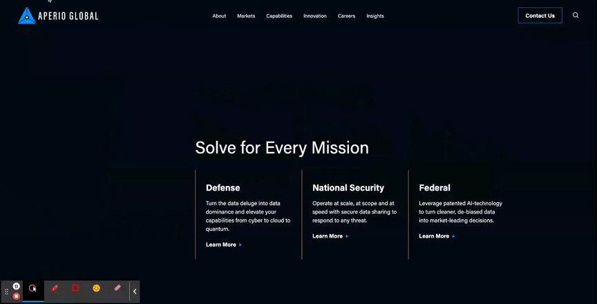
- Aperio Global: Here, you can see how this cyber company applied motion to a key graphic element of their brand to turn a text-based component into an eye-catching section of the page.
Unique Scroll Effects
One major challenge to website design is that users can get exhausted or frustrated with having to scroll through long pages of content. While it is best practice to keep page content concise when possible, another way to mitigate scroll fatigue is by creating interesting scroll effects that feel less effortful for users.
- The Parallax Scroll is an effect where the background of the page appears to move at a different speed than the content in the foreground. This can be an effective way to make the scrolling for users feel like it’s moving along quickly and seamlessly.
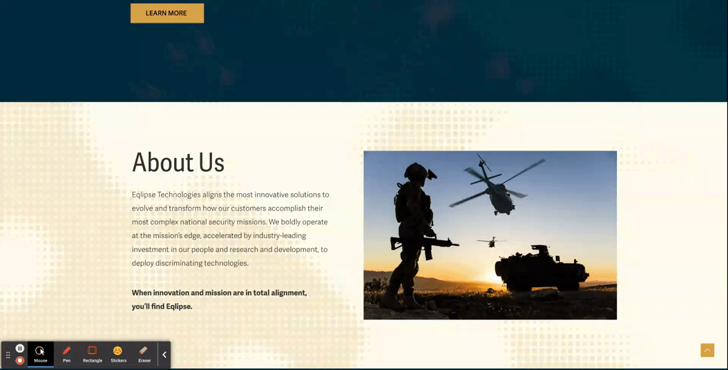
- Eqlipse: See how a static background image creates the appearance of a quicker scroll.
- A Locked Scroll is an experience where the page viewport stays “locked” in place, where only the featured information of the page switches out. A user cannot scroll up or down on the page without scrolling through all the information. Feeding content to the users in smaller bite-sized sections like this helps ensure that the users don’t skim through important information hidden under tabs or within large blocks of copy.
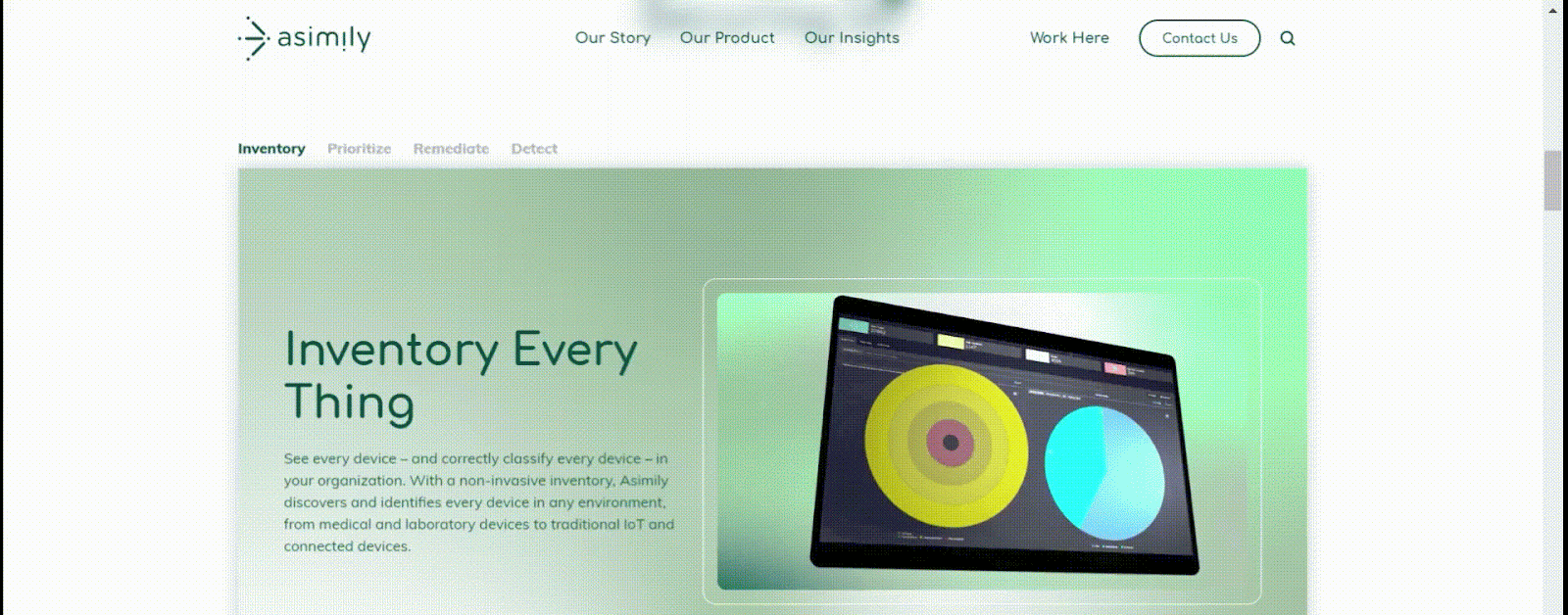
- Asimily: In this example, when a user scrolls down the page, the content switches over to the next tab’s information without changing the positioning in the viewport, and the tabs continue to filter through as a user scrolls. After they’ve navigated all the tabs, then the page experience continues more traditionally, so that the viewport shifts at the same speed as the scrolling.
Immersive Scroll Experiences
For modern, industry-leading, high-tech brands, one way to convey that they’re always staying ahead of the curve is by curating a website experience that is equally as bold. Immersive scroll experiences are one major trend for website design that companies can use for more cohesive storytelling on their website. If you’re interested in learning more about this design technique, read our UX Trends in Immersive Scrolling blog for a more detailed explanation of what makes a page experience immersive.
The creative minds at Bluetext are always excited about the opportunity to explore how branding can be applied to create a high-impact landing page that guides users through an immersive scrolling experience. See some of our favorite examples below:
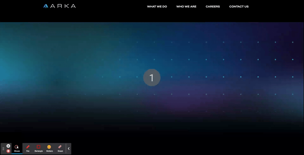
- ARKA
- With an aspirational message at the top of the page, “Beyond Begins Here,” the hero zone of this page kicks users off on an exciting journey. Notice that, while there are images, graphic elements, and motion incorporated in the first viewport, the messaging is the focal point of the screen. Project managers at Bluetext work hand-in-hand with designers to ensure that amazing visuals never overshadow important information.
- The placement of design elements is used to direct users where to go. You’ll notice that there’s a slight peekaboo of the next information on the page so that the user knows there’s more to explore. Additionally, the circles following the orbital patterns on the screen intentionally dip out of sight and into the next viewport, just another way of leading users to the next viewport.
- As you scroll further down the page, the text is animated to slide onto the screen, and images grow larger as you settle into the viewport. Since immersive pages tend to have more information on them, this allows users to ease into the components, rewarding them with exciting visuals for each new section they scroll to. This type of interaction tends to keep users on the page for longer, and they feel more engaged with the dynamic content rather than just scrolling past static areas.
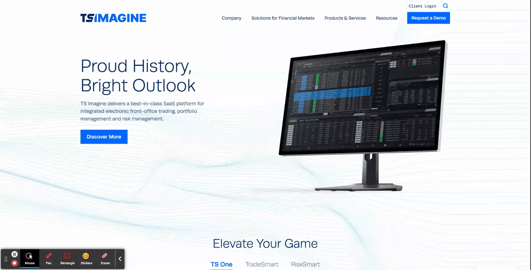
- TS Imagine
- The top portion of the TS Imagine homepage is a great example of how animation, graphic elements, and content placement all work together in an immersive experience to lead the user smoothly from one piece of content to the next.
Designing a smooth and exciting user experience for your brand’s website is a major undertaking. Whether you are updating a current website or starting from scratch, a design agency can help you to consider the best options for your user experience during every step of the process, to ensure that your new site is using UX to the fullest.
Need help? Contact Bluetext to get expert support in perfecting your user experience design.
Pagination – a seemingly simple yet immensely impactful element of web design and content organization. One that can transform an overwhelming scroll into a series of inviting steps, prompting exploration and easing the burden of information overload. In this post, we’ll uncover the essential role pagination plays in enhancing user experience and strategies to create a seamless, page-turning digital journey for all who venture online.
PAGINATION IMPORTANCE
Pagination is a user-friendly approach for the display and management of large volumes of information on a website. In contrast to infinite scrolling- or, a continuous flow of content that automatically loads as the user scrolls down the page- pagination involves creating a system of numbered links or buttons that allow users to navigate through different pages or sections of content and data. This is a critical tactic in website design as it significantly enhances usability.
When used strategically, pagination can positively impact user experience in the following ways:
- Easier access to relevant content. While infinite scrolling can provide an immersive experience, it can be difficult for users to locate specific information or access footer navigation. Pagination enables users to quickly locate the content they’re interested in and can significantly reduce the length of a page, making it easier for users to reach the footer.
- Maintains a balance between aesthetics and function. Cluttered interfaces with endless scrolling can lead to a clunky user experience. Pagination offers a clean and structured layout, preserving the overall coherence and readability of the website’s design. Not only does this enhance the visual appeal of the website, but allows users to enjoy a more intuitive browsing experience.
- Simplifies content consumption. Without pagination, websites featuring extensive articles, product listings, or search results could become overwhelming and tedious to navigate. By breaking down content into smaller, manageable chunks across multiple pages, users can easily digest information without a sense of frustration.
- Responsive Design: Pagination can also contribute to a more responsive design, especially on mobile devices. Large volumes of content on a single page can be challenging to render properly on small screens, while pagination allows for a more adaptable and user-friendly presentation.
- Faster Load Times: With infinite scrolling on a long page, you’re constantly loading more and more content into memory. This hurts page performance since the browser has much more work to do to load the page. By spreading content across multiple pages or views, pagination reduces the amount of data that has to render and transmit on initial page load. This leads to a faster and smoother browsing experience for users, including those who may have slower internet connections or limited bandwidth.
In addition to positively impacting user experience, pagination also plays a crucial role in improving web accessibility by making it easier for users of all abilities to access and interact with the content effectively. Here are a few of the ways pagination helps ensure that content remains digestible and navigable for those with disabilities or impairments:
- Reduced Cognitive Load: Individuals with cognitive disabilities can often find it challenging to process large amounts of information presented on a single page. Pagination breaks down content into smaller, more manageable segments, reducing cognitive overload and making it easier for these users to understand and engage with the material.
- Improved Screen Reader Experience: Screen readers- tools used by people with visual impairments- navigate web pages by reading out the content in a linear fashion. With pagination, the content is presented in a structured manner, allowing screen readers to provide better context and enable users to explore the information more efficiently.
- Keyboard Navigation: Some users rely solely on keyboard navigation due to motor impairments or other reasons. Pagination provides clear landmarks and links, enabling these users to move through the content with precision. It prevents the need to scroll through an overwhelming amount of data, making navigation smoother.
- Predictable Interaction: Consistent and predictable user interactions are vital for accessibility. Pagination offers a standard way for users to move between pages, ensuring that individuals who rely on assistive technologies can anticipate and understand how to navigate the website’s content.
To sum it up, pagination prevents information overload, allows for ease of use, and improves navigation, all of which collectively contribute to a more user-friendly, inclusive, and satisfying experience on a website.
PAGINATION TYPES AND USES
In web design, different types of pagination styles can be employed to enhance user experience and navigation. Each style offers a unique way of presenting content across multiple views. Let’s break down some of the most common pagination styles and when they should be used:
- Numeric Pagination: This is a classic pagination style that involves displaying a series of numbered links that correspond to different pages of content. Numeric pagination is suitable for websites with a substantial amount of content, such as articles, blog posts, or search results. It provides users with a clear overview of the available pages and allows them to jump to specific sections directly.
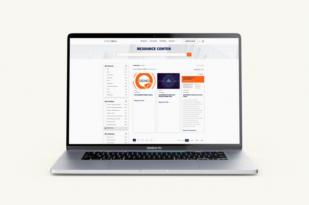
Check out our SonicWall work here
- Prev/Next Pagination: Prev/Next pagination employs “Previous” and “Next” links to navigate between pages sequentially. This style is suitable for content that follows a linear progression, such as articles or blog posts. It’s a simple and intuitive approach that is especially useful when users prefer to read content in a specific order. See this approach in action on the Bluetext blog — and read some more UX tips and tricks while you’re at it!
- Alphabetical Pagination: Alphabetical pagination categorizes content based on alphabetic characters, allowing users to jump to sections of content starting with a particular letter. Alphabetical pagination helps organize a large amount of data in an easily accessible manner and is most often used for directories, glossaries, or indexes.
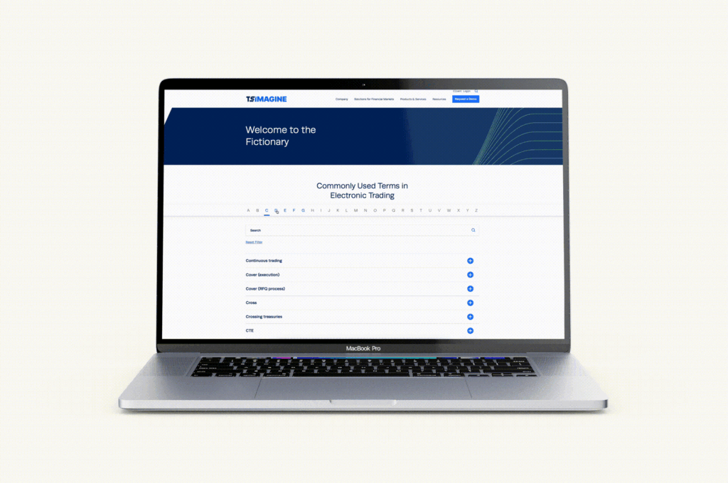
Explore more of our TS Imagine work here
- Date-Based Pagination: Date-based pagination organizes content by date, often seen in archives, news websites, or event listings. Users can navigate through different periods of time to find relevant information. This style helps users discover content based on chronological relevance.
- “Load More” Button: Instead of traditional pagination links, the “Load More” button dynamically loads additional content as the user progresses down the page. This approach is a strong alternative to infinite scrolling, allowing for the same seamless feel and browsing experience while minimizing page reloads and giving users control over when to retrieve new content. “Load More” is commonly used for social media feeds, image galleries, and continuous content streams, as well as robust listings like Google search results.
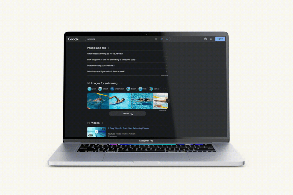
Google search listings recently upgraded from a simple, numeric pagination to a dynamic scroll and load more experience.
When choosing a pagination style, it’s important to consider the type of content you’re presenting, user preferences, and the platform’s goals. The chosen style should align with the overall user experience strategy, offering convenience, clear navigation, and a seamless interaction that caters to the specific needs of your audience and the nature of the content being displayed.
Ready to pump up your pagination or revamp your website with the help of a leading digital design agency and UX experts? Get in touch with Bluetext today and let us transform your digital brand experience, one page at a time.