It’s no secret that mobile internet use has seen significant growth in the past few years. Over half of all web traffic now comes from mobile users, a majority of which are those using their smartphones to surf the internet.
However, with an installed base of over 190 million devices in the United States and counting, there’s a high likelihood that some of the mobile users visiting your site are doing so from a tablet device as well. It’s just as crucial for your website to look good and function properly on these devices as it is on laptops and smartphones, because in order to be relevant on the web today, your site must perform on all the devices that use the web.

Thinking beyond the desktop
Unfortunately, standard desktop sites don’t have the best track record for working seamlessly on tablets on default. Even websites designed to be responsive in the transition from desktop to mobile face complications on unique tablet sizes. Oftentimes, a site may register a tablet as a mobile device, causing the font and buttons to be too small and intended for a small phone screen. On the contrary, if a site still displays the desktop version, the content becomes too close together, and many of the interactive functionalities just don’t work. While desktop sites are a great starting point, intentional design tweaks are needed to make your website tablet-friendly. Because, no matter what device your visitors are using, the goal is to give them all the best possible user experience on your site.
Luckily as a top website design agency, Bluetext has picked up several techniques over the years that make your user experience goals possible. Whether you’re starting to build a new effective tablet site or are looking to improve your current tablet user experience, here are 5 tips for tablet-friendly website design.
-
Increase font size, line height, and margins for legibility
Let’s be honest, we all know how annoying it is to have to consistently double tap or pinch your screen in order to read the content on a page. Avoid making tablet users do this on your site by bumping the font size up a few pixels, or to at least 16px, and use a line height of 1.5 for some extra breathing room between lines on text-heavy pages. To improve legibility even more, try increasing margins on pages and content blocks to add white space and reduce overall visual complexity, so your website’s content is easier for users to read and consume.

-
Improve finger-friendliness
Unfortunately, human fingers tend to be much less deliberate and a whole lot clumsier than the tiny point of a computer cursor. This means that anything you want a user to click on a tablet, whether that be buttons, menu items, or form fields, needs to be appropriately spaced and sized to allow room for our fingertips. Based on the average width of the index finger for most adults, a touch target of at least 44 pixels should allow a user’s finger to fit comfortably within the target. Additionally, increasing padding around touch targets by 5-10 pixels will improve user accuracy and reduce the frustration that often comes with unintended button-clicking and navigation.

-
…and make touch targets obvious
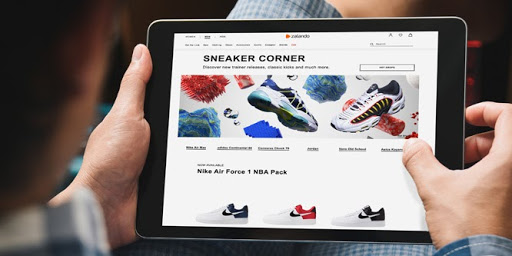
Not only should there be ample room to click on touch targets, but it should be very clear where and what those touch targets are. All buttons, CTAs, clickable links or elements should be large, bold, and stand out from the rest of their surrounding content. Hover states do not exist on a tablet, so styling with contrasting colors, underlines or shadows helps these touch targets to look tap-able. The more obvious CTAs are to your visitors, the more they’ll be able to navigate intentionally and with confidence.
-
Make people tap-happy
You don’t want to just design a website that’s easy to use, but one that’s pleasant and satisfying to explore! Keep in mind that a lot of your tablet visitors use that same device for personal entertainment and are used to clicking, swiping, sliding, and pinching their way through various apps. Creating visually enticing opportunities for tablet users to tap and engage with your site via unique interactive components like sliders, carousels, or accordions could not only help increase the amount of time they spend on your site, but make it more enjoyable.

-
Design & test on the most appropriate tablets
Lastly, it’s important to keep in mind where most of your visitors are coming from when designing and testing your tablet sites. There are dozens of different tablet makes and models out there today, with screen sizes anywhere from 7 to 12 inches wide. Unfortunately, it isn’t possible to test your website on every single one. This is where your website’s analytics come in handy; using tools like Google Analytics can help you determine which devices and browsers are most frequently accessing your website, so you can narrow your efforts on the tablets that make up a majority of your traffic and optimize for the greatest number of users.

Taking these steps and making these small changes can make a huge difference in the experience tablet users have on your website. Making it easy for them to read, navigate, click, and enjoy finding content or information on your site from all of their devices is crucial to keep visitors engaged and coming back for more.
Interested in tablet-proofing your website? Get in touch with Bluetext to see what our top visual designers can do for you.
2020 will forever mark a significant milestone in remote work practices. To comply with COVID-19 safety protocols many companies have closed or limited office capacity and enabled their workforce to work remotely. There is a significant change in everyday work practices, but even more significant change in large industry events from trade shows, networking events, and conferences. While industry events as we know them are not yet possible, business must go on. Luckily, digital-based agencies such as Bluetext, have been hard at work to innovate solutions that can replicate the in-person experience as much as possible with virtual events.
Virtual events will become a universal industry standard in the future, regardless of when large gatherings become safely possible again. Hosting a virtual event eliminates the time and cost associated with work travel and allows flexibility to attend event sessions while keeping up with the normal day to day operations. Virtual events allow employees or colleagues from anywhere in the world to easily join from the comfort of their own home or office and can choose to be present at only event sessions relevant to them and their interests. Rather than having your whole team out for three days, there is the flexibility to attend select sessions for a couple of hours at a time.
If your company is considering hosting a virtual event, there’s a couple of things to consider first. After the success of Citrix Bootcamp and SonicWall Boundless 2020, Bluetext has rounded up their top tips for the first step of any virtual event: registration.
Ace the Virtual Event Invite
One of the first things to consider with any event is: Who is the audience? Is this a trade show for a number of different companies? An employee only training? Select clientele? A virtual event marketing agency will assist with the outreach to attendees, whether that strategy is based on a specific email list or advertised publicly. From email nurture campaigns to targeted paid advertising, the options are endless for inviting attendees. Based on who the target audience is, a digital marketing agency can prescribe the right strategy for your company and design promotional assets to get people interested in the virtual event.

Load Up the Landing Page
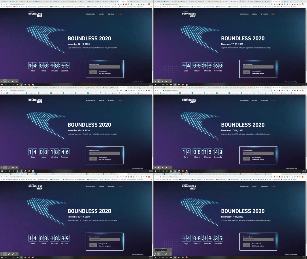
Once you’ve sent out invites or promotional messages, attendees will need a place to RSVP. Just like a traditional in-person event, a headcount of attendees is needed to properly plan and test for specific traffic levels. Registration numbers are also a great KPI to measure event success. To fully close the conversion, the landing page for the virtual event must be clear, concise and enticing. There’s no formula for the perfect virtual event registration page, but at Bluetext we recommend the following components:
- A concise listing of event details (date, time, time zone, etc.)
- Spotlight of the top event sessions to get users interested
- A sizzle reel to showcase the event highlights in a minute
- A clear and easy to find the registration form
Who’s On the List?
A key component to consider with virtual event registration is registration security. Will there be proprietary information discussed at the event? Will sessions be targeted at only your employees to introduce not in market products or strategies? If so, you may want to consider white-listing your company’s email domain. If the event is centered around internal strategies and training, you may want to also black-list the email domains of your top competitors. Depending on the size and subject matter of the event, it may also be important to reinforce security by black-listing personal email addresses and ensuring all attendees are relevant business partners and colleagues.
Always Say Thank You!
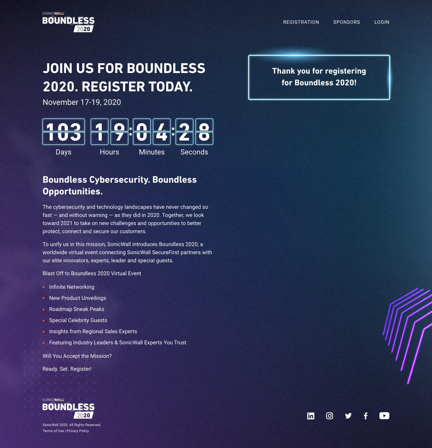
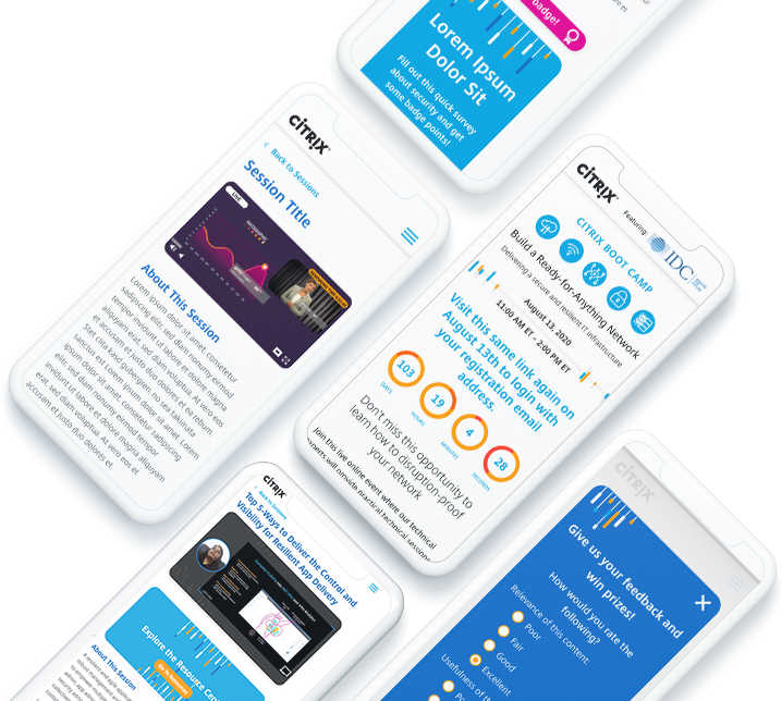
Once a user has found your enticing landing page and successfully registered for your virtual event, don’t let the excitement end there. Be sure to send them an equally interesting thank you page. In our virtual event marketing experience at Bluetext, we have found that dynamic countdown clocks are a great way to get users excited about the event. A great thank you page may also want to link out to event FAQs, or highlight a special session to look forward to.
Reminder Emails They’ll Want to Read
Once a user is registered don’t let your virtual event fall off the radar. Use the registration email list to trigger a nurture email campaign that can send additional event details, reminders, and more! A full event agenda can be overwhelming to a user two months out but would be useful when they’re blocking off their calendar a week or so in advance. It’s always a best practice to remind users a week, a day, and an hour in advance of the date. Check out the recent SonicWall Boundless 2020 virtual email for some inspiration on event teasers and reminders.

A content management system (CMS) is a software application that allows users to build and manage a website without having to code it from the ground up. The kind of content management system a site uses depends on the company’s content goals and the nature of the content itself. Since content management systems must meet so many different goals and needs, both internally and externally, the number of dedicated CMS platforms continues to grow, with many new and highly targeted systems aimed at meeting very specific needs.
So how do you know which CMS is best suited for your company’s needs? To start, let’s have a quick introduction to two of the most common open-source CMS players: Drupal and WordPress.
WordPress
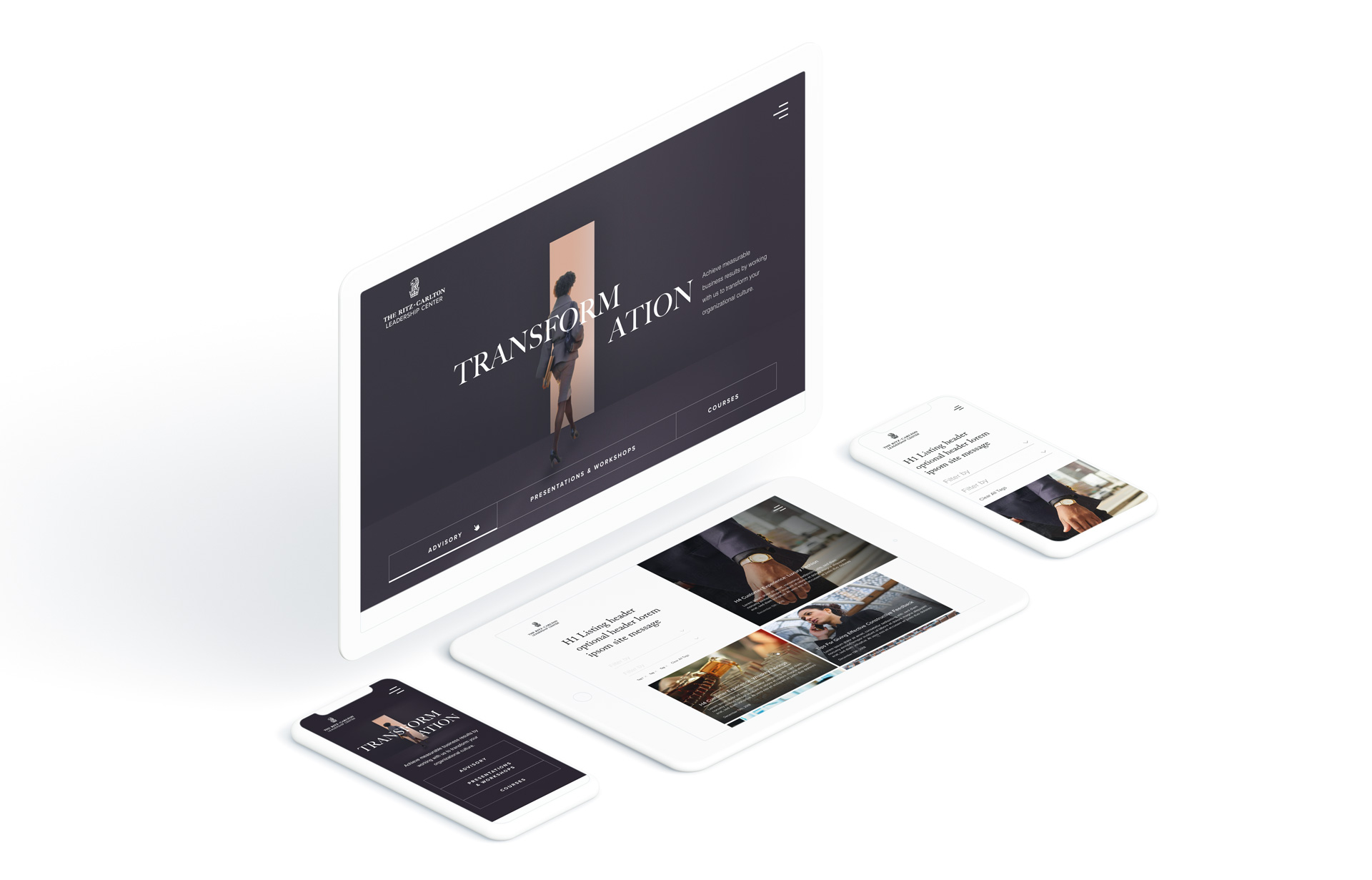
WordPress is the world’s most popular content management system. Initially launched as a blogging platform in 2003, WordPress now powers 39% of all websites. Examples of WordPress sites designed and developed by Bluetext include Ritz-Carlton Leadership Center, Clarabridge, and Perspecta.
Drupal
Drupal was launched in 2000 and claims 2.5% of the market share. Some examples of Drupal sites designed and developed by Bluetext include CACI, HughesNet, and George Mason’s Schar School of Policy and Government.
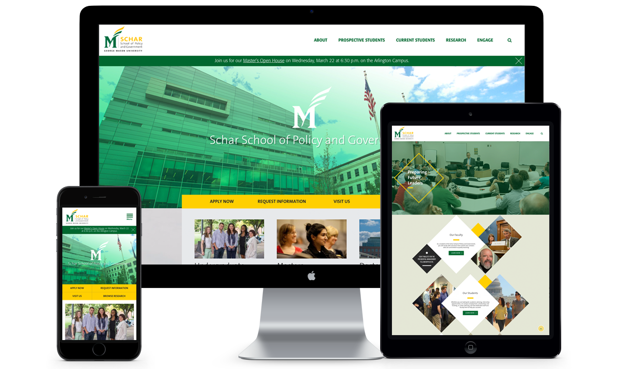
While a website design and development agency will help you determine which platform best suits your needs, you can start by understanding each content management system’s commonly known advantages.
Benefits of WordPress
- Ease of use: WordPress is significantly more user-friendly, especially for non-developers or users who do not come from a technical background.
- Extension integrations: WordPress’ plugin communities mean it is easy to extend your CMS’s functionality without the need for custom development.
- Cost: Because WordPress is a set of open-source code files that can be installed on just about any hosting platform, it does not require a purchase or subscription like many other CMS’s.
- Support: Due to its prevalence and large market share, WordPress users and platform creators are constantly keeping the platform updated and secure, providing a multitude of resources for both new and experienced users to get round-the-clock support.
Benefits of Drupal
- Customizability: While WordPress does provide some flexibility with custom post types, most users consider Drupal’s custom content types the most flexible.
- Data management: Drupal’s taxonomy system is more elaborate and flexible than the WordPress system, which is a major plus when handling extensive amounts of content.
- Permissions flexibility: While WordPress offers five basic user types, Drupal has a built-in access control system where you can create new roles with individual permissions, which is especially useful in large organizations where many users need access to the CMS.
- Security: Drupal is mostly well-known for its safety. With their unique centralized model, all add-ons have additional coverage of Drupal’s internal security programs. While this can complicate the creation of modules and skins, it also makes it much more difficult to smuggle in malicious code.
While both Drupal and WordPress have their own unique features and advantages, both are great platforms to support your website needs. Contact us to find out which CMS best fits your needs!
So you want to host a webinar? In the wake of COVID-19, webinars are your safest option for meeting with your network. According to ON24, at the onset of COVID-19 webinar usage jumped up by more than 330% as a result of the work from home shift. Six months later and webinars are the new normal. So how can you ensure yours is as successful as possible? Check out our virtual experience tips below
Timing is Everything
Studies show that unlike before, your webinar is most likely to draw in participants if it’s held on a Tuesday. While webinars have increased in popularity across every day of the week, Tuesdays have proven to be the most effective. Additionally, any promotional emails for your webinar should be sent early to mid-week for maximum effectiveness. Let’s face it, most of us are most effective early in the week–before the week gets too crazy. Bluetext can help you put together and execute a comprehensive marketing plan to advertise your webinar when audience attention is highest. From coordinated social media posts, designing promotional email templates, and even creating and placing ads, Bluetext is ready to assist you every step of the way.
Tech Support
We’ve all come to learn with work from home protocols, technical difficulties have been encountered by the best of us. However, they can change the tone and impression of professionalism for every participant. As an experienced virtual event and webinar agency, we’ve learned a few ways to avoid this frustrating user experience. First, always conduct dry runs internally to ensure all your settings and equipment work properly–the last thing you want is for your host to have AV problems at the start of your webinar. Second, we recommend having team members on standby to provide any last minute tech support to your attendees. Third, have a backup plan! Whether you offer a second platform for viewing the webinar like Facebook Live or Twitch, or a backup laptop for your host, think through any potential issues ahead of time. Lastly, if you need to contact customer support, be prepared to wait. With the increase in virtual meetings, vendors are struggling to keep up with the tech support demand. That’s why we recommend preparing in advance and working with a trusted agency, such as Bluetext, that has experience troubleshooting these sorts of technical problems.
Resources
What good is a webinar if you don’t have actionable content for attendees to access? Whether you present a PowerPoint or review a whitepaper, attendees should have access to it all. The goal of a webinar is to engage and inform, so ensure any content you provide will be relevant for a few months. We also recommend having your resources link back to your site to increase engagement and keep your company top of mind. Additionally, ensure the content you share establishes you as a thought leader in your industry. Industry leadership is established by valuable content, but also professional and impressive brand identity. Be sure all of your collateral is aligned with your brand, contains digestible and insightful graphics or diagrams, and above all else creates a lasting and positive impression of your company. If your resources need a refresh, Bluetext is a full-service creative and copywriting agency that will ensure your content is as effective as possible.
Webinar Platforms
When it comes to webinars, there are countless platforms to choose from, but these are not one size fits all. So how do you know which is right for you? Each platform offers different features, branding opportunities, and security features. From experience in virtual networking and webinars, Bluetext has dug through all the major players and can recommend the platform that best fits your needs. We have been perfecting the webinar experience for the past few months with our virtual events and learned quite a few things along the way. Experience equates to first hand knowledge on what to expect from each platform, and the pros and cons the platform itself may not tell you.
Why settle for the same old webinar when you can increase engagement and memorability with a fully polished immersive experience. With our customizable virtual events, your users will feel like they’re attending an in-person conference again. In these times, a taste of normal is what we all need. Want to learn more about how Bluetext can help your webinar be a hit? Get in touch with us here.
Whether you are starting up a small blog or running the online presence of a multinational enterprise, analyzing, managing, and understanding website traffic data is crucial to the success of your business. From the perspective of a digital marketing agency, Google Analytics is one of the most powerful and accessible tools out there, with the wealth of free information that it offers. However, with all of that data at your fingertips, it can be easy to feel overwhelmed. Even if you know where to start, you may not be aware of all the many features available, or just how deep you can dig.
Over the years, Bluetext has learned several useful Google Analytics tips and tricks that have allowed us to glean even more valuable business insights for ourselves and our clients. Here are four easy ways you can do the same and dive deeper into your Google Analytics:
1. Automate Reporting Notifications/Set Up Custom Alerts
By default, Google Analytics will notify you of any unusual site activity. However, you can set up your own custom alerts so you don’t have to rely on Google to tell you when something important happens. Custom Alerts is a feature in Google Analytics that allows you to set custom parameters to monitor for unusual site activity and track changes in the metrics that are most meaningful to your business. Once configured, you can opt-in to have Google send you an email notification if a change triggers one of your custom alerts. What may be considered unusual? Say, for example, your site experiences a 200% increase in traffic on a given day. This initially sounds great, but be wary, this could be a bot attack!. If you have Custom Alerts set to notify you for traffic increases of higher than 50% in a day, Google Analytics would record the data surrounding this event and alert you to it.
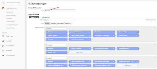
While it can be tempting to create dozens of alerts to cover every possible anomaly in your traffic, you should focus on tracking information that is most closely related to your business’ top priorities and signals events on which decision-makers are likely to take action. Custom Alerts can be set up to monitor and notify you of things like:
- Analytics Flatlining
- Traffic Drops or Drops in Organic Traffic
- Increases in Referral Traffic/Conversions from Syndicated Content
- Drops or Spikes in Goal Completions
This is an extremely useful tool, because while automated notifications should never be a replacement for regular review of your KPI-based reports, Custom Alerts can assist you by proactively identifying any issues or opportunities, including those you may have missed otherwise.
2. Create Custom and Advanced Visitor Segments
Custom segments are a powerful tool that allow you to dive deeper into your audiences and create reports within reports to gain information about how specific users are interacting on your site. Custom segmentation filters traffic based on particularly chosen criteria including dimensions or metrics, visit date, location, and more, so you can compare the performance and behavior of specific segments to the rest of your users. When implemented this can be used to gain valuable insight into how certain types of visitors behave in comparison to one another, rather than forcing you to make do with a broad overview of all pageviews or sessions.
There are many possible applications of custom segmentation, including:
- Tracking very specific groups of visitors, like male users aged 18-35 who have a strong interest in financial services, visited your site from a mobile device and are located in a particular region
- Identifying high-value customers by filtering for visitors within your target demographic whose sessions lead to a conversion
- Evaluating the performance of a given marketing campaign by identifying new users who that spent more than 20 seconds on your site during a specific time frame

Taking the guesswork out of the equation, custom segments enable you to gain valuable business insights and understand core audiences in a more robust way.
3. Utilize Annotations in your Custom Dashboards and Reports
Google Analytics allows you to create custom dashboards and reports so you can quickly access the most valuable data and focus on the KPIs that are most pertinent to your business goals. These dashboards display critical information as they are specifically designed for your needs. However, perhaps you aren’t the only person responsible for looking at these custom dashboards and reports. Maybe you understand the reasons behind any spikes, drops, and other unusual events that appear in your reports, but need a way to keep tabs on why these things happened when. Enter: annotations.
Annotations are simple notes that appear as speech bubble icons along the bottom of an Analytics graph. They can be added by clicking the downward arrow tab icon immediately beneath the graph and then “+Create new annotation”. Aside from recording the note, annotations can also document the date created, the author’s email and be set to “Private” or “Shared” to control who can view the annotation.
 Whether you’re sharing a report with relevant stakeholders and need to explain a certain fluctuation in traffic, need to be reminded of when a content update was made when returning to a graph weeks later, or want make other account managers aware of a promotional campaign that launched on a given day, annotations are a great way to communicate anything of note directly within Analytics.
4. Analyze Behavior Flows to Optimize UX
One of the best ways to improve your user experience is to gain a deep understanding of how your users behave. How are they moving around your site? What pages do they visit, and in what order? Where are they coming from and when are they exiting? Where and when do they convert or drop out of the funnel? Answering these questions can help you discover potential opportunities or problem areas in the user journey, so that you can then prioritize and address them to optimize the user experience. Lucky for you, using Behavior Flow in Google Analytics can help you do just that.

The Behavior Flow report visualizes the path a user follows from one page to the next or from one event to another. This report can give you insights on:
- The most common routes visitors take to get in and out of specific pages
- Pages that are bridges or areas of the site that are conversion hubs
- What content keeps users engaged with your site
- Potential content issues, confusing navigation, or misleading design
- If users are leaving the site when you want them to, like from a “Thank you” page, or right before they convert, indicating a poor customer journey
Additionally, by comparing Behavior Flows to Event tracking- which allows you to track anything and everything that a visitor or a user can click on like CTA buttons, downloadable items, ads or pop-up interactions- you can get a visualization of what within a user flow catches user attention, or not. Analyzing user behavior through Behavior Flows and other means will not only help to improve and optimize the user experience, but produce logical, easy steps that will encourage users towards conversions.
Conclusion
The possibilities are endless when it comes to Google Analytics. The real question is though, how can your business best analyze the data and turn it into actionable intelligence. Enter: a marketing analytics agency, such as Bluetext. A marketing analytics partner will help set up these custom dashboards, pinpoint the key metrics to pay attention to, and help set goals to reach your overall business objectives. Interested in seeing what Google Analytics insights can do for your business? Contact us today.
As a digital design agency, we know that the average person spends 3 – 5 hours a day on their mobile device! Over 20% of people check their phones every few minutes and over 50% of users look at their phones a few times an hour. Ever advancing apps and functionality are allowing people to transition almost any aspect of their life into digital devices. Order takeout? Sign a document on the go? Even adjust your thermostat. As a digital design agency, we’ve seen the increasing need for mobile-first web design. As mobile usage spikes by the day, hour, and even minute, a seamless mobile experience has become increasingly critical.

Responsive text is a no-brainer, your website copy will need to reformat to be visible and easily readable. But, to add a layer of complication to web design, images and illustrations must also work across all types of devices. With this in mind, designing websites and illustrations often turn into a puzzle, where elements must shift from wider pages to fit skinnier pages and vice versa. Before diving into a few of the benefits of mobile-optimized websites and illustrations, it’s important to first understand the two main ways you can build your site to work for multiple devices.
Responsive Design vs. Adaptive Design
Simply put, adaptive web design relies on static layouts that detect the size of the target screen and load the appropriate layout for it. We typically recommend designing adaptive sites for six common screen widths: 320, 480, 760, 960, 1200, 1600. However, technology companies are always debuting new devices with new screen sizes. Conversely, responsive web design is a dynamic design method that adapts to whatever screen – no matter the size – an individual is using. More specifically, responsive design uses CSS queries to change screen width, height, display type, etc. to adapt to the needs of a target device. As a digital design agency, we recommend a responsive design for a more fluid user experience.
Now that you have a better understanding of the main ways to adapt your site to multiple devices, keep reading to understand a couple of benefits you may not expect of mobile-optimized websites and illustrations.

SEO Benefits
Many familiar with Google’s SEO practices know that there are three major steps to how it’s algorithm works: Crawling, Indexing, and Ranking. While all three are incredibly valuable components to understand, indexing is the most relevant for the purpose of this conversation. In short, indexing is Google’s process of storing the information and content they’ve deemed relevant for users. Since Google recognizes that most of its users are on mobile devices, they have shifted toward mobile-first indexing, which means Google ranks pages, structured data, and snippets from mobile pages of websites instead of desktop pages.
A key part of this process involves images and illustrations. In the past, many websites have blocked certain illustrations from showing on non-desktop devices. Therefore, Google can’t index these illustrations as valuable content to a user. However, as a digital design agency, we know that Google’s algorithm wants to see and categorize images and illustrations. By having a responsive web design, your website’s images can display on any device, making it easier for your website to rank in Google’s top organic search results.

Visual Triggers
For better or for worse, a large percentage of people comprehend and perceive images faster than words. Generally speaking, people are better able to perceive visual marks and process data when transformed into images. Additionally, almost 80% of users scan any new page they encounter, whereas 16% read word-for-word. Whether users are scanning or reading word-for-word – images, illustrations, and infographics are incredibly important. Not to be cliché, but a picture truly can be worth a thousand words.
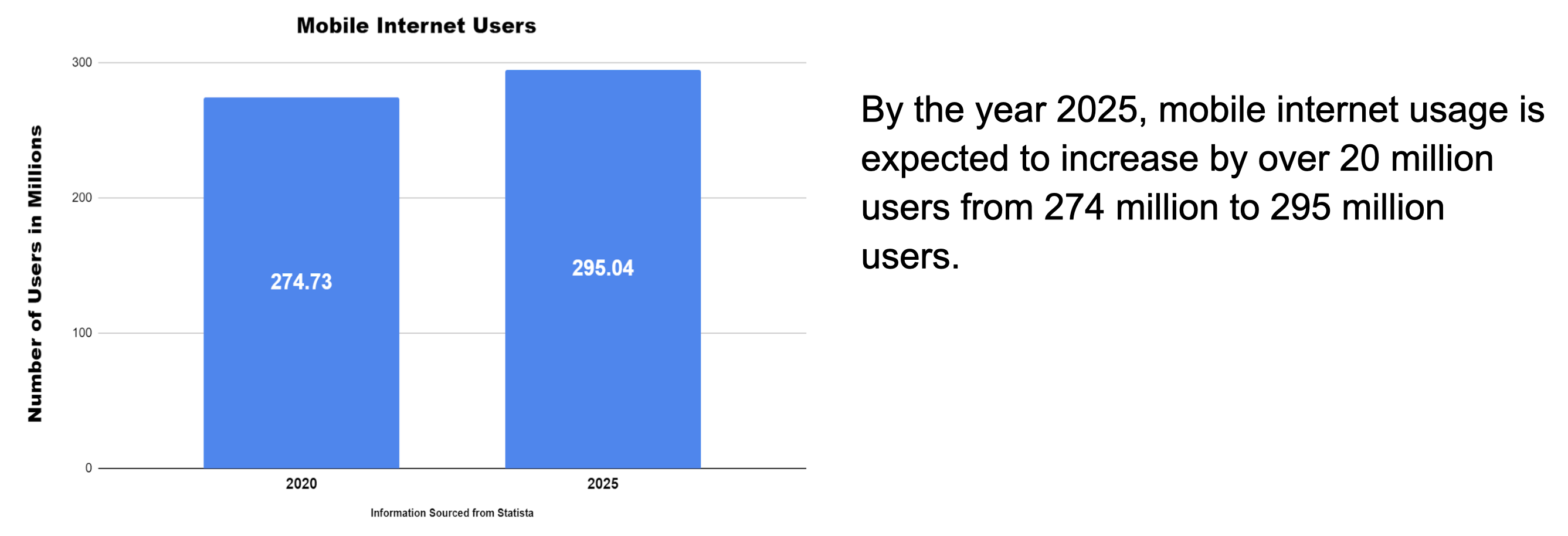
When viewing the information above, which drew your eye first, the graph, or the block of text? This question should always be asked when formatting content on a webpage, as we know that the user’s eyes are more easily drawn to illustrations than words. However, it’s important to note that images can be overdone. Adding too many images can be counterproductive, as it can create visual overkill. An experienced digital design agency, like Bluetext, can help make sure your images are helpful, relevant, and transferable between device types.

Conclusion
Images, illustrations, and infographics all visually communicate ideas and leave cumulative impressions on visitors to your website. By using them, you can create an immersive, empathetic, and humanized sense of context for users. An immersive experience can truly set your company apart from competitors and should be available to a user regardless of the viewing device. With mobile making up almost 60% of internet traffic, mobile-optimized sites and illustrations are necessary to ensure the user experience is fluid, attractive, and usable, no matter the device a visitor is using.
Interested in working with a digital design agency to help with your mobile experience? Contact Us!
What is ADA Compliance?
The Internet should be accessible for all, and Section 508 of the Rehabilitation Act of 1973, ensures that. Section 508 is designed to extend federal responsibilities to all individuals with disabilities, especially as the world moves towards more digitally based interactions. In 1998, the law was updated to include specific terminology over ‘electronic and information technology.’ Because the actual terms and conditions outlined in § 508 are ambiguous, the W3C created specific guidelines (Web Content Accessibility Guidelines or WCAG) to be able to run specific criterion tests on the suggested interpretation of the guidelines. Since January 2017, the current version, WCAG 2.0, has been accepted as the primary set of implementation guidelines.
This Is A Lot of Legal Jargon, Why Should You Care?
Every company should want as much reach for your digital content as possible, even if your target audience is not visually impaired or disabled. Not to mention, you could get sued if your website is not ADA compliant. If you’re federally funded, you must be compliant. For non-federally funded websites, it’s a gray area, but certainly a legal risk. Best practice is to be compliant and empower equal access and equal opportunity for all digital content. The Internet in particular can dramatically improve the lives of people with disabilities. It’s important to remember that accessibility is not just for the blind – it also accommodates auditory, motor, cognitive, and seizure disabilities. With about 15% of the global population living with some form of disability, it’s crucial as a reputable brand to want to make your website and digital content accessible for everyone. But it’s not always easy…
Accessibility Design
Accessibility should be considered early on in the design phase. It’s also important to remember that there’s no “end” to accessibility – it’s an evolving process. There’s also no ‘correct’ solution to accessibility. The WCAG 2.0 instead focuses on four principles of accessibility to base on for criterion testing:
- Perceivable
- Operable
- Understandable
- Robust
What do these principles mean and how can I design in style with them in mind?
Perceivable
This means web content is made available to the senses – sight, hearing, and/or touch.
Text Alternatives: You must provide text alternatives for any non-text content so that it can be changed into other forms people need, such as large print, braille, speech, symbols, or simpler language.
- All non-decorative images should have alternative text (aka ‘alt text’)
- Complex images should be described on a separate and linked page
- Form buttons and fields should be labeled
Pro tip: Use arrows so google can “read” hidden content.
↓

Time-Based Media:
- Audio content should have text transcripts
- Video content should have synchronized captions
- Any visual content in video should be described
Adaptable: Create content that can be presented in different ways (for example, simpler layout) without losing information or structure.
- Semantic markup is used for headings and text (e.g, <h1>, <ul>, <ol>, <strong>)
- Menus should be logical and intuitive from reading order alone
- Instructions do not rely on shape, size, location, or with auditory cues
Not only are these practices compliant, but they also provide tremendous SEO benefits! So why wouldn’t you implement an adaptable structure?
Distinguishable: Make it easier for users to see and hear content including separating foreground from background.
- Color is not used as the sole method of conveying content or distinguishing visual elements
- Contrast (http://webaim.org/resources/contrastchecker/)
- The text has a contrast ratio of 4.5:1 (AA)
- The large text has a contrast ratio of 3:1 (AA)
- Large text is defined as text larger than 18 points (~24px) or bold text larger 14 points (~19px)
- The page is readable and functional when text size is doubled (AA)
- Should be able to pause or change the volume of any audio longer than 3 seconds
Pro Tip: Test your color contrast and font size with this tool to ensure it’s compliant. Accessible design can still look modern and creative! https://www.getstark.co/
↓

Operable
This means the user interface components and navigation must be operable.
Keyboard Accessible: Make all functionality available from a keyboard
- All functionality is available using the keyboard unless the functionality cannot be accomplished in any known way using the keyboard
- Keyboard focus is never trapped
Enough Time: Provide users enough time to read and use content
- If a page or application has a time limit, the user is given options to turn off, adjust, or extend that time limit
- Automatically moving, blinking, updating, or scrolling content that lasts longer than 5 seconds can be paused, stopped, or hidden by the user.
Pro Tip: On auto-scroll content, include a play/pause button so it can be paused and the content can be consumed. If the content on auto-play doesn’t have a link or text, or really any content associated with it, then it does not need a pause/play button.
↓

Seizures: Do not design content in a way that is known to cause seizures
- No content flashes more than 3 times per second and do not contain too much red
Navigable: Provide ways to help users navigate, find content, and determine where they are
- A link is provided to skip navigation and other page elements that are repeated across web pages
- Pages have descriptive and informative page titles
- Navigation is logical and intuitive
- The purpose of each link can be determined by the link text and context alone. Links with the same text that go to different locations are readily distinguishable.
- Multiple ways to find other web pages of the sites (e.g., table of contents and search) (AA)
- Avoid duplicative page headings and label text (AA)
- Focus states are visible to the user (AA)
Understandable
It’s as simple as it sounds – content and interface need to be easy to understand. This should be a website goal for both disabled and abled users!
Readable: Make text content readable and understandable
- The language of the page is identified using the HTML lang attribute (e.g., <html lang=“en”>)
- The language of page content that is in a different language is identified using the lang attribute (e.g., <blockquote lang=”es”>) (AA)
Predictable: Make Web pages appear and operate in predictable ways
- When a page element receives focus or a user interacts with a form or control, it does not result in a substantial change to the page, creates a pop-up, or any other change that could confuse the user, unless the user is informed of the change ahead of time
- Navigation links do not change order (AA)
- Elements across multiple webpages are consistently identified (AA)
Input Assistance: Help users avoid and correct mistakes
- Required elements for a form are clearly labeled as such
- Form validation issues are provided in a quick and accessible manner
- Required interactive elements have sufficient labels and instructions
- Suggestions should be provided for fixing input errors (AA)
- Changes to legal or financial data can be confirmed or reversed (AA)
Robust
Content can be used reliably by a wide variety of user agents, including assistive technologies
Compatible: Maximize compatibility with current and future user agents
- Avoid HTML parsing errors (http://validator.w3.org)
- Markup is used in a way that facilitates accessibility (e.g., ARIA labels for custom interface components)
Remember, accessibility is more than just following these guidelines – it’s about equal access to digital content. You could be the next big example in your industry for accessibility, and maybe even be eligible for an award. And once your beautiful, new website is built, there are tools to help you ensure your site is accessible. Download WAVE to identify accessibility and Web Content Accessibility Guideline (WCAG) errors.
Not sure how to get started? Contact us at Bluetext – we’re here to help!
A business’ marketing content is crucial in informing and educating prospects and customers about the company. It helps communicate the company’s story, credibility, leadership in the industry, as well as specific solutions and challenges they can solve. It not only represents your business but also your value proposition. It determines what sets you apart from your competition. Content marketing helps to educate and guide customers on authentic and trustworthy experiences, ultimately leading to conversions for your business.
There is no shortage of marketing resources available. From infographics to whitepapers, to case studies and blogs, marketing content exists in all shapes and sizes. The variance helps open your resources to a wide range of audiences while also keeping content fresh and modern. But what is the best way to showcase all your resources together in one organized, concise place?
Rise of the Resource Centers
The popularity of businesses creating online Resource Centers/Hubs on their websites is through the roof. Resource Centers consist of pages and pages of content marketing assets. End users typically can preview the type of content, a short description, and maybe even a thumbnail image. Resource Centers can often become extremely overwhelming for a user, driving away conversions. The user journey is important to keep top-of-mind when designing your Resource Center.
One of the best ways to improve the user experience while browsing content marketing is to aid them in finding exactly what would cater to their needs. Taxonomy tags are the most efficient way to categorize content by type, category, or keyword. Users should be able to easily search or filter between taxonomies, to view results relevant to them as a click of a button. Resource Center listing pages can even pre-filter content and allow the user to view specific collateral types, topics, or more upon landing.
Industry Examples
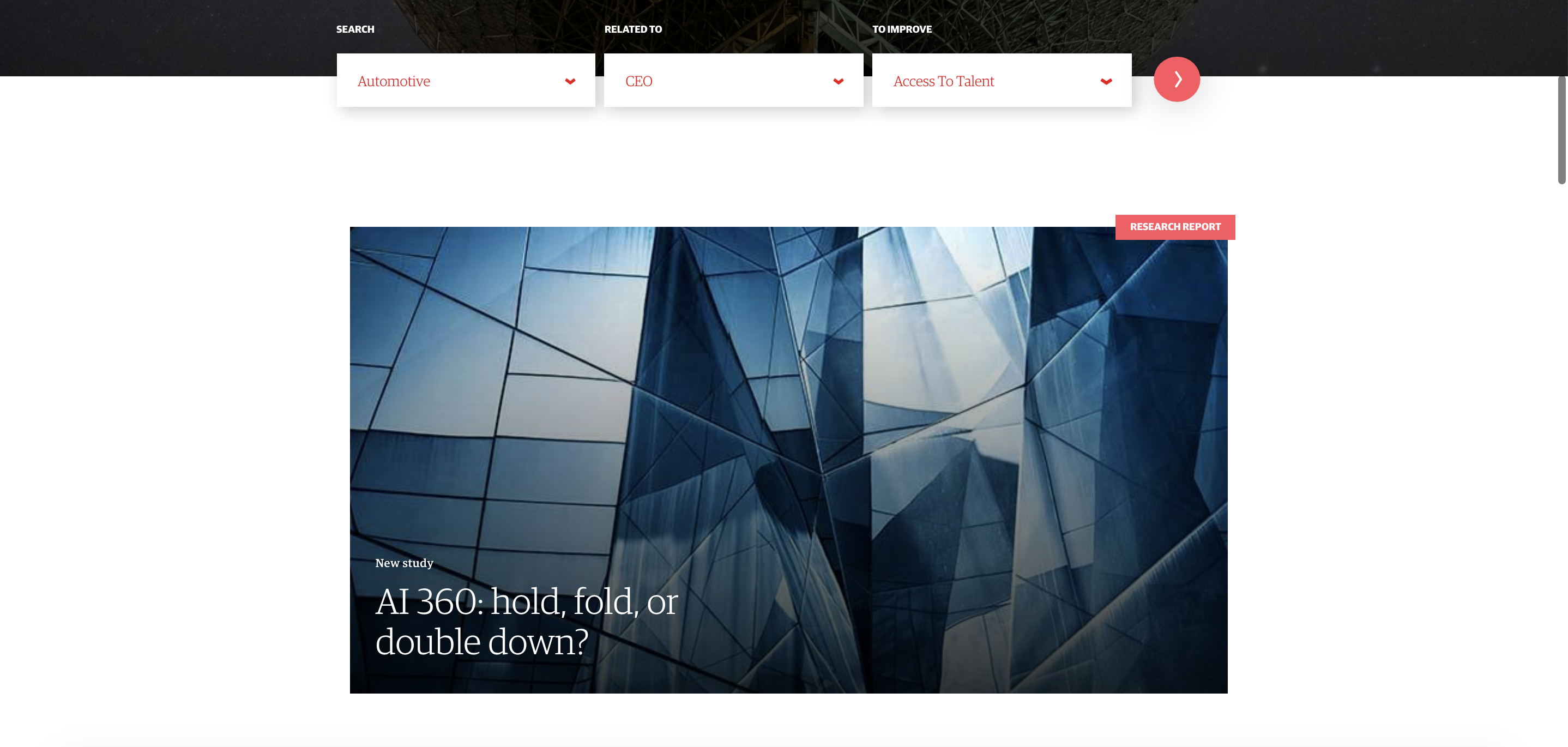
For example, Genpact exemplifies a simple user journey on their Resource Center. The first thing a user sees landing on their “Insights” page is the ability to search for content related to a specific industry, function, or even to improve a strategic goal. By establishing obvious and easy to use personalization options, users feel catered to and confident they will find exactly what they are looking for. And even without a specific intent in mind, users can pre-filter options to simply browse by industry, function, or goal-relevant to them. Users can even combine all three filtering options to view even more tailored results.
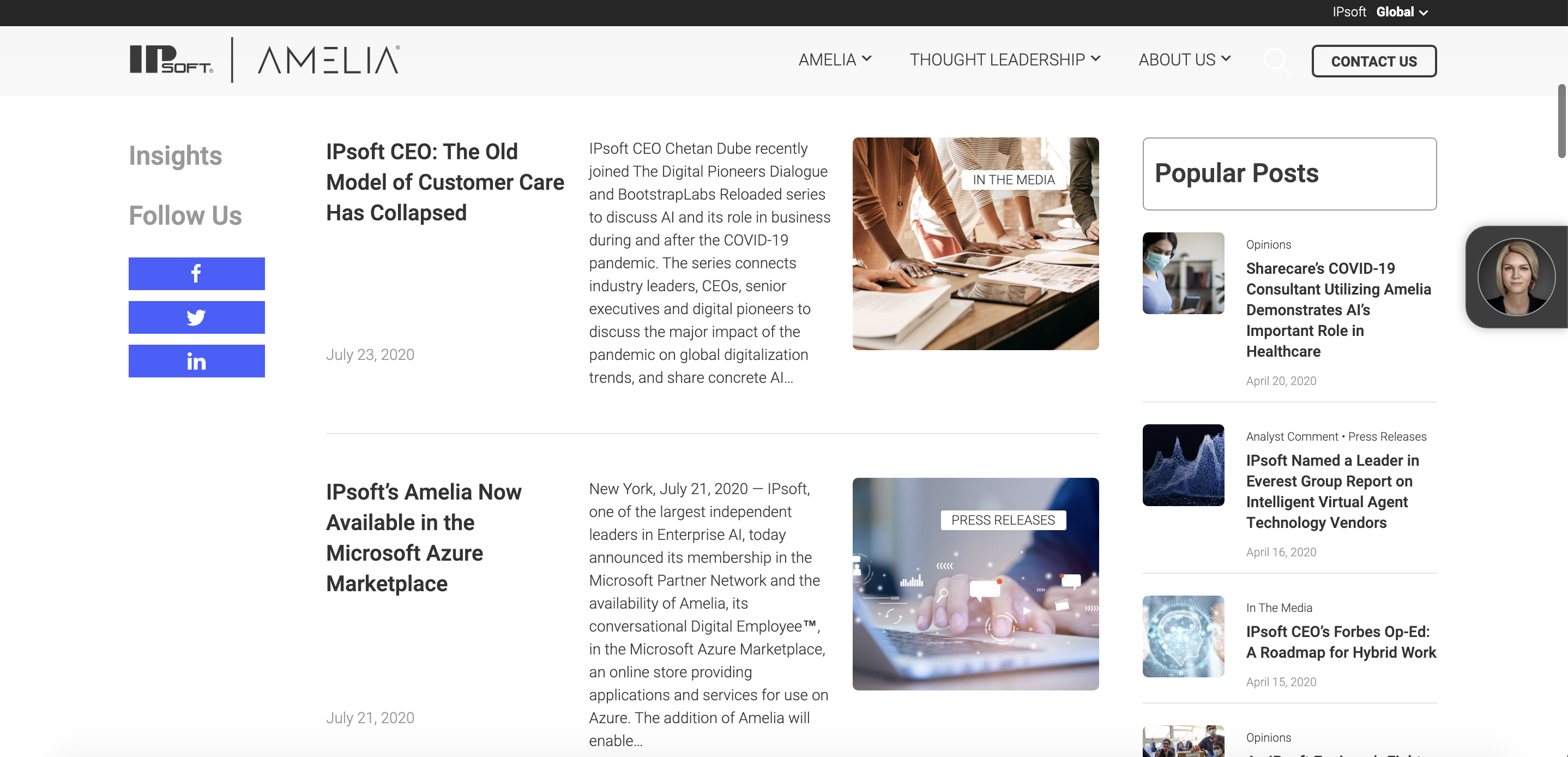
Another great example of pre-filtered content in a Resource Center is IPsoft. IPsoft filters all content by types, such as Press Releases, Opinions or blogs, or educational resources such as whitepapers and videos. For users browsing the newsroom, all content is sorted chronologically and categorized by large, recognizable tags. In addition, popular posts constantly follow the user in the right-hand column while social media share buttons are easily accessible in the left-hand column.
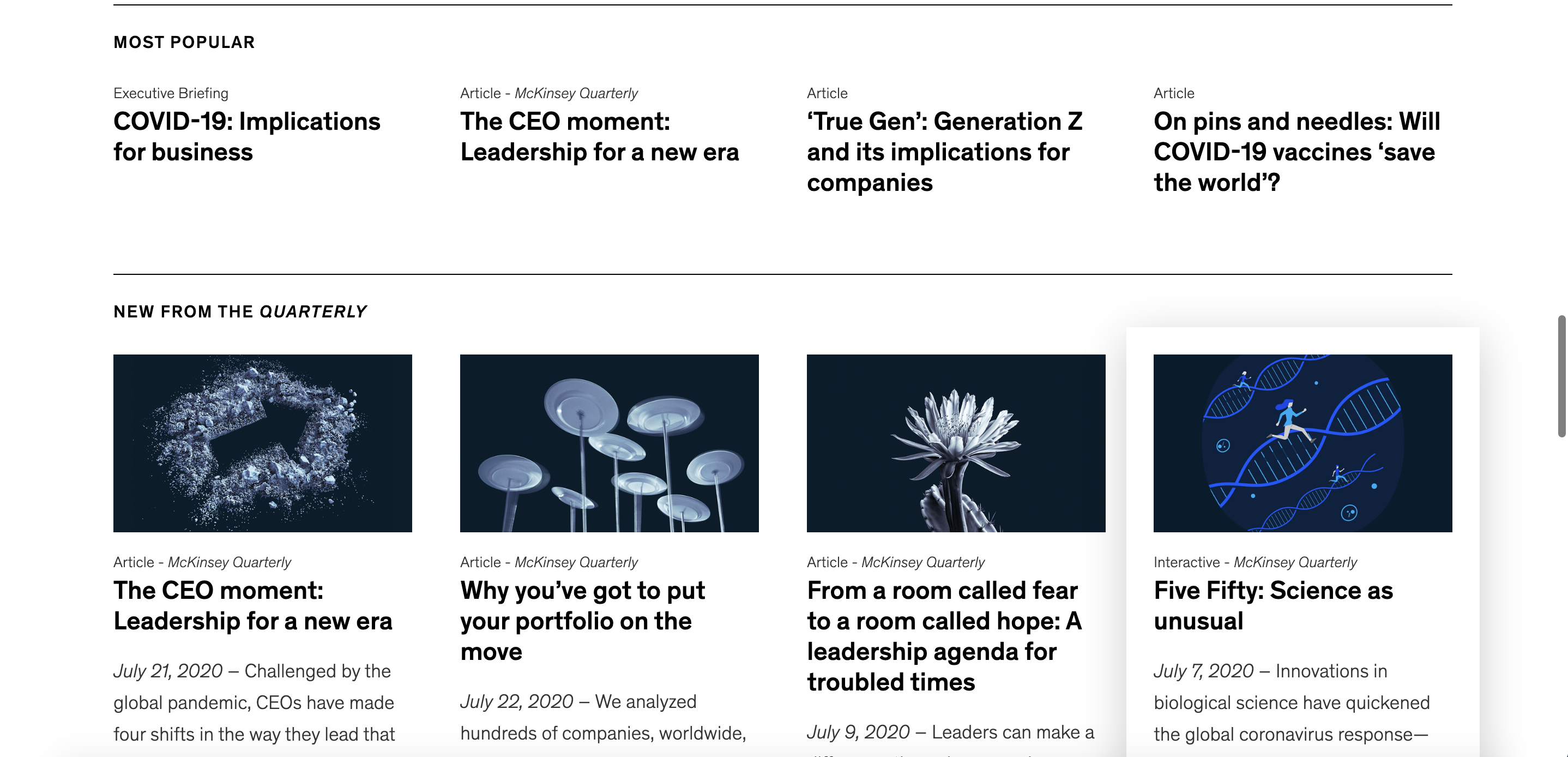
McKinsey takes a unique approach in its Resource Center by showcasing its range of content marketing and news types in nugget-sized promotional banners. With this approach, a user is introduced to a wealth of resources and content types, without being overwhelmed. With only one to four resources shown per type, the page is easily scannable. This not only caters to the simplified user journey for the user who knows what they want they’re looking for, but also for the user who wants to explore and browse content. McKinsey sorts by popular posts, magazine insights, global institute insights, and podcasts and videos into one streamlined interface, much like a magazine stand. This further cements the credibility of the company as well by highlighting various company publications.
Along with pre-filtering content for your audience, creating a unique and well-designed Resource Center is key for standing out amongst your competitors and bringing in potential conversions. It’s crucial you recognize the goal for your Resource Center – is it to highlight outstanding thought leadership? Or is it to showcase your wide range of insights? Once you have your goal in mind, focus on user experience, and strategic branding to achieve your goals and watch the conversions come in.
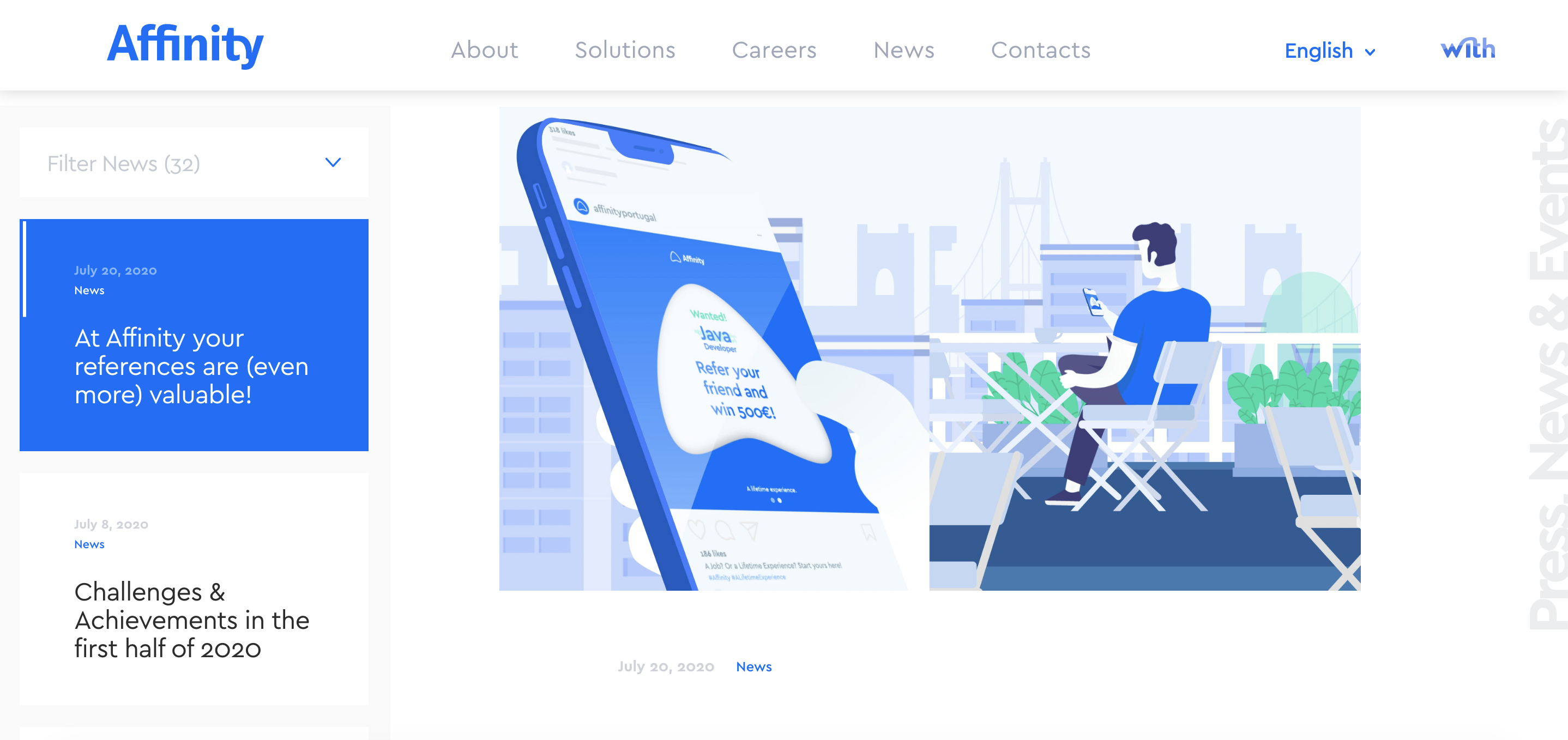
Affinity is a prime example of using unique branding to frame their content marketing as interesting and valuable. Affinity is focused on showcasing a breadth of content and has created a unique design to accomplish this goal. When you land on the News, you immediately view the most recent article, ready for your users to read. While prioritizing the most up to date content, the left-hand column allows users to scroll through other posts or resource types with the ability to filter by categories. It gets a user hooked on the breaking headline, but not without showing off the greatest hits.
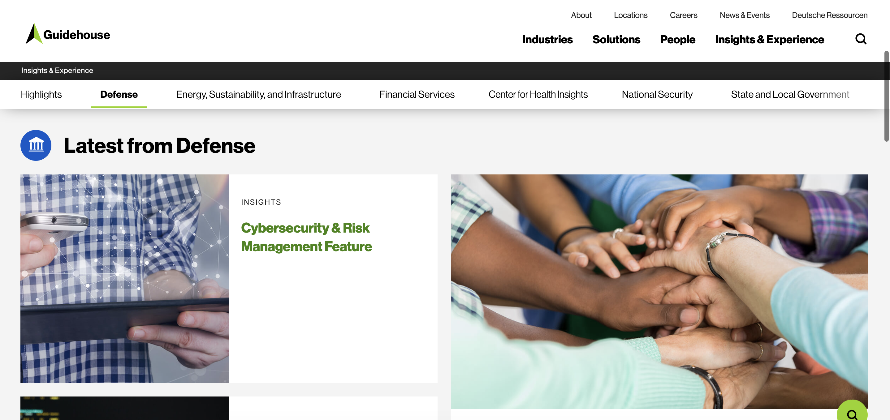
Another great example of a unique Resource Center is Guidehouse. Guidehouse has a large number of insights, thus utilizes sticky navigation. Sticky navigation follows a user as they scroll up and down on a page so that a menu of alternate pages or sections are always in view. Their sticky navigation showcases pre-filtered content in a variety of industries. This highlights their range of abilities, while also ensuring users never feel lost in an unfamiliar industry.
We all want to be thought leaders, but your company has to look the part. Don’t underestimate the power of your marketing content. Utilize your content and drive conversions for business and reputational success!
Considering amping up your Resource Center? Trust Bluetext with all your digital marketing and design needs!
What is responsive web design?
At its core, responsive web design uses a single layout for a web page then dynamically adapts to best fit the user’s screen, whether it’s a desktop, laptop, tablet, or a mobile device. This creates a seamless and recognizable experience for every user and session if viewed on a laptop one day, and on a mobile device the next.
Responsive web design not only improves user experience but also increases development and design efficiency. This method of web design is preferred over an adaptive approach since it reduces the number of layouts designers and developers need to account for. Rather than designing the same page for small and large desktops, tablets, and mobile devices, responsive design dynamically updates page layout to fit the users’ screen.
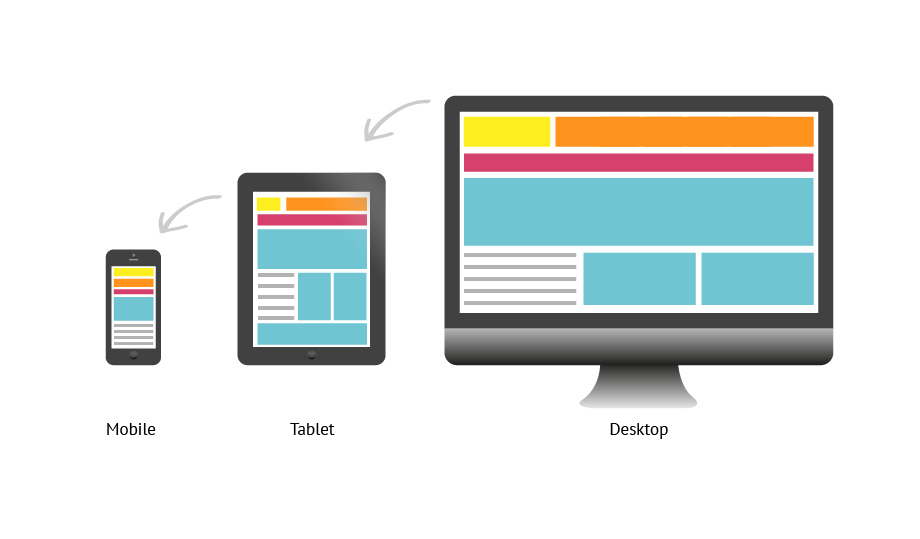
User Experience and Expectations
Welcome to 2020, where everyone is walking around with a miniature computer glued to the palm of their hands. Users have become more and more comfortable browsing online for everything from e-commerce to B2B research. Even if your business imagines themselves being primarily viewed at the office or on traditional desktop screens, you must accommodate for changes in user behavior. It’s highly likely that your users may find your website while browsing LinkedIn on their phone or tablet, or maybe Googling on-the-go. And if you have successfully captured their interest on a mobile device, you better prepare for a more thorough investigation on desktop. Your website now has two unique sessions that you should ensure are seamless and as familiar as possible. Imagine being blown away by a beautifully designed website, only to show your colleague the next day on your iPhone and find the mobile site clunky and unusable.
As Krisztina Szerovay explains responsive web design, nowadays, it’s more of an expected standard than a luxury for sites to utilize a responsive design. With a significant portion of site traffic coming from mobile, it’s more important than ever to ensure your site caters to all users regardless of screen size.
Work smarter, not harder.
Responsive web design provides many benefits such as increased flexibility, better SEO, reduced costs, and better mobile experiences. Instead of making a new design for each new device or screen size, rapid response allows you to stick with one design. Google recommends using responsive designs as they allow you to focus on a single page while also improving the mobile experience for users.
This approach is also cost-effective thanks to its faster implementation and easier management. Lastly, responsive designs’ simplified layouts provide your mobile users with more enjoyable experiences. And as we already know, with more and more web traffic coming from mobile, a good mobile experience is essential. Responsive web designs have even led to higher engagement, with users visiting more pages on average per visit.
A word of caution, trust the experts
While responsive web design has numerous benefits, it’s worth noting it’s not for every company. This method requires more up-front planning to ensure the design and experience are clear for users. But that’s where Bluetext comes in, our experienced designers and developers collaborate to develop a site that not only meets your goals but also works across all devices.
Indirectly, the responsive method provides additional benefits. Since your site must be designed for all the content to be repositioned based on the users’ screen, we work with you to find the simplest and clearest way to convey your message. Often, responsive designs benefit from a very straightforward design. For example, Apple doesn’t change any of the content that’s shown on their desktop site compared to its mobile site, the only difference is their menu and content placement. With the knowledge of industry best practices, we can guide you every step of the way from content placement to functionality.
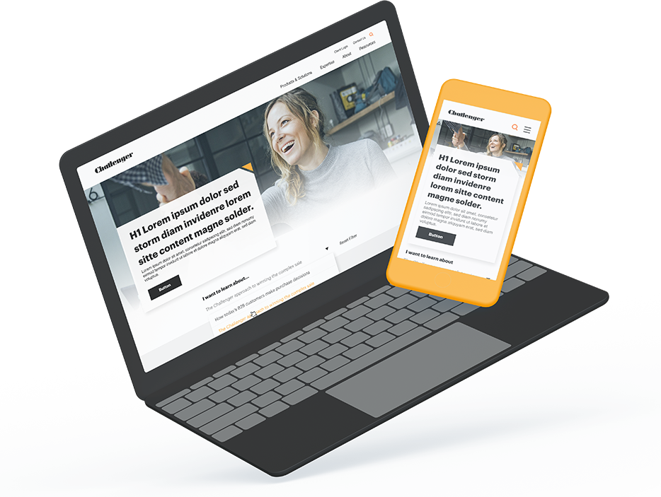
Read more about how we recently designed and developed a fully responsive site for Challenger. Our team created a site with current best practices for content functionality while giving more flexibility to the back-end users to accommodate various user journeys.
When building and launching digital campaigns, many of the key determinants of success are evaluated through digital engagement measurement and tracking. However, as websites and ad-tech have evolved in recent years, so have protections and privacy policies. It’s easy to write off the need for a comprehensive privacy policy, however, this is a recipe for disaster in the age of big data regulation and enforcement. To avoid the FTC and International regulators ire, digital agencies such as Bluetext recommend taking data privacy measures that cater to the most comprehensive regulations in effect.
For businesses with users outside of the United States, being aware of the General Data Protection Regulation (GDPR) and similar legislation is an essential consideration. The GDPR has created strict provisions for EU web users’ privacy and data rights, which extends to US browsers. As global privacy legislation evolves, North American businesses that handle global users’ data must comply with current regulations and build with an eye on future compliance. Top digital marketing agencies advise and design campaigns and websites with these policies in mind to provide frictionless engagements.

What is the GDPR?
The GDPR is an extraterritorial set of provisions that updated Europe’s data protection standards. The privacy policy strengthens the protections set in 1995, adding requirements for greater transparency and disclosure to users, in addition to modernizing the “cookie law” of 2002.
The GDPR goes beyond earlier regulation, focusing on personal data protection regardless of the type of data and how companies must document user consent in a transparent fashion. These protections apply to all persons browsing within or originating from the European Union.
The term “personal data” is not synonymous with “personally identifiable information”, or PII. PII has traditionally been a legal concern for American businesses, and it refers to a more defined set of information than the GDPR model. PII does not have to be context-specific to be regulated, in contrast, the GDPR emphasizes the consumer risks of data aggregation.
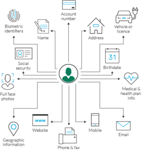
My business isn’t located in Europe, why should I care?
The GDPR’s reach is far greater than the medley of privacy protections in effect across the United States. Violators of the regulations risk penalties of €20 million ($22.6 million as of writing) or 4 percent of global annual revenues for the preceding fiscal year, whichever is greater. Comprehensive legislation at the state level in the U.S. has been varied, many forward-thinking businesses are beginning to take steps to adapt their practices to comply with the California Consumer Privacy Act (CCPA). Ultimately every website will have to comply with some set of standards, so it is wise to be proactive and implement privacy protection now. Top digital marketing agencies such as Bluetext are taking steps to protect against potential violations of the CCPA and GDPR by changing cookie collection practices, recommending new data collection practices, and designing clear consent forms.

Changing privacy policies impact sites from the bottom up, starting with development and design
In a digital-first world, data is a critical component of many businesses online and offline strategies. With the implementation of the GDPR, marketers and web developers must be more diligent about what data we collect, the means by which we collect it, and how we handle sensitive information. When building or updating websites, web developers, and digital project managers should take this as an opportunity to rethink how sites can be more transparent and adopt the Privacy by Design framework.
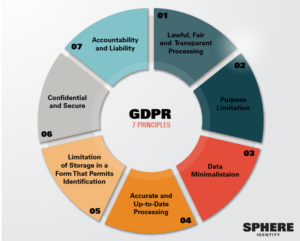
The Privacy by Design framework highlights design-thinking approaches to development prior to launch to eliminate the need for post-hoc privacy fixes once a project is live. Solutions such as making privacy the default setting for site visitors, making privacy standards visible and open, and giving users specific privacy information notices are easy considerations to add to the development plan.
If your site is already live, consider a development sprint focused on auditing areas of potential weakness. In assessing your data hygiene, your team can look for unsafe or unnecessary modules that can be disabled, particularly those found in APIs and third-party libraries. Adtech integrations may help source leads and retarget with better precision, but validating that their pixels and tracking are in alignment with GDPR best practices is essential.
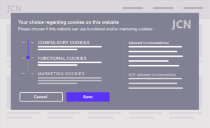
The aesthetic design of websites is also impacted by changing privacy practices. GDPR consent requires clear and explicit opt-in notices to users. Designers, user experience experts, and marketers should work collaboratively to update existing landing page components to incorporate new disclosure features. One simple mantra to internalize in the design phase? Offer accessible, clean choices around cookies and pixels.
When building clear user permissions for data capture, the GDPR requires that websites define data retention and deletion plans for all the personal data collected. Adding GDPR conscious logic to scripts at the code level of your site can save time for site custodians and business analysts alike in the future.
Updating best practices for common marketing tactics and tools
Updating the fine print on your Privacy Policy is just the first step of complying with new regulations; common marketing campaign tactics such as cookies should also be rethought through the lens of compliance. Cookies are the small data files that can be placed on users’ browsers and provide a trove of useful insight to website operators. Under the GDPR, businesses are legally liable for any activities on their sites, specifically protecting user data from third-party cookie tracking.

Many businesses use cookie tracking to better measure the impact of their marketing strategies, and they combine tracking with other user data to build user personas. While this has been an accepted practice in the past, the new regulation now requires clear permission from European users to collect this information, whether the site is for an American or French company. As noted in the impact of GDPR on design, cookie usage has to be explained on either the homepage or a second-level page on the navigation. This immediate opt-in should allow users to understand how their data is collected, the purpose of the data, and how long they are consenting to these cookies.
As a website operator, sites must withhold all cookies and trackers on your website until you have received clear and explicit user consent on each type of cookie and tracker. This consent has to be given freely, described in explicit plain language, and users must have the ability to withdraw consent. The rights of users under the GDPR are extensive — to comply, website custodians must update their privacy policies and opt-in tools.
This sounds like a lot of work, why should I care?
Ultimately, thoughtful privacy policies, development, and design provide a safeguard for both businesses and users. The GDPR gives consumers new rights to access and manage their data on digital platforms, and businesses that do not adapt to meet these regulatory requirements can face steep fines. While these changes can seem overwhelming, a top digital marketing agency such as Bluetext can guide your business through the murkiness of data privacy design and compliance.