As a digital design agency, we know that the average person spends 3 – 5 hours a day on their mobile device! Over 20% of people check their phones every few minutes and over 50% of users look at their phones a few times an hour. Ever advancing apps and functionality are allowing people to transition almost any aspect of their life into digital devices. Order takeout? Sign a document on the go? Even adjust your thermostat. As a digital design agency, we’ve seen the increasing need for mobile-first web design. As mobile usage spikes by the day, hour, and even minute, a seamless mobile experience has become increasingly critical.
Responsive text is a no-brainer, your website copy will need to reformat to be visible and easily readable. But, to add a layer of complication to web design, images and illustrations must also work across all types of devices. With this in mind, designing websites and illustrations often turn into a puzzle, where elements must shift from wider pages to fit skinnier pages and vice versa. Before diving into a few of the benefits of mobile-optimized websites and illustrations, it’s important to first understand the two main ways you can build your site to work for multiple devices.
Responsive Design vs. Adaptive Design
Simply put, adaptive web design relies on static layouts that detect the size of the target screen and load the appropriate layout for it. We typically recommend designing adaptive sites for six common screen widths: 320, 480, 760, 960, 1200, 1600. However, technology companies are always debuting new devices with new screen sizes. Conversely, responsive web design is a dynamic design method that adapts to whatever screen – no matter the size – an individual is using. More specifically, responsive design uses CSS queries to change screen width, height, display type, etc. to adapt to the needs of a target device. As a digital design agency, we recommend a responsive design for a more fluid user experience.
Now that you have a better understanding of the main ways to adapt your site to multiple devices, keep reading to understand a couple of benefits you may not expect of mobile-optimized websites and illustrations.
SEO Benefits
Many familiar with Google’s SEO practices know that there are three major steps to how it’s algorithm works: Crawling, Indexing, and Ranking. While all three are incredibly valuable components to understand, indexing is the most relevant for the purpose of this conversation. In short, indexing is Google’s process of storing the information and content they’ve deemed relevant for users. Since Google recognizes that most of its users are on mobile devices, they have shifted toward mobile-first indexing, which means Google ranks pages, structured data, and snippets from mobile pages of websites instead of desktop pages.
A key part of this process involves images and illustrations. In the past, many websites have blocked certain illustrations from showing on non-desktop devices. Therefore, Google can’t index these illustrations as valuable content to a user. However, as a digital design agency, we know that Google’s algorithm wants to see and categorize images and illustrations. By having a responsive web design, your website’s images can display on any device, making it easier for your website to rank in Google’s top organic search results.

Visual Triggers
For better or for worse, a large percentage of people comprehend and perceive images faster than words. Generally speaking, people are better able to perceive visual marks and process data when transformed into images. Additionally, almost 80% of users scan any new page they encounter, whereas 16% read word-for-word. Whether users are scanning or reading word-for-word – images, illustrations, and infographics are incredibly important. Not to be cliché, but a picture truly can be worth a thousand words.
When viewing the information above, which drew your eye first, the graph, or the block of text? This question should always be asked when formatting content on a webpage, as we know that the user’s eyes are more easily drawn to illustrations than words. However, it’s important to note that images can be overdone. Adding too many images can be counterproductive, as it can create visual overkill. An experienced digital design agency, like Bluetext, can help make sure your images are helpful, relevant, and transferable between device types.
Conclusion
Images, illustrations, and infographics all visually communicate ideas and leave cumulative impressions on visitors to your website. By using them, you can create an immersive, empathetic, and humanized sense of context for users. An immersive experience can truly set your company apart from competitors and should be available to a user regardless of the viewing device. With mobile making up almost 60% of internet traffic, mobile-optimized sites and illustrations are necessary to ensure the user experience is fluid, attractive, and usable, no matter the device a visitor is using.
Interested in working with a digital design agency to help with your mobile experience? Contact Us!
Learn your customers. This is not news to anyone in sales, but the more you understand about your audience, the better you can appeal to them. With more and more sales moving to digital, companies need to invest in digital empathy and offering a personalized brand experience is the way to go. Gartner agrees, that this is the year that personalization can enable up to 15% more profits for companies who re-engineer their content strategy to align with customer intent on a case-by-case level. For instance, a questionnaire that simultaneously tracks their answers and interests while drawing them to your critical on-site content that aligns with those interests is a win-win. In the end, your customers are satisfied immediately when, after a few clicks, get what they need on a personalized listing page or action report, especially if you gate it, and you understand your customers in real-time. Raise your hand if you want to be a trusted consultant and thought leader with great top of funnel pipeline…
Peak Interest. Peak Opportunity.
You’re being overmarketed. That must sound strange coming from a marketing blog, but the truth as we see it is that there is more noise out there than ever and digital ad-apathy is stronger than it’s ever been. So how can marketers cut through that noise and get their foot in the door? Lead generation today is about taking the time to tailor and target the message to the right person. It’s important to balance marketing automation with personalized lead-by-lead outreach. Is it time-consuming? Absolutely. Is it worth it to increase your ROI? Absolutely.
Marketers overwhelmingly agree that personalization is a huge benefit for developing and maintaining customer relationships. According to Adobe 60% of us are having trouble trying to make the switch to personalized content, but 90% of marketers recognize that their target audiences expect a personalized experience.
So what change is happening to boost marketers’ confidence in 2020?
Empirical Empathy.
You may have the creative personalized ideas, writers, designers, and web developers ready to help go to market, but until your business has the right data to drive your GTM ideas, you might be starting from scratch. Instead, companies who cultivate all of their customer data together, including customer journey tracking, cross-platform reporting, and aggregating lead generation trends across their web, mobile, email, and social channels will find the personalized insights they need to succeed. Harness the bountiful (and cheap) organic user information, across multiple data platforms, into one cohesive customer profile. Then build your storytelling experience, quiz, or dynamic CTA button around what you’ve discovered about your users. Turn your expensive anonymous users into cheaper hyper-targeted users through a foundation of data and let a personalized marketing experience reap the benefits.
On average, marketers within companies store their customer data in at least four different systems, most of which are not shared or have no way to make meaningful connections. Dramatic investments are in store for whatever integration, platform, or process can unite the omnichannel user data and enhance data analysis. Start with implementing data-driven objectives like:
- Location Data
- Overlays
- Survey Responses
- Ad Campaign Interaction
- Tag and Filter Results
- Track Pageviews
- Smart Lists
- Dynamic Content Blocks
- Link Clicks
- Referral Source
With this precise user understanding at marketers’ fingertips, we enjoy the familiarity of personalized campaigns. Yet culling that data together and offering a message or experience to the potential lead based on their previous interactions with your company is vital to getting that foot in the door. Invest in understanding your audience and their behavior and interests and they will invest in understanding you.
Email is Still Mail.
Let’s face it, our inboxes aren’t overflowing with personal communications from friends and loved ones. That doesn’t mean email marketing has to be impersonal. So how do we get a user to click on that one email subject line when they return from vacation to a mailbox full of ads? Personalize your headline copy, customize imagery by location, gender, or season, and insert dynamic CTAs to make the offer relate to what you know about them. Make it pop!
Bonus – add additional personalized flair to your brand experience by implementing a kickback email upon conversion. The most common form of a kickback email is an automated thank you note sent to their inbox once their personal information enters your CRM. Higher engagement rate – check. Great first impression – check. Polite digital etiquette – check.
You’re on the Right Landing Page.
Let’s say you’ve finally convinced the user to engage with your content and click on the CTA button, you know you have their full attention. Making a personalized first impression when they arrive on the landing page both affirms that they are in the right place and encourages them to remain there. In the Calling All Optimists case study, the media campaign was designed to match the messaging that worked in the first place to pull double-duty by complementing the interest on the landing page. Driving the target audience to the site, the user is met with a unique welcome message in the hero-zone correlated to the specific ad they engaged with.
Personalizing your page ensures that traffic from all over the world sees the most appealing content for them. Whether it’s one of your homepages (yes – the more the merrier!) or a campaign landing page, every page should have a purpose correlating to every unique visitor and their previous exposure to your brand.
Make It Personal
Stand out by personalizing your digital reputation. Customers will remember your services, your messaging, and your products if you direct them to what makes sense for them, rather than sending them on a wild goose chase. Content marketing has been top of mind for this industry for years now, but personalizing that content marketing strategy is a way to make your brand feel exciting and special.
It’s time to say goodbye to cookie-cutter content passively thrown into your resources listing page and keeping your fingers crossed that someone stumbles into it. With social media engagement on the downfall and Google’s algorithm prioritizing their own thought leadership over yours, it is imperative to transform your strategy into something that appeals to your ideal customer. Two-thirds of consumers say they will switch to brands that treat them like an individual rather than a data point, a trend that will continue to be driven by younger audiences who value brands that are transparent, authentic, and personal.
No matter the tactic, the fundamental purpose of personalizing any campaign is to boost engagement by telling the user you understand their need. Communicating your own message by listening to their needs first will always prove to be worth the research, planning, and testing effort. Delighting the modern consumer is going to take some analytics-grit, but doing your marketing homework before investing in any large personalization initiative will pay off in 2020.
If you’re looking to digitally personalize your content, reach out to Bluetext to help you succeed.
Always keep in mind: your website is the first impression that users will get to see what it’s like to do business with you. Just like you would put on a clean suit for a pitch, put on your best interface on your website. Do not drive away a business opportunity by designing a cumbersome website that is hard to navigate! Below are the best practices for implementing a B2B navigational system with users in mind.
Create a Buyer Persona
When thinking through your navigation, it is important to focus on who is buying your product. A key goal should be to tailor your navigation to buyers, without excluding any potential leads. A way to do this is by creating buyer personas.
Buyer personas are fictional representations of who is buying your product. Your personas should be rooted in data from analytics tools such as Google Analytics, Hotjar, or Siteimprove. When making navigation decisions, ask yourself, WWMBD — “what would my buyer persona do?”.
Bluetext, as a top UX design agency, uses a combination of quantitative web traffic data and stakeholder perspectives to ensure a comprehensive understanding of a business’ users. It is always important to put trust in the numbers, but also consider the unique perspectives a sales or product marketing team may bring. A bounce rate may key you into acknowledging a problem but does not always explain the root of frustration.
Declutter Your Navigation
According to a study conducted by Hubspot, 76 percent of people answered that the most important factor in a website’s design is the ease of use. In order to make your website as easy to use as possible, declutter your navigation and design it to be scannable and intuitive.
A good rule of thumb for decluttering navigation is to present the user with no more than six top-level navigational choices in your main navigation. If more than six choices are needed, consider creating a utility navigation for items that could be considered “tools” or require action. Utility navigations provide a sense of hierarchy and create separation from content that could be mostly for browsing or educating buyers on the products and services your company offers.
Need some help purging your navigation? Get a fresh perspective! Hiring a UX agency will give your site a fresh set of eyes to evaluate what is and isn’t needed. Like a true scientist, a UX design agency will also use tools to test their theories with tools such as a tree test to validate proposed sitemaps.
Implement Sticky Navigation
Usability studies show that implementing a persistent website navigation, or a “sticky navigation” increased website conversions as much as 10%. Studies show that users were able to focus on the products on the webpage they were on and scrolled further down the page when the navigation was always at the top of the screen.
Keeping navigation items accessible at all points of the user journey will help avoid the “dead end” scenario if lost on a page. It’s like having a built-in GPS for your user journey to always present alternate routes and course correction.
Make it Easy for Users to Contact You
Having your “Contact” button in the top navigation, as well as your footer, ensures that users will be able to get in touch with your business no matter where they are on the site. There is nothing more frustrating than wanting to get in touch with someone without the proper means to do so. If you implement a sticky navigation as stated above, adding “Contact” will serve as a persistent call to action leading to more leads generated from your website.
Need to make changes to your website to improve your navigation? Bluetext can help.
Your website acts as an essential business tool — used across every industry for a diverse number of functions. B2B companies rely on their websites to generate leads, phone calls, or physical location visits. No matter what function your website serves, there is one universal goal every business wants to accomplish with its website: leveraging it to create more growth.
There are several ways to increase your leads, sales, and revenue without investing in a complete redesign and rebuild. A great website will enable your team to work smarter, not harder. Here are tips that you should consider trying — while simple, they can help your business grow significantly.
1. Responsive Design
Mobile accounts for over half of global website traffic; if your site isn’t mobile-friendly, you may be losing valuable leads. In the coming years this number will only increase, and ensuring a mobile-friendly design may be crucial to your future success. A responsive website design (RWD) adapts to fit any screen in a way that makes all pages, features, and actions accessible to users. Making sure that your website can support traffic on any browsing device ensures that users are not dropping off your site because they cannot access what they’re looking for.
2. Simplify Your Navigation
In order to increase conversions, you need to keep users on your website. When a user lands on your website, they should be able to quickly and intuitively navigate to relevant content, allowing them to find the information they need without losing interest. The first step to keeping a user on your site is maintaining a simple and intuitive navigation. Too many options will likely overwhelm your user; it is important to have a clear path for users to the action you would like them to take as well as the information they are looking for. Otherwise, they may look elsewhere.
3. Avoid Clutter and Complex Noise
While incorporating animation and motion on your website adds visual interest for users and helps your site stand out, it’s important to be aware of the balance between unique design and overly-complex noise. Too much movement can be overwhelming for your user and may detract from what they originally came to your website to achieve. A complex design can also negatively impact your site speed, potentially increasing bounce rate and affecting your SEO score. While finding a middle-ground between these two extremes can be difficult, it’s important to ask if new design elements will add value to the end-user.
4. Don’t Go Crazy With Your Fonts
While fonts are an easy way to enhance your CVI and bring visual interest to your website, they may also be difficult to read for some users or on some devices. Using a Sans Serif font for your website’s body copy and making sure the font size and color meet accessibility standards is crucial in getting your message across to users. If they are not able to read the content on your site, they definitely won’t be converting.
User experience is crucial to effective website design, but so is your internal team! Here are some tips to streamline the digital sales process for end-users and internal teams. A positive user experience will directly translate into increased conversions.
Use Call Tracking
If driving users to make a phone call is one of the main goals of your website, it is important to know which page has prompted the user to make the call. You can easily track this information by using unique phone numbers on different pages, allowing you to determine which page is driving the most traffic to your call center. These numbers can easily be configured to route to your main phone line, meaning there won’t be any disruption to the way you’re currently handling phone leads.
Install Live Chat
While live chat may not seem immediately relevant to your business, every website can benefit from this simple tool. Live chat functions to facilitate interactions with your users and enables them to quickly get the answers they’re looking for without spending too much time hunting around the site. Many chat services will also integrate with mobile phones, allowing your business to easily monitor traffic.
To learn more about driving leads via a responsive UX design and how Bluetext can help you increase conversion rates, contact us today.
Have you ever found yourself on a website, staring blankly at the screen wondering where the rest of the pages are? Navigation is one of the most important functions of any web page whether it be a blog, product listing page, about section, or a document library. If your user doesn’t know where this content is housed, the utility of the information is lost! As a crucial element of user experience, failing to build smart navigation into your digital interface can lead to a variety of issues including secondary UX issues, accessibility problems, and increased bounce rates from frustrated users.
Let’s take a step back; what is a navigation menu, and do I still need one if I have “search”?
Navigation menus are maps of the categories or features of your content; on websites, these are known as sitemaps. These menus can appear in a variety of ways; from the traditional header locked navigation bar, to hamburger menus that pop out to link to various interior pages of a website.
While many websites have a Search function of some kind, whether it be a search bar or filter, research shows that 70% of users rely on navigating to content directly. While search features are helpful to some users, navigation menus can lead your visitors to the content they need quickly and reliably.
No matter where you are with your website, here are some quick, easy tips to help you optimize your platform for a better user experience.
1. The 3 Click Rule
Your navigation structure should be intuitive and allow users to land on any page and find what they are looking for in 3 clicks or less.
If your site has lots of content and sub-pages that relate back to a greater unifying category, take advantage of breadcrumbs. Breadcrumbs are a component of navigation menus that help users orient themselves within a sitemap. They can be embedded into the navigation bar as a dropdown, or appear in the design of the child pages on your site to guide users through the various layers of content.
2. Show Off Your Menu
Don’t try to reinvent the wheel-don’t hide your navigation menu! When a user visits your site, it’s likely one of the hundred other web properties that they have browsed in the last few days. As our digital lives have progressed, users have become accustomed to certain kinds of queues and user interface (UI) elements. Keep your navigation menu in an intuitive location, be that the left rail, top of the browser window, or a pop-out hamburger menu with an obvious icon.
3. State the Obvious
Be as clear and descriptive as possible. Avoid using vague descriptions in your navigation headings. If a user can’t tell exactly what to expect from a page in the navigation, there’s a chance they won’t make it past the landing page. Use descriptive language to identify what your pages contain, less is more with heading titles. Streamline the main menu display experience where possible and take advantage of dropdown menus for categories with multiple child pages. If you hyperlink to pages within your site from banners or in-line content, make your hyperlinks obvious!
4. Stay on Topic
Don’t let SEO impact your navigation taxonomy. While ranking well in search engines is important, packing your Headers and menu items with keywords that don’t relate to the page contents won’t do you any favors with users. Avoid this common pitfall by using the copy and metadata on your pages for SEO strategies, leave your headings and menu items clean and accurate for better UX.
5. Lead with a Mobile-First Mentality
Over 53% of all web traffic occurs on mobile devices. When designing your navigation menu, start by thinking about how users might visit the site; on both their computers and mobile devices. Take advantage of responsive designs that can adapt to a variety of browsers and devices rather than discovering post-launch that your navigation is broken.
6. Stop Guessing! Test Your Audience
If you’ve updated your navigation menu but still see disappointing numbers for bounce rate and click through on your site, test your experience. User behavior can be monitored with tests such as a Crazy Egg Heatmap, which illustrates where your users are browsing on the page.
TLDR: improving your navigation design can improve your relationship with users
Confusing or obscure navigation will lead to fewer visitors to your interior pages and can result in awful analytics reports. Clear and effective navigation can enhance visitors understanding of where your content is located, instill confidence in browsing your site, and create credibility about your product.
Do you need to up your navigation game but you’re not sure where to start? Get in touch with us.
There’s no denying it. Our society is more digital now than ever. You, me, your neighbor, your neighbor’s neighbor… we are all online. Most importantly, your prospective clients are online and are ready to consume high-quality digital content.
Now is the time to invest in your website and make it more user-friendly for your audience. There is a lot of low-hanging fruit to improve your site, ranging from basic content updates like changing imagery and posting blog posts. Or investing in more impactful measures such as consulting top digital marketing agencies to understand the most cost-effective way to improve your website.
So what exactly will make your website user-friendly for today’s content consumers? Many UX designers will tell you that you should either keep your users either scrolling or clicking from one page to another within your site. So which is the better user experience? To scroll or not to scroll?
Keep reading (and scrolling) to understand why scrolling on a website is OKAY and why it is actually expected from the vast majority of online users.
Social Media
Today’s world is used to scrolling. Why? The never-ending social media feed.
Social media sites are designed with one thing in mind: to get users to consume as much content as possible. The best way to do this is to get them to continue to scroll so that they can consume infinite amounts of new content. Most social media platforms are best used on mobile devices, which are easy to use for scrolling through as the flick of a finger takes very little effort.
The Computer Mouse & Track Pad
Okay, so this may be a given… but you know that little roller ball on your mouse? Okay, wait. That may be a little archaic… Do you know that trackpad on your laptop? Well, that lovely thing is used to invite the user to scroll down a page. We know that webpages are going to be lengthy, so much so that the actual hardware we use to “surf the web” has adapted to allow us to do so.
Okay, pause. Those two reasons are only related to how the physical interface prompts a user to scroll. You may be asking, “What are the different types of scrolling that you can include on my website?”
1. The Subtle Scroll
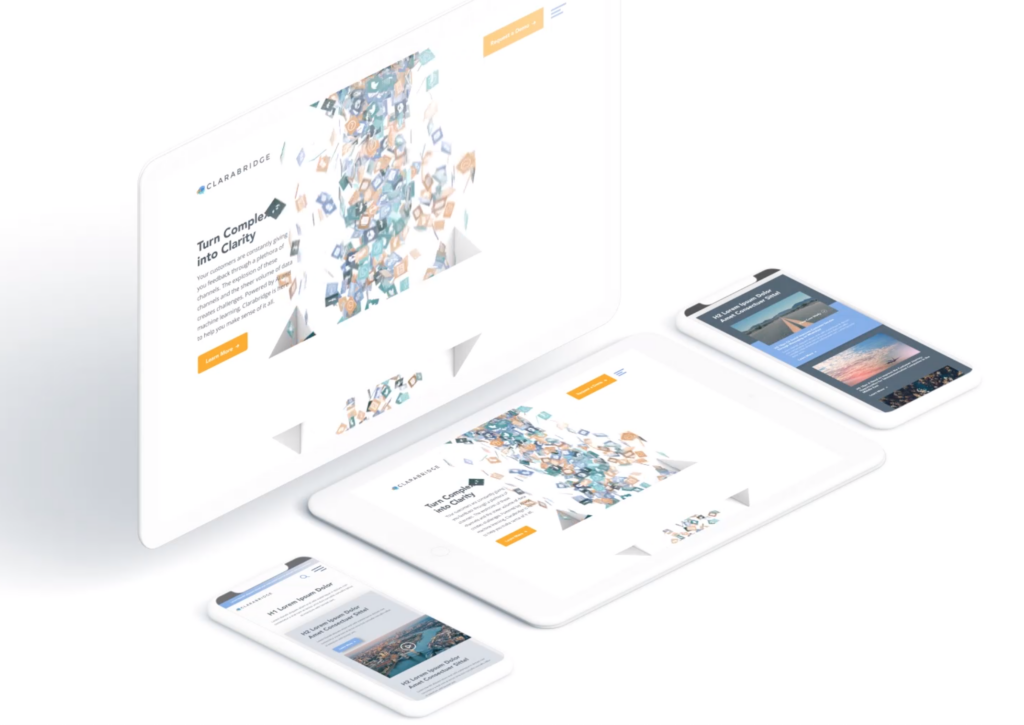
Design the page so that it appears as though you are scrolling through one long piece of content. Maybe the background color stays the same, maybe it slowly changes color, as shown on Palantir’s About Page. Perhaps you’re experiencing parallax scrolling – which in and of itself invites the user to fixate on one piece of the webpage at a time. With this effect, the user barely notices the page length, as the seamless design shift keeps them engaged and focused on the story.
Check out how Bluetext implemented this type of scrolling on the homepage of the Clarabridge website. We designed a seamless animation that invited the user to continue scrolling through the homepage to better explain the technical and analytical power behind the Clarabridge platform.
2. Fixed Long-Scrolling
Instead of having the whole page scroll, fixed long-scrolling allows for specific aspects of the content to remain static while the rest of the content scrolls around it. You can also set up the scrolling to shift to a new section when the user reaches a certain point.
This is ideal if your website has important content or CTAs that should always be accessible to the user. For example, a sticky call to action button is often used to keep key conversion points always present and top of mind.
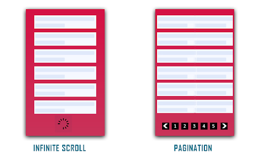
3. Infinite Scroll
This is most similar to the type of scrolling shown in social media. Is your website a news site? Do you have blog content that you want your users to explore? Consider implementing infinite scroll on your listing pages, allowing posts to continue to load so that the page gives the appearance of infinite content. Of course, this can often be overwhelming for a user who is attempting to find something specific, so we invite you to consider including intuitive filtering so that users can self-select the types of content they are looking for.
(Photo Credit: knowband.com)
4. Parallax Scrolling
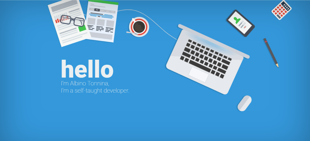
Parallax scrolling is different from the previous three types of scrolling as it invites the user to see new pieces of content and animations with every scroll. Check out how Bewegen invites the user to scroll through their home page and explore their main product. For a personal favorite, give a scroll through Albino Tonnina’s personal website.
Now that you have four great design options to incorporate into your website, it’s time for you to choose the right design for the content on your website. Top web design agencies like Bluetext are great resources for you to turn to in order to gain expert insights on what is best for you.
Looking to begin your next website project? Contact Bluetext today for a consultation.
It’s rare for a business to offer its services for free. The phrase “there ain’t no such thing as a free lunch” reigns true in most industries and all business decisions. Originating with early-century saloon owners marketing free, salty lunches as a way to entice beer drinking, even the etymology of the #TNSTAAFL phrase foreshadows the destiny of commerce itself – it’s impossible to get something for nothing.
So, what does a free ham sandwich in 1891 have to do with 2020 content marketers and gated thought leadership? Imagine your business is the bar and that hungry and thirsty passerby out front is the CMO searching for a way to convince their boss on more paid media dollars, or a CTO who needs a VPN alternative. You have something they could want – a delicious, frothy piece of premium content to quench their industry-specific questions. Post that “Free Lunch” sign, give them some snacks, and then charge them for the beer to wash it all down. You’ll have a bar full of returning customers every time.
You Want to Be a Thought Leader?
Let’s break it down. Businesses that are trying to establish themselves as thought leaders in their space usually have two types of content: Blogs and premium content. Typically, you want to spend your time on the premium content first and then chop it up into free digestible portions, which become your blogs. Since the blogs are free and busting at the seams with the same SEO juice that you prioritized in your premium content, both should come up as a result when someone is looking online for an industry-question you have the answer to.
Think about the last time you were researching B2B tactics. You wouldn’t hand over your email address to just anyone at the beginning of your research. You browsed around to see who knows what they’re talking about. Once you found a credible thought leader, then you actually started paying attention to what they were talking about.
Economy vs. Premium Content
According to content marketing agencies, balance is key. The trick is to walk the line between having free ungated blogs that are enticing and helpful to draw traffic but not too helpful and giving away a company’s expertise without gaining any leads. Save the premium advice and info for the premium content. Ask yourself, “Would someone reasonably pay for this service?”
Make it exclusive, insightful, and urgent. Typically, premium content are eBooks, courses, webinars, checklists, and sometimes videos. Those resources take a lot of effort to create, so you want to put them to work for you and your marketing team. This premium content comes with a price or a gate. The key to the gate and unlocking the juicy stuff is usually as harmless as an email.
As a top content marketing agency, Bluetext breaks down some do’s and don’ts behind gating the premium content.
Do Design Gated Content Conversions Using Ungated Content UX/UI
Make sure your tip top-funnel blogs feed into your top funnel gated content. A UX design company will engineer an ungated content user interface to drive invested leads to gated content. Dangle the carrot and then drive them down a rabbit hole of insights. If your resource page template’s layout has a related topic listing, you can get someone reading one blog to jump to the next, especially when you have click-worthy resource titles.
Create a clear, focused path to follow. Put an enticing CTA at every step of your ungated posts to draw them to the gated content. Theoretically, the user lands on a first blog post via Google search, they peruse 2-3 of your other blogs, and then they are a bit invested by the time they get to gated content. Long story short, using the Free Lunch scenario, clean up your bar so it looks inviting enough to have them buy a drink.
Don’t Forget to Design the Landing Page UX/UI for Conversion
At least make the gated content page template easy to use and worthy of personal info. Best practices for gated content landing page design include showcasing the product, talking about the benefits and insights they can learn, highlighting a quote from the piece, and ideally some social proofing or testimonials. A website design agency will be your best bet to formatting these nuggets of information in a clean, digestible fashion. Like any other business transaction, sell it with foreshadowing what they are about to invest in.
Do Add SEO Excerpt from Gated Content on the Landing Page
The Google Algorithm crawls ungated content, but while you will be losing out on SEO potential by putting keywords behind the gate, you can still put some of those keywords directly on the landing page. Think of it like a teaser, or a sample sip of the beer you want them to buy.
Don’t Miss Out on Capturing User Journey Clues Via CTA Pixel
If the user has followed the intended path laid out above, they have digested other information on the website before converting on the gated content. A digital marketing and analytics expert will implement Google Analytics or UTM parameters to track where users come from and behavioral trends. This is a critical insight that can help your sales and marketing team follow up and understand the lead without asking them. In fact, don’t ask them anything else besides their email (coming up next!).
Trusting a digital marketing and analytics agency to configure the UI/UX back end of your CMS to gather clues (via UTM or Google Analytics) will ensure these tools talk to your CRM when it passes over the lead. Your CRM can then organize to segment those leads into audience pools with the user journey info and UTM parameters. Did they arrive via Facebook or LinkedIn? Did they read about technology or marketing thought leadership? Did they visit SMB or Enterprise blogs before? Depending on what you want to do with the leads gathered from the gated content, a digital marketing agency can follow up with retargeting campaigns. By taking out the guesswork, digital marketing campaigns are then geared toward the topics and categories you know a specific user is interested in.
Don’t Over-Gate with Nosey Forms
Sometimes businesses want more defining characteristics of the user to help their follow up marketing to have some foundational info. Asking for an email is the easiest marketable piece of info you can gather – but should you want more, make sure the form is at least easy to use. For instance, free type is ok, but dropdown select from offers convenience. Ideally, if you need to ask for more info, triage that asks by making some questions optional so you don’t scare anyone away. Remember – you want them more than they want you at this point. You might be the third tab they have open in their research, so think twice if knowing their position is worth losing them to a competitor’s simpler gated content.
Do Gate Content. Don’t Gate Content.
We wish it were black and white, but the answer to the infamous To Gate or Not to Gate question comes down to the following:
- How exclusive is your offer?
- How easy is your form to fill out?
- How SEO friendly is your LP?
- How actionable is your CTA?
If you have your thought leadership on fleek from a UX/UI, SEO, and CMS perspective than you’re ready to start offering free lunches to any potential lead that comes into your digital business.
As the world becomes increasingly digital, having a professional, user-friendly website is now more important than ever. With countless options for building or overhauling a website, picking the right content management system or DC digital web design agency can seem overwhelming. Don’t panic, Bluetext is here to provide expert advice to all decisions that go into building your digital ecosystem. As a top DC digital web design agency, with teams of Drupal and WordPress development experts, Bluetext has worked with countless client’s to build high-quality, easy-to-navigate websites. Our teams of user experience and user interface specialists take many things into consideration when building a website; however, navigation is always a top priority. 94% of web users report easy navigation is the most important feature when evaluating a website. As an experienced DC digital web design agency, we’ve been able to test why and how logical website navigation is critical. Here are four ways to make sure your website is as intuitive as possible.
1. Keep Things Orderly
In creating a new website, the order of information on a page can make or break the user experience. People tend to best recall the first and last items in a series and forget the information in the middle – this is known as the primacy and recency effect. For this reason, the most important information should be included in the hero zone of a website. The hero zone, in other words, can be best equated to an elevator pitch – a short description of your idea, product, or company that briefly explains your concept in such a way that any viewer can quickly understand it.
2. Remain Consistent
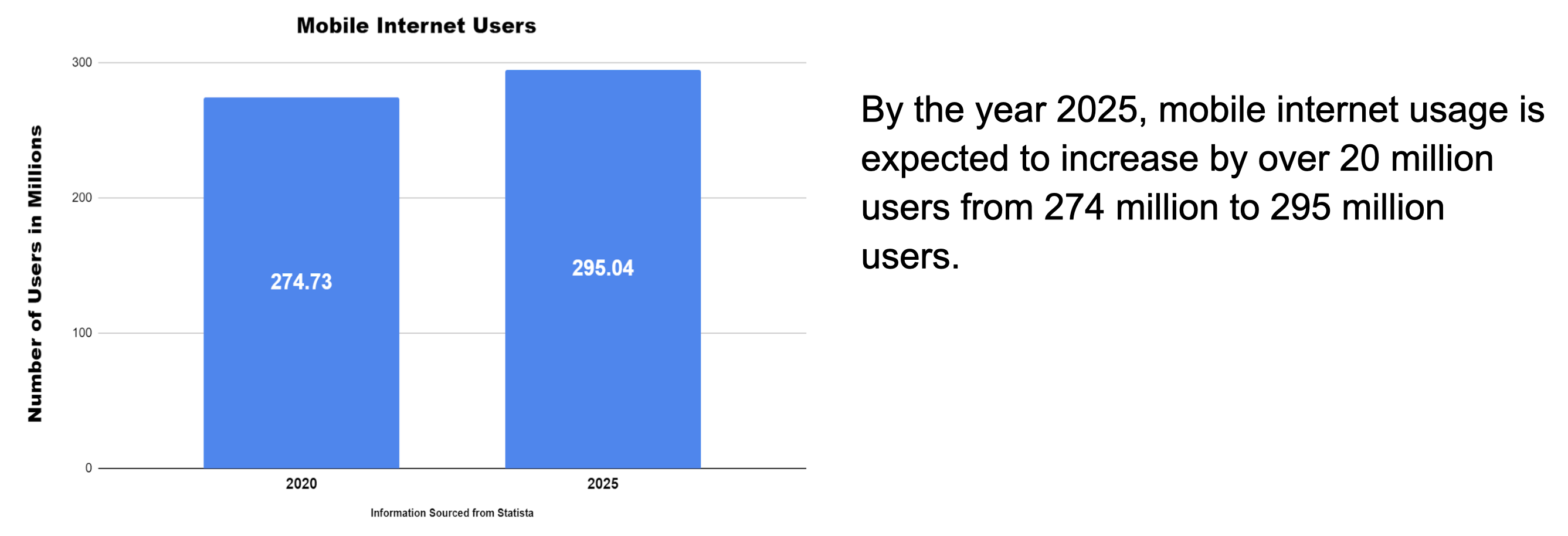
By 2027, there will be more than 41 billion IoT devices around the world. The increased volume of IoT devices means more individuals around the world will be accessing the web through a wider range of devices. As a DC digital web design agency, we’ve seen the increased importance of creating responsive websites that automatically scale to device type but remain consistent in general structure. Menu systems often become crowded and confusing as screen widths decrease to tablet and mobile devices. Digital design agencies can help overcome this obstacle by recognizing the critical breakpoints in your site’s design and implementing menu structures optimized for tablet and mobile screens of all generations. By keeping this consistency in structure and navigation across devices, users will become more familiar with and loyal to your website and brand.
3. Limit Menu Items
To ensure a website is easy-to-use and navigate, the structure is essential. For example, listing each page separately in a navigation header creates an overwhelming and near impossible user journey. Your sitemap should act as a foundation, with the most important items laying the building blocks for secondary pages. By systematically creating a logical sitemap utilizing primary and secondary navigation, you can create a fluid user experience that allows users to find exactly what they need with ease. As a DC digital web design agency, we have access to and frequently use site map testing tools, such as Treejack, to evaluate the findability of topics on a website. Not to mention, creating a logical, hierarchical sitemap makes it much easier to produce an XML sitemap, which is pivotal for SEO.
4. Test. Test. Test.
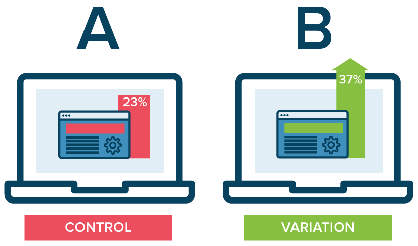
A/B testing website navigation is the only way to truly take the guesswork out of website optimization. As a DC digital web design agency, our Drupal and WordPress development experts have seen first hand the benefits of A/B testing. With proper testing, website navigation changes can be data-driven. Conversations surrounding those changes then shift from “I think” to “I know.” Although A/B testing can be employed to answer one-off questions, it should be continually used to improve metrics, such as conversion rate, over time.
In building or redoing a website, intuitive navigation design should always be a top priority to ensure users don’t require instruction or trial and error to move around the site. By using the navigation best practices mentioned above, you’ll have taken a great first step towards better engagement and higher conversion rates on your website by enhancing overall user experience. To learn more about our processes and to see our work, check out our case studies.
If you’re looking to hire a DC digital web design agency with Drupal and WordPress development experts, see what Bluetext can do for you.
Trends in website design are ever-evolving. It’s a fast-paced industry, but any business with a digital marketing presence should take efforts to stay informed and keep up with best practices. Just as you would ensure employees are helpful and informative to customers in a physical store, your users expect the same experience online. Here are three user experience trends that you should consider for your business’ website in 2020:
Design as a part of your business strategy.
A few years ago, chief executives might have excluded themselves from having a say in website design or functionality to focus on the bottom line. That being said, more and more companies have come to recognize the critical importance of a strong online presence. With the world participating in the digital-first movement, your website says a lot about the health of your business.
The future of the company often lies in the hands of top executives, as they typically establish the company culture and the goals with investors or the board of directors. Including top stakeholders in the design process is critical to get initial sign off and ensure their vision is incorporated. It is important to involve diverse perspectives into any web design, especially the ones writing the checks. These stakeholders offer a unique perspective in the current state and future aspirations of the company. Website strategists and UX designers should always include the top decision-makers in the room to make sure the website they are designing today aligns with the business strategy of the future.
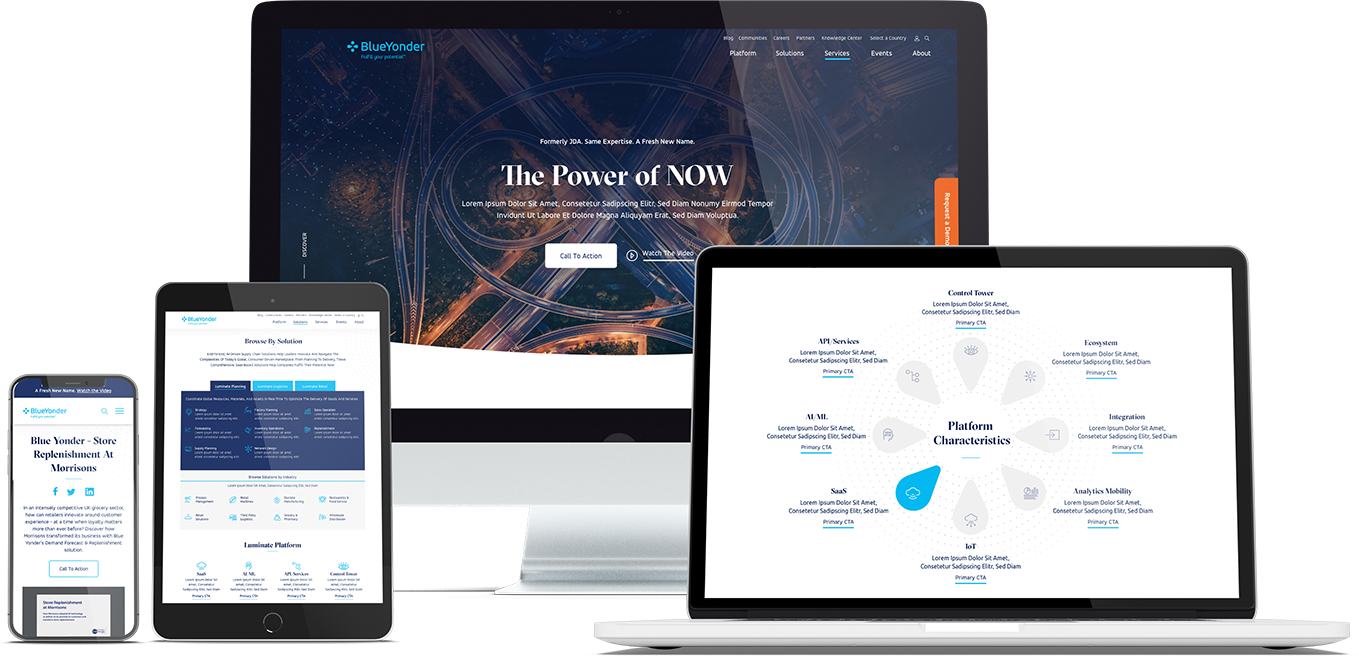
When Bluetext recently partnered with Blue Yonder (formerly JDA), the #1 supply chain management software company in the world, we made sure to include top decision-makers from the initial discovery session, all the way through to launch of their brand new website. You can view our work with Blue Yonder here.
Thumb-friendly design.
With over 50% of website traffic coming from mobile devices, responsive website design has become a top priority. Menu navigation and intuitive user journey has been and always will be a top design consideration, but recently there has been a shift in attention towards mobile menu design.
How do top UX design agencies optimize for user comfort as we design for mobile? We think about adding content and important elements to the “thumb-zone”.
The “thumb-zone” includes the area at the bottom of a mobile device and on the side opposite the thumb. Test it yourself by holding your mobile device. Where does your thumb naturally fall? User studies say that about 75% of user interactions are thumb-driven, so including navigational items and important content in this zone creates a simplified and more natural user experience. In 2020, you will likely notice a lot of websites start to move away from hamburger navigation on the left side of the screen. These are often replaced by navigation bars at the bottom of the screen, aka the thumb’s natural setting.
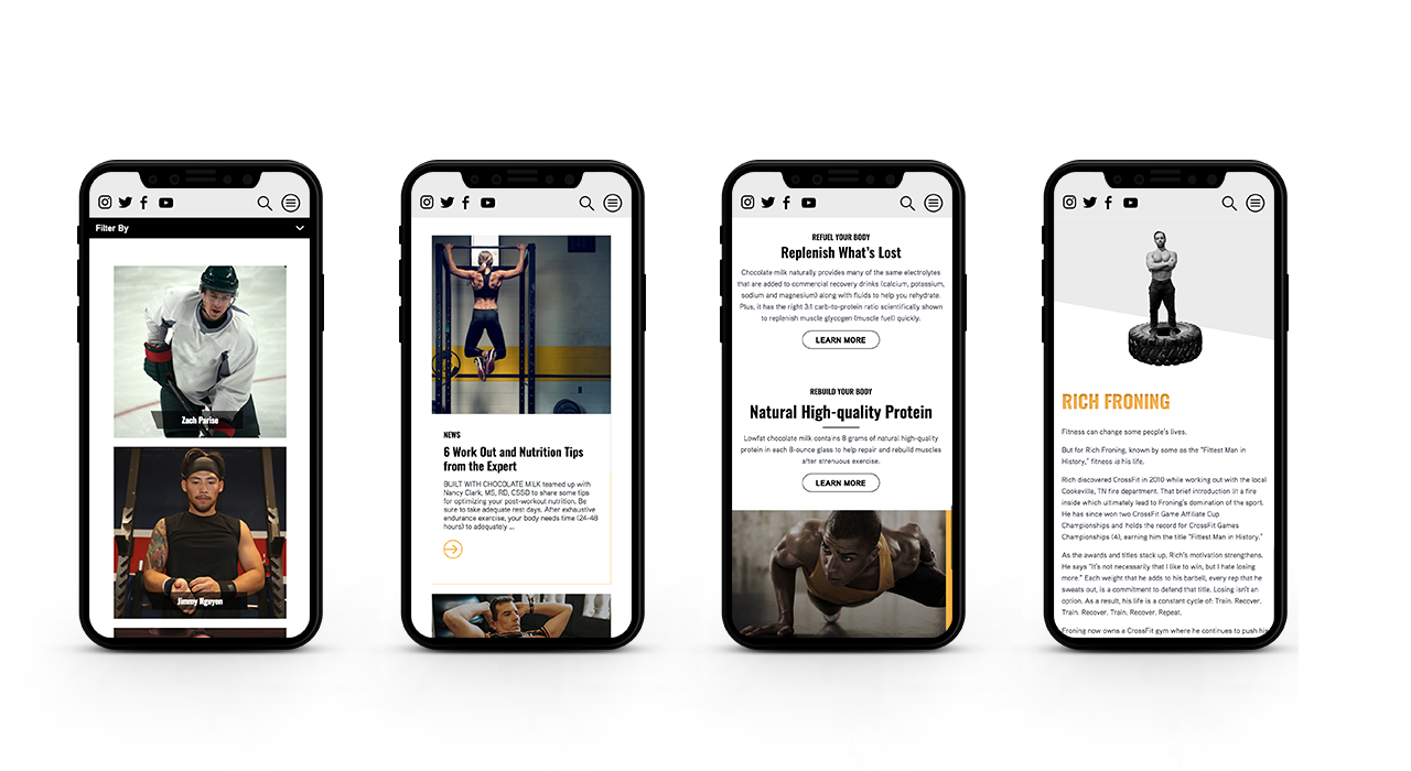
Bluetext designed a mobile-first website for Built With Chocolate Milk, an organization that promotes the benefits of chocolate milk as a natural recovery drink. Bluetext enhanced the user experience and overall engagement through a website redesign that emphasizes the science-backed benefits of chocolate milk and showcases Built With Chocolate Milk’s impressive partnerships with world-class athletes such as Klay Thompson of the Golden State Warriors.
Accessibility.
With the internet being a critical part of daily life and the rise of user-centric design, it is no surprise to see accessibility on the list. When thinking through how a user gets from point A to point B, UX designers should be inclusive of those people who may have a disability and use assistive technology.
One way of keeping accessibility top of mind is to develop separate personas for users that may have low vision, deafness, or other disabilities. Persona creation is a common exercise for top digital marketing agencies when beginning a website project. But thinking beyond the expected customer personas can open insight into a more inclusive and realistic set of potential web users. Having empathy for these personas while designing will help ensure little tweaks are made that allow them to equally experience your content. For example, ensuring text is large enough for users with low vision and inclusion of space for video transcripts are all UI elements that make the website more accessible to all. With the rise of imagery- and animation-heavy sites, adding alt text to all website imagery will allow screen readers to provide context to visually impaired users. Plus, this step will kill two birds with one stone by improving your site’s SEO ranking with keyword-rich descriptions.
Added bonus: Google prioritizes websites that are more accessible to more users, so if you want to boost your SEO rankings, keep accessibility top of mind.
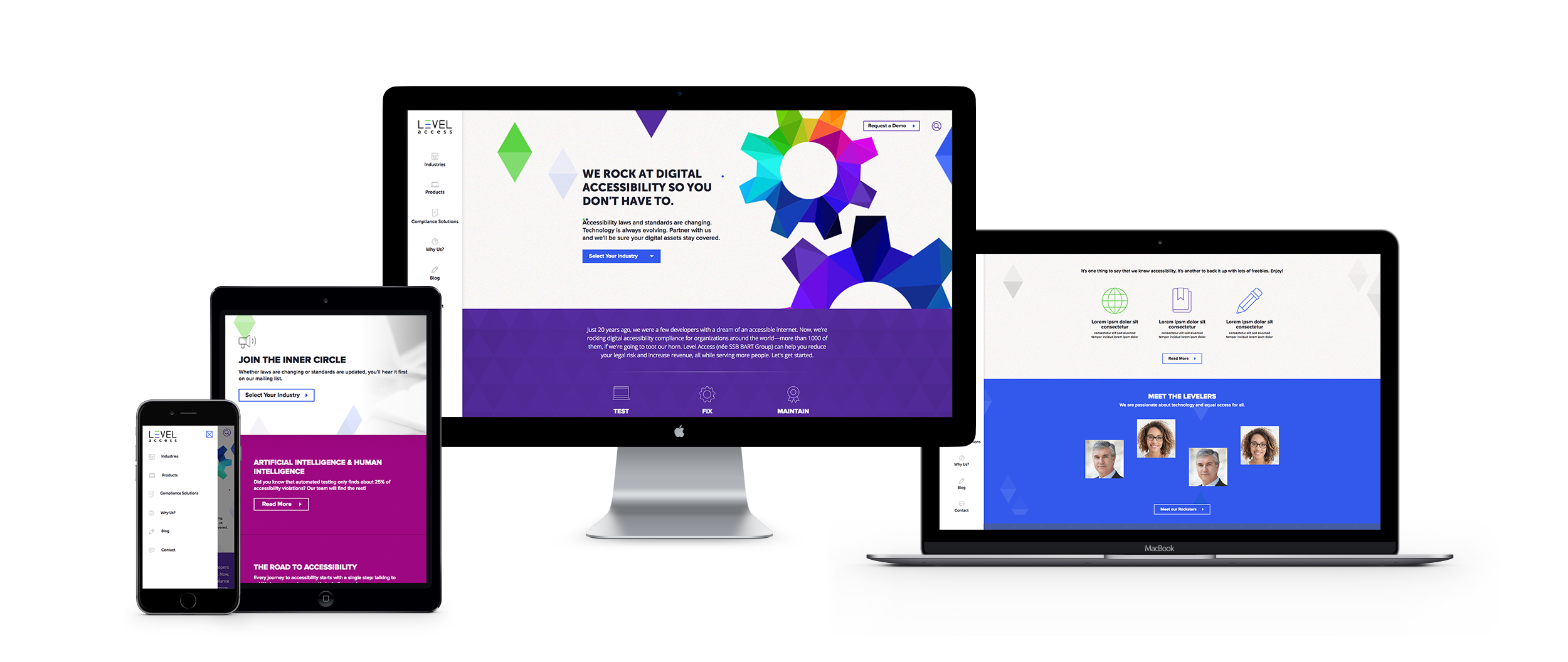
When the SSB Bart Group, the leading provider of accessibility solutions and software, needed a new brand to increase its market share and continue on its growth trajectory, it chose Bluetext to deliver a new name, brand, and website that would focus on its people and expertise. After a thorough discovery process, competitive review and market analysis, Bluetext proposed Level Access to simplify the brand and its promise to the industry. The new look and feel and how it is presented on the website reflects Level Access’ mission “to create a world where digital systems can be made readily accessible to users with disabilities—enabling digital technology to become a profound empowering force in their lives.”
Looking for more information about the state of web design and where we’re headed? Check out some more of our case studies.
The decades-long reign of the PC is over, with mobile devices now making up more than 52% of all internet traffic. While plenty of people preach the importance of responsive website design, far fewer have articulated updated guidelines for the reality of today’s internet. Keenly aware of trends as ever, Google has continually refined its search algorithm to keep pace with increasingly mobile and untethered internet. Advertisers, marketers, and website owners alike need to be aware of what these paradigm shifts are, and how that could impact their sites’ SEO.
Cellphones’ bountiful data has empowered Google to enhance its search engine. Search results are more custom than ever before, incorporating key differentiating factors like time of day, weather, and geography. The search results for a morning bagel in Washington D.C. will look entirely different three hours later in San Francisco.
Optimizing for Local Search
More so than ever before, websites need to be local. Gone are the days of simply tacking on addresses and list of phone lines. To be competitive in 2020, websites need to address the mindset and inquiries of the region they serve, be it a street, coast, or country. A quintessential, doughy foldable New York slice is in stark contrast to a dense, deep-dish pie from Chicago. The top result for a pizza in Manhattan will not be wasting content on merely their cheese, sauce, and pepperoni, but rather what distinguishes their slice from their other New York brethren. Language, context, and local distinctions are now a mandatory part of website content strategy.
Dealing with Short Attention Spans
Major changes to search algorithms are only a handful of the changes introduced by the rise of mobile. Attention spans online are shorter than ever with the ubiquity of the internet and easily accessible information, even more so for mobile where screen size comes at a steep premium. Hero zones should be appropriately leveraged. Heroes should state the most important critical information concisely and contain a quick and simple CTA or takeaway. Organic visitors who cannot immediately find an answer to their search query after a glance and a few swipes will assuredly bounce away to a competitor.
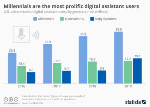
Search and Virtual Assistants
Smartphones’ impact on websites has not just been limited to mobility and smaller screens. Virtual assistants like Amazon’s Alexa, Google Assistant, and Apple’s Siri fundamentally change how people browse the internet. For many on-the-go, the automated search functionality provided by these virtual assistants have all but replaced a typical Google search.
How Google and the other virtual assistants parse through webpages and present them for voice search is a complex topic, but the vital SEO fundamentals remain in place. Research demonstrates that people are unsurprisingly far more conversational in their wording versus a typed-in search. Optimized content thus needs to serve this need directly, often best served using blogs that cover such frequent, informal topics as “What is the best X” or “Y versus Z”.
Google has been increasingly leveraging its structured data for voice search results, largely due to its predictable format and parseable nature. For best results, website owners need to cross-reference website content and identify what data could be passed off to Google using structured data. Articles, menus, locations, events, and reviews are just a handful of the many structured data formats that Google accepts. Conveniently, Google now provides a simple tutorial for anybody familiar with HTML to get started on incorporating structured data and improving their site for voice search.
The shift to mobile devices has opened up new avenues for content creation and design. Location and voice were unheard of topics even a decade ago, but they are here to stay for organic search. It’s up to website owners and marketers whether they take advantage of these new strategies, or get left in the dust.